This time last year I worked with The Write Life during their three-day sale of The Writer’s Bundle, a collection of digital products for writers. I built a dynamic dashboard using Google spreadsheets so the team could visually monitor progress throughout the sale.
This year The Writer’s Bundle 2015 was bigger and better than ever, so I wanted to create an even more useful dashboard for the team. The dashboard was a key tool for the team, to monitor both overall and individual sales channel performance, as well as to be a motivating force by giving everyone a visual sense of progress.
A lot of the inner workings of the spreadsheet (the raw data, formulas and data validation, for example) were the same as last year, but I added several new charts this year that I highlight below.
The following GIF shows the dashboard in action, with three display windows (tabs) showing various graphical representations of the data. What you don’t see is the fourth hidden tab for the raw data, which underpinned the graphics.
Note: Names and confidential information have been removed from this GIF.
The process to get the raw data into graphical form was as follows:
- Download new sales data from ejunkie (every 3 hours, except overnight).
- Import the new sales data into the raw data tab of the spreadsheet.
- The formulas then automatically updated the tables for the charts to include this new data.
- The charts were then updated automatically to reflect the latest data.
Behind the charts: the data
The underlying spreadsheet mechanics were largely the same as last year, and those details can be found here.
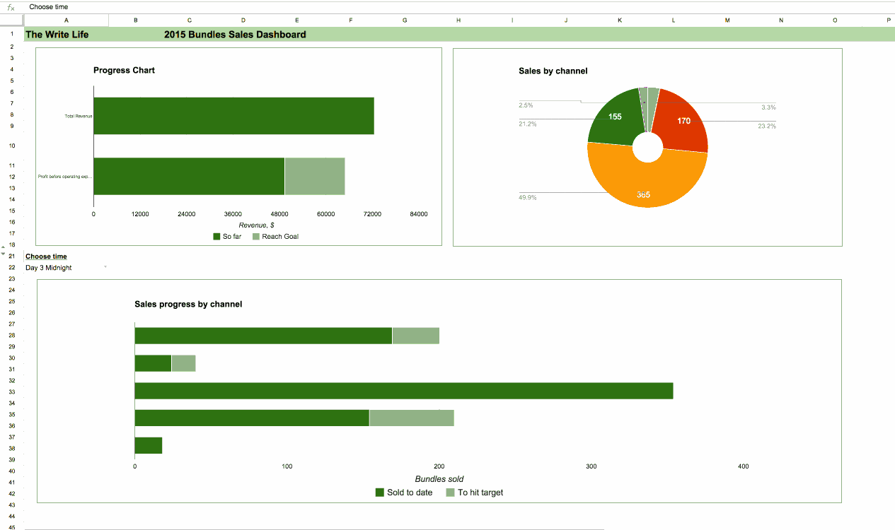
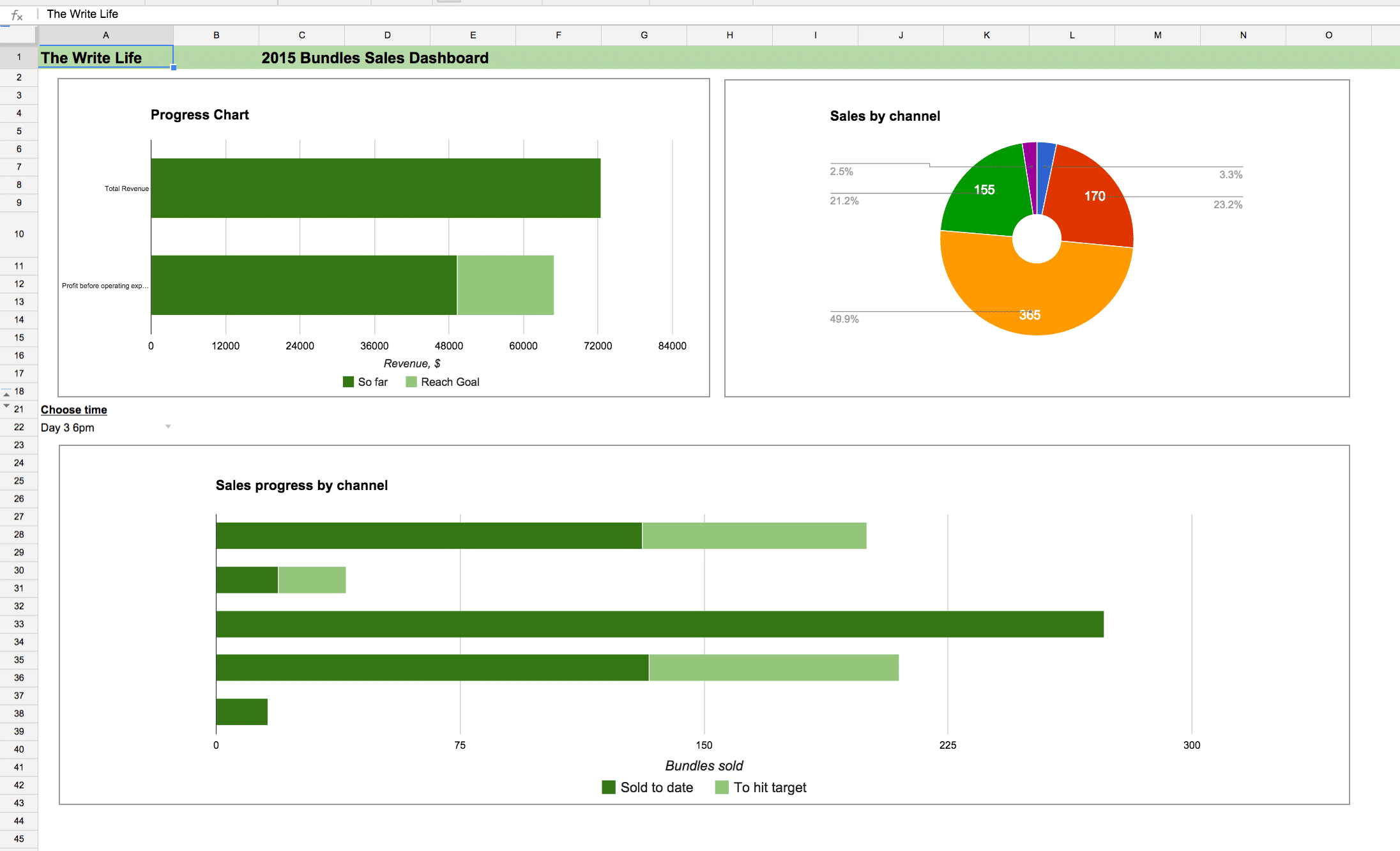
Tab 1: The progress dashboard
Similar to last year’s dashboard, this tab show some high-level summaries of revenue (before and after affiliate cut), sales by channel and an interactive chart showing progress by channel by time.
Tab 2: Year-on-year sales comparison chart
New for this year, and definitely the easiest chart to read and get a sense of progress, this one showed the high-level total sales compared against the same point in time of last year’s sale. For example, the following chart shows the position at 3pm on day 2, where we can easily compare this year’s progress against last year. The steepness of the chart indicated the momentum of sales.
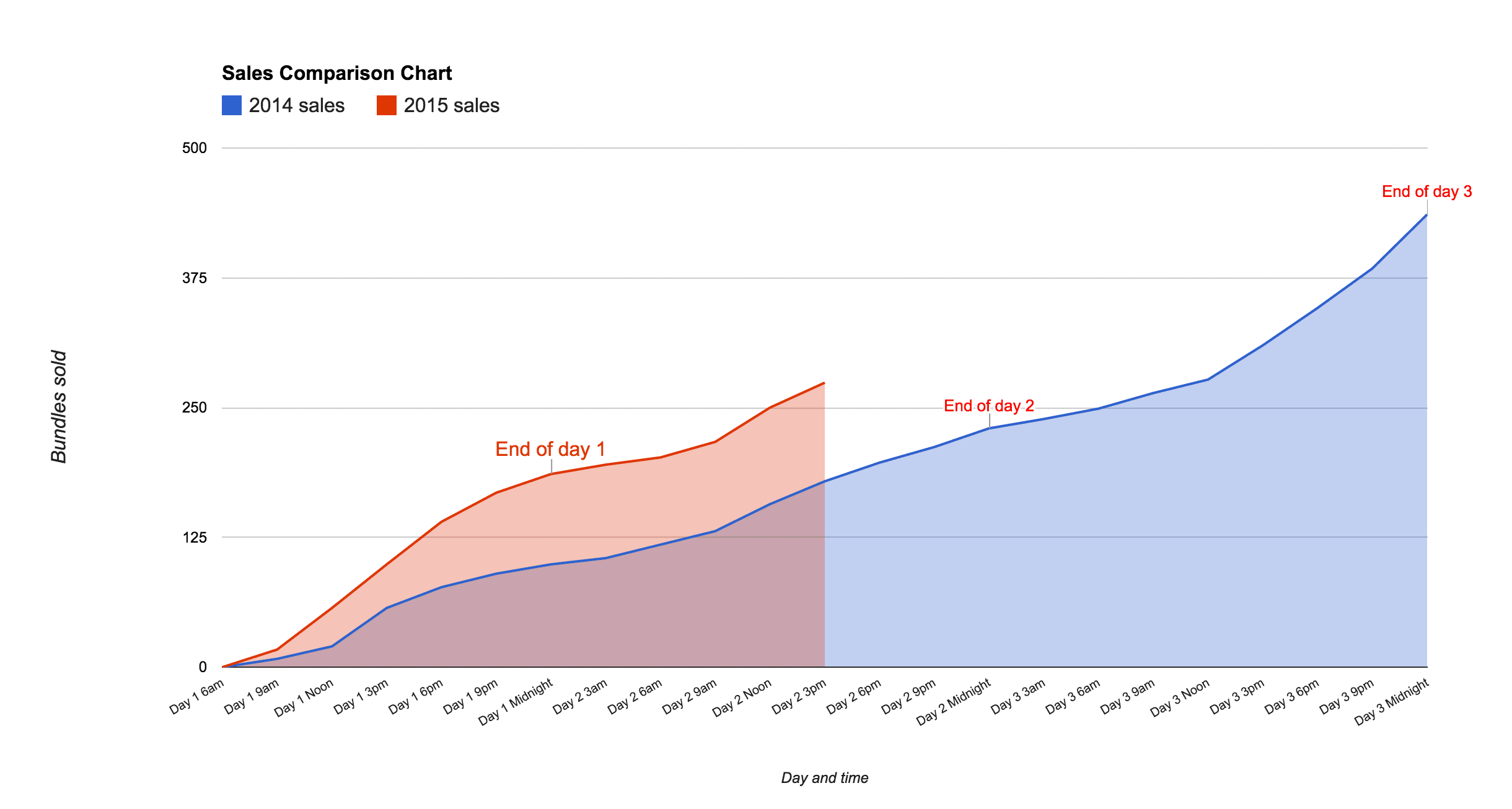
The sale finished like this, showing a nice improvement over last year:
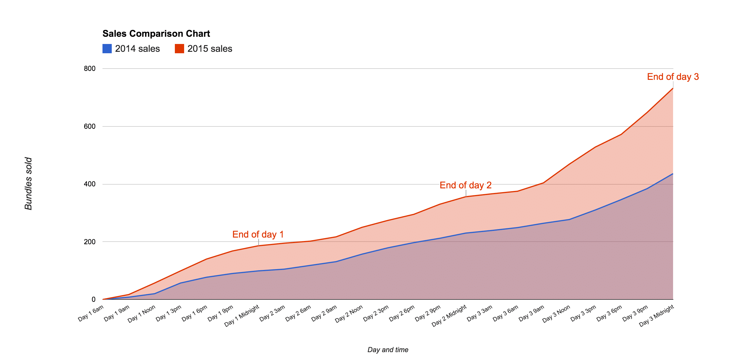
All around, this was the most popular visual for the team this year, who eagerly awaited each update. We shared and discussed progress in a team Slack chat. The team was excited to see how much better we did than last year, especially how well day three went.
Tab 3: Detailed breakdown
Also a new addition this year, this chart was designed to provide a granular breakdown of sales by each individual channel, as follows:
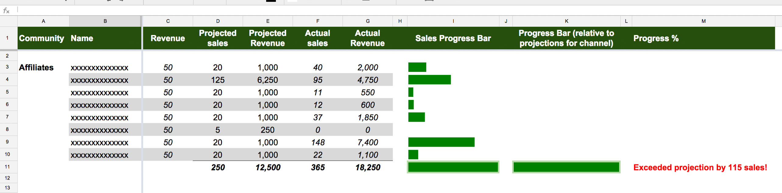
I have to confess to a mild obsession with sparklines. I think they’re a wonderful, quick win for visually showing a result without needing to know specifics. In this case they were perfect to show a visual representation of how each channel was doing side by side (the small green bars above), without needing the complexity of a full-blown chart. Plus, it allowed me to keep the visual representation next to the detailed figures, rather than having them separated. This allowed the team to quickly see which channels were performing best or not meeting projections.
I used the following formula to setup the sparklines in column I:
=if($F3=0,"",sparkline($F3,{"charttype","bar";"max",200;"color1","green"}))So, what’s going on here? There’s an IF statement which sets the cell to be blank if the value in column F (sales figure) is zero. In other words, only draw a sparkline if there’s some data to show.
Then I use the sparkline formula:
sparkline($F3,{"charttype","bar";"max",200;"color1","green"})where I’ve set the max to 200 for every cell (so they are all on the same scale and therefore comparable). I also set the color to green to match the overall theme of this dashboard. Further info at the official docs here.
I have a second sparkline in cell K11, which shows the sparkline relative to the estimated sales for this channel. In other words, rather than fix against a scale with max of 200, this one has a max equal to the projected sales for the channel, so it shows progress against the internal target. The formula to do this is:
=if($F11=0,"",sparkline($F11,{"charttype","bar";"max",$D11;"color1","green"}))with the red text showing the change. The formula now references a cell rather than a fixed value of 200, otherwise it’s the same.
To conclude, it’s amazing how much value a few (relatively) simple charts can add to a data-driven project, both for their incredibly useful insights and for their motivating message that everyone can grasp. Raw data alone does not provide that.
One thought on “Building a dynamic dashboard for a 3-day digital flash sale”