My Twitter feed is mostly populated with data-related resources and people, so I almost always find something new and shiny going on there to distract me.
Sometimes this can be a good thing though (and sometimes, it can be the best thing ever).
Take last Friday. I found myself procrastinating, browsing my home feed when I saw this tweet for the upcoming Microsoft Data Science summit:
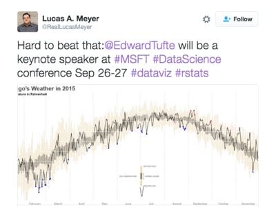
What caught my eye was not the actual tweet, but the sumptuous weather visualization that I recognized as one of Edward Tufte’s famous creations.
I clicked through to the article, which linked to Tufte’s original chart (here) and a fantastic tutorial about re-creating the chart using R, from Brad Boehmke (which is actually the chart shown in the tweet above).
It looks at daily average temperature over a period of time and captures the historic min/max range, the normal range (95% confidence interval), the 2014 temperature line and picks out the highs and lows. It renders all of this information in a single, beautiful column/line combination chart.
Curiousity piqued, I wondered whether this would be possible with Google Sheets?
The short answer is….. Continue reading Recreating Tufte’s famous weather chart with Google Sheets and Charts API