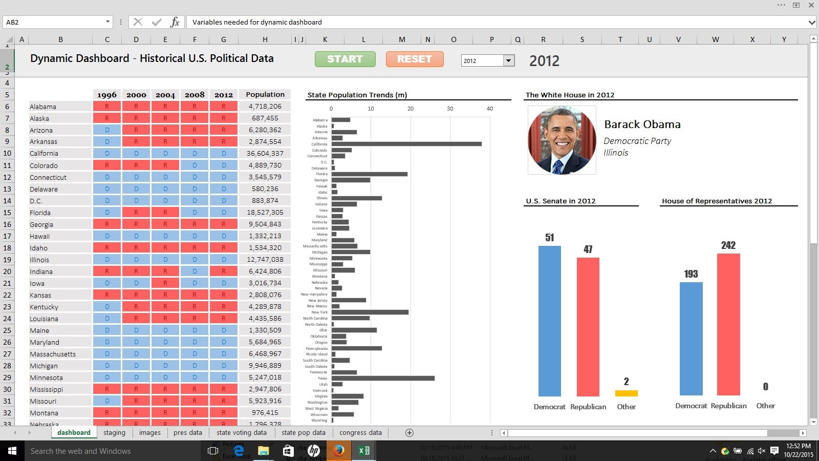
Who doesn’t love a dynamic, animated Excel dashboard?
Here’s one I’ve been working on recently, a data visualization of historical U.S. political data, showing party trends, state populations and sitting presidents over time:
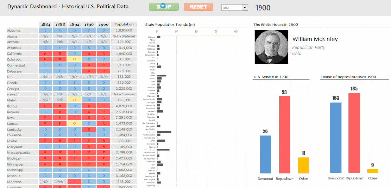
In the following post, I delve into the details of how I created this dashboard. It’s not a full cell-by-cell account of how I did it, because that would require an article at least twice as long, but rather a look at the various steps and thought processes along the way.
If it appears a little ragged, that’s because it probably is! Most likely because I’m writing this bleary eyed at 1am, between feeds and diaper changes of my 6 week old son. 😉
Continue reading Excel tutorial: Building a dynamic, animated dashboard for U.S. political data