Introduction
In 1854, London was in depths of a devastating Cholera outbreak. Hundreds of people were dying and many more were fleeing the city.
Doctors were scrambling to understand the cause, hampered by the limited scientific knowledge of the day.
One doctor, John Snow, believed that germ-contaminated water was the source of the outbreak, not particles in the air.
Snow created an incredibly impactful data visualization to help prove his theory. He superimposed small bar charts on a map of the outbreak area, which showed that sick households were sharing the same contaminated well.
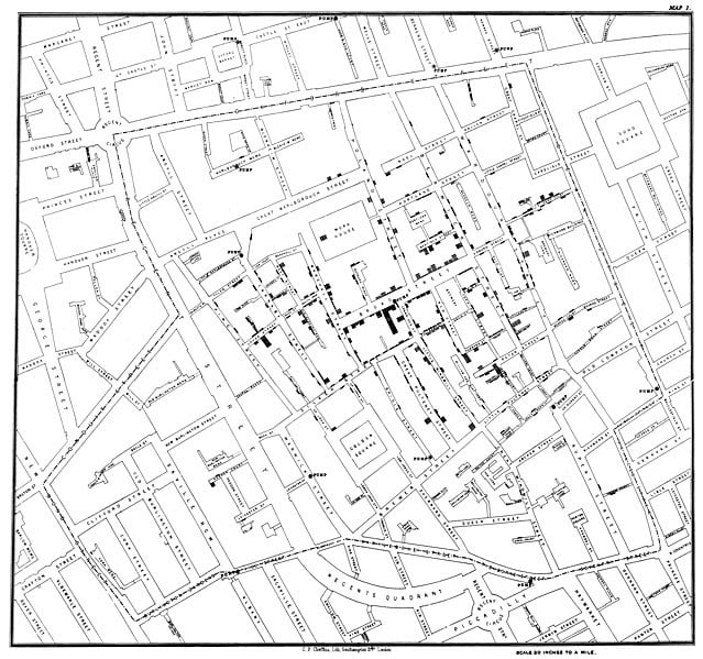
This chart is frequently cited as one of the most influential data visualizations of all time and undoubtedly saved many lives.
It was so effective because it was the correct chart choice for the problem. It showed the viewers exactly what was happening.
But there are a dizzying number of ways to present our data visually.
How do we know which chart to use?
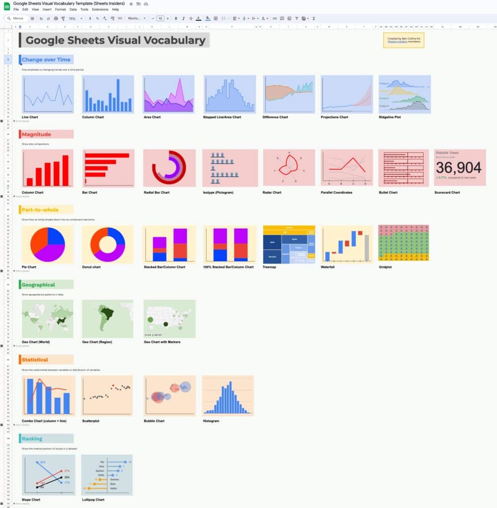
I created this Visual Vocabulary template to help you answer that question.
It includes 31 of the most common data visualizations, grouped into categories, with examples of when to use them. It’s not meant to be exhaustive, but it should cover the vast majority of common use cases.
Google Sheets Visual Vocabulary Template
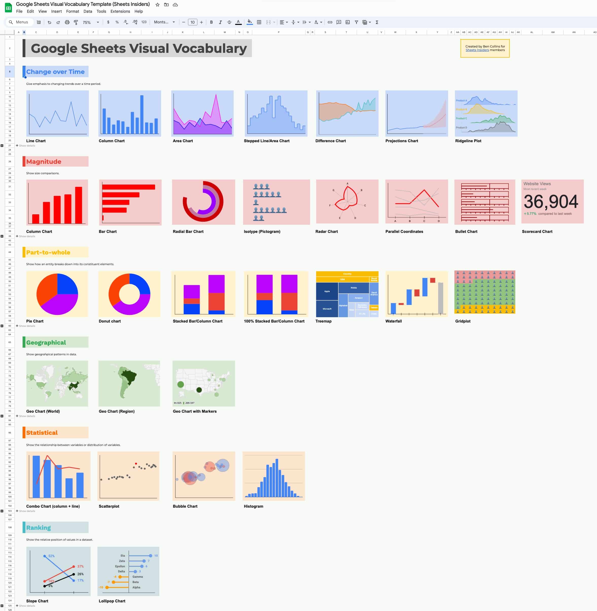
Click here to make a copy of this template >>
What’s inside this template
Grab your favorite caffeinated beverage, download the template, and let’s get started.
Four ways to get value from this template
1. Use it to select suitable charts
There are a surprisingly large number of chart types and picking the correct one can be difficult. The idea behind this visual vocabulary is to put the most common chart types side-by-side for easy comparison.
Each chart on the main sheet is annotated with a description and example use case.
Data visualization is a huge topic and this template is intended to be a jumping off point into the exciting and rewarding field of data visualization.
I look forward to exploring more data visualization and dashboard topics over the coming year.
2. See how to create specific charts in Google Sheets
Many of the charts in the template are straightforward to create, and exist natively in Google Sheets.
However, there are some charts, such as the bullet charts, lollipop charts, and ridgeline charts, that are more complex to create. Often the key factor is the “shape” or layout of the data.
Please explore the individual charts to see how the underlying dataset is organized. I encourage you to click on the chart editor and see how the “columns” from the data map to the “series” in the chart editor.
Over the coming year, we can dive deep into many of these chart examples to see how they were created.
3. Use it for design inspiration
I made the following design choices in the Visual Vocabulary Sheet:
- The front “Info Sheet” gives users information about what’s inside the template and includes a page of contents.
- The “Index Sheet” records the chart types in the template.
- The different chart groups are color coded to help differentiate them.
- I used background cell colors to make the headers visually appealing.
- I left plenty of whitespace around the charts to give them room to “breathe”.
- The font is “Montserrat”, which matches my brand.
- Hiding the gridlines makes it look more professional and less like a spreadsheet.
- The Show/hide technique, using the grouped rows and subtotal function, is a great way to include information in your dashboards (see tutorial below).
Feel free to copy any or all of these for your own projects!
4. Use the Show/Hide rows technique
You’ll notice that under each row of charts is a “+ Show details” button.
If you click the + in the sidebar it unhides some new rows that contain additional information about the charts.
You’ll also notice that the button changes to a “-” and now says “➖ Hide details“.
How can we do that?
- Open a new Google Sheet.
- Highlight rows 4, 5, and 6.
- Right click and select “View more row actions > Group rows 4 – 6“
OR go to the menu View > Group > Group rows 4 – 6 - Enter a value in cell A5, e.g. “My secret information”
- In cell A3, above the grouped rows, enter this formula, making sure that the cell A5 is not blank:
=SUBTOTAL(103 , A5)
Now toggle the +/- buttons to show/hide the rows and watch what happens to the output of this SUBTOTAL formula.
It toggles back and forth between 0 (rows hidden) and 1 (rows showing).
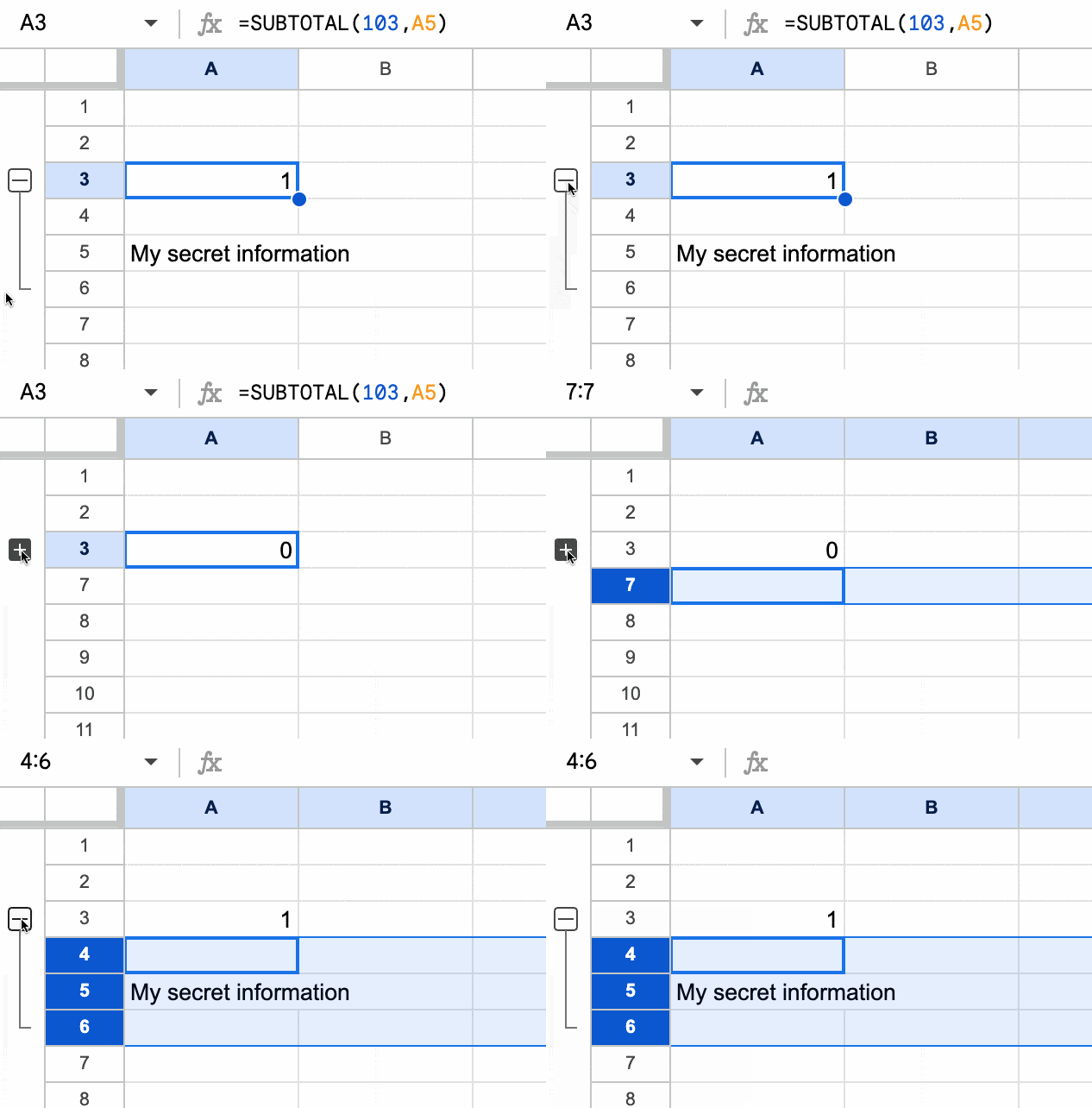
So let’s wrap that inside an IF function which changes the text depending on whether it’s a 0 or 1. In other words, it changes the text depending on whether the rows are hidden or showing.
Modify the formula above (in cell A3) to this:
=IF(SUBTOTAL(103,A5)=0,"+ Show details","➖ Hide details")
Now, when we toggle the +/- button in the sidebar, the Sheet shows different text:
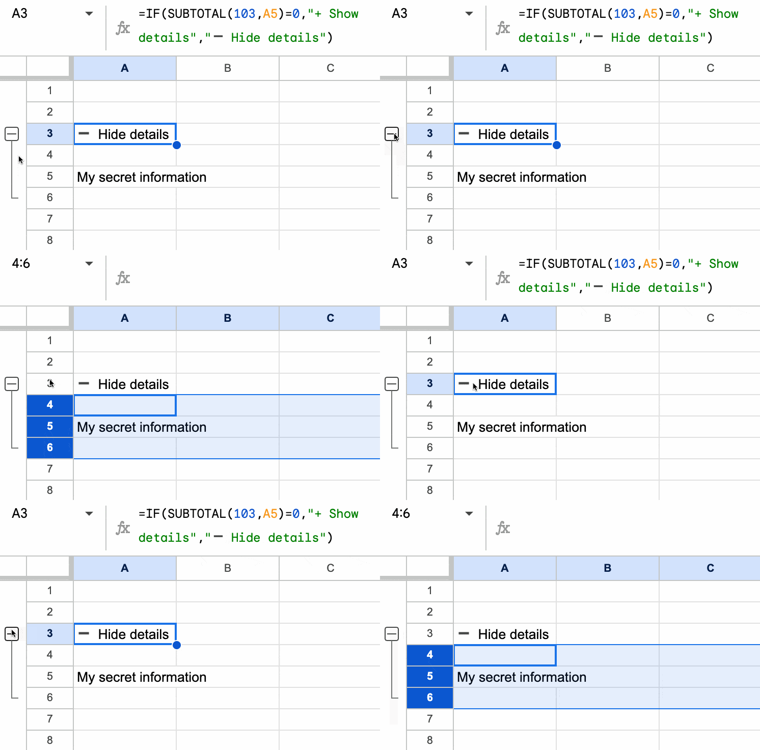
The grouped +/- buttons to the left of the row numbers are easily missed or misunderstood.
So this is a great way to bring attention to them and make it easy for users to understand what they do. It’s an efficient way to include information in a Sheet that doesn’t need to be shown all the time.
You can see how I’ve used this technique effectively in the Visual Vocabulary template above. It’s particularly suited to dashboards.
(Thanks to reader Jean R. who showed me this technique several years ago.)