This week, we’re looking at Google’s Looker Studio and building this chart:
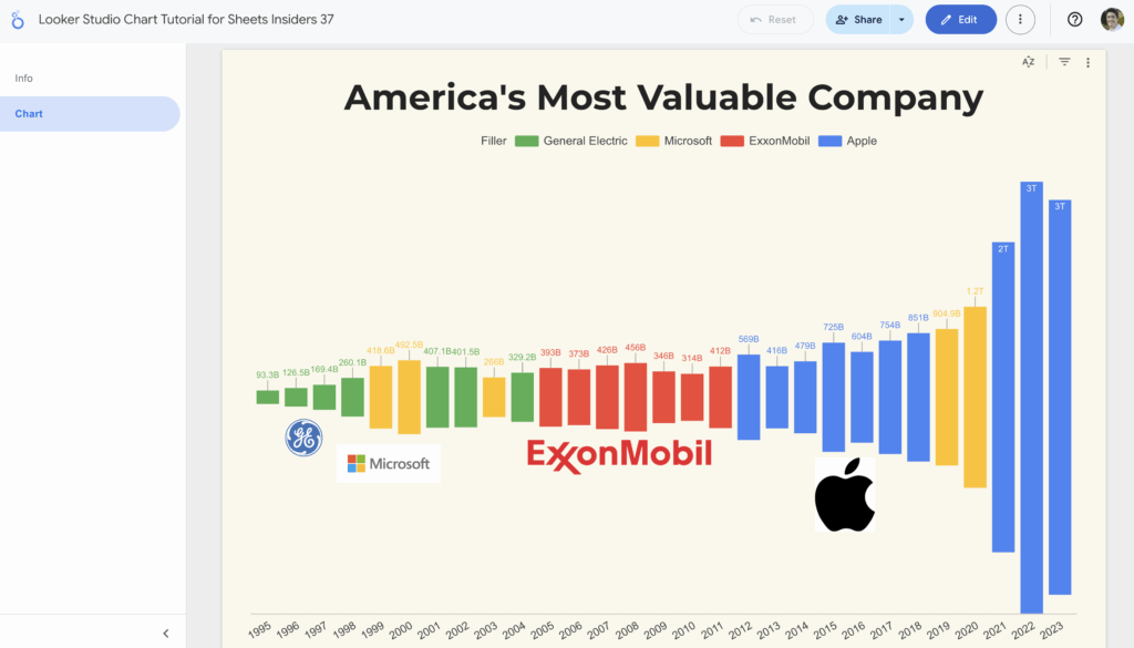
Does it look familiar?
It’s the chart of America’s most valuable companies that we created in Google Sheets for Sheets Insiders issue 2. I thought it would make for a nice comparison to create it in Looker Studio too.
What is Looker Studio?
Looker Studio is a free online tool that lets you turn data, including from Google Sheets, into interactive reports and dashboards. (It was first introduced as Data Studio in around 2015/16.)
Looker Studio is a powerful upgrade from creating reports in Google Sheets. It lets you easily visualize data from multiple sources, with more interactivity options than Google Sheets.
Looker Studio is designed for sharing engaging, live reports that update automatically.
Sounds wonderful, right?
It is. But, of course, there are some caveats.
It has a steep learning curve and it can be tricky to use initially. That’s because it has a lot of functionality, so it’s more complex than the simple chart tool in Google Sheets.
Additionally, I found it buggy in places (for example, button text showing backwards, which seems to be an ongoing issue). And whilst it’s better overall for visual reporting, it’s easier to control some custom features (like individual datapoint labels) in Google Sheets.
But overall, Looker Studio is an incredible tool for doing visual reporting work. It pairs really well with your data in Google Sheets when you need to create visual reports that are more complex than what Sheets can do alone.
And what’s the best way to learn Looker Studio?
By building charts of course!
Open it up and give it a try.
Chart Tutorial
Today we’re going to create this 2-page report in Looker Studio:
Chart Steps:
- Open the Google Sheets data template and make your own copy (click the “Use Template” button).
- Go to Looker Studio and log in.
- Open a new Blank Report.
- You’re prompted to add a data source, so click Google Sheets.
- Select the Google Sheets template you’ve just copied, and select the “Looker Studio Data Source” sheet.
- In the report, select the “Combo” chart (about half way down the chart selections, under “Line”). Drag it out to your page and resize it.
- Change the Dimension to “Year”.
- Change the Metric to “Filler”.
- Add the company names to the Metric area.
- Change the Sort value to “Year” and “Ascending”.
- Under the Styles section, select the “Stacked bars” option.
- Change each series to “Bar”.
- Change the color of each series. Make the first one — Filler — match the background color of your chart so it disappears.
- Add Data Labels to each series.
- Add a Title to the chart.
- (Optional) Add company logos to the chart through the menu: Insert > Image
Report Steps:
- Click “Add Page” in the toolbar to add a second page.
- Change the order of the pages.
- Add text to the blank page to create a front, information sheet.
Template
Make your own copy the Looker Studio Template
Click the three dots menu > Make a copy.
Make your own copy of the Google Sheets data source
Click on “Use Template” in the top right corner.
There is no Apps Script with this template.