Welcome to issue 10 of the Sheets Insiders membership program.
You can see the full archives here.
Template
Download the Combo Chart Tutorial Template
Click on “Use Template” in the top right corner to make your own copy.
There is no Apps Script with this template.
Introduction
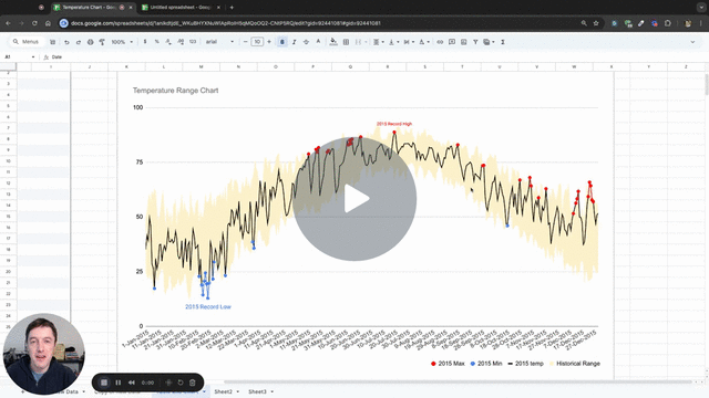
In this tutorial, we’re going to build this combo chart showing a year’s worth of temperatures in Washington DC compared to historical minimum and maximums:
This chart was inspired by a chart originally created by the New York Times and shared on the popular data blog of Edward Tufte.
It shows the daily temperature across the year in New York city, against record low and high temperatures.
It packs a lot of information into a single chart. We can infer how temperature changes over the season and how much variation occurs.
Video Tutorial (11 minutes)
Step 1: Prepare the data
Our data looks like this initially:
Our first action is to convert it to a Table, from the menu: Format > Convert to table
Now, we add new calculation columns to the right side of the table.
Firstly, this formula to calculate the historical range:
=Table1[Historical Maximum]-Table1[Historical Minimum]
Drag it down the full column.
Then we add columns to calculate min and max values.
2015 Min:
=IF(Table1[2015 temp]= Table1[Historical Minimum], Table1[2015 temp],)
This formula checks if the temperature from the “2015 temp” column equals the temperature from the “Historical Minimum” column. If they are equal the temperature is recorded for that row, otherwise the row is left blank.
2015 Min Label:
=IF(Table1[2015 Min]=MIN(Table1[2015 Min]), "2015 Record Low",)
This formula adds a label to the row with the minimum temperature, but leaves all the other rows blank.
Next, we create equivalent max columns.
2015 Max:
=IF(Table1[2015 temp]= Table1[Historical Maximum], Table1[2015 temp],)
2015 Max Label:
=IF(Table1[2015 Max]=MAX(Table1[2015 Max]),"2015 Record High",)
Notice how none of the formulas use A1-style range references. This makes it easier to understand and modify the formulas, and is one of the benefits to using Tables.
(Although, I do wish that Google had implemented the Table formulas to fill down a column automatically.)
Our data now looks like this with the extra columns:
These extra columns are mostly blank, but will have data for the minimum and maximum values.
Step 2: Create combo chart
We’re ready to create our beautiful chart from this data.
Highlight the whole table (shortcut Ctrl + A or Cmd + A on Mac).
Then go to Insert > Chart
In the Chart Editor sidebar, make the following changes:
- Chart type –> Combo chart
- Stacking –> Standard
Then, under Series, click on the 3 dots next to the first series and select “Remove all series”.
Now we have this blank chart canvas:
Begin adding the series back, in this order.
Under X-axis:
- Add “Date”
Under Series, add the following series:
- Historical Minimum
- Historical Range
- 2015 temp
Go to the Customize menu of the chart editor sidebar and click on Series.
- Set Historical Minimum to “Area”, color white, area opacity 0%, and line thickness to 0 (you have to type that)
- Set Historical Range to “Area”, color light orange, area opacity 70%, and line thickness to 0
- Set 2015 temp to “Line”, color black, line thickness 1px
Our chart now looks like this:
Looking good! Nearly there.
Step 3: Add labels
Back in the Setup menu, under Series, add the 2015 Min and 2015 Max series.
Then, click the 3 dots for 2015 Min and add the 2015 Min Label, as follows:
Repeat to add the label to the 2015 Max series, so that our series now look like this:
All that’s left are cosmetic tweaks!
For example, let’s change the minimum series color to blue, because it corresponds to cold temperatures.
And we could rotate the x-axis labels (under Customize > Horizontal axis > Slant labels).
Applications elsewhere
We’ve used temperatures for this tutorial, but this chart could be used to illustrate any series that fall within a range. It works well because it lets us compare how the current series falls within a range.
Some ideas that come to mind:
- showing medical results (e.g. blood pressure) within a normal range
- showing student scores over time within a range of worst-best performers in the population
- showing returns from a specific fund within the min/max of a portfolio
Happy charting!