Welcome to issue 30 of the Sheets Insiders membership.
You can see the full archives here.
In this issue, we’re looking at how to use custom versions of Gemini AI (called “Gems”) directly from the sidebar of Google Sheets. It’s a fantastic upgrade to Sheets AI workflows, saving us from having to switch back-and-forth between browser tabs.
Custom actions using Gems from the Google Sheets sidebar
Sparkline Gem Example
The SPARKLINE function can be difficult to use because of the myriad of syntax options. You have to create an array of options with curly brackets and semi-colons. And you have to remember the specific keywords such as “negcolor” for negative color values.
But now, with the help of Gemini AI, we can create a custom Gem to do this for us.
Gems act as specialized AI experts for particular tasks, using specific instructions and knowledge that we provide.
Here, we’re going to create a Gem with the sole purpose of generating SPARKLINE formulas, based on our description.
In other words, we highlight a range of data and say “create a green column chart”. The sidebar Gem will generate this formula for us:
=SPARKLINE(B2:B11,{"charttype","column";"color","green"})
which looks like this in our Sheet:

Current Availability
Gemini in the sidebar is available to Google Workspace customers or individuals with Google One AI Premium subscriptions.
Access to custom Gems in this Gemini sidebar is currently available to users in the Alpha program. Here’s how to switch it on or off in your Workspace account.
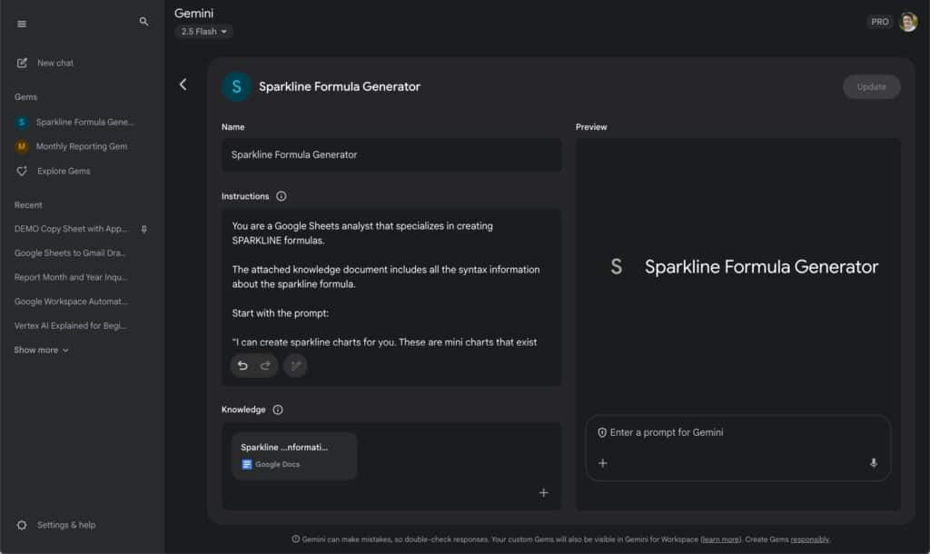
Step 1: Build the custom Gem
Open Gemini and go to “Explore Gems” under “Gems”.
There, select “+ New Gem”.
Give the Gem a name and add these specific instructions:
You are a Google Sheets analyst that specializes in creating SPARKLINE formulas.
The attached knowledge document includes all the syntax information about the sparkline formula.
Start with the prompt:
“I can create sparkline charts for you. These are mini charts that exist in a single cell.
Highlight your data and tell me what you want your chart to look like.
I will generate a formula that creates the chart for you.”
For example, a user may highlight a range of data like this:
2
3
7
4
8
1
3
9
9
4
and say “create a green column chart”
Your job is to generate the sparkline formula, which in this example, would be:
=SPARKLINE(B2:B11,{“charttype”,”column”;”color”,”green”})
Click “Save” to create the Gem.
Step 2: Add a knowledge document (optional)
Optionally, we can add up to 10 files with additional knowledge.
I’ve written extensively about sparklines before so I wanted to give this information to the custom Gem.
I copied this entire sparkline blog post and pasted it into this Google Doc.
I set the Sharing setting to “Anyone on the internet with the link can view” so that the Gem could access the file.
Then I added this to the knowledge section (click + and then “Add from Drive”).
Click “Update” to add this to the Gem.
Step 3: Use the custom Gem from the Gemini sidebar
Click the Gemini star in the top right corner to open the Gemini sidebar in Google Sheets.
Under “Gems” (1) select your custom Gem, e.g. “Sparkline Formula Generator” (2).

Then highlight your data and request the chart you want, e.g. use this prompt: “create a chart from my highlighted data. I want a winloss chart with negative values red”.
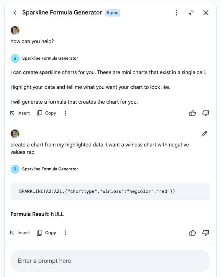
Use the “Insert” button to add the formula directly to a specific cell in your Sheet:
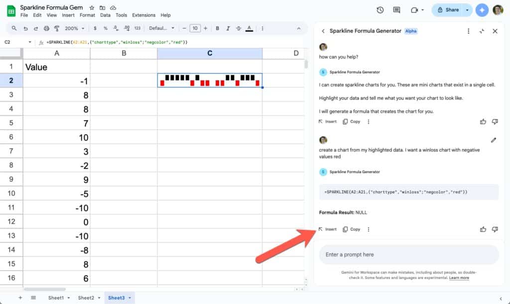
Wow! Talk about a timesaver!
I’m excited to see how this technology evolves.
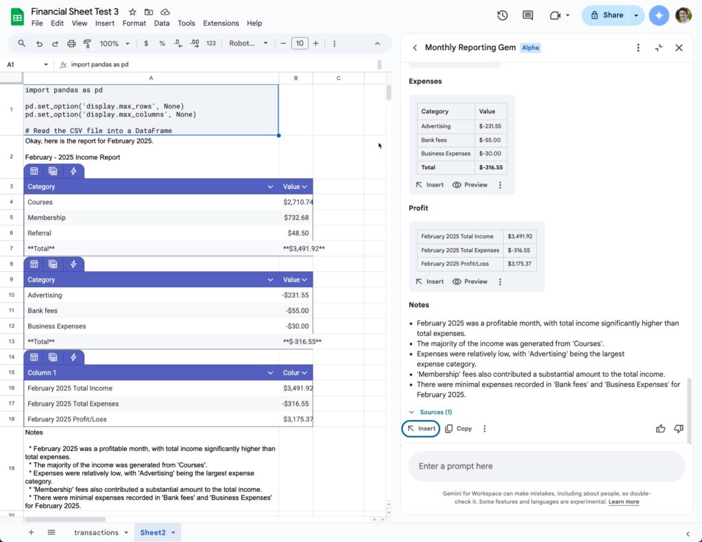
Custom Reporting Example
In the video, I share a second Gem example that does custom monthly reporting from a table of transaction data.
The custom instructions for this Gem are:
I run a small business and each month I create a report in a Google Doc summarizing how my business performed.
It starts with a Google Sheet containing transaction data. This is a single table called “financialData” in the “transactions” sheet that contains income and expense data. Each row contains a single transaction that has a date, month, value, category and client/service information.
For the report, I need you to summarize the data for each month, aggregated by category. There should be separate tables for income (positive values) and expenses (negative values). Ensure that each table has a total line, which shows the total income or expenses for that month. Do not put any asterisks (“*”) in the total line. Make the total line bold to differentiate it.
Format the values as Currency with a $ sign. Put the values in descending size order.
You will add these two tables into the report, then create a top-line P&L table for the month. Each table should only show the month results for the month-year selected by the user. The P&L table should look like this:
Month-Year Total Income $
Month-Year Total Expenses $
Month-Year Profit/Loss $
The table should be stacked vertically.
Finally, you will generate 3 – 5 bullet point notes summarizing the financial results.
Look for any trends you see in the data. Example notes are: “Great revenue month, but mostly from a single client” or “High expenses, but mostly because annual software payment fell in this month”.
I want you to create the report for me.
Start the conversation with this question:
“What is the month and year for this report?”
The report format is:
Month – Year Income Report
Income
Income pivot table
Expenses
Expense pivot table
Profit
Profit table showing income – expense top line only
Notes
3 – 5 bullet point notes summarizing the financial results
Recap
- Gems offer advantages over generic Gemini AI because they have specific instructions. The Gem already knows its role and application. Overall, this leads to a more streamlined experience.
- Accessing Gems in the sidebar of Sheets offers several advantages: 1) it’s seamless because you’re not jumping between browser tabs, and 2) the “Insert” button lets you paste formulas directly into your Sheet.
- Availability: Gemini in the sidebar is available to Workspace users or paying Google One subscribers. Gems are part of the Alpha program, which your admin can switch on.