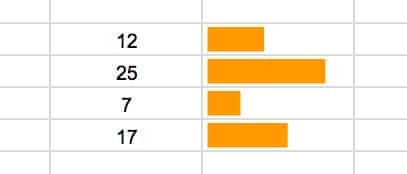
Sparklines are small, lightweight charts, typically without axes, which exist inside a single cell in your spreadsheets. They’re a wonderful, quick way to visualize your data, without needing the complexity of a full-blown chart.
- Introduction
- Sparkline Examples
- Sparkline Syntax
- Line Sparklines
- Column Sparklines
- Bar Sparklines
- Winloss Sparklines
- Option/value pairs in cells
- More advanced examples
- Further reading
Introduction
Sparklines were first created by interface designer Peter Zelchenko around 1998. The term “sparkline” was coined by statistician and data visualization legend Edward Tufte.
Click here to get your own copy >>
Sparkline examples
I’ve been building a lot of dashboards in Google Sheets recently, making heavy use of sparklines to show data trends.
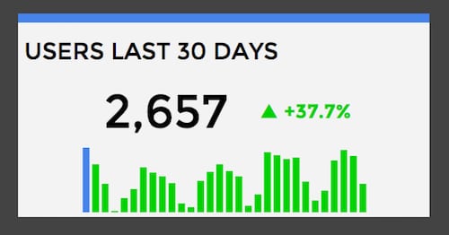
For example, here’s a column sparkline to show website users in the past 30 days:
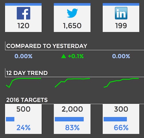
Then, a combination of line sparklines and bar sparklines for social media metrics:
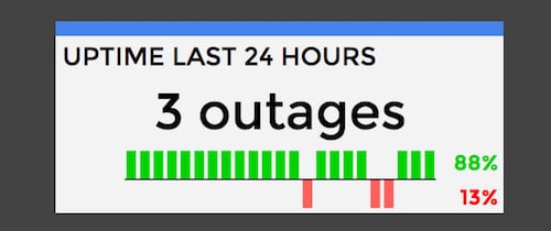
And finally, I’ve used a winloss sparkline chart to show web outages over the past 24 hour period:
So let’s explore how to create these charts and customize them to meet your needs. Links to all of the examples below are available for viewing in Google Sheets.
Sparkline Syntax
The most basic sparkline in Google Sheets looks like this:
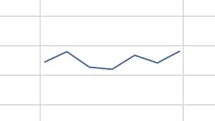
Assuming your data is in range A1 to A8, the formula would be:
=sparkline(A1:A8)More generally, the sparkline formula syntax is:
=sparkline(data,[options])data
This refers to the dataset (the range of values) you want to plot as a sparkline.
[options]
This is an optional argument, used to specify things like chart type (e.g. column), color and other specific settings:
- Conditions are placed inside a set of curly braces
{ ... } - Options are further enclosed in double quotes, e.g.
"charttype" - Option values are usually enclosed in double quotes, e.g.
"column"but numbers or true/false settings do not need the double quotes - Options and values are separated by commas
- Multiple options/value pairs are separated by semi-colons
Example:
{"charttype","column" ; "axis",true ; "axiscolor","red"}We’ll explore all of this below.
There are four types of sparkline charts available in Google Sheets: line charts (the default), column charts, bar charts, and winloss charts.
Let’s take a look at each in turn, through a series of examples.
Line sparklines
Click here to get your own copy >>
This is the default choice for sparklines in Google Sheets, meaning that Google will default to showing a line if you don’t specify anything in your options.
Assume I have the following data in columns A and B of my Google Sheet. The idea here is to create a sparkline that displays the sales data from column B in a single cell, as a simple, lightweight chart without any additional details.
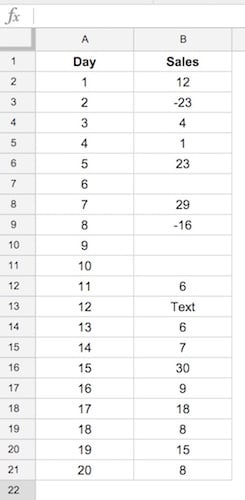
You’ll notice there are some blank values, some negative values and some text values in column B. That’s intentional and we’ll explore how to deal with each of those with the sparkline formula.
Default:
Since line charts are the default sparkline option, we don’t need to explicitly specify the chart type. So we can create a sparkline line chart with this simple formula:
=SPARKLINE(B2:B21)
Color option:
Change the color of your sparkline by adding the color option/value pair, as follows:
=SPARKLINE(B2:B21,{"color","red"})or using hex notation:
=SPARKLINE(B2:B21,{"color","#FFA500"})
Line-width option:
The higher the number you specify, the thicker the line.
=SPARKLINE(B2:B21,{"linewidth",3})
Xmax and Xmin options:
If our data includes a column of x-values, then we can then specify a minimum or maximum for that axis. So from our data above, we now include column A in our spakrline formula argument, then specify a minimum and/or maximum in our sparkline options, for example:
=SPARKLINE(A2:B21,{"xmin",5;"xmax",15})This would only include values from column B, where the values in column A are between 5 and 15.
Note: I would advise a degree of caution with the xmin and xmax criteria. They are somewhat volatile and caused one of my Google Sheets to repeatedly crash.
Ymax and Ymin options:
Similarly we can specify bounds on the y values we plot in our sparkline, by using the ymax or ymin criteria. For example to only include values zero or above we would use:
=SPARKLINE(B2:B21,{"ymin",0})To set a ymax and ymin:
=SPARKLINE(B2:B21,{"ymin",10;"ymax",20})Empty option:
Use the “empty” option to determine whether blank cells in your dataset are rendered as 0 in your sparkline, or just ignored (the datapoint is not included in your sparkline). The formulas are respectively:
=SPARKLINE(B2:B21,{"empty","zero"})=SPARKLINE(B2:B21,{"empty","ignore"})Nan option:
Similar to the empty option above, use the “nan” option to determine how non-numeric cells (text cells) in your dataset are rendered in your sparkline. The options here are to convert to 0 or to ignore, as above, and the formulas are respectively:
=SPARKLINE(B2:B21,{"nan","convert"})=SPARKLINE(B2:B21,{"nan","ignore"})Rtl option:
Want your chart to show from right-to-left? Use the option “rtl”, which can be set to true or false, to specify the direction of your sparkline.
=SPARKLINE(B2:B21,{"rtl",true})
Compare this sparkline to the first line chart and you’ll see the reversed direction:
Column sparklines
Click here to get your own copy >>
As the name suggests, column sparklines are small column charts that exist inside a single cell. For these examples, I’m using data set up as per the line chart example.
Default option:
=SPARKLINE(B2:B21,{"charttype","column"})
Color option:
=SPARKLINE(B2:B21,{"charttype","column";"color","#FF0000"})
Lowcolor option:
=SPARKLINE(B2:B21,{"charttype","column";"lowcolor","red"})
Highcolor option:
=SPARKLINE(B2:B21,{"charttype","column";"highcolor","red"})
Firstcolor and lastcolor options:
=SPARKLINE(B2:B21,{"charttype","column";"firstcolor","red"})
Similarly, you can see the lastcolor option.
Negcolor option:
=SPARKLINE(B2:B21,{"charttype","column";"negcolor","red"})
Axis and Axiscolor options:
=SPARKLINE(B2:B21,{"charttype","column";"axis",true;"axiscolor","red"})
Ymax and Ymin options:
Works the same as the line chart examples above. For example, setting a max value of 0 creates a sparkline with only the negative columns showing:
=SPARKLINE(B2:B21,{"charttype","column";"ymax",0})
Empty option:
Works the same as the line chart examples above.
Nan option:
Works the same as the line chart examples above.
Rtl option:
Works the same as the line chart examples above.
Trick to add a reference line at a set point
A reader emailed in to ask whether you could add a reference line at a set point on a column sparkline. Unfortunately you can’t; the only thing you can do is add a y-axis at 0.
However, we can use a trick and split the data in two, and create two sparklines with a border between them to achieve this effect:
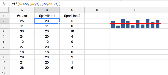
In this case, the values lie between 10 and 30, with a reference line at 20. An IF formula is used to create the split data (columns B and C):
=IF(A2<20,{A2,0},{20,A2-20})This formula is copied into cell B2 and copied down to B21 only. It outputs an array which will populate column C. The top sparkline formulas is:
=SPARKLINE(C2:C11,{"charttype","column"})and the lower sparkline formula is:
=SPARKLINE(B2:B11,{"charttype","column";"ymin",0})Bar sparklines
Click here to get your own copy >>
You guessed it, these are small bar charts that exist inside a single cell. The usage is a little different than the line and column charts we've looked at so far though because these are stacked bar charts. So you can point to a single cell of data and create charts based on that, for example.
Using multiple bar sparklines to create charts:
This method works by setting a max value that applies to all your bar sparklines, using the "max" option. So step 1 is to determine a suitable maximum that works for your whole data range (consider using the MAX() formula to determine). In this example, 30 worked as my max option.
The formulas to create these sparklines are:
=SPARKLINE(A3,{"charttype","bar";"max",30})=SPARKLINE(A4,{"charttype","bar";"max",30})=SPARKLINE(A5,{"charttype","bar";"max",30})etc...

Two series:
=SPARKLINE(A16:B16,{"charttype","bar";"max",40})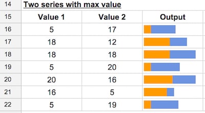
Two series with as stacked percentage chart:
=SPARKLINE(A27:B27,{"charttype","bar";"max",1})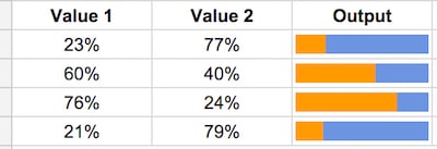
Two series with as stacked bar chart:
Using the sum of the two values as the "max" option ensures that the bars will always be 100% of your cell width.
=SPARKLINE(A33:B33,{"charttype","bar";"max",sum(A33,B33)})
Changing colors:
You can specify up to nine colors in sparkline bar charts, using the name convention "color1", "color2", etc.. The colors alternate for each new value.
=SPARKLINE(B40:C40,{"charttype","bar";"max",SUM(B40,C40);"color1","red";"color2","black"})
Other options:

The formulas to create these bar sparklines, in the order they appear above, are:
=sparkline(B45:D45,{"charttype","bar";"max",30;"color1","#009900";"color2","#66ff66"})=sparkline(B46:D46,{"charttype","bar";"max",30;"color1","#009900";"color2","#66ff66"; "empty","zero"})=sparkline(B47:D47,{"charttype","bar";"max",30;"color1","#009900";"color2","#66ff66"; "empty","ignore"})=sparkline(B48:D48,{"charttype","bar";"max",30;"color1","#009900";"color2","#66ff66"; "nan","convert"})=sparkline(B49:D49,{"charttype","bar";"max",30;"color1","#009900";"color2","#66ff66"; "nan","ignore"})=sparkline(B50:D50,{"charttype","bar";"max",30;"color1","#009900";"color2","#66ff66"; "rtl",true})Winloss charts
Click here to get your own copy >>
These are a special type of column chart that plots only 2 possible outcomes: positive and negative (e.g. like a coin toss, heads or tails).
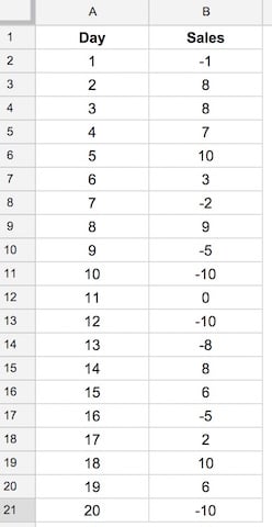
Here's the dataset for the following examples. The winloss sparkline is only concerned with whether a datapoint is positive or negative, it doesn't take relative sizes into account. So, in effect, it's really like a column chart of -1's and 1's.
Default winloss sparkline:
=SPARKLINE(B2:B21,{"charttype","winloss"})
Color option:
=SPARKLINE(B2:B21,{"charttype","winloss";"color","red"})
Lowcolor/Highcolor option:
Even though the winloss chart displays all the "columns" the same height, it is able to highlight the highest and lowest values in your original dataset. For example, the following formula colors the lowest values red (in the case of this dataset, that's the three -10 values):
=SPARKLINE(B2:B21,{"charttype","winloss";"lowcolor","red"})
Firstcolor option:
Highlights the first value of the dataset:
=SPARKLINE(B2:B21,{"charttype","winloss";"firstcolor","red"})
Lastcolor option:
=SPARKLINE(B2:B21,{"charttype","winloss";"lastcolor","red"})
Negcolor option:
Highlights all the negative values:
=SPARKLINE(B2:B21,{"charttype","winloss";"negcolor","red"})
Axis and Axiscolor options:
=SPARKLINE(B2:B21,{"charttype","winloss";"axis",true; "axiscolor","red"})
Empty option:
Works the same as the line chart examples above.
Nan option:
Works the same as the line chart examples above.
Rtl option:
Works the same as the line chart examples above.
Option/value pairs in cells
Click here to get your own copy >>
So far, we've encoded the options as an array of text strings inside of the sparkline formula, between the curly braces, e.g.:
{"charttype","column";"axis",true;"axiscolor","red"}However, we can instead list our option/value pairs in a range of cells in our spreadsheet and then reference them in the sparkline formula.
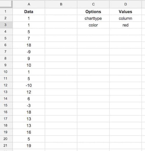
Consider a dataset and option/value pairs setup as follows:
Then enter this formula into cell F2:
=sparkline(A2:A21,{C2,D2;C3,D3})to create your sparkline. We still need to enclose the options in the curly braces, { ... }, and separate the options and values with commas and semi-colons, but notice how we've used cell references instead of text strings this time.
The output of this formula is the following sparkline, in cell F2:

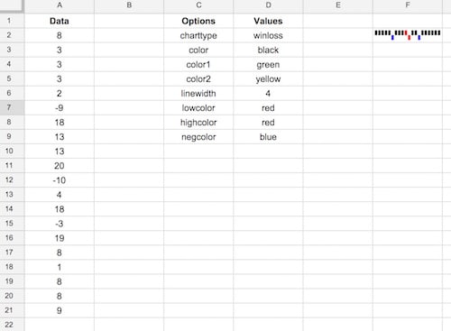
We can take this even further by putting all our options into two columns and then referencing those ranges:
The formula in this case is then:
=sparkline(A2:A21,{C2:C9,D2:D9})where my range of option/value pairs extends down to row 9 (adjust as needed to accommodate a different number of options).
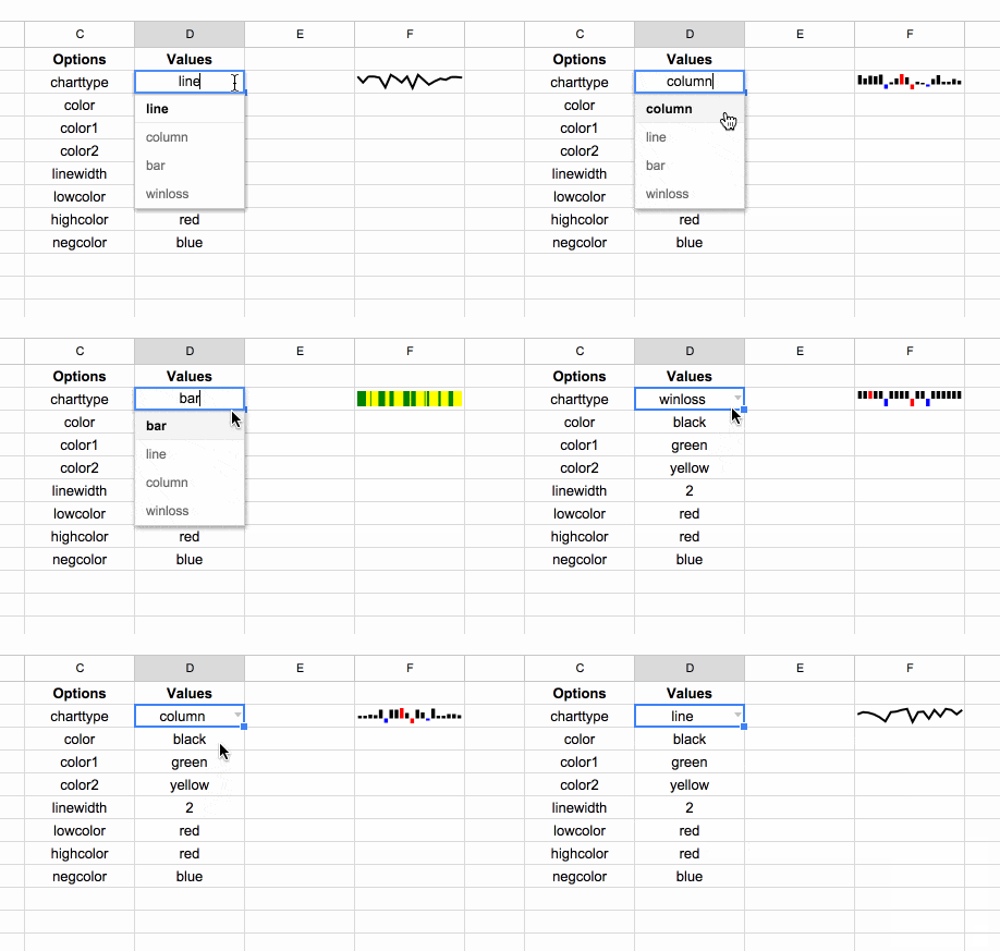
Lastly, we could get fancy by adding a data validation drop down menu to pick from the option/value pairs, e.g. for charttype, as shown in the following GIF:
Advanced Sparkline Examples
Click here to get your own copy >>
You can nest other formulas inside of sparklines, for example, you can quickly and easily plot stock prices using the sparkline formula.
Let's create sparklines for the big tech stocks for the past 60 days, like so:

We create these charts by first using the GOOGLEFINANCE() function to get the stock prices for the past 60 days up to today (using the TODAY() formula):
=GOOGLEFINANCE($B3,"price",TODAY()-60,TODAY(),"DAILY")Then we nest this inside the sparkline formula to chart this data:
=SPARKLINE(GOOGLEFINANCE($B3,"price",TODAY()-60,TODAY(),"DAILY"),{"charttype","line";"linewidth",2;"color","#5f88cc"})Cool huh!
We can also turn this same data into column charts, but we need to finesse the GOOGLEFINANCE data since we only want the second column of data. We do this with the QUERY() function:
=QUERY(GOOGLEFINANCE($B13,"price",TODAY()-60,TODAY(),"DAILY"),"select Col2",-1)Then we nest this inside the sparkline formula:
=SPARKLINE(QUERY(GOOGLEFINANCE($B13,"price",TODAY()-60,TODAY(),"DAILY"),"select Col2",-1),{"charttype","column";"highcolor","red"})I've also highlighted the highest stock price in our period, using red shading. The output is as follows:

Crazy Sparkline Examples
Your imagination is the only limit with the sparkline function.
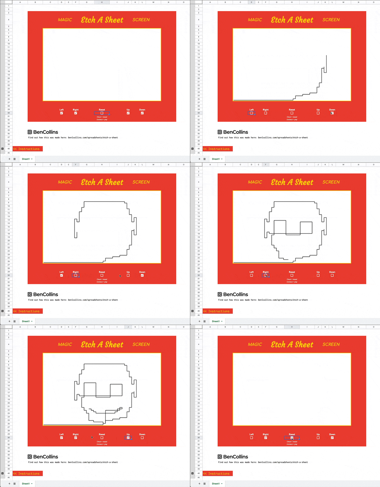
How about an Etch-A-Sketch clone built using a sparkline formula?
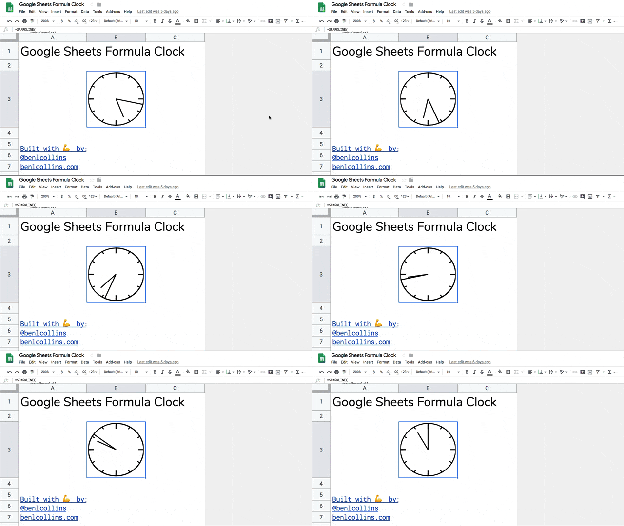
Or what about a working analog clock built with a single sparkline formula:
See also this post on recreating Visualize Value's design work in a Google Sheet using SPARKLINEs (opens in Twitter).
Further reading
Official Google Documentation.
Sparklines on Wikipedia.
Edward Tufte's detailed take on sparklines.
Hi Ben,
I wonder if sparklines can be used to show the distribution of data. I find myself in many situations in which I’m looking at really basic statistics, but I may be missing out on the real data by looking at the distribution of data.
If I could easily see where there’s some significant normal or chi distribution, I would save time doing graphs one by one and straigh away see where there are interesting things to dig into!
Any ideas?
Hi Albert,
You can definitely use sparklines to create mini histograms to look at whether data is normally distributed or not. For example, I would use a column chart to show this:
=sparkline(A3:A23,{"charttype","column"})as shown in this image:Here’s some more info on normal distributions and charts in Google Sheets: https://www.benlcollins.com/spreadsheets/histograms-normal-distribution/
I am trying to generate a sparkline using not continous cells (e.g., B2, G2, M2). Is there any way that I can do that? Thank you so much!
Yes — you can create sparklines, and other charts, using the array-style entry in Google Sheets. For example, =sparkline({B2,G2,M2},{“charttype”,”column”}) would create a sparkline column chart of the values in B2, G2, and M2.
The array designation is useful in a lot of contexts in Google Sheets formulas. Here’s the quickie version:
Curly braces surround arrays. Commas separate columns, semi-colons separate rows.
={A1,B3,C2,A2}
returns a single row of 4 values that can be entered in a formula. If entered by itself in a cell, it will fill four cells across with these values.
={1,3,6,10,15}
returns a single column of 5 numbers.
={{C3,A1};{B2,C4}}
returns a 2×2 matrix of values, with C3 in the top left, A1 in the top right, B2 in the bottom left, and C4 in the bottom right.
={{1,2,3},{4,5}}
returns a row of 5 values
={1,2},{3,4}
returns an error because the comma isn’t inside an array definition
={{1,2,3};{4,5}}
returns an error because the array matrix isn’t complete — one row has 3 values but the other only has two.
Hi Ben
Really useful.
Can a series show “highcolor” and “lowcolor” at the same time? I’m looking to use both with this formula.
Regards – Nigel.
sparkline(query(GOOGLEFINANCE($A$5,”price”,DATE(2016,1,1),TODAY(),”DAILY”),”select Col2″,-1),{“charttype”,”column”;”highcolor”,”red”})
Hi Nigel, you can add the lowcolor option after the highcolor, like so:
=sparkline(query(GOOGLEFINANCE($A$5,”price”,DATE(2016,1,1),TODAY(),”DAILY”),”select Col2″,-1),{“charttype”,”column”;”highcolor”,”red”;"lowcolor","orange"})However, you probably won’t be able to see the lowcolor on your sparkline, because it’s so close to the axis as to be invisible. If you try with a smaller date range, you should be able to see the effect, e.g. last week prices for Google ticker:
=sparkline(query(GOOGLEFINANCE("GOOG","price",today()-7,today(),"DAILY"),"select Col2 offset 1"),{"charttype","column";"highcolor","red";"lowcolor","orange"})Hope that helps!
Ben
I am using the sparkling And google finance function Together but it’s taking too much time to load. Any solution for that ?
Ben price yerine close kullanıyorum.
=sparkline(query(GOOGLEFINANCE(“GOOG”,”close”,today()-7,today(),”DAILY”),”select Col2 offset 1″),{“charttype”,”column”;”highcolor”,”red”;”lowcolor”,”orange”})
=SPARKLINE(I3:K3,{“linewidth”,3})
I can´t understand why it is not working in my spreadsheet.
When I create the sparkline above it shows me an #ERRO!
But if I use only =SPARKLINE(I3:K3) it´s work.
Hi Renato, Not sure why that’s not working for you. I’ve just tried:
=sparkline(I3:K3,{"linewidth",3})and it works for me in my Google Sheet. Feel free to share the sheet if you want.
Ben
Try using ; rather than ,
Great suggestion Stefan, thanks! The use of comma’s or semi colons as separators in your formulas depends on your locale. Hopefully this fixes the issue for you.
Hi Ben,
I experience the same problem as Renato.
I’ll get a message saying: “Function SPARKLINE parameter 2 has incorrect column size. Expected: 2. Actual: 1.”
I’ve tried to both change the column size and to merge two cells, but it doesn’t work. Hope you have a suggestion.
/Ken
Hey Ken,
Can you share your formula? Where are you based? In some of the European countries you’ll need to use “;” instead of “,” in the formulas.
So try this:
=sparkline(range ; { conditions })I’ve even seen an example where the back slash was used to separate conditions inside the sparkline, like this:
=sparkline(range ; { "charttype"\"column" ; "color"\"red" })Hope that helps!
Ben
Crazy. the only thing that worked was: =SPARKLINE(GOOGLEFINANCE(C2 ; “price” ; TODAY()-365 ; TODAY() ; “weekly”) ; {“charttype”\”line”;”linewidth”\2;”color”\”#5f88cc”})
Thank you Ben! It’s solved. I used the back slash as you recommended, now it works!
/Ken
I was having the same issue.
Try
=SPARKLINE(I3:K3,{“linewidth”\3})
or
=SPARKLINE(I3:K3;{“linewidth”\3})
Some details in https://stackoverflow.com/questions/28654796/formula-parse-error-in-google-spreadsheet-sparkline
Hi Ben,
Is it possible to highlight/color out of range values? Like for a specified max or min value (sort of like highcolor and lowcolor will do, but for as many high or low values outside of a certain range as are in the data)?
I’m thinking of charting lab results, where a “normal” range is expected and I’d like to highlight higher or lower than normal values. Could be in a line or column sparkline.
Ideas?
Thanks,
Saro
Hi Saro,
Unfortunately you can’t get to this level of detail with the line or column sparklines.
The closest I could get was with bar sparklines to highlight values above a threshold: https://docs.google.com/spreadsheets/d/1zKlMFfI6-K9RywMze-emK0VquerUnsHoQ9JpSA-V9IE/edit?usp=sharing
Sparklines are really designed for “at-a-glance” type reading so they’re not best suited to really detailed charts. You might be better plotting with a regular stacked column chart.
Thanks,
Ben
Hi Ben,
Thanks for responding. I actually found a very clunky workaround that involves plotting the normal range values (max and min) as extreme datapoints, and then using xmin and xmax to hide them from the sparkline view. That way, I get two horizontal lines at the normal maximum and normal minimum, which will work for what I’m doing. Example is here: https://docs.google.com/spreadsheets/d/1IsYuFgQJxeUFQK-ynuQBeHbpifhb8qlCqyLwglKF0RI/edit?usp=sharing
But I really like the stacked columns/bars idea, and might play with that too if I decide the colors would be easier to see that way. I just want an at a glance indicator if something was out of the expected range.
Saro
Great work Saro and thanks for sharing your worksheet! I hadn’t thought of using an array as the data for the sparkline, really interesting. I’ll have to update this post to deal with input arrays at some stage…
No problem! I only went the array route because the x-axis for me included unequal interval dates.
Saro
Is it possible to create a sparkline in googlesheets with multiple ranges? I’m trying to create a cell-based column chart that does not use consecutive data (though all in the same row). If so, is there also a way to filter out certain columns based on the column headers?
Thanks!
Hey Amy,
Yes, you can do that. After some experimentation I found using the filter function with an Array Formula will do the trick. The trick is to create an array of TRUE/FALSE corresponding to the columns you want to include/exclude. You can do this with a helper row (which has the advantage of being able to change the column selection easily) or by coding TRUE/FALSE directly in the formula.
For example, if I had data in columns B to J and I want to include only columns B,C,F,G,H,J then I can use either of these formulas:
=sparkline(ArrayFormula(FILTER(B13:J13,{TRUE,TRUE,FALSE,FALSE,TRUE,TRUE,TRUE,FALSE,TRUE})))=sparkline(ArrayFormula(FILTER(B5:J5,$B$3:$J$3)))Here’s an image of the sheet and formula:
Here’s a spreadsheet showing these formulas. Feel free to make a copy.
Hope that helps.
Cheers,
Ben
Ben, thanks so much for your quick and thorough reply! (And for being a genius!)
The column headers in my spreadsheet are selected from drop-down lists, so I’m using your first suggestion (the helper row) and it’s working perfectly. All I needed was an =IF formula based on the column headers to generate the helper row.
Greatly appreciated!
Amy
Great!
Hi Ben,
I just started customizing Eric Bates’ highly recommended project management template (http://eric-bates.com/project-planning-template/) and wanted to find out more about sparklines. I was happy to find your very clear guide on how to use and adapt them — btw, your page is the second search result for “sparklines Google sheets” — First is Google support 🙂
Happy too to see a compatriot making it in DC. ╭( ・ㅂ・)و ̑̑
Thanks David! That project template looks great as well, I hadn’t seen that before so thanks for sharing.
Thank you so much #1
Hi
Do you know how to create a sparkline in Google sheets that automatically updates based on last value in a column? For example if I have a column of data from A10 to AXX, where XX constantly changes, how do I create sparkline for this?
Sure thing! There’s a couple of ways to do this, one easy and one that involves some more advanced formulas but is rather crafty 😉 (there are probably/possibly other ways too).
1. Simply use the range
A10:Ain your sparkline formula, so it looks like this:2. Use a formula to find the last cell in the column that is non-blank, create a string from that, create a named range for the cell with the string, use the indirect formula to refer to this string range inside your sparkline formula! Oooof, definitely harder!
Here’s the sheet with both examples.
Feel free to make your own copy and then you can try it out.
Cheers,
Ben
Thanks! Great explanation.
Thanks! Worked great and excellent explanation.
this is really cool, thx
Hi Ben!
Tx a lot for this article, it’s really helping me, i just wanna ask you one quesiton, because i was unable to do it in G spreadsheets.
I have an excel spreadsheet that i want to convert to GSpreadsheet, in the excel i have the following bar chart: (check the screenshot, pls)
https://www.dropbox.com/s/4339rm2v7a6wm4v/Screenshot%202016-09-23%2021.31.38.png?dl=0
The thing is that i can’t figure it out how to display the negatives value, as in excel. There is any way to do it, or i need to go with a column chart type?
tx, Bruno!
Hey Bruno,
Yes, you can get pretty close (minus the data labels) by using the Right-to-Left feature of bar sparklines. I use an IF formula to see if I have a positive or negative value, then choose the sparkline accordingly. Here’s the formula:
=if(A1>0,sparkline({100,A1},{"charttype","bar";"color1","white";"color2","green";"max",300}),sparkline({200,abs(A1)},{"charttype","bar";"color1","white";"color2","red";"max",300;"rtl",true}))which will create sparklines like this:
Here’s a google sheet example: https://docs.google.com/spreadsheets/d/1lZJBFvjy6zmKQ7FTGioeft28VpPjekzAYg-fJXXq0II/edit?usp=sharing
Hope that helps.
Cheers,
Ben
Awesome. Simplified the formula a little:
=sparkline({100,abs(A1)},{"charttype","bar";"color1","white";"color2",if(A1>0,"green","red");"max",200; "rtl",A1<0})Suppose you want a dynamic maximum and not artificially set the (virtual) zero line, this is a way to do it:
=IF(
$A1>=0,
{“”, SPARKLINE($A1, {“Charttype”, “bar”;”color1″, “black”;”max”, MAX(ARRAYFORMULA(ABS($A$1:$A$7)))})},
{SPARKLINE($A1, {“Charttype”, “bar”;”color1″, “red”;”max”, MAX(ARRAYFORMULA(ABS($A$1:$A$7)));”rtl”, TRUE}), “”}
)
For positive values, it will output an array consisting of nothing and a sparkline; for negative values, it will be a sparkline and an empty cell.
Copy this down B1 through B7 and you will get sparklines in columns B and C, with red negative values in B and black positive ones in C.
Provided the columns are of equal width, the positive and negative values will both be to the same scale, dynamically depending on the absolute maximum of the range in column A.
NB: I’m European, so I hope I converted the notation properly.
Awesome article! Thanks so much!
Do you know if it’s possible to put labels on the bars in a sparkline? I looked everywhere, and it doesn’t seem like a feature that exists, but I’m keeping my fingers crossed that you know how! Thanks.
Hey Dave – You can’t add labels to bars on sparklines, as they’re really just for showing trends quickly.
What you can do is add context in the surrounding cells, e.g. putting data labels into adjacent cells like so:
If you need to add a lot of data labels then a regular chart is the way to go.
Thanks a lot! Very usefull information – I deeply recommand! Only info, I couldn’ found was, how to make sparkline bar with gradient colors, but when I looked into Google Sheet documentation, it seems it is not an option, unfortunatelly.
Unfortunately not!
Is it possible to show a sparkline from a Vlook up?
The date is on one sheet and would like to show the spark line on another sheet in the same workbook?
Yes, you can have data and sparklines on different sheets. As long as you give the sparkline formula a valid data range or data array, then you’re good to go!
Hi Ben,
Is it possible to change periods (e.g 6 months trend) in sparkline mini chart by drop down menu. I would like to see the actual period but changing the periods the sparklines are automatically changed.
Hi Krisztina,
You could create a drop-down menu for user input periods and then just modify the data range based of the user choice. The sparkline, based off this range, would then automatically update. Is that what you meant?
Cheers,
Ben
Hi Ben,
Let me specify my question. I have at least 2 countries and the figures with sparklines in one sheet, I have database on the other sheet, but the first sheet would like to change the periods and the figures and spirklines should be adjusted to the selected period showing the actual (selected period) figures and 6 months trends in sparklines for e.g 2 countries on the first sheet. with drop down menu and unique ID I have solved the figures to be updated based on the selected periods, but I am not able to link this to the sparkline. Hope it helps you.
Hi Krisztina,
Assuming your sparkline is something like this:
=SPARKLINE(range,{"charttype","column"})then provided your range is the same range as the dynamic row of figures that updates on your dropdown, it should also update the sparkline.
Feel free to share your sheet if you want me to take a quick look.
Cheers,
Ben
Hi Ben,
How can I upload a screenshot here?
Cheers,
Krisztina
Unfortunately you can’t upload screenshots, but feel free to share a copy of your Google Sheet.
Cheers,
Ben
please find the link to my file will be available for one day.
please find the link to my file will be available for one day.
https://docs.google.com/spreadsheets/d/1gNSHZJQV8d1we5s52ZG-g9pXvMrZs817Q7NVez0F3Lo/edit
Hey Krisztina,
I think this is the formula you’re after (this one goes in row 8 of your ‘MPD one page’ tab):
=ArrayFormula(sparkline(vlookup(B8;Sparklines!B:I;{2\3\4\5\6\7\8};false);{"charttype"\"column";"color"\"#00b050";"empty"\"ignore";"nan"\"convert";"negcolor"\"#ff0000"}))This will dynamically extract the data range from the Sparklines tab. Hope that helps!
Thanks,
Ben
Hi Ben,
thank you so much for your help.
It seems to be working well.
Cheers,
Krisztina
Ben,
Is there a way to use a line chart, but it has an axis at 0? So you can quickly see above and below 0? This will help with a point of reference, as to whether the ups and downs are above or below 0.
Make sense?
Thanks!
Great question Jeffrey!
Unfortunately there’s no way to do this with the line sparkline (although you can do it with the column sparkline). However, you could create two sparklines, one for the positive values and one for the negative values, and have them in two cells, like this:
The formulas to do this make use of the ymin and ymax attributes of the line sparkline:
=sparkline($E$22:$E$28,{"charttype","line";"ymin",0;"color","green";"linewidth",2})and for the negative numbers:
=sparkline($E$22:$E$28,{"charttype","line";"ymax",0;"color","red";"linewidth",2})Cheers,
Ben
Dear,
i have data in A2,C2,E2,G2
the below function didnt work with me
=sparkline(ArrayFormula(FILTER(B13:J13,{TRUE,TRUE,FALSE,FALSE,TRUE,TRUE,TRUE,FALSE,TRUE})))
=sparkline(ArrayFormula(FILTER(B5:J5,$B$3:$J$3)))
can you help
Hey Ramlawi,
Have a look at this comment and the Sheet that it links to so you can see how those formulas work. Hope that helps!
Cheers,
Ben
Ben,
Thanks for the helpful guide–I find myself referring back to it often. And your responsiveness in the comments! Two-part comment/question for you:
1. Seemed to me win/loss data could also (better?) be represented with bars take up all of the vertical space, and differ only in color: same info with more salience / less wasted space. If it’s helpful to you/others, this is possible by coding wins as a positive high value, and losses as a positive low value–here, 2 & 1 respectively:
=SPARKLINE({2,2,1,2,2},{"charttype","column";"lowcolor","red";"ymax",1})2. In the process of figuring that out, I came across what seems to be a bug: ymax/highcolor and ymin/lowcolor don’t seem to play well together. A simple way to see this is with this sparkline, which highlights the 2-bar rather than the 3-bar.
=SPARKLINE({1,2,3},{"charttype","column";"highcolor","red";"ymax",2})Is that something you’ve experienced as well? Know any workarounds, or have a direct line to Google?
Thanks again!
Pepe
Hey Pepe,
Thanks for your comments. To illustrate the different options on point 1 for anyone else, this is what they look like:
where the formulas are, respectively:
=SPARKLINE({2,2,1,2,2},{"charttype","column";"lowcolor","red";"ymax",1})=SPARKLINE({2,2,-1,2,2},{"charttype","winloss";"lowcolor","red"})=SPARKLINE({2,2,-1,2,2},{"charttype","winloss";"lowcolor","red";"axis",true;"axiscolor","black"})I like it, it stands out more although you lose the impact of losses being negative. I think the winloss with the axis is a good representation, especially if you can widen the row.
For point 2, I wish I had a direct line into Google!
Nice–great to see all the options visualized so clearly and concisely.
I’m kicking myself for commenting slightly too soon, though–I’ve realized since my post that because of the problem in (2), the method in (1) is unreliable–it breaks down if if there are any zeros/blanks:
–This works:
=SPARKLINE({2, 2, 1, 2, 2},{"charttype","column"; "lowcolor","red"; "ymax",1})–This doesn’t!
=SPARKLINE({2, 0, 1, 2, 2},{"charttype","column"; "lowcolor","red"; "ymax",1})The auto-scaling also messing things up if there are all wins or all losses.
A seemingly-reliable workaround uses different values: “win” = some value (1.00), “loss” = a visually indistinguishable amount more (1.01). The exact “loss” amount gets a highcolor. Adding in ymin solves the autoscaling issue. So for the same win-blank-loss-win-win sequence, it’s:
–This (always?!) works:
=SPARKLINE({1, 0, 1.01, 1, 1},{"charttype","column"; "highcolor","red"; "ymin",0; "ymax",1.01})Way more complicated than it should be, and of equivocal value, but perhaps that will help someone somewhere!
Pepe
Thanks for the clarification Pepe!
Is there a formula for a bar graph to show the differences between dates? I’m trying to develop a chart showing dates of different projects but I can’t figure out the sparkline formula to show date calculations.
Hey Christian,
You can subtract dates to get the days between them, and then use this value in your bar sparkline. Subtracting dates is the same as subtracting ordinary numbers (because dates are in fact stored as numbers in the background).
If you want to actually use dates in your chart in some way, then you’ll want to use a regular chart since sparklines are very lightweight and deliberately limited.
Cheers,
Ben
Hi Ben,
Very useful article.
One thing: I would like to integrate my COLUMN-sparklines into a Google-presentation-file (where I can update the chart with one click – like in other cases) – but I can not find a way to do this. It seems, that it works only by integrating the “classic” line-sparkline-chart/diagram. Do you have any ideas how I could get this done?
Thanks.
Dan
Hey Dan,
This is only possible with the regular Sheets charts, not the sparklines unfortunately. You can create a regular chart without axes to look like a sparkline and then embed that maybe?
Cheers,
Ben
Is there a way to create a column header array formula for sparklines? I have data being submitted from google forms and would like to use a single formula to create sparklines automatically down a column instead of having to have a formula in each cell
Hey Cory,
Great question! Unfortunately I’ve not found a way to get the sparkline formula to work this way. I got as far as this, but it simply prints out the formula as text sadly:
=ArrayFormula(IF(ISBLANK($C:C),"","=sparkline(A"&row(C:C)&":C"&row(C:C)&")"))This assumes I have data in columns A, B and C coming from my form.
I’ve written this article about Forms and Array formulas, if you want to try to take this further. If you get something to work, I’d love to hear how you did it!
Cheers,
Ben
Hi there,
When I use column sparklines and want to ensure my entire worksheet has a comparison of value across all the data (so for e.g. an $18k in the row above should show taller in the column chart than a $9k in the row below it), how do I adjust the axis setting within a Google Sheets doc? Please see video example of what I’m trying to achieve in normal excel (not within Google Sheets) – https://www.screencast.com/t/HShztzJCNY
Hi Shanthini,
Use the ymax attribute to standardize your axes, like this:
{..... ;"ymax", 18000; ....}Hope that helps!
Cheers,
Ben
Is there a way to reverse the y-axis (vertical) so that a higher number is bad?
For example, for Google search rankings, a #1 position is the best, while a #20 position would not be good. But a sparkline shows 20 as higher = better.
Workaround would be a bar chart, showing negatives a green, but would be great to see a solution as a Sparkline!
Hey Joe,
You could try just multiplying your range by -1 with an array formula? Something like this:
=ArrayFormula(sparkline(A1:A10*-1,{"charttype","column"}))Feel free to share your Sheet if you still have a specific question.
Cheers,
Ben
Hi, Ben,
Please refer the google spreadsheet data. Link shared below.
I want the sparkline bar chart with an in cell of below condition
1. comparison between LTP, vs S1, S2 and R1, R2; where LTP is a middle point and .S2, S1 as lower band and R1, R2 as the higher band. and the chart colour moves according to LTP price. All the condition in one cell. (Example- if LTP Price increase to words R1, R2 then Green should grow and vice versa.)
2. comparison between PIVOT and LTP where LTP price is on another sheet and PIVOT also.(Example- sheet1 having LTP Price and sheet2 have pivot price)
Google Spreadsheet LInk
=========================
https://docs.google.com/spreadsheets/d/1uGjZeoyxWcW_qzsBOMw1iQ_EvJUn7Z0tg1sytmrFzfA/edit?usp=sharing
ScreenShot
==================
https://lh3.googleusercontent.com/-K563yPxNnrQ/WceFZCm4yGI/AAAAAAAAH3g/ynsn4K6WqCUewydnnJgKGCIksm8AB9BlACLcBGAs/s1600/vs.JPG
Thank you,
Hi!
Can I have values from separate bulks of columns? Whenever I do the following code I get an error:
=SPARKLINE(C4:F4;H4:N4)or
=SPARKLINE(C4:F4,H4:N4)I want to skip the info in column G, but have the info in C through F and H through N in the same sparkline.
Right now I’m quickfixing it with the code for counting a cell as zero, as shown by you:
=SPARKLINE(C4:N4;{"empty"\"zero"})And before you comment on it, commas don’t work for me, they must be semi-commas and \ for some reason. Could be an American/European version difference? Not sure.
Thanks in advance!
Hey Andreas,
Yes, as you correctly guessed, the comma issue is a European location setting. So commas become backslashes or semi-colons. Bit of pain to translate the formulas on this page I know. Maybe one day I’ll try posting both variations, but that would require a lot of time.
If want to specifically skip column G, then you can create a new dataset for the sparkline formula using the { } notation, like this:
=sparkline({C4:F4\H4:N4})Alternatively, and probably a better way, would be to set the empty option to ignore in your sparkline, like this:
=sparkline(C6:N6;{"empty"\"ignore"})Hope that helps!
Cheers,
Ben
Hi again.
Thank you for such a quick reply!
=SPARKLINE({C3:F3\H3:N3};{“empty”\”ignore”}) worked perfectly. I am very grateful.
The reason I used “zero” instead of “ignore” before is something I’d like to ask a further question about though.
Reason #1: I have changed to “ignore” like you suggested, but one thing I miss out on compared to using “zero” is that if there are empty cells that I *don’t* want to skip they pass me by without alterting me. I use this for grades, so if student 001 is absent on a test the dip to 0 shows me they need to catch up. But if I manually set it to 0 then maybe I think further on that the student got 0 points, rather than seeing that the student missed doing the test entirely.
Reason #2: If I use “ignore” the min and max values in the sparkline are always the lowest and highest value I base the graph on. However, since I’d like to see the values (I use % for everything) in relation to 0 or 100, “ignore” doesn’t tick all my boxes. If a student gets mostly 100 and the worst result is 95% throughout the entire semester it would look weird if that is a dip equal to a dip from 80% to 40% and back to 80.
I’ve tried this solution:
=SPARKLINE({C3:F3\H3:N3};{“empty”\”ignore”};{“max”\100})
but then I get an error saying “#missing! expected 1 or 2 arguments, got 3” or something in that fashion.
Let me try to summarize what I am aiming for:
– I have the values 40%, 80%, 60% and 100% in the cells C3, D3, E3, and F3 respectively,
– an entirely empty G column (by choice),
– 40% in H3,
– an empty cell in I3 (not by choice: student absent = no result),
– and lastly 100% in J3.
Using
=SPARKLINE({C3:F3\H3:N3};{“empty”\”ignore”})
gives me the graph where it skips the intentional empty G-column, but shows 20% as the minimal value of the entire graph. If I manually insert 0% and 100% then the graph shows the entire width of the 0-100 spectrum, but I tried to explain why that is no good in reason #1 above.
Is there any chance you can help me out with this?
Oh, I figured it out by taking a look at some of the previous comments.
Here is my solution (for Europeans):
=SPARKLINE(D4:L4;{“empty”\”ignore”;”ymax”\1;”ymin”\0})
Now that I enter a % value it related to a 0-100 scale, so a student going down from 100% to 93% doesn’t plummet to the bottom; instead it looks like a very small decline, like it should. Fantastic!
Hi, Im doing a chart were the third out of six data points was a relevant date and I would like to mark it as a different color. Being that it is not either first, last, highest, lowest or negative, is there a way that I can color this point at will??
Unfortunately this is not possible with sparklines.
Hi,
I’m working in a gantt template and have next question:
Why use 0,1 instead of a cell range?
=SPARKLINE({0,1}, {"charttype","bar";"max",1;"color1","white";"color2",I$7})Hi! I don’t follow what you’re trying to do with the formula the way it’s written. But in general {0,1} is just an array containing 0 and 1, and you can use fixed arrays instead of a range of cells when you want static numbers, for example you only ever want the value 0 or 1 to show.
Is there anyway to display a sparkline via a Pivot Table?
I already have the sparkline in a column of the dataset that the Pivot Table is pulling it’s data from. But when I add that column to the PivotTable it wants to display it as a number, not at the sparkline graph.
thanks!
Hi Michael,
Unfortunately there’s no way to bring a sparkline into a pivot table that way. You’d have to build your pivot table and then re-create the sparklines in another column alongside.
Cheers,
Ben
Is there a way to introduce a 3rd colour into a stacked bar graph. For example, if I have 3 columns of data in my sheet, each representing a percentage contribution. An example would be 10%, 70%, 20% shown as different colours in a stacked bar chart.
Hi Ben,
Is it possible to draw SPARKLINE for intraday movements of stocks?
Great article, thanks.
Hi sir,
Is this possible to set color according to the trend means is the trend is towards down it should be red otherwise green
for this formula=SPARKLINE(GOOGLEFINANCE(“NSE:TCS”,”PRICE”,TODAY()-22,TODAY(),1),{“LINEWIDTH”,2})
Hi
Me also expecting same scenario, if any one suggest some ideas.
Hey I’m trying to use bar graphs in sparklines to create a gantt chart.
It looks like the bars are out of proportion in the cell. so a cell that should take up about 20% of the cell is taking up about 50% of the cell but its only true of some cells even though I’ve dragged down the formula.
Any suggestions for why it might be doing that?
Hi Ben,
Is it possible to show a red bar if the value in the series decreases (say for cells B30 to M30) and a blue bar if the value is higher than the previous value?
I am using a column chart in the sparklines.
Regards,
Christian
Hi Ben, Thanks for a great article. I would like to build a sparkline from a query, similar to how you built the google finance chart.
Is it possible to make the source of the sparkline a dynamic value rather than a reference to a static range of cells?
For example: the rows would be a list of accounts, the columns would be the date for each account, and the values I wish to use for the sparkline would be the sum of revenue for each account by date.
Hi Ben,
Great article, as promoted by everyone else! Love the comprehensiveness. Is it possible to have recurring dates in a single sparkline? I’m using a sparkline to visually represent a Gantt for tasks. Currently, I’m using 2 dates (start & end) for the sparkline, but I have tasks that run bi-monthly, so instead of 1 long sparkline for the entire time period, I’d like to show the working period of each task. I know I’d have to manipulate the formula, however I haven’t been able to find if it is even possible to have breaks within one sparkline? Would love your thoughts.
I’ve copied my formula as it currently stands:
=sparkline({int(B5)-int($B$2),int(C5)-int(B5)},{“charttype”,”bar”;”color1″,”white”;”color2″,”blue”;”max”,int($C$2)-int($B$2)})
Here’s a visual of the formula and a manual color coding of what I want it to do!
https://docs.google.com/spreadsheets/d/1CVty6KIKoytxlmG7UUUtCzxjtecMB2uPraCZBl3Y-z0/edit?usp=sharing
Thank you oh wise one!
Congratulations Ben, this is by far the best place to learn how to properly use sparkline.
I have a quick question, is there an easy way to create a winloss sparkline chart for changes in stock prices using the “change” or “changepct” functions?. I am basically trying to have this chart to show the days with gains and losses within a certain period of time. On your section “More advanced sparkline examples” there is a good way to do something similar with price trends which I have tried and works fine but doesn’t work with “change” or “changepct”. Thank you in advance
HI!
I’d like to add target for sparkline (line), can I do this?
Thanks
Hi Ben,
I’ve been searching all over the net for 2 day now but I can’t seem to find how to create a sparkline that will also show the value or percentage of the cell.
Would you know if this is possible?
Thanks,
Gelo
Hi Gelo,
You can’t have anything else in the cell with the sparkline, so you’d have to put the value or % change in an adjacent cell.
Cheers,
Ben
Thanks for the info Ben!
Hi,
Is it possible to show or include the value in the cell? I wanted to show the progress bar and its value, using sparkline I can only show the progress bar and not the value itself.
Thanks!
Gelo
Is it possible to have a sparkline with 3 colours? I am able to select 3 different data points to include in the line but for the moment I only seem to be able to display 2 colours despite defining 3.
e.g.
=SPARKLINE({C3,D3,G3},{“charttype”,”bar”;”color1″,”#57d411″;”color2″,”#419d0d”;”color3″,”#870000″})
Thanks!
I found that with a column type, the values for ymin and ymax can be absolute values (which cause the Sparkline to scale as expected), simple in-place calculations and functions, but nothing with references to other cells. That includes stuff like MAX(SomeNamedRange) but also straight coordinates like M2. (where M2 would hold some integer value).
I have tried enclosing the arguments in (superfluous) curly braces, normal braces, absolute and relative references, to no avail.
Using cell references for other parameters seems to work fine (as per your own mix’n’match example).
Have you encountered this behaviour? It feels like a bug to me.
Enclose in value()?
I am having an issue with custom color format using the “color1” in bar type. If I change to hue of red it becomes a blueish purple. Change to simple “red” and everything works.
here is google not applying correct color hex:
https://i.postimg.cc/P58DLfV4/sheet-color.jpg
here is same cell with simple “red”:
https://i.postimg.cc/TYsmY501/sheet-color2.jpg
For anyone else this far down the rabbit hole, I figured it out. Sheets uses HTML HEX and not standard hex codes for colors.
Hi Ben,
How to make sparkline for last 7 numbers in the row?
Regards,
Vladimir
Ben – Love your work! This is fantastic.
HOW DID YOU DO THE ARROWS?! <3
I have equity macd histogram values. I want to draw sparkline with colors based on trend. i.e. for every increase in value “Green” and for every decrease “red” color.
For Eg( 0, 1, 2, -3,-1, 3, 0) to be drawn as ( Black ( starting color), Green, Green, Red, Green, Green,Red) bars Kindly suggest to draw the same in sparkline
Hi Ben,
How can I do a sparkline of bar chart for qualitative answers? I want to plot a bar graph for the number of users in different age groups (but they are not integers as they are separated by age buckets).
Hi, is it posible use a combo chart (bar and line) with sparkline?
Hi Mario – No, only separately.
Hi Ben,
Is it possible to overlay values on a sparkling bar chart please?
Hi Ben,
I hope you have a wonderful today. I would like to ask if its possible to make a sparkline formula with statements inside the cell “progress data bar”.
Ex. if cell 1 = 100%, cell 2 = will be the result and should contain a bar with text “Not Started”, “Inprogress”, “Completed”
Hey Ben,
I’m trying to create a bar sparkline function, which shows one color if a cell value is > x, and a different color if a cell value is 130,sparkline({E5},{“charttype”,”bar”;”color1″,”red”;”max”,167}),E5<90,sparkline({E5},{"charttype","bar";"color1","orange";"max",167}))
William
Whoa – not sure what happened there, sorry. Here’s the full function I tried to use:
=if(E5>130,sparkline({E5},{“charttype”,”bar”;”color1″,”red”;”max”,167}), E5<90,sparkline({E5},{"charttype","bar";"color1","orange";"max",167}))
This one didn't work.
Hi,
is it possible to create a horizontal sparkline that will have a minimum 06:00:00 AM and maximum 06:00:00 PM. So when the workers select the working hours (e.g. 08:00:00 AM and 04:00:00 PM), the sparkline will position itself somewhere in between (providing visual representation of working period). That would help me a lot for organizing.
Is there a way to create a actual versus target using sparkline formula? This can be done in Excel. Please see video
https://youtu.be/D30aPpzqbgg
The idea is to have the progress bar showing what percentage of 521 page book someone has read when inputting reading up to page 121, for example.
Sure, you can use the MAX option in the sparkline options. Suppose you have 121 in cell A1 and 521 in cell C1, then put this formula into cell B1 to get the sparkline:
=SPARKLINE(A1,{"charttype","bar";"max",C1})Hope this helps!
Ben
Ben,
I have a portfolio of stocks, that I’d like to chart the total value of for the last 365 days.
Sparkline does the chart well for 1 stock. Have you found a way to chart a portfolio of stocks?
I’m thinking that this requires googlefinance to output an array of % changes for each stock, for each day, that needs to be added to?
Hi Ben,
Is there any way I can add a Title or a Label to a sparkline cell?
No, the cell can only contain the sparkline. Best you could do is add a heading in the cell above.
Hi Ben
I have a chart that will show daily results. Can I set my sparkling to show the results for the last five days only that automatically updates as I enter more data.
Hi Chris,
Have a look at this formula to grab the last 7 values in a column, which you could modify easily to 5 values and then plug into your sparkline as the input range: https://mailchi.mp/benlcollins/rolling-average
Hope that helps!
Ben
I will give it a go tomorrow cheers
Popped that into my excel but it came back with #name is it different to google sheets ???
Yes! There’s no sparkline function in Excel. Instead you create them through the Insert menu on the ribbon.
Cheers,
Ben
Hi, I hope someone can help me, I’ve tried so many different things with no luck at all.
I need a bar charttype that changes colours based on their values.
Not a gradient bar, just a single colour bar.
value 0-15: Green
Value: 16-19: Orange
Value: 20-25: Red
Hi Charl,
You can try a formula like this one:
=SPARKLINE(A1,{"charttype","bar";"max",25;"color1",IFS(A1<16,"green",A1<20,"orange",A1<=25,"red")})Cheers,
Ben
I wonder if it is possible to plot a sparkline (line version) for the monthly data of a field for a year. The future months will be blanks so no line there. however I want to put the Last point marker on the current month. If I plot the ful lyear with future months blank then the last point marker is not present as there is no Dec value. I would like the Last point marker to move with the current month through the year while still plotting the full year. Possible?
Hi Ben!
Thank you so much for this (and for your awesome site).
I have an issue with sparklines that’s driving me nuts and maybe you could help me. Consider this case:
=SPARKLINE(A1;{“charttype”\”bar”;”max”\C1})
As you can see, I’m in a decimal comma notation locale.
Everything works fine as long as C1 contains an integer. But if it has decimals (separated by a comma in my locale), it seems to generate a conflict and the sparkline is drawn as if the “max” property was 0.
I’ve tried using INDIRECT and other methods to no avail. Rounding the numbers isn’t really an option for me.
Any ideas?
Hey Luis,
I’m having the same problem…
Have you found a solution to this?
Thank you.
When I paste a block including a sparkline into a google doc, the sparkline cells are empty. Is there a way to get sparklines to appear in a linked document?
Any solution to this?
Hi,
How to ignore zero’s at the end of the data, in the sparkline graphs(simple line).
For example 10, 20, 35, 14,0, 22, 9,45,0,0,0,0…
I can’t delete zeros at the end since it is the result of formulas..
Best Reagrds
Same problem here, did u find a solution?
How to draw a line chart with multi sparklines data for stocks tracking?
Something like:
=(
SPARKLINE(GOOGLEFINANCE(“NYSE:APPL”,”price”,TODAY()-365,TODAY(),”daily”),{“color”,”blue”}), SPARKLINE(GOOGLEFINANCE(“NYSE:CAT”,”price”,TODAY()-365,TODAY(),”daily”),{“color”,”red”}),
SPARKLINE(GOOGLEFINANCE(“NYSE:GM”,”price”,TODAY()-365,TODAY(),”daily”),{“color”,”green”})
)
Line chart examples for reference:
https://jsfiddle.net/api/post/library/pure/
https://developers.google.com/chart/interactive/docs/gallery/linechart (Customizable axis and tick labels)
https://www.d3-graph-gallery.com/graph/line_several_group.html
Looking for quick help in google sheets. How can i combine multiple spark lines like those that track daily stock prices? For example these 2:
=SPARKLINE(GOOGLEFINANCE(“.inx”,”price”,TODAY()-7,TODAY(),”daily”),{“charttype”,”line”;”linewidth”,1;”color”,”green”})
=SPARKLINE(GOOGLEFINANCE(“goog”,”price”,TODAY()-7,TODAY(),”daily”),{“charttype”,”line”;”linewidth”,1;”color”,”blue”})
Any change to make a seperator bar block?
Ilustration https://i.imgur.com/BhjOe0w.png
=SPARKLINE(A1,{“charttype”,”bar”;”max”,10})
Good Share!!!
Hello- First thank you for this awesome tutorial. I created a sparkline as your example, Using multiple bar sparklines to create charts. However when I enter this formula: =SPARKLINE(B2,{“charttype”,”bar”;”color”,”red”;”max”,15}) the color remains orange and does not change to red. What am I doing wrong?
Thanks in advance.
Hi Caitlin,
In the bar chart sparkline type, you have to refer to the color with “color1” not “color”. (You’re permitted two colors: color1 and color2.)
Cheers,
Ben
I suffered with this “color” at some time. I just could not understand what the problem is.
You have to use “color1” instead of “color” …!
I had the same issue!!
Thanks for sharing!
Very Informative
Hello!
I would like to make a sparkline that will automatically trace my portfolio value for the past 90 days. With a line in the middle to show my P/L line. Green above the line and Red below the line.
Is it possible to make this line automatically populate without a chart. As the value of my portfolio is updated every 20 mins through google finance.
Can you make the spark just watch a Particular Cell and populate itself over time with the
This is a great question that I’d love to know the answer to as well. What I’m curious about is somewhat similar. I’d like to see if I can use a sparkline bar to illustrate where a stock price is in relation to its 52-week low and high.
Hi Ben,
I don’t suppose you know how I can ensure a colour pulls through for if the value is 0. Currently I have the below, which all works apart from the G13=0,”grey” part and I can’t work out why.
=iferror(sparkline(G13,{“charttype”,”bar”;”max”,5;”color1″,IFS(G13=0,”grey”,G13<=2,"red",G13<=3,"orange",G13<=4,"green",G13=5,"green")}))
Hi Ben,
Not sure if you are still monitoring this post but in case you are, do you have any advice on how to create a sparkling that shows a trend for data in every nth column? I am trying to set up a spreadsheet that would track progress over time and the progress is captured in every 5th column across a number of rows. I’d love for each row to show the trend for the datapoint in those 5th column cells.
Thanks, Your Post Such a great & informative post. A useful wording is a great way to highlight the significant aspects of the topic keep it up.
On the “Trick to add a reference line at a set point” if need is to have the graph in a single cell, it’s possible to offset the values by the amount of the set point, so that it’ll be the new 0 (axis), so you’ll have your Values Column, and a offsetted one (by deducting your offset (set point) from the original values) and then use the:
=SPARKLINE(B2:B21, “charttype”,”column”;”axis”,true;”axiscolor”,”red”})
Where B2:B21 is the offsetted column.
Ben, thanks for this, great.
i have a question, i can’t get along with,
can you explain hoe do i have two colors with two categories tick-boxes?
For exaple,
a training flight were we tick a flight completed also plus it will have a checkride (another thick box)
This is just fantastic. Thanks. 1 question though:
I have a future-proofed sheet that leaves room for years up to 2040, and therefore my sparklines flatline at the end. I can’t make it ignore zeros or blanks as i have some relevant zeros in my past data. I have a helper cell ($B$1)that matches this year to hopefully tell my sparklines how many datapoints to include… How would i use that please? Thanks!
oops, i should have mentioned in my question above that usual sparkline do indeed ignore empty data at the end. However, I have a column of individual sparklines (showing sales of individual items) and then a column of grouped sparklines, ie a sparkline of the range of items).
=if($B$10″ON”,””, sparkline( {sum(M61:M64), sum(N61:N64), sum(O61:O64), sum(P61:P64)}, {“charttype”,”column”; “empty”,”ignore”}))
this therefore creates an array with zeros, rather than blanks for the future dates. I know a possible solution would be to add a helper row with the sum() ‘s in, and do a simple sparkline of that, but i’m hoping to avoid that with something clever… and it seems you have the skills in this area!
Hi,
I’m attempting to use sparkline to create progress bars that respond to checkboxes. I’ve structured my data so that the checkboxes are positioned in alternate columns as I want the checkboxes to the left of the text in the column directly right of the checkbox. When I entered the formula: =sparkline(countif(G12,I12,K12,M12,O12,Q12,true),{“charttype”,”bar”;”max”,6}) I got a #N/A. Is there an error in the formula or is sparkling unable to work using alternate columns. Really hope someone can assist me.
Thanks,
Hi Ben,
Impressive and easy to follow. thank you for sharing your work.
I have been looking at sparkline for visual display (say a tick) on a range or scale of two figures.
For example Current Temperature on scale of min and max temperature over the last 24 hr.
Is there a document that outlines the valid color names for sparklines?
I’ve tried entering color names as they appear in the tooltips; “light cyan 1”, etc, but that doesn’t work.
Here you go: http://dmcritchie.mvps.org/excel/colors.htm
Oh, interesting. Thanks!
amazingly useful!!! I keep returning to this page for reference!
1 question: with charttype= BAR, is there a maximum of 2 colors that alternate?
I have 3 bits of data to plot on each bar, and I’m using
=sparkline(a1:a3, {“charttype”,”bar”; “max”,sum(a1:a3); “color1″,”green”; “color2″,”red”; “color3″,”black”})
but it’s ignoring the 3rd color… Is there any way to include a 3rd color category?
THANKS!
This is an old thread but very useful. I am new to SPARKLINES and trying to utilise them. However I am coming up with a parse error that i cant seem to resolve.
I am trying to check 3 cells contents for words. It works fine using =SPARKLINE((COUNTIF(A1:B1,”PASS”)),{“charttype”,”bar”;”max”,3})
But this only checks for that one word, I wanted to COUNTIF for multiple words, so figures I could use =SPARKLINE((COUNTIF(OR(…
but it doesnt like it.
How should i format this? Should I be using another way to achieve this?
Brilliant! thanks, that was very helpful. Is there is way to have a vertical stacked option? The following formulae stacks 2 items horizontally. =Sparkline(B18:C18, {“charttype”, “bar”; “max”, Sum(B18:C18); “color1″,”#123a4f”;”color2″,”#dc552d”})
Hi Ben, your articles are definitely the best in the intrrnet for google sheets. Inspired by your etch a sketch drawing, I thought of a way to show two data series on the same sparkline…only thing is when the lines overlap it is a bit confusing because of only a single colour. Is there anything creative you can think of as a workaround for this?
The sheet shows 2 stock prices over the last month or so. Here is the sheet: https://docs.google.com/spreadsheets/d/1a2Zq4wF4eFR_4QoTM6jWL4USPdnVt2hPTnleDqFAPr0/edit?usp=drivesdk
Wow, this is clever. Nice work, Chris! Hmm, you’re limited to a single color with the line chart sparkline so I can’t think of any workarounds, unfortunately. Great stuff though!
Hi, Thanks for this post!
I still need to add a tooltip over the sparkline, so do you have a way to achieve that?
Thanks
Nice!!! Thanks for sharing this. It’s very useful for many
Wow, so amazing Sparkline and so amazing post.
Thanks for the great sharing.
I am totally new to the Sparkline but I am exciting to try it in my google sheet.
Just want to know if possible to create the chart column comparison Jan 2021 next to Jan 2022 instead of Jan 2021,Feb 2021…Dec 2021,Jan 2022
This was excellent content! I am trying to create a sparkline that will count three columns of checkboxes and then apply a color depending on how many boxes are checked. I can get the line size to vary, but it won’t apply the color. This is my code:
=SPARKLINE((Countif(B25:D25,”TRUE”)),{“charttype”,”bar”;”max”,3;”min”,0;”color1″,IF(3,”green”,IF(2,”yellow”,”red”))})
Do you see where I am missing something?
Hello Ben.
I’m trying to output a progress bar from a cell (B10) that has ” %” in it. It comes from a .csv file. Is there a way of ignoring ” %” in a cell like this: “30.58 %” and use it in here:
=SPARKLINE(B10,{“charttype”,”bar”;”max”,100;”min”,0;”color1″,IF(B10>70,”92da81″,IF(B10>50,”e9dc54″,”f59379″))})
So far I could not figure it out.
Thanks.
Hello,
I am trying to use sparkline to reflect a status in a drop down menu. for example if i have a drop down menu with (ready to start, in progress, waiting feedback, approved) and I want the bar to represent each status with a specific color and percentage.
how can I do that please. I am a project manager and I always want to see the status visually. thank you
Hello,
I’m trying to use spreadsheets for the sales evolution of my company:
We have our clients’ names in every row, and we call them weekly. We insert “S” for Sold in green, “NS” for Not Sold in yellow, and “NR” for No Respond in red.
I was trying to put the evolution of every client weekly on a spreadsheet with an IF function like if it’s “S”=1 if it’s “NS”=0 and if it’s “NR”=-1, but it’s not working.
Any ideas?
Thanks!
Hello Ben,
Thank you for your great work !
Do you know if there is any way to upload sparklines with linked objects in Google slides.
Indeed, I do reporting on Gslides with tables coming from Gsheet but Sparlklines does not import at all.
Any hint on this one ?
Thank you for your help !
Great!
How to make the bar chart vertical though?
Thanks Matt
https://docs.google.com/spreadsheets/d/1X4IpPbqWntdPuSDpi-s2odGS4Ii8Dyf4PCvoK9UDYQE/edit?resourcekey=0-LyuRPmRa2vrR5RYtf99xjw#gid=0
excellent excellent page. My query: how can i make bar charts right aligned. e.g. column A in the below type arrangement:
A1 B1 C1
——- label 1 ——–
—– label 1 —–
— label 1 —
— label 1 —
the above question makes no sense as the webpage changed it into 1 line… I was trying to represent a population pyramid, also called an age/gender demographics graph. The left hand-side of which tapers to the right, but i can only make sparkline bar charts go from left to right (ie SMALL BARS ALWAYS SHOW ON THE LEFT OF A CELL). A solution would be MUCH appreciated!
Do you mean like this?
The formula in cell B2 to do this is:
=SPARKLINE({1-A2,A2},{"charttype","bar";"color1","white"})The key is to use a white color (or whatever color matches your cell background) to “hide” the relevant portion of the sparkline. You can set “color1” or “color2” of the sparkline depending on which gives you the illusion of right aligned bars.
Hope this helps!
Ben
Hi Ben, thanks for the explanation. My background is creamy gray (light gray) – in HTML, it should be #F3EFEF. I tried using this
=SPARKLINE({1-A2,A2},{"charttype","bar";"color1","gray"})but it looks even worse than with white, and=SPARKLINE({1-A2,A2},{"charttype","bar";"color1","F3EFEF"})does not work. How to do it so that I can hide the relevant portion of the sparkline with the exact (grey) color? Or should I just change the background back to white?Hi Denisa,
You need to put the “#” sign back in front of the hex code. Try:
=SPARKLINE({1-A2,A2},{"charttype","bar";"color1","#F3EFEF"})Cheers,
Ben
I never got an email of this reply, otherwise I’d have thanked sooner. YES! That’s exactly what i meant! GREAT. Thanks so much!
(As it’s the most thorough resource for SPARKLINES on the web, I would recommend adding a note of this functionality in the main article. What is probably obvious to you, wasn’t to us mere mortals!)
N.B. I wasn’t working with %, so I had to use a variation on your suggestion above.
Column X9:X had source data ranging from -50 to +200.
Cell $X$1 found the max to scale both columns of sparklines to.
Column Y had the negative numbers shown in right aligned red bars, using:
=if($X9>=0,””, SPARKLINE({$X$1-$X9,$X9},{“charttype”,”bar”;”color1″,”white”;”color2″,”red”}))
Column X had the positive numbers shown in left aligned green bars, using:
=if($X9<=0,"", SPARKLINE({$X9,$X$1-$X9},{"charttype","bar";"color1","green";"color2","white"}))
I feel like a more efficient solution is either possible already, or should be coded for by google sheet, but eitherway my problem for now is solved. Thanks again!
Looks cool, I’ll have to try some graphing
I never got an email of this reply, otherwise I’d have thanked sooner. YES! That’s exactly what i meant! GREAT. Thanks so much!
(As it’s the most thorough resource for SPARKLINES on the web, I would recommend adding a note of this functionality in the main article. What is probably obvious to you, wasn’t to us mere mortals!)
Hi,
I’m trying to find a way to use sparklines for a use-case I don’t seem to have seen in this article.
Here’s what I’ve used the bar sparklines for :
I have a sheet that gives exercises to people. They enter the results of how they perform for each exercise in a cell.
Then with the bar sparkline, they can see their “progression”.
So let’s say the exercise is doing 20 pull-ups. If they manage to do 10, then the sparkline will fill only 50% of the cell. If they manage to do 20 or more, then the bar is 100% full.
This is pretty easy to do using the max parameter.
But now my problem is the following: let’s say I have an exercise in which the goal is to have the smallest number possible.
Example: they have to do a pull-up on the smallest edge possible (the smallest being 6mm for instance). They start by trying an edge that is 40mm, then 30mm, then 20mm and so on… until the smallest which is 6mm. If they manage to do 6mm, then I want the bar to be at 100%.
I can’t figure out a way to do this. Do you have an idea? 🙂