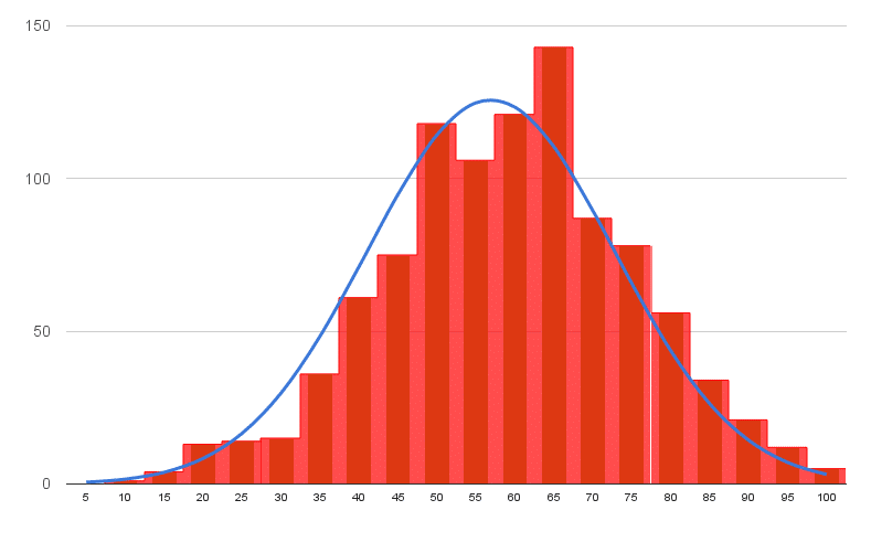
In this tutorial you’ll learn how to make a histogram in Google Sheets with a normal distribution curve overlaid, as shown in the above image, using Google Sheets.
It’s a really useful visual technique for determining if your data is normally distributed, skewed or just all over the place.
What is a Histogram?
A histogram is a graphical representation of the distribution of a dataset.
In this example, I have 1,000 exam scores between 0 and 100, and I want to see what the distribution of those scores are. What’s the average score? Did more students score high or low? How clustered around the average are the student scores? Are the scores normally distributed or skewed?
What is a Normal Distribution Curve?
The normal distribution curve is a graphical representation of the normal distribution theorem stating that “…the averages of random variables independently drawn from independent distributions converge in distribution to the normal, that is, become normally distributed when the number of random variables is sufficiently large”.
Bit of a mouthful, but in essence, the data converges around the mean (average) with no skew to the left or right. It means we know the probability of how many values occurred close to the mean.
We expect 68% of values to fall within one standard deviation of the mean, and 95% to fall within two standard deviations. Values outside two standard deviations are considered outliers.
We expect our exam scores will be pretty close to the normal distribution, but let’s confirm that graphically (it’s difficult to see from the data alone!).
Let’s see how to make a Histogram in Google Sheets and how to overlay a Normal Distribution Curve, as shown in the first image above.
How to make a Histogram in Google Sheets
Step 1: Raw data
Copy the raw data scores from here into your own blank Google Sheet. It’s a list of 1,000 exam scores between 0 and 100, and we’re going to look at the distribution of those scores.
Step 2: Name that range
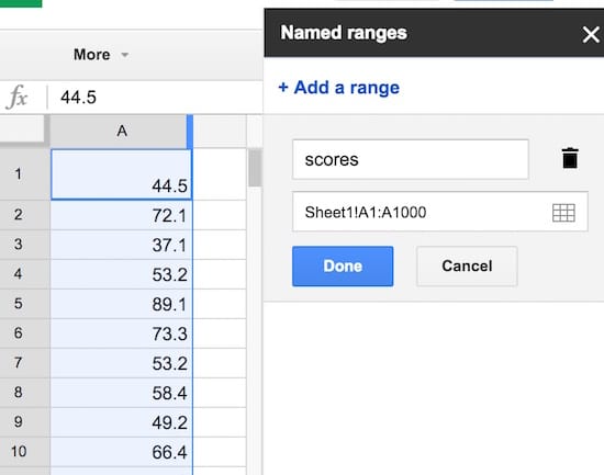
Create a named range from these raw data scores, called scores, to make our life easier. Highlight all the data in column A, i.e. cells A1:A1000, then click on the menu Data > Named ranges… and call the range scores:
Step 3: Summary statistics
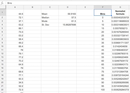
Set up a small summary table with the mean, median, mode and standard deviation of our population. The formulas are:
Mean:
=AVERAGE(scores)Median:
=MEDIAN(scores)Mode:
=MODE(scores)Standard Deviation:
=STDEVP(scores)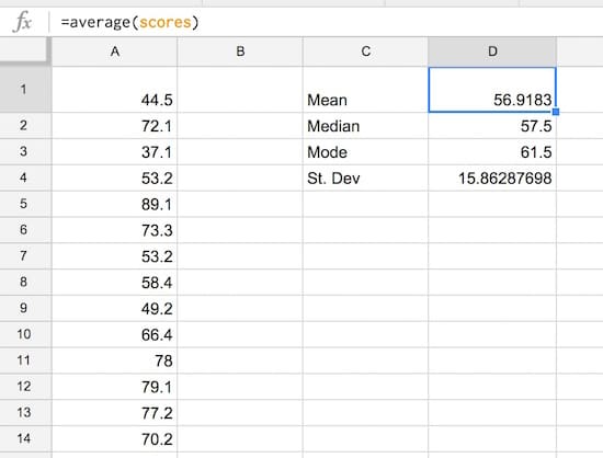
Step 4: Create the frequency bins
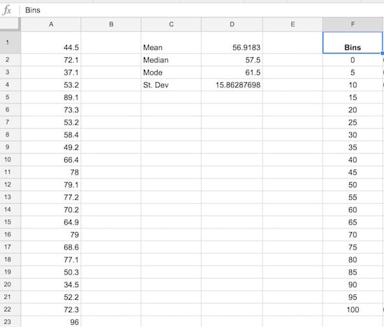
Set up the frequency bins, from 0 through to 100 with intervals of 5. Put 0 into cell F2 and then you can use this formula to quickly fill out the remaining bins:
=F4 + 5(it adds 5 to the cell above). Name this range bins.
Step 5: Normal distribution calculation
Let’s set up the normal distribution curve values.
Google Sheets has a formula NORMDIST which calculates the value of the normal distribution function for a given value, mean and standard deviation. We calculated the mean and standard deviation in step 3, and we’ll use the bin values from step 4 in the formula.
In G2, put the formula:
=NORMDIST(F2,$D$1,$D$4,FALSE)Drag it all the way down to G22 to fill the whole Normdist formula column:
Step 6: Normal distribution curve
Let’s see what the normal distribution curve looks like with this data.
Select the bins column and the Normdist column then Insert > Chart and select line chart, and make it smooth:
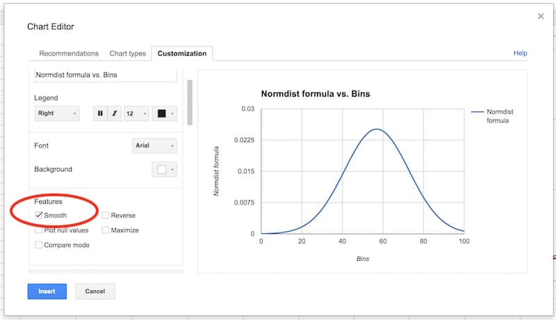
You’ll have an output like this:
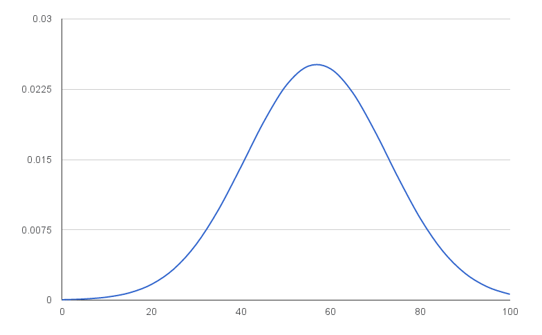
That’s a normal distribution curve, around our mean of 56.9. Great work!
We now need to calculate the distribution of the 1,000 exam scores for our histogram chart.
As we’re going to create a totally new chart with the histogram and normal curve overlaid (easier than modifying this one), you can put this normal distribution chart to one side now, or delete it.
Step 7: Frequency formula
Leave column H blank for now (we’ll fill this in shortly).
In column I, let’s use the FREQUENCY formula to assign our 1000 scores to the frequency bins. Type the following formula into cell I2 and press Ctrl + Shift + Enter (on a PC) or Cmd + Shift + Enter (on a Mac), to create the Array Formula. It’ll fill in the whole column and assign all the scores into the correct bins:
=ArrayFormula(FREQUENCY(scores,bins))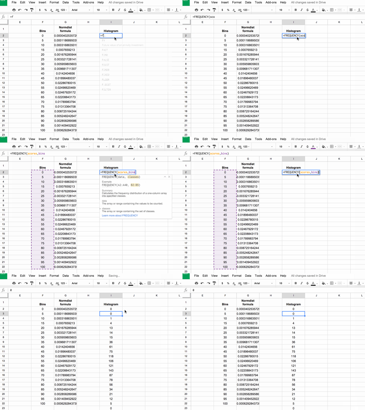
If you’re new to Array Formulas, check out this post: How do array formulas work in Google Sheets?
Step 8: Copy values
Copy this column of frequency values into the adjacent column J (we need this for our chart).
Pro tip: you can just copy I1:I2 into J1:J2, it’ll fill out the whole column with values.
Step 9: Scale the normal distribution curve
We need to scale our normal distribution curve so that it’ll show on the same scale as the histogram. Since we have 1,000 values in bins of 5, our scale factor is 5,000. Meaning, when I multiply the normal distribution values by 5,000, they’ll be comparable to the histogram values on the same axis. Also, they’ll sum to 1,000 matching the number of values in our population.
So in the blank column H, add the following formula and drag down to H22:
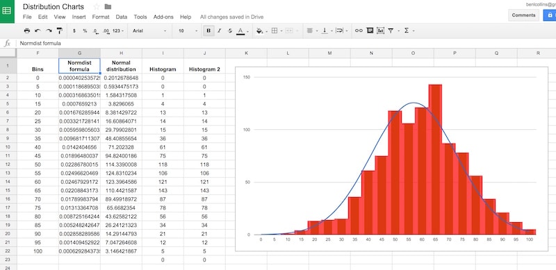
= G2 * 5000Our completed data table now looks like:
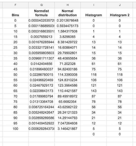
Step 10: Create the chart
This is where we see how to make a histogram in Google Sheets finally!
Note: the screenshots shared below show the old chart editor. The new chart editor opens in a side pane, but the steps and options are essentially the same.
Hold down Ctrl (PC) or Cmd (Mac) to highlight the bins data column, the Normal distribution and two histogram columns, but omit the Normdist formula column, as follows:
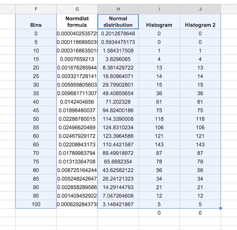
Then Insert > Chart, and select Combo chart:
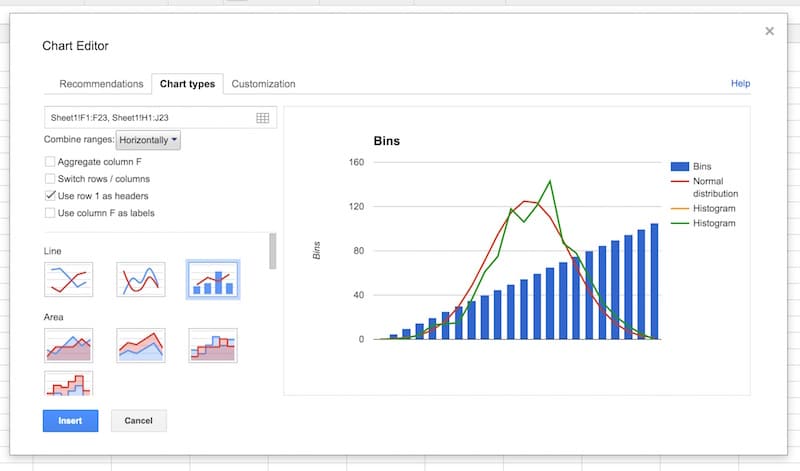
Select the option to use column F as labels:
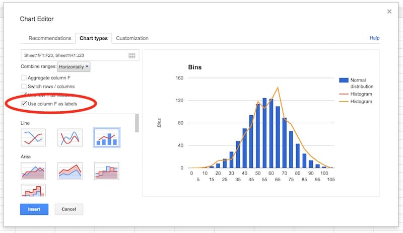
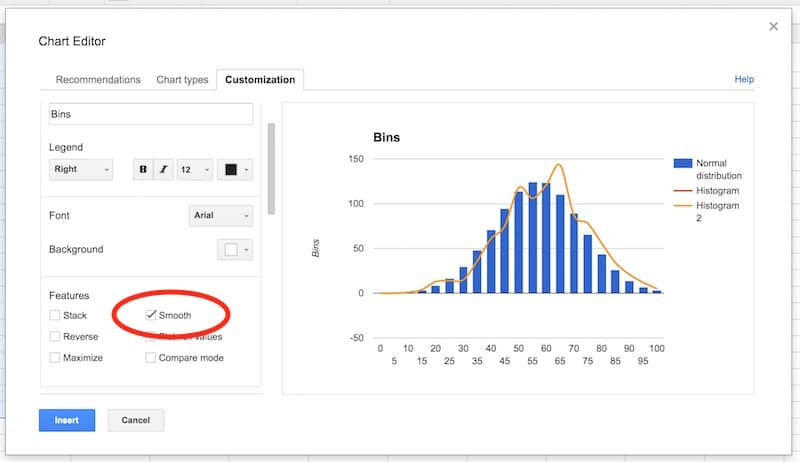
In the Customization tab, remove the title and legend. Select the Smooth option:
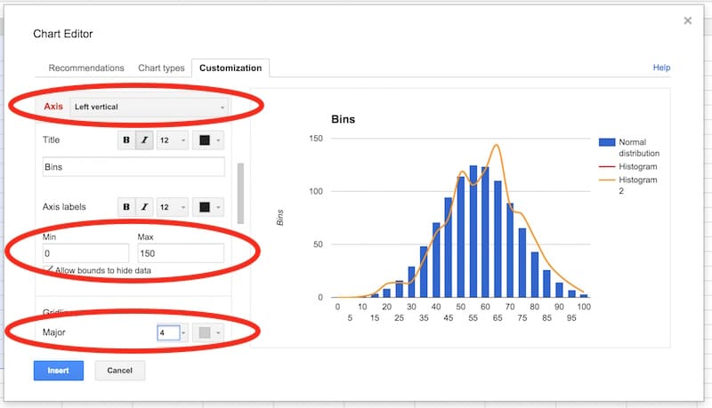
Select the vertical axis. Delete the axis name. Set to have a range of 0 to 150, and set the major gridlines to 4.
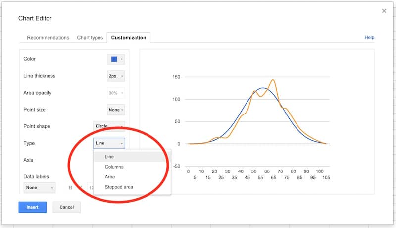
In the series section of the customization menu, choose the Normal Distribution series, and change from columns to line, so your chart looks like this:
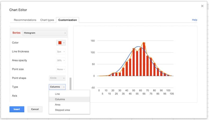
Next, choose the Histogram series and change the type from line to columns:
Select the Histogram 2 series and change the type from line to stepped area:
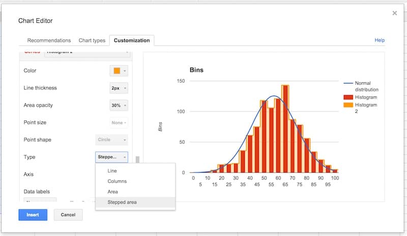
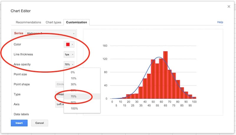
Then change the color to red, the line thickness to 1px and the opacity to 70%, to make our chart look like a histogram (this is why we needed two copies of the frequency column):
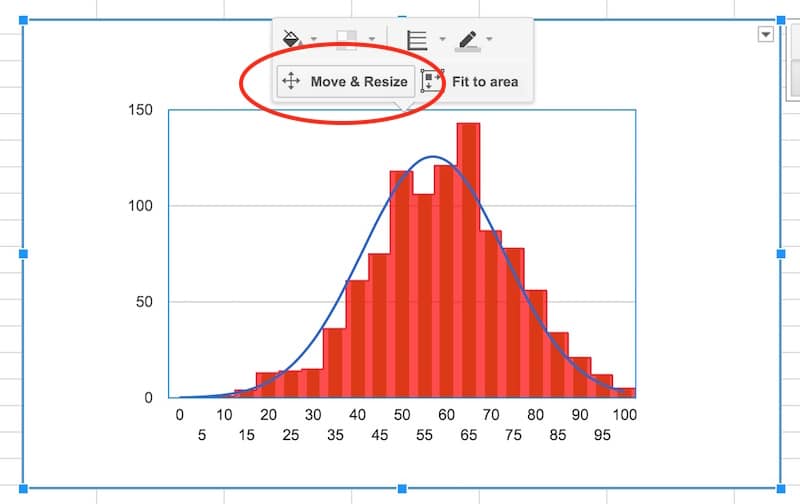
Final tidy up: set the axes labels font size to 10, then click in the chart area to move and resize the it by dragging the edges outwards, so it fills out the whole of our chart canvas:
Voila! You’ve now learnt how to make a histogram in Google Sheets, overlaid with a normal distribution curve:
Want your own copy of this histogram chart?
Click here to access your copy of this template >>
Conclusion:
To conclude, we can see our exam score data is very close to the normal distribution. Hooray!
If we look closely, it’s skewed very, very slightly to the left, i.e. it has a longer tail on the left, more spread on the left. See how there is space between the red bars and the blue line on the left side, but the red bars overlap the blue curve on the right side. It’s subtle though.
 Learn more
Learn more about how to make a histogram in Google Sheets with the Data Analysis in Google Sheets course
This thread is outdated. You do not have *smoothing* anymore in Google Sheets. I hope you update it soon.
Hi Masi,
I just checked now and the smooth option is definitely still available. You have two options:
1. You can choose the smooth line chart option in the chart choose menu:
2. Or, you can choose the smooth option in the customization menu:
Ben
Hi Ben, Do you know how to make a histogram when I have a theoretical ‘Engagement Score’, a continuous variable, in Col A and counts of a given score in Col B?
You’ve shown an elegant way to produce a histogram based on raw data at an individual user level. The data I have is at an aggregate level and instead of Engagement Score of 18.8 listed out in 1,000 rows, I simply have a2 = 18.8 | b2 = 1000.
How should I manipulate my data to be able to create a histogram in Google Sheets?
Hi,
Can you please be precise and say how you choose the data in the step six? I myself have a similar data but I choose graphically those two columns with their titles (like you do in Excel) and do Chart > Line > …
However, after the creation of the ND, I see false input in the Advanced settings’ Chart types’ first box where is only one column, while I expect there to be two columns. Can you please be more precise on the step 6 because I cannot reproduce your method.
Hey Masi,
You want to select columns F and G in my example (called “bins” and “normdist”) as shown in this image:
To get the bars and line on the same chart, look at the remainder of the tutorial, especially point 10 when I show that.
Hope that helps!
Thanks,
Ben
it’s so very very very very very very helpful for me
Thank you, that was very helpful. But why do you multiply by 5000?
Hi,
Assume you have real values (negative, positives, zeros) in Scores and the bin width is real number (etc 2.93) so bins (0, 2.93, 5.86, …). I get a big tail of zeros by your method in Histogram 1 but everything else seems to work.
So I think `=arrayformula(frequency(scores,bins))` cannot be applied like that. There may be needed a shift. Can you please extend your thread about it?
Hi Masi, this tutorial assumes only positive numbers (since they are exam scores), so I suggest sharing your specific question and spreadsheet on the Google Sheets help forum: https://productforums.google.com/forum/#!topicsearchin/docs/category$3Aspreadsheets
This was super helpful and made for a really neat chart. I learned quit a bit, thank you!
Thank you for a tutorial that was clear and concise.
However, I have some quick questions, if you won’t mind answering them:
1) What is the difference between “STDEV” and “STDEVP” when calculating the standard deviation for a set of raw datas?
2) Are the “bins” listed and plotted just for because we want to create a histogram alongside the normal distribution curve?
3) How do you determine what increments to use for the “bins”? (ie. how did you come up with increments of 5 with the example that you used in the tutorial above?)
Thank you very much!
Hey Morris,
1) The P at the end of STDEVP stands for population and should be used for calculating standard deviations on whole populations, as opposed to when you’re looking at samples (when you’d use the regular STDEV function). This is a great article that goes into more detail about standard deviations: http://datapigtechnologies.com/blog/index.php/understanding-standard-deviation-2/
2) Yes.
3) Good question. So you want the bins to be the same size and cover your whole dataset. It’s advisable for them to be whole numbers too, both aesthetically and to ease understanding. As a starting point, you can take you max value (99.2 in this example) and min value (9.7 in this example), calculate the range between them (89.5) and then divide by how many bins you want to show (e.g. if you want to see 20 bins, then divide by 20 to get 4.475, which I’ll round up to 5 to be my bin size, which will cover me from 0 to 100). The number of bins you show is up to you – enough to show some detail or trends, but not so many that it stops being a histogram and turns into a regular column chart. I’ve added some notes to the “Charts” tab of the Google sheet here.
Hope that helps!
Ben
Fantastic tutorial. Thank you. The use of FREQUENCY instead of COUNTIFS to fill up the histogram frequencies is particularly good.
Thanks Mike!
This was a great exploration for me, both in learning more advanced charts (advanced for me, at least!) and in analyzing student data. Thank you!
#NUM! comes up when I try to use the normdist formula for some values. What does this mean? How can I make it work? (I’m not using the data you’ve provided for the tutorial).
Hmm, difficult to know without seeing your data. The #NUM! error means that the formula is trying to use values that are not valid numerical values, so it can’t compute the normal distribution.
Dear Sir,
After selecting a combo chart, I am not getting the “Smooth” option. Do you why this is the case?
Hi Neil,
Seems the new chart editor does not have the “smooth” option for the combo charts, but you can click “Use the old chart editor” at the bottom of the sidebar to go back to the old editor which does still have the smooth option.
Thanks,
Ben
Hi Ben, this is great. Are you able to do this using the native Histogram charts in Google Sheets instead of using a combo chart option?
No, unfortunately you can’t overlay a normal distribution curve with the native histogram chart. However, it is a much quicker method to create a histogram that way.
Do I need to Identify first the range of my data for me to get the bins?
Yes, and you can use MIN and MAX to do this to get the range. Then you’re free to choose sensible sized bins (not too narrow, not too wide).
Hi,
Should I always start my bins with 0? Can’t I start it with the value closer to my lowest data? Thanks!
Hi! Yes, you can start your bins nearer to the lowest value provided you don’t miss any data! However you should not truncate the y-axis (vertical axis) because the height of the bars is measured from zero and this prevents the data being distorted.
This is super helpful, not simple. However it gets the job done in clear and concise steps.
Thanks a lot.
You’re welcome!
Ben,
How to calculate the Scale Factor? I have 78 values in bins of 0.005. Is the Scale Factor 0.39 (78 * 0.005)? If this is the way to calculate, I’m not getting comparable numbers between the Histogram and the Normal Distribution columns.
Thanks for the great tutorial!!
Cheers,
– Christian
sml!
What if you are trying to compare your data not to the normal distribution of your data, but say the district’s average? If you were told your district had a mean of 75% with a standard deviation of 15, is it possible to create a combo chart with your data overlaid with the district data?
Hi Ben! This is some really useful stuff. I’d been a google sheets skeptic until I read through some of your posts. Thanks for setting it up, it’s helped me become way more productive!
One quick note – I think the text for normal distribution theorem should be slightly different?
It says “…the averages of random variables independently drawn from independent distributions converge in distribution to the normal…”
But it should be “…the averages of random variables independently drawn from *identical* distributions converge in distribution to the normal…”
Because this weak law of large numbers actually holds true only for iid random variables.
Ben,
You are using a built-in NORMDIST function to fit the data, but how to modify your procedure to fit an arbitrary function, such as the two- or three-parameter Weibull distribution, to a skewed data set?
Great Article! Thanks heaps!
How can I get the labels on the X-Axis to be a range, like 0-9%, 10-19% … etc.?
Ben That is a brilliant explanation. I was able to modify the method to suit my data really easily. Thank you so much, sorting that out by discovery would have taken me an age!
That’s great to hear, John! Thank you!
Awesome tutorial! However, I think you may have reversed “left” and “right” in your conclusion. (The red bars overlap with the blue line on the *right* side of the plot, not the left.)
Yes, great spot! You win today’s prize 😉
Thanks for pointing this out. I appreciate it. I’ve updated the article.
Cheers,
Ben
how can you have 5000 instances in bin 5 when you only have 1000 scores in total?
Thank you. May I ask why the frequency is 5?
=F2+5 – in the bin recurrent formula