Making Google Sheets look less like… Google Sheets

This is a guest post from Josh Cottrell-Schloemer.

Google Sheets is an incredibly powerful spreadsheet tool for pulling, processing, and presenting data. But many people don’t realize that you can also use it to build interactive dashboards.

With a bit of creativity we can go from this:

Dashboard Data Table in Google Sheets

To this:

Google Sheets Dashboard

The skills to build this type of dashboard aren’t difficult to learn and you can get started with a basic knowledge of Google Sheets.

Here’s a walkthrough of the dashboard shown above:


Continue reading Making Google Sheets look less like… Google Sheets

How To Create A Heat Map In Google Sheets

Heat maps in Google Sheets are a great way to add context to your data.

They bring attention to the high and low values in your data, to outliers that demand attention.

Best of all, heat maps in Google Sheets are easy to create.

Consider this dataset showing monthly temperatures for Washington D.C.:

Temperature Data In Google Sheets

Without any formatting, it’s boring to look at, doesn’t convey any immediate takeaways, and it’s hard to spot trends such as which years were hotter than others.

Now compare that to the same dataset with a heat map overlay (click to enlarge):

Temperature Heat Map In Google Sheets

Wow! The stories jump off the page at you now. You can easily compare the years and see which years had longer winters, or hotter summers.

Let’s see how to create a heat map in Google Sheets.

Continue reading How To Create A Heat Map In Google Sheets

How To Draw The Sierpiński Triangle In Google Sheets

The Sierpiński triangle is a fractal set in the shape of an equilateral triangle, divided into smaller triangles infinitely.

Graphically, we can draw an approximation of the Sierpiński triangle in Google Sheets:

Sierpinski Triangle In Google Sheets

🔗 Get this example and others in the template at the bottom of this article.

It is named after the Polish mathematician Wacław Sierpiński and is also known as the Sierpiński gasket or Sierpiński sieve.

It has the property of being self-similar, meaning it looks the same at any magnification.

See Wikipedia for more on the Sierpiński triangle.

Continue reading How To Draw The Sierpiński Triangle In Google Sheets

Dot Plots In Google Sheets

Dot plots are simple charts consisting of dots plotted on a simple scale, typically used to show small counts or distributions.

Dot plots are one of the simplest statistical charts, only suitable for small-sized data sets. They’re helpful for understanding the “shape” of your data by highlighting clusters, gaps, and outliers. (A histogram is better suited to showing the data distribution of larger datasets, e.g. > 30 datapoints.)

Here’s a table using dot plots to show the hypothetical number of meetings per day for these five employees:

Dot Plot in Google Sheets

How To Create Dot Plots In Google Sheets

You create dot plots in Google Sheets with formulas! 

Suppose we have this data in row 1 of a Google Sheet, in cells A1 to E1:

Data for Dot Plot in Google Sheets

Step 1: 

Create a basic REPT function next to the data, e.g. in cell F1:

=REPT("*",A1)

Step 2:

Next, turn this REPT formula into an array formula:

=ArrayFormula(REPT("*",A1:E1))

Step 3:

Then use the JOIN function and CHAR function to combine the array output. CHAR(10) creates a carriage return, which we use as the delimiter:

=ArrayFormula(JOIN(CHAR(10),REPT("*",A1:E1)))

Step 4 (optional):

Convert the * into circles with the CHAR function:

=ArrayFormula( JOIN(CHAR(10),REPT(CHAR(9679), A1:E1)))

Step 5 (optional):

Rotate the cell up:

Format > Rotation > Rotate up

Here’s an image showing the outputs for these 5 steps in column F:

Dot Plot workings

How To Create Multi-Colored Dot Plots In Google Sheets

Taking this idea one step further, we can add colored symbols to indicate the relative counts.

Here’s an example with green dots for large counts, then orange, and then red dots for the smallest counts:

Multi-Colored Dot Plot in Google Sheets

The formula is more complex and uses the IFS Function to categorize the inputs by relative size:

=ArrayFormula(JOIN(CHAR(10),REPT(IFS(A1:E1/MAX(A1:E1)>0.85,"🟢",A1:E1/MAX(A1:E1)>0.5,"🟠",TRUE,"🔴"),A1:E1)))

How does this formula work?

It’s an array formula that takes an input of the five numbers in columns A to E.

Inside the IFS function, the number (e.g. 7) is divided by the maximum number in the range (10 in this example) and compared to see if it’s bigger than the first threshold (0.85 in this example). If this is true, then the green dot is plotted, otherwise, the threshold is checked (0.5 in this example) If that’s true, then orange dot is used. If that is not true, then the red dot is used as the default.

The REPT function and the JOIN function perform the same way as step 3 above for the simpler single color example.

You can also replace the colored dots in this formula with their CHAR function equivalents, to keep it entirely formula driven:

=ArrayFormula(JOIN(CHAR(10),REPT(IFS(A1:E1/MAX(A1:E1)>0.85,CHAR(128994),A1:E1/MAX(A1:E1)>0.5,CHAR(128992),TRUE,CHAR(128308)),A1:E1)))

As a final step, don’t forget to rotate the cell text up, to get the dots plotted as columns rather than bars.

Notes

This Dot Plot technique first appeared in issue 188 of my weekly Google Sheets Tips newsletter. Signup here if you’d like to receive it!.

Thanks to reader Marcel L. for his sharing his idea for the multi-colored dot plot.

Radial Bar Charts in Google Sheets

In this post, I’m going to show you how to create radial bar charts in Google Sheets.

Radial Bar Chart in Google Sheets

They look great and grab your attention, which is important in this era of information overload.

But they should be used sparingly because they’re harder to read than a regular bar chart (because it’s harder to compare the length of the curved bars).

How To Create A Radial Bar Chart In Google Sheets

Let’s begin with the data.

In this example, we’ll create a radial bar chart in Google Sheets with 3 series.

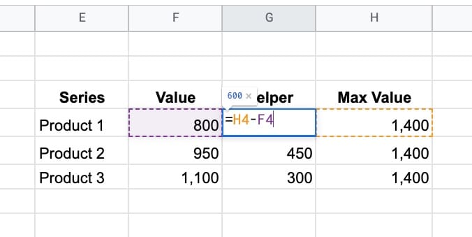
We need a column of values for these 3 series, for example, products with a number of units sold.

Next, we need some upper limit (max value) for our bars. This allows us to scale the bars properly.

Lastly, we need a helper column that calculates the difference between the max value and the actual value.

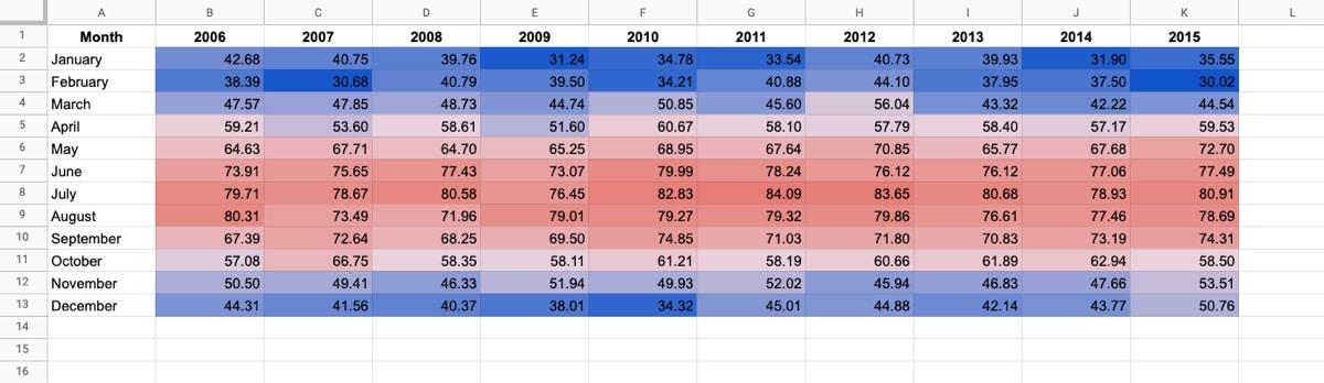
Here’s the data for the radial bar chart, in cells E3:H6:

Radial bar chart data table with Formula

Ok, I’m going to let you in on a little secret now…

This is not a single chart. No sir, it’s three charts overlaid on top of each other.

And yes, this means it takes three times as long to create!

Step 1: Create the inner circle

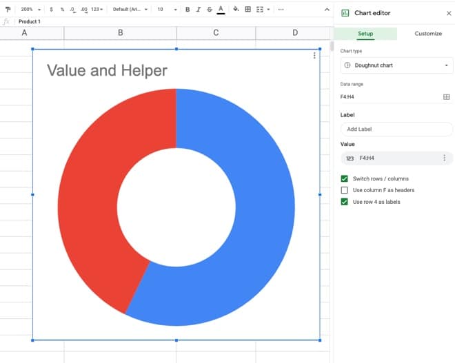
Highlight the first row of data but exclude the max value column. In the example dataset above, highlight E4:G4 and insert a chart.

Select a doughnut chart.

Under the Setup menu, make sure to check the “Switch rows/columns” checkbox, so your chart looks like this:

Donut chart in Google Sheets

Under the customize menu of the chart tool, set the following conditions:

  • Background color: None
  • Chart border color: None
  • Donut hole size: 67%
  • Set Slice 2 color to none
  • Remove the chart title
  • Set the legend to none

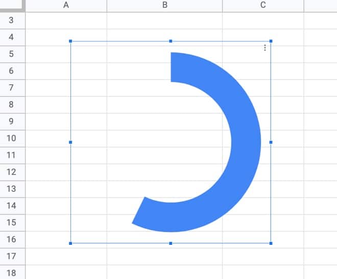
This is what the inner donut should look like:

Donut chart in Google Sheets

Step 2: Create the middle circle

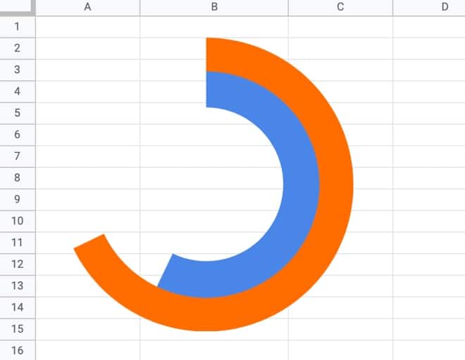
Repeat the steps above for the inner circle, but use the next row of data, choose a different color, and set the donut hole size to 77% (you may have to experiment with these percentages to line everything up at the end).

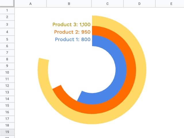
Drag the second donut chart on top of the first and line up the radial bars to get:

Radial Bar Chart in Google Sheets

Step 3: Create the outer circle

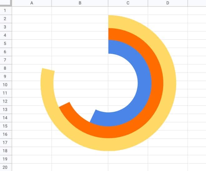
Again, repeat the steps above from the inner circle to create a third donut chart, using the third row of data, a different color, and setting the donut hole size to 81% (again, this might need tweaking to line everything up).

Drag this third donut chart on top of the other two and you have a radial bar chart in Google Sheets!

Radial Bar Chart in Google Sheets

Note on editing charts:

Since the charts are placed on top of each other, you’ll only be able to access the top chart to edit. You’ll have to move it to the side to access the chart underneath, and then move that one if you want to access the inner chart.

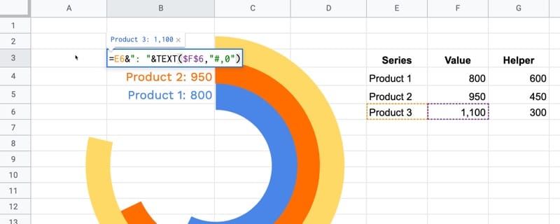
Step 4: Add the data labels

It gets messy to add the data labels to each chart through the chart editor, so I opted to create formulas to add my data labels into the cells next to each bar of the radial bar chart.

To access cells underneath the charts, click on a cell outside of the chart area and then use the arrow keys on your keyboard to reach the desired cell.

Once there, add the following formula:

=E6&": "&TEXT(F6,"#,0")

This formula uses the TEXT function to combine text and numbers in Google Sheets.

This shows the series name and value alongside each bar:

Data labels for radial bar chart in Google Sheets

To finish, remove the gridlines from your Sheet to give the chart a clean look.

Radial Bar Chart in Google Sheets

Can I see an example worksheet for the radial bar chart?

Yes, here you go.

Real World Examples of Radial Bar Charts

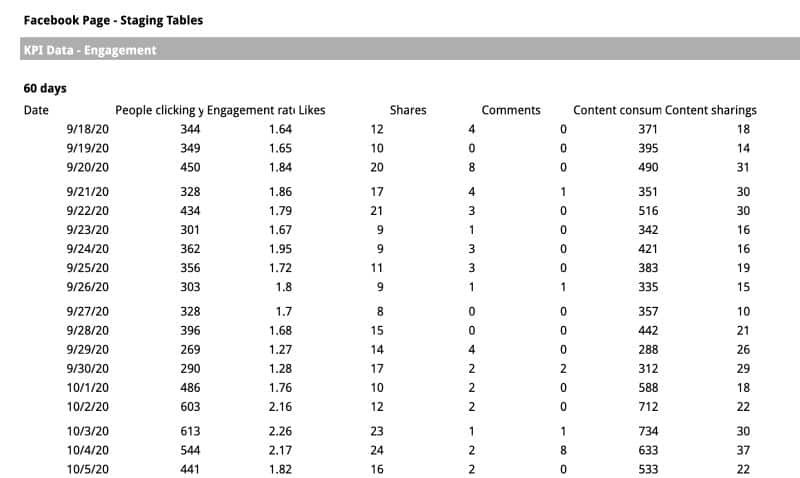
My friend Jeff Sauer, who founded Data Driven U to teach people data-driven marketing, contacted me recently about creating a radial bar chart for one of his workshops.

He is graciously sharing his report here, so you can see a radial bar chart with six rings:

Data Driven U chart

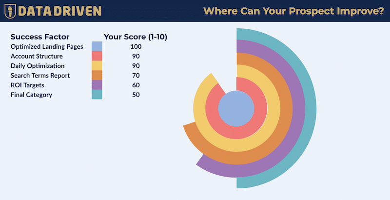
This is a screenshot of his Google Sheet!

(If you’re looking for top draw digital marketing, then you should definitely check out Jeff’s site: DataDrivenU.com This is not an affiliate link, just a personal recommendation!)

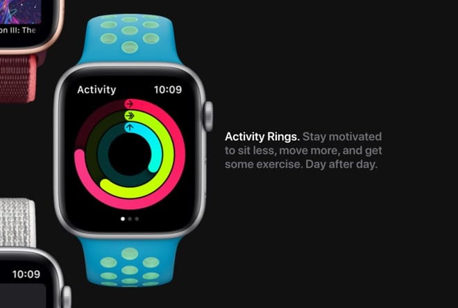
You’ve probably also seen a radial bar chart in the wild with the Apple Watch Rings Chart!

Apple Watch Ring Chart