Heat maps in Google Sheets are a great way to add context to your data.
They bring attention to the high and low values in your data, to outliers that demand attention.
Best of all, heat maps in Google Sheets are easy to create.
Consider this dataset showing monthly temperatures for Washington D.C.:
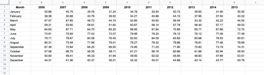
Without any formatting, it’s boring to look at, doesn’t convey any immediate takeaways, and it’s hard to spot trends such as which years were hotter than others.
Now compare that to the same dataset with a heat map overlay (click to enlarge):
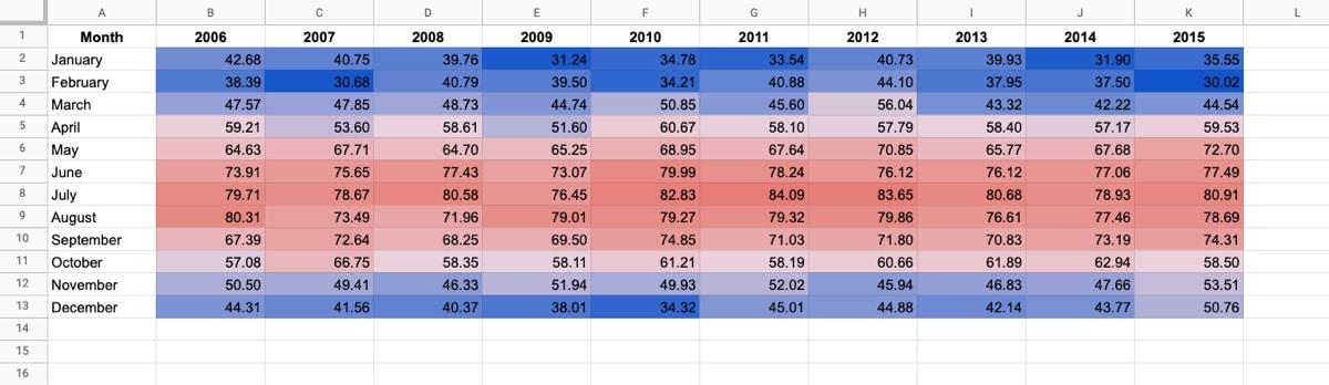
Wow! The stories jump off the page at you now. You can easily compare the years and see which years had longer winters, or hotter summers.
Let’s see how to create a heat map in Google Sheets.
Step By Step Guide To Create A Heat Map In Google Sheets
Heat maps can be created with any dataset that contains values. It works particularly well for data that has both row and column categories (like the example above). Oftentimes, pivot tables work particularly well as heat maps.
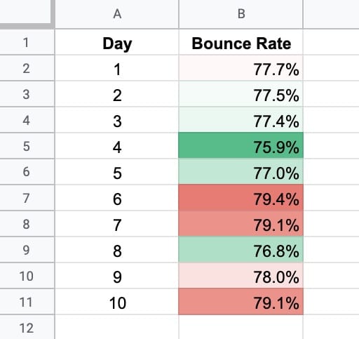
For this example, suppose we have this small dataset of bounce rates for a website (bounce rate = percent of users who leave a website after viewing only one page):
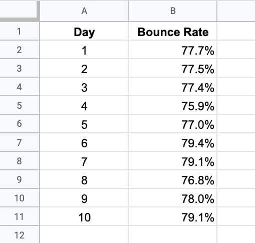
It’s hard to see, at a glance, which days the website did well (a low bounce rate) and which did poorly because the values are close.
It requires mental effort to separate the values in your head and decide which are the “best” and which are the “worst”. There’s a risk that you miss something.
It becomes much easier to see if you turn this into a heat map in Google Sheets.
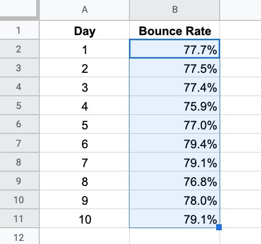
Step 1: Highlight Your Data
Highlight the range of data that you want to include in the heat map. Typically this excludes any category data, like headings, tags, days, etc.
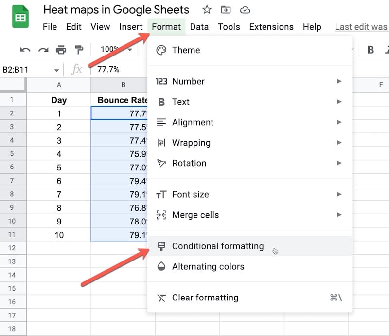
Step 2: Open Conditional Formatting
Go to the conditional formatting menu: Format > Conditional Formatting
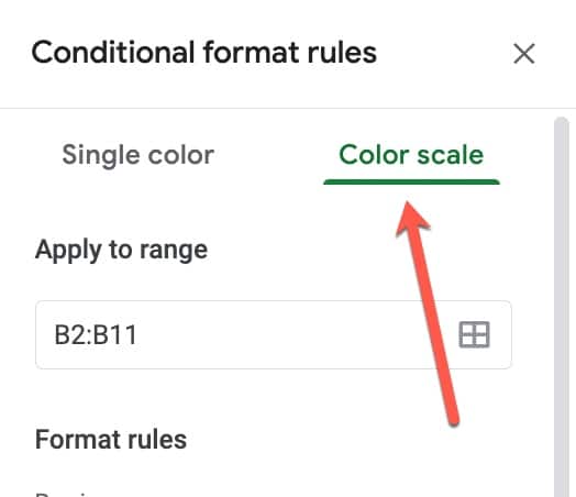
Step 3: Select Color Scale
Select the Color scale option:
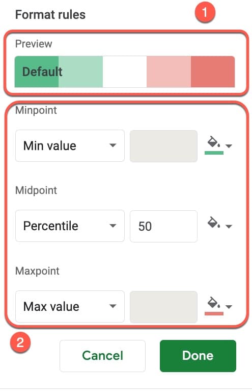
Step 4: Set Format Rules
Here, you have two choices: 1) use the pre-built default color schemes, or 2) create your own custom color scheme.
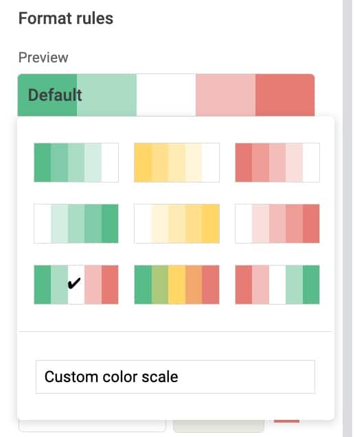
Default Options
If you click on the “Default” color bar, it will open a panel with preset choices:
The colors are shown as low values on the left through to high values on the right.
In this example, low bounce rates are good, so they should be green. And high bounce rates are bad, so they should be red.
Select the green-white-red combination and click Done.
The data now looks like this:
You can immediately see the difference.
It’s now very easy to identify the days our website underperformed (in red, high bounce rate) and which days it did well (in green, lower bounce rate).
Custom Format Rules
You’re not limited to the default settings.
Instead, you can set your own colors, how to measure the min-, max-, and midpoints, and even define where the midpoint lies.
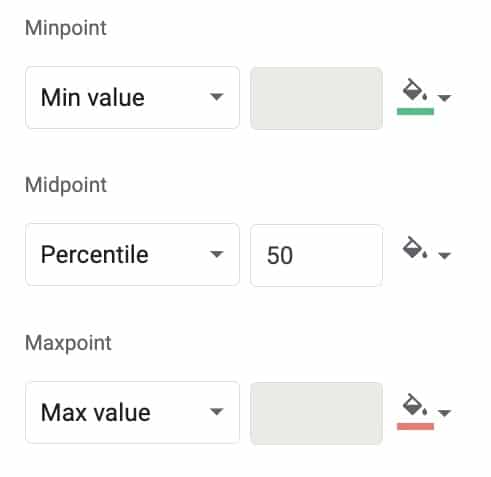
The minpoint can be set to Min value, Number, Percent, or Percentile.
The midpoint can be set to None, Number, Percent, or Percentile.
The maxpoint can be set to Min value, Number, Percent, or Percentile.
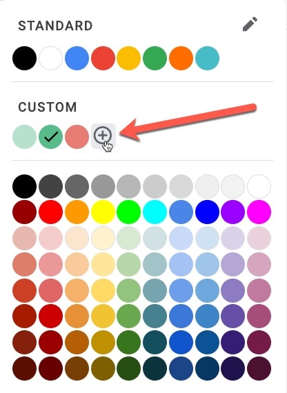
And for all three, you can customize the color to one of the presets or a custom color (by clicking on the + shown by the red arrow):
Other Examples Of Heat Maps In Google Sheets
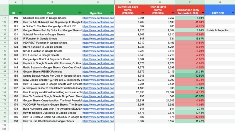
In my own work, I use a heat map to show trends in my web traffic, so I can how individual articles are performing.
Specifically, I use Fathom Analytics* for my web analytics and pull the data into my Google Sheet using Apps Script and the API. Then I display the current 30 days of traffic with the prior 30 days and compare them.
* affiliate link, meaning I earn a small commission if you decide to purchase Fathom via this link.
Finally, I add a heat map (in column P) to showcase the trends quickly. Lots of green is good. Lots of red is bad. As you can see in the following image, my results are somewhat mixed at the moment 🤨
Here’s another example of a more complex heat map, taken from my Data Analysis in Google Sheets course, depicting the customer retention rate for a fictional SaaS company:
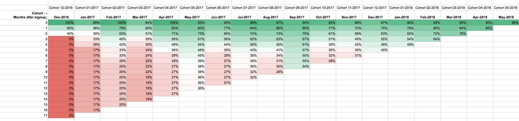
The heat map adds context and gives a clear sense of what’s happening.
Ben – I’m searching for using the data idea collecting survey results against topics (column) and counts (column). I want to display it with the graphic of words in sizes. Have you seen/done?
Is there anyway to do color scale conditional formatting but using the data from a different row or column?
Hi, great article!
A question: Doesn’t it risk making the sheet quite slow if you apply conditional formatting to all of it?
For example, say I have 100 stock tickers with 10 different formulas from Google Finance. Then I apply a heat map to it.