If you use Google Sheets, or any spreadsheet application for that matter, but don’t use Pivot Tables, then you’re missing out on one of the most powerful and useful features available.
This tutorial will (attempt to) demystify Pivot Tables in Google Sheets and give you the confidence to start using them in your own work.
Contents
- An Introduction to Pivot Tables in Google Sheets
- What are Pivot Tables?
- Why use Pivot Tables?
- How to create your first Pivot Table
- Let Google build them for you
- Pivot Tables: Fundamentals
- Rows, columns and values
- Totals
- Sorting
- Pivot Tables: Tips and Tricks
- Multiple value fields
- Changing aggregation types
- Adding filters
- Multiple row fields
- Copying Pivot Tables
- Extracting Data from Pivot Tables
- Pivot Tables: Next steps
1. An Introduction to Pivot Tables in Google Sheets
What are Pivot Tables?
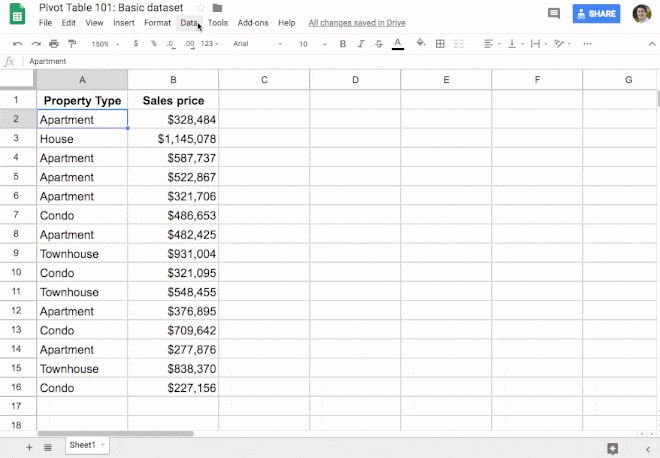
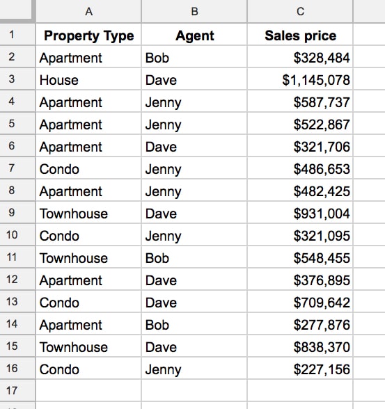
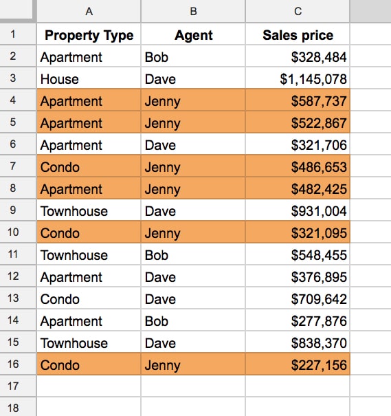
Let’s see a super simple example, to demonstrate how Pivot Tables work. Consider this dataset:
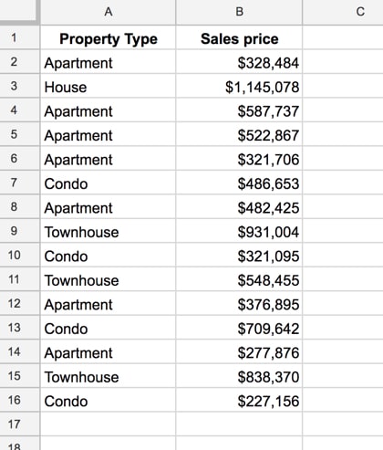
You want to summarize the data and answer questions like: how many apartments are there in the dataset? What’s the total cost of all the apartments?
Now, this would be easy to do with formulas, using a COUNTIF function and a SUMIF function, but if you change our mind and now want to summarize “Condo” you have to modify all your formulas, which is a pain.
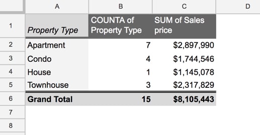
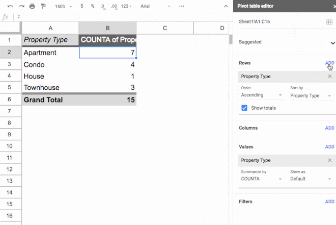
Enter the Pivot Table:
This took me eight mouse clicks and I didn’t have to write a single formula (in a few paragraphs I’ll show you those exact 8 clicks so you can build your own version).
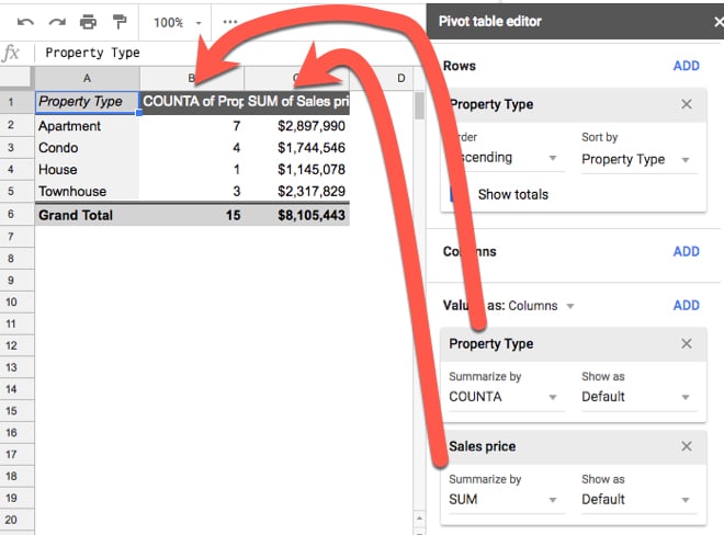
This Pivot Table summarizes the data for each property type. It counts how many of each property type is found in our dataset and then totals up the sales prices, to give a total sales price value for each property type category.
For example, the seven rows of data for Apartments are combined together into a single line in our Pivot Table (click to enlarge):
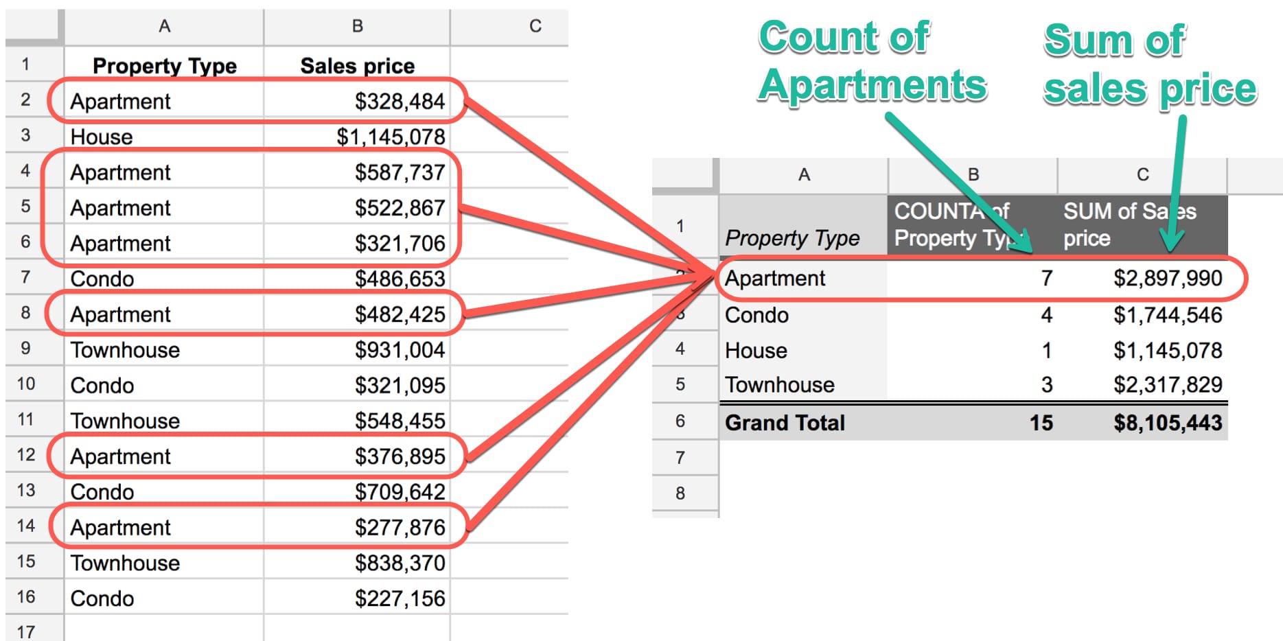
In technical parlance, the Pivot Table aggregates our data.
 💡 Learn more
Learn more about working with data in Pivot Tables in the Pivot Tables in Google Sheets course
Why use Pivot Tables in Google Sheets?
Pivot Tables in Google Sheets are unrivaled when it comes to analyzing your data efficiently.
They’re flexible and versatile and allow you to quickly explore your data.
Pivot Tables in Google Sheets are generally much quicker than formulas for exploring your data:
This is lesson 3 of the Pivot Tables in Google Sheets course — a comprehensive, online video course covering Pivot Tables from beginner to advanced level.
How to create your first Pivot Table
Let’s create that property type pivot table shown above. I promised you eight clicks, so here you go:
1. Copy the data from this sheet into your own blank sheet (this doesn’t count towards the 5 pivot table clicks, ok?)
2. Click somewhere inside your table of data (I’m not counting this click ?)
3. Click the menu Insert > Pivot table (clicks one and two)
This will create a new tab in your Sheet called “Pivot Table 1” (or 2, 3, 4, etc. as you create more) with the Pivot Table framework in place.
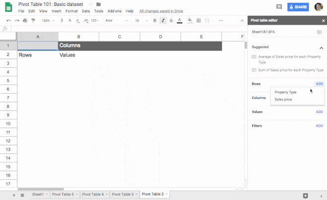
4. Click Rows in the Pivot table editor and add Property Type (clicks three and four)
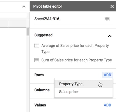
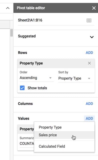
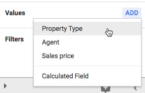
5. Click Values in the Pivot table editor and add Property Type (clicks five and six)
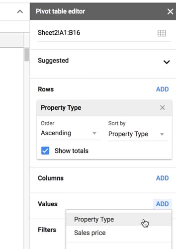
6. Click Values in the Pivot table editor and add Sales price (clicks seven and eight. Boom! ?)
Here are the steps in sequence (note that you now use Insert > Pivot table, not Data > Pivot table):
And that’s it!
Eight clicks and you have a summary report of your dataset that gives you fresh insights into your data.
Now granted this is a super simple dataset, but even if we’d had hundreds, thousands or tens of thousands of rows of data, it would still be the same eight clicks to create this Pivot Table.
Let Google build Pivot Tables for you
Leverage the power of Google Sheets’ built-in AI!
When you create your Pivot Table, you’ll notice that Google automatically suggests some pre-built Pivot Tables for you in the editing window:
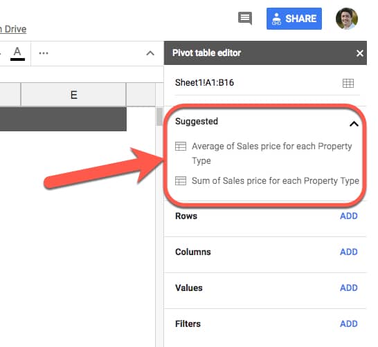
With a single click you can then create a Pivot Table:
It’s a neat way of quickly building them out as a starting point, and if it happens to answer your questions then even better.
I would absolutely still advocate learning how to build your own Pivot Tables however.
Even if you intend to always use the automatic Pivot Table builder, it’s still a good idea to understand how they work so that you know what the data is showing you.
So let’s take a look at building Pivot Tables in Google Sheets in more detail.
2. Pivot Tables in Google Sheets: Fundamentals
When you create a Pivot Table from a table of data, all of the columns from the dataset are available to use in your Pivot Tables.
Rows, columns and values
At the heart of any Pivot Table are the rows, columns and values.
Rows:
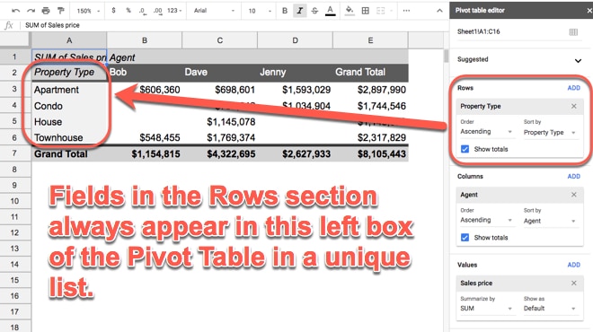
When you click Add under the Rows, you’re presented with a list of column headings from your table. When you select one, the Pivot Table will add all of the unique items from that column into your Pivot Table as row headings. Recall from the example above, it takes all the rows of property data and squashes it down to just four rows, which are the four unique property types we see.
Columns:
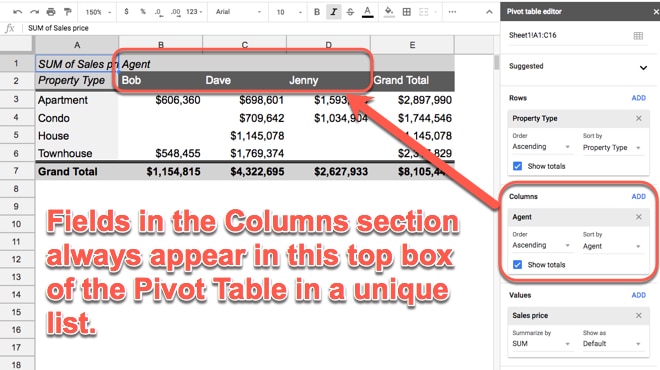
Adding Columns produces the same effect as adding Rows, but in for the columns. The Values data is displayed in aggregated form, for each column.
Values:
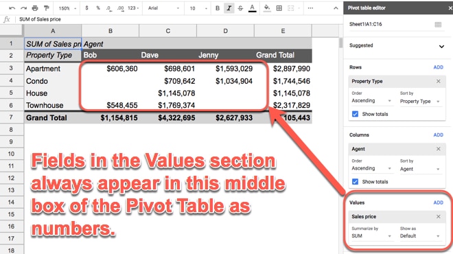
When you click on Values, you’re presented with the same list of column headings. When you select one, you’re telling the Pivot Table to summarize that column. For example, if it’s a list of revenue you might want to sum it up, or average it. Or, if it’s a column of text values, you may want to count them. This is what happens when you add values: the data is summarized, i.e. all the individual values from each row are combined together into single value (they’re aggregated).
If you have anything in the Rows section of your Pivot Table, the aggregation will be done at that level (e.g. if we have property types in Rows, the Pivot Table will display the aggregated values for each Property Type).
You can also drag-and-drop the fields in your Pivot Table to easily move them around, for example from Rows to Columns, as shown in this GIF:
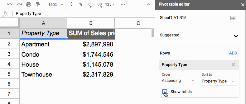
Totals
You can easily toggle totals on or off for any of the Values columns in your Pivot Tables.
The button is in the Rows section:
Sorting
The sort options are found in the Rows section of your Pivot Table.
Each Row field can be used to sort with, and each one has their own sort options.
First, choose which Row field you want to sort with under the Sort by menu option (1). Then you’ll have a choice of sorting by the category field itself or any of the value fields that have been aggregated for this category column (2). This image shows this:
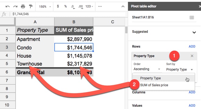
The second option for sorting data is Order (3) where you specify whether you want it ascending or descending (4):
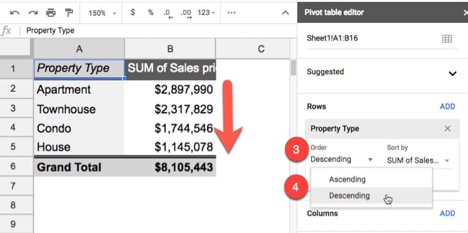
In this example, I’ve elected to sort by the second column, the SUM of Sales Price, and then chosen to sort descending so the whole table is sorted so that the largest values in this column are at the top and the smallest values at the bottom.
3. Pivot Tables in Google Sheets: Tips and Tricks
To show you a few more tricks with Pivot Tables, we need an extra column in our data table:
Grab a copy of this dataset here (File > Make a copy…).
Multiple value fields
So far, we’ve just looked at a single values column, showing a sum of the sales prices.
However, you can add more value columns. For example, you might want to count how many properties are in each category or what the average sales price was for each category.
Click Add in the Values section of the editor to add as many value columns as you want:
By adding the property type column (which is all the text values in our original data), the Pivot Table will default to counting the number of times each property type occurs (using the COUNTA function).
You can drag the values fields to rearrange the order of the columns in your Pivot Table.
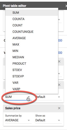
Changing aggregation types
You can add the Sales Price field again, so that you have it twice in your Pivot Table. Initially it’ll default to SUM in both cases, giving you identical total columns. Not particularly useful.
However, you can change the aggregation type of one of the columns, e.g. change the SUM to AVERAGE instead, and then you’ll get fresh insights:

The aggregation options are accessed by clicking where its says SUM (or AVERAGE or whatever you’ve selected) and then choosing from the menu:
The Pivot Tables in Google Sheets course goes into a lot more detail about the different aggregation options.
💡 Learn moreLearn more about working with data in Pivot Tables in the Pivot Tables in Google Sheets course
Adding Filters
Pivot Table filters are conceptually the same as ordinary filters we use with our data.
We add a filter to show only a subset of our data based on some condition. For example, maybe you want to only see data from 2018, or just the month of September, or from Region A, etc.
They’re easy to add and use in Pivot Tables.
It’s the last section of the Pivot Table editor that we haven’t talked about yet.
Consider this example showing a count of properties for each property type:
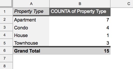
It shows all 15 properties from the original dataset.
Add a filter by clicking Add in the Filter section:
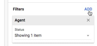
In this example I’ve chosen the Agent column to add as my filter. This means that I want to choose to look at the data from just one of the Agents in my Pivot Table, i.e. filter down to show only that Agent’s data.
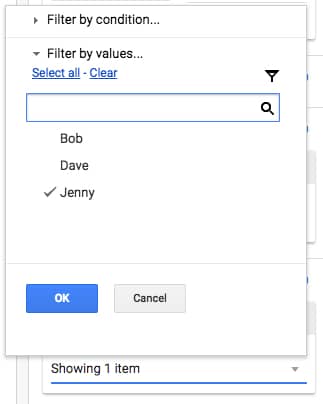
To filter on Jenny only for example, click on the “Status > Showing all items” and uncheck the items you want to discard. Whatever is left selected (shown with a tick) is the data that will be used to create the Pivot Table.
The output shows only the six properties for which Jenny was the agent:
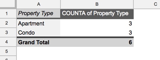
Looking back at the data, what’s happening is that the Pivot Table is only including the rows of data related to Jenny in the Pivot Table, i.e. these six rows:
Multiple categories
(Note: I’ve taken off the filter for this exercise.)
What happens when we add multiple fields to our Rows section? Let’s see.
The first field you add shows creates a unique list of items from that column. When you add a second row field, it appears as sub-categories, so that between the two columns in your Pivot Table, all the unique combinations of the two fields are shown.
Swapping the order of the row fields, by simply dragging and dropping them in the Pivot Table editor window, will swap the order of the categories.
For example, you can summarize the breakdown of property types for each Agent, or you can summarize the sales by each Agent for each Property Type.
Like everything with Pivot Tables don’t be afraid to just experiment here. Try different combinations and take a moment to understand what the Pivot Table is showing with each combination.
Copying Pivot Tables in Google Sheets
Oftentimes you’ll find yourself wanting to replicate a Pivot Table, perhaps as a starting point for further data exploration.
There’s a quick trick for copying an existing Pivot Table, rather than starting over. It also gives you the option of moving your Pivot Tables to a different tab.
Click into the top left corner cell of your Pivot Table and click copy (Cmd + C on a Mac, or Ctrl + C on a PC/Chromebook). This adds the Pivot Table to your clipboard and you can paste it wherever you want in your Sheet (Cmd + V on a Mac, or Ctrl + V on a PC/Chromebook).
Note: You need to ensure there is enough space available wherever you wish to paste a copy of your Pivot Table (i.e. enough empty cells) or you’ll see the #REF! error.
Extracting Data from Pivot Tables
To extract data correctly from pivot tables, use the GETPIVOTDATA function. Regular cell references can lead to errors if the pivot table changes size.
4. Pivot Tables: Next steps
The nice thing with Pivot Tables in Google Sheets is that they’re really easy to experiment with. Just try adding different fields in different parts of your Pivot table editor to see what effect it has. You can always start over!
+ Check out my online training course, Pivot Tables in Google Sheets course, for a complete look at Pivot Tables, from beginner through to advanced level.
+ Keep up-to-date with new articles, course launches and exclusive offers, by signing up for my Google Sheets newsletter, and get my free 80-page ebook on Google Sheets tips.
+ If all else fails, ask for help on the Google Sheets forum.
+ A novel use case: Pivot Table Maps!
+ Google documentation on how to create & use pivot tables
+ Google documentation on how to customize a pivot table
Well, that’s it for this tutorial! Happy pivoting!
Hi Ben,
Great tutorial !!!
Thank you!
Great tutorial! Can you do one on using Query formulas for pivot tables? I much prefer using Query but I can’t ever seem to get them right for pivoting data.
Hi Deborah,
Yes you can pivot data with the QUERY function too, using the PIVOT clause: https://developers.google.com/chart/interactive/docs/querylanguage#pivot
I’ve actually got an example about half way down this recent post on Tiller & Sheets: https://www.benlcollins.com/spreadsheets/tiller/
Hope that helps!
Ben
Hi Ben. Can I sort columns in a query when i´m using the “pivot” sentence?
I´m using a query with pivot(col.) for dates and i need make an descent order from left to rigth columns
Excusme for my English
Hi Ben,
Great tutorial.
For certain data points we’re having to format the column at the pivot table level. e.g. changing the value to show as a $ amount or %.
When we then try to further segment this data by adding another row like viewing month and day it pushes all the columns to the right to add the days. But the formatting doesn’t follow suit, it stays where it was set.
I understand why this happens, but is there a way to set the formatting at the value level?
Hey Nathan,
Pivot tables take their formatting from the underlying data formatting, so if you can make your dataset have the formatting you want in your pivot table, that should do it. Otherwise, as you’ve seen the formatting is attached to a Sheet column, rather than the pivot table column… (you maybe able to solve this with apps script).
Cheers,
Ben
Hi Ben,
I have a google sheet receiving response from Google forms regularly. I have created a pivot table for analysing the data. Now as the new response is received in the sheet, the corresponding pivot table shows old data and does not refresh itself, nor it has any refresh option, like in excel. Kindly help.
I am also looking for an answer to this.
Right now, the only thing I can think of is updating the pivot table data range manually every time the spreadsheet data is updated.
Hi Ben,
I would like to know some tricks about the format of the pivot table.
When I build a pivot table and if I add more rows, all the formatting changes (especially for the totals and sub-totals). In excel it does not do this and it is very time consuming changing every time the colors etc.
Thank you for your help,
Cristina Capatina
Thanks for the tutorial.
I would like to filter based on a column in the tab containing the pivot table. I get the data from a tab named Transactions which has a column named Quarter containing values like 2019Q1, 2019Q2, etc. On the Pivot table tab, I have a cell containing the value of the Quarter field I would like to filter on so I can easily change the data range I’m looking at without changing the pivot table settings.
Is that possible?
Hi Ben and all,
Can we create a pivot table by using a dynamic named range? Thanks in advanced!
Can you do a tutorial on calculated fields within pivot tables?
I have one column for costs and another column for units.
I’d like to show the average cost per unit, grouped by month.
Currently, I have:
Rows = Months
Values = Cost, Units
I need this too Alex – did you get any answers on this?
I use google sheets very frequently and cannot for the life of me figure out how to redock the pivot table editor so it does not automatically show up on the right when the table is clicked on. Can you tell me if there is a way to hide the pivot editor even when pivot table cells are clicked on?
Unfortunately this isn’t possible. It will always pop open the editor when you click on the table. I suggest sending in feedback (via the menu: Help > Report a problem). Hopefully it’s something they can change. I’ve heard lots of other people request this too! Ben
Sir , it is done now?
Not yet.
I have a tab with raw data that I use a pivot table on a different tab to run reports on daily.
The raw data expands with added rows everyday (+20-50 rows per day).
However the pivot table does not include these new added rows, and instead stops at wherever the pivot table was originally setup as.
Is there a way to input the pivot table RANGE so that it continues to include the new rows added everyday? I have maybe 20-30 pivot tables in different tabs that work off the same data set…so updating the range on each pivot table multiple times per day….would take too much time. Thanks!
Did you receive any input on this question? I am new to Google Sheets and have the same problem.
How do you do Calculated Item? Say, you want to add a column that adds up both Bob and Daves sales then subtract Jenny’s Sale?
Say:
Calculated Item (Bob Sales + Dave Sales) – Jenny Sales?
Thanks!
@Ben do you know why pivot tables > values > calculated field will not work for AVERAGEIF or AVERAGEIFS? It functions fine for AVERAGE as well as other ifs like COUNTIFS, but gives the error of “Argument must be a range” when I try to AVERAGEIF(s) anything.
Done a lot of searching on this one, cannot find a solution. Thanks anyone!
Here is my formula, ‘Days on Lot’ and ‘Retail Date’ being headers from the source data. I have maybe 15 other calculated fields in pivot table using these and other headers in the formula and all perform perfectly just to help narrow this down.
=AVERAGEIFS(‘Days on Lot’,’Retail Date’,””&TODAY()-730)
Thank you very much for your effort.
May I ask a question, how can I show the text value in the pivot table. I have a table that contains different values number, % and yes or no answers in the same column. What I want it to retrieve the data form this column. I need the text value itself, not the sum or count. How can I do that?
Thank you in advance.
Greetings,
I have a list of schools, some elementary, some jr high and some secondary. I need to put them in alpha order in those categories. How do I do that?
Thank you this was very helpful!
Thank you for creating this tutorial. I’ve been struggling to understand how pivot tables work – and the relevant use cases – for years. (I’ve even had a CPA try to teach me, to no avail.)
This is the clearest, most comprehensible tutorial I have seen. I understand them now.
Thanks, Jason. Glad it was helpful!
Hi Ben,
Great tutorial for begginers like me !!! 🙂
Thanks for your effort and, mainly, for your useful learning content.
I use pivot table quite extensively in my work. One functionality I greatly miss is to get filtered data source directly from the pivot table. The native drill down feature is of limited use as it is different from the original data source and hence getting the exact rows for editing is not possible.
Can you please work on this functionality.
https://www.contextures.com/excel-pivot-table-drilldown.html explains the above concept , though it is done for excel.
Hi Ben,
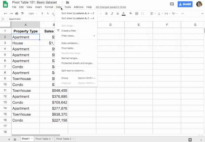
Just flagging that Google have changed the steps to generate a pivot table from Data > pivot table to Insert > Pivot Table! Thanks
Thanks, Caitlin!
Thank you for your efforts. I have one question about the Google Sheets pivot table filter section.
How do we make a filter for property type equal to a specific column on the sheet If that column does not include our property types, I don’t want to show them. Can we use arrayformula over there like =arrayformula(f:f)
Dear Ben,
Greetings
I am sharing with you a sheet which shows the working of a script by which one can get the source data in filtered mode , just showing the rows which make a particular value of the pivot table.
At present it will work only for a maximum one column field in the pivot. I’m trying to extend it to more than one row.
I hope you find it useful. You may do a blog on this if you like it.
The link is
https://docs.google.com/spreadsheets/d/1MgZR9OcdW-4QIa-NqNN57-Z-8YNJrJkk3HU4vGtOTJg/edit#gid=804532785
S K Srivastava
Dear Ben,
I have improved the sheet and now it offers two ways to display the details of a pivot table value directly on the source sheet.
The first, to see it in normal filter mode, is a simple one-step process in which the user selects a cell and clicks on an adjoining button.
The second, to view it in filterview mode, is a two-step process involving populating the filter criterion and then clicking on a hyperlink. The script is versatile, able to handle different pivot table structures and allowing for easy navigation between pivot and source data. However, users should make a copy of the script to ensure proper functionality.
Link:
https://docs.google.com/spreadsheets/d/1MgZR9OcdW-4QIa-NqNN57-Z-8YNJrJkk3HU4vGtOTJg/edit#gid=804532785
Though it has all the functionalities I needed, I am sure you can further improve it.