Dot plots are simple charts consisting of dots plotted on a simple scale, typically used to show small counts or distributions.
Dot plots are one of the simplest statistical charts, only suitable for small-sized data sets. They’re helpful for understanding the “shape” of your data by highlighting clusters, gaps, and outliers. (A histogram is better suited to showing the data distribution of larger datasets, e.g. > 30 datapoints.)
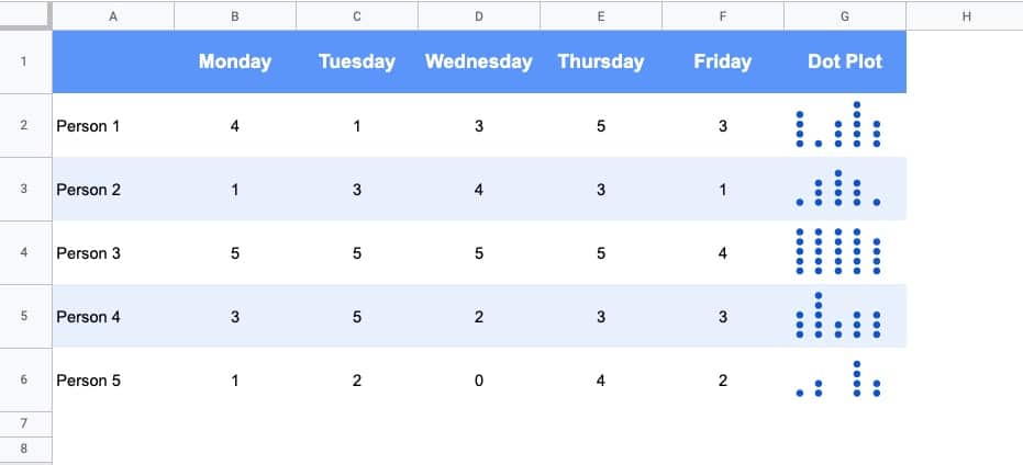
Here’s a table using dot plots to show the hypothetical number of meetings per day for these five employees:
How To Create Dot Plots In Google Sheets
You create dot plots in Google Sheets with formulas!
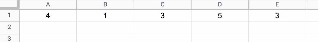
Suppose we have this data in row 1 of a Google Sheet, in cells A1 to E1:
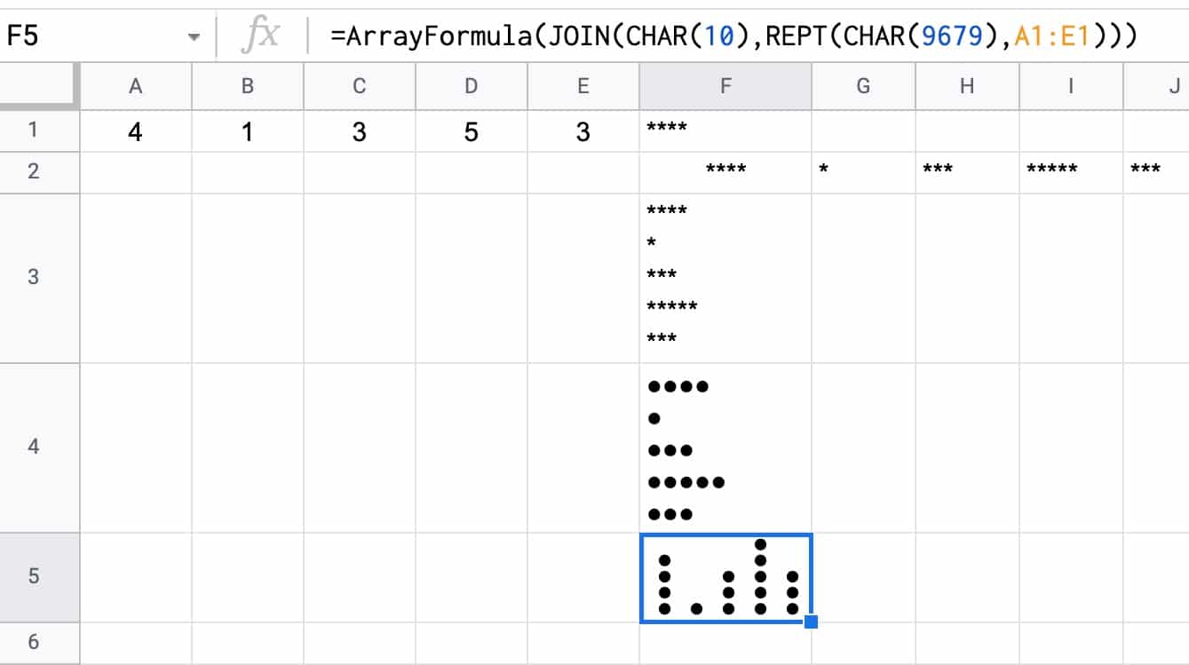
Step 1:
Create a basic REPT function next to the data, e.g. in cell F1:
=REPT("*",A1)Step 2:
Next, turn this REPT formula into an array formula:
=ArrayFormula(REPT("*",A1:E1))Step 3:
Then use the JOIN function and CHAR function to combine the array output. CHAR(10) creates a carriage return, which we use as the delimiter:
=ArrayFormula(JOIN(CHAR(10),REPT("*",A1:E1)))Step 4 (optional):
Convert the * into circles with the CHAR function:
=ArrayFormula( JOIN(CHAR(10),REPT(CHAR(9679), A1:E1)))Step 5 (optional):
Rotate the cell up:
Format > Rotation > Rotate up
Here’s an image showing the outputs for these 5 steps in column F:
How To Create Multi-Colored Dot Plots In Google Sheets
Taking this idea one step further, we can add colored symbols to indicate the relative counts.
Here’s an example with green dots for large counts, then orange, and then red dots for the smallest counts:
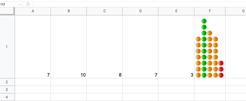
The formula is more complex and uses the IFS Function to categorize the inputs by relative size:
=ArrayFormula(JOIN(CHAR(10),REPT(IFS(A1:E1/MAX(A1:E1)>0.85,"🟢",A1:E1/MAX(A1:E1)>0.5,"🟠",TRUE,"🔴"),A1:E1)))How does this formula work?
It’s an array formula that takes an input of the five numbers in columns A to E.
Inside the IFS function, the number (e.g. 7) is divided by the maximum number in the range (10 in this example) and compared to see if it’s bigger than the first threshold (0.85 in this example). If this is true, then the green dot is plotted, otherwise, the threshold is checked (0.5 in this example) If that’s true, then orange dot is used. If that is not true, then the red dot is used as the default.
The REPT function and the JOIN function perform the same way as step 3 above for the simpler single color example.
You can also replace the colored dots in this formula with their CHAR function equivalents, to keep it entirely formula driven:
=ArrayFormula(JOIN(CHAR(10),REPT(IFS(A1:E1/MAX(A1:E1)>0.85,CHAR(128994),A1:E1/MAX(A1:E1)>0.5,CHAR(128992),TRUE,CHAR(128308)),A1:E1)))As a final step, don’t forget to rotate the cell text up, to get the dots plotted as columns rather than bars.
Notes
This Dot Plot technique first appeared in issue 188 of my weekly Google Sheets Tips newsletter. Signup here if you’d like to receive it!.
Thanks to reader Marcel L. for his sharing his idea for the multi-colored dot plot.
This is brilliant! But it’s a bar chart not a dot plot. For instance, a dot plot for person 1 would have one dot above 1, zero dots above 2, 2 dots above 3, 1 dot above 4, and one dot above 5.
Thank you for clarifying! I did not realize a dot plot specifically referred to frequency counts. I’ll update the article when I get a chance. Cheers!