How To Create A Grid Chart In Google Sheets

Earlier this year, The Washington Post told a story about the effects of Coronavirus on the US workforce, and illustrated the story with grid charts.

Grid charts can show you the breakdown of the whole into constituent parts, to allow at-a-glance understanding of the big picture.

In this post, I’ll show you how to create a Grid Chart in Google Sheets.

💡 This was tip #128 of my weekly Google Sheets newsletter. Join over 35k+ others and receive the Google Sheets Tips newsletter for exclusive tips, tricks and Google Sheets news.

Grid Chart

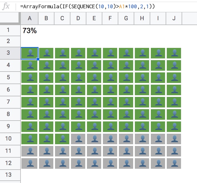
Here’s a fictitious grid chart example in Google Sheets, showing how students fared in an exam:

Grid Chart in Google Sheets

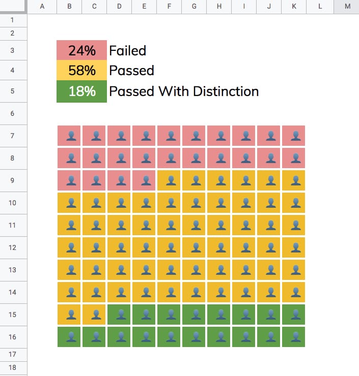
Changing the percentages in the cells above the chart will automatically adjust the chart colors to match.

How to create a grid chart in Google Sheets

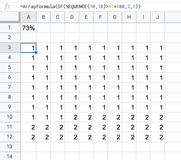
1. Enter a % value in cell A1 e.g. 73%

2. Underneath, in cell A3, enter this SEQUENCE formula:

=SEQUENCE(10,10)

This outputs a 10 by 10 grid of ascending numbers from 1 to 100.

3. Next, adjust the column widths (and row heights) so that the cells are square.

4. Wrap the sequence function with an IF statement and ArrayFormula to check whether the value in a given cell is greater than the threshold percentage:

=ArrayFormula(IF(SEQUENCE(10,10)>A1*100,2,1))

Your output now will look like this:

Grid Chart in Google Sheets

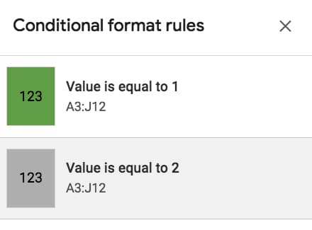
5. Highlight the 10 by 10 grid and add two conditional formatting rules:

  • Green cell background if the value “Is equal to 1”
  • Grey cell background if the value “Is equal to 2”

Conditional Formatting in Google Sheets

6. With the 10 by 10 grid highlighted, add thick white borders to separate the grids. Turn off the gridlines for the Sheet too, for an even cleaner look.

7. Keeping the grid highlighted, change the number format to a custom number format with the emoji symbol: 👤

Format > Number > More formats > Custom number format, then paste in the emmoji: 👤

Custom Number Rule in Google Sheets

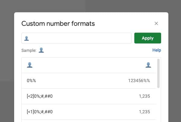
This changes all the values to 👤, regardless of whether it’s a 1 or a 2.

8. Finally, center-align the values horizontally and vertically:

Grid Chart in Google Sheets

Nice!

When you change the % value, the chart will adjust automatically for you.

3-Color Grid Chart

Grid Chart in Google Sheets

To create the 3-color chart shown above, add an additional percentage value and modify the formula to compare against both percentage figures using two IF statements, e.g.:

=ArrayFormula(IF(SEQUENCE(10,10)<=A1*100,1,IF(SEQUENCE(10,10)<=((A2+A1)*100),2,3)))

In the second conditional test, you’ll notice I need to add percentage 1 and 2 together, to get the cumulative value at that point in time.

You also need to add an extra conditional formatting rule for the cells that have the value 3.

Google Sheets Grid Chart Template

Click here to open the Google Sheets Grid Chart template.

This will open a view-only version of the template. Feel free to make your own copy: File > Make a copy

(If you’re unable to open this file it may be because it’s from an outside organization, and my G Suite domain is not whitelisted at your organization. You may be able to ask your G Suite administrator about this.

In the meantime, feel free to open in an incognito window to view it.)

Multi-colored line charts in Google Sheets

In this article, you’ll see how to create a multi-colored line chart in Google Sheets, for example when the line is increasing it’s colored green, when it’s decreasing it’s colored red, as shown in this image:

multi-colored line chart in Google Sheets

Colors are a powerful way of adding context to your charts, to bring attention to certain trends and add additional understanding.

The embedded charts tool in Google Sheets is pretty basic, so we can only achieve this with a formula workaround.

How do I create a multi-colored line chart in Google Sheets?

Basic Example

Let’s start with this basic dataset:

line chart data in google sheets

which, when charted, looks like this:

Basic line chart in google Sheets

To create the colored version seen at the top of this post, we need to add helper columns to the dataset, one to create a dataset of decreasing values, and an optional column to mark the inflection points (where the line changes from going up to going down, or vice versa).

The finished dataset looks like this:

multi colored line chart dataset

The green highlighted cells contain formulas to calculate the decreasing data and the inflection points (see below). The first and last lines in column C and D (cells C2, D2, C11, D11 in this case) are left blank.

The IF function in column C, starting in cell C3 down to C10 is:

=IF(OR(B3>B4,B3<B2),B3,"")

The formula in column D, for identifying inflection points, starting in cell D3 down to D10, is:

=IF(OR(B3=MAX(B2:B4),B3=MIN(B2:B4)),B3,"")

With this data table setup, highlight the whole table (use Ctrl + A, or Cmd + A on a Mac, to do this quickly) and Insert > Chart...:

Multi colored line chart setup in Google Sheets

Then simply format to the style you want, such as coloring the Increasing Series in green and the Decreasing Series in red:

multi-colored line chart in Google Sheets

Problem with this basic interpretation of this chart

This method has a drawback though, if you have adjacent inflection points, i.e decreasing – increasing – decreasing, then it tricks the chart so it colors the whole section decreasing, as shown in this image:

Problem with basic version of multi-colored line chart

The fix

If you encounter this issue of adjacent inflection points, then you’ll need to create additional decreasing series to separate them, like this example dataset:

complex  line chart data

The final chart will then look like this:

complex multi colored line chart

Add the inflection point values

Again we need to split the inflection point data into two columns so there are no adjacent inflection points in these series. The dataset now looks like:

line chart data

and the final chart:

Complex multi-colored line chart in google sheets

Even more customization options

Select the Combo chart instead of the straightforward line chart and change the increasing series to a line and the decreasing series to area charts:

Combo chart in Google Sheets

Your final chart will look like this:

Multi colored combo chart in Google Sheets

And here’s the version with the inflection points marked:

Complex multi-colored line chart in google sheets

Can I see an example worksheet?

Yes, here you go.

How to Create an Annotated Line Graph in Google Sheets

line graph in Google Sheets
Animated line chart in Google Sheets

This post looks at how to make a line graph in Google Sheets, an advanced one with comparison lines and annotations, so the viewer can absorb the maximum amount of insight from a single chart.

For fun, I’ll also show you how to animate this line graph in Google Sheets.

Want your own copy of this line graph?

Click here to access your copy of this template >>

This chart was originally developed for The Write Life during their 4-day product sale earlier this year. It featured as part of a dashboard that was linked to the E-junkie sales platform and displayed sales data in real-time:

Google Sheet e-junkie real-time dashboard

As with any graph, we start with the data:

The data table

Line graph data table

The key to this line graph in Google Sheets is setting up the data table correctly, as this allows you to show an original data series (the grey lines in the animated GIF image), progress series lines (the colored lines in the animated GIF) and current data values (the data label on the series lines in the GIF).

In this example, I have date and times as my row headings, as I’m measuring data across a 4-day period, and sales category figures as column headings, as follows:

Annotated line graph data table

Red columns

The red column, labeled with 1 above, contains historic data from the 2015 sale.

Red column 2 is a copy of the same data but only showing the progress up to a specific point in time.

In red column 3, the following formula will create a copy of the last value in column 2, which is used to add a value label on the chart:

=IF(AND((C2+C3)=C2,C2<>0),C2,"")

Purple columns:

Purple columns 4,5 and 6 are exactly the same but for 2016 data. The formula in this case, in column 6, is:

=IF(AND((F2+F3)=F2,F2<>0),F2,"")

Green columns:

Data in green columns 7 and 8, is our current year data (2017), so in this case there is no column of historic data. The formula in column 8 for this example is:

=IF(AND((H2+H3)=H2,H2<>0),H2,"")

Creating the line graph in Google Sheets

Highlight your whole data table (Ctrl + A if you’re on a PC, or Cmd + A if you’re on a Mac) and select Insert > Chart from the menu.

In the Recommendations tab, you’ll see the line graph we’re after in the top-right of the selection. It shows the different lines and data points, so all that’s left to do is some formatting.

Line graph selection

Format the series lines as follows:

  • For the historic data (columns 1 and 4 in the data table), make light grey and 1px thick
  • For the current data (columns 2, 5 and 7 in the data table), choose colors and make 2px thick
  • For the “max” values (columns 3, 6 and 8 in the data table), match the current data colors, make the data point 7px and add data label values (see steps 1, 2 and 3 in the image below)

Line graph data labels

This is the same technique I’ve written about in more detail in this post:

How can I annotate data points in Google Sheets charts?

Animating the chart with Apps Script

How about creating an animated version of this chart?

Oh, go on then.

When this script runs, it collects the historic data, then adds that data back to each new row after a 10 millisecond delay (achieved with the Utilities.sleep method and the SpreadsheetApp.flush method to apply all pending changes).

I don’t make any changes to the graph or create any fancy script to change it, I leave that up to the Google Chart Tool. It just does its best to keep up with the changing data, although as you can see from the GIF at the top of this post, it’s not silky smooth.

By the way, you can create and modify charts with Apps Script (see this waterfall chart example, or this funnel chart example) or with the Google Chart API (see this animated temperature chart). This may well be a better route to explore to get a smoother animation, but I haven’t tried yet…

Here’s the script:

function startTimedData() {
  var ss = SpreadsheetApp.getActive();
  var sheet = ss.getSheetByName('Animated Chart');
  var lastRow = sheet.getLastRow()-12;
  
  var data2015 = sheet.getRange(13,2,lastRow,1).getValues(); // historic data
  var data2016 = sheet.getRange(13,5,lastRow,1).getValues(); // historic data
  
  // new data that would be inputted into the sheet manually or from API
  var data2017 = [[1],[7],[14],[19],[27],[32],[34],[36],[44],[49],[57],[65],[72],[76],[79],[86],[92],[99],[104],[109],[111],[112],[120],[128],[130],
                  [132],[133],[140],[144],[149],[151],[152],[158],[162],[170],[177],[179],[184],[188],[194],[200],[205],[211],[216],[224],[232],[238],
                  [241],[246],[248],[252],[259],[266],[268],[276],[284],[291],[299],[300],[301],[306],[311],[315],[316],[323],[324]];
  
  for (var i = 0; i &lt; data2015.length;i++) {
    outputData(data2015[i],data2016[i],data2017[i],i);
  }
  
}

function outputData(d1,d2,d3,i) {
  var ss = SpreadsheetApp.getActive();
  var sheet = ss.getSheetByName('Animated Chart');
  
  sheet.getRange(13+i,3).setValue(d1);
  sheet.getRange(13+i,6).setValue(d2);
  sheet.getRange(13+i,8).setValue(d3);
  Utilities.sleep(10);
  SpreadsheetApp.flush();
}

function clearData() {
  var ss = SpreadsheetApp.getActive();
  var sheet = ss.getSheetByName('Animated Chart');
  var lastRow = sheet.getLastRow()-12;
  
  sheet.getRange(13,3,lastRow,1).clear();
  sheet.getRange(13,6,lastRow,1).clear();
  sheet.getRange(13,8,lastRow,1).clear();
  
}

On lines 6 and 7, the script grabs the historic data for 2015 and 2016 respectively. For the contemporary 2017 data, I’ve created an array in my script to hold those values, since they don’t exist in my spreadsheet table.

This code is available here on GitHub.

Finally, add a menu for access from your Google Sheet with the following code:

function onOpen() {
  var ui = SpreadsheetApp.getUi();
  
  ui.createMenu("Timed data")
    .addItem("Start","startTimedData")
    .addItem("Clear","clearData")
    .addToUi();
}

This allows you to run the Start and Clear functions directly from your Google Sheet browser tab, rather than the script editor tab.

That’s it. Hit Start and you should see your chart animate before your eyes:

Animated Apps Script chartAnimated Apps Script chart

If you look closely, you’ll also see the data populating your sheet.

Dashboard Design Checklist: From a Blank Google Sheet to Business Insights

Dashboard design is hard.

You start with a blank canvas, or a blank Google Sheet in this case, and you have to somehow turn that into business insights, which will grow your bottom line, make your organization more efficient or help you understand your customers better.

Dashboard design process
Notice the blank sheet is Draft 1 and the final dashboard is Draft 4. It’s an iterative process. Click to open larger image in new browser tab.

The blank screen stares back at you, waiting for you to do something.

It feels overwhelming.

You clasp your hands around the back of your head, lean back in your chair and rue the day you mentioned building a dashboard to your boss.

It was supposed to be easy. Easy to create a masterpiece, a thing of beauty to wow your team.

Meanwhile, that blank Sheet continues to stare back at you, emptier than ever.

Dashboard design starts with a blank Google Sheet

Continue reading Dashboard Design Checklist: From a Blank Google Sheet to Business Insights

How can I format individual data points in Google Sheets charts?

In this article, you’ll see how to annotate your Google charts, by adding formatting and data labels to specific data points only.

Formatting specific datapoints or adding data labels are a very powerful way of adding context to your charts, to bring attention to certain data points and add additional explanation.

How to add formatting to individual data points only?

Custom formatting for individual points is available through the chart sidebar: Chart Editor > CUSTOMIZE > Series > FORMAT DATA POINTS

Chart Editor format series

Continue reading How can I format individual data points in Google Sheets charts?