Let’s talk about funnel charts in Google Sheets.
The charts themselves are a bit of a novelty. Yes, they’re aesthetically pleasing because of that resemblance to a real-world, tapering funnel, which reinforces their message, but a plain ole’ bar chart would be equally suitable and actually easier to read data from (because the bars have a common baseline).
However, they throw up some interesting techniques in Google Sheets and for that reason, merit this long article.
We’ll build them using tricks with the chart builder tool, then with two different types of funky formula and finally, and best of all, we’ll build a tool using Apps Script, as shown in this image:
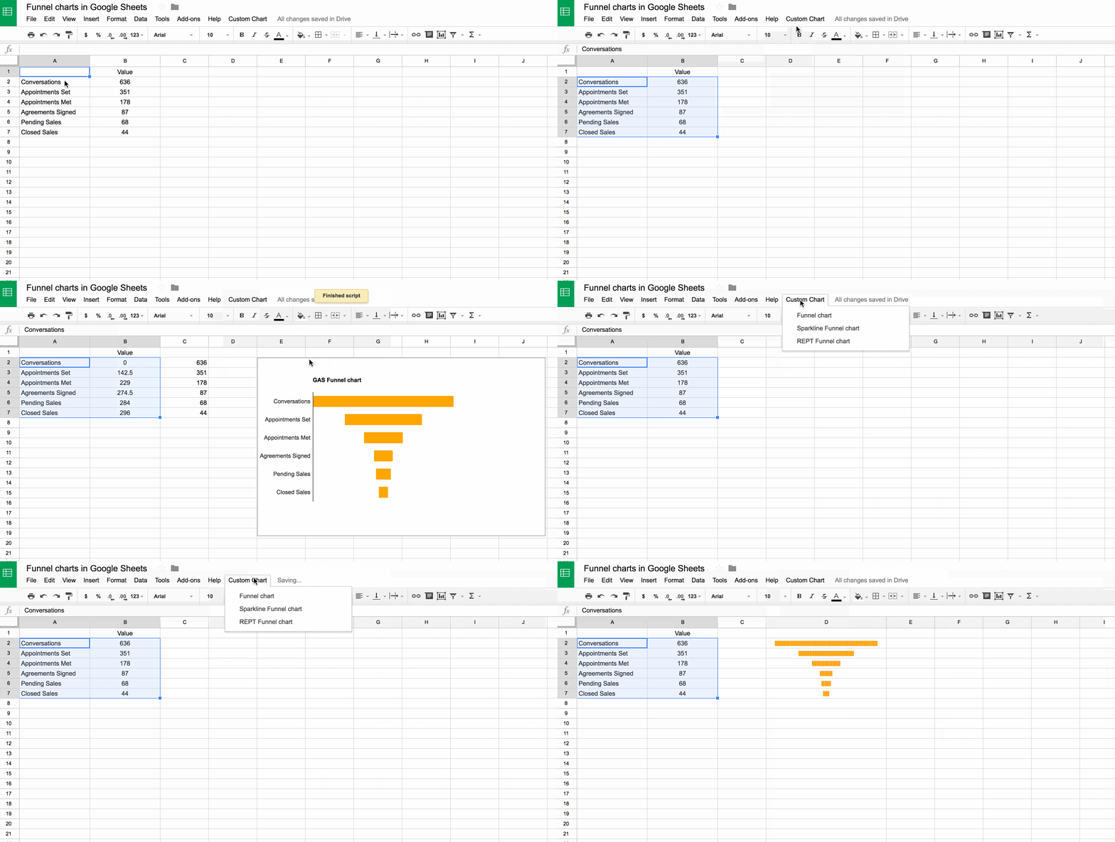
As with the waterfall charts in Google Sheets, they’re not one of the out-the-box charts available to us, so we have to manually create them with a crafty workaround. Thankfully, they’re relatively simple to create, certainly simpler than the waterfall chart.
For all of these examples, we’ll use this fictitious real-estate dataset:
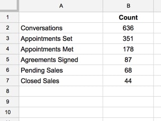
Here, I’m imagining the real estate agency collects data relating to their sales funnel, and they want to display it in a funnel chart format.
Click here to open up the Google Sheet template and make your own copy (File > Make a copy...).
Funnel charts in Google Sheet with the embedded chart builder
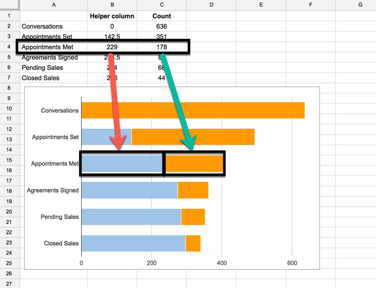
As with the waterfall charts in my earlier post, the trick here is to use a stacked bar chart with transparent base bars, to achieve the floating effects:
Step 1: Create a helper column
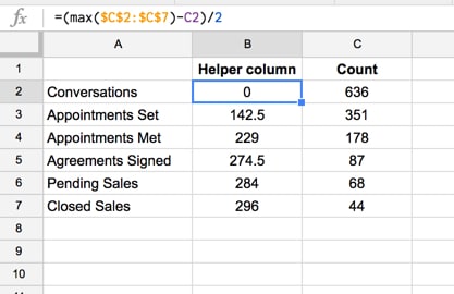
So the first thing to do is to create a helper column containing the values for the transparent bars.
Move the data from column B into column C, so B1:B7 are now sitting in cell range C1:C7. In the new blank column, add the heading “Helper column” and insert the following formula:
=(max($C$2:$C$7)-C2)/2This formula determines the max value in our data (in this case 636), calculates the difference between the max and the current value and then divides the result by 2 to center the bar, like so:
Step 2: Insert a chart
Highlight the new data range, including the helper column, and click Insert > Chart....
Make sure you select Stacked Bar Chart from the Chart Types options.
You should end up with a chart like this (image shows how the data is plotted):
Step 3: Set the helper column bar color to none
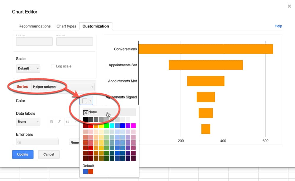
Set the helper column bars to be transparent, thereby “hiding” them to give the appearance of floating bars in a funnel chart.
Step 4: Add data labels and remove x-axis
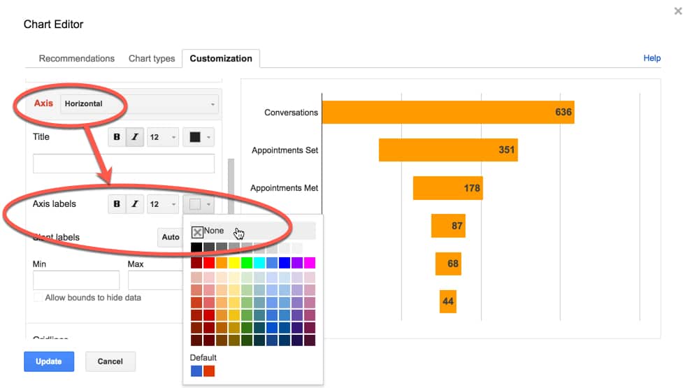
This is an important step. Take a look at the x-axis as it stands. It’s meaningless really, because our bars are floating in the middle of the chart area.
We can fix this by adding data labels, then removing the x-axis labels altogether:
That’s it!
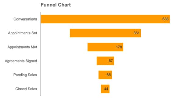
Our final chart should look something like this:

Funnel charts in Google Sheets with sparklines
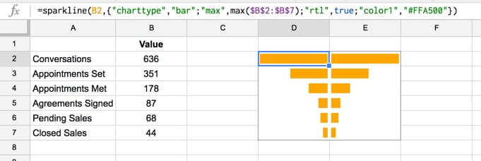
We can use the sparkline formula to create funnel charts in Google Sheets:
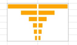
Assuming we have the same data above, in the range A2:B7, then use the following sparkline formulas:
In column D:
=sparkline(B2,{"charttype","bar";"max",max($B$2:$B$7); "rtl",true;"color1","#FFA500"})Notice the option "rtl",true, which specifies the direction of the bar within the cell, allowing the symmetrical appearance.
In column E:
=sparkline(B2,{"charttype","bar";"max",max($B$2:$B$7); "color1","#FFA500"})as follows:
Funnel charts in Google Sheets with the REPT function
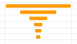
Another method, similar to the sparkline approach. We use the REPT function and some funky font formatting to create the funnel chart.
Here’s what the final chart looks like:
Again, with the data in range A1:B7, add the following formulas into column D:
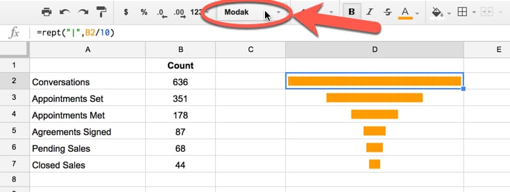
=rept("|",B2/10)The “|” is the pipe symbol, usually found above the Enter key.
The value 10 is a scale factor to ensure the largest bar fits into the cell, so feel free to adjust this as needed until your largest bar fits. It’s imperative to use the same scale factor value in each formula though.
Next change the font to make the pipe symbols thicker – I’ve found font Modak works pretty well for this – and then ensure all the cells with the REPT formulas are center aligned. :
Using Apps Script to build an automatic funnel chart tool
Saving the best to last, let’s write some apps script code to create each of these charts automatically for us!
If you’re new to Apps Script, check out my introductory post on the subject first.
I’ll show you how to use the apps script template first, then run through the code.
Steps to use this template:
1. Click here to open up the Google Sheet Apps Script funnel chart.
2. Create your own copy (File > Make a copy...)
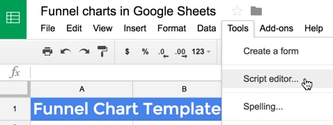
3. Open the Script Editor window (Tools > Script editor...)
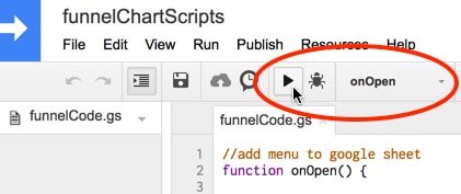
4. Select and run the onOpen() function to add the custom menu
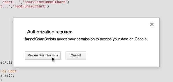
5. Click Review Permissions in the Authorization required popup:
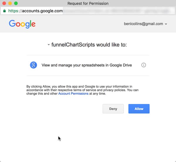
6. Review the permissions, in this case accessing your spreadsheets in Google Drive, and click Allow:
7. Return to your spreadsheet, to the tab called With Apps Script, and you’ll now have a Custom Chart menu, with options for the three different funnel charts. Highlight your data (excluding the heading) and then insert the funnel chart you’re after:

Boom! You have your own working copy of the funnel chart tool.
For those wanting to see under the hood, let’s take a look at the code:
Code for the custom menu
First step is to add a custom menu so that we can simply click a button to insert the funnel chart of our choosing (embedded charts, sparklines or REPT formulas).
This is straightforward boilerplate code from the Apps Script documentation (read more here).
//add menu to google sheet
function onOpen() {

  //set up custom menu
  var ui = SpreadsheetApp.getUi();
  ui.createMenu('Custom Chart')
    .addItem('Funnel chart...','funnelChart')
    .addItem('Sparkline funnel chart...','sparklineFunnelChart')
    .addItem('REPT funnel chart...','reptFunnelChart')
    .addToUi();
};
Funnel charts in Google Sheets using the chart builder
This is a two stage process: first, create the helper column so the data is ready, and second, insert a chart using Google Sheets’ chart tool.
In lines 5 – 26, we grab the data range, move the values column one to the right and insert a new value into the helper column, using the formula [(maxVal - d[1]) / 2]
Inserting the chart is relatively straightforward, and most of the code in lines 31 – 44 relates to setting options to make the chart look the way we want.
// embedded chart builder
function funnelChart() {

  // get the sheet
  var sheet = SpreadsheetApp.getActiveSheet();

  // get the range highlighted by user
  var range = sheet.getActiveRange();
  var data = range.getValues();

  // move the values one column to the right, to make space for helper column
  range.offset(0,range.getNumColumns(),range.getNumRows(),1)
    .setValues(data.map(function(d){
      return [d[1]];
  }));

  // get the max of the data
  var maxVal = Math.max.apply(Math, data.map(function(d){
      return [d[1]];
  }));

  // create the helper column
  range.offset(0,range.getNumColumns()-1,range.getNumRows(),1)
    .setValues(data.map(function(d){
      return [(maxVal - d[1]) / 2];
  }));

  // make the new funnel chart
  // To do: add the data labels to the bars with the annotations option
  // see: https://developers.google.com/chart/interactive/docs/gallery/barchart#labeling-bars
  sheet.insertChart(
    sheet.newChart()
    .addRange(sheet.getDataRange())
    .setChartType(Charts.ChartType.BAR)
    .asBarChart()
    .setColors(["none", "#FFA500"])
    .setStacked()
    .setOption("title","GAS Funnel chart")
    .setOption("hAxis.gridlines.color","none")
    .setOption("hAxis.textStyle.color","none")
    .setLegendPosition(Charts.Position.NONE)
    .setPosition(2, sheet.getLastColumn()+2,0,0)
    .build()
  );
};
Here’s a challenge to you (and me): add the data labels to the bars.
Hint: start with this article in the Apps Script documentation.
Funnel chart code for sparkline version
In this example, there’s no need to change the data.
So I just need to create the left and right sparklines in adjacent columns. I do this by creating a left array, formulasLeft, and a right array, formulasRight, to hold all these text formulas. I loop over the original data values and for each one, create sparkline formulas that I add to formulasLeft and formulasRight respectively.
Finally, I identify the output range and paste in these left and right formulas. I use the R1C1 notation to allow me to position formulas relative to where the original data values are.
They show up as sparklines in our Google Sheet!
// sparkline chart builder
function sparklineFunnelChart() {

  // get the sheet
  var sheet = SpreadsheetApp.getActiveSheet();

  // get the range and data highlighted by user
  var range = sheet.getActiveRange();
  var data = range.getValues();
  var len = data.length;

  // sort the range by the second column of values, highest to lowest and find max value
  var sortedRange = range.sort({column: range.getColumn()+1, ascending: false});
  var maxVal = sortedRange.getValues()[0][1];

  // create array to hold sparklines left
  var formulasLeft = [];
  for (j = 0; j < len; j++) {
    var optionsLeft = '{"charttype","bar";"max",R[-' + j + ']C[-2]; "rtl",true; "color1","#FFA500"}';
    var sparklineFunnelLeft = "=SPARKLINE(R[0]C[-2]," + optionsLeft + ")";
    formulasLeft.push([sparklineFunnelLeft]);
  }

  // create array to hold sparklines right
  var formulasRight = [];
  for (i = 0; i < len; i++) {
    var optionsRight = '{"charttype","bar";"max",R[-' + i + ']C[-3]; "color1","#FFA500"}';
    var sparklineFunnelRight = "=SPARKLINE(R[0]C[-3]," + optionsRight + ")";
    formulasRight.push([sparklineFunnelRight]);
  }

  // identify range for sparkline output
  var funnelOutputLeft = sheet.getRange(range.getRowIndex(),range.getColumn()+3,len,1);
  var funnelOutputRight = sheet.getRange(range.getRowIndex(),range.getColumn()+4,len,1);

  // put the sparkline formulas into the output ranges
  funnelOutputLeft.setFormulasR1C1(formulasLeft);
  funnelOutputRight.setFormulasR1C1(formulasRight);
};
Funnel chart code for REPT version
This is pretty similar to the sparkline version above and even simpler because I don’t need to create two sets of formulas with the left/right symmetry.
Again I loop over my array of data values and create a REPT formula text string in a new array. Then I identify the output range and insert this array of formulas.
The final step is to format the output to the correct font and color to achieve the desired funnel chart look.
// REPT chart builder
function reptFunnelChart() {

  // get the sheet
  var sheet = SpreadsheetApp.getActiveSheet();

  // get the range and data highlighted by user
  var range = sheet.getActiveRange();
  var data = range.getValues();
  var len = data.length;

  // sort the range by the second column of values, highest to lowest and find max value
  var sortedRange = range.sort({column: range.getColumn()+1, ascending: false});
  var maxVal = sortedRange.getValues()[0][1];
  var scaleFactor = maxVal / 65; // trial and error to calculate that this gives a good scaling for a column width of 250

  // create array to hold REPT formulas
  var formulas = [];
  for (j = 0; j < len; j++) {
    var rept = '=REPT("|",R[0]C[-2] /' + scaleFactor +')';
    formulas.push([rept]);
  }

  // identify range for REPT output
  var reptOutput = sheet.getRange(range.getRowIndex(),range.getColumn()+3,len,1);

  // format output range for REPT funnel chart
  reptOutput.setFontFamily("Modak");
  reptOutput.setFontColor("#FFA500");
  reptOutput.setHorizontalAlignment("center");

  // set the column width to 250 for the REPT chart column
  sheet.setColumnWidth(range.getColumn()+3, 250)

  // put the sparkline formulas into the output ranges
  reptOutput.setFormulasR1C1(formulas);
};
The full code is available here on GitHub.
Check out this GIF showing the apps script in action:

If you’ve enjoyed this post, check out my other recent Google Visualization articles: Waterfall charts, animated temperature charts and Tufte recreations.
Thank you so much!!! I didn’t know how to do this and it worked perfectly for me. You’re the best
Thanks a ton, this is super helpful.
How would one add the % drop-off between each step to the charts? Ex:
Step 1: 100
-50%
Step 2: 50
-10%
Step 3: 45
Many thanks, this is perfect!
Great post, thanks a lot! Is there a way to use this same method, from a google sheet into a DataStudio report, with the same type of “funnel barchart”? thanks again, I will defintely be using this method for Sheets data
Great post! Thank you!
Is it just me, or is step 3 (hiding the helper) isn’t working anymore? Sure, I can copy the sheet, but trying to duplicate the chart in another sheet doesn’t seem to work.
Hey Nico, It should still work for you. The screenshots show the old chart editor though, so it does look a little different now. Once you have a stacked bar chart setup, select the helper column series and set the color to none (or white) and it should work.
Hi Ben,
This is all working perfectly, except the right side of the bars are slightly rounded, making the chart look a little off. Is there any way to change the bars to just be rectangles?
Hi Ben,
Using app script to create funnels is amazing!!
But can funnels be created for Google Analytics, likewise funnels are created in GA.
Or to be precise, Can a GA flow be created using app script for GA.
Thanks
Sid
Man, great hack! Thank you!
This was great! Thank you for posting this information!
Phenomenally useful. Thank you so much
THANK YOU SO MUCH FOR THE IDEATION
Great solution Ben, thank you!
Really helpful, like all your advanced courses¡¡