My Twitter feed is mostly populated with data-related resources and people, so I almost always find something new and shiny going on there to distract me.
Sometimes this can be a good thing though (and sometimes, it can be the best thing ever).
Take last Friday. I found myself procrastinating, browsing my home feed when I saw this tweet for the upcoming Microsoft Data Science summit:
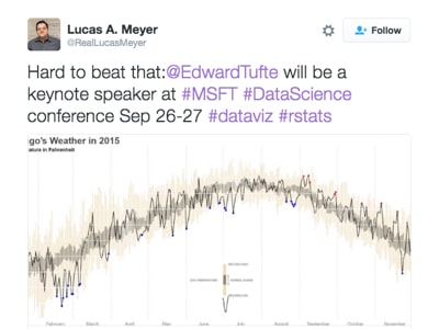
What caught my eye was not the actual tweet, but the sumptuous weather visualization that I recognized as one of Edward Tufte’s famous creations.
I clicked through to the article, which linked to Tufte’s original chart (here) and a fantastic tutorial about re-creating the chart using R, from Brad Boehmke (which is actually the chart shown in the tweet above).
It looks at daily average temperature over a period of time and captures the historic min/max range, the normal range (95% confidence interval), the 2014 temperature line and picks out the highs and lows. It renders all of this information in a single, beautiful column/line combination chart.
Curiousity piqued, I wondered whether this would be possible with Google Sheets?
The short answer is…..
…no, well maybe, ok yes, but not with Google Sheets alone (we need the Chart API too).
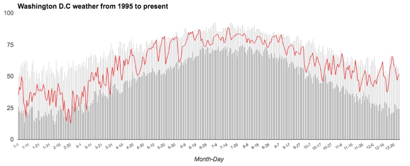
You can create something bearing a resemblance in Google Sheets only, but with significant shortcomings as I’ll discuss below.
Ok, so how else can you improve it? Well Google supports a Chart API, where you can leverage Google’s charts, but with much more control and customization options using a small amount of Javascript code.
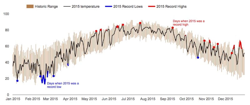
Using this API with the data in my Google Sheet, I was able to create something pretty similar to Brad Boehmke’s R version of Tufte’s original chart:
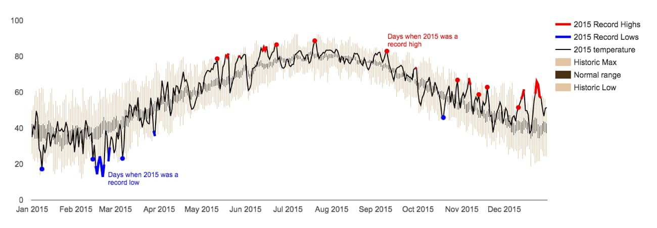
Here’s this same chart live on my site.
Attempt 1: natively in Google Sheets
Getting the raw data
The University of Dayton has archived a dataset for each city as a .txt file of average daily temperatures. Find the city you’re interested in (I’m using Washington D.C. in this example) and click the link to open the text file.
Then in a new blank Google Sheet, type the following formula, inserting the URL of the text file for the city you’ve chosen:
=importdata("http://academic.udayton.edu/kissock/http/Weather/gsod95-current/MDWASHDC.txt")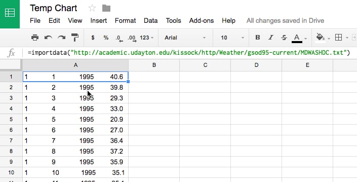
Unfortunately, the data is all imported into a single column, so we need to do some data cleaning before it’s ready.
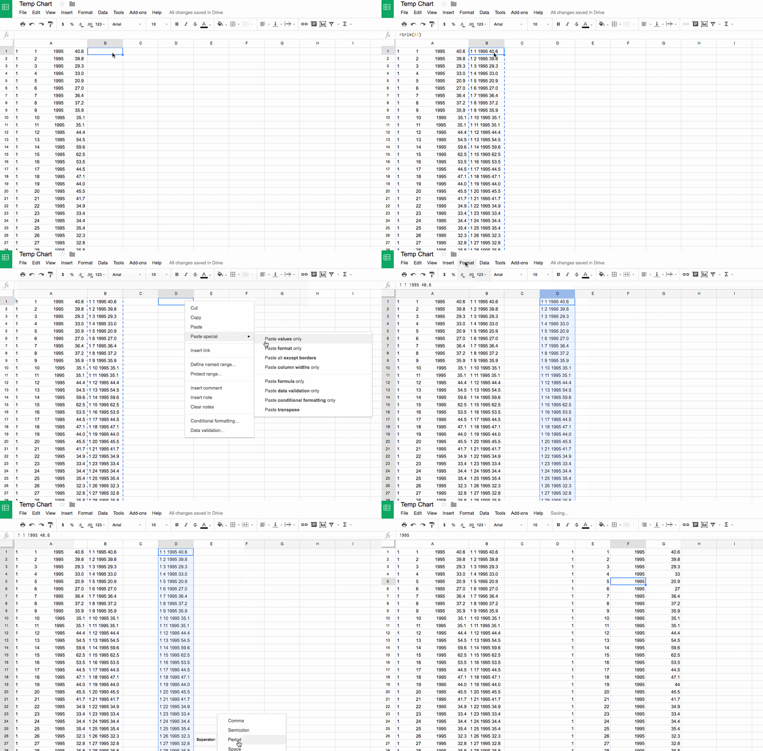
What we’ll do is use Text-To-Columns (now available in Google Sheets) to split the data into columns, splitting the data by spaces. However there’s currently a uneven number of spaces which means the data won’t line up nicely into columns.
Use this TRIM formula in the adjacent column to normalize all of the values to only have a single space between values:
=TRIM(A1)Then copy this new column, and then text-to-columns with the space delimiter and you’ll have your cleaned data ready. Easy!
Lastly add a new row above this raw data and add suitable column headings: Month, Day, Year, Av. Daily Temperature
Preparing the data for charting
Presently the data is in a tall format (great for databases and Tableau) whereas we need a wide, table format for this chart. Read more about the shape of data in this excellent article from Robert Kosara.
To do this we need to use a pivot table.
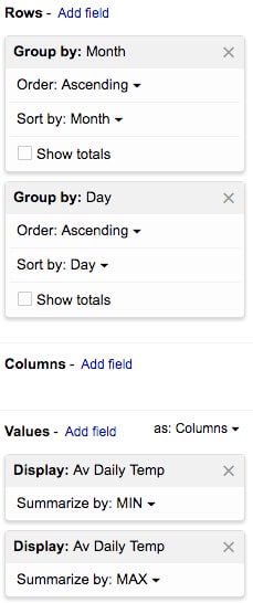
Highlight the raw data and click Data > Pivot table...
Set it up like this:
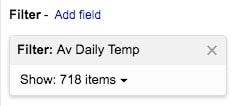
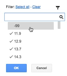
Add a filter to remove the “-99” outliers that will affect the results:
and it should look like this:
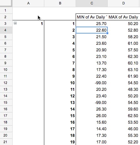
This gives us our historic temperature range, with a min and max temperature for each day of the year.
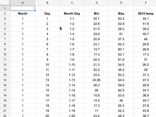
Copy this into a new table, combine the Month and Day fields (e.g. using =A3&"-"&B3) and add the 2015 data, so you end up with:
Creating the chart
Highlight the last four columns of this dataset (from Month-Day on) and Insert > Chart...
Choose the combination chart, then specify the Min and the Max series as column charts and the 2015 series as a line chart:
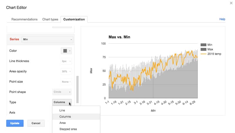
After a few tweaks I ended up with this, which was about the closest I could get to the original:

I can hear your questions already…
Why not set the Min to white? Try it, and you’ll see that the max extends all the way to the x-axis and you’re back to square one.
Ok, so why not use a stacked column chart? Because you can’t in a combination chart!
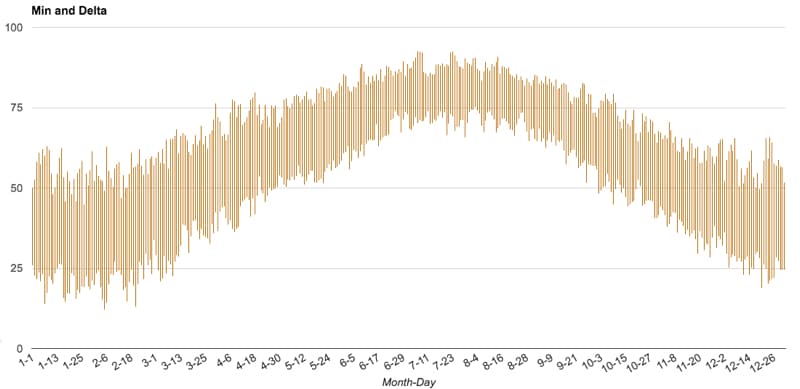
You can create this stacked column chart, but you can’t add the 2015 line series to it 🙁
Don’t fret, there is another way!
Attempt 2: using the Google Charts API with Google Sheets
Rest assured we can get much closer using the Google Chart API, by writing a few lines of Javascript to customize our chart settings. Here’s version 1 using the Charts API.
Preparing the data
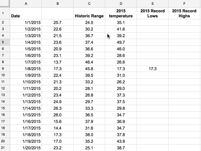
Not a huge deal to do here, but since we can use a stacked column chart in this case we need to set that up. Create a new column called Historic Range that is simply the Max minus the Min, which we’ll use as our series 2. This represents the record low and high average daily temperatures in the past 20 years.
Also, create two new columns called 2015 Record Lows and 2015 Record Highs, which we’ll use to mark when the 2015 series line corresponds to the minimum or maximum temperature in the range.
For minimum, test if the 2015 temperature equals the minimum on that day, and if so print the result in this new minimum column, otherwise leave it blank:
=if(D2=B2,D2,"")Similarly for the maximum, test if the 2015 temperature is equal to the minimum plus the range value (i.e. the max) that day, otherwise leave blank:
=if(D2=(C2+B2),D2,"")The final dataset should look something like this:
Here’s a link to the Washington, D.C. dataset if you want.
Writing the code for the chart
Here’s all the code to create our chart:
<script type="text/javascript" src="https://www.gstatic.com/charts/loader.js"></script>
<script type="text/javascript">
// Load the Visualization API and the corechart package.
google.charts.load('current', {'packages':['corechart']});
// Set a callback to run when the Google Visualization API is loaded.
google.charts.setOnLoadCallback(drawChart);
// Callback that pulls data from Google Sheet,
// instantiates the chart, passes in the data and
// draws it.
function drawChart() {
var queryString = encodeURIComponent('SELECT A, B, C, D, E, F');
var url = "<Put your own Google Sheet sharing URL here, with editing enabled>";
var query = new google.visualization.Query(url + '#gid=0&headers=1&tq=' + queryString);
query.send(handleQueryResponse);
}
function handleQueryResponse(response) {
if (response.isError()) {
alert('Error in query: ' + response.getMessage() + ' ' + response.getDetailedMessage());
return;
}
var data = new google.visualization.DataTable();
data.addColumn('date', 'Date');
data.addColumn('number', 'Min');
data.addColumn('number', 'Delta');
data.addColumn('number', '2015 temp');
data.addColumn('number', '2015 Min');
data.addColumn('number', '2015 Max');
var raw_data = response.getDataTable();
var chart = new google.visualization.ComboChart(document.getElementById('chart_div'));
var options = {
height: 600,
width: 1500,
seriesType: 'bars',
isStacked: true,
series: {
0: { type: 'bars', color: 'white', enableInteractivity: false },
1: { type: 'bars', color: '#aa7243' },
2: { type: 'line', color: 'black' },
3: { type: 'line', color: '#0000e6', lineWidth: 5 },
4: { type: 'line', color: '#e50000', lineWidth: 5 }
},
hAxis: {
gridlines: { count: 12, color: 'white' }
//format: 'date'
},
vAxis: { gridlines: { count: 6, color: 'white' } },
legend: 'top'
};
// draw chart
chart.draw(raw_data, options);
}
</script>
A lot of this code is boilerplate from the Google Chart API examples.
Highlighting a few of the key lines in here:
- The Google corechart package is loaded on line 5.
- On line 16 I specify the URL of my Google Sheet (which needs to be shared with editing access*).
- Line 14 specifies which columns I want to select from my Google Sheet.
- A blank Data Table is setup in lines 28 – 34.
- The raw data from my Google Sheet is added in line 36.
- On line 37 I specify a new combo chart to be added to the chart_div element of my webpage.
- In the options in lines 39 – 54, I specify the different settings for the chart. Note that I can refer to each of the different series by number and then add specific key/value pair settings, like so:
3: { type: 'line', color: '#0000e6', lineWidth: 5 } - The minimum bars, series 0, have the most important settings:
0: { type: 'bars', color: 'white', enableInteractivity: false }
they’re set to white and have the interactivity disabled, so that no tooltip or highlighting will show up when I hover over them with the mouse. - Finally on line 60, I draw the chart with the raw data, based on all the settings in my options object.
* Need to get the Google Sheet link with editing rights, otherwise you’ll get an error and need to setup authorization… read more.
For it to work, I need to then add the requisite HTML, which is:
<html>
  <head>
    <!-- Javascript from above goes in here -->
  </head>

  <body>

    <!--Div that will hold the chart-->
    <div id="chart_div"></div>
</html>
You should be able to drag and drop this local file into your browser and see the chart open up. Voila!
Further developments
Adding confidence bands: To add the normal range, simply add additional series to the Google Sheet representing the normal range (the confidence band) and then add them to the Chart code above.
In the pivot table, add columns for mean, standard deviation and a count of the number of records for each day. Then use the confidence formula to calculate a confidence interval.
Here’s the updated Google Sheet data table and the new code on Github.
Here’s version 2 of the Google Charts API rendering of Tufte’s temperature chart:

Annotating the chart: I added a couple of overlays to explain the red and blue series on the chart with absolute positioning per the documentation. So apologies if they appear a little out of place…
I’ll leave it for you to experiment with them.
Here’s the full code on Github, including the confidence bands and overlays. Don’t forget to insert your Google Sheet link where I have the comment “Put your own Google Sheet sharing URL here, with editing enabled”.
Here’s the link to the actual chart on my website.
If you liked this post then you may enjoy my follow-up where I re-create another classic chart using Google Sheets and the Google Visualization API – this time an animated temperature visualization.
Great article, thank you
Great learning resource – thaks
Lovely card, a great image for your vintage card, I've joined as a follower so hopefully will get back as often as I can to check out your lovely crnaeions,Satdy
Awesome! I’ve been meaning to add something like this to all the phenology data I have from native plants blooming/fruiting/etc. I’ll check out the raw data… any rainfall numbers?
Unfortunately I don’t have any rainfall data, but I’m sure it’ll be out there somewhere. I found the DC temperature dataset used here through Google search.
I did a follow up article on a dynamic chart with this same dataset.
Good luck!
Say, how did you propagate the trim formula to the cells? I see the control + down for the dataset.
—-nevermind, thinking two steps ahead 😛
Hi. I’m having a hard time replicating this exercise. Where should I copy this code into? In Google Sheets script editor I tried pasting it into a html file and a script file but it seems I’m doing something wrong. Could you explain the correct way to do it?
I just spent a week revisiting these technologies and ran into all these same issues (trying to make the perfect, labeled waterfall in my case) and ultimately went with a native chart. End result has some of these same tricks! How much have you continued to use and master the visualization API?
Hey Max! Not at all really since this post and the animated chart post. But I’d love to explore again when time permits.