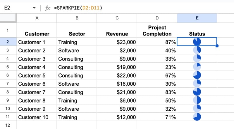
In this post, we’ll look at how to create miniature formula pie charts in Google Sheets. Formula pie charts are miniature pie charts that exist inside a single cell of a Google Sheet.
We’ll even create a Named Function to make it super easy to use these miniature pie charts. We’ll name this new function SPARKPIE, in honor of the eponymous SPARKLINE function.
How to Use the SPARKPIE Named Function to Create Formula Pie Charts
Before we dive into the complexities of the SPARKPIE formula, feel free to simply copy the template and start using it.
Step 1: Make a copy of the Formula Pie Charts Template.
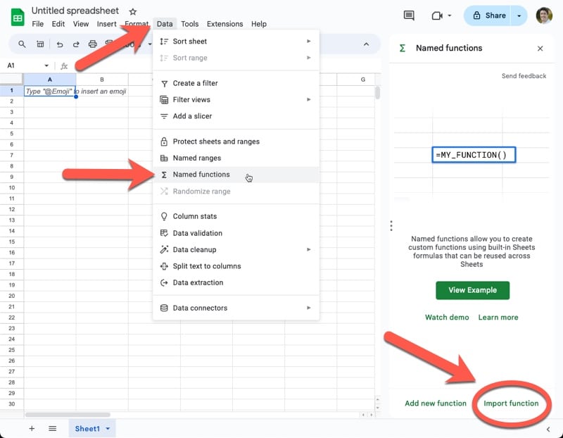
Step 2: In another Sheet, where you want to create mini pie charts, import the Named Function SPARKPIE from your copy of the template.
Go to: Data > Named functions
Then select: Import function
Then, find the copy of the new template file we copied above, most likely under the Recent tab:
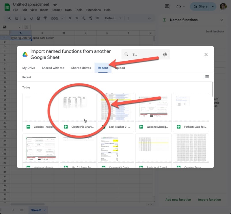
Select the file and click Insert.
Then select the SPARKPIE named function to import it:
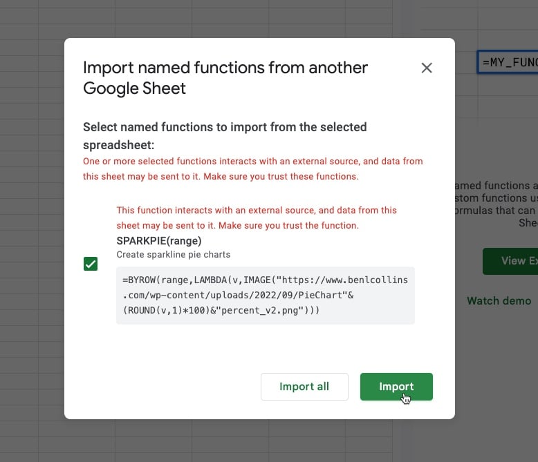
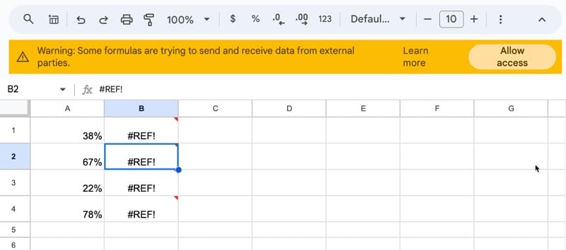
The red warning text is because the named function contains the IMAGE function, which imports external data.
Step 3: Before using SPARKPIE for the first time, we need to authorize it to receive external data, since it uses the IMAGE function.
Click “Allow access” to authorize it:
Step 4: Thereafter, we can use it like any other function:
The SPARKPIE syntax is:
=SPARKPIE(range)
It takes a single argument: range, which is a percent value (represented as a percent or as a decimal number between 0 and 1).
How Formula Pie Charts Works
Below, I run through a full breakdown of the formulas. But, before we get to that, I want to explain this technique at a high level.
Each of the mini pie charts is in fact an image, displayed using the IMAGE function. The formula works by finding the pie chart image that is closest to the input value.
So I created 11 pie charts in Google Sheets for each 10% interval, so 0%, 10%, 20%, 30%, etc. up to 100%, with no titles or legends (e.g. like this one).
Note: if you want more accurate formula pie charts, create more pie chart images. For example, you could try 5% intervals or even 1% intervals if you have infinite patience. You can also change the colors.
I downloaded these 11 pie charts as images (this option is found under the three dots menu in the upper right corner of any chart). Then I uploaded them to my server. It’s necessary to have the images available at a public URL so that the IMAGE function can access them from your Sheet.
Feel free to use the 11 pie chart images I created.
You can use the named function from the template (link at the end of this article) or follow the steps below to create your own. Either method will use the URLs of the pie chart images I uploaded (for reference, here’s a list of the URLs).
Create Your Own Pie Chart Formulas
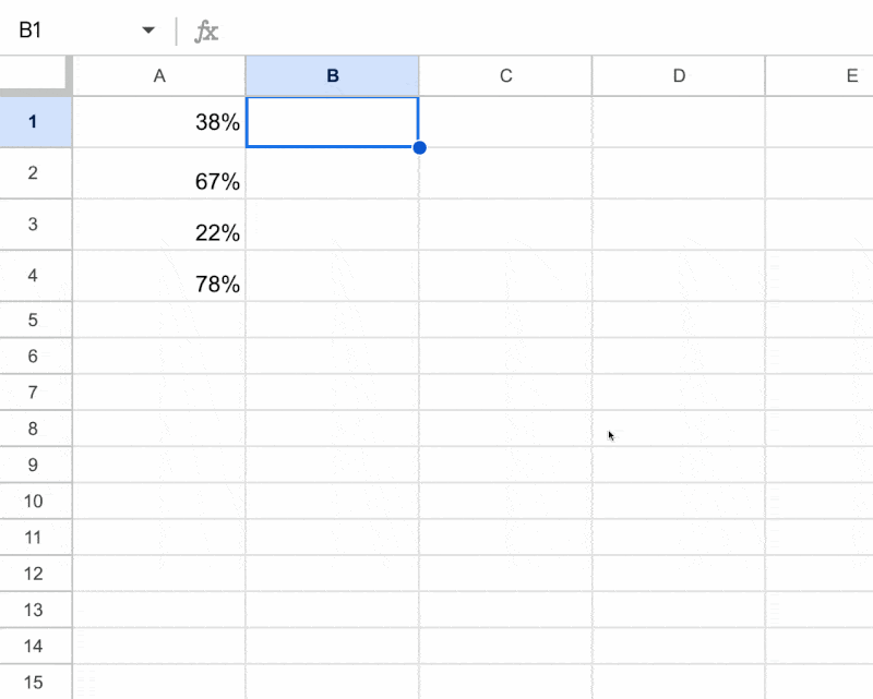
Let’s put a percentage number in cell A1. Enter it as 0.38 and format as a percentage with the “%” button in the toolbar.
In cell B1, enter this formula:
=ROUND(A1,1)*100This rounds the percent value to the nearest 10% and then multiplies it by 100, to convert the decimal to a number between 0 and 100.
This is done so that it matches one of the numbers in the 11 pie chart image URLs.
In cell C1, enter this formula to build a string URL containing the number for the percent value:
="https://www.benlcollins.com/wp-content/uploads/2022/09/PieChart"&B1&"percent_v2.png"In our example, these two formulas convert 38% to an image URL as follows:
38%
–> 40%
–> 40
–> https://www.benlcollins.com/wp-content/uploads/2022/09/PieChart40percent_v2.png
These string URLs are the URLs of pie chart images on my server. Here’s the full list of them.
Turn this URL into an image with this formula in cell D1:
=IMAGE(C1)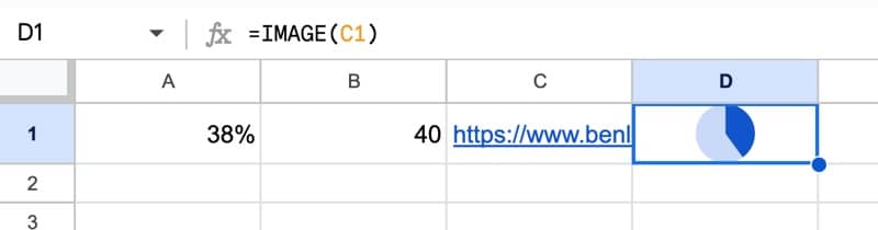
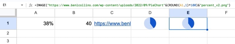
Finally, following the Onion Framework, we work backwards, nesting each formula into the outer formula.
Thus, in E1, we have the final form of the single pie chart formula:
=IMAGE("https://www.benlcollins.com/wp-content/uploads/2022/09/PieChart" & (ROUND(A1,1)*100) & "percent_v2.png")In our Sheet:
Extend to Work With Ranges
Let’s extend this formula to work with ranges as well as single cells. To do this we’ll use the BYROW and LAMBDA functions.
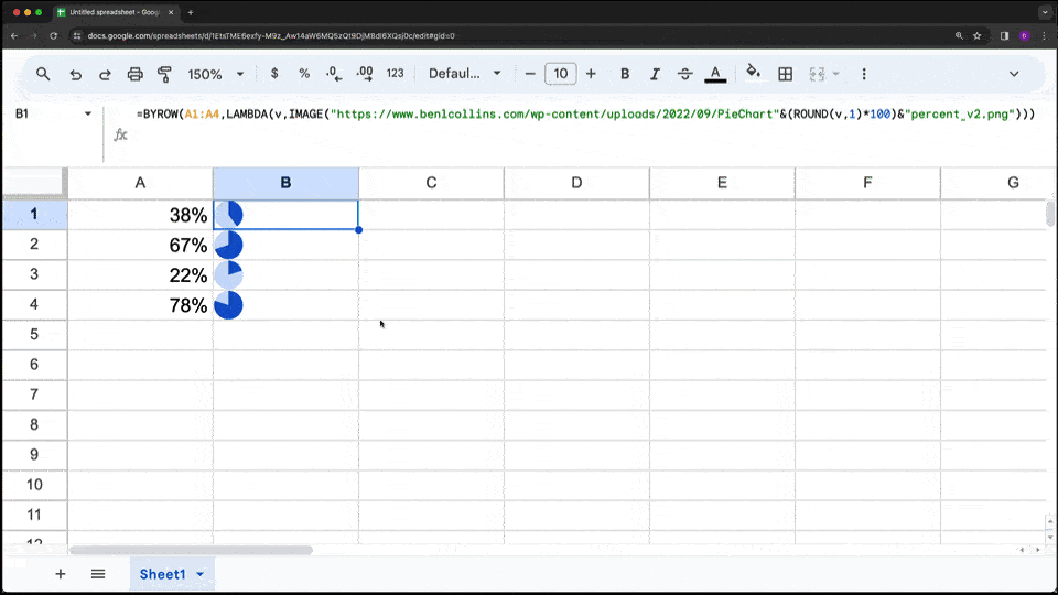
Add some additional percentage values in cells A2, A3, and A4, so that we have percentages in the range A1:A4.
Now change the formula in cell E1 to a lambda-style formula:
=BYROW(A1:A4,LAMBDA(v,IMAGE("https://www.benlcollins.com/wp-content/uploads/2022/09/PieChart" & (ROUND(v,1)*100) & "percent_v2.png")))BYROW applies the inner LAMBDA function to each element of the array. I.e. each percent value in turn is turned into the URL and then into an IMAGE.
Create a Named Function
The final step is to turn this BYROW formula into a Named Function, so it’s much easier for others to use.
Right click on the cell containing the SPARKPIE formula.
At the bottom of the right-click menu, select View more cell actions > Define named function
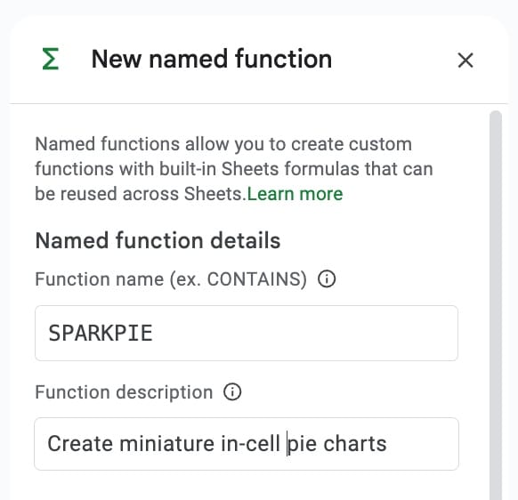
In the name box, enter SPARKPIE and give it a suitable description:
Under the description, leave the argument placeholder box empty.
The formula will be showing in the Formula definition box. Under this will be the range argument A1:A4. Click this and replace it with the suggested “range” variable.
Click Define to swap the specific A1:A4 range reference to a general placeholder “range”.
Then click Next and complete the argument details for argument description and example on the next screen.
This process to define a Named Function is shown here:
Back in our Sheet, we can now use this new function in the same way we use a regular function:
=SPARKPIE(A1:A4)
Formula Pie Charts Template
Click here to open a view-only copy >>
Feel free to make a copy: File > Make a copy…
If you can’t access the template, it might be because of your organization’s Google Workspace settings.
In this case, right-click the link to open it in an Incognito window to view it.
Other Sparkline Resources
If you enjoyed this post, you might enjoy these other Sparkline resources and examples:
Everything you ever wanted to know about Sparklines in Google Sheets
Bullet Chart in Google Sheets with Sparklines and Named Functions
Whenever I see pie charts all I can think of is Cole Nussbaumer… Not sure you are familiar with her work on storytelling with data, but I find her books and blog enlightening. Its called storytelling with data, and she has one particular post calling for the death of pie charts lol
Yes, she does tremendous work and it’s a fantastic book. I have a well-used copy on my shelf. Although pie charts get a lot of flak, they are valuable tools if used correctly (to show parts of a whole, and with less than 5 slices, ideally fewer!). Cheers