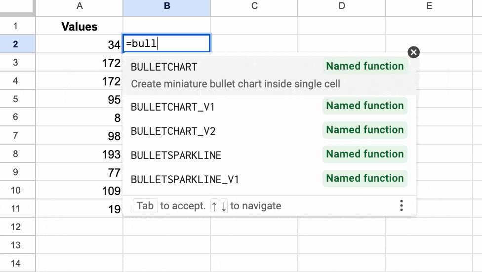
In this post, we’ll build a named function that creates a miniature bullet chart in Google Sheets, as shown in this GIF:
Bullet charts are variations on bar charts that show a primary measure compared to some target value. They’re highly effective because they capture a lot of information in a small, neat design.
To begin with — a warm-up if you like — let’s create a simple version of a bullet chart using a standard sparkline. (This formula featured as Tip 237 in my weekly Google Sheets newsletter. Sign up to get a weekly actionable Google Sheets tip!)
⚡ A template is available at the end of this post.
Version 1: Simple Bullet Chart in Google Sheets
The SPARKLINE function is a function that outputs a chart! It’s probably my favorite function in Google Sheets. And it’s the key to creating a bullet chart in Google Sheets.
Create basic sparkline
Suppose we’ve completed 40% of a task. Let’s see how we can show that with a simple bullet chart.
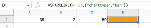
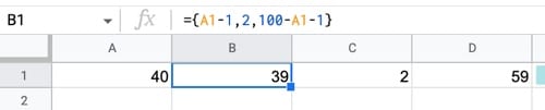
To begin, put the values 39, 2, and 59 into cells A1, B1, and C1 respectively.
Then add this sparkline formula, where we specify the chart type as a bar chart:
=SPARKLINE(A1:C1,{"charttype","bar"})The sparkline formula creates a bar chart with one block 39 units wide, then one block that is 2 wide, and finally, one block 59 wide (making 100 in total).
The 2-width block is the indicator bar. I found that using a width of 2 worked better than 1, which was too faint.
This gives the effect we’re after:
(Please note, if you’re based in Europe, you require a backslash “\” instead of a comma “,” inside the curly array brackets. Read more about location-based syntax differences.)
Change The Colors
This is an easy step.
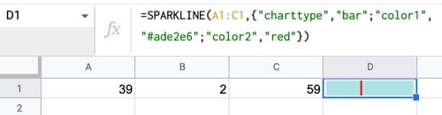
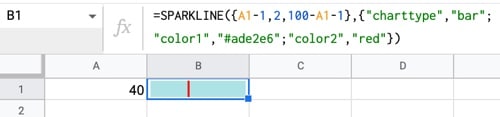
Within the sparkline bar chart, we can specify a color1 and a color2. It alternates between them in the sparkline output.
Here, I’ve chosen a light blue/red combination, but feel free to experiment. You can specify colors by name (for standard ones) or by hex color.
=SPARKLINE(A1:C1, { "charttype","bar" ; "color1","#ade2e6" ; "color2","red" })The output of this formula is this bullet chart in Google Sheets:
Use Array Literals
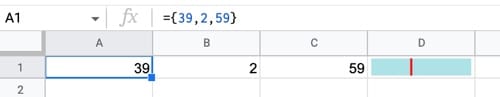
Next, we use an array literal formula to generate the data rather than typing it into 3 separate cells.
Clear the contents of cells A1, B1, and C1.
Then, add this formula to cell A1:
= { 39 , 2 , 59 }This generates a row of data for us:
(As mentioned in Step 1, some users based in Europe will require a backslash “\” instead of a comma “,” inside the curly brackets.)
Change To A Variable Input
So far the formula is completely static. Let’s change that.
Add a new column at the left edge of the Sheet and add a value to cell A1.
Then, modify the array formula (now in cell B1) to this:
={ A1-1 , 2 , 100-A1-1 }which gives this output:
Nest Inside Sparkline Formula
Finally, nest this array formula inside the sparkline formula, as the data argument:
=SPARKLINE( {A1-1,2,100-A1-1} , {"charttype","bar" ; "color1","#ade2e6" ; "color2","red"})The output of this formula is:
And there we go!
One last thing to mention…
Deal With Edge Cases (optional)
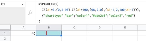
Play around with the formula and try values 0 or 100 and you’ll notice it doesn’t quite work for these extreme values.
Consider 0: the output of the data array is {-1,2,99}.
The sparkline formula, in bar chart mode, interprets this as {1,2,99} since it only recognizes the “size” of the number, not the sign.
It’s hardly noticeable though, so we could ignore it.
But, since we’re all artists here we can’t let that lie. Let’s fix it!
Here’s a way to rectify it, using two IF functions to handle the edge cases:
=SPARKLINE( IF(A1=0 , {0,2,98} , IF( A1=100 , {98,2,0} , {A1-1 , 2 , 100-A1-1})), {"charttype","bar" ; "color1","#ade2e6" ; "color2","red"} )Here’s the final simple bullet chart in Google Sheets:
Version 2: Full Bullet Chart in Google Sheets
(Many thanks to reader Jean-Rene B. who shared his work on this topic in response to the simple bullet chart I shared above and originally in newsletter #237. The solution I present below is similar and shares much of the same logic. Hat tip to JR!)
The trick here is to use the SPARKLINE function to draw a 2-dimensional shape inside a cell. I’ve used this technique before to draw working analog clocks, rockets and etch-a-skectch tools.
We create a box with a line in the middle, and it looks like a bullet chart in Google Sheets.
The best way to build this formula is step-by-step, using the onion framework.
Ready? Let’s begin:
Step 1: Create the scale
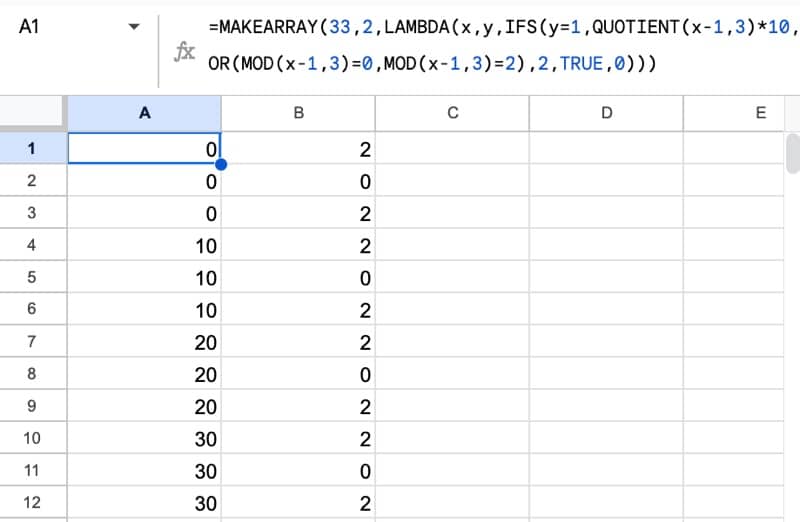
Use this MAKEARRAY formula to generate an array of data:
=MAKEARRAY(33,2,LAMBDA(x,y,IFS(y=1,QUOTIENT(x-1,3)*10,OR(MOD(x-1,3)=0,MOD(x-1,3)=2),2,TRUE,0)))It generates a repeating sequence of numbers from 0 to 100 in column 1, each repeated 3 times, and 2-0-2 repeating in column 2:
 💡 Learn more
Learn more about working with Lambda Functions, Named Functions, and X-Functions in the FREE Lambda Functions 10-Day Challenge course
To illustrate what these 2-d coordinates look like, let’s look at them with the sparkline function:
Step 2: Use LET to simplify
This formula gets complicated quickly, so we’ll use the LET function to keep it organized.
Modify the formula in step 1 by introducing the LET function to name this 2-d array:
=LET(

scale,

MAKEARRAY(33,2,LAMBDA(x,y,IFS(y=1,QUOTIENT(x-1,3)*10,OR(MOD(x-1,3)=0,MOD(x-1,3)=2),2,TRUE,0))),

scale)
Step 3: Add the box
Add coordinates to draw a box and use the VSTACK function to stack the box coordinates underneath the scale coordinates:
=LET(

scale,

MAKEARRAY(33,2,LAMBDA(x,y,IFS(y=1,QUOTIENT(x-1,3)*10,OR(MOD(x-1,3)=0,MOD(x-1,3)=2),2,TRUE,0))),

box,

MAKEARRAY(3,2,LAMBDA(i,j,IFS(AND(i=1,j=1),100,AND(OR(i=1,i=2),j=2),10,TRUE,0))),

VSTACK(scale,box))
The sparkline now looks like this:
Step 4: Add the bar to show value
Let’s turn the sparkline into an actual bullet chart now, by adding coordinates to draw the value bar.
Add a set of bar coordinates using an array literal construction:
=LET(

scale,

MAKEARRAY(33,2,LAMBDA(x,y,IFS(y=1,QUOTIENT(x-1,3)*10,OR(MOD(x-1,3)=0,MOD(x-1,3)=2),2,TRUE,0))),

box,

MAKEARRAY(3,2,LAMBDA(i,j,IFS(AND(i=1,j=1),100,AND(OR(i=1,i=2),j=2),10,TRUE,0))),

bar,

{0,10;0,2;0,6;B1,6;0,6},

VSTACK(scale,box,bar))
Don’t forget to add the “bar” variable into the VSTACK funtion too!
The sparkline now looks like a bullet chart:
Step 5: Add the target value
We need to add a target line to complete the bullet chart. Add another row of coordinates into the LET and VSTACK functions:
=LET(

scale,

MAKEARRAY(33,2,LAMBDA(x,y,IFS(y=1,QUOTIENT(x-1,3)*10,OR(MOD(x-1,3)=0,MOD(x-1,3)=2),2,TRUE,0))),

box,

MAKEARRAY(3,2,LAMBDA(i,j,IFS(AND(i=1,j=1),100,AND(OR(i=1,i=2),j=2),10,TRUE,0))),

bar,

{0,10;0,2;0,6;B1,6;0,6},

target,

{0,2;B2,2;B2,10},

VSTACK(scale,box,bar,target))
The output of this formula is:
Step 6: Add a max value
So far, the coordinates are based on a 100 scale, but what if a different scale is required?
It’s easy enough to fix, by inserting a max value that adjusts the coordinates to the correct scale.
=LET(

scale,

MAKEARRAY(33,2,LAMBDA(x,y,IFS(y=1,QUOTIENT(x-1,3)*10,OR(MOD(x-1,3)=0,MOD(x-1,3)=2),2,TRUE,0))),

box,

MAKEARRAY(3,2,LAMBDA(i,j,IFS(AND(i=1,j=1),100,AND(OR(i=1,i=2),j=2),10,TRUE,0))),

bar,

{0,10;0,2;0,6;B1/B3*100,6;0,6},

target,

{0,2;B2/B3*100,2;B2/B3*100,10},

VSTACK(scale,box,bar,target))
The sparkline doesn’t look any different, but it now works with any values, not just numbers between 1 – 100.
Step 7: Combine into sparkline
Finally, we combine the data and the sparkline formulas, by simply wrapping the VSTACK function with the SPARKLINE function, like so:
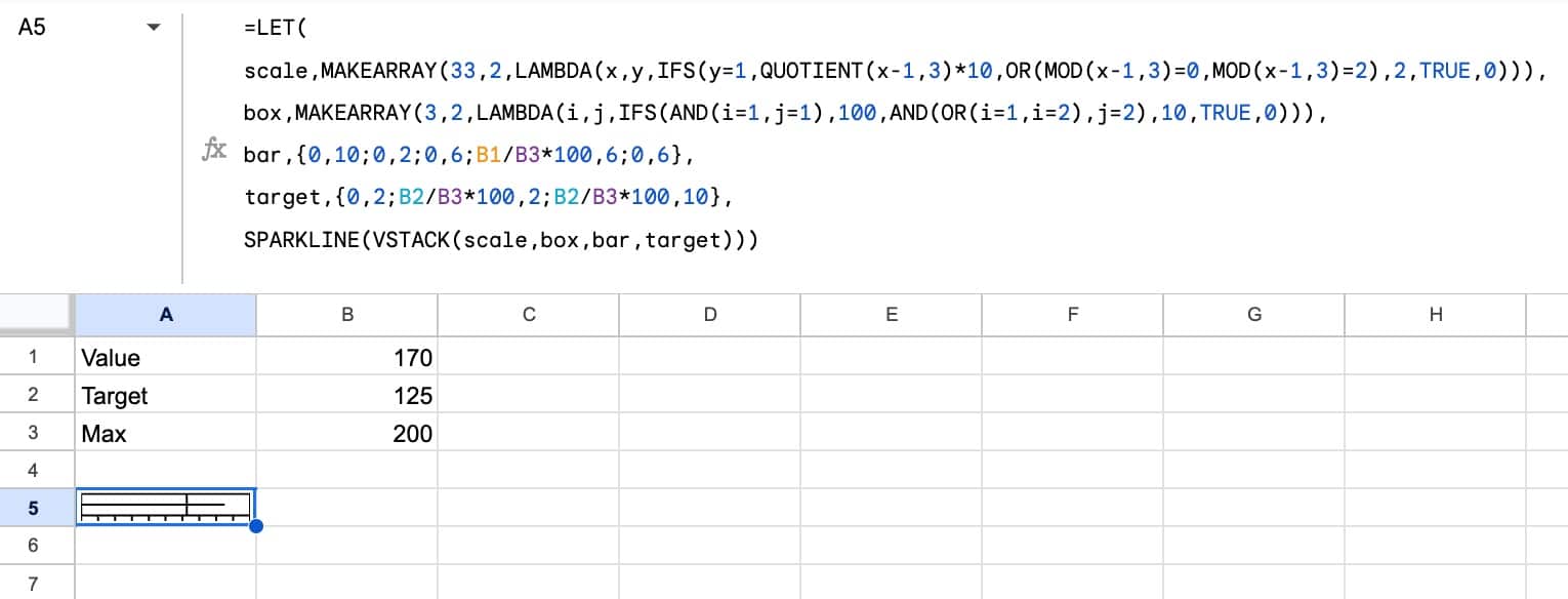
=LET(

scale,

MAKEARRAY(33,2,LAMBDA(x,y,IFS(y=1,QUOTIENT(x-1,3)*10,OR(MOD(x-1,3)=0,MOD(x-1,3)=2),2,TRUE,0))),

box,

MAKEARRAY(3,2,LAMBDA(i,j,IFS(AND(i=1,j=1),100,AND(OR(i=1,i=2),j=2),10,TRUE,0))),

bar,

{0,10;0,2;0,6;B1/B3*100,6;0,6},

target,

{0,2;B2/B3*100,2;B2/B3*100,10},

SPARKLINE(VSTACK(scale,box,bar,target)))
The output is now our single sparkline bullet chart in Google Sheets:
(click to enlarge)
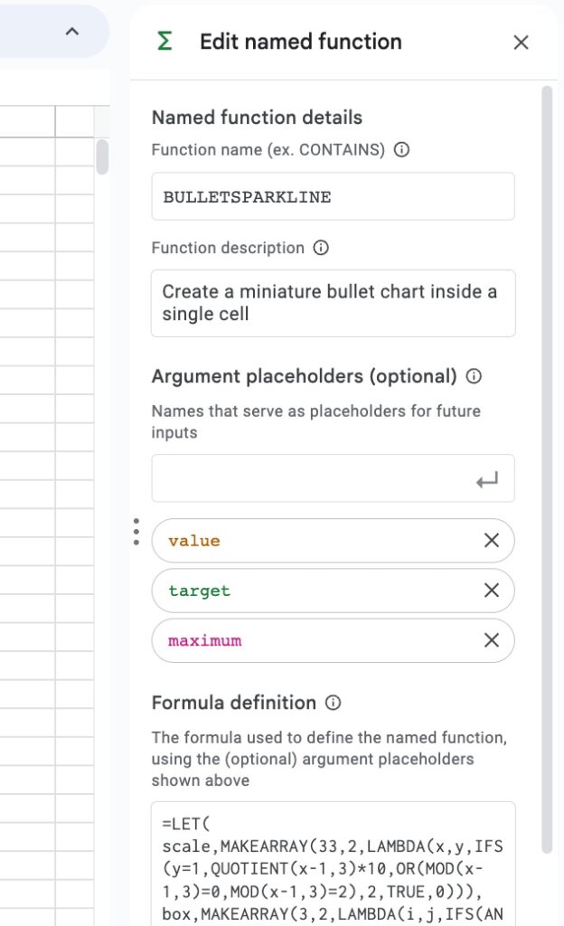
We could stop here, but it behoves us to turn this into a named function. It makes it MUCH easier for to use!
Step 8: Create first named function
Go to Data > Named functions
Enter the function name: BULLETSPARKLINE and a description.
Next, add the function definition and define each of the variables:
Now we can use a much simpler function to add the bullet charts, because the named function has abstracted away the complexity:
Sensible folks would stop here and call it a day, satisified with this fancy new named function.
But that’s not us. We’re spreadsheet maniacs, so we have to take it to the nth degree.
So let us continue…
Step 9: Add a scale
Let’s add an optional scale, that uses a Boolean value (i.e. a TRUE or FALSE, which we’re generating by a checkbox in this GIF) to control whether it’s showing or not:
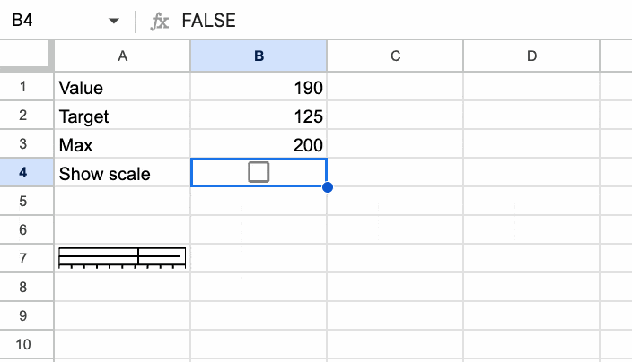
The formula for this is:
=HSTACK(

BULLETSPARKLINE(B1,B2,B3),

IF(B4,"Scale: 0→"&B3&" | Target: "&B2&" | Value: "&B1,)

)
We use an HSTACK function to combine the named function BULLETSPARKLINE with an IF statement to show or hide a simple string concatenation (the scale).
Step 10: Generalize the bullet chart in Google Sheets
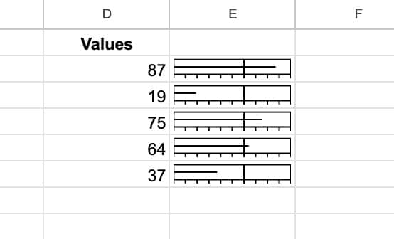
So far, our formula only accepts a single cell value, but it would be nice if it could accept a range so that we could create a batch of bullet charts in one go.
We can use the MAP function to do this.
=MAP(

D2:D6,

LAMBDA(

v,

HSTACK(BULLETSPARKLINE(v,B1,B2),

IF(B3,"Scale: 0→"&B2&" | Target: "&B1&" | Value: "&v,)

)))
This single formula generates this output:
Step 11: Add color scale
For a final flourish, let’s add a color scale, built with a second sparkline function.
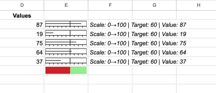
A VSTACK function is used to stack the new color sparkline underneath the existing function:
=VSTACK(MAP(

D2:D6,

LAMBDA(v,HSTACK(BULLETSPARKLINE(v,B1,B2),

IF(B3,"Scale: 0→"&B2&" | Target: "&B1&" | Value: "&v,)

))),

HSTACK(IF(B4, SPARKLINE({B1,B2-B1},{"charttype","bar";"color1","#ce2029";"color2","#90ee90"}),),)

)
Step 12: Create a second named function
The last step is to create a second named function, so that the fully featured bullet chart function can be used easily.
Go to the menu Data > Named functions
Enter the name BULLETCHART, a description, the function definition, and the variable definitions.
Now we can use BULLETCHART to easily add bullet charts to our data:
Now the formula is a simple vanilla function:
=BULLETCHART(A2:A11,150,200,TRUE,TRUE)Bullet Chart in Google Sheets Function Template
🔗 Click here to open a view-only copy >>
Feel free to make a copy: File > Make a copy…
If you can’t access the template, it might be because of your organization’s Google Workspace settings.
In this case, right-click the link to open it in an Incognito window to view it.
Once you have made your own copy, you can import the named Bullet functions into other sheets.
Other Sparkline Resources
If you enjoyed this post, you might enjoy these other Sparkline resources and examples:
Everything you ever wanted to know about Sparklines in Google Sheets
This is excellent .
Is it possible to do the following
1. Bar line to be in a different color
2. Target line to be in a different color against the scale
The color and linewidth changes for the entire bullet chart. I would want Box, bar and target to be in a different color.
SPARKLINE( VSTACK(scale, box, bar, target),
{“linewidth”,2; “color”, “blue”}
)
Thanks! Unfortunately, you’re limited to one color for the sparkline line chart.
You’re fantastic! God bless you! Thanks for this material 🙂
This is great Ben! I had two questions
1. How you might make the sparkline formula work if the goal was not 100 (for example 45 is what you are aiming for and you could be below [40] or above [50] that)?
2. How would I be able to make the sparkline formula work for %?
Thanks!
I think Step 6 deals with this, where you can input a value as the max, not just 100. Since 100% = 1, you could try setting the max to 1 for percentages.
In Step-8 : In the screen shot can anyone show the full formula, As it is static to B1,B2 and B3 and not dynamic
What if Actual exceeds Target
Is this possible to be adapted where a points time line can be created, where Team 1’s points (first place) are shown with Team 2’s points and the remaining teams on top of each other.
https://docs.google.com/spreadsheets/d/1FT_LYEr3YWmzf_31UrA3KCpa2ki2c511bvKFFkHwE88/edit?usp=sharing
TIA
Ged