Update December 2017: Google has added Waterfall Charts to the native charts in the Chart Tool of Google Sheets, obviating the need for you to manually create your waterfall charts (or use apps script) per my original post.
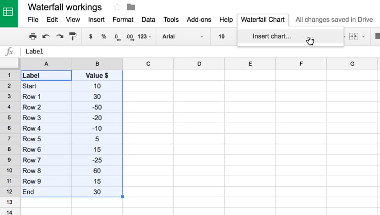
Now you simply highlight your data, click Insert > Chart and under the Chart type picker choose “waterfall”, as shown in the following image:

This original post that follows was first published in late 2016, and I’m leaving it here for anyone who wants to look under the hood at how waterfall chart data is constructed and how to do that using apps script.
Original article:
In this post, we’ll look at how to create a waterfall chart in Google Sheets.
Waterfall charts are real. And useful. They show the cumulative effect of a series of positive and/or negative values on an initial starting value.
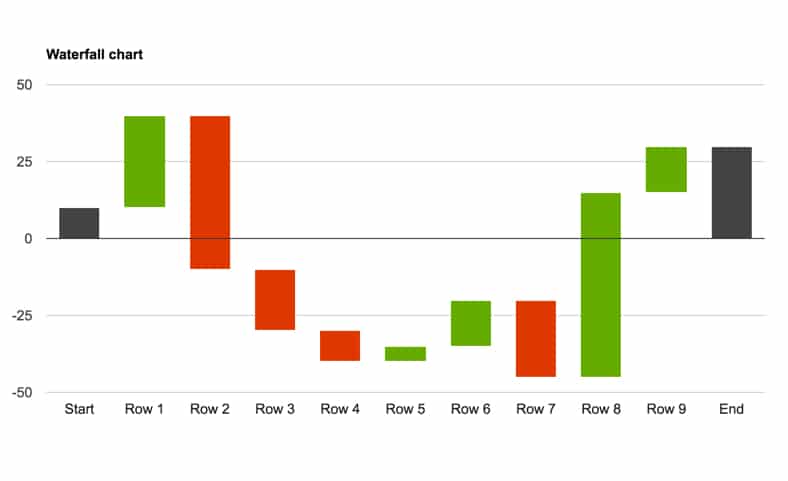
The following waterfall chart shows the headcount changes for a department, visually depicting the cumulative effect of the additions and deletions to the start value:
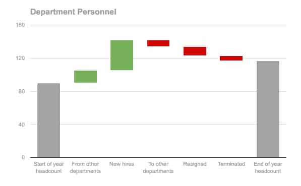
It shows the number of staff in our department at the start of the year (left grey bar), the number of people added from other departments or as new hires (green bars), the number of people who left (red bars) and finally the balance which is the headcount at the end of the year (right grey bar).
The waterfall chart above is relatively easy to create in Google Sheets but does still require some data wrangling to set it up. Notice that all of the bars are above the x-axis (Case 1), which makes the data set up vastly simpler than the case when we have a mix of bars above and below the x-axis, or spanning the x-axis (see Case 2 below).
I’ll show you how to create both of these cases, starting with the easier, positive-bar case.
After creating the simple and complex versions manually with formulas, I’ll show you some Apps Script code to automate the majority of the process and massively speed up creating complex waterfall charts.
Templates are available for all three methods, with links at the end of each section and at the end of this post.
Case 1: Simple Waterfall Chart
In this case, all the bars are above the x-axis.
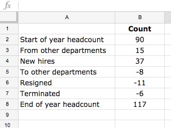
Step 1: What does our waterfall chart data look like?
The data for our simple waterfall chart looks like this initially:
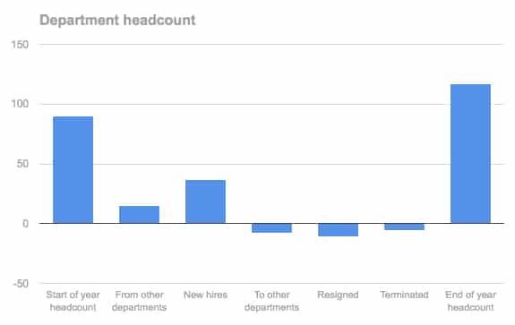
What happens if we simply create a chart from the data table above?
Well, we end up with a standard column chart, which doesn’t show what’s happening as clearly as the waterfall chart. We can’t change the color of the bars, since they’re all part of the same series:
We can do better than that!
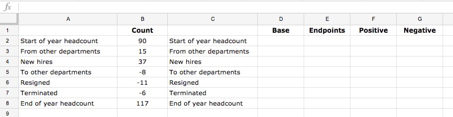
Step 2: get the data into the right shape
Create a new data table for the waterfall chart.
Directly adjacent to the original data, make a copy of the row labels, then add four new columns: Base; Endpoints; Positive; Negative, as shown below:
Step 3: Formulas for our waterfall chart
Add the following formulas to the table (click to enlarge):
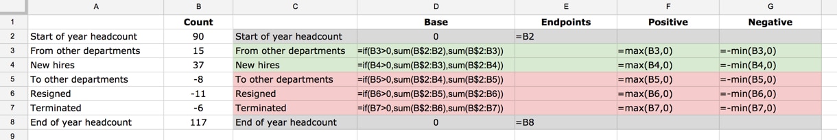
I’ve added color-coding to distinguish the different parts of the table.
In the first and last rows, rows 2 and 8 in this example, I’ve put 0 in the Base column and the count value in the Endpoints column. The Positive and Negative columns are left blank.
For the middle rows, rows 3 to 7 in this example, put this IF formula into the Base column:
=if(B3>0,sum(B$2:B2),sum(B$2:B3))Leave the Endpoints column blank.
Put this formula in the Positive column:
=max(B3,0)Put this formula in the Negative column:
=-min(B3,0)Drag these formulas down.
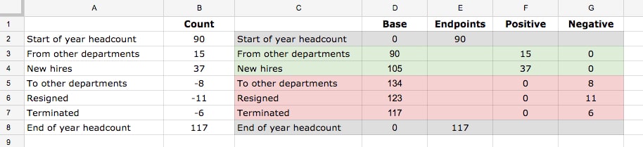
The completed table should look like this now (click to enlarge):
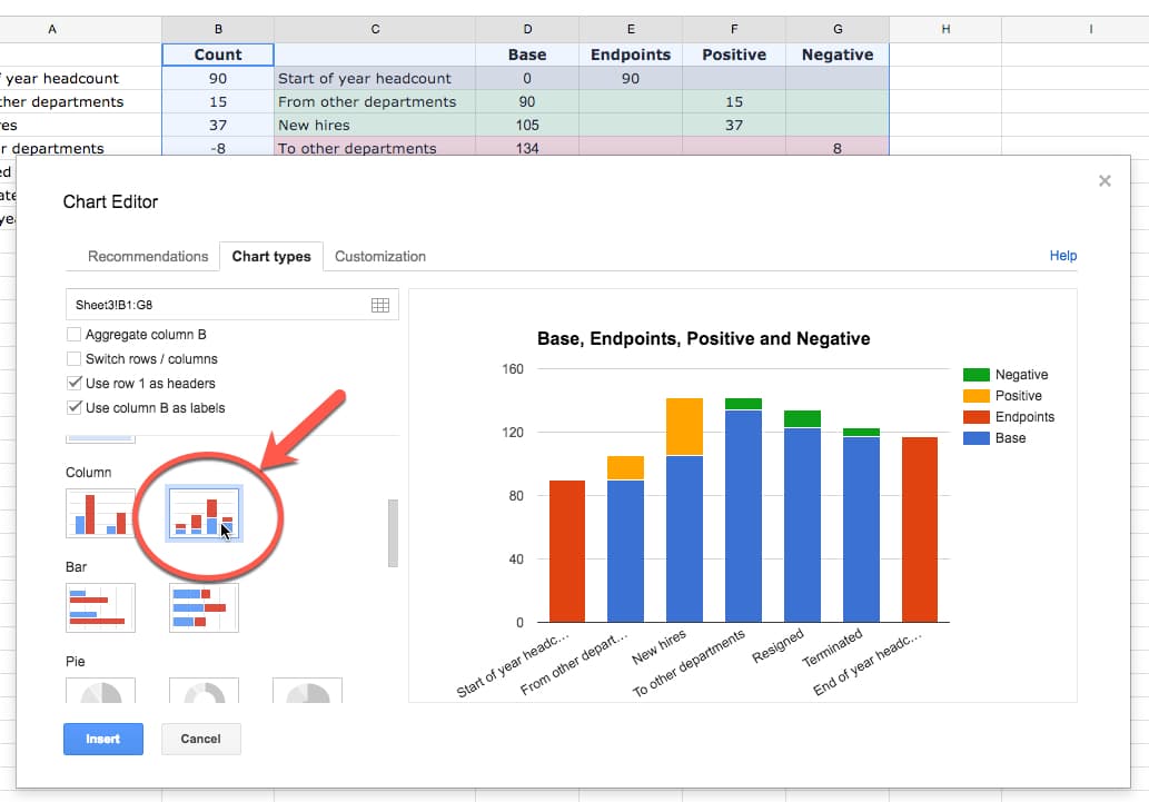
Step 4: Create a stacked column chart
Highlight this new table and create a chart: Insert > Chart...
Make sure you select the stacked column chart:
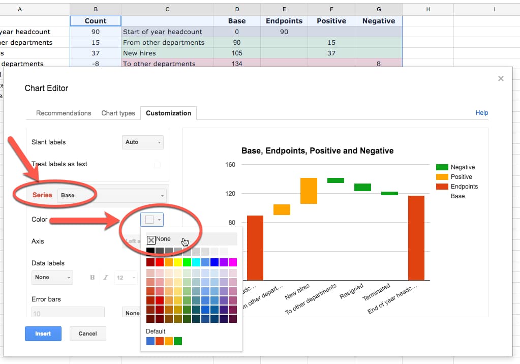
Step 5: Make the base transparent
Set the Base column color to none:
Step 6: Format the chart for presentation
Now it’s simply a matter of selecting suitable colors for the other series, formatting axes and titles.
You should also remove the legend as the series labels are essentially meaningless.
The final chart looks like this:
Feel free to make a copy of the Simple Waterfall Chart Template (File > Make a copy...).
Case 2: Complex Waterfall Chart
In this scenario, let’s look at what happens if we have negative columns or columns that span the x-axis. For example:
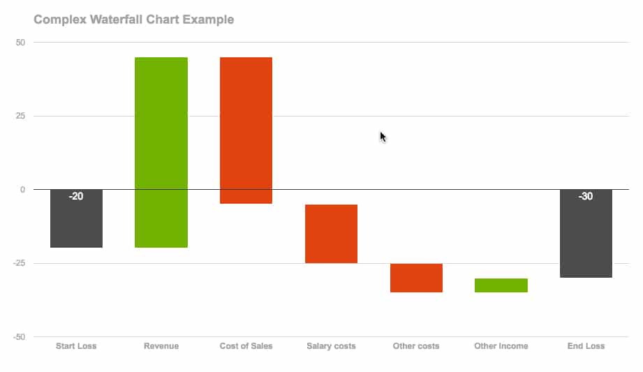
It doesn’t look too different from the simple one above, so what’s the big deal?
Well, you’ll notice we have positive-value columns that cross the x-axis (e.g. Revenue in above chart), negative-value columns that cross the x-axis (e.g. Cost of Sales in above chart), as well as positive- and negative-value columns above and below the axes.
So there are more variations for our formulas to handle, which makes it more complex than the first example above.
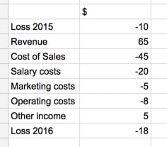
Step 1: Complex waterfall data
This time our dataset is more complex:
Step 2: Use MIN and MAX formulas to shape the data
Naturally, so are the formulas.
I embarked on this project trying to create one single formula that I could drag across and down my columns and rows that would just fill in the values. I got bogged down in seriously wacky IF statements and decided the ROI wasn’t worth it (I still think it’s possible tho!). So I created an in-between version with special formulas for the first and last row, and then general formulas for the middle rows.
The formulas I created were hideous love-children of Array Formulas, IF formulas, SIGN formulas, ROW formulas, etc… Suffice to say, sub-optimal.
So I googled around to see how other people had solved this problem and found a far more succinct, understandable set of formulas from Excel visualization guru Jon Peltier. These are the formulas I’ve included in the waterfall chart template below.
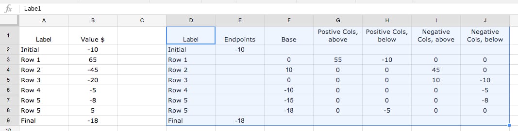
Assuming the data from Step 1 above is in range A1:B8, add the following formulas to the following cells:
Header-row:
D1: Label
E1: Endpoints
F1: Base
G1: Positive Cols, Above
H1: Positive Cols, Below
I1: Negative Cols, Above
J1: Negative Cols, Below
End-rows:
D2: =A2
E2: =B2
F2 to J2: Leave blank
Middle-rows:
D3: =A3
E3: Leave blank
F3: =max(0,min(sum($B$2:$B3),sum($B$2:$B2))) + min(0,MAX(sum($B$2:$B3),sum($B$2:$B2)))
G3: =max(0,min(sum($B$2:$B3),B3))
H3: =min(0,G3-B3)
I3: =max(0,J3-B3)
J3: =min(0,MAX(sum($B$2:$B3),B3))
Your final data table should look like this:
Step 3: Create a stacked column chart
Highlight the new data table and Insert > Chart... (Step 4 above)
This will add a waterfall chart to your page, from where you can follow steps 5 and 6 of the Simple example above to finish the chart.
Feel free to make a copy of the Complex Waterfall Chart Template (File > Make a copy...).
How-to create waterfall charts automatically with Apps Script
As you saw in the example above, the formulas are pretty finicky for a generic, catch-all scenario when we have positive and negative bars, some of which may also cross the x-axis.
Arguably a better way to solve this problem is to write a small macro, using Google Apps Script, to do all the heavy lifting, wrangle the data and insert the chart directly into our Sheet.
For example, imagine we have the following data that we want to display as a waterfall chart:
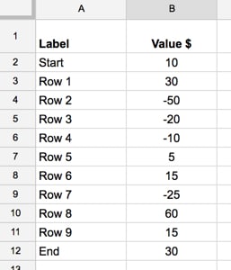
It’ll take some time to manually figure out which bars cross the x-axis and what the base bars need to be for each one. However, once I’ve written a small macro, it takes only a few seconds each time to create the chart.
I’ve added the following code to my Script Editor:
//add menu to google sheet
function onOpen() {
  //set up custom menu
  var ui = SpreadsheetApp.getUi();
  ui.createMenu('Waterfall Chart')
    .addItem('Insert chart...','waterfallChart')
    .addToUi();
};

// function to create waterfall chart
function waterfallChart() {

  // get the sheet
  var sheet = SpreadsheetApp.getActiveSheet();

  // get the range highlighted by user
  var range = sheet.getActiveRange();
  var data = range.getValues();

  var newData = [['Label','Endpoints','Base','Postive Cols above','Positive Cols below',
                  'Negative Cols above','Negative Cols below']];

  var tempTotal = 0;
  var tempTotalPrior = 0;

  var lastRow = sheet.getLastRow();
  var lastCol = sheet.getLastColumn();

  for (i = 1; i < data.length; i++) {

    // running totals
    tempTotalPrior = tempTotal;  // assign previous total to new variable to keep track of it
    tempTotal += data[i][1];  // add up total of values so far

    // Endpoints
    if (i == 1 || i == data.length - 1) {
      newData.push([data[i][0],data[i][1],0,'','','','']);
    }

    // Non-endpoints
    else {

      // Base values
      var baseVal = Math.max(0,Math.min(tempTotal,tempTotalPrior)) + Math.min(0,Math.max(tempTotal,tempTotalPrior));

      // calculate minimum of running total and current value
      var val1 = Math.min(tempTotal,data[i][1]);

      // calculate maximum of running total and current value
      var val2 = Math.max(tempTotal,data[i][1]);

      // Postive Cols above
      // if val1 is negative, set to 0, otherwise take val1, which is min of running total and current value
      var posValAbove = Math.max(0,val1);

      // Postive Cols below
      // subtract current value from Positive Col Value to catch any part of column below 0. If a positive value, set to 0 by using minimum
      var posValBelow = Math.min(posValAbove - data[i][1],0);

      // Negative Cols below
      // if val2 is positive, set to 0, otherwise take val2, which is the max of running total and current value
      var negValBelow = Math.min(0,val2);

      // Negative Cols above
      // subtract current value from Negative Col Value to catch any part of column above 0. If a negative value, set to 0 by using maximum
      var negValAbove = Math.max(negValBelow - data[i][1],0);

      // push all new datapoints into newData array
      newData.push([data[i][0],0,baseVal,posValAbove,posValBelow,negValAbove,negValBelow]);
    }

  }

  // paste the new data into sheet
  sheet.getRange(lastRow - data.length + 1, lastCol + 2, data.length, newData[0].length).setValues(newData);

  // get the new data for the chart
  var chartData = sheet.getRange(lastRow - data.length + 1, lastCol + 2, data.length, newData[0].length);

  // make the new waterfall chart
  sheet.insertChart(
    sheet.newChart()
    .addRange(chartData)
    .setChartType(Charts.ChartType.COLUMN)
    .asColumnChart()
    .setStacked()
    .setColors(['grey','none','green','green','red','red'])
    .setOption('title','Waterfall Chart')
    .setLegendPosition(Charts.Position.NONE)
    .setPosition(lastRow - data.length + 4,lastCol + 4,0,0)
    .build()
  );
}
View this code on GitHub.
The onOpen() function adds a custom menu to the Sheet, so you can run the waterfallChart() function from the Sheet.
You run the function by highlighting the waterfall chart data and then selecting Waterfall Chart > Create Chart from the custom menu:
This runs the chart function, wrangles the data, pastes the new data into your Sheet and finally creates a draft chart for you:
Steps to setup and use this apps script waterfall chart template:
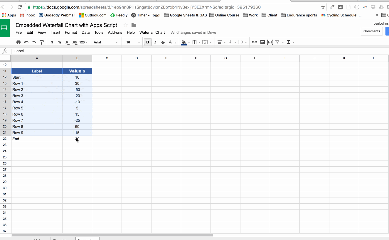
1. Open the view-only version of this file: Embedded Waterfall Chart with Apps Script
2. Create your own copy: File > Make a copy...
3. Open the script editor where the code lives: Tools > Script editor...
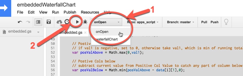
4. In the menu bar, choose onOpen in the Select function drop-down menu bar (shown by the red arrow 1 in the image below), and then click the triangle (shown by the red arrow 2 below) to run this script:
5. Go back to your Google Sheet and you should now have a new menu option, called Waterfall Chart.
6. Highlight your waterfall chart data in columns A and B, then click Waterfall Chart > Insert chart....
This will create new table of data and waterfall chart.
Here’s the full process again:
Links to the Google Sheet templates
- Simple Waterfall Chart Template
- Complex Waterfall Chart Template
- Embedded Waterfall Chart with Apps Script
File > Make a copy...
Let me know your thoughts/questions/comments below!
Hi Ben,
Thanks for this. It has been very helpful.
I have one issue though, with WF charts that go into negatives (your last example). I have an issue with labels, because they show just a part of the amount (if the bar is halfway across the axis) or a negative number (if the bar is below the axis).
Is there a way to amend this, or manually change the labels? (I haven’t been able to do so at the moment.
Best regards,
Hey Pedro,
Unfortunately you can’t modify the data labels on the chart or do anything about the partial numbers being shown. You can add data labels to the start/end columns and display the correct numbers.
The alternative workaround is to add the amounts to the labels on the x-axis, and you can make these dynamic so they will automatically change if your values change.
So, in the waterfall chart table, in the labels column, replace this:
=A2with this:
=A2&":"&char(10)&B2(Assuming your original data table has headers in A1 & B1, and the first row of data is row 2).
Here’s a screenshot of the formulas (my data is in row 12 in this screenshot):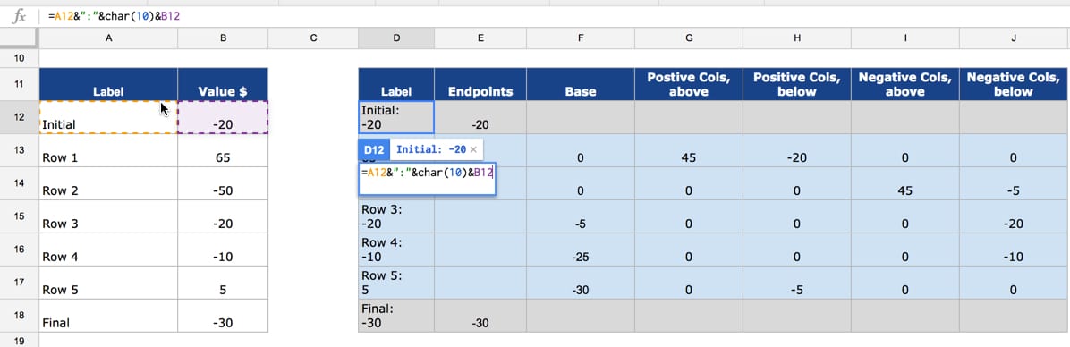
and this is what the final output looks like: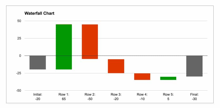
Hope that helps!
Ben
Hi Ben – chart works great! thanks….
Is there a way to show values on the columns – both negative and positive? When I display it shows both at the same time.
Hey Mike,
Unfortunately I haven’t found a satisfactory way to label the values directly on the chart. You can label individual series only, which solves some problems, but the bars that span across the x-axis are made up of a positive and negative component, so cannot be labeled with a single value this way. The only workaround I’ve found is to add a value into the x-axis labels, using a formula. The chart will look like this:
where the formula is something simple like:
=A12&": "&TEXT(B12,"#,###0")Here’s an example sheet: https://docs.google.com/spreadsheets/d/1UYRbb58jWzRpRPWUZRMbyzY8PKXvRv5E0qYCV-qbtTY/edit?usp=sharing
Hope that helps!
Thank you very much. I was most of the way there but could not figure out how to give the cost components and the revenue components in my waterfall chart different colors.
I was a McKinsey analyst in the early 90s. I used white tape and paper to make waterfall charts back then. At least I’m using a computer now.
Thanks!
Hey Ben,
thanks for this amazing tutorial!
Is there any chance to get a combination waterfall chart for example a p&l target/actual comparison?
Thanks
Thank you so much! That helped me a lot!