Dashboard design is hard.
You start with a blank canvas, or a blank Google Sheet in this case, and you have to somehow turn that into business insights, which will grow your bottom line, make your organization more efficient or help you understand your customers better.
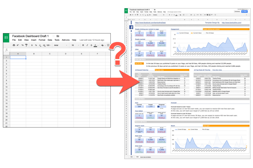
The blank screen stares back at you, waiting for you to do something.
It feels overwhelming.
You clasp your hands around the back of your head, lean back in your chair and rue the day you mentioned building a dashboard to your boss.
It was supposed to be easy. Easy to create a masterpiece, a thing of beauty to wow your team.
Meanwhile, that blank Sheet continues to stare back at you, emptier than ever.
Dashboard Design Checklist
In this dashboard design example, I’m going to discuss the strategy I used to create a Facebook Page Management Dashboard recently and how I conquered the fear of the blank sheet (like writer’s block, but for numbers. Sheet-block anyone?).
Step 1: Make a plan
“Give me six hours to chop down a tree and I will spend the first four sharpening the axe.”
~ Source unknown
This is the most important step of the whole dashboard design process. Time invested here pays dividends further down the line.
I’m not talking about the design of your charts, formulas, layout or any other UX factors. They’re all HOW questions: how do I show this or that? How do I create this formula or that chart?
Rather, I’m talking about the fundamental WHY questions. You should think about the answers to the following questions before putting pen to paper, or cursor to cell in our case.
- Why are you building a dashboard?
- Do you really need one?
- What questions will you try to answer with it?
- Who is it for? (You? Your boss? A client?)
- Is the audience familiar with the data?
- Is the audience technically savvy? Or does it pay to keep it simple?
- What will the intended audience do with it?
Well-thought out answers to these questions should determine what data you need and what you need to do with that data.
With this knowledge fresh in your mind, make a list of the KPIs and charts you want to see. The ones that allow you to answer the right questions for your business. Don’t worry, you may not know them all at this stage, but listing what you can now is a good place to start.
For example, C-level execs need to see the high-level, 40,000ft view of the business, with insight into return on investments, resource levels and of course, revenue and profitability. They (probably) don’t need the minutiae of individual post or campaign metrics, unless there’s wisdom to share and apply to the big picture.
The outcome of Step 1 is to understand what you’re trying to achieve with the dashboard and how you’re going to do that.
Step 2: Set up your Sheet structure
Early on in the process, I add all the tabs I think I’ll need to my master Sheet, labeling and coloring them as required.

I separate the raw data tabs, the staging tabs and the dashboard tab by inserting blank sheets between them, and then labeling these separator tabs consistently with a red color and this style:
Raw data >>
I use this same format for every dashboard I build, so I know these are blank separator tabs.
Step 3: Get your data
For the Facebook dashboard example in this post, I needed to get all of my Facebook Page insight data into my Google Sheet. This is not an easy thing to do yourself. There’s no native connection and, other than a basic web scrape of Facebook likes with formulas, you’ll need to use Apps Script to create an authenticated app that connects to the Facebook API.
Like I said, non-trivial.
Thankfully there is another way.
Supermetrics is a superb data extraction tool, which you can use to import your Facebook Page (or Ad) data into your Google Sheet (it works with lots of other data sources too, and dramatically simplifies the process of bringing data into your Google Sheets).
It’s a subscription Google Add-On, installed through the Add-ons > Get add-ons… menu. It opens up in a sidebar where you establish and authenticate your data connection and then specify what data to import.
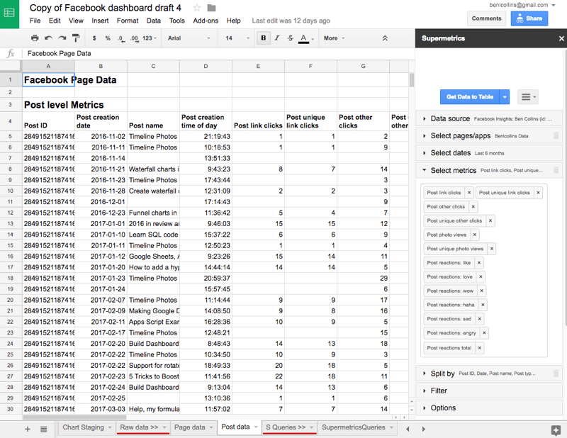
You have fine control over the data ranges you want to import and you can even slice and dice the data at this stage, although I prefer to do that once I have the raw data into my Google Sheet.
For this Facebook dashboard design, I created two raw data tabs in my Sheet, one for Page-level data (e.g. total number of fans, likes, shares etc.) and one for Post-level metrics (e.g. post clicks, post photo views, post video views, post likes etc.) split out for each post.
Now you have your raw data sitting in a sheet, it’s time to…
Step 4: Explore your data
This is a fun step.
Take your list of KPIs, charts and anything else you identified in your plan in Step 1. With this list in mind, think about what you need to do with your raw data to transform it into these KPIs and charts, and how you’re going to do it.
You’ll probably need pivot tables. Lots of pivot tables.
And formulas too. Powerful formulas like the FILTER and QUERY functions.
Go ahead, experiment.
Wield your spreadsheet muscles to wrangle the data into the form and shape you need. Extract your KPIs and create summary tables and quick charts to see if you’re answering those questions and uncovering insights.
The goal here is to see if you can answer the questions in your plan from Step 1. In other words, do the KPIs/charts/insights you’ve identified answer your questions? Do you have the right data? Enough data? Is it in the right format or can you convert it? Etc.
By actually extracting KPIs and summary tables and creating charts, you’ll be forced to really understand the data and think hard about the your questions and answers.
I often create new blank tabs to do this in, and then move valid results into my Staging tabs (Step 6) and delete results I don’t need.
Step 5: Create a settings Sheet
It’s likely that you have targets for the various data points you measure. Maybe a target number of fans of your Facebook page, or a goal for the number of content clicks each week. Rather than sprinkle them ad-hoc through your spreadsheet, or worse yet, hard code them as numbers inside your formulas, it’s best to record them all in one place, in a dedicated settings sheet.
I’d advocate doing this step every-time, even if it feels like overkill. It’s good practice for when your dashboards get more complex, when it really pays off because you’ll only have to make changes in one place.
For this Facebook example, my settings page was pretty simple, but it’s there and I can always add more to it later:
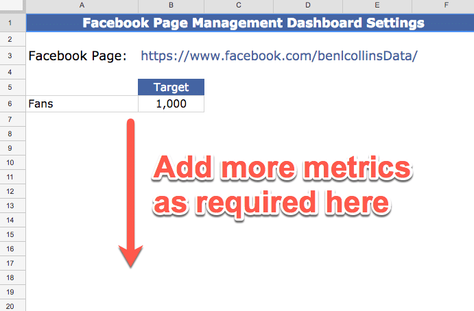
Whenever, I want to use that fan target metric in a formula, I simply link to this one cell, B6 in the Settings tab:
Settings!$B$6That way, when I want to revise that number upwards to 2,000, 5,000 or 10,000 (one day!) I only need to change it once here. Boom!
Build Business Dashboards With Google Sheets
– 9+ hours of video content, lifetime access and copies of all the finished dashboard templates.
Learn more
Step 6: Stage your data
This step is the bridge between your raw data and your dashboard tables and charts.
Using your work from Step 4, when you explored the data, you should create the data tables you need to power the elements in your dashboard. For example, if you have a 7-day engagement chart, then you’ll need to create the corresponding 7-day engagement data table for this chart in your staging sheet. Not only does this keep a separation between raw data and analysis, which is good practice, but it’s often necessary, as it’s unlikely you’ll be able to use your entire raw data table as your chart input range.
The process in a nutshell for this Facebook dashboard is:
Supermetrics Query

    ⬇️

Raw Data Sheet (e.g. last 6 months of FB Page data)

    ⬇️

Staging Sheet (e.g. 7 day summary table)

    ⬇️

Dashboard Sheet (e.g. 7 day sparkline chart)
You may be able to prepare your KPI and chart data tables in a single staging tab, or it may make sense to separate into several if you need:
Keep your data tables organized and well labeled, as it quickly gets confusing when you have multiple tables to work with.
For example, here are the formulas from my staging tab to extract 1 day and 7 day current and previous engagement metrics:
1 day:
=FILTER('Page data'!$A$5:$K,'Page data'!$A$5:$A = today())1 day prior:
=FILTER('Page data'!$A$5:$K,'Page data'!$A$5:$A = today() - 1)7 day:
=FILTER('Page data'!$A$5:$K,'Page data'!$A$5:$A > today() - 7)7 day prior:
=FILTER('Page data'!$A$5:$K,'Page data'!$A$5:$A > today() - 14,'Page data'!$A$5:$A < today() - 6)where the range:
'Page data'!$A$5:$Kcontains my raw data, which is the output of my Supermetrics query.
To recap, you should now have your data staged and ready to go at this stage. You should also have a single repository of any variables you need, like target number of fans or content click goals, in your setting sheet.
So it’s time for you to return to that blank dashboard sheet and turn it into your masterpiece, your Van Gogh.
Step 7: Create your dashboard header row
Wait, what? This is a whole step to itself…?
Yes, and here’s why. It helps get over that huge hurdle of what to do when faced with a blank sheet. It gets you started.
I find that creating the dashboard header, even going so far as formatting it to look professional, is the tipping point I need, the catalyst, for getting the design going.
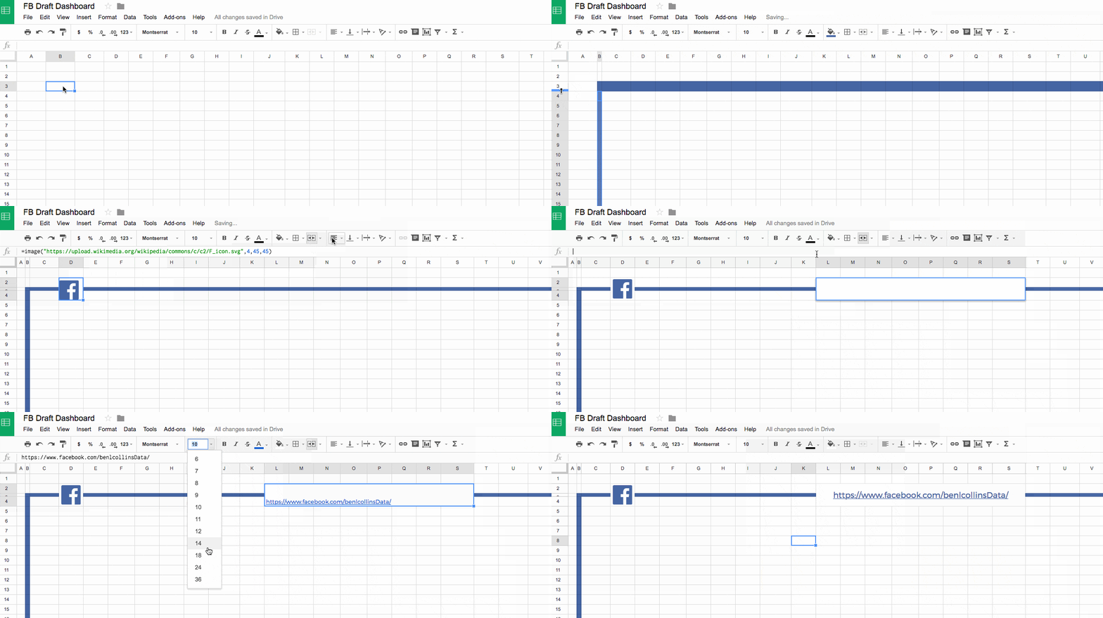
Here are the steps I took to create this header for my Facebook dashboard design:
- Add Facebook blue background color (custom hex color #3c5a99) to row 3 and column B, then make them both narrow to create a border effect.
- Make column A narrow to leave some whitespace at the side
- Merge cells
D2:D4(How to merge cells in Google Sheets) and add the Facebook logo (Google image search > Tools > Usage rights > Labeled for reuse). Use this formula to then add an image:=IMAGE("https://upload.wikimedia.org/wikipedia/commons/c/c2/F_icon.svg",4,45,45) - Center align the logo, horizontally and vertically
- Merge cells
L2:S4and add a title (e.g. name of the Facebook Page) - Resize the title and center align, horizontally and vertically
- Remove the gridlines temporarily, to see what the finished title will look like:

Great, it’s looking good. Not perfect, but good enough to make the Sheet feel like a dashboard rather than a blank spreadsheet.
Alternatively, you can use text rotation to create a header row with the branding on the left margin:
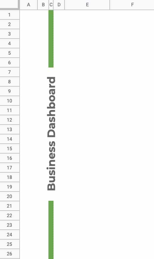
Don’t worry, you’ll almost certainly change this header before you’re done, but the point is that the Sheet now looks like the start of a dashboard.
You’ve built the solid foundations for your dashboard design with steps 1 to 6, and, with this step 7, the dashboard sheet is no longer blank.
So start adding your KPIs and charts…
Step 8: Build the first draft dashboard
By now, you’ve got your raw data, your settings and your staging tables ready to go. You have a list of KPIs and charts you want to create. Your dashboard sheet is no longer blank. In fact, it has a pretty slick header row.
You’re primed to create the first draft of your dashboard.
Don’t worry too much about the placement of KPIs and charts with this first draft. Just starting adding them.
Experiment with layouts and try different formats. I often format as I go, making things look “pretty” so I can start to picture the final dashboard.
Don’t be afraid to change the width of rows and/or columns and use merged cells, to create the custom look you need.
With the heading in place, I added the first KPI, fan metrics, and then copied it as a placeholder for the other KPI metrics, as follows:
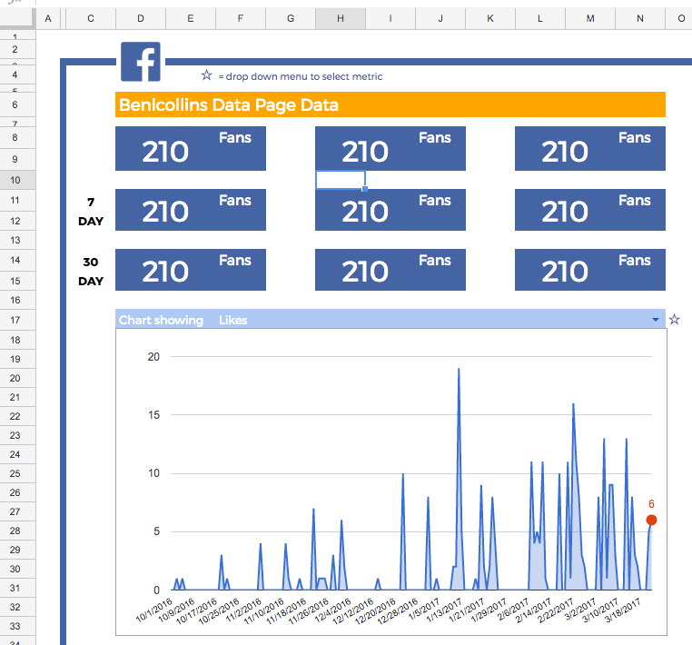
This allows you to see what the dashboard looks like, how the different elements fit together. You can fill in the individual metrics whenever you want.
For this Facebook dashboard, the next element I added was this dropdown chart:
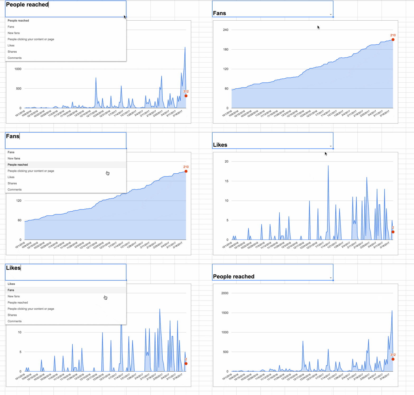
I used the data validation method to create a dropdown menu for the dynamic chart, so the viewer can select the metric they want to see. The last datapoint label is added with an extra series.
The first draft dashboard ended up looking like this:
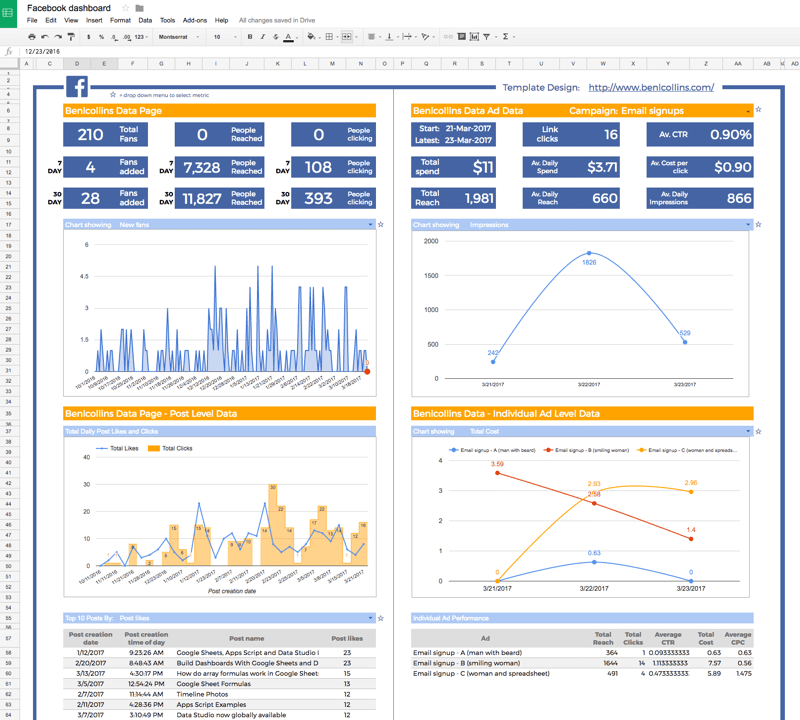
I set up triggers with Supermetrics to refresh the data on a daily basis.
You can set these triggers to refresh data hourly, daily or weekly, as well as emailing copies of dashboards to yourself, colleagues or clients on a timely basis.
As you can see, this dashboard is really two dashboards side-by-side, one for the Page data and one for the Ad data. After using it for a while, I decided it was too confusing to have these complex data reports next to each other. So I made the decision to focus the second draft of the dashboard solely on Facebook Page data.
But first, I needed to…
Step 9: Step away from the dashboard
After the planning of Step 1, this is another important step. And the step that people often omit in their excitement to show their creation to the world.
Put your pen down, well, ok, let go of your mouse, and step outside into the sunlight. Go grab a coffee with a colleague and chat about sports or arts or whatever else you’re into (just not politics or religion, right?). Better yet, go for lunch and don’t think about your dashboard for an hour or two.
Even better if you can put it aside overnight or for a couple of days.
Then come back to it, and see how you feel about the design, the layout, the presentation of ideas. Is it answering those critical questions from your planning step?
Ask a friend or trusted colleague to take a look. Don’t explain the dashboard, just let them see it and give you feedback. What works, what doesn’t. Why is this here? What is this? What the hell is that…? Wait, John in Sales makes how much a year….?
Inevitably, you’ll want/need to make some changes.
I recommend reading this excellent article from Google data evangelist Avinash Kaushik and I challenge you not to re-think your dashboard design.
Re-arrange elements, get rid of pointless metrics and complex charts. As Avinash Kaushik says, avoid creating “data pukes”.
Add text to explain insights and, even better, suggest actions.
The second draft dashboard I came up with for this Facebook Page was this one. It’s not pretty but it conveys more information than the dazzling first draft above:
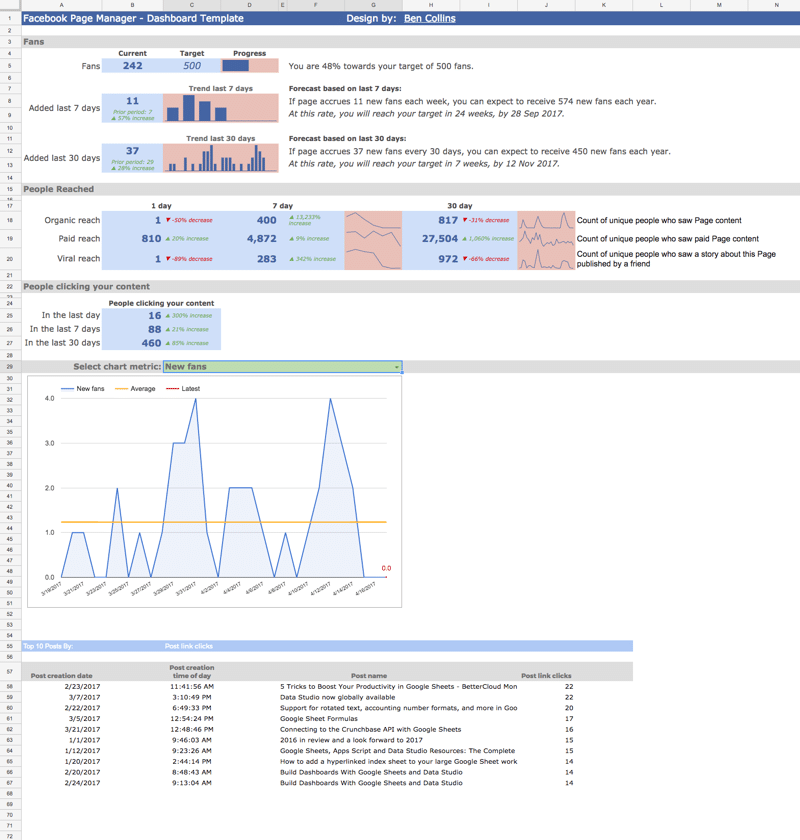
I added some text formulas to explain the metrics better. For example:
If page accrues 37 new fans every 30 days, you can expect to receive 450 new fans each year.
and:
At this rate, you will reach your target of 1,000 fans by 25 Dec 2018.
which change dynamically based on my current data, and are created with these formulas, respectively:
="If page accrues "&J49&" new fans every 30 days, you can expect to receive " & TEXT((J49/30)*365,"#,##0") & " new fans each year."and:
=IF($F$45>$H$45,"Target reached!","At this rate, you will reach your target of " & TEXT($H$45,"#,##0") & " fans by " & TEXT(TODAY() + (($H$45-$F$45)/$J$49)*30,"d mmm YYYY") & ".")There was nothing wrong with this dashboard, but I knew the layout of information could be improved and since I was doing that, I thought I could take some of the design elements from the first draft.
So the next step is to build a new draft of your dashboard…
Step 10: Build the next iteration of your dashboard
I made a fresh copy with the following changes:
- I moved the engagement metrics into the top left and demoted the fan metrics to near the bottom of the dashboard, as the top left is the most valuable real estate, where you want to place your most important metrics.
- Under engagement metrics, I had metrics for my 10 most recent posts and top 10 posts of all time (which varied depending on the metric selected).
- I kept all of the textual context sections, as the are some of the most valuable parts of the second dashboard.
- The title bar was moved from the top row to the left side, using Google’s new text rotation feature to show the title rotated 90 degrees.
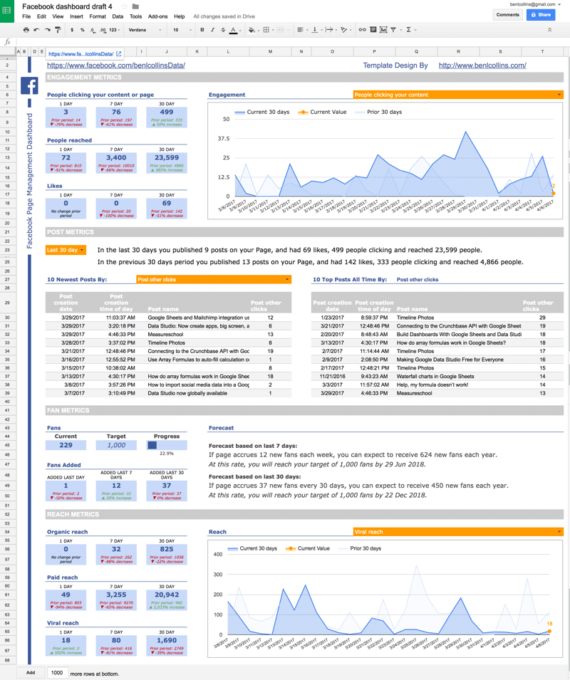
This dashboard design is still a work in progress, one that will evolve with the changing business needs of my Facebook Page.
It’s an iterative process, one that never really finishes. You need to periodically revisit whether you’re still answering your business questions. Never be afraid to critique your work, tweak your dashboards or even rip them up and start afresh.
It’s also worth saying that this is simply the workflow process I follow, which works for me. It’s certainly not the only way of approaching dashboard design, and you should adapt it as you see fit.
Let me know your thoughts or questions, or if you’re interested in any of these dashboards as templates, in the comments below. I’m working on shareable template versions, coming soon, so keep your eye out.
If you enjoyed this post, you may also enjoy 10 techniques for building a Google Sheets dashboard (focussed on the practical, how-do-I-do-that-with-formulas type questions…) and this dashboard template I recently created for a sales launch.
(This post contains affiliate links, which means I earn a small commission on some of the products mentioned in this post.)

Thank you for great article. Can you share your sheet for deeper understanding?
Hi Zaut,
The dashboard template is now available for download in the Supermetrics template gallery (a Supermetrics account is required to use it). Read more here.
Hi Ben
Thanks for sharing this great dashboard.
I have a quick question: Because the query runs with ascending dates, 1 day and 7 day scorecards do not calculate the most recent day and week but 1 day and 7 days from 60 days prior. Am I wrong?
Thanks!
Erkut
Hey Erkut,
Good spot, unfortunately, I think one copy of this template had the formulas back-to-front as you describe. You should be able to modify the ranges so that you get the most recent 1 and 7 days.
Sorry for any confusion.
Cheers,
Ben
Hello Ben,
I can not find it on websites. Do you think taht you can share link or sheet one more time with me.
Thank you
Jan Mach
Hi Jan,
Here you go, it’s a few years old and not actively maintained anymore but hopefully still useful!
https://docs.google.com/spreadsheets/d/1eq03WiTLipqQ6LB4sSpQmuLrvTvzDULE8Y8BuoIwijI/edit?usp=sharing
Cheers,
Ben
Ben – love this template (and not just because it’s way prettier than my “I-forgot-the-meeting-was-in-5-minutes” dashboards).
One issue—it looks like when grabbing the post names, it sometimes grabs the *link* name instead. Example: I had a post inviting people to my Slack community. In the dashboard, that post name shows up as “Create Account | Slack”, which is obviously the OG meta Slack creates.
I’m trying to figure out why it’s doing this, but it’s my first time with Supermetrics. Any ideas?
There is a problem in the query. It’s not showing exact data for Likes, Love & other reactions when you select from the drop-down menu. Doesn’t showing data for each recent days as well.
i want to populate the data based on a condition (a cell reference actually)
condition – if Cell(A5) = 03/03/187 then give the data related to that date
else
if cell (A5) = “All” then give me all data
What’s the best way to safe data at 30 day (monthly) query? I’d like to use this for reporting to clients. I’m also wondering if there is a way to adjust dates of query. Month day 1 to Month day 31. etc?