Google Sheets is an incredibly powerful spreadsheet tool for pulling, processing, and presenting data. But many people don’t realize that you can also use it to build interactive dashboards.
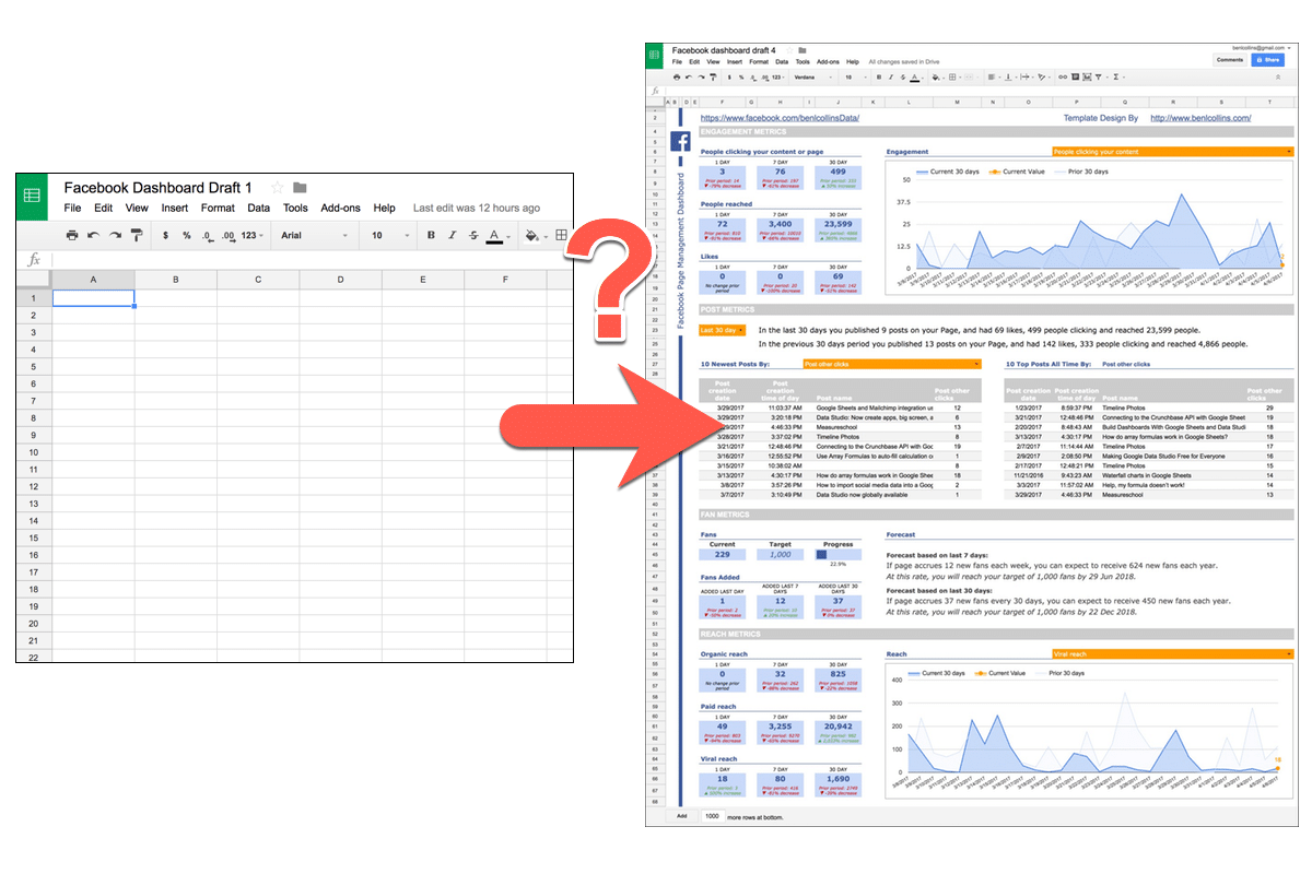
With a bit of creativity we can go from this:
To this:
The skills to build this type of dashboard aren’t difficult to learn and you can get started with a basic knowledge of Google Sheets.
Here’s a walkthrough of the dashboard shown above:
You start with a blank canvas, or a blank Google Sheet in this case, and you have to somehow turn that into business insights, which will grow your bottom line, make your organization more efficient or help you understand your customers better.
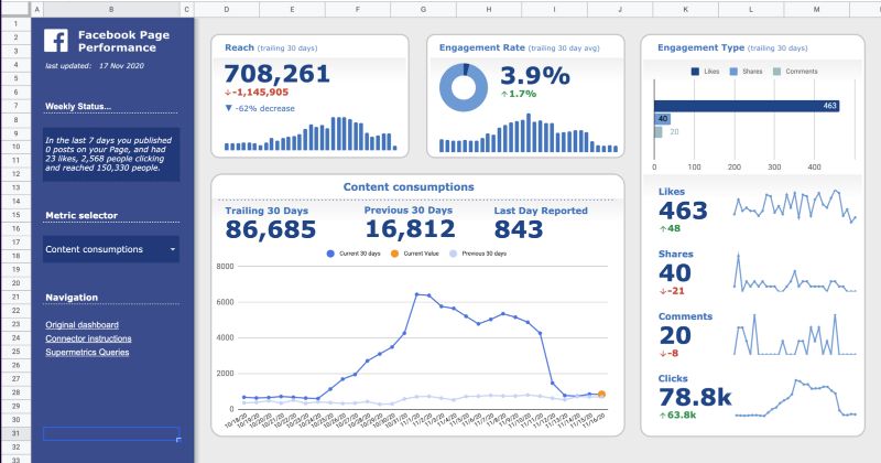
Notice the blank sheet is Draft 1 and the final dashboard is Draft 4. It’s an iterative process. Click to open larger image in new browser tab.
The blank screen stares back at you, waiting for you to do something.
It feels overwhelming.
You clasp your hands around the back of your head, lean back in your chair and rue the day you mentioned building a dashboard to your boss.
It was supposed to be easy. Easy to create a masterpiece, a thing of beauty to wow your team.
Meanwhile, that blank Sheet continues to stare back at you, emptier than ever.
It’s day two of a four day product launch. You’ve worked hard all year to create a fantastic product, test your sales systems and tell the world about this amazing offer. You know you’ve sold 100 products so far, but…
…you don’t know whether your ads are effective, which affiliates are really killing it versus which have forgotten about your launch, or even whether your own emails are converting.
Looking at your sales log only, and having to decipher what’s happened since the last time you looked an hour ago, is like trying to drive in the dark without headlights.
Thankfully there is a better way to track your sales, so you can see your data, get insights about what’s working and what’s not, and immediately act to increase your bottom line.
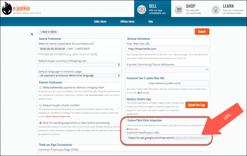
This post looks at how to build a real-time dashboard for the E-junkie digital sales platform using Google Sheets:
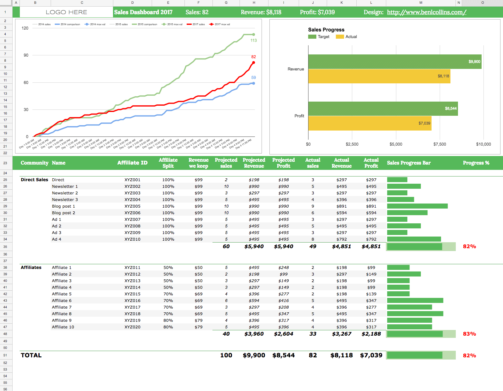
Google Sheet e-junkie real-time dashboard (fictitious data)
E-junkie is a digital shopping cart, used for selling digital products and downloads. The system handles the shopping cart mechanics, but does not do any data analytics or visualizations.
You can view a transaction log (i.e. a list of all your sales) but if you want to understand and visualize your sales data, then you’ll need to use another tool to do this. Google Sheets is a perfect tool for that.
You can use a Google Sheet to capture sales data automatically in real-time and use the built-in charts to create an effective dashboard.
You’d be crazy not to have a tracking system set up, to see and understand what’s going on during sales events or product launches. This E-junkie + Google Sheets solution is effective and incredibly cheap ($5/month for E-junkie and Google Sheets is free).
The Write Life ran a Writer’s Bundle sale this year, during the first week of April. It’s a bundled package of outstanding resources for writers, including ebooks and courses, heavily discounted for a short 4-day sales window.
I created a new dashboard for The Write Life team to track sales and affiliates during the entire event. This year’s dashboard was a much improved evolution of the versions built for the Writer’s Bundle sales in 2014 (which, incidentally, was my first blog post on this website!) and 2015.
The biggest improvement this year was to make the dashboard update automatically in real-time.
In previous years, the dashboard was updated every 3 hours when new data was manually added from a download of E-junkie sales data. This time, using Apps Script, I wrote a script and set up E-junkie so that every sale would immediately appear in my Google Sheet dashboard.
So, it truly was a real-time dashboard.
Animated chart showing fictitious sales data during a flash sale
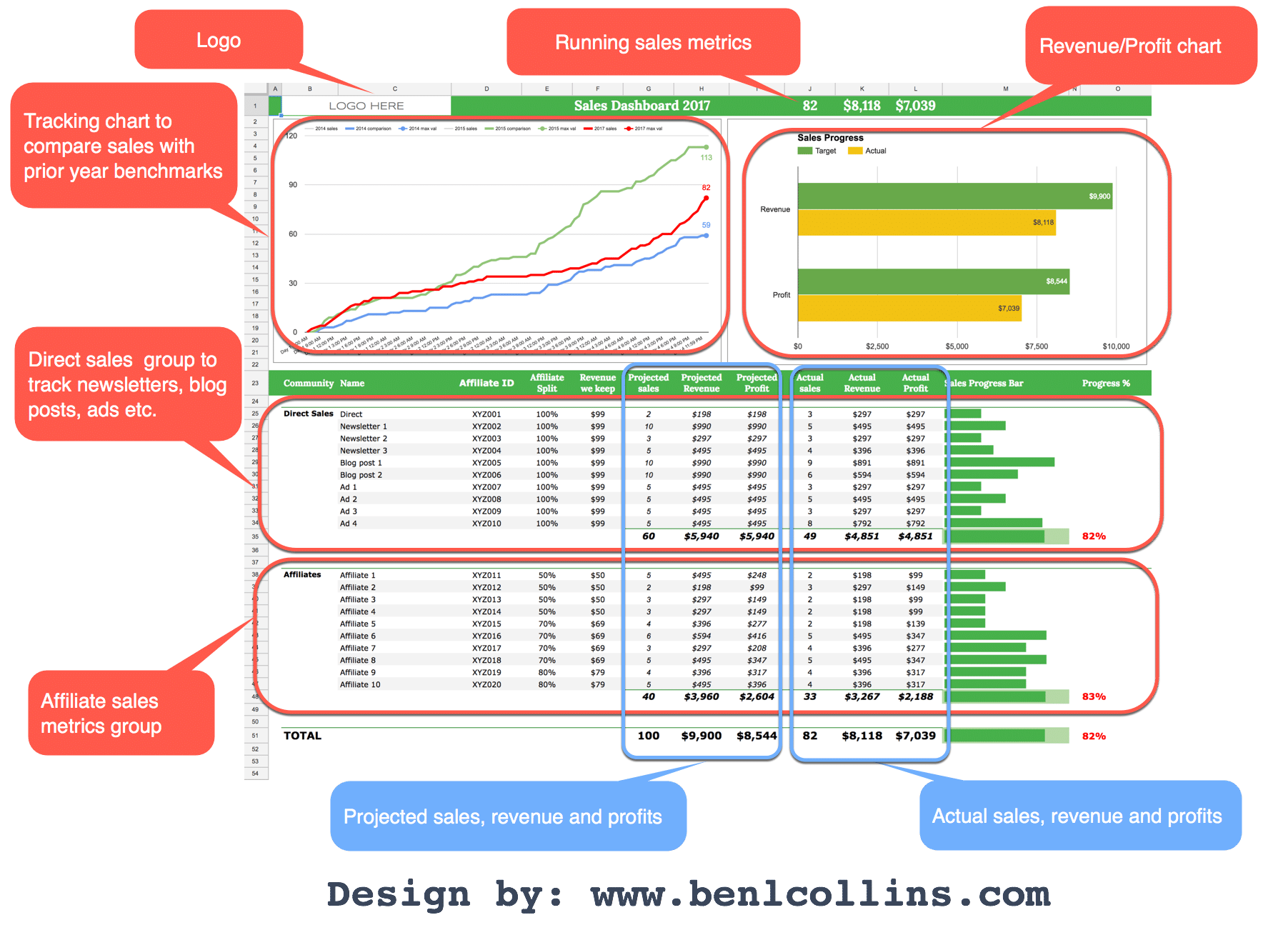
Here’s the final dashboard, annotated to show the different sections:
Annotated Google Sheets dashboard with fictitious data (click to enlarge)
There are too many steps to detail every single one, but I’ll run through how to do the E-junkie integration in detail and then just show the concepts behind the Google Sheet dashboard setup.
How to get data from E-junkie into Google Sheets
New to Apps Script? Check out my primer guide first.
Open up a new Google Sheet and in the code editor (Tools > Script editor…) clear out any existing code and add the following:
function doPost(e) {
  var ss = SpreadsheetApp.getActiveSpreadsheet();
  var sheet = ss.getSheetByName('Sheet1');

  if (typeof e !== 'undefined') {
    var data = JSON.stringify(e);
    sheet.getRange(1,1).setValue(data);
    return;
  }
}
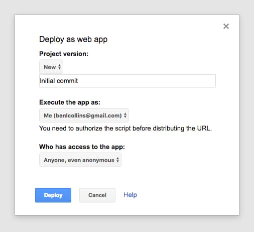
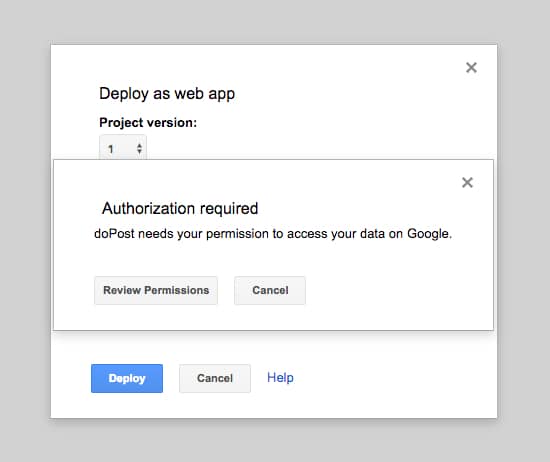
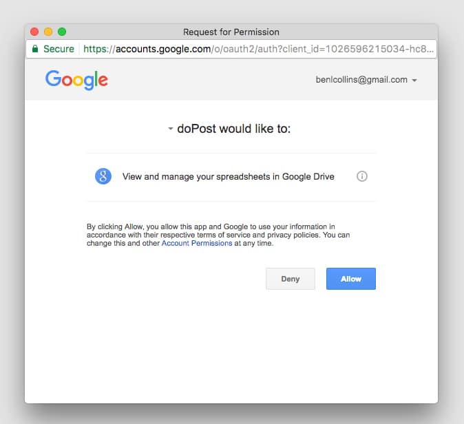
Save and then publish it:
Publish > Deploy as a web app...
and set the access to Anyone, even anonymous, as shown in this image:
You’ll be prompted to review permissions:
followed by:
Click Allow.
This is a one-time step the first time you publish to the web or run your script.
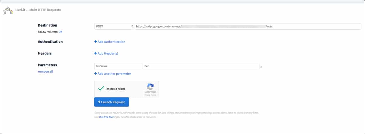
Now we want to test this code by sending a POST request method to this Sheet’s URL to see if it gets captured.
We’ll use a service called hurl.it to send a test POST request.
Open hurl.it, select the POST option in the first dropdown menu, add the URL of your published sheet into the first text box and, for good measure, add a parameter, like so (click to open large version):
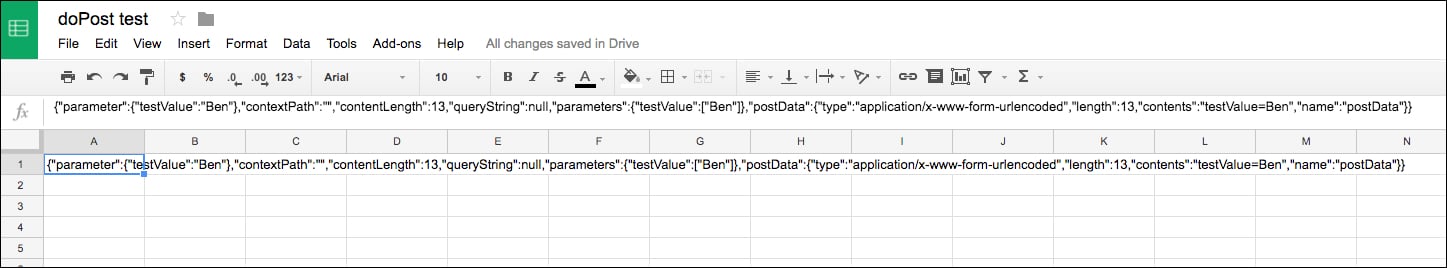
Click “Launch Request”, head back to your Google Sheet and you should now see some data in cell A1 like this (click to open large version):
where the data is something like this (the custom parameter shown in red):
Voila! The data sent by the POST action is sitting pretty in our Google Sheet!
It’s essentially exactly the same mechanics for the E-junkie example.
So now we know it’s working, let’s change the Sheet and the code to handle E-junkie data.
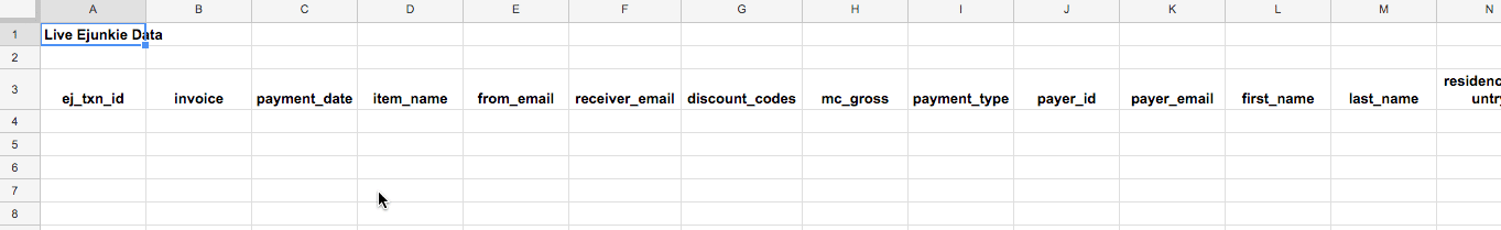
For the Sheet: Delete the data in cell A1, and add a row of headings that match the headings in lines 12 to 33 of the code below (omitting the data.):
(This screenshot doesn’t show all the columns, some are off-screen to the right.)
For the code: Delete all the previous code and replace with this (note that I’m still referring to Sheet1, so if you’ve changed the name of your Sheet to something else you’ll need to change it in the code on line 4 as well):
function doPost(e) {

  var ss= SpreadsheetApp.openById("<Sheet ID>");
  var sheet = ss.getSheetByName("Sheet1");

  var outputArray = [];

  if(typeof e !== 'undefined') {
    var data = e.parameter;

    outputArray.push(
      data.ej_txn_id,
      data.invoice,
      data.payment_date,
      data.item_name,
      data.from_email,
      data.receiver_email,
      data.discount_codes,
      data.mc_gross,
      data.payment_type,
      data.payer_id,
      data.payer_email,
      data.first_name,
      data.last_name,
      data.residence_country,
      data.payer_status,
      data.payment_status,
      data.payment_gross,
      data.affiliate_id,
      data.item_affiliate_fee_total,
      data.mc_currency,
      data.payer_business_name,
      data.payment_fee
    );

    sheet.appendRow(outputArray);
  }

  return;
}
– Learn how to build beautiful, interactive dashboards in my online course. – 9+ hours of video content, lifetime access and copies of all the finished dashboard templates. Learn more
How I created the dashboard in Google Sheets with E-junkie data
Really the crux of this whole example was getting the E-junkie data into my Google Sheet in real-time. Once I had that up and running, I was free to do anything I wanted with the data.
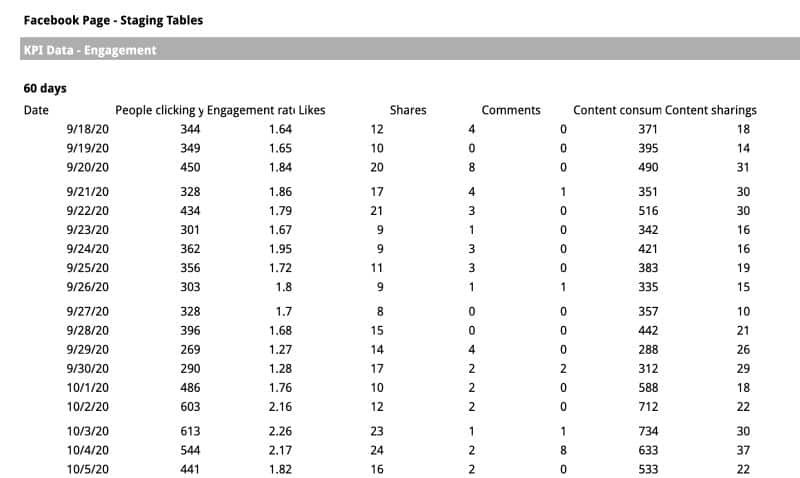
Data staging
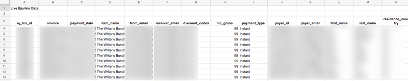
The E-junkie sales data looked like this in my Google Sheet once the transactions started to come in (blurred to hide details):
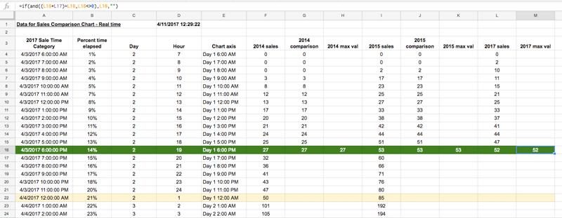
From this raw data, I created a staging table for the line tracking chart:
This table was driven by checking whether the hour date in column E of the current row (green) was less than the current time and then counting sales up to that point. The 2014 and 2015 datasets were included for reference.
To ensure everything updated in near real-time, I changed the calculation settings (File > Spreadsheet settings... > Calculation) to: On change and every minute
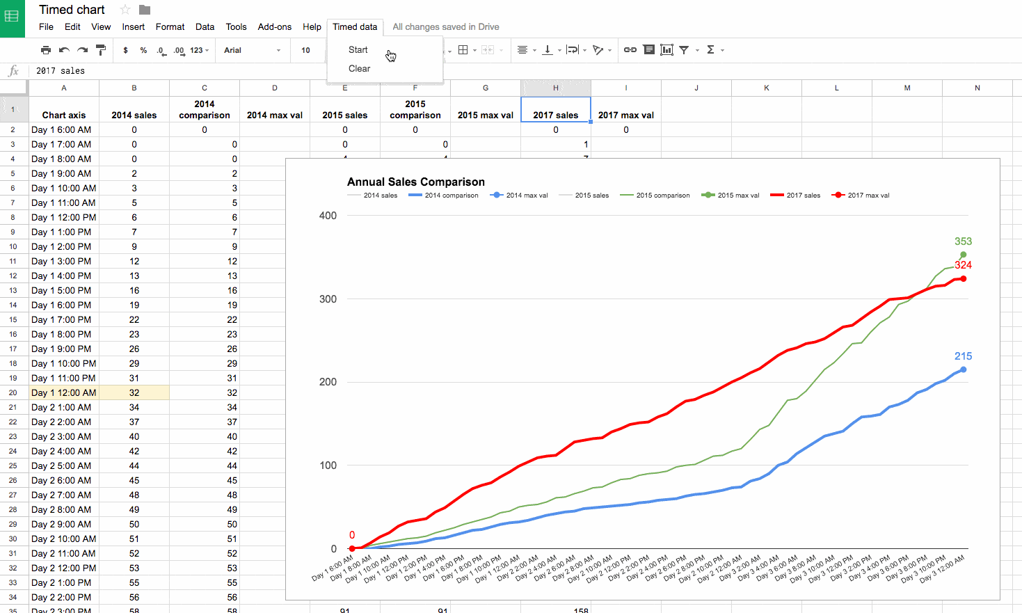
Progress tracking chart
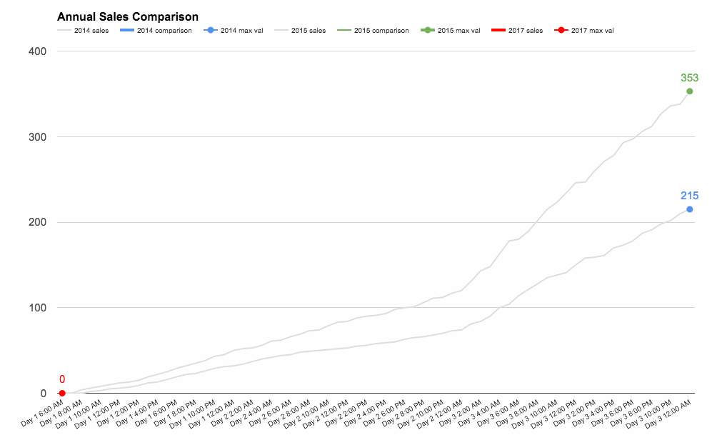
The line tracking chart showed progress during the sale period, against the 2014 and 2015 benchmarks.
In action, it looked like this (showing fictitious data, and sped up to show progress through the sale period):
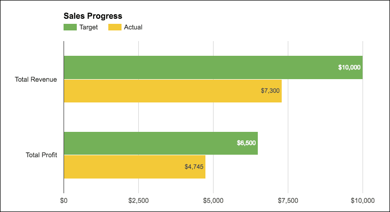
The revenue/profit chart was a standard bar chart showing total revenue and total profits against the target metrics (fictitious numbers):
Sales channel metrics
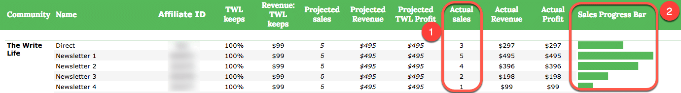
The lower portion of the chart was a breakout of all the different sales channels we tracked, everything from individual emails, to ads (Facebook and Pinterest) and different affiliates.
Every one of these channels had their own row, showing the actual sales performance against that channel’s projected sales (click to view larger version; numbers are fictitious):
The key formula driving this section of the dashboard was a simple COUNTIF formula, labeled 1 above, which counted the number of sales in the E-junkie dataset attributed to this channel:
=COUNTIF('ejunkie staging data'!$S$4:$S,D25)
The sparkline formula for the green bar charts, labeled 2 above, was:
Note: both of these formulas work for the data in row 25.
In action
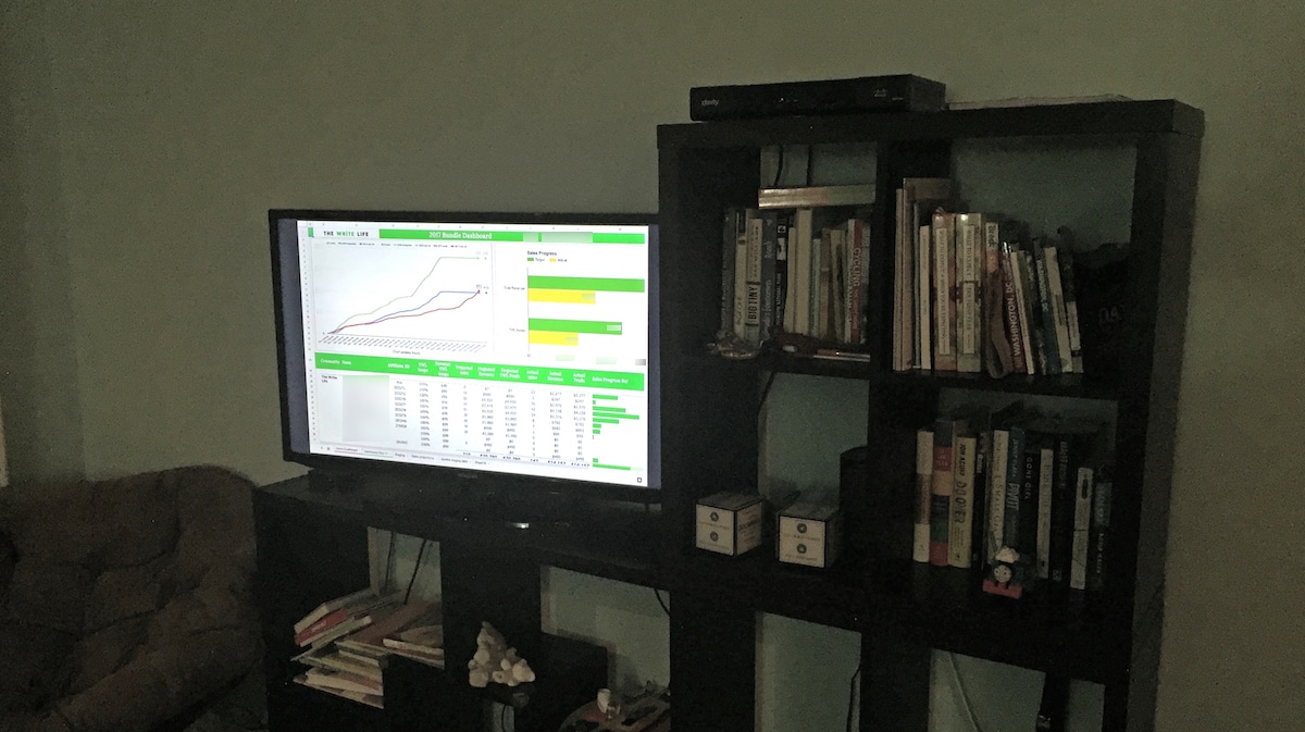
One fun thing we did with the dashboard this time around, which I’d never done previously, was to show it full screen on a big TV during the sale, using an Apple TV and AirPlay:
Google launched a new business intelligence tool called Data Studio in May 2016. It’s a really smart reporting tool for quickly creating powerful, stunning dashboards from multiple Google data sources.
It’s a great option for small/medium businesses already using Google tools, who want to build bespoke dashboards for that 40,000ft view of their business.
Google Data Studio Example Reports
Here are two example reports for a mid-size website (~500k pageviews a month).
Regular readers will know of my enthusiasm for building dashboards, especially using Google apps (like this one or this how-to article).
So I was super excited in May of this year (2016) when Google launched Data Studio, a free data visualization and dashboard tool to compete against incumbent dashboard vendors Microsoft PowerBI, Tableau and Qlickview.
Here, I’m excited to share my initial impressions and show you some of the basics steps to build dashboard reports using this tool.
I’ve been using it these past few days to build several different test dashboards.
First impressions: I love it. It’s simple and intuitive. Impressive.
Of course, since it’s a beta launch and it’s a nascent product, there are still areas where it’s lacking sufficient depth or flexibility and it’s a little buggy in places (see discussion below) but overall it’s a significant entrance into the Business Intelligence world for Small and Medium Businesses.
For Enterprise businesses, Google has Data Studio 360 – the full-fat, paid platform.
This article focusses on the free Data Studio version.
Data Studio: The smart way to build dashboards and reports with your Google data
So, another data analysis tool? What’s the value proposition here then?
The premise is that you can connect all of your disparate business data sources (only Google services at the moment but there are other non-Google data connections coming soon) and easily build beautiful, interactive dashboard reports to display that information. And all atop Google’s super-reliable, powerful, scalable architecture. Plus, as with so many Google products, it’s free.
It’s a simple drag-and-drop process to add charts and build reports, and it doesn’t require any knowledge of coding. That makes it super quick to create and modify reports. There’s a boat-load of data and formatting options so you can customize reports to match your needs.
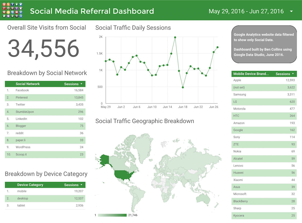
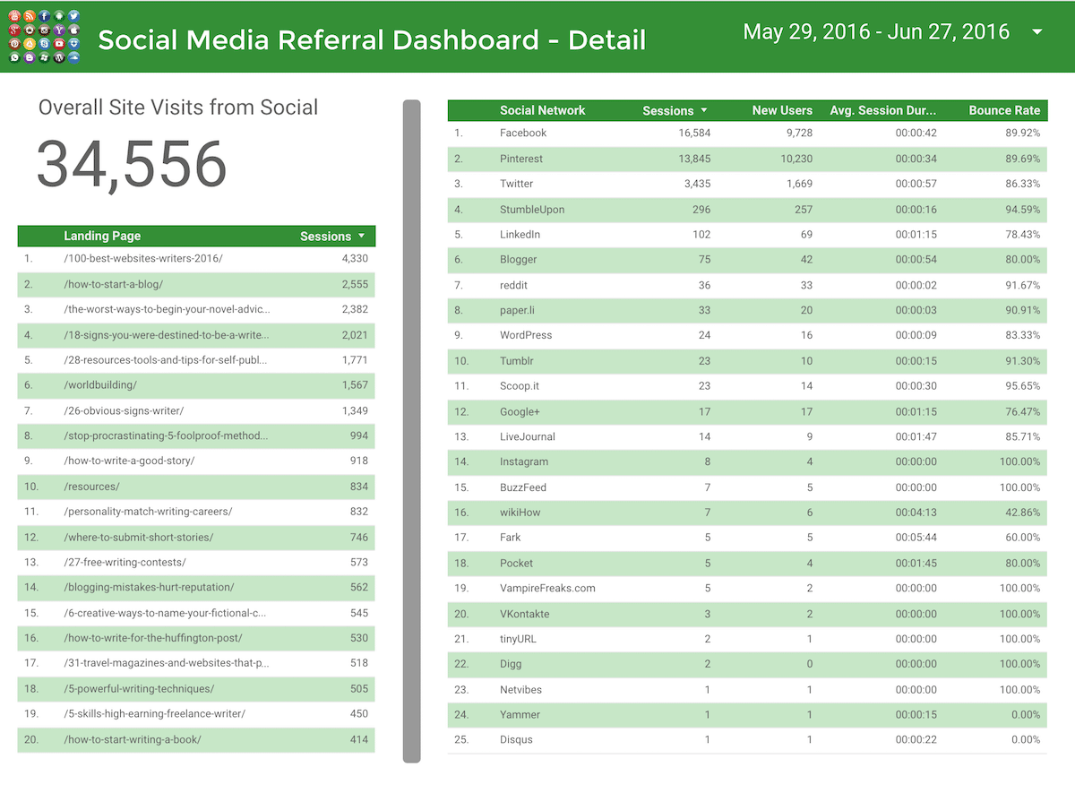
Example: Social Media Reporting Dashboard with Google Data Studio
Want to see what this tool is really about? Heck yeah, I thought so!
Well there’s no better way to do this than seeing a real dashboard with real data.
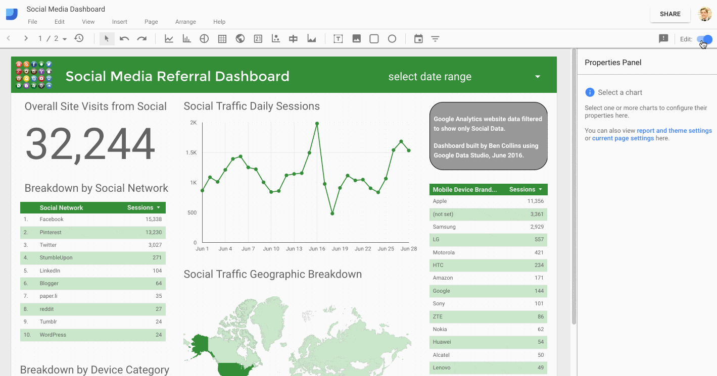
So I’ll show you a dashboard for reporting social media referral traffic of a mid-size website (~500k pageviews a month). I’ll show some of the steps below and discuss how easy it is.
Ready?
Great, well here’s our dashboard:
Data Studio Social Referral Dashboard – Page 1Data Studio Social Referral Traffic Dashboard – Page 2
I’m not going to go through every step in detail, instead I’ll mention a few of the main steps and key points to keep in mind.
There are three steps to using Data Studio: 1) connecting to a data source, 2) creating visualizations in a dashboard, and 3) sharing your finished creation.
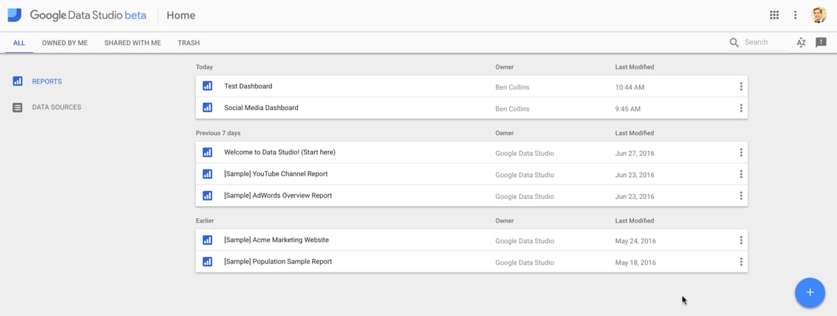
Step 1: Setting up Data Studio and connecting to a data source
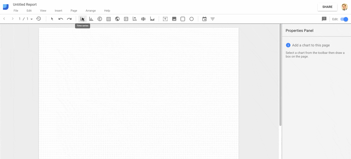
You’ll be taken to your home page, showing a bunch of example Google templates (well worth a look) and any of your own dashboards:
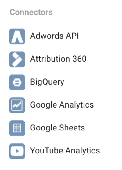
Clicking the big blue plus in the bottom right of the home page creates a new dashboard from where you can connect to different Google data sources:
Data Studio data connectors
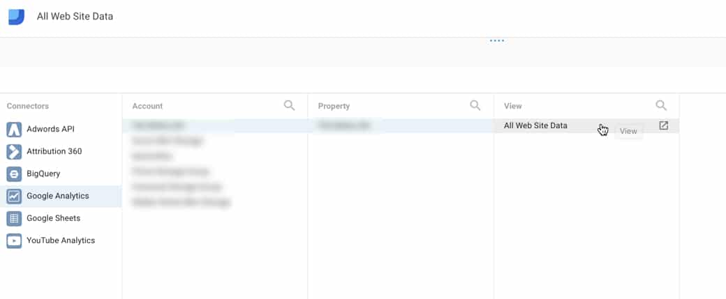
I’ve chosen to connect to Google Analytics and then to a specific web property, as shown in the following image:
This imports all of the data into my report and makes it available for charting or displaying on my dashboard. I discuss these steps in more detail in the video at the beginning of this post.
Step 2: Creating visualizations and creating a dashboard
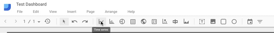
In the control bar along the top of the window, there are 9 chart types available (line, bar, pie, table, geographic, scorecard, scatter plot, bullet chart and area chart) and the ability to add images, text, rectangles and circle shapes. Plus there are two filters available: date and a general “type” filter.
Adding charts is as simple as selecting the one you want in the toolbar, then creating a container for it somewhere on your dashboard canvas. Google will then build the chart, with some default data (which you can easily modify). The following GIF shows this step, along with changing the data being displayed and formatting the chart:
I’d encourage you to play around with the tool for a while at first, adding and deleting different charts to get a feel for what they look like and what sort of data they can display. There’s more info in the video at the start of this post.
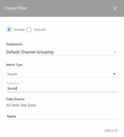
For the Social Media dashboard above, I’ve made use of line charts, tables, scorecards and a geographic map. I’ve added a filter to the data source to restrict the data to show Social visits only:
Once you’ve finished building, switch to view mode to lock everything down and remove the gridlines. The filters still work in this view mode.
Switching between editing and viewing mode is done by toggling the blue toggle switch in the top R corner of the window, as shown in the following GIF:
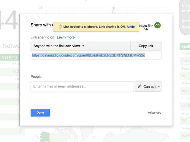
Step 3: Sharing your dashboard
As a final step, you’ll probably want to share your dashboard with colleagues, clients or friends. Click the big Share button in the top R corner of the screen to bring up the share menu pane.
Here, you can enter email addresses of people you want to share the dashboard with or, as shown in the following image, copy the shareable link and send that to people, share on social media or your website. In both cases you can control whether others will have editing access or see the dashboard as view-only.
What I really liked about Data Studio
It’s flexible and can connect to multiple different data sources.
It’s super easy to create charts. Without too much effort you can produce really professional-looking, slick dashboards.
It’s really quick to create reports.
There’s a huge level of customization, especially with the Google Analytics data connection.
Multiple pages allow you to create a hierarchy of dashboards of increasing levels of detail/complexity, to tell a story.
Best of all, the data range and filter range controls are very easy to implement but incredibly powerful in how they work.
And of course, like many Google products, it’s free!
On a similar note, snapping to a grid to help line up objects would be helpful. Provided it could be toggled on/off of course!
More data connections, for example to SQL databases. This is coming soon…
I’d love to see more granular control over the chart details, for example formatting of the axes and working with data labels. The range of options is a great step in that direction and you can already make beautiful looking charts but this would take it to the next level.
I could not select multiple items by holding down the Ctrl (or Cmd) key and selecting, which struck me as odd. You can select multiple objects by dragging and holding the cursor across them however.
When I tried sharing, I was prompted to log into Google despite choosing the option to share with anyone. So, it seems that non-Google users can not view these dashboards at the moment.
When in Full Screen display mode, the page buttons are hidden and barely accessible, making it difficult to navigate through the dashboard.
Closing thoughts
If you’re invested in the Google ecosystem, work with data, especially Google Analytics, then I’d encourage you to give it a try. I’m sure Google will invest in this product and build out the features and data connection options. It’ll be interesting to see where it goes and how it competes with Microsoft’s PowerBI and other vendor offerings.