Welcome to issue 2 of the Sheets Insiders membership program.
You can see the full archives here.
This week, we’re sticking with the data visualization theme. I have a walkthrough of a stunning chart in Google Sheets. There are lots of techniques in play, which you can transfer to your own projects.
I also encourage you to watch the video version (see below) as this is definitely an tutorial with a visual angle!
Learning Objectives
By the end of this tutorial, you’ll understand:
- Why series (columns) of data are KEY to building charts
- How to use “filler” bars to float data
- How to use formatting and drawings to make your charts visually pop!
Template
Download the Chart Tutorial Template
Requires you to be logged in to your Google account. Click “Use Template” to make a copy.
Video Tutorial
Sheets Insiders 2: Chart Tutorial Part 1

Sheets Insiders 2: Chart Tutorial Part 2
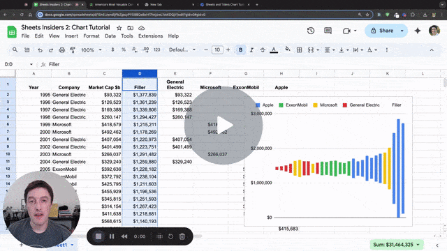
Chart Tutorial
One of the best ways to improve your charts is to study great charts and try to copy them. You can incorporate design ideas you like into your own charts.
So I want share two great sources of inspiration for data visualization:
Both regularly publish fantastic charts, often based on current events.
And today, we’re going to recreate this chart from Visual Capitalist.
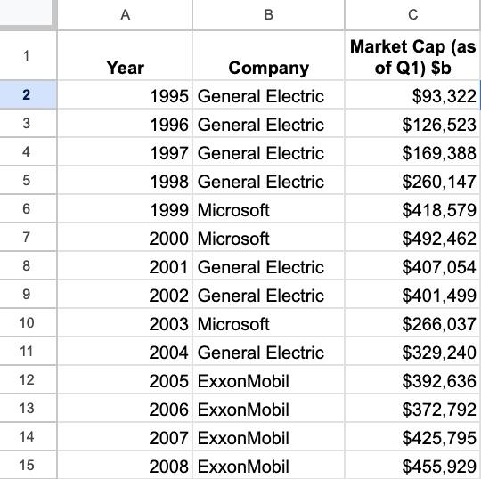
Step 1: Prepare the data
We start with this simple table of years, companies, and market cap values:
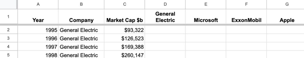
Let’s begin by adding the 4 unique company names as column headers in cells D1 to G1:
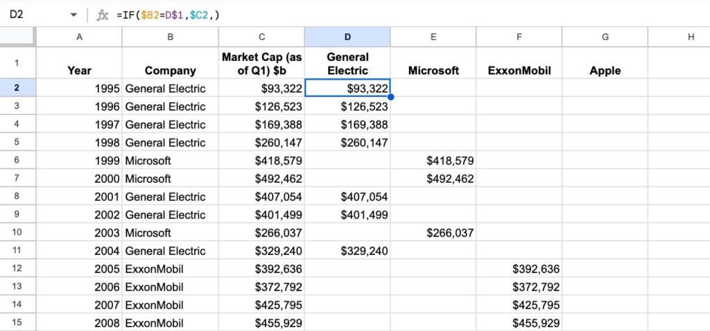
Then split the market cap into the separate columns with this IF formula in D2, which can be dragged down and across to fill the range:
=IF($B2=D$1,$C2,)
Now our data looks like this:
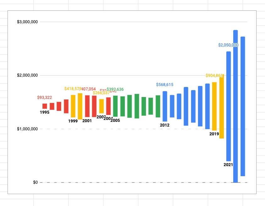
Step 2: Chart version 1
We can create our first chart:
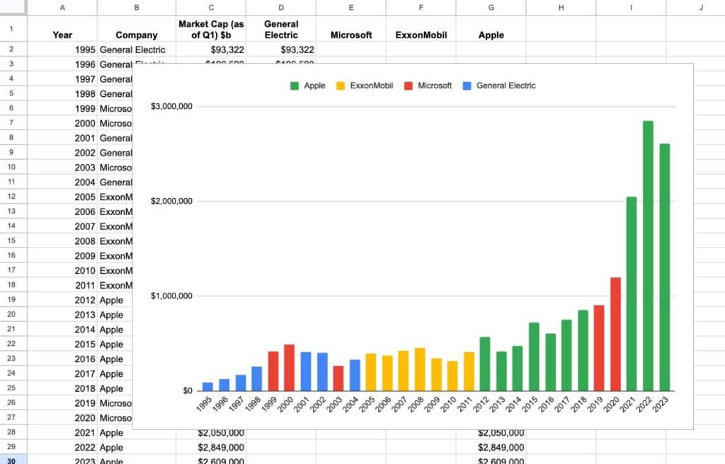
Use these settings:
- Chart type –> Stacked column chart
- X-axis –> Year
- Series –> delete the “Market Cap $b” series and only show the 4 companies
- Check the box “Use row 1 as headers”
- Check the box “Use column A as labels” and “Treat labels as text”
One important point to mention: we need to be careful when we use color to add meaning to our chart. In this example, what would happen if someone printed it in grayscale. Would the companies still be distinguishable? Probably not.
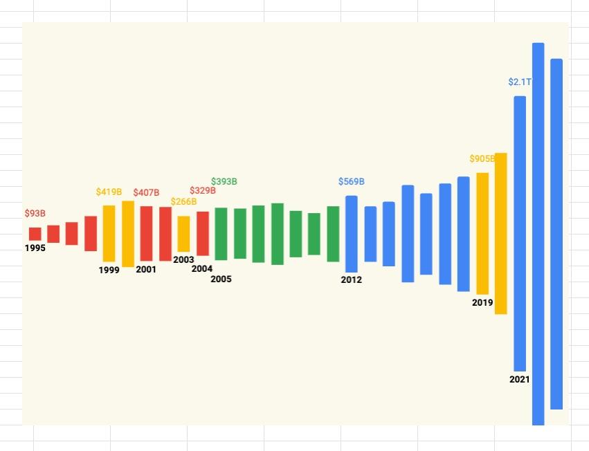
Step 3: Reshape the data
We introduce a “filler” column to recenter the bars around the midpoint of the y-axis. You’ll see what I mean in the updated chart below.
Insert a new column between “Market Cap $b” and “General Electric” and insert this formula into cell D2:
=(MAX($C$2:$C$30)-C2)/2
Drag it down the column.
It finds the maximum value of the market cap values column. Then it subtracts the current value. Finally, it halves the result.
It’s working out how much “filler” to add under each column in the chart, where the largest column doesn’t have any filler underneath (because the formula gives 0).
Update the chart as follows:
- Add the “Filler” column to the Series
- Set the “Filler” series color to white
- Set the “Apple” series color to blue
- Remove the legend Customize > Legend > Position > None
And now our chart looks like this:
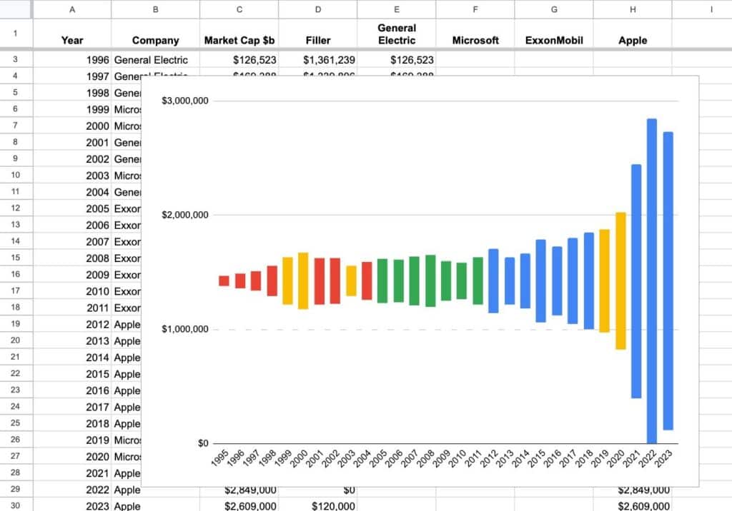
Compare it to the first chart and you can clearly see what the “Filler” has done.
And now it doesn’t take a great leap of imagination to see how our Google Sheets chart is evolving into the original Visual Capitalist chart that was our inspiration.
Step 4: Create labels with series
The shape of the chart now looks great. But we can do more with the labeling to get closer to the original chart we’re trying to replicate.
The trick here is to add additional series to our chart, and use them to place labels strategically on the chart.
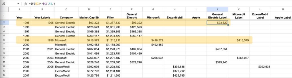
First, let’s add a new column between “Year” and “Company” that we call “Year Labels”. Add this formula to B2:
=IF(C2=C1,,A2)
This creates a column where the year shows only when there is a change in the company column.
This will temporarily mess up the chart, but ignore that for now. We’ll fix that shortly.
Now, let’s use this strategy to add the company names to the chart too.
Add these headers next to the company names (in the cells J1 to M1):
- General Electric Label
- Microsoft Label
- ExxonMobil Label
- Apple Label
Then add this formula in cell J2, under the “General Electric Label” header, and drag it down and across to fill the new columns:
=IF($C2=$C1,,F2)
This creates columns with values for each company but only for the years when they become the most valuable company after a change.
Our data now looks like this, and I’ve highlighted two rows to show you the formulas picking up data when the most valuable company changes:
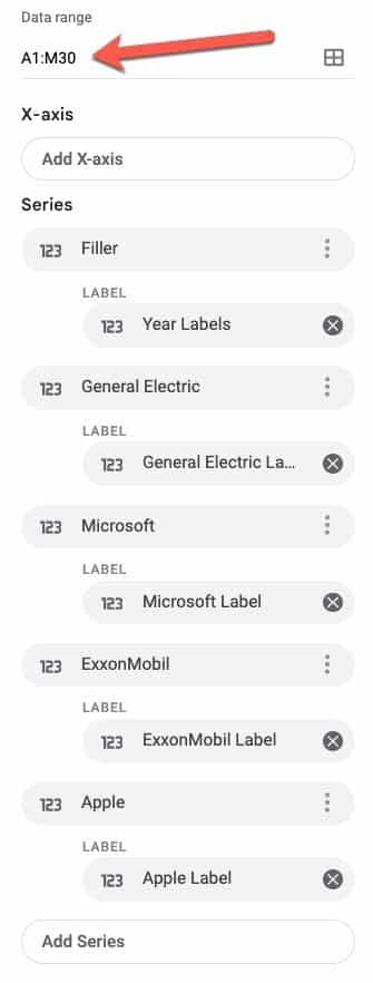
Let’s update the chart in the chart editor sidebar.
First thing you’ll need to do is expand the chart “Data range” to include the extra columns (A1:M30 now) otherwise they won’t be available to use.
Next, remove the X-axis value, since we don’t want that to show in the final chart.
Then, setup the series to match these (you can remove and add them as needed):
Your chart will now look like this:
Step 5: Format the chart
All that remains are cosmetic touches to make the chart pop.
Highlight the 4 company labels columns and apply this custom number format:
[<999950]$#,##0,"B";$#,##0.0,,"T"
Go to Format > Number > Custom number format and enter the rule into the input box. This formats the numbers as billions or trillions and makes the chart more readable.
In the “Customize” section of the chart editor, apply the following settings:
- Chart style > Maximize
- Chart style > Background color > Custom > Enter this hex code for pale yellow #fbf9ec
- Chart style > Chart border color > None
- Series > Filler > Fill color > Select the pale yellow color (same one used above)
- Legend > None
- Vertical axis > Text color > Select the pale yellow color (same one used above)
- Gridlines and ticks > Vertical axis > Uncheck the “Major gridlines” box
- Double click on the overlapping labels and manually drag them apart (this is finicky, be warned!)
Now our chart looks like this:
Step 6: Finishing touches
To complete the chart, and match the original chart that inspired our effort, we need to add titles and company names and logos.
We’ll use the drawing feature to place these on our chart.
Go to Insert > Drawing
Create graphics with text, arrows, or even logos that you paste into the drawing window.
Save the drawing to add it to you Sheet.
Resize it and drag it on top of the chart.
Note, you can also add logos directly as images (Insert > Image > Insert image over cells).
Feel free to copy any of the drawings from the template. Double click the drawing to open it, and copy the graphical elements from there. Open a new drawing object in your Sheet and paste the graphical elements.
Our finished chart looks like this:
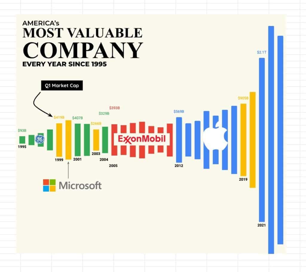
It’s surprising how good we can make charts look in Google Sheets with a little ingenuity.