Let me show you a unique use case for pivot tables – Pivot Table Maps!
Can you guess which city this is?
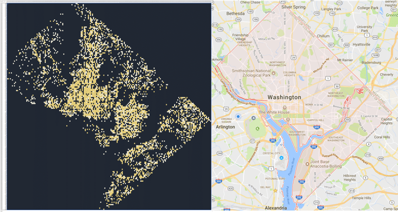
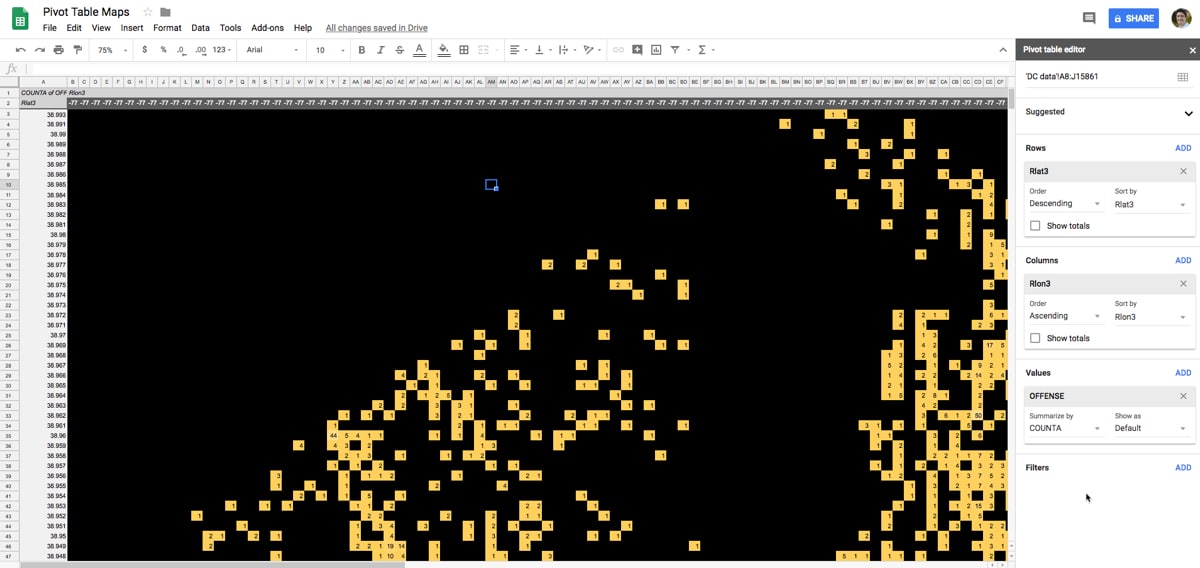
It’s Washington D.C. and it’s also a pivot table in Google Sheets. The image on the left is the Pivot Table map built with a pivot table. The image on the right is a screenshot of Washington D.C. from Google maps.
Look closely and you might just be able to see the Google Sheet row and column headings around the map.
Wait, what?
I downloaded a dataset of DC crime data, which had latitude and longitude data, and plotted it as a pivot table with conditional formatting.
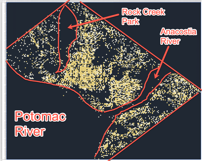
The dark areas in the pivot table map represent Rock Creek Park (huge wooded area with few people, hence few crimes) and two rivers, the Anacostia, which runs through the SE of the city, and the Potomac river, which delineates the W edge of the city.
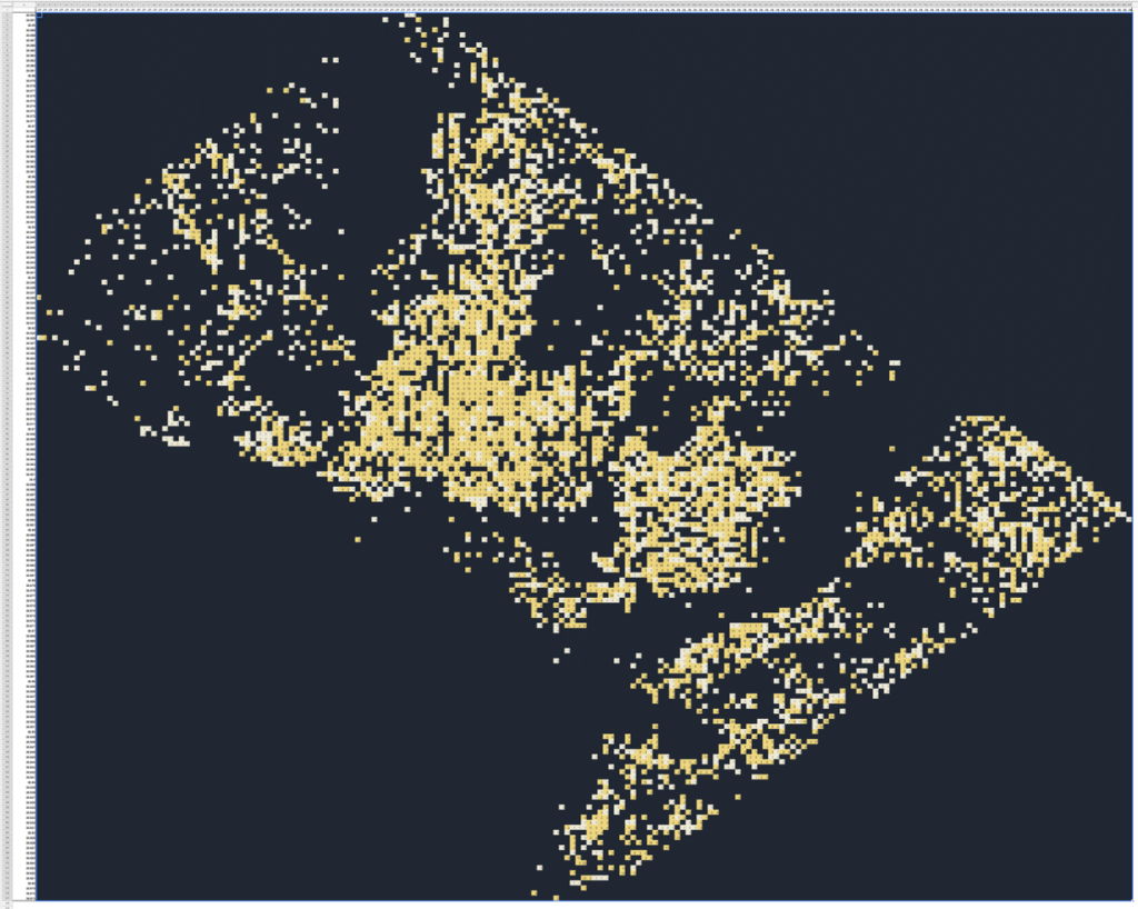
And here’s a close up of the Sheet, to convince you it’s really a pivot table (click to enlarge) 😉
I first saw this technique implemented in Excel (see this example) but I haven’t seen anything in Google Sheets before.
How to make Pivot Table Maps
It’s actually pretty simple and can be performed on any dataset with latitude and longitude data, to varying degrees of success (some datasets are too large, some not granular enough).
- Download your chosen dataset.
- Round your latitude and longitude data columns to 1, 2 or 3 decimal places (depending on how granular your data is, trial and error).
- Highlight the whole data table and create a pivot table.
- Insert latitude as rows.
- Sort the latitude rows as descending, since larger positive numbers are further North.
- Insert longitude as columns.
- Highlight all the longitude columns and reduce the column width of all of them in one go, so all the cells are square.
- Insert your measure into the values section of your pivot report builder, in the DC map example above I inserted “Offense” and used COUNTA to count them.
- Highlight whole pivot table and choose Conditional Formatting –> Color Scale (I chose variations of yellow).
- Change the background of the pivot table to black.
- Zoom out on your Sheet as far as you need to see the full “map”.
Want to see this template?
Feel free to make your own copy (File > Make a copy…).
 💡 Learn more
Learn more about working with data in Pivot Tables in the Pivot Tables in Google Sheets course
When could we use Pivot Table Maps?
It’s a quick and dirty way of visualizing geographic data sets.
It’s not really suitable for deep analysis or final charts, where a tool like Tableau would really prove it’s worth, but for a quick look with only a few minutes work, it’s not too bad!
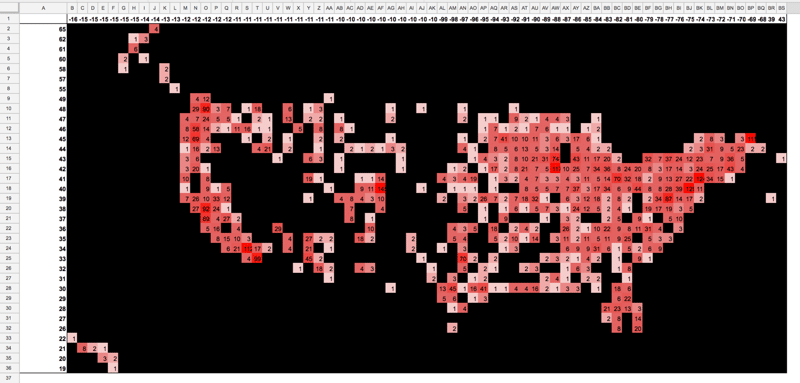
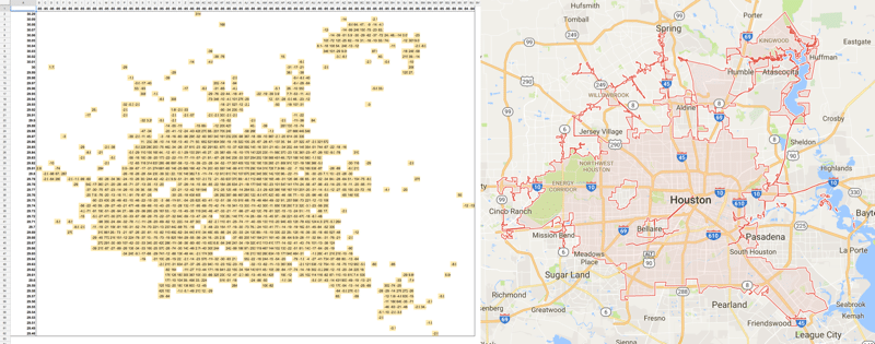
Here’s a few more Pivot Table Maps of my own:
A pivot table map of 7,000 breweries and brew pubs in the USA:
Houston, Texas as a pivot table map, created from 311 data:
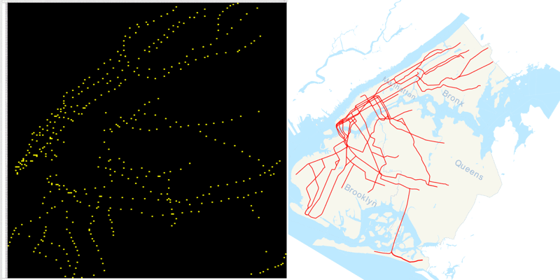
Subway stations of New York City pivot table map:
Let me know if you try this yourself! I’d love to see any creations you come up with.
💡 Learn moreLearn more about working with data in Pivot Tables in the Pivot Tables in Google Sheets course