Welcome to issue 18 of the Sheets Insiders membership.
You can see the full archives here.
Chart Tutorial
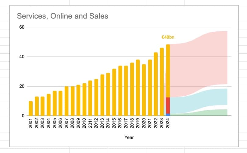
Inspired by this Ikea chart (half way down), I wanted to see if we could recreate it in Google Sheets.
It turns out, with some creative chart techniques, we can do a pretty good job!
Here’s the final chart in Google Sheets:
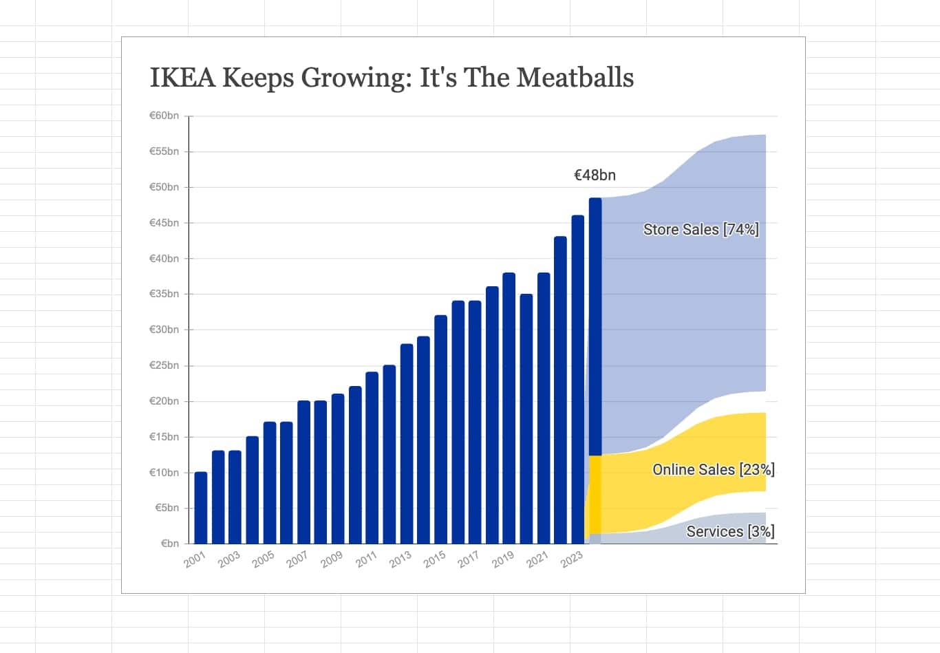
It’s a “Combo” chart with columns and area charts, and some clever data manipulation tricks.
This is a rather long and complex tutorial, so is better explained in the video below. But for completeness, and because it’s not always possible to watch videos, I’ve included written instructions also.
Video Recording
Template
Download the Advanced Chart Tutorial Template
Click on “Use Template” in the top right corner to make your own copy.
There is no Apps Script with this template.
Create the Base Chart
- Highlight the 4 columns of the initial dataset
- Go to Insert > Chart and select Combo chart in Setup
- In Setup, set the stacking to Standard
- In Customize, go to Series and set each to columns
- In column E of your dataset, add the header “Sales Label” and put the value 48 in cell E25
- Click on cell E25, go to menu Format > Number > Custom number format (learn more) and set the rule to:
€#,##0bn
- Update the chart to include column E. Under Setup > Data range, change the range to A1:E25
- Under Setup > Series > Sales click on the three dots menu to Add labels and choose Sales Label
- Format your chart: change the title, remove the legend, change the colors, etc.
Add the Flow Chart
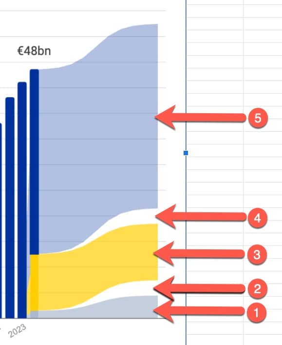
To create the nice flow chart showing the split of revenue, we need to add an extra FIVE series to the chart:
That means five new columns in our dataset.
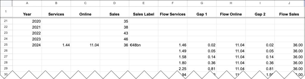
10. Add the following column headings to the dataset:
Flow Services
Gap 1
Flow Online
Gap 2
Flow Sales
The area chart begins when the column charts finish, so all the new data will be in rows 25 onwards.
11. Add the number 3 into cell O2. This is our scale factor that determines how big the flow chart curves are (see the video above to see how this affects the chart).
Now we need to use some rather complex formulas to generate those nice (sinusoidal) curves for the flow charts.
12. Add this formula into cell F25 to get a series of values for the first flow chart (number 1 in the image above):
=BYROW(SEQUENCE(11,1,-5),LAMBDA(r,B25+O2 / (1 + EXP(-1 * (r - 0)))))
13. Add these formulas into cells G25 to J25 respectively:
=BYROW(SEQUENCE(11,1,-5),LAMBDA(r,O2 / (1 + EXP(-1 * (r - 0)))))
=SEQUENCE(11,1,C25,0)
=BYROW(SEQUENCE(11,1,-5),LAMBDA(r,O2 / (1 + EXP(-1 * (r - 0)))))
=SEQUENCE(11,1,D25,0)
Now, our data looks like this:
14. Update the chart range (under Setup) to A1:J35
15. Add the new series under the Setup tab
16. Under Customize > Series change the new series to Type > Area
17. Change the colors to match the columns. The “Gap” series should both be white.
18. Change the Line Thickness to 0 for all these new series (you have to type “0” because it’s not an option under the dropdown)
The chart will look something like this now:
Ok team, we’re nearly there! Phew!
There are just a few steps to go.
19. Change the colors of the columns and area charts to match the blue/yellow/grey of the original chart.
20. To add the labels to the flow charts, add three more label series (columns) to the data.
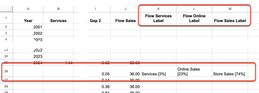
21. Add these new labels in the chart editor (same process as Steps 7 and 8 above).
22. Format the new labels to be black and positioned to the right to get them to show up.
After that, it’s up to you how you format the chart.
Have fun!

Previous Chart Tutorials for Sheets Insiders
Sheets Insiders 10: Combo Chart Tutorial
Sheets Insiders 2: Most Valuable Company Chart Tutorial

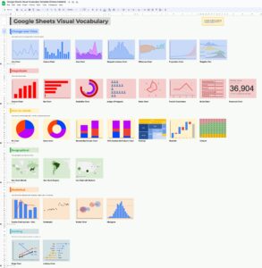
Sheets Insiders 1: Visual Vocabulary Template