The future of Google Sheets is analyzing millions, even billions, of rows of data with regular formulas and pivot tables.
The future of Google Sheets is Connected Sheets.
That’s a bold claim, so let’s explore it.
Check out this formula operating on 1.5 billion rows of data:
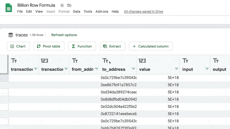
I just ran a COUNT function across 1.5 Billion rows of data. Inside my Google Sheet.
1.5 Billion rows of data!
Whaaaaat?
Fzzzzzzt……that’s the sound of all the circuit boards in my head frying simultaneously ?
Connected Sheets
I think we can all agree there’s a lot of data out there. We live in a data-rich world. And it’s only ever going to grow from here as more and more people and devices come online.
And we can also agree that “big data” is too large to store and analyze in your Google Sheets.
Until now…
Connected Sheets is a new data feature in Google Sheets for customers of G Suite Enterprise, G Suite Enterprise Essentials and G Suite Enterprise for Education.
You use the Connected Sheets feature to analyze millions or billions of rows of data inside your Google Sheets, using regular functions, pivot tables and charts.
The data lives in Google BigQuery, which is a big data analysis product from Google Cloud.
BigQuery is an incredible tool but does require knowledge of SQL code to use it.
Connected Sheets circumvents that need and gives Google Sheets users the ability to analyze big data inside their Sheets, using the familiar interface.
What Can Connected Sheets Do?
Connected Sheets can do similar operations with big datasets that you’re used to doing with regular datasets in Google Sheets, namely:
- Running a defined set of functions on big datasets*
- Creating calculated columns with big datasets*
- Extracting small data tables, called Extracts, from big datasets*, which can be used like regular Google Sheets tables
- Creating pivot tables from big datasets*
- Creating charts from big datasets*
- Scheduling automatic data refresh jobs to keep data current
* i.e. tables with millions or even billions of rows of data in BigQuery
I think the best way to explore these features is to run through a quick demo data analysis project.
Analysis Of New York Citibike Data
You access Connected Sheets through the Data menu of your Google Sheet.
You need to have a project setup in BigQuery with billing enabled before you can connect to it from the Connected Sheets menu.
When you create a new Connected Sheet, you’re prompted through a series of options to select a BigQuery project and table that you want to connect to.
In this example, I’ve connected to the New York Citibike public dataset, which has 59 million rows of data and 16 columns, which would be nearly a billion cells of data if we could put it into a spreadsheet.
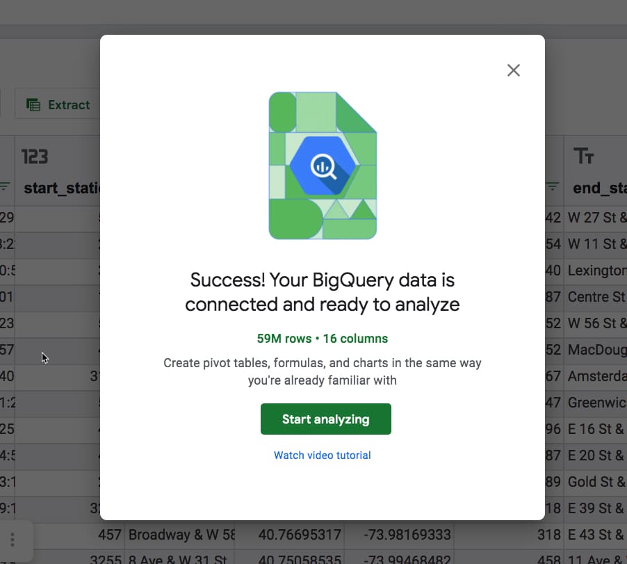
When it opens, you’re shown a preview of the dataset, i.e. all of the columns and the first 500 rows.
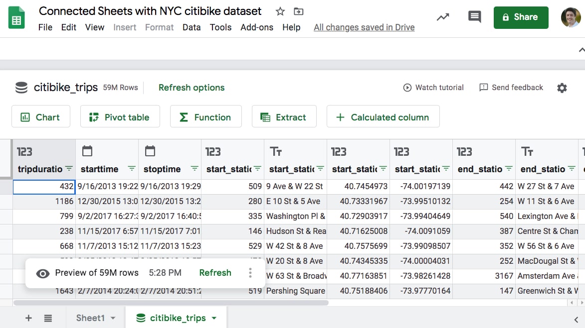
It looks like an ordinary Google Sheet, but there are five action buttons above the Sheet: Chart, Pivot Table, Function, Extract and Calculated Column.
You’ll also notice the word “Refresh options” next to the table name and “Refresh” down at the bottom in the preview note. You need to refresh periodically to include any new data from BigQuery in your Connected Sheets results. You can schedule these refreshes to happen automatically.
Now let’s explore each of the features in turn, starting with functions:
Functions with Connected Sheets
Functions in Connected Sheets are useful for getting specific answers from your data, i.e in situations when you know what you’re looking for.
For example, if I want to count how many rows of data there are in a dataset then I would use a simple COUNT function.
It’s exactly the same here with the Big Dataset in the Connected Sheet. I use a simple function in Connected Sheets.
The flow is a little different, as there is an extra click to activate the function, but otherwise it’s a regular ole’ formula:
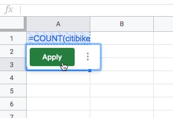
The formula looks like this in the Sheet:
=COUNT(citibike_trips!starttime)And gives the answer:
53,108,72153 million rows of data, each representing a bike trip with one of New York City’s Citibike bikes.
Boom! It’s as easy as that!
Comparison: To do the same calculation in BigQuery, you need to write a simple query in the BigQuery editor:
SELECT
  COUNT(starttime)
FROM
  `bigquery-public-data.new_york_citibike.citibike_trips`
Which gives the same answer of 53,108,721
As you can see, it requires knowing your way around BigQuery and of course, how to write basic SQL.
Wait a minute though!
This dataset is supposed to have 59m rows of data, not 53m.
There must be some blank rows (null values) in the data.
Let’s use Connected Sheets to test that hypothesis, using the Extract feature.
Connected Sheets Extracts
The Extract feature lets you extract smaller tables from the larger BigQuery dataset (remember the data shown in the Sheet is just a preview and the actual dataset lives in BigQuery).
Extracts are useful for things like extracting all records pertaining to a certain customer or looking at the largest X transactions for example. Another use case might be investigating issues with datasets.
For example, I have a strong hunch there are null values (blanks) in the dataset.
So I create an Extract using a filter set to “Value is empty” to return a subset of empty rows.
The Extract Editor is similar to the pivot table Editor, allowing you to select which columns to include, what filters or sorts to apply and what the row limit is (how many to return).
Here’s the Extract editor prior to pressing the Apply button.
You can see the blue cross shading applied to the data area to show it hasn’t been queried yet.
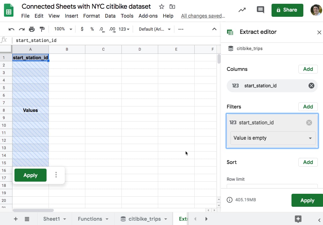
With every calculation in Connected Sheets, you need to press the “Apply” button to run the query in BigQuery to return the data.
The Extract is returned with blank rows as I expected. So there are null values in the dataset!
Presumably, there are about 6 million of them, but let’s confirm that using a calculated column and function in Connected Sheets to count the null values.
Calculated Columns in Connected Sheets
Much the same way as you’d insert a column into a regular Google Sheet table and add in a formula to perform some calculation, you can do the same with Connected Sheets datasets.
Calculated columns are added to the right side of the Connected Sheets preview table (although the order doesn’t matter in a database, since you access a column by its name).
You can use a limited set of regular Google Sheets functions in calculated columns, which are then applied to the entire big dataset in BigQuery.
Let’s continue with the New York Citibike dataset.
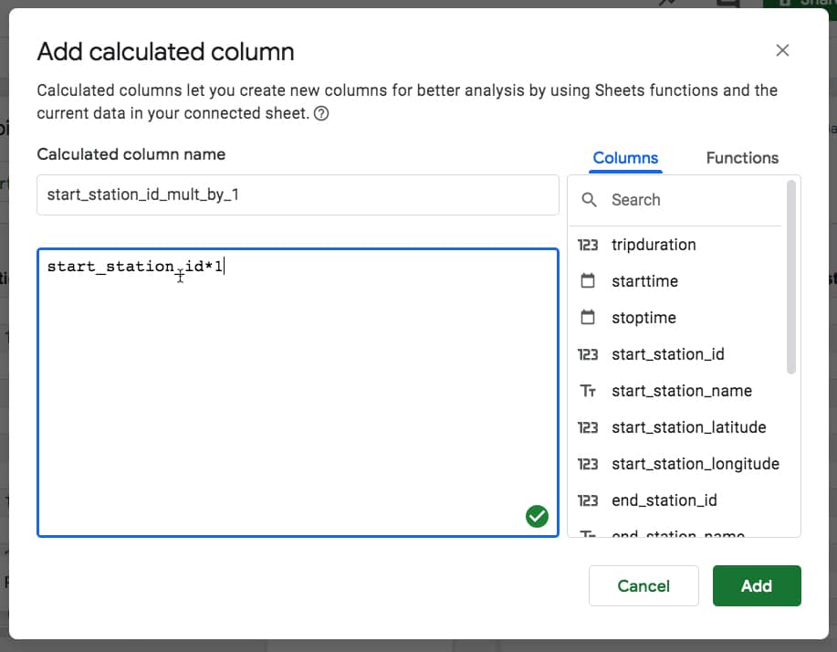
Choose the “+ Calculated Column” button above the data preview.
The Calculated Column editor pops up, where you can enter a formula using column names instead of range references.
I’m going to multiply the start station ID by 1, because this will transform any blanks (nulls) into 0 values, which I can count.
I can now create a COUNTIF function using this calculated column, to count these null rows:
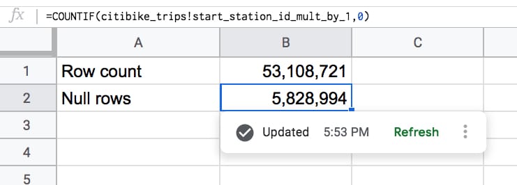
That looks about right!
Added together, those two values give us the 59 million rows in our full dataset.
Let’s add another calculated column to calculate a rider’s age.
The dataset contains the birth year for every rider, which we can use to calculate the age:
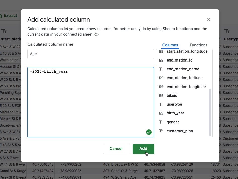
There are some very old people in the data!
To me, this seems unlikely (people over 100 years old riding citibikes in NYC? Hmm, I don’t know about that). These are probably errors in the data and would merit further exploration.
But for now, let’s draw a chart of rides by age.
Connected Sheets Charts
You can showcase your results with Charts, created directly from the data in BigQuery.
Clicking on the Chart button above the dataset creates a chart and opens the chart editor.
It’s more akin to creating a pivot table than a regular Google Sheets chart. The same customization options are all there, however.
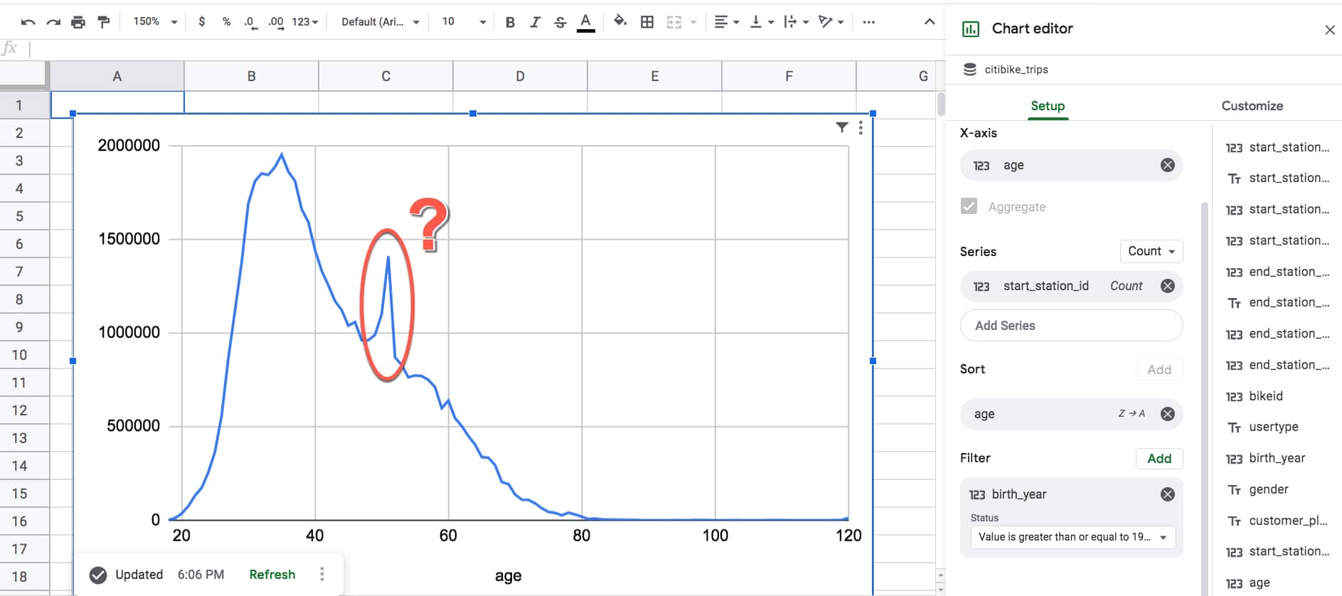
Two things jumped out at me from this chart:
Firstly, it’s an example of a classic right-skewed distribution. It’s unsurprising to see the peak age of riders is in the mid- to late-thirties and then it gradually decreases from there. This is what you’d expect.
Secondly though, what on earth is that spike doing around age 51? It seems unlikely there would be a sudden, huge increase of ridership going from 50 to 51, and then equally precipitous drop-off going from 51 to 52. Perhaps it’s a strange mid-life crisis unique to New York City.
Let’s use a pivot table to investigate further.
Connected Sheets Pivot Tables
Pivot tables are an incredible tool that allow you to explore your datasets in depth.
In essence, pivot tables aggregate (i.e. roll-up or summarize) your data.
It’s quick and easy to change the variables shown in your pivot tables, so they’re a great tool to understand what’s going on with your data.
Pivot tables in Connected Sheets condense millions or billions of rows of data into concrete insights. Insights that would be impossible to find any other way.
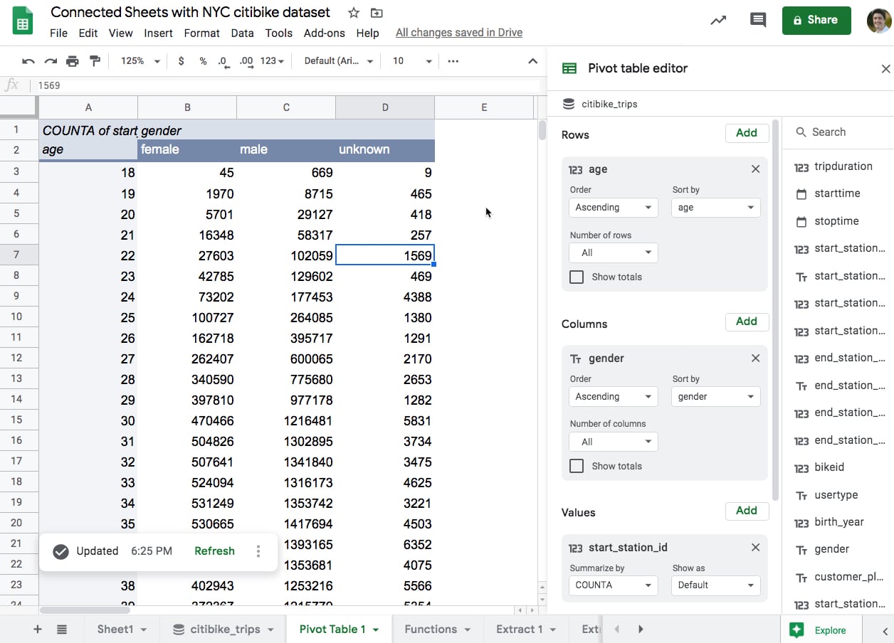
In this example, the pivot table shows the number of rides summarized by the age (rows) and gender (column) of each rider. It includes the full 59m rows of data.
Using this pivot table data, let’s recreate the rides-by-age chart again, but this time split by gender as well:
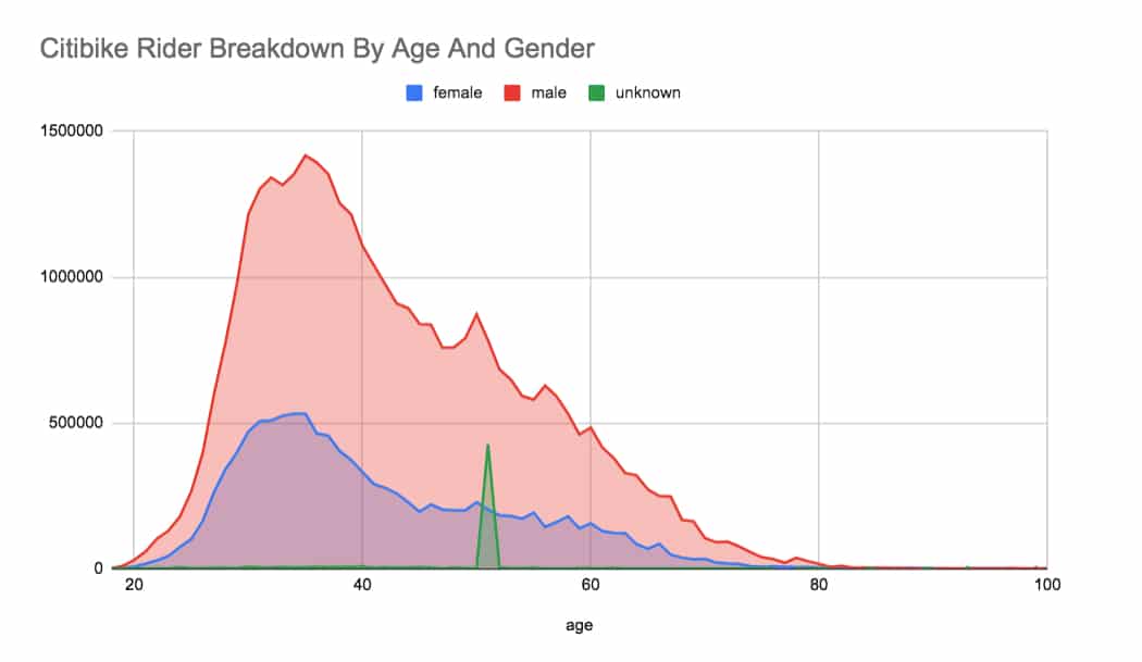
And there we go!
The mystery is revealed.
There’s a group of riders in the data whose gender is unknown and who all have the same age around 51.
Perhaps there’s a ‘prefer not to say option’ for both “How old are you?” and “Gender?” questions during the sign-up process.
That would explain the unknown gender designation, but what about the spike of riders aged 51?
Well, databases use a system called Unix time or Epoch time to measure points in time. This begins on 1/1/1970. So if some riders didn’t enter a date of birth, maybe the system sets the date of birth to the start of Epoch time, causing a spike at age 51. Very interesting!
More Connected Sheets Examples
Proportion of round trips
Suppose we want to know how many trips are round-trips, where the bike is dropped off at the starting station?
In other words, we want to identify all rows of data where the start station and end station match.
Here’s the formula to identify the round-trip rows, which will show as TRUE values.
= start_station_id = end_station_id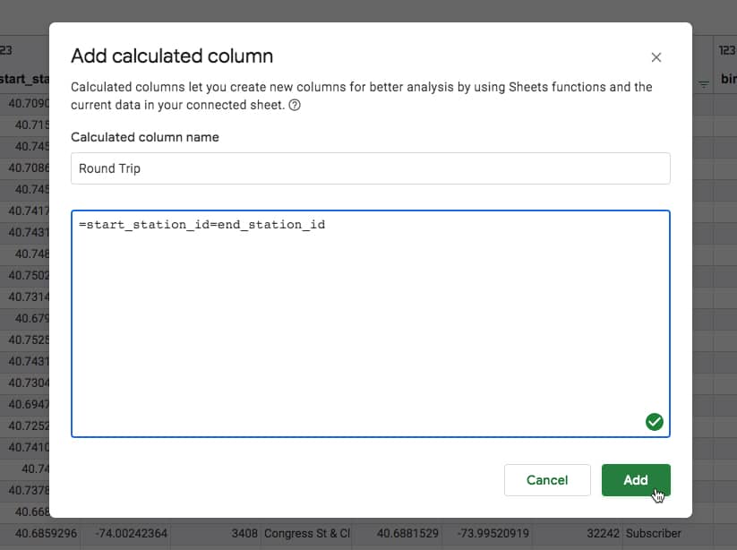
What’s super cool is that we can then use these calculated columns elsewhere too, for example in a pivot table where we can now answer the original question about identifying round-trips:
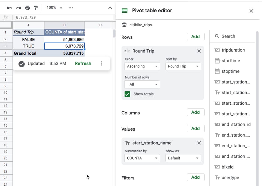
Out of the 59 million bike trips in the dataset, approximately 6.9 million started and finished at the same station (the TRUE values). About 12% of the trips.
Trips per month
Here’s a chart showing the number of bike trips per month. Although this looks like a regular Google Sheets chart, it includes all 59m rows of data from BigQuery (click to enlarge):
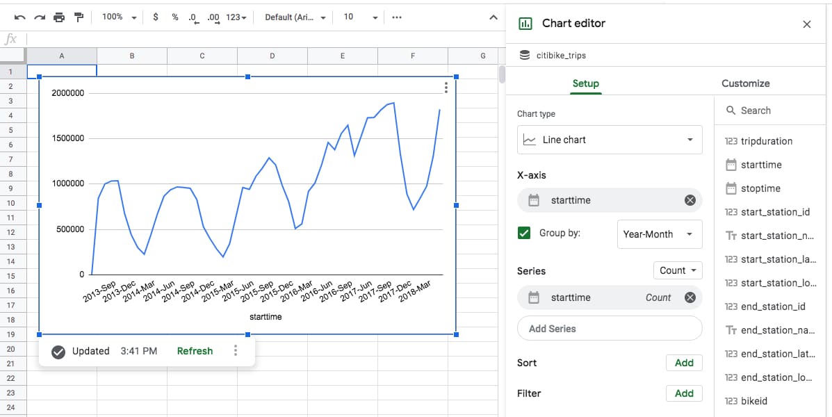
It clearly shows the increasing number of trips undertaken with Citibike, as well as clear seasonal cycles (the dips in winter).
It also illustrates another important point.
The chart is a static representation of your data at the time you created it.
You can see the timestamp in the bottom left, underneath the chart.
There’s also the option to refresh the data, which updates the chart.
Daily rides by gender
Here’s another chart example — this time drawn from the data in a Connected Sheets pivot table, rather than directly — which looks at the entire population of bike trips and counts the number on each day, split by gender.
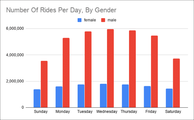
It’s clear to see that the demand is driven by commuters during the week, as evidenced by the peak during the week.
It also clearly shows there have been about three times as many male riders as female riders, to date.
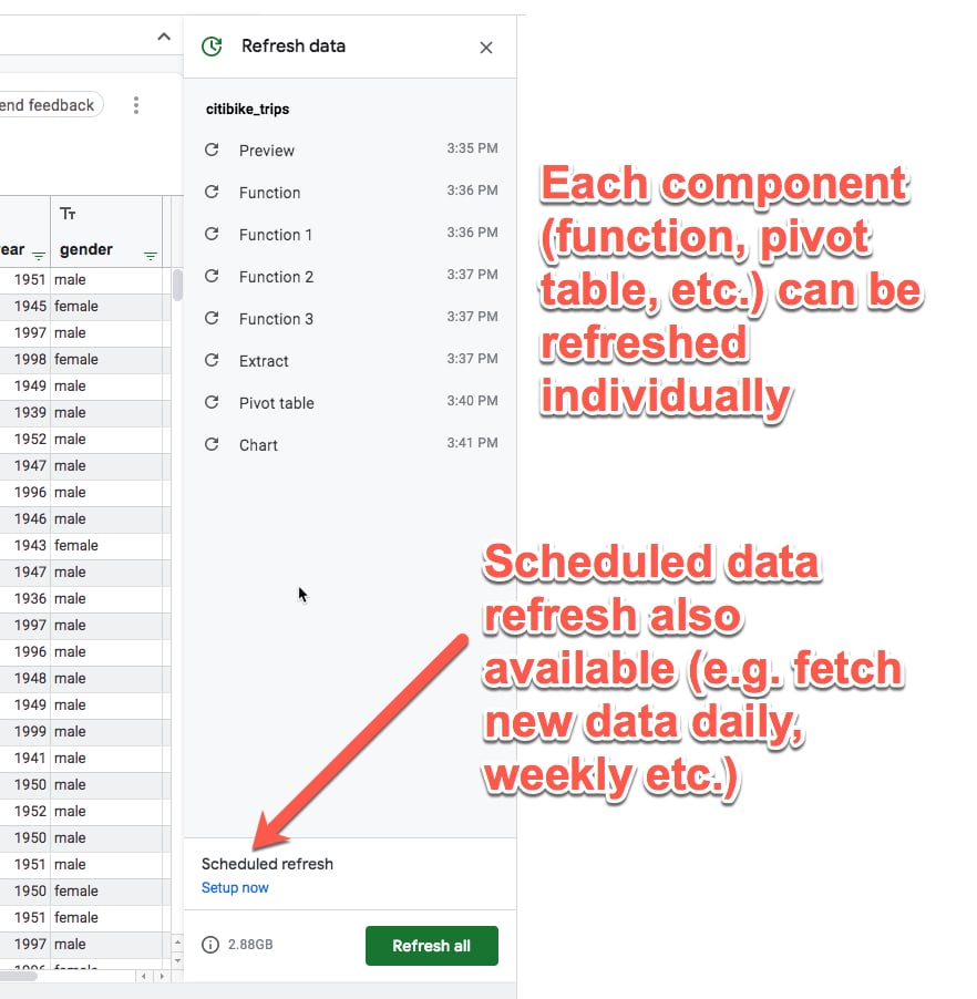
One final feature to showcase is the refresh pane.
Refreshing Components
It’s important to note that the components aren’t live in the way the equivalent Google Sheets component is.
A Connected Sheets function is calculated at a given moment in time and has to be refreshed for new data to be included (whereas in a plain Google Sheet the formula will just reflect whatever data is included).
Similarly, other components need to be refreshed. You can control them individually or collectively from the Refresh pane.
There’s also an option to schedule a data refresh so that the data under consideration in your Connected Sheet is up-to-date. This can be done daily, weekly, or monthly.
Availability of Connected Sheets
Connected Sheets is available to customers of G Suite Enterprise, G Suite Enterprise Essentials and G Suite Enterprise for Education.
A BigQuery account is required to use it and it will fall under the existing BigQuery pricing plan (prices are based on both the volume of data stored and the consumption of that data).
Conclusion
Connected Sheets represents a huge leap forward for Google Sheets.
It opens up the world of Big Data to the regular Google Sheets user, and that is very exciting.
Through the examples in this article, I hope you’ve seen how easy it is to work with big datasets. If you can analyze small data in your Google Sheets already, then you’ll be able to apply those same skills to big datasets.
Now you won’t have to rely on a developer to write custom queries for you. You can just dive straight into the data yourself.
I can’t wait to see how this feature is used over the next few years. After all, datasets are only getting bigger from here on!
Further Reading
For more information, keep an eye out for announcements on the G Suite section of the Google Cloud blog and the G Suites Updates blog.
Check out this Connected Sheets YouTube tutorial from the G Suite team.
Spike reason – it’s easy: unknown gender + 1969 year of birth 🙂
Thanks, Kos. Have updated the article with my theory along similar lines. But why a spike of 1969 births?
It’s something about null values being imported from elsewhere . In the dark and cobwebby recesses of my mind I have a vague recollection of a system that counts dates starting at 1970-01-01. So null dates would be interpreted as 1969.
I have a similar problem where patients in my research database were born on 01-01-01, because the system forces you to enter *something*. I have to be aware that the spike in 19-year-olds is not real.
Genius! Thanks, Pat! Have updated the post.
I remember that too but didn’t think about it in this context.
It’s called Unix time or Epoch time and begins on 1/1/1970, so the 1969 date makes perfect sense.
Cheers,
Ben
Nobody more surprised than me to have got something right for a change :-))
Great site – I learn a lot here!!
Ben, you’ve been helping me keep up to date with Sheets technology and I really appreciate it. Thank you!
Hi Ben
Hopefully not a stupid question.
Does it work with BQ datasets that use multiple tables?
Great question, Hugh! As far as I know, you can only connect to a single table at a time in BigQuery, to analyze in Google Sheets. So, if you want to work with multiple tables, you need to write a query in BigQuery first, to join those tables and output a new table which you connect your Google Sheet to.
Hi Ben
Thank you for your reply and indeed for the article. Both very interesting helpful. You are a master of your craft!!
Hi there — We’ve connected a few tables, just FYI
I’m looking for a way to vlookup against the dataset and have been striking out since they rolled this out. Input would be appreciated!
My BQ table is essentially “CustomerNumber|AccountManager” (appx 10m cells), while my sheet contains “Col1 | CustomerNumber”. I want to blend so I end up with “Col1 | CustomerNumber | AccountManager” on a couple hundred rows.
Normally, I’d simply query() or vlookup(), but that’s not possible for a dataset this large. I tried setting up a textjoin() cell above my header using ” OR ” as the delimiter and the CustomerNumber column as the range, and then used that string as the parameter within the BigQuery connection, but that didn’t work.
Any suggestions?
I figured this out!
SELECT *
FROM `table`
WHERE CustomerNumber
IN UNNEST(REGEXP_EXTRACT_ALL(@parameter,”[0-9a-zA-Z]+”))
Awesome Mark.It worked for me .Many Thanks
Thanks Ben! Very interesting your post. I hope have early this function in my spredshetts.
Saúl CM
Hi Ben,
I’m trying to create a table using the extract editor. I would like to use a dynamic cell reference as a filter but this doesn’t appear to be possible “Connected sheet filters must use explicit values, not formulas”. Do you know of any workarounds please?
Thanks,
I’m also trying to do this with a DATE field in my pivot table!
Looking to filter my Pivot Table where DATE field is greater than a DATE VALUE referenced in a cell.
Example
DATE
Filter by condition
Greather than
C2
I you have found a way, let me know.
I can’t seem to find the option to create calculated fields within the pivot table. Does this upgrade have the capability?
Please, I’d also like to know more about this!
They have removed Calculated Fields from Pivot Tables on Connected Sheets.
What could be a potential workaround?
Hi Tyler,
The pivot tables within connected sheets don’t have calculated fields and never have had them. However, you do have + calculated column available in the main data sheet, alongside the Chart, Pivot Table, Function and Extract buttons.
Note: regular pivot tables (i.e. not the connected sheets pivot tables) do have calculated fields available.
Hope that helps!
Ben
In our company we have the Gsuite Basic Edition, and unfortunately, I cannot use this feature.
Updating from 6$ user/month to 25$ user/month is a too great leap.
Do you know if it is going to be soon available?
Antoni – as far as I know, Connected Sheets is only for G Suite Enterprise, G Suite Enterprise for Education, and G Suite Enterprise Essentials customers.
Hi,
A pretty big problem I am experiencing is that google had set a 4.5 minute limit on query run time.
This causes for many of the data refreshes to fail due to this limit.
Any suggestions on how to overcome this?
In the connected sheet pivot table, is there a way to get the data when a value is clicked on as it can in Google Sheets native pivot tables, where it opens a new tab with the raw data? Or it’s a limitation at this time?