Whenever I’ve taught data analysis classes or data visualization classes, for General Assembly or privately or online, I find that the humble scatter plot is often poorly understood.
Perhaps it’s because they’re less common than simple bar charts, line charts or pie charts? Or maybe it’s because they take a bit more mental effort to understand what they’re telling us?
Regardless, they’re a crucial tool for analyzing data, so it’s important to master them. This post looks at the meaning of scatterplots and how to create them in Google Sheets.
What is a scatter plot?
Simply put, a scatter plot is a chart which uses coordinates to show values in a 2-dimensional space.
In other words, there are two variables which are represented by the x- and y-axes.

In this example, the scatter plot shows the relationship between pageviews of a website and the number of signups that website received. As you can see, when the number of pageviews increases, the number of signups tends to also increase. They are positively correlated, but more on that in a minute.
Often the variable along the x-axis is the independent variable, which is the variable under the control of the experimenter, and the variable up the y-axis is called the dependent variable, or measured variable, because it’s the variable being observed to see how it changes when the independent variable changes.
It’s possible for both variables to be independent, in which case it doesn’t matter which axis they’re plotted on and the scatter plot shows any correlation between the two.
Why is a scatter plot useful?
A scatter plot is incredibly useful because it can show you, at a glance, what the big picture is, what the overall relationship is, what the trend is, between two variables.
Looking at the numbers alone is not particularly intuitive. It’s hard, impossible often, to determine how they’re related to each other.
Scatter plot example
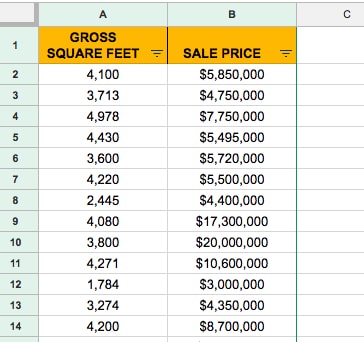
Let’s take a look at a real-world example, using data showing property sales in Manhattan. I’ve extracted the data for properties between 1,000 sq.ft. and 5,000 sq.ft. and removed any without a sales price listed.
This leaves 250 values in a dataset, like so:
To create a scatter plot, highlight both columns of data (including the header row).
Then click Insert > Chart
Initially it’ll create a terrible bar chart, where each of the 250 rows of data is represented by a bar. Yikes!
It’s a very simple fix to transform it into a scatterplot. On the chart menu, on the Data tab, simply choose the Scatter option, as shown in this image:
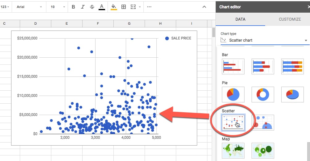
There you have a nice scatter plot!
Focus on a single point for a moment (shown in red in this image):
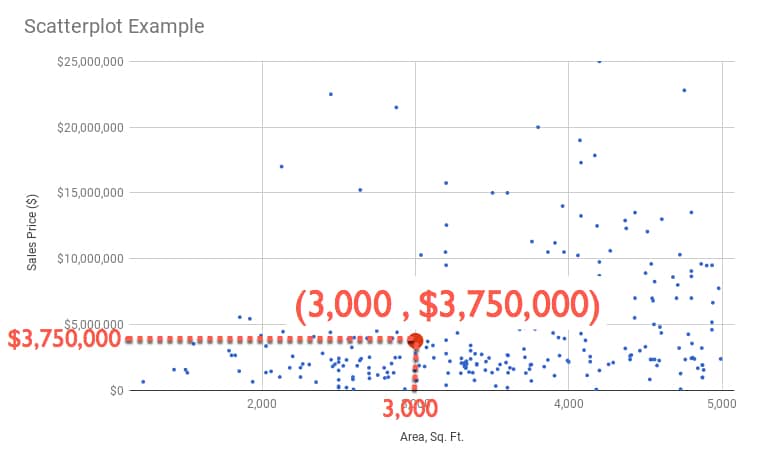
You can read off a pair of values, in this case 3,000 sq. ft. and $3,750,000, which tell us that we have a data point (representing a property sold in Manhattan) which was 3,000 square foot and had a sales price of $3.75 million.
We can write it as a coordinate pair: (3,000 , 3,750,000)
So each point, each plot, in our chart represents a coordinate pair of area and sales price, each plotted according to the rows of data in our dataset.
This is the real power and beauty of a scatter plot. It shows all of those rows of data in a single chart, so we can absorb something about the dataset as a whole.
Interpreting a scatter plot (correlation)
Well all those points on your scatter plot are pretty and they show something, but what exactly? And is there anything else we can glean from the scatter plot?
They show trends within our dataset.
But it’s hard to see this from just the points, so we can add a trendline like so (shown in red):
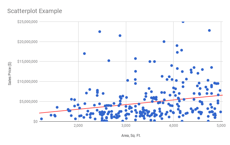
Ah ha! That’s interesting and useful.
It shows a general upward trend, which is what we’d expect. As the size of a property increases, so does it’s sales price.
Now, if we want to predict a sales price for a given area, say 4,500 sq. ft., we can use this line.
Start at the 4,500 sq. ft. mark on the x-axis, trace up to the line and then across to the y-axis and read off the value:
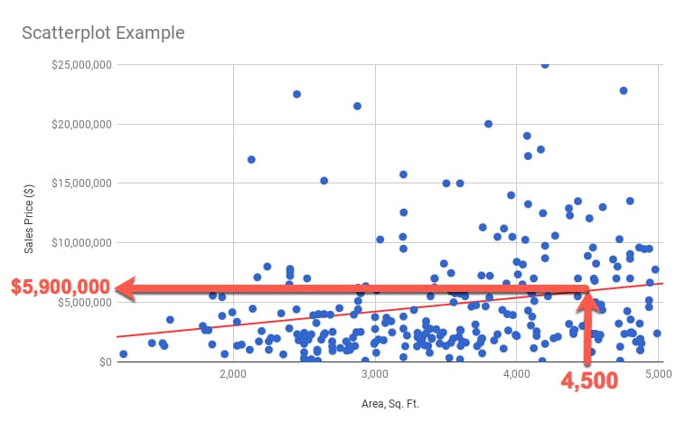
I can read off a value of $5,900,000 as the predicted value of a 4,500 sq. ft. property.
You might be wondering how to do that a bit more “scientifically”?
Well, we can use the equation of the trend line to calculate the number.
The line equation takes the basic form:
y = ax + b
So to predict y, we need to know the value of x (4,500 sq.ft. in our example) multiplied by the value of a (which is the slope of the line) and adding on the value of b (the intercept, or where the line crosses the y-axis).
We calculate a from our data using the SLOPE function:
=SLOPE( B2:B277 , A2:A277 )
which gives us: 1166.42218
We calculate b from our data using the INTERCEPT function:
=INTERCEPT( B2:B277 , A2:A277 )
which gives us: 712264.7317
Then I can calculate my predicted y-value using the equation:
y = 1166.42218 x + 712264.7317
into which I plug in the x-value of 4,500 sq. ft.:
y = 1166.42218 * 4500 + 712264.7317
to get the answer: $5,961,165
All that from a humble scatterplot.
How do we know if this line is a good fit? Will it give us “good” predictions?
Stay tuned for the next post, where we’ll look at how to answer that question.
See Also
How to make a Histogram in Google Sheets and overlay a Normal Distribution Curve
Want to learn more about Data Analysis?
There’s a lot more to scatterplots, and my new course, Data Analysis with Google Sheets, does a deep dive into scatterplots and how to use them to understand your data better.