
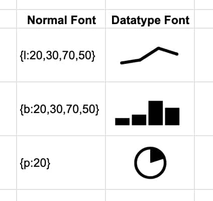
The Datatype font turns text values into miniature charts. It’s like a magic trick that turns data values in your Sheet into sparklines, but without the complexity of the sparkline formula.
It’s been really fun to explore in Google Sheets.
How to add the Datatype font in Google Sheets
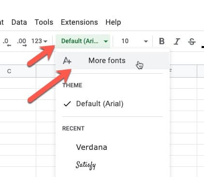
From the font selector in the toolbar, click “More fonts”, type in Datatype, and then select it:
Datatype Basic Syntax
Datatype converts text, called chart expressions, which are data values inside curly brackets {…}, into line, bar, or pie charts.
The syntax is:
- an opening curly bracket,
- a letter to denote the chart type (l, b, p),
- a colon,
- the comma-separated values,
- finally a closing curly bracket.
For example:
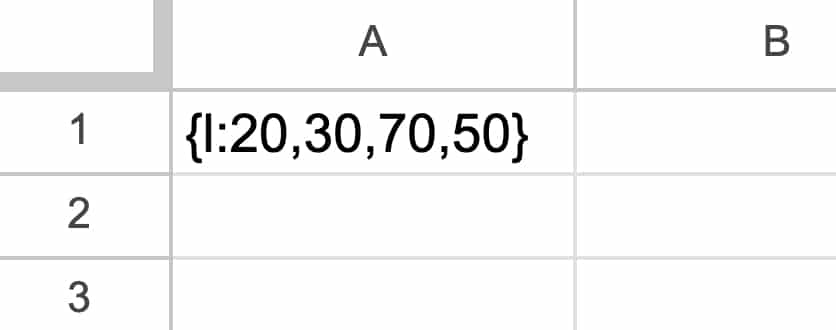
{l:20,30,70,50}
In a Google Sheet, it looks like this:
Then we apply the Datatype font to this cell from the toolbar:
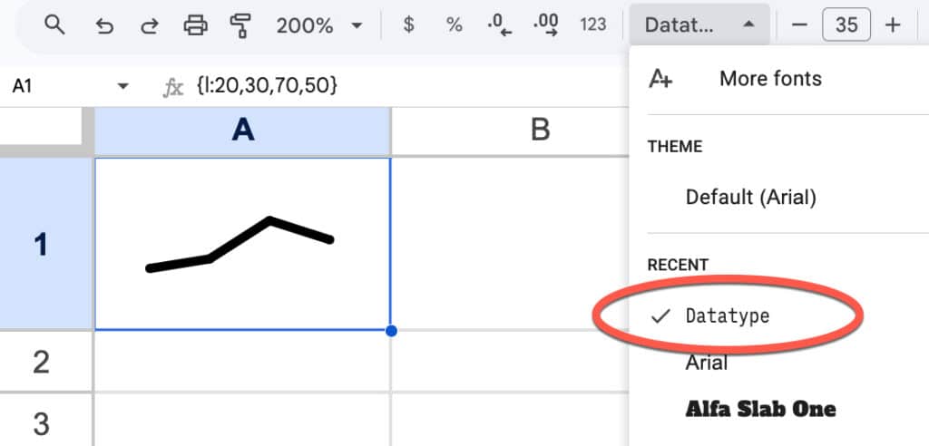
Like magic, it turns into a mini chart! (Increase the font size to fill the cell.)
Datatype Options
Datatype has line, bar, and pie charts available:
There are restrictions on each chart class, as follows:
- Line charts: up to 20 datapoints, each with a value between 0-100
- Bar charts: up to 20 bars, each with a value between 0-100
- Pie charts: a single value between 0-100
Example Use Cases
Here are some example use cases, starting with the practical but ending with some esoteric, unhinged, and not at all useful examples!
1: Chart Inside Sentence
Since Google Sheets allows multiple fonts within a single cell, we can add miniature charts to sentences within our Google Sheets:
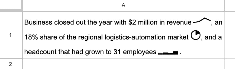
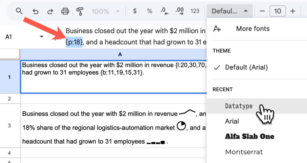
To achieve this, write out your sentence and include the chart expressions for the data you want to show, e.g. {p:18}. Then highlight that data and change the font to Datatype:
2: Formulas to Convert Values into Chart Expressions
It’s unlikely that you’ll have data already in the perfect format.
But thankfully, it’s easy to use a concatenation formula to combine the curly brackets, etc., with the data to get the correct chart expression format.
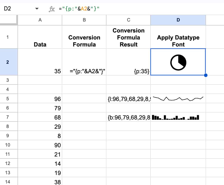
For example, to turn a value into a pie chart expression, we use this formula:
=”{p:”&A1&”}”
And to convert a set of values into the correct line or bar chart expression, we use this formula:
=”{l:”&JOIN(“,”,A5:A24)&”}”
or
=”{b:”&JOIN(“,”,A5:A24)&”}”
where the range of 20 values is in A5:A24.
It looks like this in our Sheet:
3: Pie Charts with Percentages
If you have true percentage figures, then you need to multiply them by 100 to get them into the correct formats for the chart expression.
Here’s an example in our sheet:
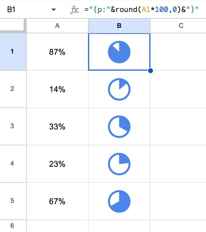
Note how I’ve applied a blue color to the font and it changes the color of the Datatype charts.
This approach using the Datatype font is much, much simpler than the previous way of implementing this using formulas and images.
You can also make these font charts bold or italic or even rotate the text, the same as you would with any other font.
And if you were planning to use these formulas often, you could set up a named formula to make your life easier.
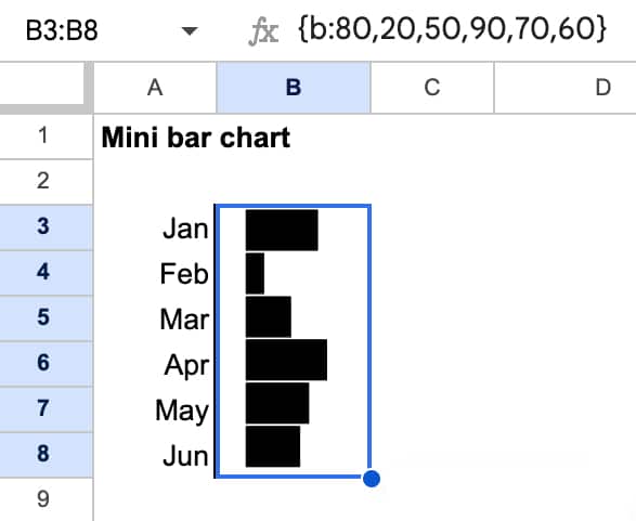
4: Bar Charts
The data type font bar charts are actually column charts, but we can easily create bar charts where the bars are horizontal by rotating the text 90 degrees.
Here’s an example:
5: Pictures
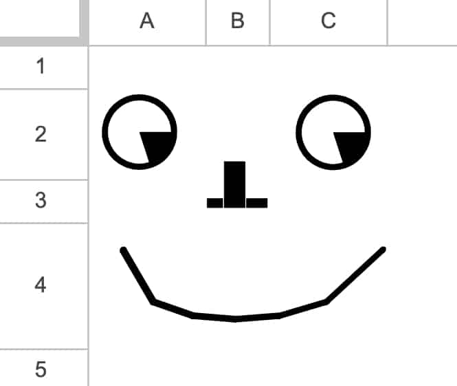
Possible? Yes.
Useful? No.
But it’s possible to draw silly things using only data with the datatype font applied, for example:
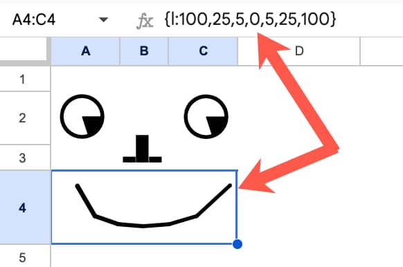
Under the hood, this is all values:
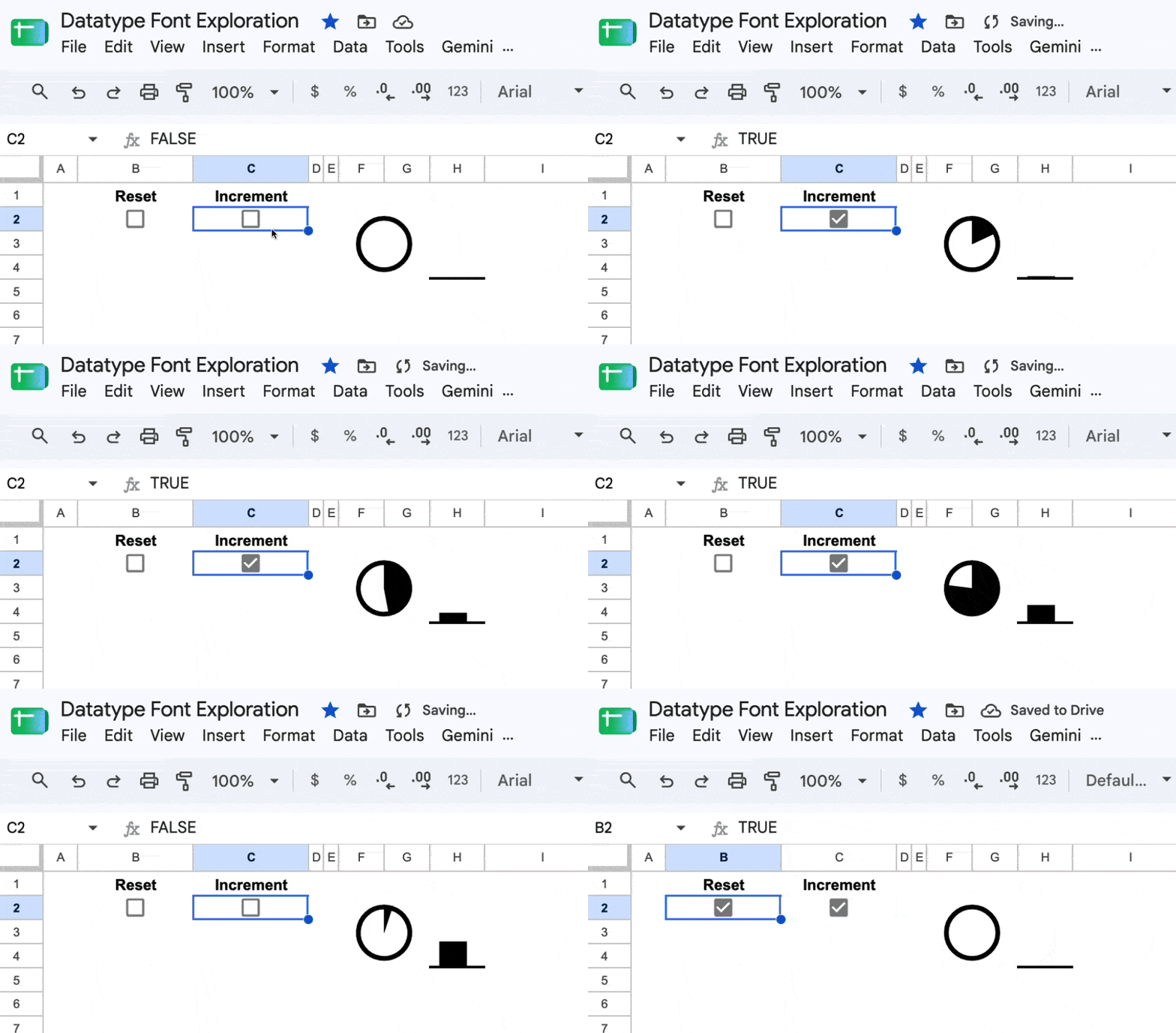
6: Animation
This is similar to some of the other crazy things I’ve built in Google Sheets, such as the Sparkline Formula Clock, the Etch-a-Sketch, and the Join-the-Dots.
Again, not necessarily useful, but an interesting concept to follow, for no other reason than to see what’s possible.
It’s based on the fact that Sheets calculates cells from top to bottom and left to right. For a fraction of a second, two cells with the same formula can have different values because one has updated but the other hasn’t. You can use this fact to create a counter.
By the way, you can toggle a checkbox very quickly on and off by holding down the spacebar.
7: Chart within a Chart
In September 2026, Google announced that the full Google Fonts web font library can now be used directly inside charts.
This means you can now create interesting “charts within charts” as shown in this example. (Whether you want to or not is another question.)
This technique uses the Datatype font to display chart labels as mini sparklines.
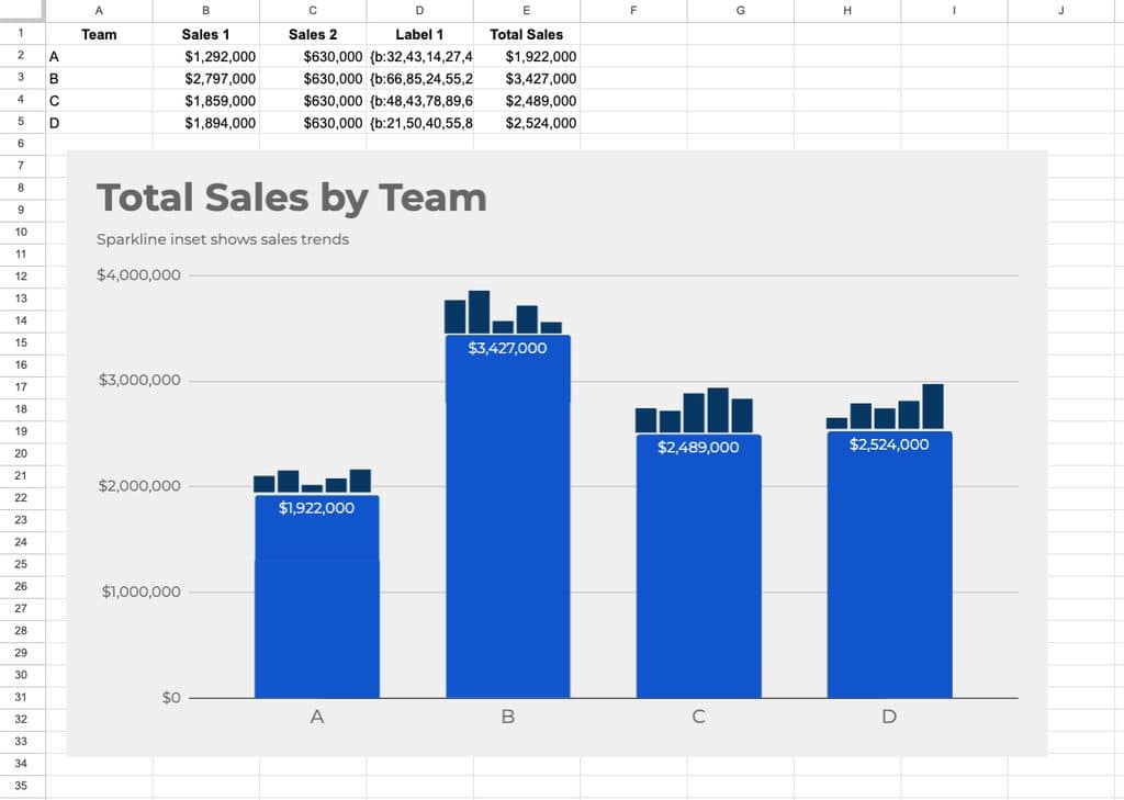
The trick is to include a label column that contains the Datatype chart expressions. In this example, it’s column D, called “Label 1” and contains data in this format: {b:32,43,14,27,45}
In the chart editor, we set this label font type to “Datatype” and it renders as mini-bar charts on top of the main bars.
This technique works for line charts as well, but weirdly, not with the pie chart option.
Template
🔗 Click here to open a view-only copy >>
Feel free to make a copy by clicking on the “Use Template” button.
If you can’t access the template, it might be because of your organization’s Google Workspace settings.
In this case, right-click the link to open it in an Incognito window to view it.
Ben, thanks for many years of useful, and incredibly interesting, tips. It’s helped us think outside the box, and achieve things with Sheets that we might never have thought of, or not thought possible.
Best wishes for your next adventure.
Thanks, Gill! Appreciate the kind words.
Thank you so much for all the incredible tips, tricks, and updates you’ve shared over the years—I’ve constantly used them in my daily work. Your latest tip on using the Datatype font was a wonderful farewell gift from the newsletter, and I can’t wait to see what exciting new idea you come up with next!
Thanks, Massimo! Appreciate the kind words.