Who doesn’t love a dynamic, animated Excel dashboard?
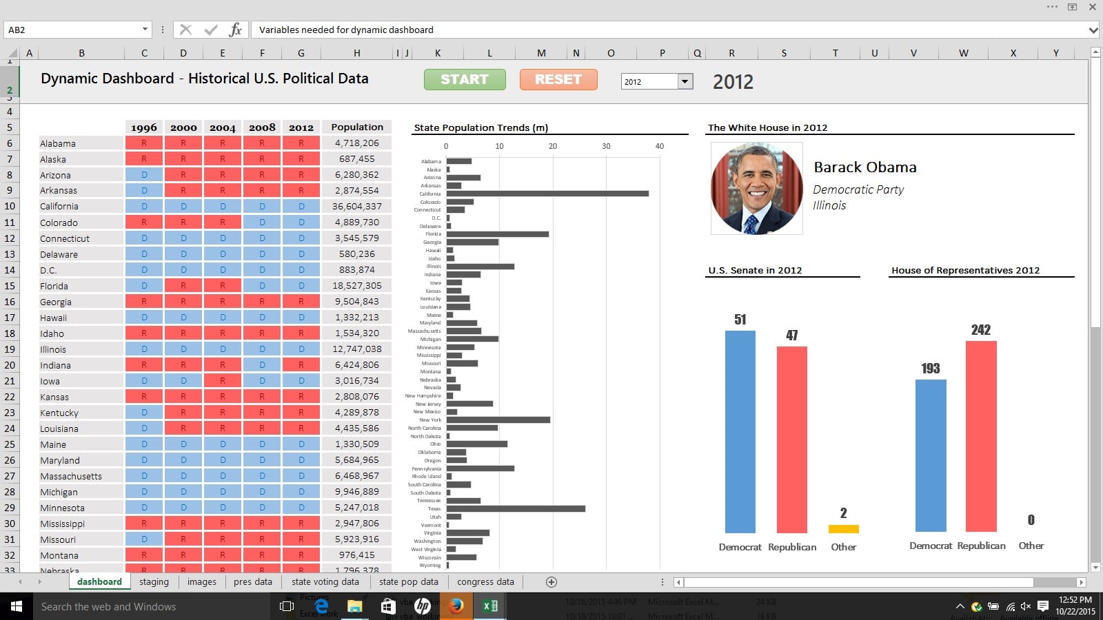
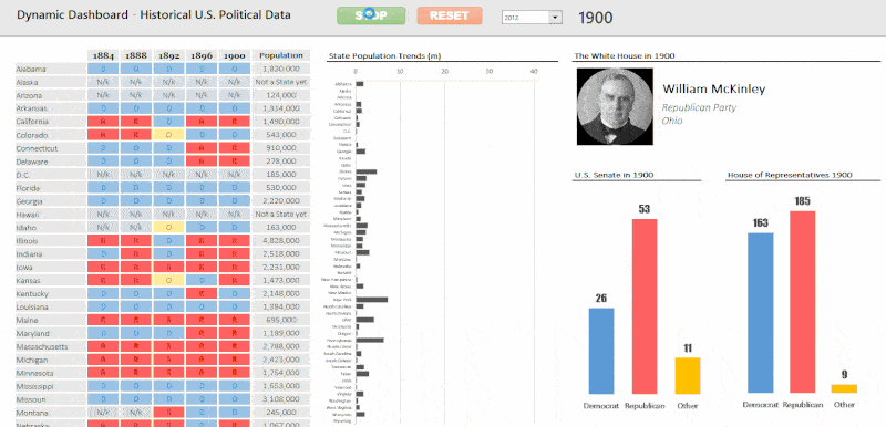
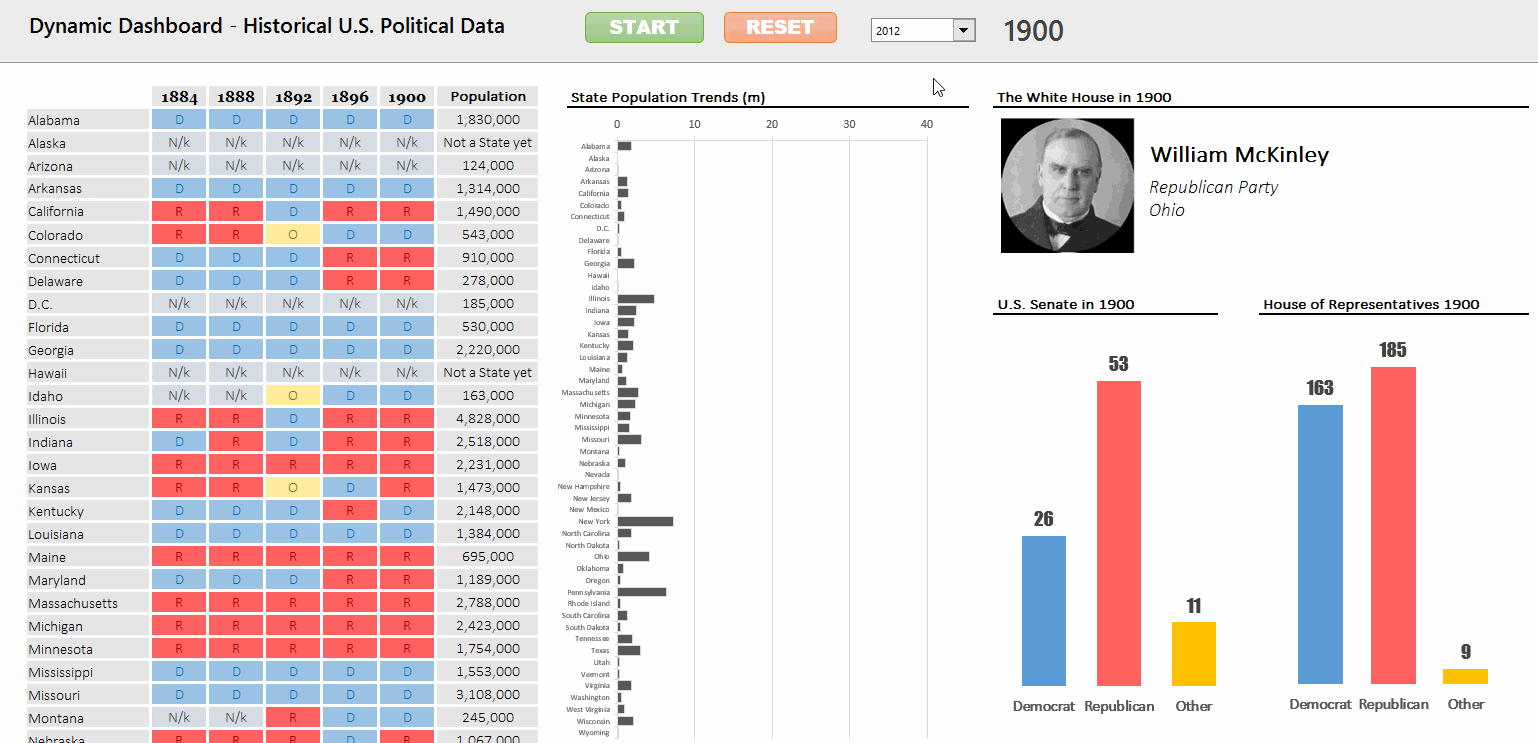
Here’s one I’ve been working on recently, a data visualization of historical U.S. political data, showing party trends, state populations and sitting presidents over time:
In the following post, I delve into the details of how I created this dashboard. It’s not a full cell-by-cell account of how I did it, because that would require an article at least twice as long, but rather a look at the various steps and thought processes along the way.
If it appears a little ragged, that’s because it probably is! Most likely because I’m writing this bleary eyed at 1am, between feeds and diaper changes of my 6 week old son. 😉
Introduction
This was a project I’ve had at the back of my mind for a long while.
The timing and motivation finally came together when I recently started teaching the Data Analytics course for General Assembly, which involves Excel and dashboarding, so it tied in nicely and was a chance to revisit some interesting facets of Excel. So I set aside a couple of days to execute this idea from concept through to publishing this blog post (it ended up taking more like a week all told – time comes in small blocks these days with a newborn 🙂 ).
I figured historical US Political data would provide a rich and interesting dataset to visualize and animate. So I went hunting for voting data, State population data and Presidential data for the past century.
Step 1: Initial concept and sketching out ideas
This project began with pen and paper, simply sketching out a few ideas of what info and charts I wanted to include. I knew it would be interesting to look at a century’s worth of voting data alongside information about the Presidents serving during that period. Following that, I thought adding US State population estimates would also be interesting.
I came up with the following notes and sketch as my initial prototype:
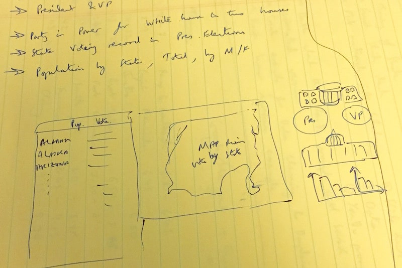
Yes, it’s pretty rough but it helped shape my initial ideas. You can see several elements in the sketch made it into the final dashboard at the top of this page, namely the table of states, the Presidents data and the two charts bottom right (representing the Senate and the House of Representatives).
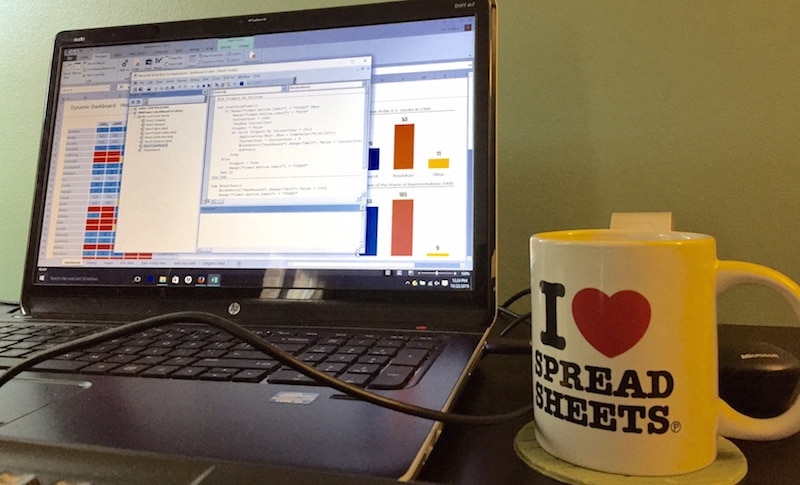
Next up I busted out the “I <3 Spreadsheets" mug! It's guaranteed to give an extra 10% to one's Excel skills when filled with strong English tea.
Step 2: Sourcing the data
Where did I get the data from?
President data
Wikipedia – list of US Presidents
I retrieved the list of US Presidents from Wikipedia and used Google Sheets to do a quick web scrape of the data using the following function:
=importhtml("https://en.wikipedia.org/wiki/List_of_Presidents_of_the_United_States","table",1)State voting data
Wikipedia – Election results by state
Similarly, I got data on the history of US State voting records from Wikipedia and again used the importhtml() formula to scrape that data into a Google Sheet as a first step.
Composition of Congress
Infoplease – Composition of Congress
State population data
US Census website’s population portal
Digging around in here I was able to get state population estimates from 1900 all the way to 2012, for example:
- 1900 dataset link
- 1980’s dataset link
- 2010 dataset link (csv format)
Finally, I noticed that certain states, Alaska and Hawaii, were “missing” population estimates for the early part of the century, which at first seemed odd. After some further reading, I found that these states weren’t actually formed until the 50’s, hence the missing data.
So my workbook has four sheets containing raw data: Presidential Data, State Voting Data, Congress Data and State Population Data.
Step 3: Staging the data
When I say “Staging the data”, I mean preparing the data and setting it up into aggregated tables ready to drive the dashboard.
The overall driver of all the visuals in the dashboard is the YEAR selected by the user (or automatically by the animation). Since my lookup formulas all run off this variable year, the data returned by the lookups changes when a different year is selected.
Cell G5 contains this year variable and so drives the dashboard. I use it in all the lookups in the staging sheet and in the dashboard sheet to get hold of the necessary data.
I then added a new sheet called “Staging” and set it up as follows:
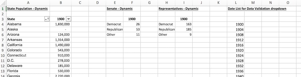
There are four tables here:
The State Population – dynamic table contains the data used for the state population column and chart in the dashboard. This table is set up so that the year at the top of the column (1900 in this screen grab) is linked to the year selected in the dashboard, so it will change to reflect the users choice (or the animation). The population data in this column is then pulled in from the State population raw data sheet using an index/match formula, using the date variable and state as lookup values (this is for illustration only, in practise it is filled out with specific cell and range references):
=INDEX(state_population_data, MATCH(lookup_date,state_population_data,0), MATCH(lookup_state,state_population_data,0))The Senate Dynamic and Representatives Dynamic are two similar tables, again using exactly the same principle of a variable year value linked to the dashboard and then a dynamic lookup to the raw data. These two tables drive the two charts in the dashboard, showing the composition of the Senate and the House of Representatives.
The Date List for Data Validation dropdown is simply a list of the years I want to display in the dropdown menu that the user can use to interact with the dashboard (see the VBA section below).
Step 4: Creating the dashboard visualizations
Grid map of voting records
The first part of the dashboard I implemented was the grid map of States and Presidential voting records, on the left side of the dashboard. Across the top of this table, I have five column headings containing year values, which change when the user activates the controls section of the dashboard.
As I mentioned the cell G5 shows the year selected by the user (or animation), and the other four years are simply based off it, as follows:
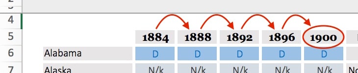
At this stage I simply typed 1900 into cell G5 – I added the interactivity in the next step (see VBA section below). For the other four column headings, based off cell G5, the formulas were as follows:
=G5 - 4

=F5 - 4

=E5 - 4

=D5 - 4
Then I used an index/match formula to dynamically retrieve voting data for each state, from the state voting data sheet, according to these changing year values (formula for illustration only, in practice I added the specific cell and range references):
=INDEX(state_voting_data, MATCH(state_lookup_value,state_voting_data,0), MATCH(date_lookup_value,state_voting_data,0))I used conditional formatting to color the cells Blue if they equalled “D”, red if they equalled “R”, grey for the “N/k” results (some states did not exist at the beginning of the period, e.g. Hawaii, see data sourcing section above) and gold otherwise (for occasions when a state voted for someone other than Democrat or Republican).
Lastly, I applied a thick white border to the whole grid to give some separation and achieve a cleaner look.
Adding the President information and profile picture
Adding information about the President was relatively straightforward. I used a VLOOKUP() formula to lookup the year value in the Presidents data table and return the name, party and state for that year. I had to set the fourth argument of the VLOOKUP (called the range_lookup) to TRUE, as the years were not exact matches.
Changing the profile picture display was a little more tricky. The idea here is to update the profile picture on the dashboard to show a picture of the President based on the name shown.
I’m indebted to Excel guru Sumit Bansal for his informative post on how to do a picture lookup using named ranges and a linked picture – a seriously cool trick that I hadn’t seen before. Thank you! Definitely check out his blog post for a full explanation of how to do this bit of magic.
What follows here is a brief description of how I applied this method to my dashboard.
In a separate sheet I set up a table with a column for all the Presidents names and in the adjacent column, their profile picture. I then defined a named range called presidents_profiles and instead of a static range, put this formula into the range input box:
=INDEX(images!$B$4:$B$23,MATCH(dashboard!$T$7,images!$A$4:$A$23,0))What this does is take the Presidents name on the dashboard (in cell T7) and find it in the column of President’s names in my images table, then return the corresponding profile picture and load that into the named range presidents_profiles. Phew!
Then I add one of the profile pictures to the dashboard and link that picture to the presidents_profiles named range. When the President name on the dashboard changes, the linked picture and named range formula work their magic and hey presto! the new President’s profile picture appears.
Adding the state population bar chart
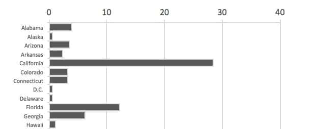
This was a straightforward Excel bar chart running off the State Population – dynamic table in the staging worksheet.
I formatted the x-axis to display the population in millions, with only major gridlines showing every 10 million increment. I set the bars to black to remain nonpartisan.
Adding the Senate and House of Representatives column charts
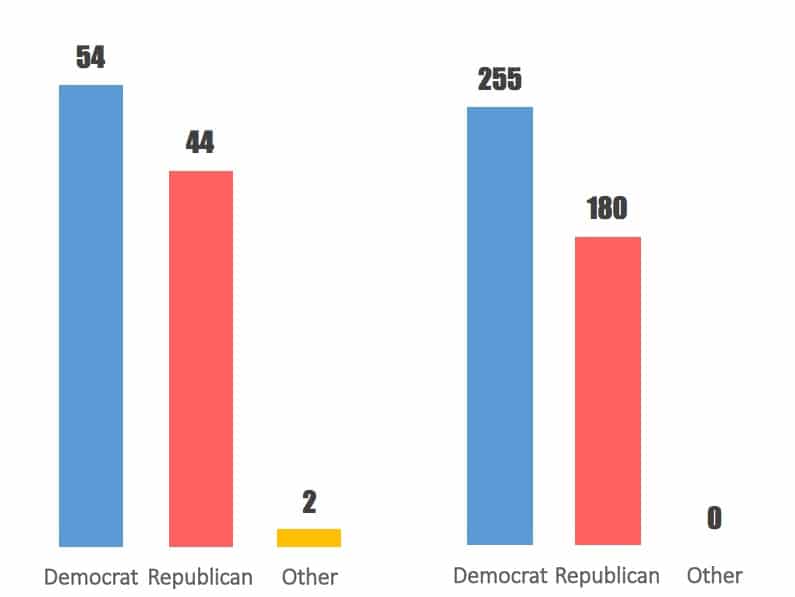
These were two fairly simple column charts, based off the Senate Dynamic and Representatives Dynamic tables in the staging worksheet.
I set the x- and y-axes to have no lines showing, removed the gridlines, added red/blue/gold color scheme and added data labels, to get the clean, minimal look I was after.
Step 5: Adding the interactivity with VBA
Now I had all of my visuals set up in the dashboard, it was time to add some interactivity. This was the final major piece of the puzzle and I used some basic VBA to implement an animation option and a manual year selection.
Animation
Excel guru Chandoo published an article last year on how to build a basic timer using VBA, which was helpful when creating my own code. I’d recommend checking that example out as a primer if you’re new to VBA.
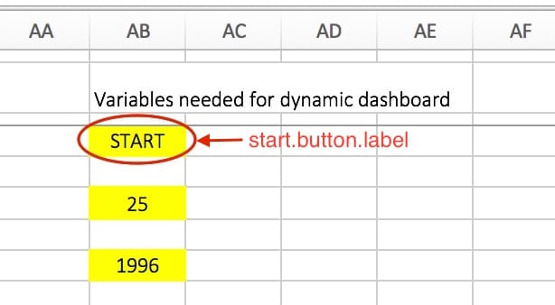
I have a cell off to the side of the dashboard (AB4) which the user can’t see that contains the word START. I then label this as start.button.label in the name box (to the left of the formula box bar in the ribbon):
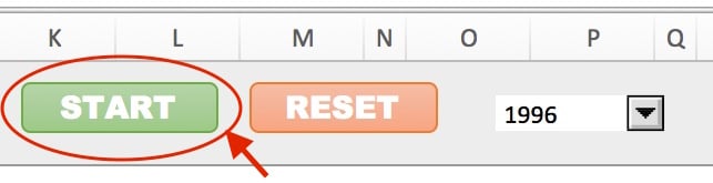
On the dashboard now, near the centre of the header section, I added a rounded rectangle shape (Insert > Shapes > Rounded Rectangle) and in the formula bar, I type =start.button.label. This links the shape to the cell with the word START in it, so that START shows up on the rectangle shape.
I formatted this button so the text was centralized and a appropriate size and changed the color to white, so it looks something like the following example:
In my VBA editor I setup a sub-procedure to handle the animation, starting with the following code:
Dim Stopped As Boolean

Sub startStopTimer()

End Sub
Here, I declared the variable Stopped and gave it a data type of Boolean, meaning it can only be TRUE or FALSE in value. Then I declared a sub procedure called startStopTimer().
I then linked the rectangular button to my startStopTimer() sub-procedure (right click the rectangle, then Assign Macro… > startStopTimer() > OK).
Now, when a user clicks the green START button it fires off the startStopTimer() sub-procedure.
I added the following code:
Dim Stopped As Boolean

Sub startStopTimer()
    If Range("start.button.label") = "START" Then
        Range("start.button.label") = "STOP"
        CurrentYear = 1900
        Stopped = False
        Do Until Stopped Or CurrentYear = 2012
            Application.Wait (Now + TimeValue("0:00:01"))
            CurrentYear = CurrentYear + 4
            Worksheets("dashboard").Range("G5").Value = CurrentYear
            DoEvents
        Loop
    Else
        Stopped = True
        Range("start.button.label") = "START"
    End If
End Sub
What the heck is going on here then?
First the VBA code checks the start.button.label cell with the statement Range("start.button.label") to see if it equals the string “START” or not.
When this is true, we enter into the IF conditional statement and execute the following:
- Change the
start.button.labelto STOP - Set the variable
CurrentYearto equal 1900 - Set the boolean variable
Stoppedto FALSE - Enter into a
Do Until Loop, which keeps looping until either the variable Stopped is TRUE (because the STOP button has been pressed) or theCurrentYearvariable equals 2012. Otherwise the loop keeps looping, each time executing the following:- Making the application wait for 1 second so the animation doesn’t happen too fast (line 10)
- Add 4 years to the
CurrentYearvariable (line 11) - Update the YEAR value in cell G5 of my dashboard sheet (line 12)
DoEvents(line 13) is a command to pass control from the application back to the operating system, so that the dashboard experience isn’t frozen and the user can do things like press the STOP button
If the start.button.label cell does not equal START (because it equals STOP), then we enter the ELSE part of the sub-procedure. Here we set the Stopped variable to True and change the start.button.label to START, ready for the animation to start again.
I added a RESET button in the same way, to handle reseting the dashboard back to 1900 with the START button showing again. The code to achieve this was relatively simple:
Sub ResetYear()
    Worksheets("dashboard").Range("G5").Value = 1900
    Range("start.button.label") = "START"
End Sub
As with the START/STOP button, I had to link the RESET button to the code (right click the Reset button rectangle, then Assign Macro… > startStopTimer() > OK), so that the code would execute when the button was pressed.
Manual dropdown menu
I also added a manual dropdown menu (Developer > Insert > Combo Box), allowing a user to manually choose a specific year.
The following code then handles the logic by simply setting the year variable to whatever is chosen from the drop down menu.
Sub ChooseYear()
    ChosenYear = Range("manual.year.choice")
    Worksheets("dashboard").Range("G5").Value = ChosenYear
End Sub
The next step is to assign this ChooseYear() macro to the combo box, so that it fires when the combo box is used.
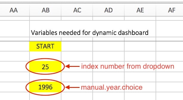
The final wrinkle to deal with concerns the combo box returning a value representing the index of the item selected, rather than the year. For example, my list contained years as follows [1900, 1904, 1908,…, 2008, 2012] so if a user selected 1904, the output was 2, if they selected 2008, the output was 28, and for 2012 the output was 29. So I needed to convert this index number back to a year value for the lookups.
I did this by adding the following index() formula to a cell off to the right side of the dashboard (AB8):
=INDEX(years_data_array,index_number_from_combo_box,0)and then naming this cell manual.year.choice so that the VBA code could find it.
The index number and manual.year.choice cell are off to the right side of the dashboard:
The end result of this manual code is as follows:
The final VBA code is on my GitHub account in this VBA repo.
Step 6: Final Touches
I formatted the header row with a light grey fill and a dark grey bottom border. I froze the top three rows to lock the dashboard title and controls to the top of the screen.
I obviously used blue and red to represent the two main political parties. However, rather than use pure blue and pure red (very intense and not easy on the eye), I used more muted variants that are softer and easier to look at, without losing any of the meaning. If I was a real stickler for detail and had the time, I’d see if the parties have official color guidelines and base my color scheme off that.
I removed gridlines from the dashboard, once I’d finished the layout of all the different pieces. Gridlines add nothing to the final product, so get rid! (Find this option in the View menu.)
I hid the column of variables lurking at the side of the dashboard, to ensure that users wouldn’t see them.
I also hid all of the other sheets containing the data and the staging data. There is no need for these to be shown to the end-user, and in fact, leaving them showing risks to users altering your data.
All of these changes were relatively minor and didn’t take long to implement, but they make a disproportionately large impact on the aesthetic quality and ultimately, the impact of your dashboard, so it’s definitely worth taking this final step.
And that’s it!
Of course, our work is never done and not a moment passed after the metaphorical ink had dried, before I began thinking about improvements and next steps.
But before that, let me share a few ideas I tried out that didn’t make it into the final dashboard…
False starts
Initially I used a radar chart to show the population growth over time. I was quite excited and pleased with the visual as it added something different to the dashboard:
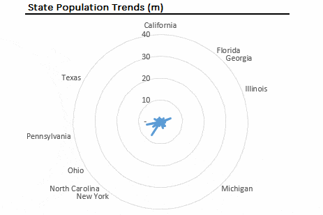
I had to remove many of the state labels because they were so crowded, leaving only the largest state names.
When I showed it to my wife this chart didn’t make any sense without me having to explain it (and she is one smart cookie). Radar charts are difficult to understand and even harder to read any actual information from, especially since I’d removed many of the State labels.
So, it failed as a visualization and therefore had to go.
Replacing it with a simple bar chart was a huge improvement. Moral of the story – beware of all the fancy charts out there, as they are rarely an improvement over their simpler, humbler brethren.
I had also hoped to include a choropleth map of the states showing the voting records, but this is a complex and challenging project, and one for another day.
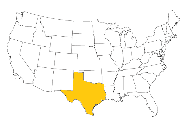
So instead, I thought about adding a state map for the President’s home state, which would dynamically update alongside the profile picture, but decided it wasn’t good ROI for the time it would have taken. I also felt it was somewhat gimmicky and wouldn’t be adding anything substantive to the dashboard (which is the number 1 criterion for inclusion).
For the record, I was planning to add small state maps like this one, with the relevant state highlighted (e.g. Texas for GW Bush):
Areas for improvement
The population chart shows states but they don’t line up with the voting record data per each state. Also, having the population column there is perhaps redundant, given the information in the chart.
If I had more time and this was being built for a client rather than for fun, then the variables to the side of the dashboard would be tidied up and placed somewhere on the staging sheet, so there’s nothing lurking on the dashboard sheet that isn’t dedicated to the purpose of showing information. In this same vein of tidy up, I would have used more named ranges to make my formulas neater and less error-prone if I was doing this again.
Having data below the fold (so it’s not visible in a single screen) falls into one of the 13 common pitfalls of dashboard design, espoused by Stephen Few in this worthy white paper, so that is something a purist would want to fix…
Charts could be condensed and additional data or information be displayed. Yes, this is definitely possible, but since this was a highly visual project, I think the visual impact would be lost to dilution by having even more information displayed.
The profile pictures of the US presidents were a mix of square and circular images, which could have been improved. However, with a 6-week old baby to look after at home, this didn’t feel like the best use of my time! 🙂
Also on the profile pictures, they don’t quite update fast enough to keep pace with the changing data when using the Auto “START/STOP” feature. As you can see in the top GIF, there’s a slight lag in the picture updating, so that the wrong face is sometimes showing against the President’s name.
Thoughts, comments, areas for improvement? Leave a comment, I’d love to hear your feedback!
Hi, thanks for your excellent guide. If you want to learn all about dashboards check this site:
https://offvis.com/create-excel-dashboard/
Kind regards,
John
Love your animation, Ben. Any chance of getting the spreadsheet to look at the way all your data is staged? Thanks.
It is nice, thanks for share.
Ben, Awesome, just wondering to get excel (US Political) file. Thanks in anticipation.
Hi Ben, Just fell this project really interesting, is there anyway can we apply the vba code equivalent in google sheets, maybe google maps script?