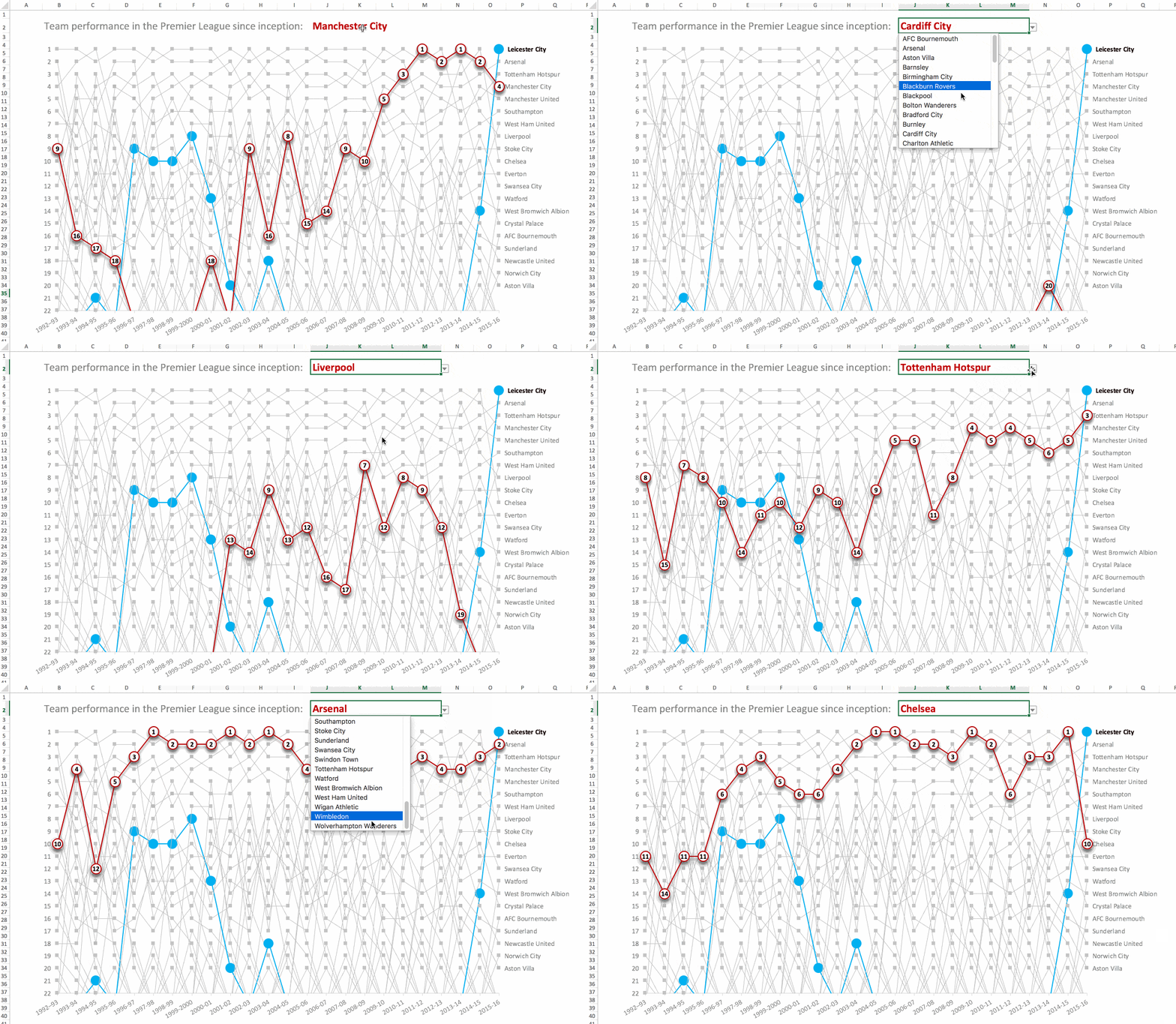
Find your team: See the history of each of the 47 teams in the Premier League here.
In this post I’ll show you how to create a dynamic bump chart like the one above, using historical data for the English Premier League going back to 1992-93 when it was created.
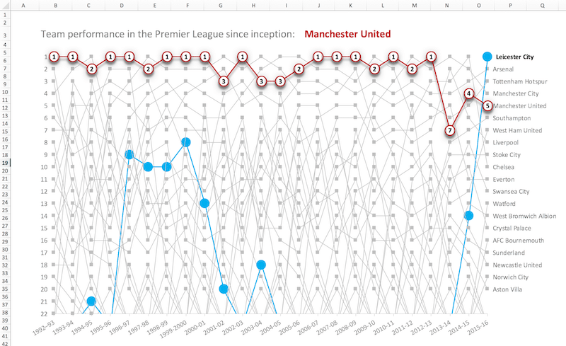
The chart shows you how successful Manchester United have been during the Premier League years:
Looking through all the different teams, you get a sense of nostalgia when recalling some of the teams that vacated the Premier League a long time ago (I remember them from my childhood):
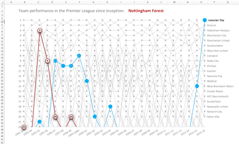
Feels like a very long time ago, a bygone era, when Nottingham Forest were hanging out with the big clubs near the top of the Premier League.
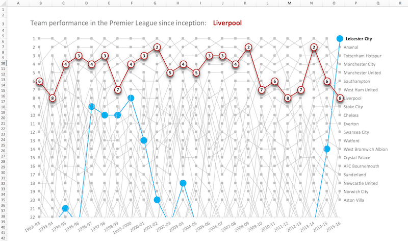
And here’s my own team, Liverpool, one of the world’s elite clubs struggling to regain the success of their glory days, yet to win a Premier League title. We came so close in 2013-14, but for one unfortunate slip at a crucial time, when we lost 0-2 to Chelsea at home.
Click here to see the history of all 47 teams who have made an appearance in the Premier League.
Creating a dynamic bump chart in Excel?
A quick note on preparing the raw data
I found all the data I needed for this chart on the Premier League pages of Wikipedia.
I stacked all of the tables for each season into one giant table of 486 rows, which has all 24 seasons data. I added a column to identify each season, expressed as a text value e.g. “1992-93”.
You can copy all the data from here if you want.
Next I had to do a little data cleaning to standardize all of the names, for example changing Arsenal !Arsenal *(C)* to Arsenal.
First I made a copy of the team name column (which I colored to distinguish it), so I could keep a record of the original data for checking.
Then I selected my new column of names and opened Find and Replace (Ctrl + F). Each team was fixed easily using Replace All with wildcard characters, as shown in this image:
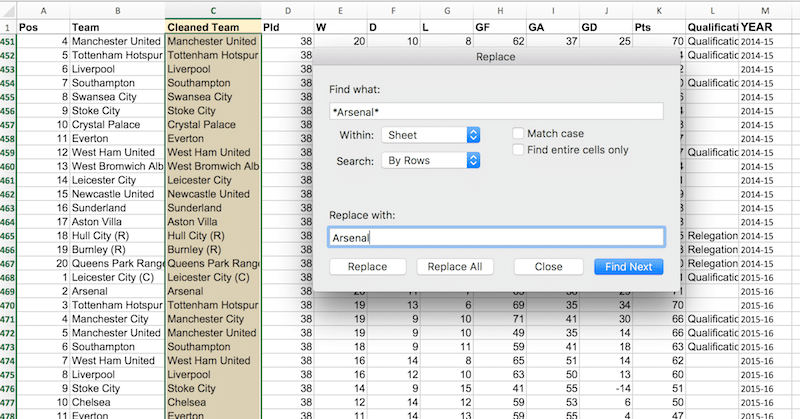
Find *Arsenal* and replace with Arsenal.
By adding the * in front of and after the string “Arsenal”, I could fix all the variations in one search.
Creating the chart
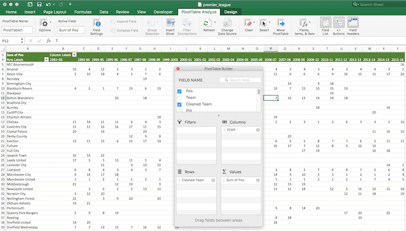
1. Select the entire table of Premier League data (Ctrl + A) and Insert > PivotTable. Add the Cleaned Team to Rows, YEAR to Columns and Position to Values, as shown in the following diagram.
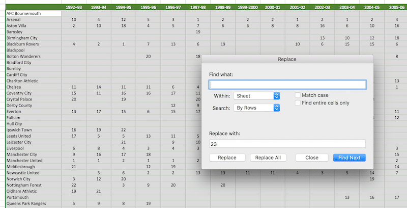
2. Make a copy of the pivot table data in a new tab. Select the whole table (Ctrl + A) then fill in all the blank cells with the value 23, i.e. for any of the teams that are not in the Premier League that season, rank them outside the top 22 (the max number of Premier League teams during the early seasons). Use Find and Replace again, this time leave the find box empty (blank) and put 23 in the replace box. Then hit Replace All.
3. Underneath this table, we’re going to add a line for the dynamic values that change when a user chooses a different team.
For now, repeat the last team name (Wolverhampton Wanderers) in the first blank cell under the team names (see the image below). Then add the following formula into the adjacent cell:
=VLOOKUP($AB51,$AB$4:$AZ$50,2,FALSE)You can use a shortcut to save typing the column reference number into your VLOOKUP formulas. If you’re in a different column to AC, then adjust the number 27 in the formula to account for the number of columns before your current data table (i.e. A to AA is 27 columns before my chart data table starts in column AB).
=VLOOKUP($AB51,$AB$4:$AZ$50,COLUMN(AC1)-27,FALSE)Highlight this final row to distinguish it as the dynamic line. The dataset is now as follows:
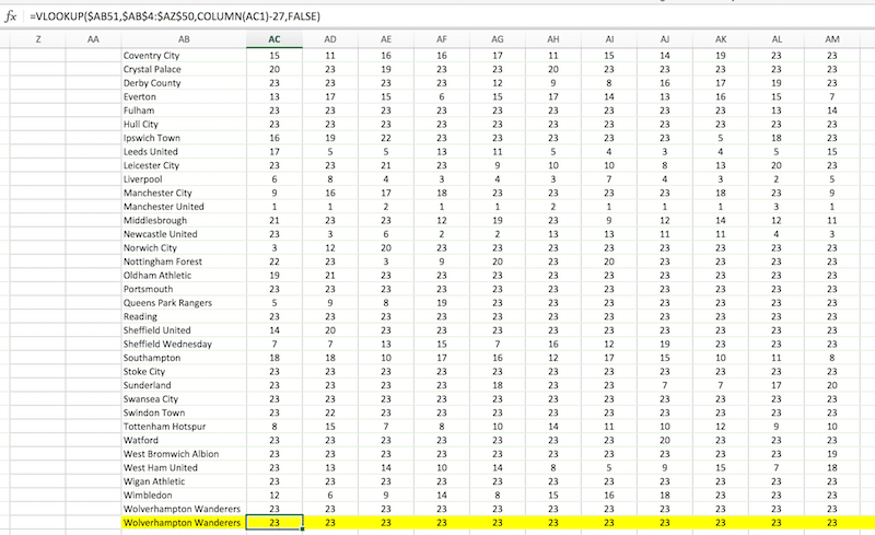
(Don’t worry, we’ll come back to change the team name to be dynamic, so the data changes with these formulas.)
Finally, let’s draw the chart.
4. Highlight the whole data table (Ctrl + A) and insert a line chart with markers. This will give you this teeny-weeny, indecipherable chart:
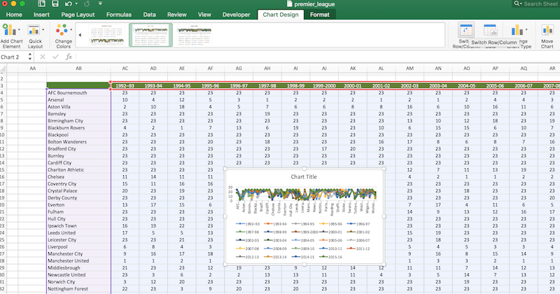
5. Excel doesn’t interpret the data the way we want, so swap the rows and columns using Chart Design > Switch Rows/Columns, to get another teeny-weeny indecipherable chart:
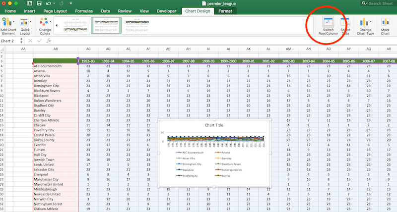
6. Expand the chart and delete the legend (click it to select it, then hit delete) and you can start to see the chart coming together:
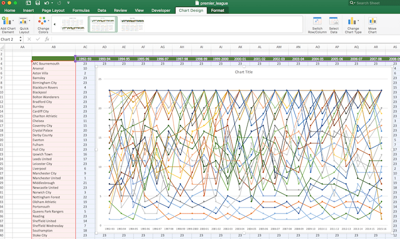
7. Now then, we need to change the color of all these lines and markers to grey, and add data labels for the team names. You can do this manually by clicking on each line in turn and:
– change the color
– change the border and fill color of the markers
– add data labels and change to “Series Name” only
– click on the data labels one-by-one and delete all except the last one.
It’s super tedious with all these lines believe me. So let’s use a bit of VBA-fu to do this for us in under a second (for a primer on VBA read this).
Go to Developer menu tab > Visual Basic menu option > Modules > Module 1, as shown in this image:
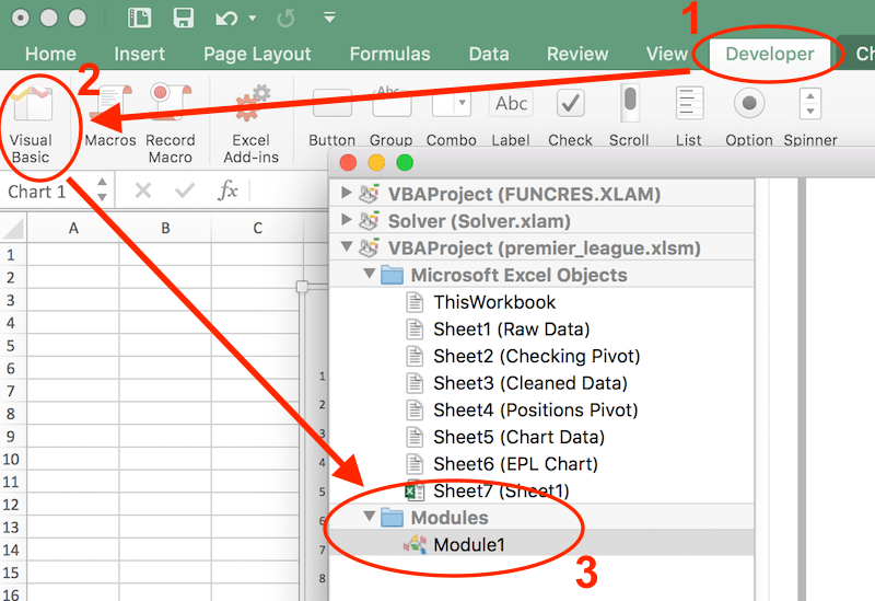
In the code window, copy and paste the following VBA code:
Option Explicit

Sub formatBumpChart()

  Dim mySrs As Series
  Dim nPts As Long

  For Each mySrs In ActiveChart.SeriesCollection

    With mySrs
        nPts = .Points.Count
        mySrs.Points(nPts).ApplyDataLabels _
          Type:=xlDataLabelsShowValue, _
          AutoText:=True, LegendKey:=False
        mySrs.Points(nPts).DataLabel.Text = mySrs.Name
        .MarkerStyle = xlMarkerStyleSquare
        .MarkerSize = 7
        .MarkerForegroundColorIndex = 15
        .MarkerBackgroundColorIndex = 15
        .DataLabels.Font.Size = 14
    End With

    With mySrs.Border
        .ColorIndex = 15 ' grey lines
        .Weight = xlThin
        .LineStyle = xlContinuous
    End With

  Next

End Sub
This contains a loop which runs over all of the lines (series) in the active chart and formats them to be thin grey lines with the team names added as a data label:
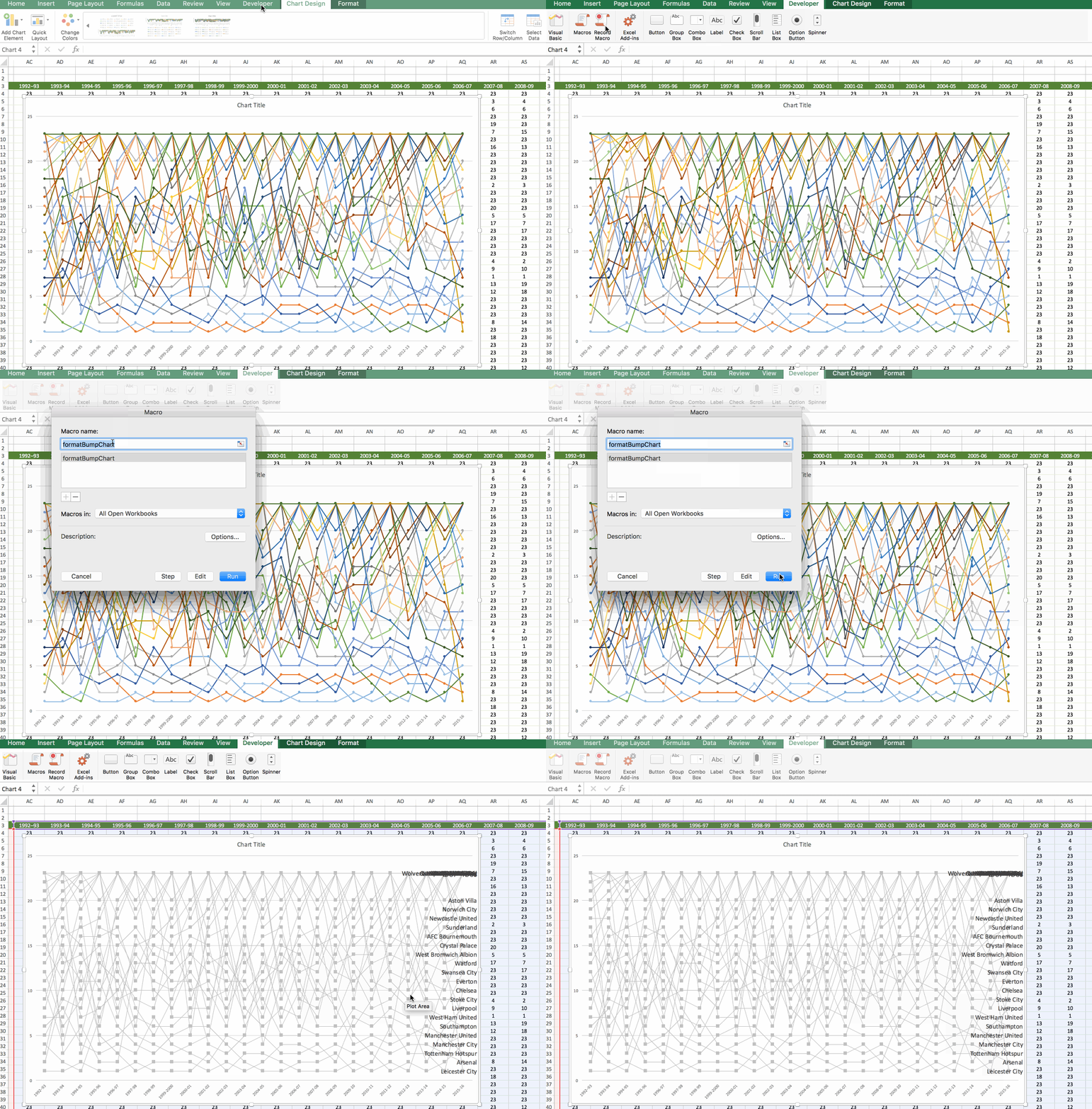
Now that your Excel file contains VBA, you’ll need to Save As and select the macro-enabled file .xlsm.
Click the chart area and move it in to give the data labels more room.
8. Noticed anything weird about that y-axis? Yeah, it’s upside down for our purposes, showing the top league positions, 1st, 2nd, 3rd etc., at the bottom of the axis and the bottom of the league positions at the top of the accident. Let’s flip it.
Click the y-axis, click Ctrl + 1 to bring up the format options and choose:
– Horizontal Axis Crosses > Maximum axis value
– Values in reverse order
to fix the axis, so that number 1 is at the top.
Set the bounds on the y-axis to from 0 to 22 inclusive and the Major Units to 1.0 in this same format panel.
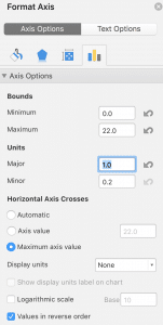
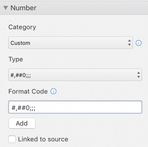
Finally, in this panel, change the number to a custom format: #,##0;; so that the 0 is not displayed (hat tip to Chandoo for this hint).
9. Time for a quick tidy up of the x-axis too. Select it, then in the format pane select the “Text Axis” checkbox and the “Between tick marks” axis position.
10. Add a new blank tab to your workbook. Cut and paste the chart into this new tab.
11. I changed the format of the current top team, Leicester City, to be a light blue similar to the club color. To do this, click Leicester’s series line (the top right data point in the chart) and format so that it stands out. I used:
– line color light blue
– line thickness 2pt
– circle marker with size 20
– circle marker color light blue
I also formatted the team name data label to be bold and light blue:
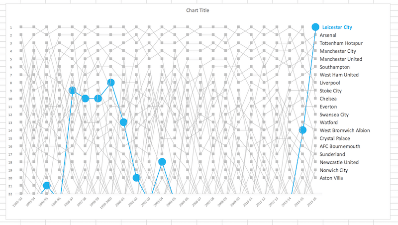
While you’re at it, select the gridlines by clicking on one of them and deleting them since they’re just cluttering up and confusing in this chart.
12. Adding the dynamic line element.
Above your chart (or nearby), create a drop-down menu that allows the user to select a team, as follows:
Data > Data Validataion
Settings > Validation Criteria > Allow: List
Click the Source input box (no. 5 in image below).
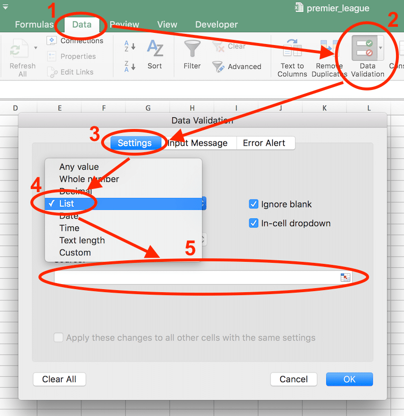
Then highlight the team names in your chart data table, excluding the dynamic one at the bottom of the list, to select all the team names:

Return to the cell where you put the data validation and you should have a drop down menu (a triangle will appear when you hover over the cell):
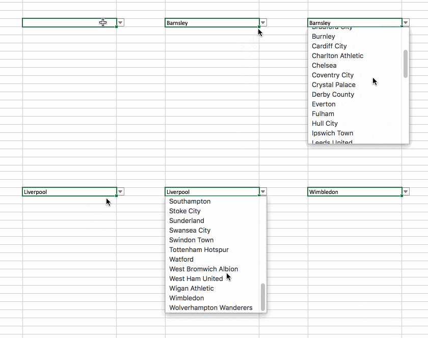
13. Return to the chart data table, to the cell at the bottom where we input all those VLOOKUP formulas in Step 3.
Click on the last team name cell (the very last cell in the column of team names, the one we typed in next to the VLOOKUPs) and type “=”, then navigate to and click on the data validation cell, so your formula is something like:
='EPL Chart'!J2where “EPL Chart” is the name of my chart sheet with the data validation. Now this cell is linked to the drop down menu, so when a different team is selected this cell will change and so the data in the VLOOKUP cells will change since they are using a different lookup value. Test it out by choosing a different team in the drop down menu.
14. Format the dynamic line representing the user selection.
This line is already in the chart as a duplicate of whichever team you have selected. So it just needs to be selected and formatted to stand out. Select the line in the chart menu: Format > then the drop down menu of chart elements > select the very last team name series (not the data labels).
Hit Ctrl + 1 to bring up the formatting menu and change the line format (dark red + 2pt + large markers).
15. Format the dynamic line data labels.
This is a little tricky. Follow step 13, select the very last team Data Labels in the Format chart menu drop down. Hit delete to remove, since it’s just the last data label showing the name.
We’ll add the data labels back as values instead:
– ensure you have the dynamic line in step 13 selected (follow those steps to select again if needed)
– Chart Design > Add Chart Element > Data Labels > Center
– this will add value data labels
– Ctrl + 1 to bring up the format menu then make sure Value is the only checkbox checked
– on the home menu, change the font size to 14pt and bold, so these values stand out.
The values represent the position the team finished in that season.
Now your chart should look something like this:
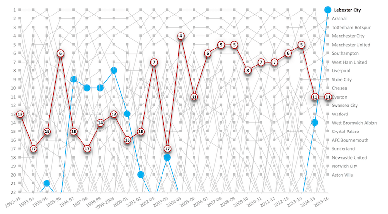
16. To get really fancy, you can add a very subtle shadow to the dynamic line too. I’ll leave that for homework 😉
From here, you can add a title with above the chart and move the drop down menu in the cell adjacent to the title if you like.
The final chart should then display and work like this:

Let me know if you have any questions, comments, or ideas for improvement in the comments below.
Hey. He did everything in the tutorials, but it looks like a mistake in step 3 or 14, I think the error with the formulas, you could describe in more detail all. Thank you
Error is that when the command is no dynamic selection command line on the other
Hey Nick!
Have you done step 13, which changes the team name to a dynamic cell reference? Alternatively, check you have your data in the same ranges (same cell references) as my examples otherwise the formulas as written won’t work. The screenshot diagram in step 3 shows the vlookup formula and cell references, so you need to have data in the same place (or change the formula references).
Step 14 is to select the last line (series of data) and then format this red. When you change the formulas this line will change position, depending on team picked.
Hope this helps! Let me know if you have any other questions.
Ben