
With the new Sheets Canvas feature, we can build professional-looking interactive dashboards directly in our Google Sheets, using nothing more than natural language prompts. It’s a huge upgrade from how we used to build dashboards in Sheets.
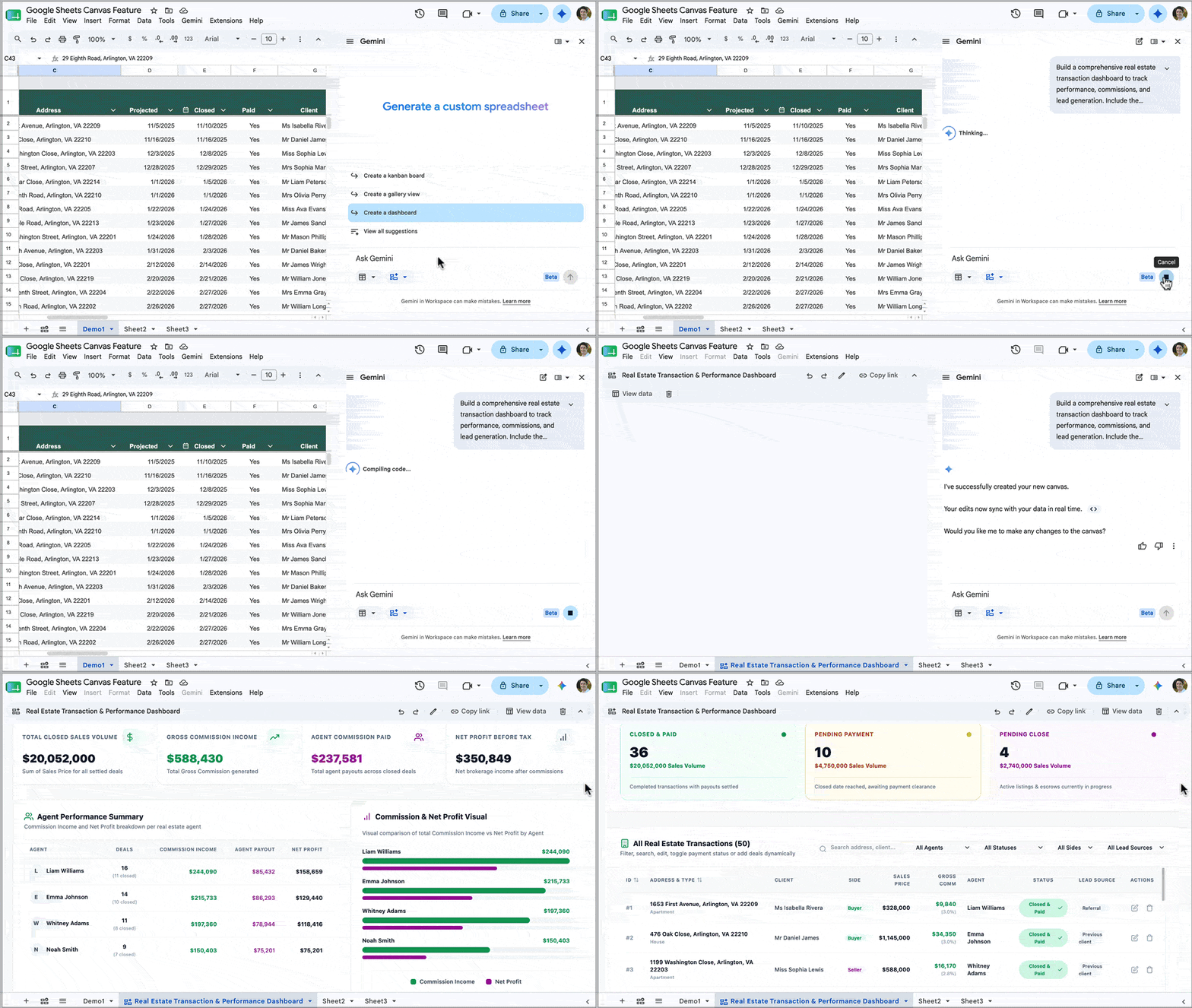
Previously, we clumped together charts and used formatting tricks such as borders and background cell colors to try and recreate a professional look. It was all rather challenging and time-consuming, with limited interactive options. (Read this post to see what I mean.)
Alternatively, we might have connected Google Sheets to a third-party tool, but these incurred extra costs, introduced security risks, and were often still pretty janky.
In this post, we are going to take a look at this new Sheets Canvas feature.
Sheets Canvas Availability
At the time of writing (August 2026), the Sheets canvas feature is only available to Google Workspace customers on Business or Enterprise Standard and Plus plans, or AI Pro for Education add-on subscribers, or to consumers on Google AI Pro and Ultra plans.
How To Build A Dashboard with Sheets Canvas
Firstly, you need to have your data ready to go in a Google Sheet, preferably in a Tables format, which is best for Gemini.
Secondly, it pays to think about your dashboard design before you start building it.
That way, you won’t end up building something that isn’t useful. Instead, you plan what information will be shown on the dashboard and how it will work, which will result in a more successful outcome.
For example, ask yourself these questions:
- What are the key metrics to show?
- Who is the intended audience for this dashboard?
- How technically literate are they? Will they understand how to read complex charts?
- How familiar are they with this data and its background context?
With your data and design plan to hand, you’re ready to start creating a Sheets Canvas.
There are three entry points:
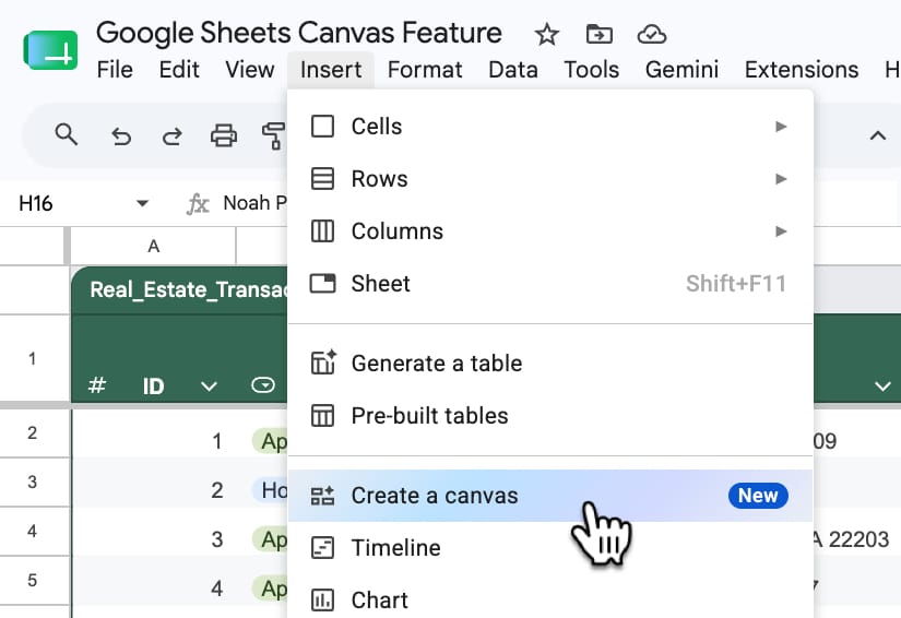
- From the toolbar: Insert > Canvas
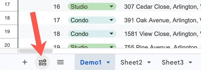
- Using the “Create a canvas” button in the bottom left of your Sheet, next to the Sheet names.
(Both 1 and 2 open the Gemini sidebar with the Canvas option pre-selected.) - You can select “Create canvas” directly in the Gemini sidebar too.
1. Insert menu:
2. Create a canvas button:
3. Create canvas in Gemini Sidebar:
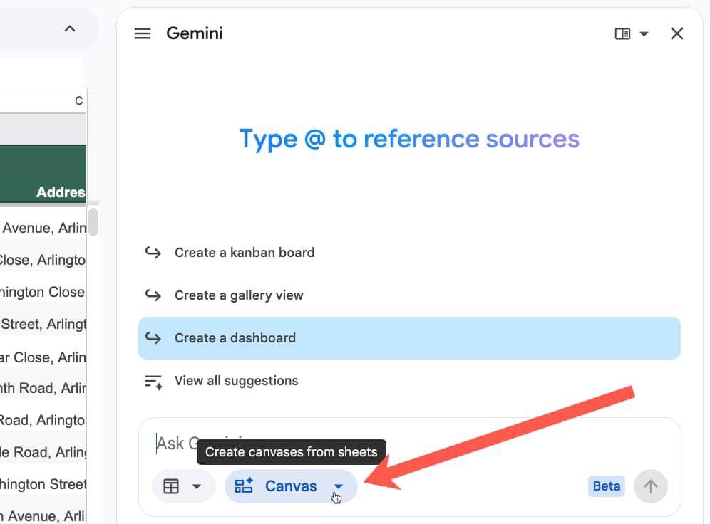
With Gemini sidebar open and the canvas feature selected, make sure you select the correct dataset(s) for the dashboard.
Use the button next to the Canvas option and choose the sheet containing your data. If you already have that sheet open, then it will automatically be selected, and you can deselect the other sheets if you don’t need them.
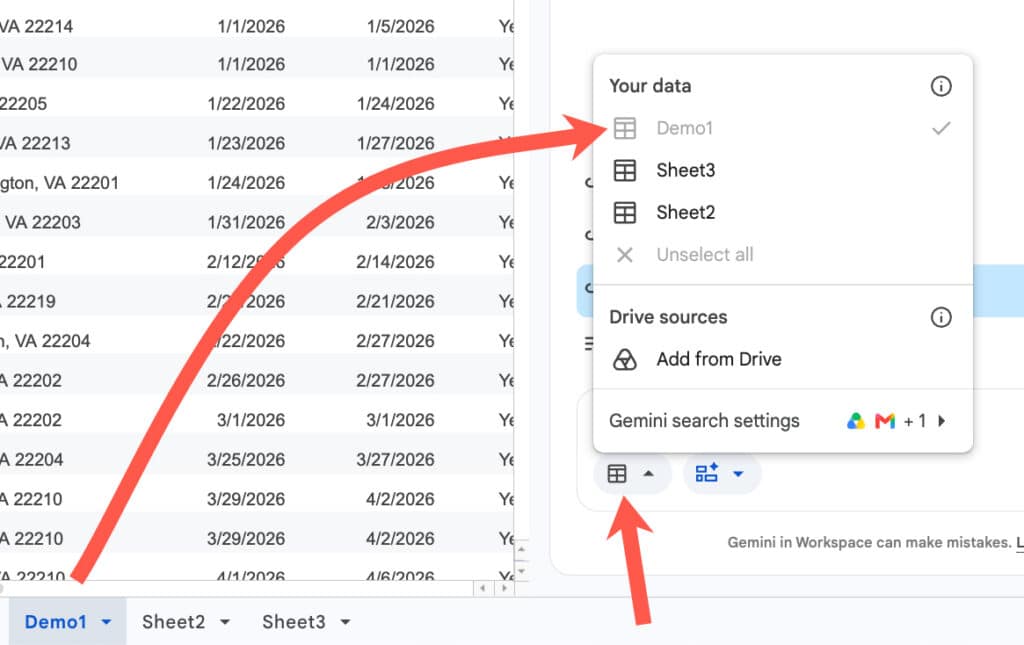
Now you’re ready to insert your prompt.
Example 1: Real Estate Dashboard
Consider this dataset of real estate transactions:
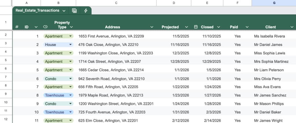
Here’s an example prompt to build a dashboard for this data:
Build a comprehensive real estate transaction dashboard to track performance, commissions, and lead generation. Include the following elements:
1. Key Performance Indicators (KPIs): Calculate the total sum of Sales Price, Commission Income, Agent Commission, and Net Profit for Tax for all “Closed” and “Paid” deals.
2. Agent Performance: Create a summary table or chart showing the total Commission Income and Net Profit generated by each Agent.
3. Lead Source Analysis: Create a bar chart breaking down total Sales Price and total number of transactions by Lead Source to see which marketing channels are most effective.
4. Buyer vs. Seller Split: Create a visual breakdown comparing the number of transactions and total Commission Income based on the Deal Side (Buyer vs. Seller).
5. Deal Pipeline: Provide a quick count of transactions categorized by Deal Status to show how many deals are currently pending versus closed.
Please format this with a clean, professional layout, using bold headers for each section and placing the charts logically next to the summary tables.
Use hex color #0F9E59 as the primary color and #9E0F9C as the secondary color.
Pro Tip: Save your best dashboard prompts in a prompt library for future reuse.
Typically, Gemini takes a few minutes to build the dashboard, depending on how complex your prompt is.
The output for the real estate data example looks like this:
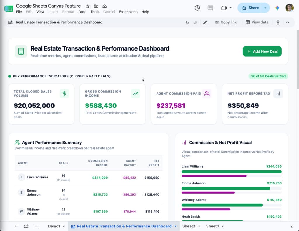
Notice how the colors match the colors mentioned in the prompt (#0F9E59 as the primary color and #9E0F9C as the secondary color).
Also, notice the “Add New Deal” button in the top right corner. When you click this, it opens a pop-up with a form to add new deals:
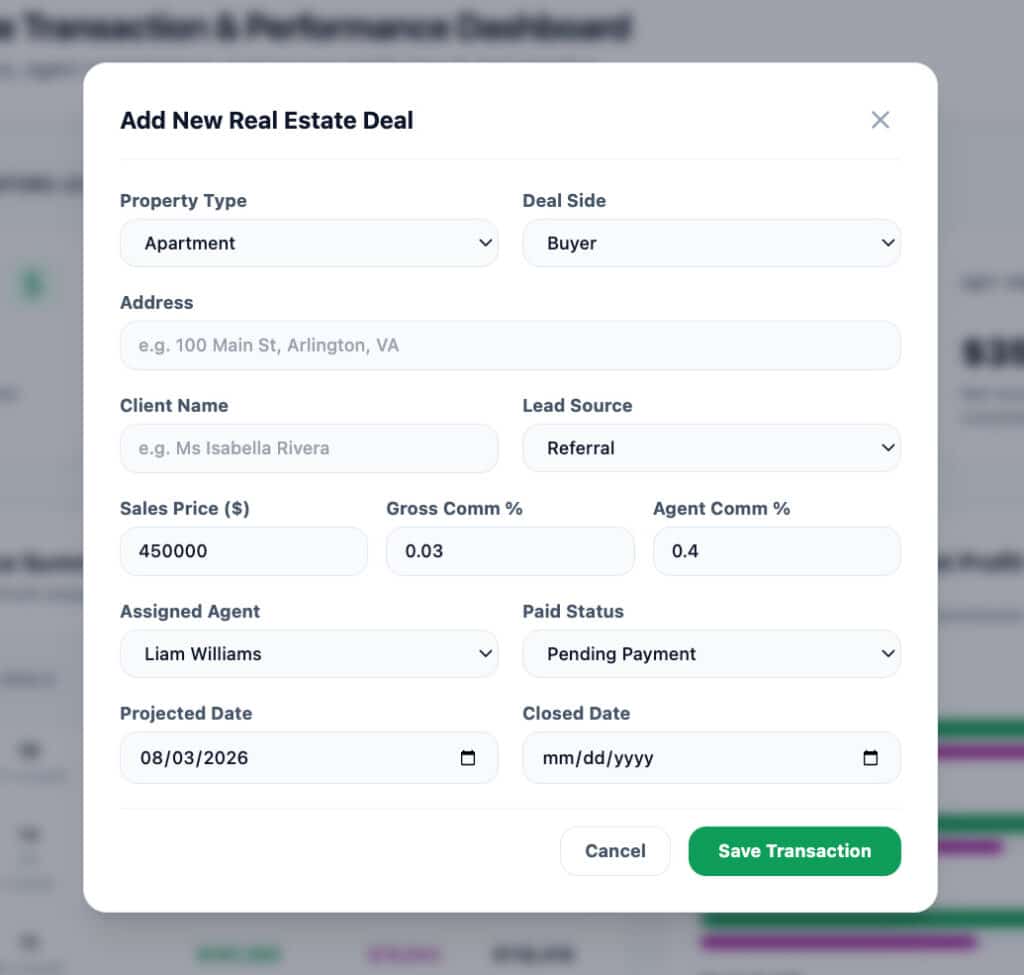
This data is inserted directly into your original data table in Google Sheets. It’s a great way for users to add new data without leaving the dashboard view, and it saves users from needing to navigate the data in the spreadsheet itself.
At the the top of the canvas is a small edit bar for making changes, sharing, or deleting the canvas:

To use the “Copy link” button to share the canvas, you need to first grant file access (through the regular “Share” button in the top right of your Google Sheet) to anyone you want to share the canvas with.
Example 2: Kanban Board
The Sheets canvas tool is not limited to regular dashboards, though.
It can also build interactive Kanban boards, which is my favorite use case and a killer feature.
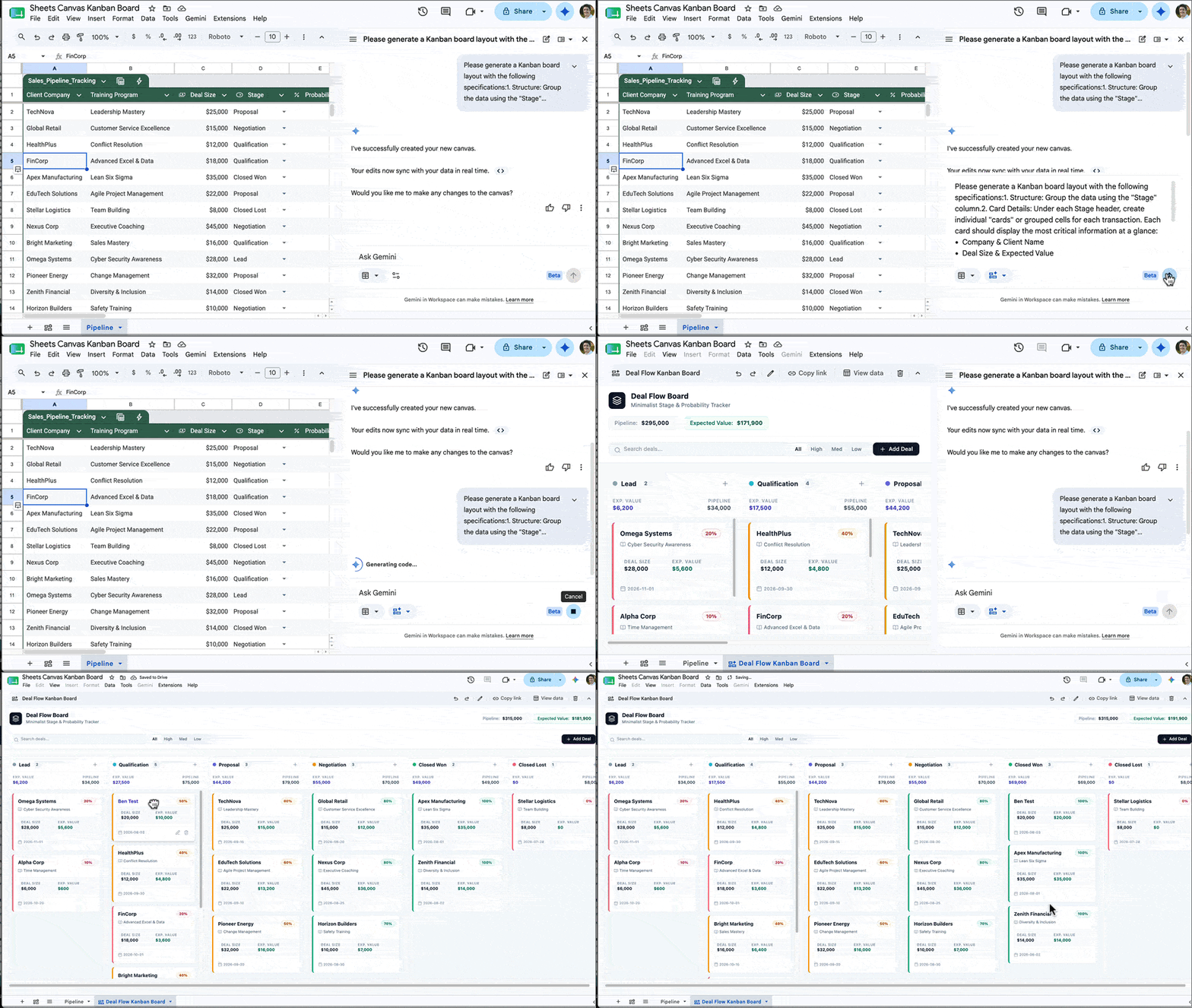
Kanban boards are visual project management tools that organize tasks into columns and allow you to drag and drop cards between these columns.
Previously, this sort of interactivity was impossible inside of Google Sheets, but now with this new Sheets Canvas feature, you can build a fully featured Kanban board with a single prompt.
For example, here is a client pipeline data set for training contracts:
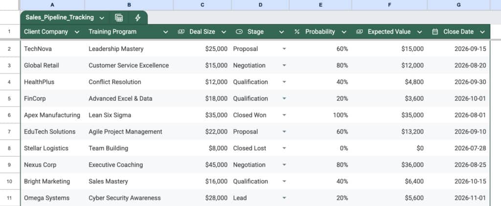
And here’s an example prompt to generate a Kanban board from this data:
Please generate a Kanban board layout with the following specifications:
1. Structure: Group the data using the “Stage” column.
2. Card Details: Under each Stage header, create individual “cards” or grouped cells for each transaction. Each card should display the most critical information at a glance:
- Company & Client Name
- Deal Size & Expected Value
3. Formatting:
- Please apply conditional formatting or color-coding to the cards based on the “Probability” column (e.g., green for high probability, yellow for medium, red/gray for low) so I can easily identify which deals are most likely to close.
- Ensure the layout is clean and minimalist.
The output from this prompt looks something like this:
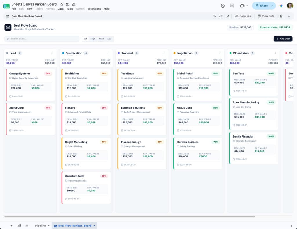
You can then drag these cards into different columns as needed to show progress. When you drag a card into a new column, the data in the underlying sheet also updates to reflect that, so they are always synced in real time.
And as with the dashboard from earlier, there is also a button to add new data from the Kanban canvas rather than having to go back to the actual spreadsheet data.
Here are 6 more mini apps you can create with Sheets canvas.
Limitations
At the moment, if you want to modify the dashboard generated by the Sheets Canvas tool, you give it an additional prompt in the Gemini sidebar. For example, you might prompt Gemini with “change the leads pie chart into a bar chart“.
Unfortunately, when Gemini updates the dashboard, other elements might inadvertently change too.
I think the real breakthrough will come when we can click on individual features within the Dashboard or Kanban board and give specific instructions to modify that specific feature only with a prompt. Hopefully that is something coming down the line.
Conclusion
This new Sheets Canvas feature is a fantastic tool that dramatically expands the possibilities of what you can do with data in Google Sheets.
And, whilst the regular chart tool will remain extremely useful for specific analysis and one-off charts, the old way of building dashboards is rapidly becoming obsolete.
I can’t imagine spending hours manually positioning charts, hand-picking background cell colors and borders, and all manner of other dark arts, to build a dashboard the old way, knowing it wouldn’t even look half as good as what this new canvas tool can build in a few minutes.
If you have access to this canvas tool, then I encourage you to experiment with it to build your dashboards.