I firmly believe that one of the most effective and rewarding ways to learn a skill is through practical application.
Solving problems you don’t know the answer to is arguably the best way to do this.
And that’s the idea behind these Formula Challenges.
I’ll post a challenge in my Monday newsletter — a question to be solved with formulas in Google Sheets — and a week later share solutions, both my own and those submitted by readers.
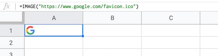
Start with a straightforward IMAGE function in cell A1, like this:
=IMAGE("https://www.google.com/favicon.ico")
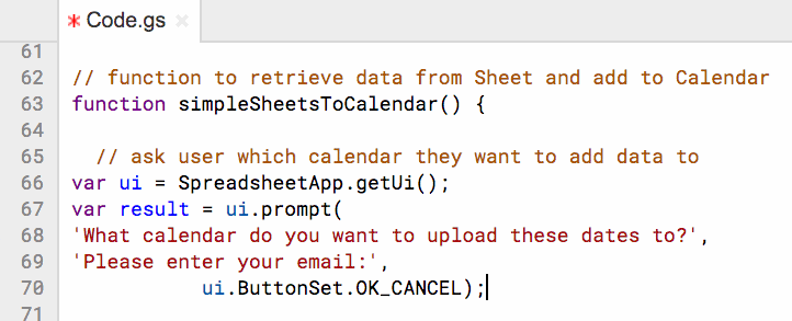
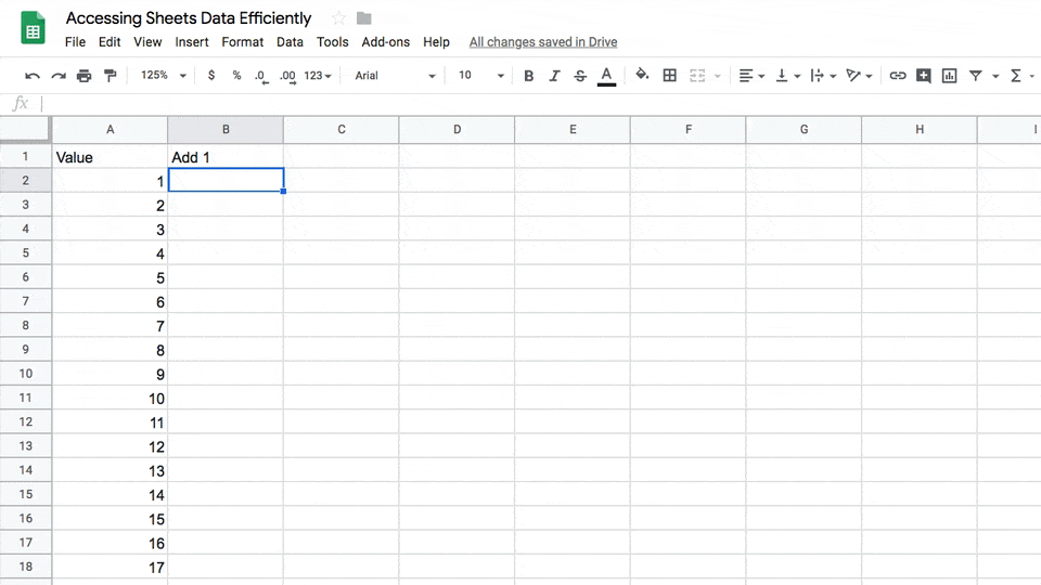
Your Challenge
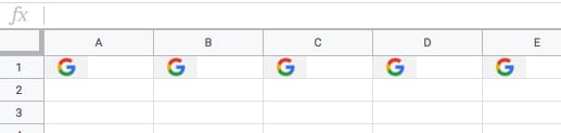
Your challenge is to modify the formula in cell A1 only, to repeat the image across multiple columns (say 5 as in this example), so it looks like this:
Rules
You’re only allowed to use a single formula in cell A1.
The problem is that the IMAGE function can’t be nested inside a REPT function, so you have to get a bit more creative.
The combination of ArrayFormula with COLUMN(A:E) will output an array of numbers 1 to 5: {1,2,3,4,5}
The IF statement treats the numbers as TRUE values, so prints out the image 5 times. For brevity, we can omit the FALSE value of the IF statement, since we don’t call it.
Solution Two: using REPT inside the IMAGE formula!
As mentioned, the REPT function doesn’t work when wrapped around the IMAGE function. However, flip them around, with the REPT inside the IMAGE function, and it does work!
In other words the IMAGE function accepts arrays of URLs as an input.
Start with this formula in cell A1, which creates a single string of joined URLs, with a pipe ( | ) delimiter between them:
What I like about this solution is that you could put the number 5 into a different cell and reference it, so that you can easily change how many times the image is repeated.
You could even embed another formula to calculate how many times to repeat the image 😉
As I’ve grown, my values have changed and evolved.
Things that mattered to me in my twenties and early thirties don’t matter so much now.
As each year passes, what matters to me becomes clearer. A simple life, with a focus around family, regular outdoor exercise, and a good work routine is what I’m looking for.
For the past few years, my wife and I have nurtured a shared dream of moving our family to a small mountain town. Continue reading In Pursuit Of A Dream
💡 Learn moreLearn how to write Apps Script and turbocharge your Google Workspace experience with the new Beginner Apps Script course
These 10 coding tips will help you develop good practices early in your coding journey.
Learning a programming language is hard. The amount of information feels overwhelming at first. However, by focussing on a few key concepts and techniques, you can make rapid progress.
Use these 10 coding tips to learn Google Apps Script effectively:
1. Make Your Code Understandable
Use plenty of white space and comments in your Apps Script code:
// get data out of spreadsheet function getData() { // code here...
}
Don’t worry about trying to make your code concise when you’re learning, better you understand it when you come back to look at it the next day or next week.
2. Use these keyboard shortcuts when working in the editor
Use these keyboard shortcuts to work more efficiently in the Apps Script editor. These simple shortcuts are SO useful when you’re working with Apps Script that I implore you to take a few minutes today to try them out!
Auto Comment
Auto Comment with:
Ctrl + /
This works on individual lines or blocks of your Apps Script code.
Move code up and down
Move code up and down with:
Alt + Up/Down
If you find yourself wanting to move code around, this is SUPER handy.
Tidy up indentation
Tidy up indentation with:
Tab
Keeping your code properly indented makes it much easier to read and understand. This handy shortcut will help you do that. It’s especially useful if you’ve copied code from somewhere else and the indenting is all higgledy-piggledy.
Bring up the code auto-complete
Bring up the Apps Script code auto-complete with:
Ctrl + Space
(or Ctrl + Alt + Space on Chromebook)
How many times have you been typing a class or method, made a spelling mistake only to see the helpful auto-complete list disappear? Bring it back with Ctrl + Space (or Ctrl + Alt + Space on Chromebook).
3. Record a macro and look at the code
If you’re not sure how to write something in code, or you’re trying something new, record a Google Sheets Macro for that action and review the code.
The macro tool doesn’t always generate the most concise code, but it will give you helpful clues on how to do certain tasks. You can copy snippets of code and utilize them in your own code.
4. Log Everything with Google script logger
Use the Google script logger Logger.log() method liberally when you’re getting started.
It prints out the values of whatever you “log”, for example the output of a function call. It’s super helpful for you to see what’s going on inside your script at different stages.
You can also add notes like this:
Logger.log("Hey, this function X just got called!");
If you see this in your logs, then you know that function X was called.
This is probably the most useful tip from these 10 coding tips!
5. Understand These Four Fundamental Concepts
i) Variables
Variables are placeholders for storing data values. You create variables with the var notation and assign values with a single equals sign.
For example, the following expression sets the variable counter to have a value of 0. Anytime you use counter in your code, it will have the value 0, until you change it.
var counter = 0;
ii) Functions
Functions are blocks of code designed to perform a specific task. A function is run (executed) when something calls it (invokes it).
Functions can be declared (created) with the word function followed by the function name, which is getData in the following example:
// get data out of spreadsheet function getData() { // code here...
}
The brackets immediately after the function name are required, and are used to hold optional arguments, in a similar way to how functions are used in Google Sheets.
iii) Arrays
Arrays hold multiple values in a single variable, using a square bracket notation. The order of the values is important. Items are accessed by calling on their position in the array. One other thing to note: the array index starts from 0, not 1!
The following expression creates a new array, called fruitsArray, with three elements in positions 0, 1 and 2.
var fruitsArray = [ "apple", "banana", "pear" ];
iv) Objects
Objects can hold multiple values too, but think of them as properties belonging to the object. They are stored in key/value pairs. For example, here is an object, stored in a variable called book, which has two key/value property pairs:
var book = {

  "title": "Apps Script Book",

  "author": "Ben Collins"

}
The order of the pairs does not matter when you write out objects. The values are accessed by calling on the key names.
Obviously there’s a lot more to Apps Script than just these four concepts, but understanding Variables, Functions, Arrays and Objects, and how to work with them, will go a long way towards you creating functional Apps Script programs of your own.
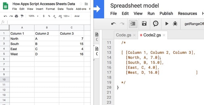
6. Understand the Google Sheets Double Array Notation
This is really, really key to using Apps Script to work with Google Sheets. Once you understand the double array notation for Google Sheets data, you open up a huge range of opportunities for extending your Google Sheets work. Spend enough time with this topic, and it’ll become as familiar as the regular A1 notation in Sheets.
On the left, Google Sheets data. On the right, Google Apps Script data.
7. Learn basic loops
The For Loop
Start with the basic for loop to understand how loops work.
It lays bare the mechanics of the loop, showing the starting number, how many times to loop and whether you’re increasing the loop counter or decreasing it.
for (var i = 0; i < 10; i++) {
Logger.log(i);
}
The ForEach Loop
Next up, take some time to learn the more modern looping method: the forEach loop.
This hides the loop mechanics, which makes for cleaner, more readable code. It’s really easy to work with once you get the hang of it.
Basically it grabs all the data from your array and loops over each item in turn. You can do something, by applying a function, to each item during each loop of the array.
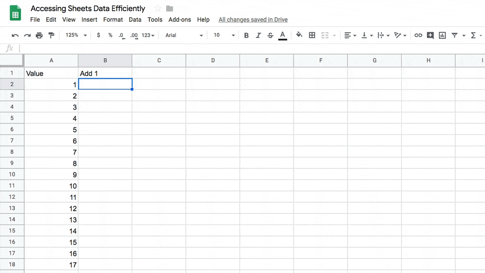
8. Understand how Google Sheets <--> Apps Script Transfer Data
Understand how data is passed back and forth between Google Sheets and Apps Script, and how to optimize for that.
Calculations in Google Sheets are done in your browser and are fast. Similarly, calculations done in Apps Script on the Google servers are lightning fast. But passing data back and forth from Sheet to Apps Script or vice versa, oh boy! That’s slow in comparison. (We’re still talking seconds or minutes here, but that’s slow in computing terms.)
To illustrate, here’s a script that retrieves values one cell at a time, performs a calculation in Apps Script and sends the single cell answer back to the Google Sheet. It performs this for one hundred numbers (shown in real time):
Contrast that to the equivalent calculation where the script grabs all one hundred numbers in one, performs the calculations and pastes them back en masse, in one go:
Looks almost instantaneous to the human eye. So much faster!
Here’s another image to summarize this optimization process:
It might feel overwhelming at first, but persevere and spend time there. Most likely you’ll find something of value to help you solve your current issue.
It’s full of both code examples and a comprehensive reference, so you can look up the precise type of the return value of function X.
10. Ask for help
The final tip of the 10 coding tips is to not be afraid to ask for help when you get stuck.
I always advocate spending time trying to solve your problems yourself, but past a certain point it’s diminishing returns.
Know when to stop banging your head against the wall and try searching for or asking for help in one of these two places:
I’ve created two high quality, online courses teaching Apps Script from the ground up. They’re the best way to learn Apps Script in the shortest amount of time.
The first course, Introduction To Google Apps Script, is designed to take you from 0 to 20 and get you started on your Apps Script journey.
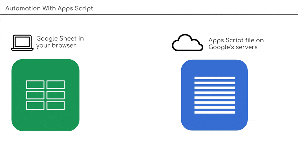
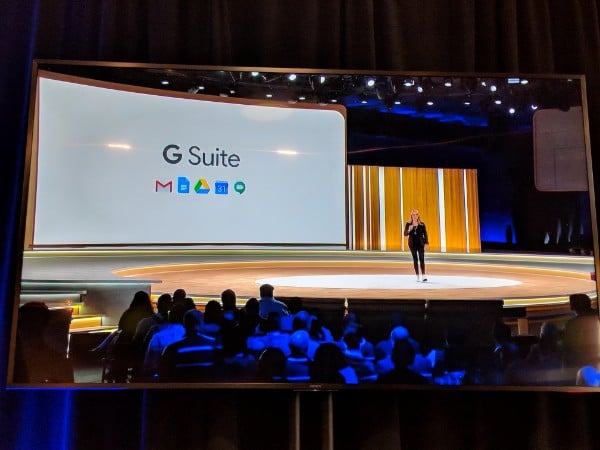
The follow-up course, Automation With Apps Script, is designed to take you from 10 to 100 (or wherever you want to go!) and focuses on how to automate workflows in G Suite and connect to external APIs. This course is available for enrollment twice per year, and the next open enrollment is in early 2020.
I’ve recently returned from a fantastic week in San Francisco at Google’s Cloud Next ’19 conference, which is their annual Cloud conference for developers and vendors. It’s a huge event, with some 30,000+ attendees and 500 sessions.
Google made a 122 announcements, including some exciting developments relating to Google Sheets.
Here are the talks from the Google Cloud Next 19 conference that related to Google Sheets:
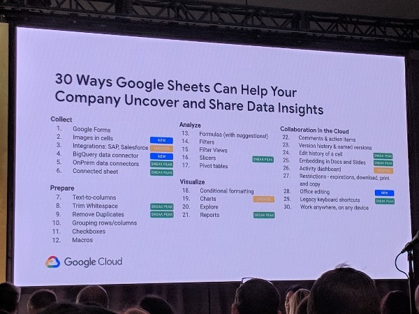
1. 30 Ways Google Sheets Can Help Your Company Uncover and Share Data Insights
If you only watch one session from next and you’re a Google Sheets user, then I’d recommend this one. It’s really well presented look at the capabilities of Google Sheets in the context of working with data and the Sheets team give plenty of sneak peeks into where the tool is going.
Here are the new features we can expect to see in the future:
Images in cells: allows you to add images anchored inside a cell, not just free-floating, and without needing to use the IMAGE function
Trim Whitespace: natively remove whitespace around data in cells, instead of having to use formulas
Slicers:slicers are controls to add filters to pivot tables and charts
Reports & Themes: features to make dashboard reports easier in Sheets
OnPrem data connectors: data connectors to other SQL databases to easily access data from Sheets
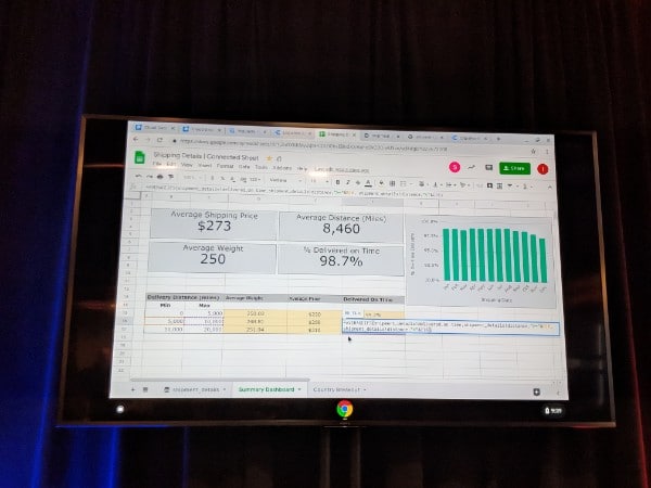
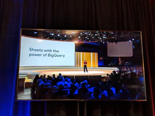
Connected sheets:Connected Sheets connect Sheets to BigQuery and use Sheets functionality, like pivot tables, formulas and charts, with millions or even billions of rows of data inside BigQuery. The presenters showed an incredible demonstration of running a pivot table on 128 million rows of data!
View and edit history of individual cells: see how cells have changed over time
Embedding Sheets in Docs and Slides
MS Office Editing: work on Office files straight from G Suite without having to convert file types
Legacy keyboard shortcuts
2. How to Grow a Spreadsheet into an Application
Most of us use spreadsheets beyond simple data tasks. We build to-do lists, address books, scheduling apps, bug trackers, etc. Eventually, however, there comes a time when you need something more robust than a standalone Google Sheet, and this talk explores that journey, from single Google Sheet to full-blown application.
3. How to Simplify Business Processes with G Suite
4. Google Docs: Taking Collaboration Beyond Real Time
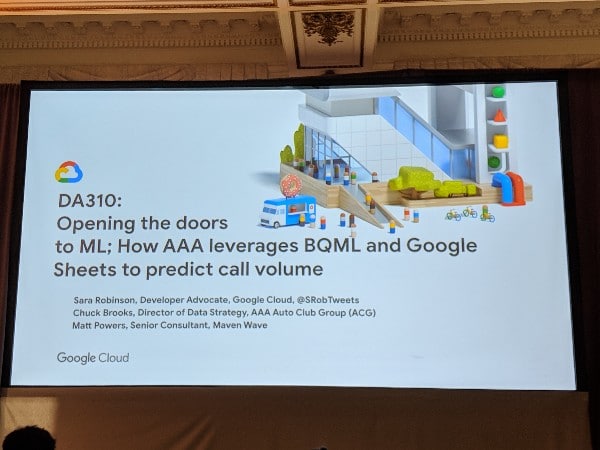
5. Open Doors to ML: How AAA Leverages BQML and Google Sheets to Predict Call Volume
An interesting session looking at how AAA uses BigQuery and Machine Learning to create predictive models that everyone can access through the Google Sheets interface. It was fascinating to see how Google Sheets has been positioned as the final step of the big data/machine learning pipelines.
6. Bring Your Favorite Enterprise Apps to G Suite with the New G Suite Add-ons
For Add-On developers, there was a big announcement about the new G Suite Add-Ons, which should make developers lives easier:
The full library of sessions from Google Next 19 can be found over on the Google Cloud Platform and the G Suite channels.
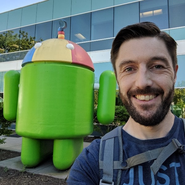
The conference may be over but I have a little time left in San Francisco. Today I had the opportunity to visit the Googleplex in Mountain View and record a video with the Data Studio team 🙂
In the studio with the Data Studio teamAndroid Robot!
1.35 PM – Growing a spreadsheet into an application
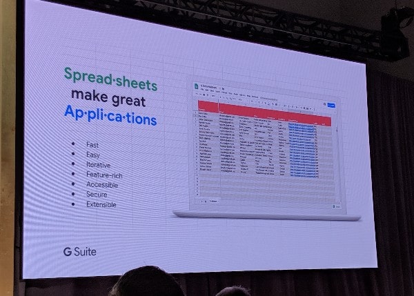
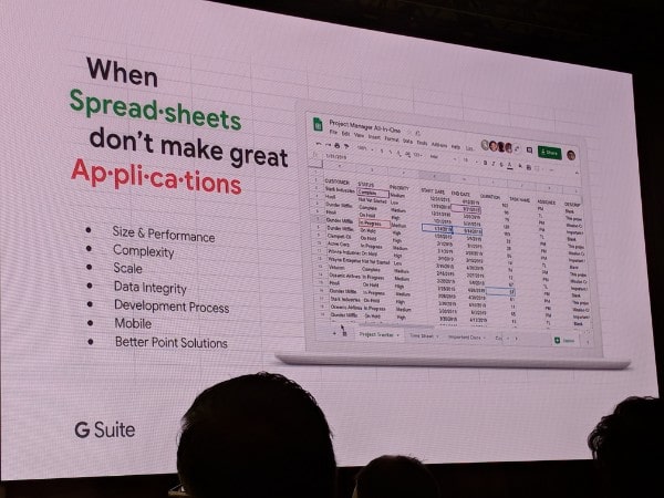
Really interesting talk about the life cycle of a spreadsheet, and how it grows into an application, and how you can move beyond the spreadsheet to a more robust, scalable solution.
Use cases when spreadsheets make good applications……and times when they don’t make good applications!
11 AM – Data Studio meetup
A bunch of Data Studio enthusiasts and Googlers got together to discuss the product and the roadmap. Great to get some insight into where it’s going. They’re certainly investing heavily in Data Studio!
9 AM – Simplify Business Processes with G Suite session
Some really interesting use-cases of businesses adopting G Suite, and how it’s simplifying and streamlining their processes.
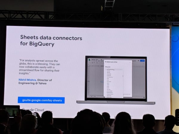
The BigQuery to Google Sheets connector is getting a lot of love! ?
Google Sheets BigQuery connector
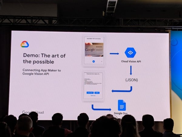
The team also shared some innovative and wide-ranging examples of App Maker apps. For example, here’s an App Maker app that can recognize text in a photo and transfer that into a Google Doc for you!
It’s the final day of Google Next 19!
Video replay of yesterday’s Sheets session!
The video replay of yesterday’s Google Sheets session is now on YouTube. This is highly recommended if you have 45 minutes. In it, the Product Managers from Google share the Google Sheets roadmap:
Lots of updates from the Data Studio team and a great demonstration of how quick the tool is to analyze a hundred million rows of data, when using the new BigQuery BI Engine between BigQuery and Data Studio.
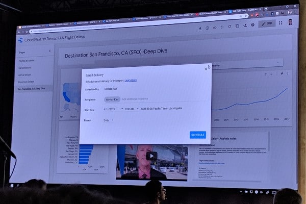
The other big updates included a sophisticated chart drill-down and cross-filtering features and more insight into the scheduled distribution of reports.
Scheduled Data Studio report
It’s very clear that Google are investing heavily in this tool!
2.10 PM – BQML and Google Sheets
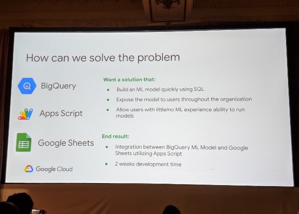
This was a really interesting session on how AAA utilize BigQuery and the new BigQuery ML (Machine Learning) tool to predict volume at call centers. They use the BigQuery connector to bring the analytical capabilities into Sheets, to open access to the model to many more people across the organization.
Fascinating stuff!
12.30 PM – Google Sheets Session
Wow! So many big features in the pipeline:
Google Sheets announcements
How we work with data in Google Sheets is changing. Some of the biggest announcements were (some available in beta today, some coming in the future):
Connected Sheets for BigQuery (see Product Keynote below)
On Prem data connectors – Oracle, MySQL, Postgres databases direct into Sheets
Reports!Easily create beautiful reports, including Themes feature
See and Edit history of a cell
Embedding Sheets into Docs/Slides
And more…!
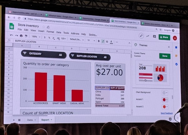
Google Sheets Reports featureAnalyzing millions of rows of BigQuery data directly in Google Sheets formula! ?
More to come…
9 AM – Product Keynote
Good to see G Suite get a lot of stage time!
BigQuery + Google Sheets! This is exciting!
Probably the most exciting feature for Sheets users is a new feature in #GoogleSheets, called Connected Sheets, which lets you collaborate on up to 10 billion rows of BigQuery data right from within Sheets (without needing SQL!) –> more details and apply for beta access now
Other big announcements included:
G Suite integration with Google Assistant (beta)
G Suite Add-ons (beta coming soon)
Office editing in Docs, Slides and Sheets (generally available)
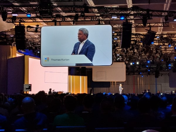
Day 1 was all about enterprise, enterprise, enterprise. Google Cloud CEO, Thomas Kurian, announced a new product, Anthos, available for managing multi-cloud solutions.
For me personally, this enterprise stuff is really interesting but not directly relevant. The highlight of the day was meeting a bunch of great folks and sharing ideas, beginning by serendipitously sitting next to a data scientist from MailChimp for the opening keynote.
Tomorrow, the focus is more on product and developers!
There are sessions focused on Sheets (new announcements hopefully!), combining BigQuery with Sheets and finally, Data Studio. So I should have a lot more substantive updates to share here on the blog tomorrow 🙂
4PM – Checking out the Vendor Hall
The scale of this conference is pretty overwhelming!
1 PM – 3.30 PM – G Suite Product Feedback session
One of the benefits of becoming a Google Developer Expert is that I get to meet some of the Google Project Managers and give product feedback directly.
This afternoon we had a big round table with most of the G Suite and Apps Script GDEs and the respective Product Managers and Developer Relations team from Google.
It was a lively discussion and great to see Google listening to all our feedback. There’s lots of exciting stuff in the pipeline, some of which will be announced at Next, some later this year.
Unfortunately I can’t share any specifics now, but I’ll certainly share anything that gets announced at the sessions tomorrow!
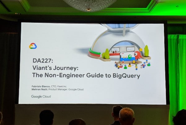
11 AM – The Non-Engineer Guide to BigQuery
Interesting presentation, although totally different to what I expected.
I was expecting more of an introduction to using BigQuery and how to approach it for product managers, analysts, managers etc. (i.e. non-engineers).
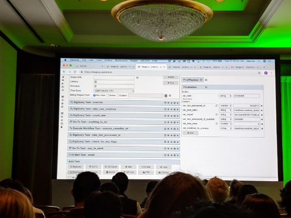
Instead it was an demonstration of a super cool tool Viant have built on top of BigQuery to democratize access to data across their organization. Their tool – potens.io – allows you to build workflows to query data in BigQuery including business logic, API integration and script outputs (like emails if certain results are obtained). Interesting stuff for sure!
Example workflow built using Potens.io to review ad assets and run them through Cloud Vision API to flag inappropriate content, all atop BigQuery
I look forward to diving into BigQuery (someday soon!) and start creating content here.
9 AM – Keynote
I managed to get into the hall for the keynote this year. The sheer number of people filing in and out of the Moscone center was still overwhelming.
Sundar Pichai (CEO of Google) kicked things off before new Cloud CEO, Thomas Kurian, took over and laid out his vision for Google Cloud.
Unsurprisingly, and understandably given Google’s position in the cloud race behind Amazon and Microsoft, the focus was entirely on Enterprise solutions and multi-cloud solutions. Not much mention of G Suite…yet.
It’s a rock concert for geeks! ?
Monday, April 8th (T – 1 Day)
6.30 PM – Next ’19 Community Dinner
Tonight Google hosted a community dinner for the Google Developer Experts in their offices downtown.
It was great to catch up with fellow Apps Script and G Suite GDEs and hear what everyone’s up to.
Everyone is using the CLASP, the Command Line Apps Script interface, with their code editors of choice. This allows for a much improved development environment over the native Apps Script one. And we’re all waiting to see if there’s any vision on the Apps Script roadmap and a timeline when the new runtime engine will come in (which will make scripts run a lot faster).
1 PM
Lunch in Chinatown with David Siegel, CEO and co-founder of Glide Apps. Glide Apps lets you turn your Google Sheets into mobile apps, with no coding required.
The Next conference starts in earnest for me tomorrow (it’s the community summit today).
12.30 PM:
Some early G Suite stats being shared at the community events today (I’m not there, so reporting this from Twitter):
1.5B+ App Users
90M+ students with an Edu license
5M+ paying G Suite Businesses (up 1M from last year)
Registration day! If you’re attending and you have a chance to collect your badge today then I highly recommend. Tomorrow the lines will be pretty long…
I’ve got my badge!
Digging the conference graphics on the side of the Moscone Center
The billboards all around the SOMA district of San Francisco are plastered with the conference ads. It’s crazy how big this event is. I’ve heard there’ll north of thirty thousand attendees. Wow!
Sunday, April 7th (T – 2 Days)
The Google Next 19 conference is almost here!
I arrived in San Francisco this morning after an early flight. It’s been a beautiful day so I caught up with a buddy and we did a great walk around the city parks. This, the view from near the top of Buena Vista park:
Golden Gate Bridge from Buena Vista park
I’m really excited to catch up with friends, meet awesome new folks and hear all about the Google product road maps this week!
Slicers ? Not yet! They’re still in the works but I’m sure there’ll be an update this week!
Better Charts ✔️ We got some nice upgrades like editing individual data points.
Pivot Table Upgrades ✔️
Big Query Data Integration ✔️ Available to G Suite Business, Enterprise and Education users
There were a bunch of other upgrades and new features announced!
I’ll be sure to share the announcements from this year’s Google Sheets session here in this blog!
Friday, April 5 (T – 4 Days)
Google Next 19, the big annual conference from Google Cloud and G Suite, is just around the corner. It starts on Tuesday 9th April, although there are things happening on Sunday and Monday beforehand.
I have my ticket and I’m flying to San Francisco on Sunday. I’m really excited!
Last year was my first time at Next, and it was an eye-opening experience. With over 20,000 attendees and hundreds of talks, it was inspiring and overwhelming in equal measure. It was great to hear first-hand from the Google Sheets team on the roadmap, and I’m looking forward to new updates this year.
This year, with experience from last year fresh in my mind, I’ve scheduled meetings ahead of time, been a little less ambitious with my schedule and packed a portable battery charger!
My plan is to update this post daily with news and announcements from Next 19.
I’ll also be posting lots of updates to Twitter, under the #GoogleNext19 hashtag.