This is a transcript of a conversation between two famous spreadsheet applications, Google Sheets and Microsoft Excel, who sat down together at a well-known beach bar, The Pivot & Chart Tavern, for a catch-up after a long WORKDAY.
For the DURATION of their meeting, SMALL and LARGE FISHERmen came and went, smelling of POISSON from the Sea.
It was a DAY to remember.
Google Sheets: “Excel! Dude! GAUSS who, yo? It’s been DAYS, MONTHs even, since we caught up. You made it. You crash so often I wasn’t sure you’d get here.”
XL: “Ah Google Sheets, you again. Rude, impetuous, cheeky. I see you’re still as mature as toddler in a COT. Still on a formula-only diet are you? Do you know FACT from fiction yet? Is this establishment to your satisfaction? I do hope it’s NOT out of your PRICE range.”
Sheets: “Woah, so aggressive. Nope, I’m all grown up now. IMREAL deal! I’m TRIM, check out my ABS. Still TRENDy and UNIQUE of course. I have so much going on right NOW, so many cool and COMPLEX features, and an ever growing, engaged, passionate community.
What about you, Excel, still hanging on? Haha.”
XL: “Hanging on? Totally FALSE! You should respect your elders.
NOW listen to me young man, I was doing advanced financial modeling whilst you were still popping zits on your funny little (inter)face. I may be over 30 YEARs old but I’m in the best health I’ve ever been. I continue to enjoy consistent product GROWTH.
Contrary to some of the marketing materials new-fangled upstarts put out, I’m very much alive and kicking, and still dominating the office data analytics scene, thank you very much. It seems you’re in rude health too Sheets, your voice is LOWER NOW, full of CONFIDENCE. Let me buy you a drink.”
Sheets: Sure, a beer please.
XL: So unsophisticated.
Turning to the barman…
XL: A beer, and I’ll have your finest aged red wine please. Put it all on the same TAB, thank you.
Barman: That’ll be 0.00091 Bitcoin please.
XL: Oh come on! Can you convert that TO_DOLLARS please?
Barman: As you CHOOSE, let me SWITCH the payment….that’ll be 10 Dollars EVEN at TODAY‘s price…
Excel hands over a 20 Dollar bill.
Barman: Is that DMIN bill you’ve got?
XL: Yes, I’m sorry for the trouble.
Barman: Ok, DMAX change I have is in 1 Dollar bills…
XL: That is no problem.
After a short SEARCH for an AREA to sit, and a brief interruption when they were INTERCEPTed by an errant ROMAN soldier, they took their seats at one of the PIVOT TABLES near the bar, to continue their rather KURT conversation…
Sheets: Do you think ISODD Excel? I MEAN, here we are in rude health, still the pre-eminent way the majority of knowledge workers manage and analyze their data.
XL: Yes, it’s TRUE! We have some sticking POWER that’s for sure. I take it as a good SIGN that our respective platforms continue to evolve and maintain their critical usefulness.
Sheets: Ok, let’s get down to business then. I want to share my theory of why we’re still the pre-eminent solution for many people…
XL: Ok, Sheets, the FLOOR is yours:
Sheets: First off, we’re ubiquitous. We’re everywhere. You’re in every office and I’m in every browser. So there’s that.
Second, we can solve most problems. Yes, there is ultra-specific software that will do certain tasks better, but nobody beats us for overall utility.
Third, we’re easy to use. Beginners can just dive right in, but we’re complex enough that even the most advanced users will never run out of things to discover.
XL: RIGHT, All TRUE, all good points. We’re definitely on the same FREQUENCY here.
Sheets: AND, we’re super flexible, so we can easily adapt to new tasks or new use cases.
XL: Yes, yes, indeed. Plus, almost all SaaS platforms have a button that exports data to Excel or Sheets. I suspect a lot of people use this, but of course that’s not a good metric for a SaaS company to divulge.
XL AND Sheets both have a little chuckle at this…
The conversation rambled on for several more HOURs. The EFFECT of the drinks made the conversation take an ODD turn:
XL:Have you ever BIN2OCT-oberfest, Sheets? You know the one I mean, the beer festival in Bavaria in the fall?
Sheets: Yeah, yeah I know the one, but no, I haven’t. Have you ever BIN2HEXham, XL?
XL: You mean the market town in the UK, right? Only once. And the airline lost my TRUNC on that trip! What a palava that was!
Sheets: TRUNC! Bwah! Now you’re showing your age. Haha. And definitely no chance of a TAN at that TIME of YEAR.
At a lull in the conversation, they both look down at their phones.
Sheets: Check this out, old man.
Sheets holds up his phone, with an app open called INDEX MATCH.
Sheets: It’s a dating service for spreadsheets. You right click on Sheets you like, left click on ones you don’t. It uses their IMPORTRANGE algorithm to MATCH you with other Sheets. Super cool.
XL: Bah, sounds like it’s just for HLOOKUPs to me. The more discerning spreadsheets look for love through a service called EDATE, all based around your star SIGN.
Sheets: Sounds like hokum to me…
You hungry Excel? Shall we get a PI?
Excel: You mean like a pizza PI? Could do, as long as we ADD spinach and ricotta, MINUS the mushrooms. Though I’d rather have CHAR-grilled steak.
Later, replete after dinner, it was time for the two friends to bid farewell…
XL: Right then Sheets, before you SLOPE off, let me tell you, it was good to catch up. TEXT me whenever you want to have a drink together again.
Sheets: ISEMAIL ok?
XL: As you wish. I’ll ask Numbers, LibreOffice, Airtable and maybe a few others to JOIN us next time, ok? They’re PROBably feeling LEFT out.
Sheets: Yep, I’ll be there. Catch up soon!
It certainly was a DAY to remember.
Resources
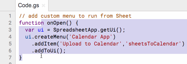
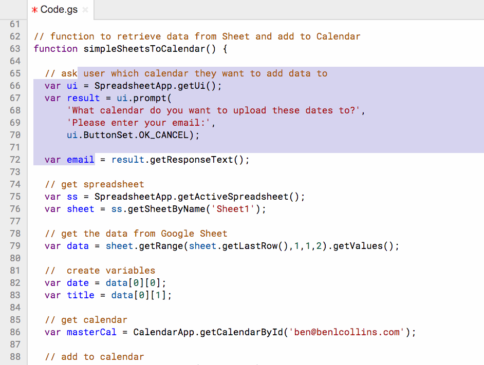
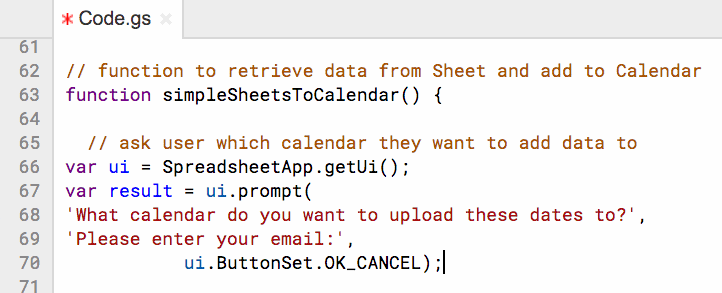
The full list of 400+ functions in Google Sheets
Your biggest competitor is a spreadsheet
My rather silly story was inspired by a similar, although much funnier, function-themed story from Mr Spreadsheet himself, John Walkenbach. Sadly I can’t find it online anymore, but if anyone can share the link, I’ll add it here.