Slicers in Google Sheets are a powerful way to filter data in Pivot Tables.
They make it easy to change values in Pivot Tables and Charts with a single click. Slicers are extremely useful when building dashboards in Google Sheets.
Educator and Google Developer Expert. Helping you navigate the world of spreadsheets & AI.
Slicers in Google Sheets are a powerful way to filter data in Pivot Tables.
They make it easy to change values in Pivot Tables and Charts with a single click. Slicers are extremely useful when building dashboards in Google Sheets.
Behold the Google Sheets Formula Clock, a working analog clock built with a single Google Sheets formula:
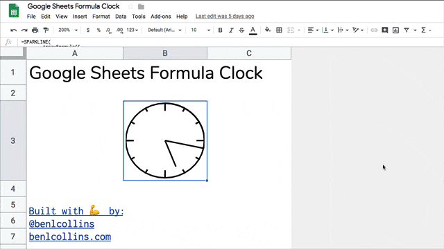
It’s a working analog clock built with a single Google Sheets formula.
That’s right, just a single formula. No Apps Script code. No widgets. No hidden add-ons.
Just a plain ol’ formula in Google Sheets!
Click here to open the Google Sheets Formula Clock Template
(Click to open the template. Feel free to create your own copy through the File menu: File > Make a copy...)
It might take a moment to update to the current time.
Open a blank Google Sheet or create a new Google Sheet
(Pro-tip: type sheet.new into your browser address bar to do this instantly)
Copy the Google Sheets Formula Clock formula below and paste it into the formula bar for cell A1 of your new Sheet:
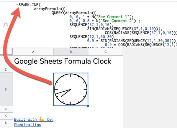
=SPARKLINE(
ArrayFormula({
QUERY(ArrayFormula({
0, 0, 1 + N("See Comment 1");
0, 0, 0.8 + N("See Comment 2") ;
SEQUENCE(37,1,0,10),
SIN(RADIANS(SEQUENCE(37,1,0,10))),
COS(RADIANS(SEQUENCE(37,1,0,10))) + N("See Comment 3") ;
SEQUENCE(12,1,30,30),
0.9 * SIN(RADIANS(SEQUENCE(12,1,30,30))),
0.9 * COS(RADIANS(SEQUENCE(12,1,30,30))) + N("See Comment 4") ;
SEQUENCE(12,1,30,30),
SIN(RADIANS(SEQUENCE(12,1,30,30))),
COS(RADIANS(SEQUENCE(12,1,30,30))) + N("See Comment 5") ;
SEQUENCE(4,1,90,90),
0.8 * SIN(RADIANS(SEQUENCE(4,1,90,90))),
0.8 * COS(RADIANS(SEQUENCE(4,1,90,90))) + N("See Comment 6") ;
SEQUENCE(4,1,90,90),
SIN(RADIANS(SEQUENCE(4,1,90,90))),
COS(RADIANS(SEQUENCE(4,1,90,90))) + N("See Comment 7")
}),
"SELECT Col2, Col3 ORDER BY Col1",
0 + N("See Comment 8")
) ;
IF(
MINUTE(NOW()) = 0,
0,
SIN(RADIANS(SEQUENCE(MINUTE(NOW())/60*360,1,1,1)))
),
IF(
MINUTE(NOW())=0,
1,
COS(RADIANS(SEQUENCE(MINUTE(NOW())/60*360,1,1,1)))
) + N("See Comment 9");
0, 0 + N("See Comment 10") ;
0.75 * SIN(RADIANS((MOD(HOUR(NOW()),12)/12 * 360) + MINUTE(NOW())/60 * 30)),
0.75 * COS(RADIANS((MOD(HOUR(NOW()),12)/12 * 360) + MINUTE(NOW())/60 * 30)) + N("See Comment 11")
}),
{"linewidth",2 + N("See Comment 12")
+ N("
Comments:
1: Initial (0,1) coordinate at top of circle. Extra 0 included for sort.
2: Coordinates to create mark at 12 o'clock.
3: Coordinates to draw initial circle. Joins markers every 10 degrees starting from 0 at top of circle, e.g. 0, 10, 20, 30,...360
4: Sequence of coordinates every 30 degrees to create small markers for hours 1, 2, 4, 5, 7, 8, 10, 11
5: Sequence of coordinates to connect the 30 degree small markers. Needed to place them correctly on circle.
6: Sequence of coordinates every 90 degrees to create large markers for hours 12, 3, 6, 9
7: Sequence of coordinates to connect the 90 degree large markers. Needed to place them correctly on circle.
8: QUERY function used to sort the circle data by the degrees column, then select just the (x,y) coordinate columns (numbers 2 and 3) to use.
9: Coordinates to create the minute hand. Includes an IF statement to avoid an error when the minute hand arrives at the 12 mark.
10: Coordinates to return to centre of clock at (0,0) after minute hand, to be ready to draw hour hand.
11: Coordinates to create the hour hand.
12: Set linewidth of the Sparkline to 2.
.
.
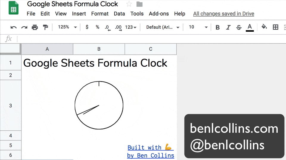
Google Sheets Formula Clock
June 2019
Created by Ben Collins, Google Developer Expert and Founder of The Collins School Of Data
Website: benlcollins.com
Twitter: @benlcollins
")}
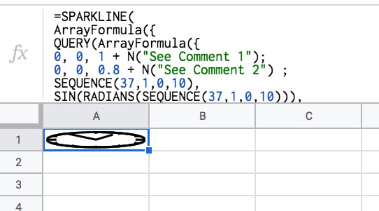
)Initially it will look like this:
Make row 1 wider by hovering between rows 1 and 2 and using the grab hand to drag the row boundary down. Make the cell wide enough to create a circle:
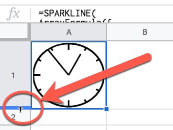
This is the step that makes the clock tick!
Under File > Spreadsheet settings set the spreadsheet calculation settings to be “On change and every minute”, like so:
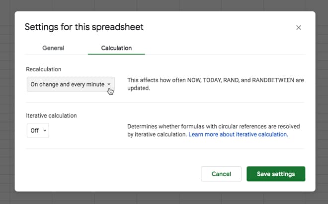
This ensures that the NOW function is refreshed every minute, so our clock hands move around the circle. That’s it!
You should see the hands of your clock moving around the face.
Tick-tock! Tick-tock!
So there are a few things going on here.
We need a way to get the current hour and minute values and have them update automatically.
Then somehow we need to draw a clock face with hands using…formulas?
Let’s run through the building blocks…
The SPARKLINE function is used to create miniature charts inside a single cell. That’s its modus operandi.
However, we can also supply it with a range of x- and y-coordinates to create 2-d shapes, like a circle for example.
Use the following five steps to create a circle with a sparkline:
1) Start with this function in cell A1:
= SEQUENCE ( 37, 1, 0, 10 )The SEQUENCE function creates 37 rows in a single column, starting from 0 and increasing in increments of 10 each.
I.e. it outputs a column of numbers representing every 10 degrees of a circle, up to 360 degrees.
2) In column B, we add this Array Formula in cell B1:
= ArrayFormula ( SIN ( RADIANS ( $A$1:$A$37 ) ) )3) And in column C, this one in cell C1:
= ArrayFormula ( COS ( RADIANS ( $A$1:$A$37 ) ) )Columns B and C now give you the coordinates of a circle.
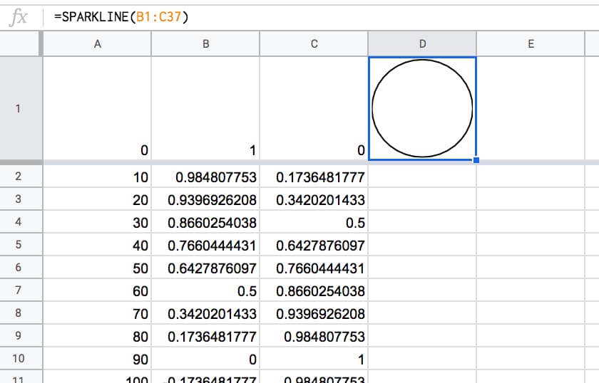
4) Let’s plug them into the SPARKLINE function in cell D1 with this function:
= SPARKLINE ( B:C )5) Lastly, make row 1 wider to show the circle.
Boom!
The SPARKLINE function draws a circle for us:
Then, we need to create a time that automatically updates every minute. Thankfully that’s relatively easy to do with the NOW function:
(Feel free to type these formulas in to the side of your sparkline workings in column B, C and D.)
= NOW()The NOW Function in Google Sheets outputs a timestamp with a time to the nearest second. It’s a volatile function, which means it recalculates every time a change is made to the Sheet. In other words, it gives a new timestamp.
Per the Step 4 in Part 1 above, we can set the Sheet to update every minute, so the NOW function updates every minute.
It’s relatively easy to extract the minute and hour from the timestamp, with these two functions:
= MINUTE( NOW() )and
= HOUR ( NOW() )We need to convert these to degrees on a circle to show how far round the hands have gone.
The formulas become:
= MINUTE( NOW() ) / 60 * 360and
= MOD( HOUR( NOW() ), 12 ) / 12 * 360respectively.
Later we’ll need to convert these to RADIANS and then into coordinates for the sparkline function.
That’s the mechanics of the clock-tick-tock part, but we still need to add them to our sparkline clock.
The middle of our circle is represented by the coordinates (0,0).
Currently, our sparkline has positioned us at the 12 o’clock position, represented by (0,1).
To add the minute hand, we need to draw another arc around the circle to travel around the edge of the circle to the current minute value, e.g. if it’s half past the hour then we need to draw another half circle to position ourselves at the bottom of the circle.
Then we can simply draw a line back to the center of the circle, and that’s our minute hand!
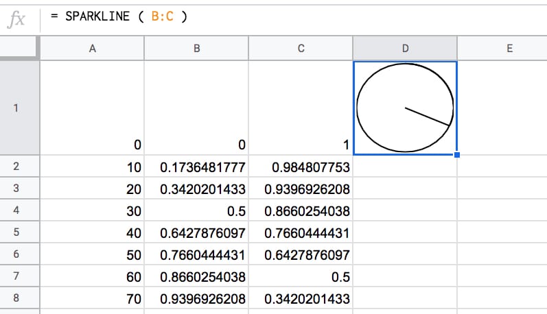
So, add this function to cell B38:
=ArrayFormula( SIN ( RADIANS ( SEQUENCE ( MINUTE ( NOW( ) ) / 60 * 360 , 1 , 1 , 1 ) ) ) )And add this one to cell C38:
=ArrayFormula( COS ( RADIANS ( SEQUENCE ( MINUTE ( NOW( ) ) / 60 * 360 , 1 , 1 , 1 ) ) ) )Essentially, what these two formulas are doing is working out how many degrees around the circle we need to go, and calculating the coordinates.
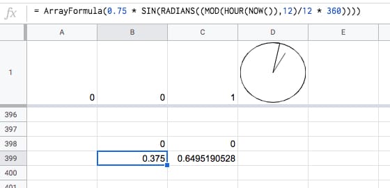
Finally, let’s return to the center of our circle, thereby drawing the minute hand.
In cell B398 put a 0.
In cell C398 put a 0.
They need to be on row 398 to give the array formula for the minutes enough space to expand (max 360 rows).
The “clock” now looks like this, and if you’ve set your spreadsheet to update every minute (see Step 4 in Part 1 above) then you’ll see this hand move around the clock.
To add the hour hand, it’s a case of drawing a line from the centre coordinate (0,0) — where we are now — back out to the edge, again, going as far around the circle as needed to represent the current hour.
Add this formula to cell B399:
= 0.75 * SIN ( RADIANS ( ( MOD ( HOUR ( NOW( ) ) , 12 ) / 12 * 360 ) ) )And this formula to cell C399:
= 0.75 * COS ( RADIANS ( ( MOD ( HOUR ( NOW( ) ) , 12 ) / 12 * 360 ) ) )This adds the hour hand.
The 0.75 multiplier at the front of the formula shortens the hour hand a little to distinguish it from the second hand.
Boom!
Now you have a working clock:
Click here to view the template of this intermediary step.
Unfortunately, in it’s current state, the formula breaks down at the top of the hour:
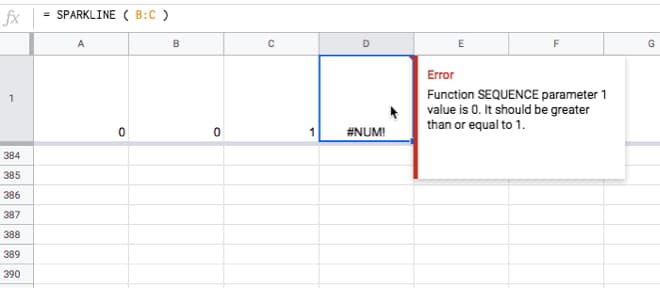
This is easily solved by wrapping the minute hand calculation with an IF statement to set it to zero at the top of the hour. This IF statement tests to see if the minute component of NOW is equal to zero and sets the value to 0 if it is, otherwise we just proceed with the full SEQUENCE function.
Change the formula in cell B38 to
=ArrayFormula( IF( MINUTE( NOW() ) = 0 , 0 , SIN( RADIANS( SEQUENCE( MINUTE( NOW() ) / 60*360 , 1 , 1 , 1 )))))and the formula in cell C38 to
=ArrayFormula( IF( MINUTE( NOW() ) = 0 , 0 , COS( RADIANS( SEQUENCE( MINUTE( NOW() ) / 60*360 , 1 , 1 , 1 )))))It won’t look any different but you’ll avoid that error when the minute hand goes past the hour mark.
This formula is demonstrated in tab 2 of the intermediary template.
The clock will now look something like this:
So what’s left?
You might consider the following improvements, but I’ll leave these as a challenge for you:
Implementing all of these is a little tricky, not the least because the formula gets rather long!
The best approach is to build in steps, employing the Onion Method technique to avoid frustrating errors.
Hickory, dickory, dock.
The mouse ran up the sparkline clock.
The sparkline clock struck one,
The mouse ran down,
Hickory, dickory, dock. 🐁 ⏱️
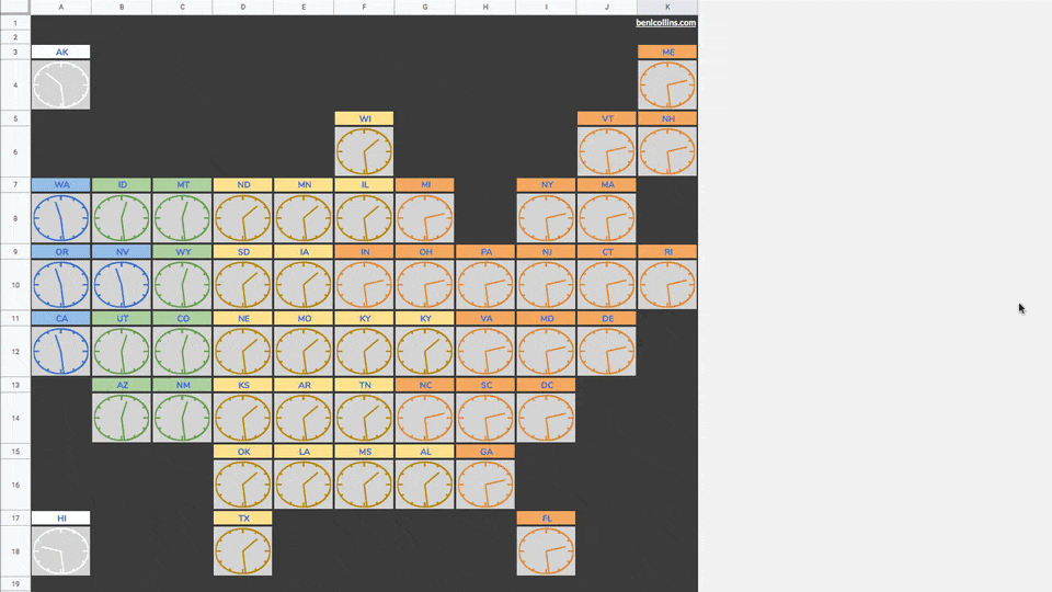
Combining many of these analog sparkline clocks onto a tile map, you can create this timezone map of the US:
See also this impressive digital clock built in Google Sheets by Robin Lord.
Your imagination is the only limit with the sparkline function.
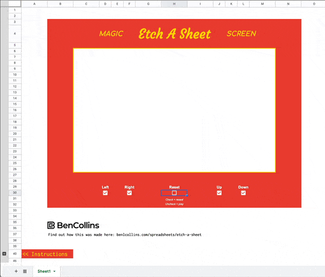
How about an Etch-A-Sketch clone built using a sparkline formula?
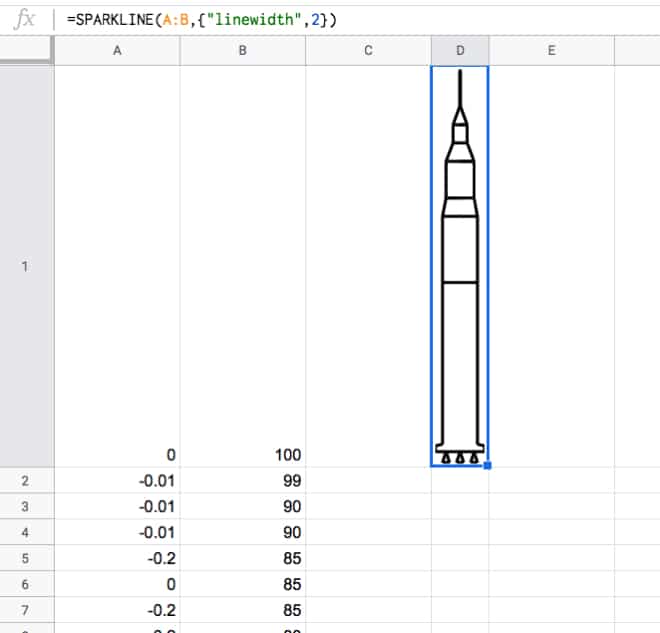
Or how about an outline of the Saturn V rocket?
Or a pie chart built with a single sparkline array formula?
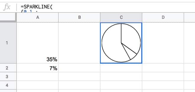
This pie chart actually inspired the analog clock…you can probably see why!
This is a transcript of a conversation between two famous spreadsheet applications, Google Sheets and Microsoft Excel, who sat down together at a well-known beach bar, The Pivot & Chart Tavern, for a catch-up after a long WORKDAY.
For the DURATION of their meeting, SMALL and LARGE FISHERmen came and went, smelling of POISSON from the Sea.
It was a DAY to remember.
Google Sheets: “Excel! Dude! GAUSS who, yo? It’s been DAYS, MONTHs even, since we caught up. You made it. You crash so often I wasn’t sure you’d get here.”
XL: “Ah Google Sheets, you again. Rude, impetuous, cheeky. I see you’re still as mature as toddler in a COT. Still on a formula-only diet are you? Do you know FACT from fiction yet? Is this establishment to your satisfaction? I do hope it’s NOT out of your PRICE range.”
Sheets: “Woah, so aggressive. Nope, I’m all grown up now. IMREAL deal! I’m TRIM, check out my ABS. Still TRENDy and UNIQUE of course. I have so much going on right NOW, so many cool and COMPLEX features, and an ever growing, engaged, passionate community.
What about you, Excel, still hanging on? Haha.”
XL: “Hanging on? Totally FALSE! You should respect your elders.
NOW listen to me young man, I was doing advanced financial modeling whilst you were still popping zits on your funny little (inter)face. I may be over 30 YEARs old but I’m in the best health I’ve ever been. I continue to enjoy consistent product GROWTH.
Contrary to some of the marketing materials new-fangled upstarts put out, I’m very much alive and kicking, and still dominating the office data analytics scene, thank you very much. It seems you’re in rude health too Sheets, your voice is LOWER NOW, full of CONFIDENCE. Let me buy you a drink.”
Sheets: Sure, a beer please.
XL: So unsophisticated.
Turning to the barman…
XL: A beer, and I’ll have your finest aged red wine please. Put it all on the same TAB, thank you.
Barman: That’ll be 0.00091 Bitcoin please.
XL: Oh come on! Can you convert that TO_DOLLARS please?
Barman: As you CHOOSE, let me SWITCH the payment….that’ll be 10 Dollars EVEN at TODAY‘s price…
Excel hands over a 20 Dollar bill.
Barman: Is that DMIN bill you’ve got?
XL: Yes, I’m sorry for the trouble.
Barman: Ok, DMAX change I have is in 1 Dollar bills…
XL: That is no problem.
After a short SEARCH for an AREA to sit, and a brief interruption when they were INTERCEPTed by an errant ROMAN soldier, they took their seats at one of the PIVOT TABLES near the bar, to continue their rather KURT conversation…
Sheets: Do you think ISODD Excel? I MEAN, here we are in rude health, still the pre-eminent way the majority of knowledge workers manage and analyze their data.
XL: Yes, it’s TRUE! We have some sticking POWER that’s for sure. I take it as a good SIGN that our respective platforms continue to evolve and maintain their critical usefulness.
Sheets: Ok, let’s get down to business then. I want to share my theory of why we’re still the pre-eminent solution for many people…
XL: Ok, Sheets, the FLOOR is yours:
Sheets: First off, we’re ubiquitous. We’re everywhere. You’re in every office and I’m in every browser. So there’s that.
Second, we can solve most problems. Yes, there is ultra-specific software that will do certain tasks better, but nobody beats us for overall utility.
Third, we’re easy to use. Beginners can just dive right in, but we’re complex enough that even the most advanced users will never run out of things to discover.
XL: RIGHT, All TRUE, all good points. We’re definitely on the same FREQUENCY here.
Sheets: AND, we’re super flexible, so we can easily adapt to new tasks or new use cases.
XL: Yes, yes, indeed. Plus, almost all SaaS platforms have a button that exports data to Excel or Sheets. I suspect a lot of people use this, but of course that’s not a good metric for a SaaS company to divulge.
XL AND Sheets both have a little chuckle at this…
The conversation rambled on for several more HOURs. The EFFECT of the drinks made the conversation take an ODD turn:
XL:Have you ever BIN2OCT-oberfest, Sheets? You know the one I mean, the beer festival in Bavaria in the fall?
Sheets: Yeah, yeah I know the one, but no, I haven’t. Have you ever BIN2HEXham, XL?
XL: You mean the market town in the UK, right? Only once. And the airline lost my TRUNC on that trip! What a palava that was!
Sheets: TRUNC! Bwah! Now you’re showing your age. Haha. And definitely no chance of a TAN at that TIME of YEAR.
At a lull in the conversation, they both look down at their phones.
Sheets: Check this out, old man.
Sheets holds up his phone, with an app open called INDEX MATCH.
Sheets: It’s a dating service for spreadsheets. You right click on Sheets you like, left click on ones you don’t. It uses their IMPORTRANGE algorithm to MATCH you with other Sheets. Super cool.
XL: Bah, sounds like it’s just for HLOOKUPs to me. The more discerning spreadsheets look for love through a service called EDATE, all based around your star SIGN.
Sheets: Sounds like hokum to me…
You hungry Excel? Shall we get a PI?
Excel: You mean like a pizza PI? Could do, as long as we ADD spinach and ricotta, MINUS the mushrooms. Though I’d rather have CHAR-grilled steak.
Later, replete after dinner, it was time for the two friends to bid farewell…
XL: Right then Sheets, before you SLOPE off, let me tell you, it was good to catch up. TEXT me whenever you want to have a drink together again.
Sheets: ISEMAIL ok?
XL: As you wish. I’ll ask Numbers, LibreOffice, Airtable and maybe a few others to JOIN us next time, ok? They’re PROBably feeling LEFT out.
Sheets: Yep, I’ll be there. Catch up soon!
It certainly was a DAY to remember.
The full list of 400+ functions in Google Sheets
Your biggest competitor is a spreadsheet
My rather silly story was inspired by a similar, although much funnier, function-themed story from Mr Spreadsheet himself, John Walkenbach. Sadly I can’t find it online anymore, but if anyone can share the link, I’ll add it here.
This Formula Challenge originally appeared as part of Google Sheets Tip #52, my weekly newsletter, on 27 May 2019.
Sign up here so you don’t miss out on future Formula Challenges:
Find all the Formula Challenges archived here.
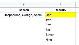
Start with this small data table in your Google Sheet:
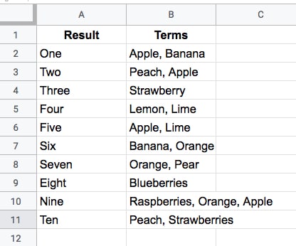
Your challenge is to create a single-cell formula that takes a string of search Terms and returns all the Results that have at least one matching term in the Terms column.
For example, this search (in cell E2 say)
Raspberries, Orange, Apple
would return the results (in cell F2 say):
One
Two
Five
Six
Seven
Nine
like this (where the yellow is your formula):
Check out the ready-made Formula Challenge template.
=FILTER(A2:A11,REGEXMATCH(B2:B11,JOIN("|",SPLIT(E2,", "))))or even:
=FILTER(A2:A11,REGEXMATCH(B2:B11,SUBSTITUTE(E2,", ","|")))These elegant solutions were also the shortest solutions submitted.
There were a lot of similar entries that had an ArrayFormula function inside the Filter, but this is not required since the Filter function will output an array automatically.
How does this formula work?
Let’s begin in the middle and rebuild the formula in steps:
=SPLIT(E2,", ")The SPLIT function outputs the three fruits from cell E2 into separate cells:
Raspberries Orange Apple
Next, join them back together with the pipe “|” delimiter with
=JOIN("|",SPLIT(E2,", "))so the output is now:
Raspberries|Orange|Apple
Then bring the power of regular expression formulas in Google Sheets to the table, to match the data in column B. The pipe character means “OR” in regular expressions, so this formula will match Raspberries OR Orange OR Apple in column B:
=REGEXMATCH(B2:B11,JOIN("|",SPLIT(E2,", ")))On its own, this formula will return a #VALUE! error message. (Wrap this with the ArrayFormula function if you want to see what the array of TRUE and FALSE values looks like.)
However, when we put this inside of a FILTER function, the correct array value is passed in:
=FILTER(A2:A11,REGEXMATCH(B2:B11,JOIN("|",SPLIT(E2,", "))))and returns the desired output. Kaboom!
=QUERY(A2:B11,"select A where B contains '"&JOIN("' or B contains '",SPLIT(E2,", "))&"'")As with solution one, there is no requirement to use an ArrayFormula anywhere. Impressive!
This formula takes a different approach to solution one and uses the QUERY function to filter the rows of data.
The heart of the formula is similar though, splitting out the input terms into an array, then recombining them to use as filter conditions.
=JOIN("' or B contains '",SPLIT(E2,", ",0))which outputs a clause ready to insert into your query function, viz:
Raspberries' or B contains 'Orange' or B contains 'Apple
The QUERY function uses a pseudo-SQL language to parse your data. It returns rows from column A, whenever column B contains Raspberries OR Orange OR Apple.
Wonderful!
Click here to open a read-only version of the solution template (File > Copy to make your own editable copy).
I hope you enjoyed this challenge and learnt something from it. I really enjoyed reading all the submissions and definitely learnt some new tricks myself.
There are two dangers with the Split function which are important to keep in mind when using it (thanks to Christopher D. for pointing these out to me).
Caveat 1
The SPLIT function uses all of the characters you provide in the input.
So
=SPLIT("First sentence, Second sentence", ", ")will split into FOUR parts, not two, because the comma and the space are used as delimiters. The output will therefore be:
First sentence Second sentence
across four cells.
Caveat 2
Datatypes may change when they are split, viz:
=SPLIT("Lisa, 01",",")gives an output of
Lisa 1
where the string has been converted into a number, namely 1.
I firmly believe that one of the most effective and rewarding ways to learn a skill is through practical application.
Solving problems you don’t know the answer to is arguably the best way to do this.
And that’s the idea behind these Formula Challenges.
I’ll post a challenge in my Monday newsletter — a question to be solved with formulas in Google Sheets — and a week later share solutions, both my own and those submitted by readers.
I’ll archive the challenges and solutions on my website here.
This first Formula Challenge originally appeared in my Google Sheets Tips newsletter, on 25 February 2019.
Sign up here so you don’t miss out on future Formula Challenges:
Find all the Formula Challenges archived here.
Start with a straightforward IMAGE function in cell A1, like this:
=IMAGE("https://www.google.com/favicon.ico")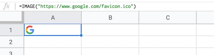
Your Challenge
Your challenge is to modify the formula in cell A1 only, to repeat the image across multiple columns (say 5 as in this example), so it looks like this:
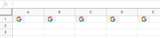
Rules
You’re only allowed to use a single formula in cell A1.
The problem is that the IMAGE function can’t be nested inside a REPT function, so you have to get a bit more creative.
=ArrayFormula(IF(COLUMN(A:E),IMAGE("https://www.google.com/favicon.ico")))The combination of ArrayFormula with COLUMN(A:E) will output an array of numbers 1 to 5: {1,2,3,4,5}
The IF statement treats the numbers as TRUE values, so prints out the image 5 times. For brevity, we can omit the FALSE value of the IF statement, since we don’t call it.
=ArrayFormula(IMAGE(SPLIT(REPT("https://www.google.com/favicon.ico"&"|",5),"|")))As mentioned, the REPT function doesn’t work when wrapped around the IMAGE function. However, flip them around, with the REPT inside the IMAGE function, and it does work!
In other words the IMAGE function accepts arrays of URLs as an input.
Start with this formula in cell A1, which creates a single string of joined URLs, with a pipe ( | ) delimiter between them:
=ArrayFormula(REPT("https://www.google.com/favicon.ico"&"|",5))Now, split these into an array of 5 separate URLs:
=ArrayFormula(SPLIT(REPT("https://www.google.com/favicon.ico"&"|",5),"|"))Finally, wrap this with the IMAGE function to get the five images in a row:
=ArrayFormula(IMAGE(SPLIT(REPT("https://www.google.com/favicon.ico"&"|",5),"|")))What I like about this solution is that you could put the number 5 into a different cell and reference it, so that you can easily change how many times the image is repeated.
You could even embed another formula to calculate how many times to repeat the image 😉