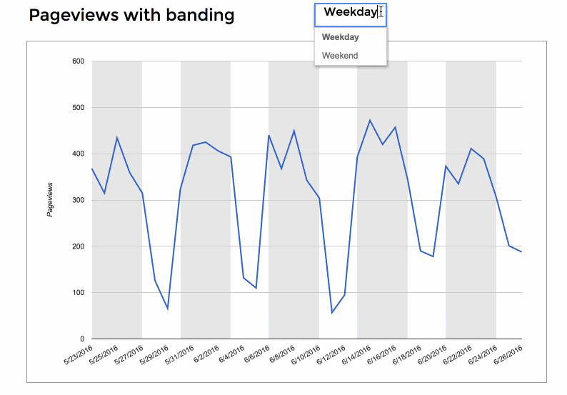
This is a simple but effective technique for adding dynamic bands to your charts, which are useful to highlight specific parts of your chart.
For example, in this chart of website pageviews, I’ve added bands to show weekdays or weekends and make it easier to see the changing trends.
What else could you use this for?
– Specific months or quarters could be highlighted in a longer-time series chart.
– Specific product groups in a product category dataset.
– Top 10/Bottom 10 values in datasets.
– Really anything that can be grouped in your dataset.
How do we create this chart?
The good news is that it’s pretty easy to do!
It’s a combination chart with the pageviews plotted as a line chart and the bands plotted with an area chart.
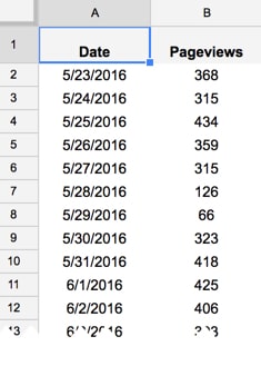
For this example, start with data consisting of a date in column A and pageview count in column B:
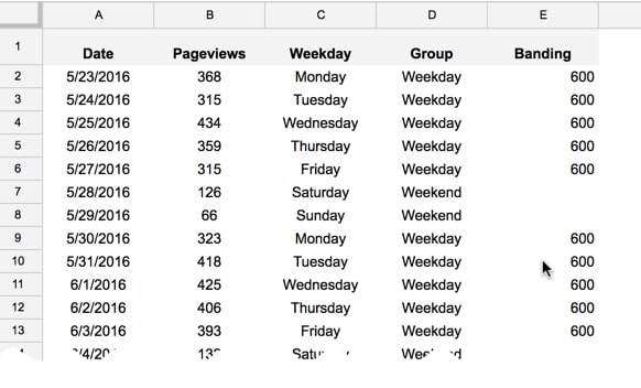
Add the following formula in column C to show each date as a weekday:
=choose(weekday(A2,2),"Monday","Tuesday","Wednesday","Thursday","Friday","Saturday","Sunday")This uses the WEEKDAY function to determine the day of the week for each date as a number and then uses the CHOOSE function to convert to an easier-to-read text format.
Then add the following formula in column D:
=if(or(C2="Saturday",C2="Sunday"),"Weekend","Weekday")to categorize days as weekdays or weekends.
Add a data validation list with two values (I put this into cell K1): “Weekday” and “Weekend”. This creates a drop-down menu that allows the user to select whether to focus on weekdays or weekends.
Finally with the data, add the following formula in column E to create the banding:
=if(D2=$K$1,600,"")where the 600 value matches the maximum value of your y-axis on the chart. (i.e. since the maximum value of pageviews in my dataset is 472, the chart tool chooses 600 as a the maximum value to plot on the y-axis. Hence, I select this one).
The IF formula compares the data validation choice (weekday or weekend) and compares that to the current row, to see if they match (e.g. both are weekdays) or they don’t match, and then populates the cell in column E with 600 if they do match or blank if they don’t.
So the dataset now looks like this:
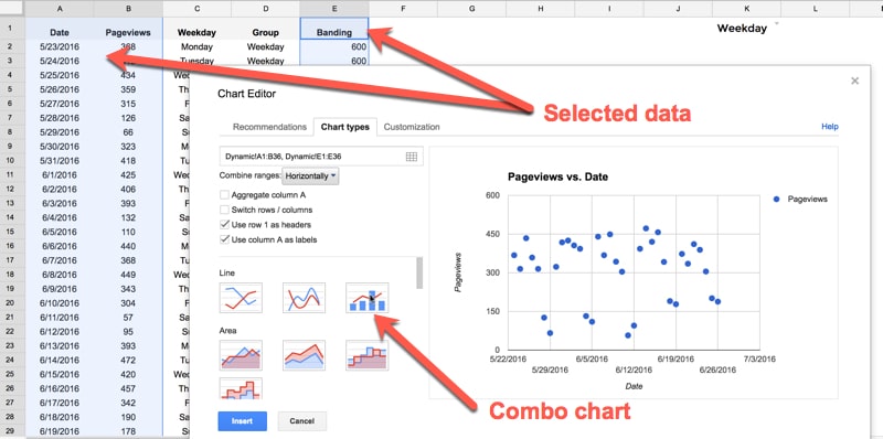
To create the chart, highlight columns A, B and E only. Hold down Ctrl (or Cmd on Mac) to do this.
Select Insert > Chart… and choose the Combo Chart under the Line chart options:
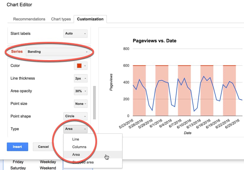
In the Customization section of the chart tool, change the Pageviews series to Line:
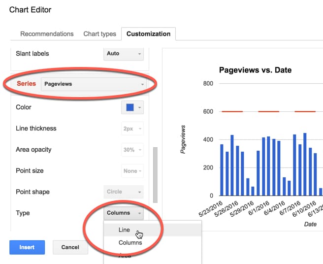
and the Banding series to Area:
From here, it’s simply a matter of changing the formatting to suit your needs.
Now when a user selects weekday or weekend from the drop down menu, the chart will automatically update to reflect the choice (like the GIF at the top of the page).
Want to play with this chart yourself? Here’s the link to it online (note, as it’s view-only, you won’t be able to change the drop down menu. Feel free to make a copy (File > Make a copy…) and then you can have your own version where the dynamic drop-down will work.)
Hi Ben,
Really great. wondering how you can accomplish that for rows and now columns