In this post, you’ll learn how to alternate colors in Google Sheets and add row or column banding to your data tables.
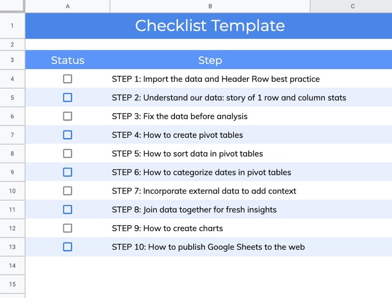
Here’s an example of alternating row bands applied to a checklist in Google Sheets:

Educator and Google Developer Expert. Helping you navigate the world of spreadsheets & AI.
In this post, you’ll learn how to alternate colors in Google Sheets and add row or column banding to your data tables.
Here’s an example of alternating row bands applied to a checklist in Google Sheets:
The TRIM function in Google Sheets removes unwanted spaces around text.
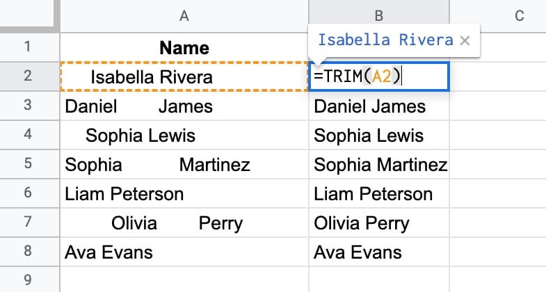
TRIM removes the leading, trailing, and repeated spaces in the text values in column A.
The formula is:
=TRIM(A2)🔗 Get this example and others in the template at the bottom of this article.
Continue reading How To Use The TRIM Function In Google Sheets To Clean Your Data
Barcodes are visual representations of numbers and strings.
Typically they represent numbers that link back to records in a database storing valuable information about a product.
They’re easy for machines to scan and are ubiquitous in stores and warehouses around the world.
Learn how to create barcodes in Google Sheets in this post, with a simple 2-step process.
Continue reading Create Barcodes In Google Sheets In 2 Easy Steps
║█║▌║█║▌│║▌║▌█║
The CHOOSE Function in Google Sheets lets you choose between different options.
It’s a lookup function, akin to a limited VLOOKUP rather than an alternative to the IF function.
It takes an index number and returns a value at that numbered position from the list of possible options.
Here’s a simple example:
=CHOOSE(1,"A","B")which will output:
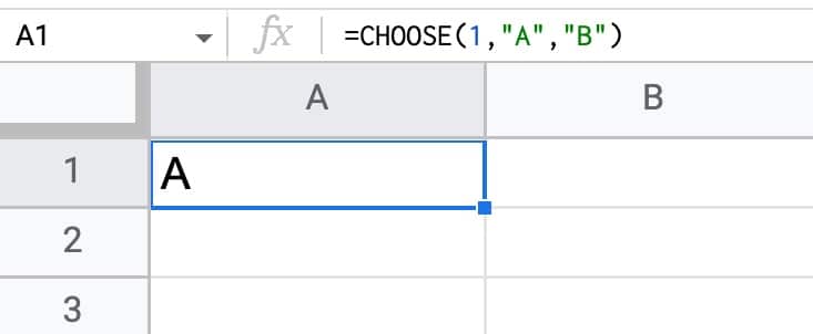
The first argument is the index number: 1.
Subsequent arguments are possible choices. The CHOOSE function returns the value at index position 1 in this case, i.e. “A”.
If I changed the index number to 2, the CHOOSE function would output “B”.
🔗 Get this example and others in the template at the bottom of this article.
Continue reading How To Use The Choose Function In Google Sheets
Heat maps in Google Sheets are a great way to add context to your data.
They bring attention to the high and low values in your data, to outliers that demand attention.
Best of all, heat maps in Google Sheets are easy to create.
Consider this dataset showing monthly temperatures for Washington D.C.:
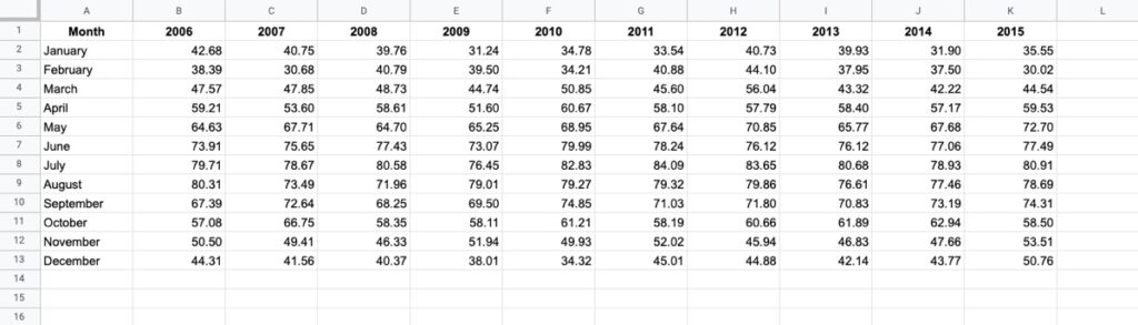
Without any formatting, it’s boring to look at, doesn’t convey any immediate takeaways, and it’s hard to spot trends such as which years were hotter than others.
Now compare that to the same dataset with a heat map overlay (click to enlarge):
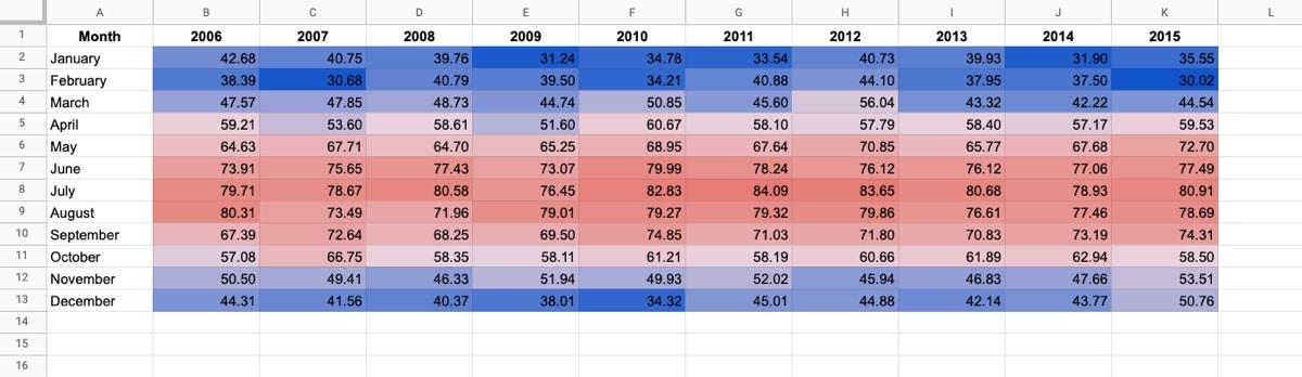
Wow! The stories jump off the page at you now. You can easily compare the years and see which years had longer winters, or hotter summers.
Let’s see how to create a heat map in Google Sheets.