This article covers how to build a dynamic dashboard in Google Sheets, using formulas and data validation methods so that charts change dynamically based on user input.
This post is based on work I did in 2015 with The Write Life team to develop some behind-the-scenes sales data analysis during their 3-day digital bundle sale. The team wanted a simple way of gauging progress and seeing how the different sales channels fared as the sale took place.
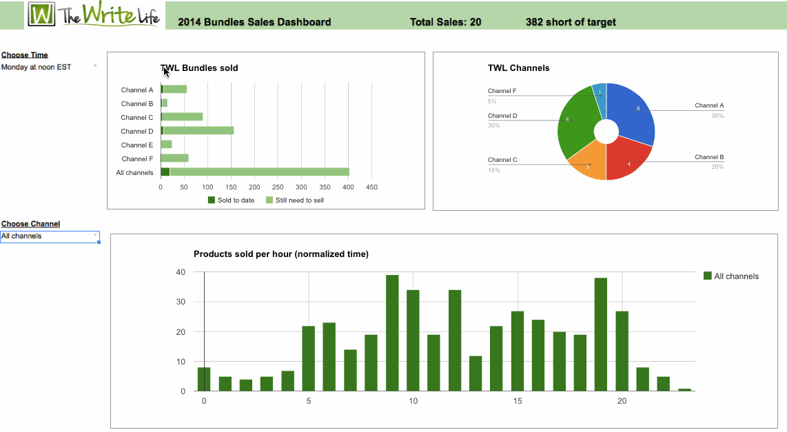
Here’s the final dynamic dashboard:
Click here to access your copy of this template >>
Introduction to this dynamic dashboard
The Write Life (TWL) is an awesomely popular resource site for writers looking for hints, tips, recommendations and inspiration on a variety of topics. (Full disclosure: this website was founded by my wife, Alexis Grant). As part of their ongoing efforts to provide great quality content and products to their audience, The Write Life team put together a bundle of digital writing products, which they offered for sale at an unbelievable low price for 3 days in March of this year. It was a huge success for the team, making $34,000 over the 3 days.
I worked with the TWL team beforehand to set some sales targets that we thought were achievable, based on our knowledge of the different channels (i.e. where the sales would come from) and some calculations on conversion rates. (That’s a topic for another day!)
The sale began on a Monday morning and concluded at midnight on Wednesday, so the team wanted a visual way to gauge progress and focus their marketing efforts during this time.
My solution was to create a dashboard that was dynamic so the team could easily see progress and act accordingly.
Step 1: Remind me again, why are we doing this?
Before diving into the weeds, it’s worth thinking about what insights you’re after. This is a really important first step, as it’ll determine where you go with the analysis.There were several questions we wanted to answer during the sale and then display graphically:
– What is the progress towards the total sales target?
– What is the progress for each of our sales channels?
– What is the proportion of our sales from each channel?
– When are people buying the products?
These would be extremely useful pieces of knowledge for the team, so they could act upon them as the sale progressed, hopefully increasing sales. For example, the TWL team could compare how many sales were coming from their email marketing campaign compared to affiliates or paid advertising.
There are three key pieces to a dynamic dashboard:
1. The raw data
2. An intermediary table that updates based on some parameter, e.g. a user input
3. A chart or series of charts
Step 2: Preparing the raw data
The raw sales data was downloaded from ejunkie (a shopping cart and digital delivery service that TWL used) as a text file. This was easily copy-pasted into a Google spreadsheet.
As a quality control check, after each import of data I ran a quick pivot table report to get an instant summary of the new data. This is a useful step to: 1) check the data you have for any anomalies (such as gaps that suggest it’s incomplete), and 2) to get a “feel” for the data before introducing complexity (this will ensure you understand the data before doing anything too fancy).
The raw data was a big mishmash of people buying in different locations around the world and through different channels, so without some finessing, it wasn’t providing any real insight.
There were, in fact, six different sales channels, including the TWL community itself, affiliates and paid advertising, so it was important to segment the data along the lines of those channels.
I took the following steps to transform the raw data into something more useful:
1. The date and time stamp from ejunkie was split into its component parts and labeled, so I had a day-of-sale category (e.g. Day 1), a separate time stamp and finally, an hour-by-hour category (e.g. 8am to 9am, 9am to 10am, etc.).
2. A timezone based on the buyer’s country was added for each sale and then converted to an offset factor from GMT, so that all the times could then be normalized to the local time in that country and thus comparisons could be made. This was done so we could compare user behavior globally and determine, for example, whether users were buying in greater numbers at 9am local time, shortly after receiving a marketing email.
3. The Sales Channel category was standardized for all the data in the spreadsheet, so every sale was categorized into one of the six sales channels, Channel A through F.
4. The Buyer Country column was standardized into more general categories to facilitate the analysis. The major countries were kept (e.g. United States, Canada, United Kingdom) but the smaller countries with very few sales were grouped into “Rest of the World” to prevent a long tail skewing summary tables and charts.
Now that we had the raw data cleaned, checked (pivot tables) and categorized, it was ready to be summarized into a suitable table format for the dynamic dashboard.
Step 3: Setting up the intermediary tables
In the dashboard, there were two main charts showing sales by channel and sales by local time. So I needed to create dynamic tables for both of these. This was a two-step process ultimately requiring four intermediary tables. Two were summary tables from the raw data and two were the dynamic tables that would underpin the charts.
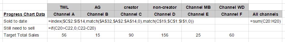
The sales channel summary table was created using a COUNTIFS formula to automatically pull in sales from the raw data table, using the following formula:
=countifs('Raw Data'!$D$3:$D$438,"<"&$B2,'Raw Data'!$P$3:$P$438,C$1)The data table, with formulas showing, looked like this:
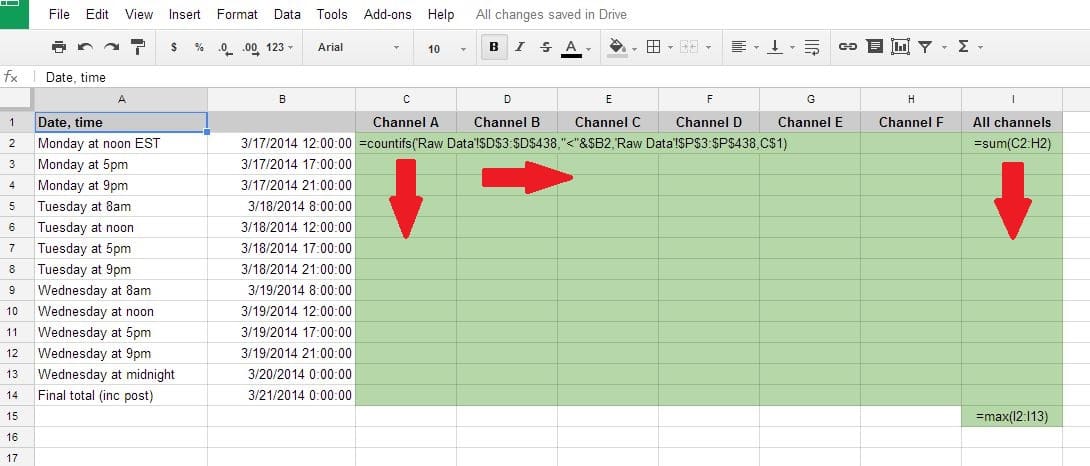
The second data table, for sales by local time, was set up in the same way.
With this summary set up, the next step was to create a method for capturing the user’s choice. For example, if the user wanted to see only data up to noon on day 2 of the sale, then the chart adjusted accordingly.
Step 4: Using the data validation method
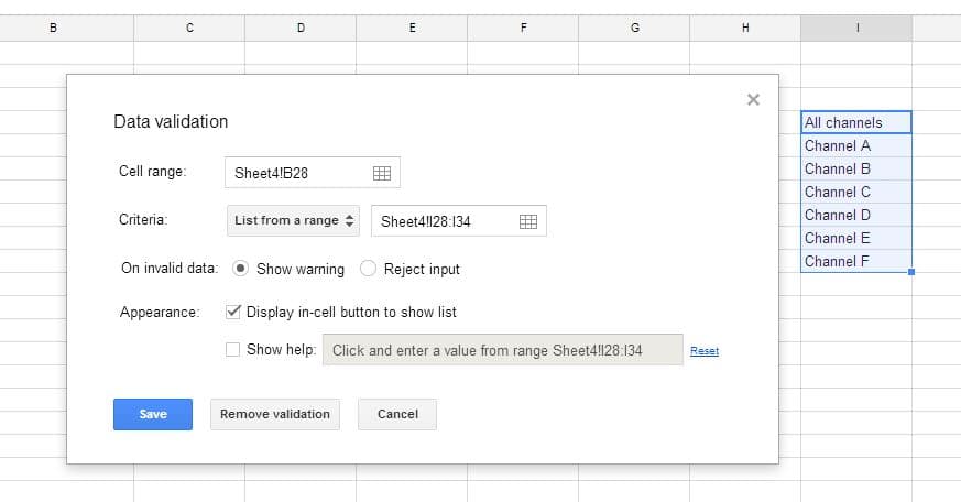
One way to offer a choice to a user in a spreadsheet is by using the data validation method. This creates a nifty drop-down menu from which the user can select a parameter, in this case a sales channel or specific time, and then point the data to this choice so it will update automatically, without needing to write any lines of code. It’s a pretty simple technique but surprisingly powerful.
First, I created two unique lists of choices to present to the user: one for dates and times, the other for sales channels.
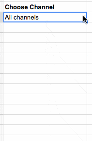
Using the Data > Validation feature on the highlighted list of values that I’d just created above, I could then create a user input menu, e.g. for sales channels:
The user is then presented with:
Another table was required to power the sales chart, which changed based on the user’s choice from the drop-down menu discussed above. This table used “index” and “match” formulas to show only the data from the sales table that corresponded to the user’s choice, as follows:
A similar table was created for the time sales data, running off the normalized time summary table.
Step 5: Creating the dynamic dashboard
Finally, the fun stuff! Props to you if you’ve made it this far. This is where the magic happens, where your charts come alive.
For the sales analysis, a stacked bar chart was most appropriate as it allowed the TWL team to see how many sales had been made so far versus how many were still required to hit the target, as follows:
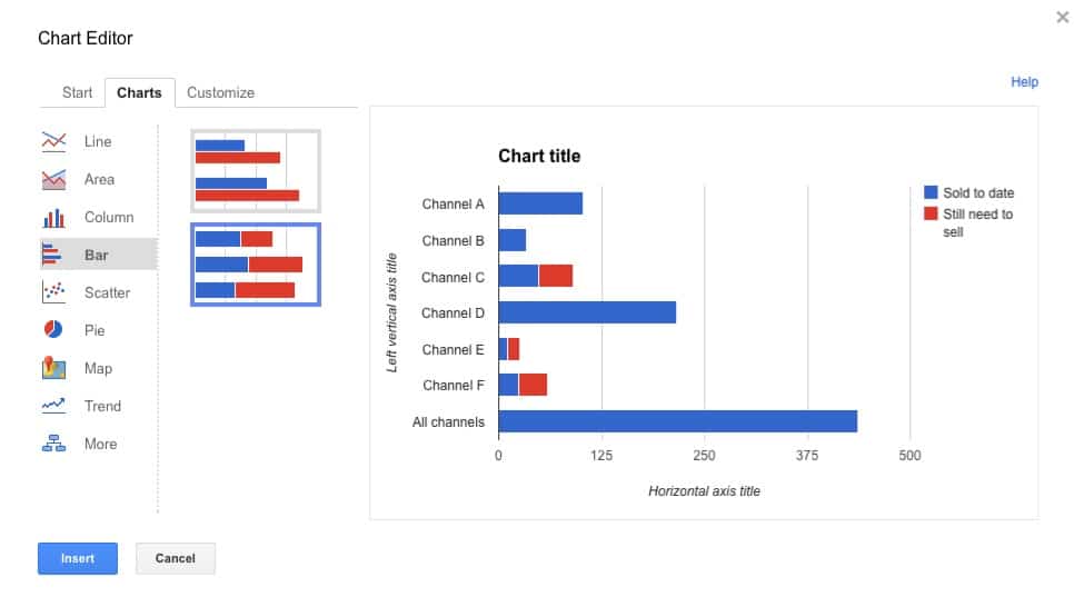
The chart adjusts each time a user picks a new parameter from the drop-down menu, because this choice alters the underlying data.
To complete the dynamic dashboard, I added a sales pie chart (running off the same table as the one above) and a vertical bar chart for the normalized time data.
As final finishing touches, I changed the shading of the bars in the chart to green to match the TWL brand, removed the gridlines, added the TWL logo and presented the dashboard in full screen mode. I also added a running total in the header bar of the dashboard — this was a simple formula linked to the data table, so it updated as a user choose different times to review. The final dashboard looked like this:
While this only took a couple of hours to put together, it came in handy during the sale. We were able to see which channels were sending the most sales in real time, which spurred the team to take specific actions to continue that momentum.
The dynamic dashboard also served as a camaraderie-builder and motivator for the team to rally around — it was energizing to see our progress, particularly once we began to surpass expectations in certain categories. And once we bypassed our sales targets on day 3, it felt like a real win to see the bar on the chart depicting “sales-remaining-to-reach-target” disappear.
Click here to access your copy of this template >>
This is amazing! Would it be possible for you to share the actual sheet? I got a bit lost and would love to see it in action so I can apply it to my own 🙂 Thanks in advance!
Thanks SJ. Click here to get a copy of this template.
The workings for the dashboard are to the right of the charts (columns Q to AO). Let me know if you have any further questions!
Unfortunately, data validation drop downs don’t work in read-only version of Google Sheets. So the dynamic nature of the dashboard can’t be seen in the link I posted in my previous comment. However, hopefully seeing the static dashboard still gives you an idea of what’s involved.
Update – I’ve now fixed this issue, so the link will take you to a dynamic version of the dashboard.
May i know how you fixed this?
Ben thanks for the article. I was looking for a way to build custom analytics dashboard for my trading data and found your blog.
Its a bit off topic but I can’t help but notice those cool animated pictures you have posted. I would love to use them for my site. How did you make them?
Hey Dustin, they’re GIFs that I’ve inserted into my post, same way as a regular old image (although when uploading GIFs to WordPress, you have to insert the GIF at full size for it to work. You can adjust the size later in the HTML.). To record the GIF I’ve been using Licecap or GifGrabber. I had better success with Licecap. Hope that helps and thanks for checking out the blog post.
Nice job. This powerful presentation is clean and easy. Thank you for sharing.
Thanks Mike!
How did you change the chart title?
Hi! I used a formula for the titles to make them dynamic. Looking at each of the titles in the dashboard:
Digital Sales Dashboard – this is just static text.
Total Sales: 90 – this is dynamic and the formula in the cell where the title shows, is:
="Total Sales: "&Y20This joins a static line of text “Total Sales: ” to a value which comes from my data.
312 short of target – again, this is dynamic so the cell showing the title is actually a formula again. This formula is a little more complex:
=if(Y20>Y22,concatenate(Y20-Y22," sales past target! Woohoo!"),if(Y20=Y22,"You hit the target! Good job!",Y21&" short of target"))Essentially, I’m just comparing total sales so far (in cell Y20) against my target total (in cell Y22), then displaying text based on whether I’m below, equal to or past my sales target. I’ve used nested IF() statements to do this. The data for the sales so far (Y20) is linked to the data validation drop down menus, so will change along with the charts when a user selects a different time.
Very useful. Quick, simple and using vanilla features. Thanks!
Thanks Miguel!
I am new to working with data validation, but I love how dynamic your charts are. Is it possible to segment more than once within the charts? I would like to create a traffic source pie chart which allows you to select different departments to see different traffic sources (direct, organic, referral) by month. I am unsure if data validation can include more than a set of information to represent the different traffic sources in a chart, and if there can be two drop level options to allow a user to select month and department.
Hi Sierra, you can definitely have multiple data validations running, so that you can use two (or more) measures to segment your data. I’ve mocked up a quick example along the lines you describe, which I hope may help: https://docs.google.com/spreadsheets/d/1_eE-cbjDHp6kBRxeSnZPp2cwER9cHAjOGxwnY9PyU4g/edit?usp=sharing
There are two choices (i.e. two data validations for month and department) highlighted in the yellow cells, which can affect the pie chart data in the green cells. Changing the selections will change the data which then changes the pie chart (the title is also a formula so that it changes with the data too). Hope this helps and let me know if you have any more questions. Thanks!
Hi Ben,
Great article. Has helped me create my own dashboard.
I have a question though, is there a way to stop multiple users overriding a dynamic filter and therefore affecting the data that other users see? In Excel for example users could open an xlsx. as read only so not affect other users.
I have potentially 100+ users of a dashboard and am reluctant to create a dashboard for each user if I don’t need too. I am concerned that there will be a challenge if everyone is trying to look at their data at the same time – the dynamic filter will keep being amended!
Do you know of any workaround for this problem?
Thanks!
Thanks Stephan!
Unfortunately, I don’t think there is a way to allow users to independently change the dynamic validation filters on their sheet view only, without overriding what others are seeing in their respective sheets too.
So, you could get people to create a copy of the sheet and have their own version, but this has drawbacks (namely that they need a google account, and secondly, they won’t see any changes or updates to the master spreadsheet, and so would have to create new copies).
I would try posting the question to the Google Docs Forum and see if anyone has any other ideas or workarounds there:
https://productforums.google.com/forum/#!forum/docs
Cheers,
Ben
I tried the same type of dashboard and the time to recalculate the fields is very slow. Your site looks instant – did you speed up the GIF image or is there something I’m doing wrong – I have a lot of fields to update.
Hi Russ, I made no changes to the GIF – it’s showing in real time as a I recorded my screen. If you have a lot of variables and charts changing each time you do a recalculation then that can slow your dashboard down, or it could be caused by a slow internet connection given that Google sheets are in the cloud.
Interesting article.
I must be missing something, but how do you “publish” your dashboard? Do you give access to the spreadsheet to the user or are you using another mechanism?
Hi PJM – you can “publish” your dashboard by sharing the link with others (and you can set to view-only or, if it’s a dynamic dashboard, lock the sheet except for any user input controls) or you can publish your dashboard online as a web page. See more here – Share and publish your Google Sheets dashboard for the world to see.
Hope this helps!
Thanks for your answer Ben – I am specifically interested in the “publish online as a webpage”. If I do that through (File>Publish and pick only the dashboard tab) I end up with a static page (user can no longer operate the data validation field such as the “Choose Channel”). Am I missing something?
Hey PJM – so I’ve done some research on “publish online as a webpage” and you’re right, it seems anything you publish will be static. Apologies for sending you down a rabbit hole on that one 🙁
Therefore I think your best, and maybe only, option is to share the spreadsheet with full editing rights but lock the entire sheet (and any raw data sheets) except for the data validation cells. You can do this by going to the Tools > Protect sheet… and then choosing to protect whole sheet except for specific cells. Check out this image to see protect screen pane on right side.
Final step would be to click Share in top right of screen, select “Anyone with link can edit” and then copy and send that link to people you want to share dashboard with. Or you could enter their email addresses into the input box on this Share screen.
Thanks Ben – I was really hoping that i was missing something there and that there was an easy way to do that. I will keep investigating.
Me too! If you do find a better solution, please consider posting it here. I’d be interested! Ben
Hi Ben,
I know this article is a bit old but it still be very helpful !
Is there a way to publish this diagram on a google site allowing people to still be able to use field to filter data?
Thanks for your reply
Clement
Hi Clement! Unfortunately, as far as I know it’s not possible to publish on a google site and keep this dynamic functionality. The best option I’ve found for sharing dashboards with others, is to share the worksheets with editing rights, and then lock the entire sheet (and any raw data sheets) except for the data validation cells. You can do this by going to the Tools > Protect sheet… and then choosing to protect whole sheet except for specific cells.
I also put some more Google sheets tips in this article: https://www.benlcollins.com/spreadsheets/10-techniques-for-building-dashboards-in-google-sheets/
Thanks,
Ben
Hello Ben,
I apologize in advance if this question is obtuse- but I am a novice at Sheets. I understand how to bring in drop-down menus, and how to create charts using data… but how do you make it interactive- i.e. how do you set the chart to change when a different drop down menu item is selected? I am not seeing any formula in the sheet…
Thanks for any help that you can provide, as this is exactly what I am looking for!
Travis
Hey Travis! Thanks for getting in touch and hopefully I can help out here.
What you need to do now is have your table of data be linked to this drop down menu by formulas. For example, assume I had the drop down menu in cell A1 and it had two options (Option A or Option B).
First I would need a table with ALL the data for Option A and ALL the data for Option B. Then I would have a second table with VLOOKUPs that gets data from this first table and uses the value in the drop down menu as the search criteria. This image shows what I mean:
Hope that helps! Let me know if you have any further questions. Cheers.
An impressive share! I have just forwarded this onto a coworker who had been conducting a little homework on this.
And he in fact bought me lunch because I discovered it for him…
lol. So let me reword this…. Thank YOU for the meal!! But yeah, thanx for spending time to talk about this subject here
on your web page.
Thanks for your kind words!
Hi Ben,
thanks for this awesome tutorial. I have now created a controlling dashboard for my product design startup to be able to dynamically compare our actual and target financial status and display which channels revenue comes from etc. . I would love to have the charts animate between changes to the parameters like yours do in the gif. How did you achieve this? Thanks in advance and all the best from Leipzig, Germany!
Jonathan
Hi Jonathan,
Great to hear you’re building your own dashboard, that’s awesome! You can make the charts dynamic by using a combination of data validation and formulas (e.g. vlookup). I wrote a how-to article a while ago, so see if this helps: https://www.benlcollins.com/spreadsheets/dynamic-charts-google-sheets/
Thanks,
Ben
Hi Ben,
thanks for your reply. Creating the data validation and changing the data is not my problem. I mean the visual animated transitions between the different states. I know it’s possible to have google animate the status change of graphs, but I just don’t know how to implement it in the way it seems you have done it with your graphs… (https://developers.google.com/chart/interactive/docs/animation)
Would be great if you could help with this topic!
Thanks,
Jonathan
Hey Jonathan,
The charts in the GIFs shown in this post are just regular static Google charts that change when the underlying data changes (e.g. from the data validation). I didn’t do anything (programmatically) to control the animation.
Thanks for that link though! Looks interesting and I’ll definitely give it a try in my next apps script project. Could be a good blog post…
Here’s another animation reference in the Google docs: https://developers.google.com/apps-script/reference/charts/bar-chart-builder#setoptionoption-value
Thanks,
Ben
Wow! This is what I am looking for. I want to create a report dashboard for my local business sales. The reporting is daily and monthly based, and use chard like your dashboard. I think it is possible. Right?
Thanks Didik. It sounds like it should be possible. Good luck!
Great article!
I used your example as a basis for my own however substituting INDEX to return a list of values instead of VLOOKUP
Was wondering how do you account for blanks?
eg. depending on the dropdown the list of values may change
Dropdown value 1 – 5 values across 3 items(A,B,B,C,C)
Dropdown value 2 – 3 values across 2 items (A,A,B)
Which gets converted to a pie chart however any fields in the chartable range which is blank is counted as its own value (D becomes the larger portion even though no data is present).
Hi Jason,
Yes, using the INDEX function is a great way of achieving this, probably better than VLOOKUP if you know how to use it. Pairs well with the MATCH formula for really flexible lookups.
Do you have a sheet you can share? Usually I find that the chart tool adjusts correctly for blanks, so not sure what’s happening in your case.
Also, have a look at this sheet of multiple drop-down menus, which may help or be of interest: https://docs.google.com/spreadsheets/d/1X3nkMEe9hgKTkBD3_ksl7Tiak8kYDRSGlQ71yhX5xyE/edit?usp=sharing
It allows you to choose items in drop-down list 1, which then updates the choices in drop-down 2.
Thanks,
Ben
You rock for sharing this! I’m wondering how you were able to share “live” your interactive samples that you showed on your WordPress website.
The “live” images are GIFs. I use LICEcap to record them.
After several hours or research, I was so please to find your work, Ben. Exactly what I was looking for.
The only problem is that when I close the sheet, then re-open it, my charts have moved and I have to move them to their original position.
Is there anything that I can do to stop the movement of the charts?
Thanks very much!
Argh, yes, this is a (minor) pain! I find it happens occasionally too, although haven’t noticed for months now. They only ever moved a little bit for me, so it didn’t matter too much.
Unfortunately, I don’t know of anything you can do about it, other than submit a bug to Google via the Help menu in Sheets (Help > Report a problem).
I’ve observed it happening about 60% of the time.
I was afraid there might not be a ‘magic bullet,’ but I thank you for your confirmation, Ben.
Hi Ben, this is a great article!
Thank you for your time in putting this together.
I have created some dynamic charts, however I wondered if there was a way to change the colour of individual bars in an interactive column chart, based on the value.
For example, if the value was 1-2 I would like the individual bar to be red, if the value was 3 I would like it to be yellow, and if it was 4-5 I would like it to be green.
Do you have any suggestions of how to do this? I suspect there would be some script writing involved.
Thank you for your help in advance!
Hi Ben, nice sheet you have there. I’m looking for a solution to dynamically change the data range of a pivot table. My raw data contains week by week points for riders. The pivot shows a chart with the latest status. I would like to use a drop-down (I guess with the data-validation feature) to change the data reach of the pivot so that I can revert back to the status of previous weeks. Let’s say we’re week 20 now, so my pivot shows the consolidated results of W20. But, it would be nice if I can easily revert back to W10. I have 2 issues: 1) even manually, changing (decreasing) the data range of the pivot doesn’t change a thing; I stick with the latest results and 2) I don’t know how to implement the drop-down to automatically change the data range. If you have an idea, would be nice if you could share it 😉
Ben, thanks for the help. I have created a client 360 view dashboard for my technicians to use. What’s the easiest way for multiple users to look at data for different clients simultaneously? For example, Tech 1 looks at Client A’s data while Tech 2 looks at Client B’s data.
Is there a trick to accomplishing this task? I have tried Filter Views unsuccessfully.
Hi Ben – thank you so much for this tutorial and providing a download of the sheet! I used the index formula you provided, but get a blank cell – or one with #N/A in it without the IFERROR added. Seems I can’t seem to troubleshoot the error with various Google searches. Any help you could provide would be most welcome! Happy to send my sheet through.
Thank you because thanks to this article I can create a report dashboard for the sale of my business.
I want to insert a slider into my dynamic dashboard. I can do it in Excel, but not in Spreadsheet. Any idea how to do it in google sheets?
Hi Ben, thank you so much for this tutorial & the download link of the sheet. The chart also works without issues in 2019.
How to apply SEO right now? Can I contact you to take a course?
Nice tips Ben, Thank you
In google sheet how to count the main report to graph
Hey Thanks putting this together! I question what AI will do in this area over the next five years.