This Formula Challenge originally appeared as Tip #194 of my weekly Google Sheets Tips newsletter, on 7 March 2022.
Congratulations to everyone who took part and well done to the 97 people who submitted a solution!
Special mention to Kieran D., Louise A., Martin H., Jelle G., Karl S., Earl N., Doug S., JP C., Alan B., and others for their ingenious solutions. I’ve shared the best below.
Sign up here so you don’t miss out on future Formula Challenges:
Find all the Formula Challenges archived here.
The Challenge Part I: Split A String Into Characters
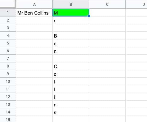
Question: can you create a single formula to split a string into characters so that each character is in its own cell?
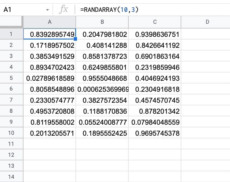
i.e. can you create a single formula in cell B1 that creates the output shown in this example:
Continue reading Formula Challenge #6: Split A String Into Characters And Recombine In Random Order