“If you can’t measure it, you can’t improve it.” – Peter Drucker
Disclosure: Some of the links in this post are affiliate links, meaning I’ll get a small commission (at no extra cost to you) if you signup.
Trying to have conversations about saving, spending and planning for retirement is infinitely more difficult and more stressful without accurate numbers in front of you.
You fall back on anecdotes and feelings because you have nothing else to go on.
Conversations start with phrases like: “it feels like we haven’t spent much on eating out this month” and they don’t get any better from there.
My wife and I have two beautiful boys, aged 2 and 4, and we’re both ambitious with our careers and work full-time. Life is crazy, crazy busy for us right now.
We’ve found it challenging to find time to manage our family finances, so we’ve been in this position of flying blind without a financial tracking plan in place. We’ve had those frustrating conversations, knowing that if we had better insights into our financial habits we could do a much better job at financial planning.
I want to show you how we changed that.
How we created a system in Google Sheets for tracking our spending habits.
It now only takes us about 10 or 15 minutes each week, so we can focus on understanding our financial situation better, and maximize our saving.
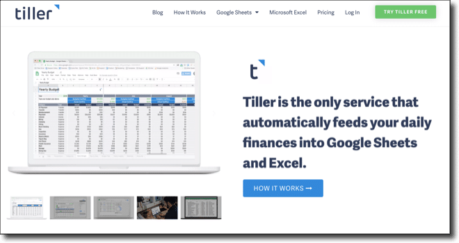
Enter Tiller
Tiller is an amazing tool that connects our bank accounts and credit cards securely to Google Sheets (or Excel), and automatically updates them on a daily basis.
It means we can see all of our financial transactions in one place and do our own custom analysis in Google Sheets.
It’s been transformative for our family’s sanity and helped us get on top of our spending and hit our saving goals.
Tiller has a suite of Google Sheet templates available too, covering spending, saving, budgeting and net worth tracking, so that you can visualize your financial data immediately.
Of course, you can also build your own solutions to answer whatever questions you have.
It costs $79/year, which is tremendous value since you’re getting a fully customizable, automated personal finance tool.
How to setup Tiller with Google Sheets
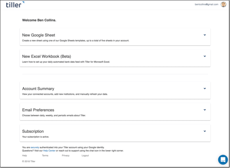
Tiller is a third-party tool so you have to create an account with them, which is done securely through your Google account credentials.
This is what your homepage looks like, and where you add accounts or create new Google Sheet templates:
Once you add the bank accounts and credit cards you want to track, you can go ahead and create a new Google Sheet:
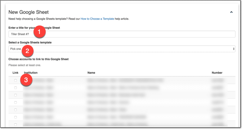
2. Choose a template or just the data
3. Select which accounts to include
Click Create and the magic happens! ?
After a short while, you can click over to your new Google Sheet, populated with all of your transaction data!
How we use Google Sheets to track our spending habits
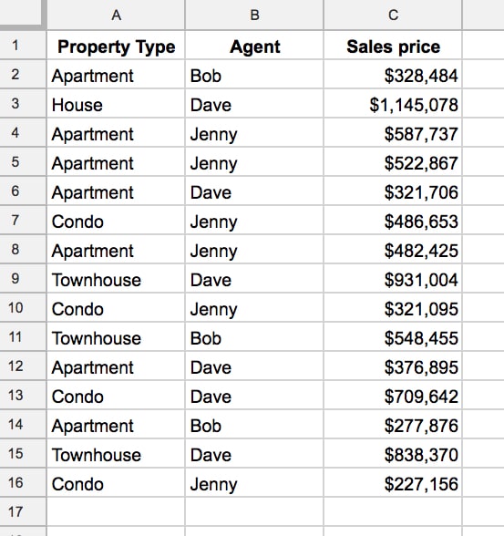
We’ve setup categories to group our transactions, so that we can see how much we’re spending on different things at a high-level. For example, we group all restaurant expenses together into an “Eating Out” category, which allows us to see how much we spend eating out.
You want enough categories to differentiate items in a meaningful way, but not too many that you end up with too much granularity. The whole idea is to summarize transactions into something more manageable.
Each week my wife or I will jump into the Tiller Sheet and categorize any new transactions. It’s as simple as selecting the category from the drop-down menu in Transactions tab in the blank cell next to the transaction name:
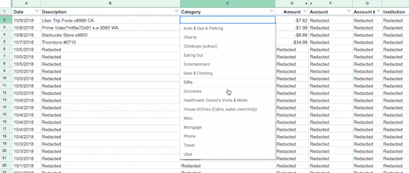
You can even use Tiller’s new Autocat tool to now automatically categorize transactions for you.
Creating custom reports with Tiller and Google Sheets
I’m going to share our solution for tracking our spending habits.
It allows us to understand how we’re spending our money and identify ways to reduce it.
I created a summary table in our Tiller Google Sheet, which shows our family spending by category. It takes the data we’ve categorized in the transactions tab, which is automatically updated by Tiller, and summarizes it.
The transactions are summarized by categories in the rows, and by months across the columns. Columns A and B contain checkboxes, which I use to control which spending categories to show in my charts.
![]()
This table alone gives us more insight into our spending habits than anything the bank gives us. Every single transaction is included and categorized, by us not the bank.
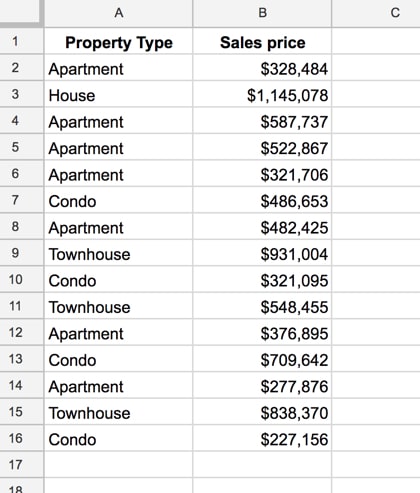
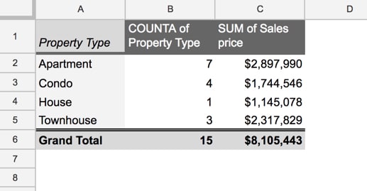
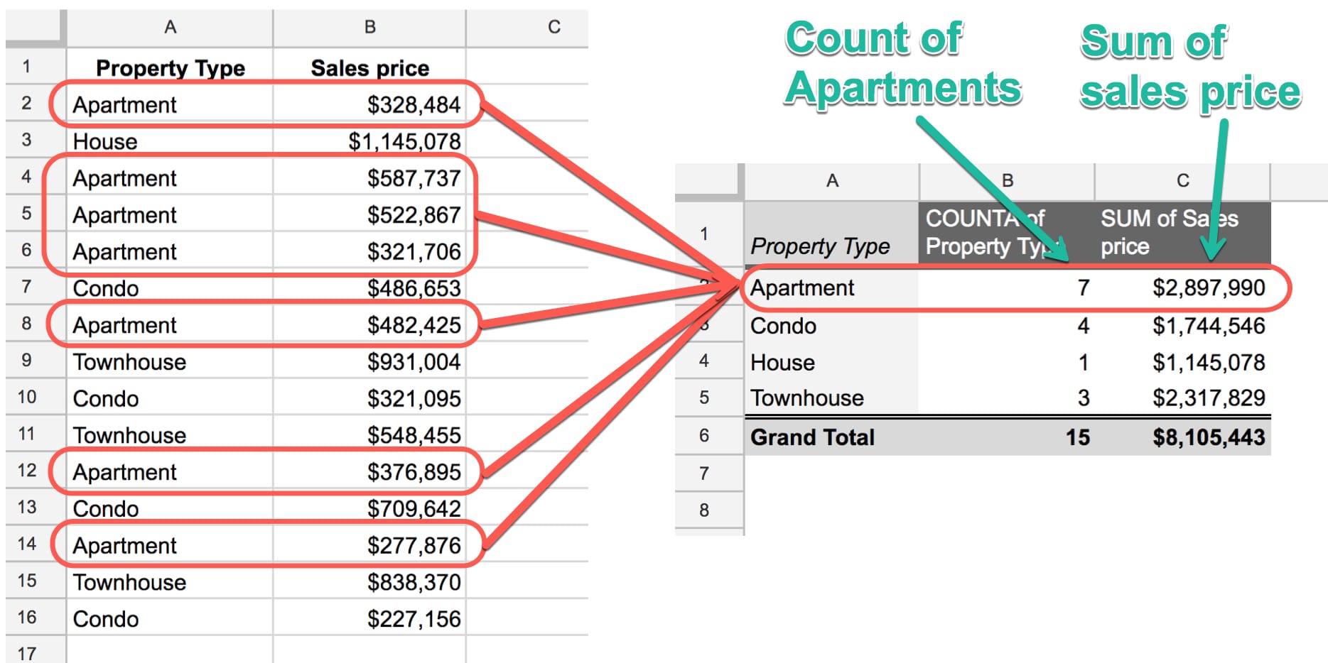
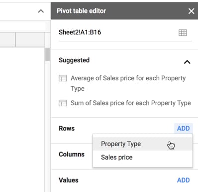
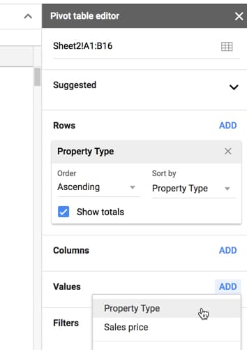
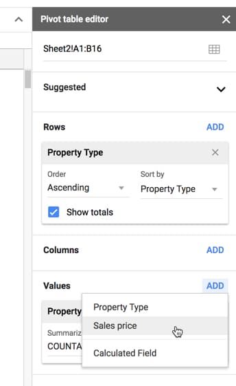
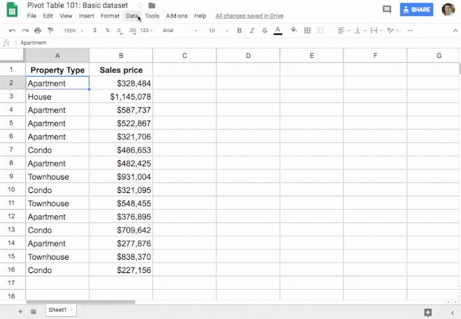
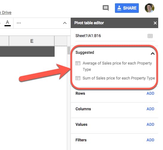
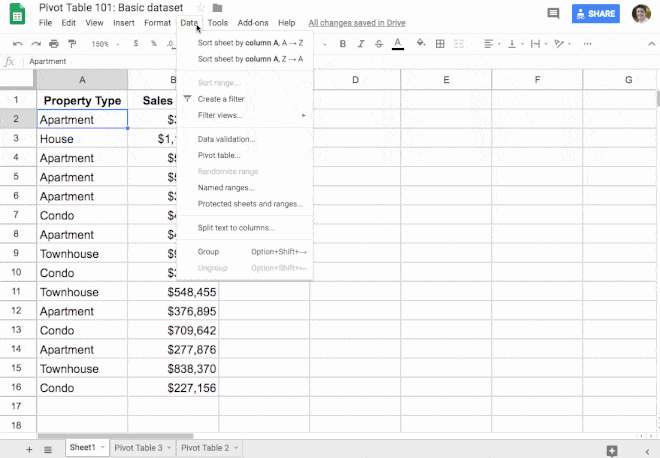
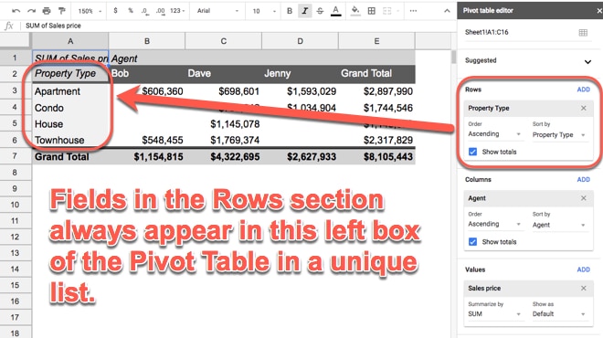
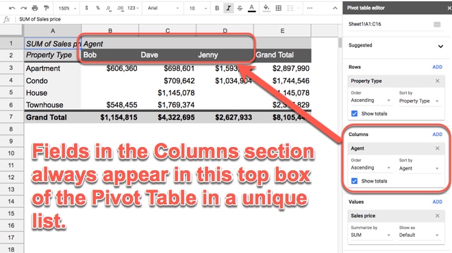
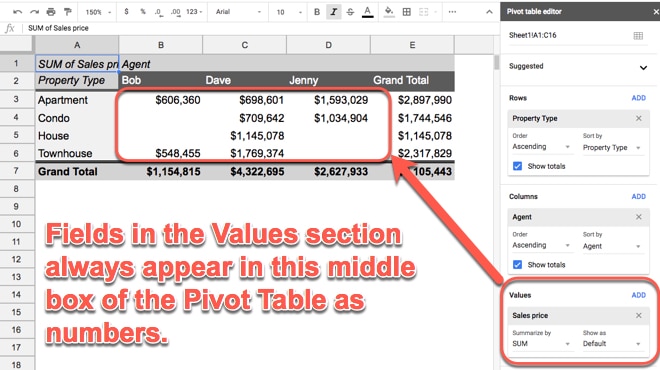
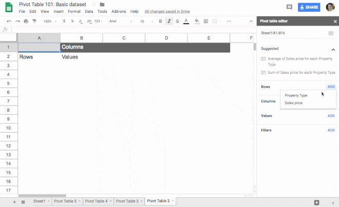
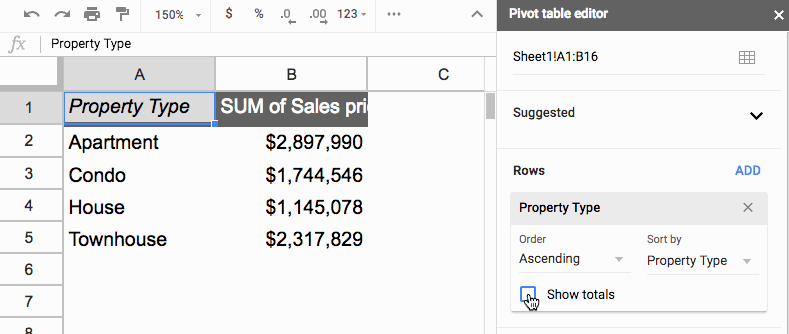
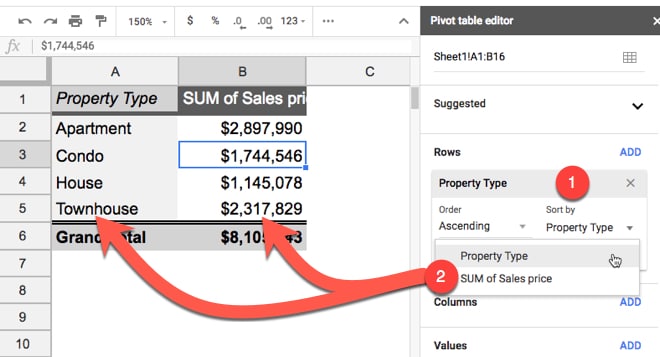
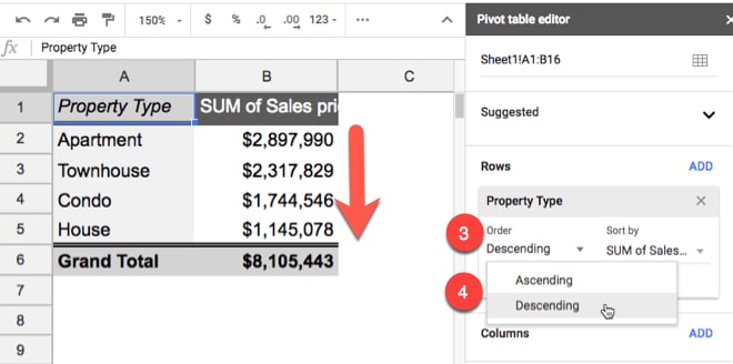
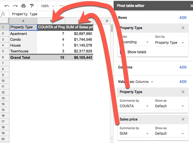
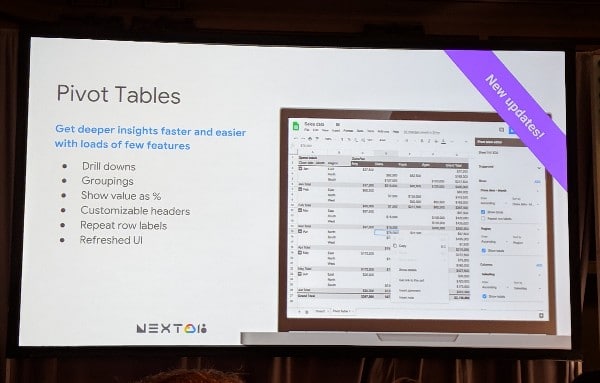
You can create a table like this with the Google Sheets QUERY function, or using Pivot Tables in Google Sheets.
In my case, I’ve used a QUERY function in cell C3 to retrieve, aggregate and pivot my transaction data:
=QUERY(QUERY(Transactions!A1:O,"select C, sum(D)*-1 group by C pivot K"),"offset 1",0)Visualizing our spending habits in Google Sheets
I added the checkboxes in columns A and B, so there’s a way for my wife and I to choose categories to focus on.
The checkboxes can be individually checked or unchecked and they feed into other data tables that only show the data for the checked items.
Our mortgage, car lease and utility payments remain largely the same month-to-month. We know we have to pay them every month, so we don’t necessarily need to see them every time. (That’s not to say they’re not important, but trying to visualize all your categories at once will just clutter your charts to the point of being useless. )
However, seeing our discretionary spending — things like travel and eating out for example — helps us understand our spending habits and find ways to save more money in a healthy way.
We’re currently using two charts to track our spending habits:
Chart 1: Current monthly spend vs. Average monthly spend
The first is a monthly breakdown by category, showing actual spend this month (blue) against the average amount we spend in this category each month (red):
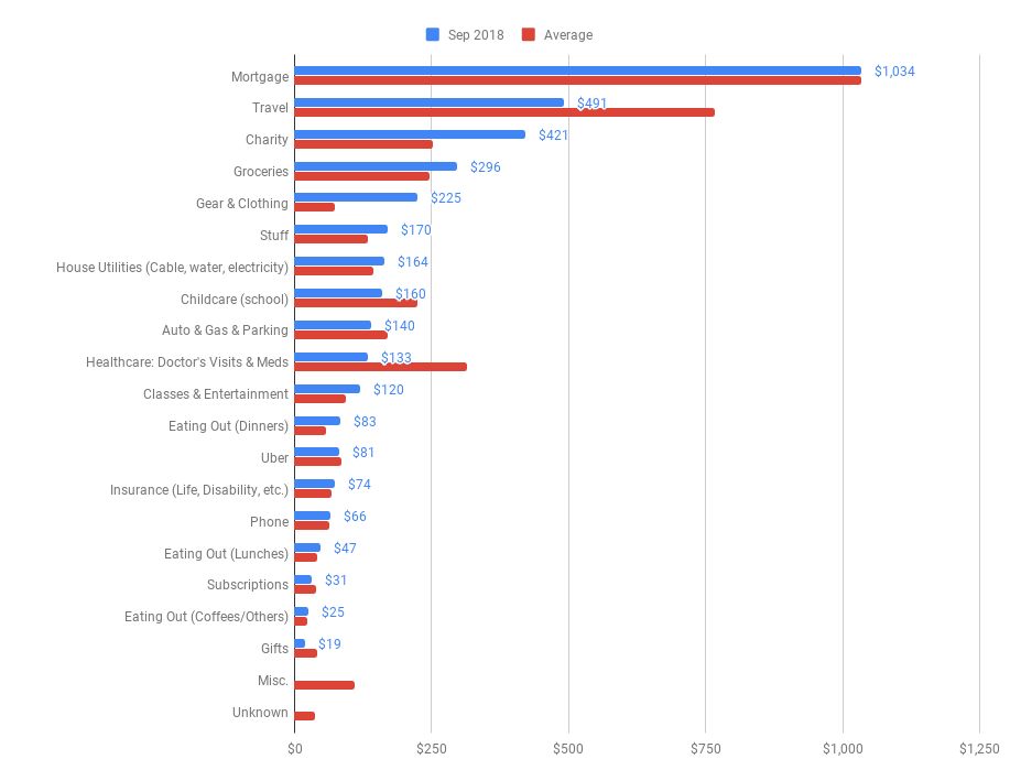
(Chart shows fictional data.)
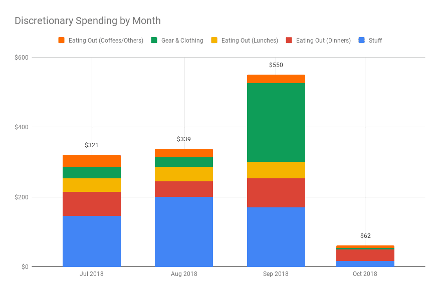
Chart 2: Discretionary Spend by Month
The second is a look at our discretionary spending over the past few months, so we can see how selected categories are trending (chart shows fictional data):
The combination of the monthly category breakdown table and these two simple charts gives us tremendous insight into our spending habits.
Knowing how we’re spending our money gives us tremendous peace of mind.
It’s helping us to minimize our unnecessary spending and maximize our saving.
See Also:
10 techniques to use when building budget templates in Google Sheets
A guide to the super useful QUERY function
Pivot Tables in Google Sheets: A Beginner’s Guide
How to use checkboxes in Google Sheets
Note: I’m not a financial expert and this post does not provide financial advice. It simply shows some techniques for working with and presenting data in Google Sheets.