This post looks at how to make a line graph in Google Sheets, an advanced one with comparison lines and annotations, so the viewer can absorb the maximum amount of insight from a single chart.
For fun, I’ll also show you how to animate this line graph in Google Sheets.
Want your own copy of this line graph?
Click here to access your copy of this template >>
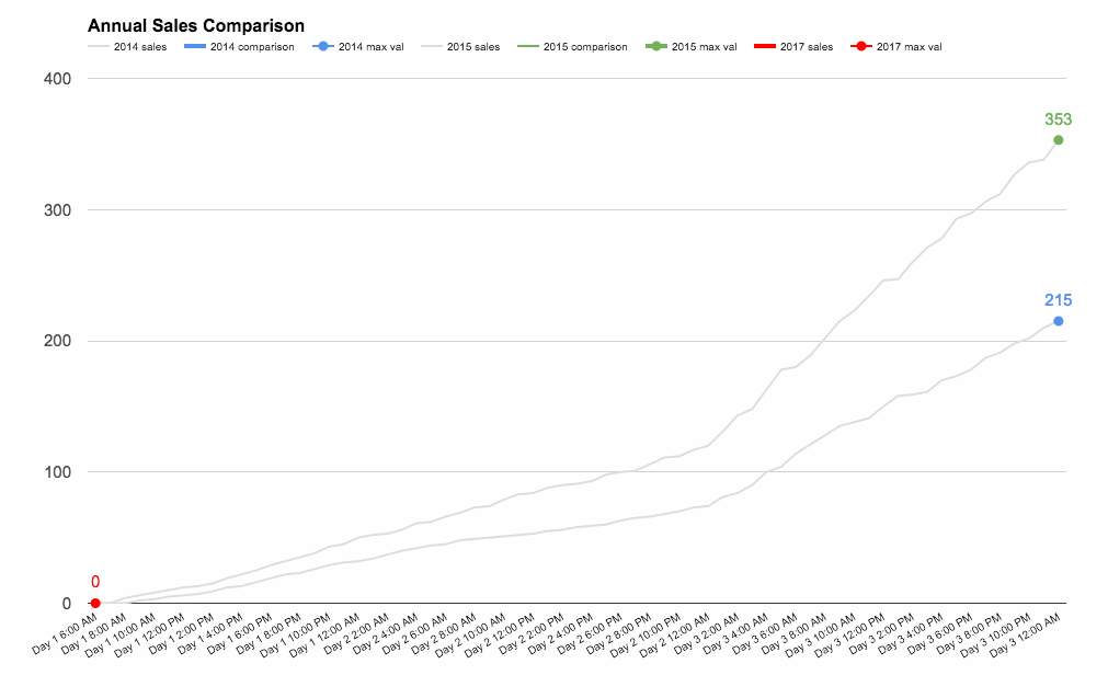
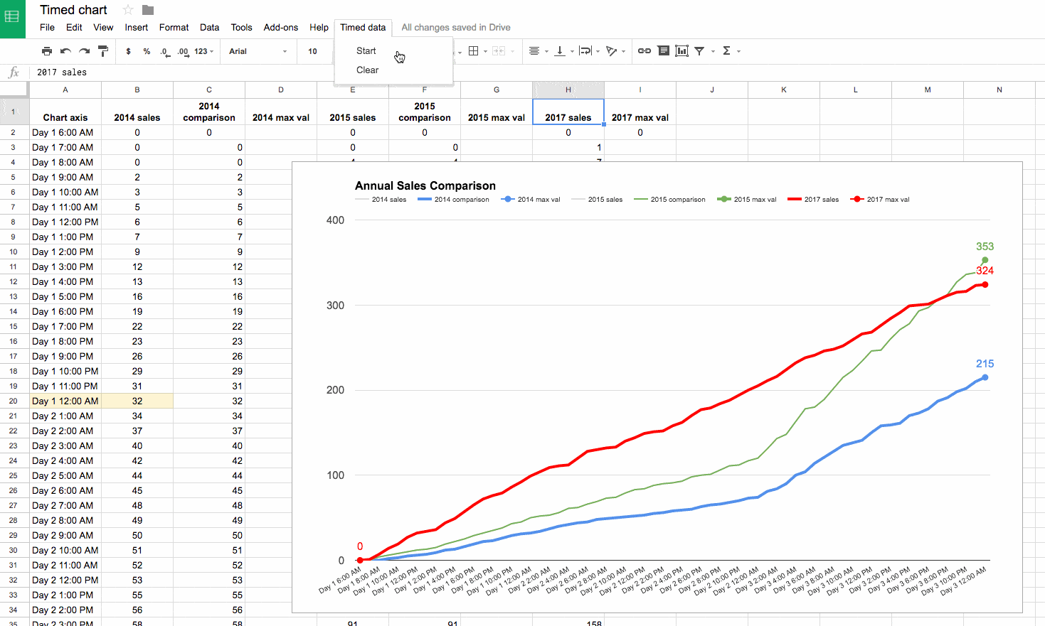
This chart was originally developed for The Write Life during their 4-day product sale earlier this year. It featured as part of a dashboard that was linked to the E-junkie sales platform and displayed sales data in real-time:

As with any graph, we start with the data:
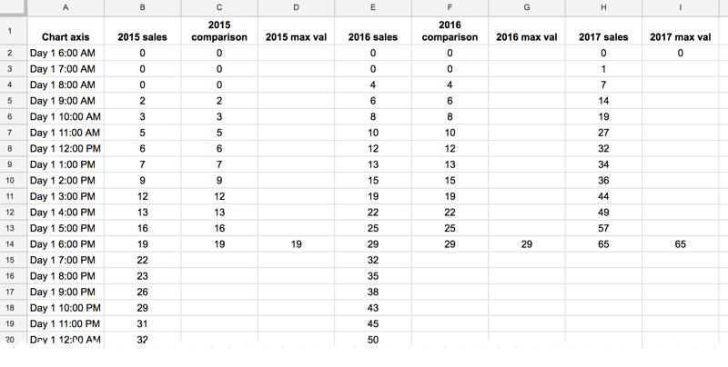
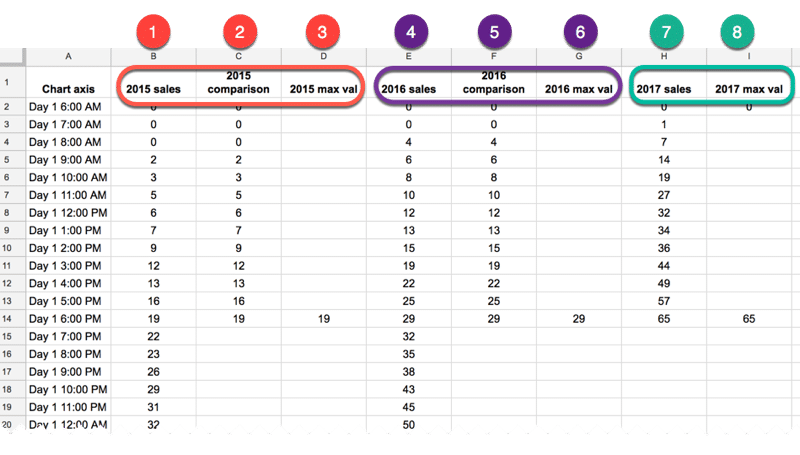
The data table
The key to this line graph in Google Sheets is setting up the data table correctly, as this allows you to show an original data series (the grey lines in the animated GIF image), progress series lines (the colored lines in the animated GIF) and current data values (the data label on the series lines in the GIF).
In this example, I have date and times as my row headings, as I’m measuring data across a 4-day period, and sales category figures as column headings, as follows:
Red columns
The red column, labeled with 1 above, contains historic data from the 2015 sale.
Red column 2 is a copy of the same data but only showing the progress up to a specific point in time.
In red column 3, the following formula will create a copy of the last value in column 2, which is used to add a value label on the chart:
=IF(AND((C2+C3)=C2,C2<>0),C2,"")Purple columns:
Purple columns 4,5 and 6 are exactly the same but for 2016 data. The formula in this case, in column 6, is:
=IF(AND((F2+F3)=F2,F2<>0),F2,"")Green columns:
Data in green columns 7 and 8, is our current year data (2017), so in this case there is no column of historic data. The formula in column 8 for this example is:
=IF(AND((H2+H3)=H2,H2<>0),H2,"")Creating the line graph in Google Sheets
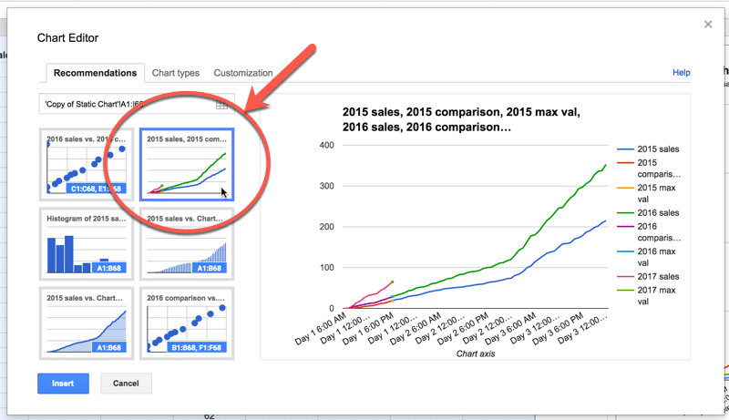
Highlight your whole data table (Ctrl + A if you’re on a PC, or Cmd + A if you’re on a Mac) and select Insert > Chart from the menu.
In the Recommendations tab, you’ll see the line graph we’re after in the top-right of the selection. It shows the different lines and data points, so all that’s left to do is some formatting.
Format the series lines as follows:
- For the historic data (columns 1 and 4 in the data table), make light grey and 1px thick
- For the current data (columns 2, 5 and 7 in the data table), choose colors and make 2px thick
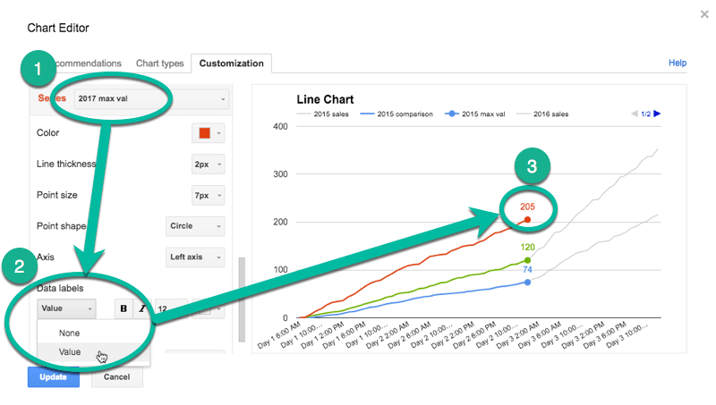
- For the “max” values (columns 3, 6 and 8 in the data table), match the current data colors, make the data point 7px and add data label values (see steps 1, 2 and 3 in the image below)
This is the same technique I’ve written about in more detail in this post:
How can I annotate data points in Google Sheets charts?
Animating the chart with Apps Script
How about creating an animated version of this chart?
Oh, go on then.
When this script runs, it collects the historic data, then adds that data back to each new row after a 10 millisecond delay (achieved with the Utilities.sleep method and the SpreadsheetApp.flush method to apply all pending changes).
I don’t make any changes to the graph or create any fancy script to change it, I leave that up to the Google Chart Tool. It just does its best to keep up with the changing data, although as you can see from the GIF at the top of this post, it’s not silky smooth.
By the way, you can create and modify charts with Apps Script (see this waterfall chart example, or this funnel chart example) or with the Google Chart API (see this animated temperature chart). This may well be a better route to explore to get a smoother animation, but I haven’t tried yet…
Here’s the script:
function startTimedData() {
  var ss = SpreadsheetApp.getActive();
  var sheet = ss.getSheetByName('Animated Chart');
  var lastRow = sheet.getLastRow()-12;

  var data2015 = sheet.getRange(13,2,lastRow,1).getValues(); // historic data
  var data2016 = sheet.getRange(13,5,lastRow,1).getValues(); // historic data

  // new data that would be inputted into the sheet manually or from API
  var data2017 = [[1],[7],[14],[19],[27],[32],[34],[36],[44],[49],[57],[65],[72],[76],[79],[86],[92],[99],[104],[109],[111],[112],[120],[128],[130],
                  [132],[133],[140],[144],[149],[151],[152],[158],[162],[170],[177],[179],[184],[188],[194],[200],[205],[211],[216],[224],[232],[238],
                  [241],[246],[248],[252],[259],[266],[268],[276],[284],[291],[299],[300],[301],[306],[311],[315],[316],[323],[324]];

  for (var i = 0; i < data2015.length;i++) {
    outputData(data2015[i],data2016[i],data2017[i],i);
  }

}

function outputData(d1,d2,d3,i) {
  var ss = SpreadsheetApp.getActive();
  var sheet = ss.getSheetByName('Animated Chart');

  sheet.getRange(13+i,3).setValue(d1);
  sheet.getRange(13+i,6).setValue(d2);
  sheet.getRange(13+i,8).setValue(d3);
  Utilities.sleep(10);
  SpreadsheetApp.flush();
}

function clearData() {
  var ss = SpreadsheetApp.getActive();
  var sheet = ss.getSheetByName('Animated Chart');
  var lastRow = sheet.getLastRow()-12;

  sheet.getRange(13,3,lastRow,1).clear();
  sheet.getRange(13,6,lastRow,1).clear();
  sheet.getRange(13,8,lastRow,1).clear();

}
On lines 6 and 7, the script grabs the historic data for 2015 and 2016 respectively. For the contemporary 2017 data, I’ve created an array in my script to hold those values, since they don’t exist in my spreadsheet table.
This code is available here on GitHub.
Finally, add a menu for access from your Google Sheet with the following code:
function onOpen() {
  var ui = SpreadsheetApp.getUi();

  ui.createMenu("Timed data")
    .addItem("Start","startTimedData")
    .addItem("Clear","clearData")
    .addToUi();
}
This allows you to run the Start and Clear functions directly from your Google Sheet browser tab, rather than the script editor tab.
That’s it. Hit Start and you should see your chart animate before your eyes:
If you look closely, you’ll also see the data populating your sheet.
I love your tutorials! They are always so helpful, and provide new ways to present data that I didn’t know was possible with Excel/Google Sheets.
However, I must be doing something wrong with this one. I was able to make a copy of the sheet, but when I start, the script, it has the yellow “running script” notification, but the graph does not move. What am I missing here?
Hey Claire,
Have you tried the template, were you able to get that running? That might help you figure out what’s different with your own example.
Also, these two lines of code are the ones that “animate” the chart by introducing a delay and ensuring all the updates are processed before moving on:
Utilities.sleep(10);SpreadsheetApp.flush();
Ben
Hello,
Thank you very very much for sharing your template!
As Claire, the script runs well but I cannot see the graph move. On top of that, new data appear on the Col 2015 comparison, Col 2016 comparison and the Col 2017 sales (I followed your template, by changing the data only to get sure I understand well).
As information, I changed the script about the Var data2017 with the data I have provided.
Also, I have created the menu, and when I want to “clear”, nothing happens.
I am trying to figure out the issue but I have not found yet.
Could you help me on that?
Thank you very much again for sharing this example of the animated chart!
If you want, I can share the google sheet where I am trying to generate the chart.
Best regards