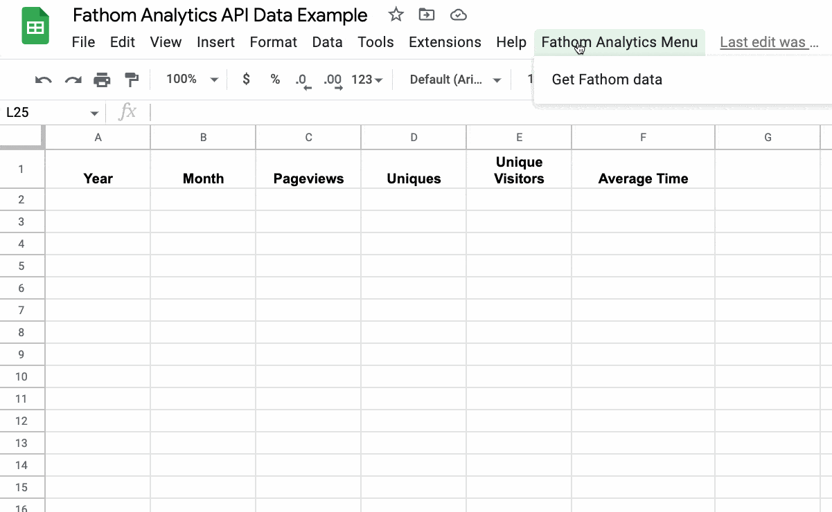
In this post, we’re going to create a tool that calls the Fathom Analytics API and pastes website traffic data into Google Sheets:
But first, a quick backstory:
Earlier this year (2022), Google announced the sunsetting of the old implementation of Google Analytics, in favor of GA4.
At the time I was running the old Google Analytics software, implemented through Google Tag Manager (along with Facebook’s pixel tracker).
It was time for me to update my web analytics software.
But I didn’t want to just shove GA4 into my existing tag manager setup. From what I’d heard, GA4 was difficult to use and way overblown for my needs.
Also, I really wanted to remove the dependency on Tag Manager from my site, because it’s too complex for my use case and I’m not particularly familiar with it. Plus, it’s been years since I’ve used the Facebook analytics pixel so I wanted to get rid of that too. I wanted to improve my site speed, and removing all this javascript would help with that goal.
So I cast around for alternative analytics software and landed on Fathom.
Fathom Analytics is a lightweight, easy-to-use, privacy-focused analytics software that is perfect for my website.
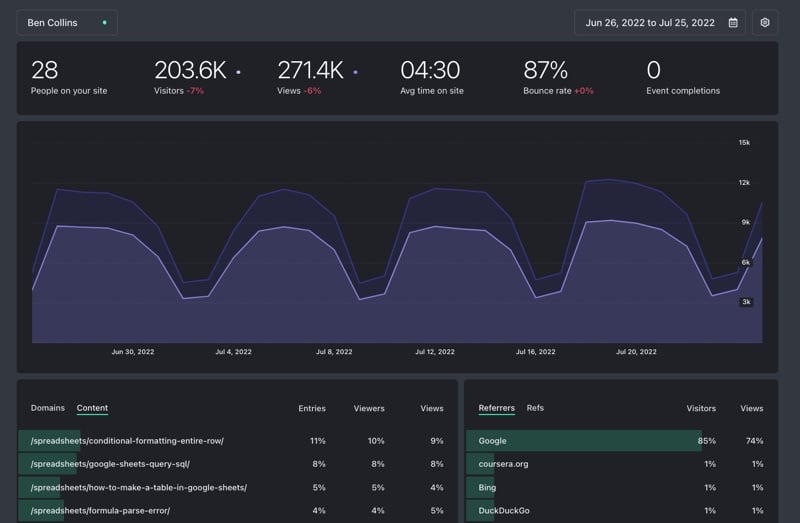
It was ridiculously easy to set up and I’ve been delighted with how easy it is to use. I jump in and can quickly see everything I need to know for my website:
Continue reading How To Get Fathom Analytics Data Into Google Sheets, Using Apps Script