This article will walk you through how to draw the MandelBrot set in Google Sheets, using only formulas and the built-in chart tool.
What Is The MandelBrot Set?
The Mandelbrot set is a group of special numbers with some astonishing properties.
You’ve almost certainly seen an image of the Mandelbrot set before.
It’s one of the most famous mathematical concepts, known outside of mathematical circles even. It’s named after the French mathematician, Benoit Mandelbrot, who was the father of fractal geometry.
The Mandelbrot set is fantastically beautiful. It’s an exquisite work of art, generated by a simple equation.
More formally, the Mandelbrot set is the set of complex numbers c, for which the equation z² + c does not diverge when iterated from z = 0.
Gosh, what does that mean?
Well, it’s easier if you look at the picture at the top of this article. The black area represents points that do not run away to infinity when you keep applying the equation z² + c.
Consider c = -1.
It repeats -1, 0, -1, 0, -1… forever, so it never escapes. It’s bounded so it belongs in the Mandelbrot set.
Now consider c = 1.
Starting with z = 0, the first iteration is 1.
The second iteration is 1² + 1 = 2.
The third iteration is 2² + 1 = 5.
The fourth iteration is 5² + 1 = 26.
And so on 26, 677, 458330, 210066388901, … It blows up!
It diverges to infinity, so it is not in the Mandelbrot set.
Before we can draw the Mandelbrot set, we need to think about complex numbers.
Imaginary And Complex Numbers
It’s impossible to draw the Mandelbrot set without a basic understanding of complex numbers.
If you’re new to complex numbers, have a read of this primer article first: Complex Numbers in Google Sheets
It explains what complex numbers are and how you use them in Google Sheets.
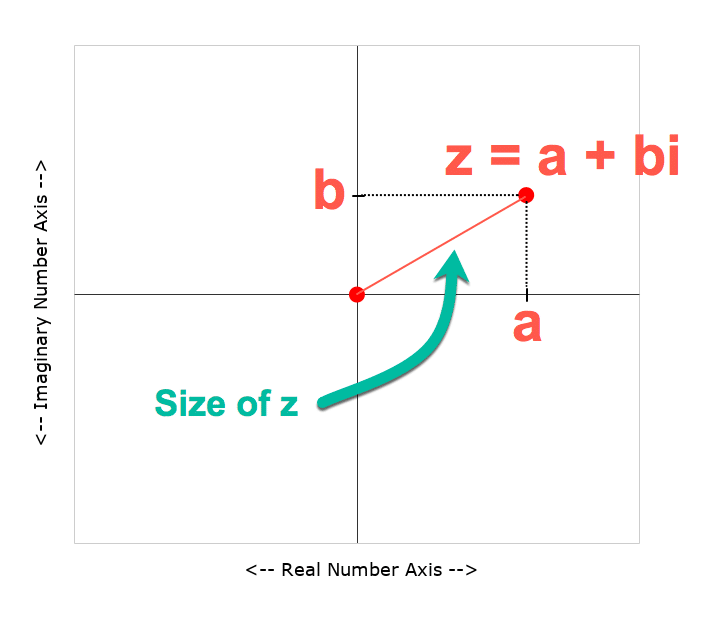
To recap, complex numbers are numbers in the form
a + bi
where i is the square root of -1.
We can plot them as coordinates on a 2-dimensional plane, where the real coefficient “a” is the x-axis and the imaginary coefficient “b” is on the y-axis.
Use A Scatter Plot To Draw The Mandelbrot Set
Taking each point on this 2-d plane in turn, we test it to see if it belongs to the Mandelbrot set. If it does belong, it gets one color. If it doesn’t belong, it gets a different color.
This scatter plot chart of colored points is an approximate view of the Mandelbrot set.
As we increase the number of points plotted and the number of iterations we get successively more detailed views of the Mandelbrot set. A point that may still be < 2 on iteration 3 may be clearly outside that boundary by iteration 5, 7 or 10.
You can see the outline resembles the Mandelbrot set much more clearly at higher iterations.
How To Draw The MandelBrot Set In Google Sheets, Using Only Formulas
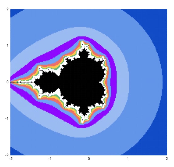
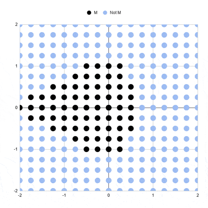
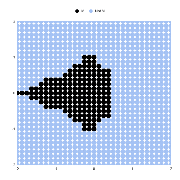
Here’s a simple approximation of the Mandelbrot set drawn in Google Sheets:
Let’s run through the steps to create it.
It’s a scatter plot with 289 points (17 by 17 points).
Each point is colored to show whether it’s in the Mandlebrot set or not, after 3 iterations.
Black points represent complex numbers, which are just coordinates (a,b) remember, whose sizes are still less than or equal to 2 after 3 iterations. So we’re including them in our Mandelbrot set.
Light blue points represent complex numbers whose sizes have grown larger than 2 and are not in our Mandelbrot set. In other words, they’re diverging.
Three iterations are not very many, which is why this chart is a very crude approximation of the Mandelbrot set. Some of these black points will eventually diverge on higher iterations.
And obviously, we need more points so we can fill in the gaps between the points and test those complex numbers.
But it’s a start.
Generating The Complex Number Coordinates
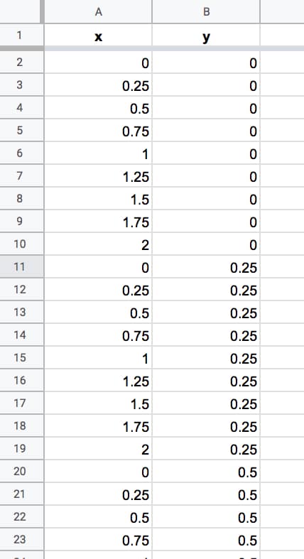
In column A, we need the sequence going from 0 to 2 and repeating { 0, 0.25, 0.5, 0.75, 1, 1.25, 1.5, 1.75, 2, 0, 0.25, 0.5, …}
In column B, we need the sequence 0, then 0.25, then 0.5 repeating 9 times each until we reach 2 { 0, 0, 0, 0, 0, 0, 0, 0, 0, 0.25, 0.25, 0.25, …}
This gives us the combinations of x and y coordinates for our complex numbers c that we’ll test to see if they lie in the set or not.
It’s easier to see in the actual Sheet:
We keep going until we reach number 2 in column B. We have 324 rows of data. There are some repeated rows (like 0,0) but that doesn’t matter for now.
Columns A and B now contain the coordinates for our grid of complex numbers. Now we need to test each one to see if it belongs in the Mandelbrot set.
Formulas For The Mandelbrot Algorithm
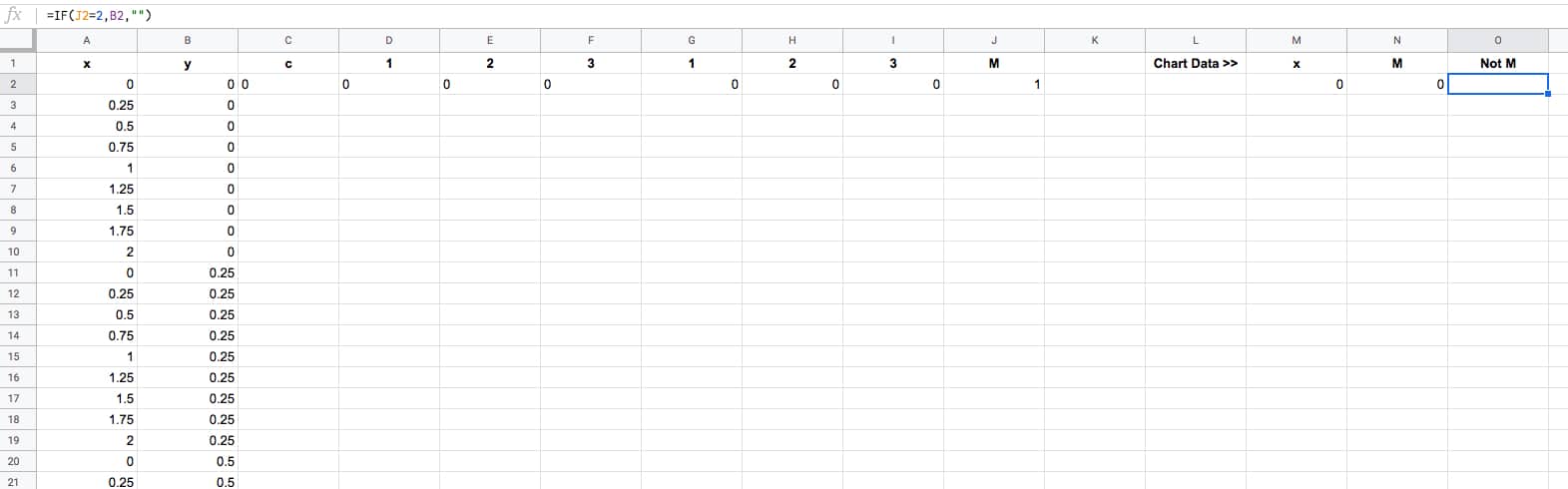
We create the algorithm steps in columns C through J.
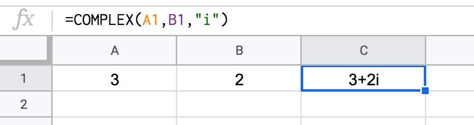
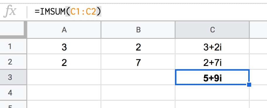
In cell C2, we create the complex number by combining the real and imaginary coefficients:
=COMPLEX(A2,B2)
Cell D2 contains the first iteration of the algorithm with z = 0, so the result is equal to C, the complex number in cell C2, hence:
=C2
The second iteration is in cell E2. The equation this time is z² + c, where z is the value in cell D2 and C is the value from C2:
=IMSUM(IMPOWER(D2,2),$C2)
It’s the same z² + c in F2, where z in this case is from E2 (the previous iteration):
=IMSUM(IMPOWER(E2,2),$C2)
Notice the “$” sign in front of the C in both formulas in columns E and F. This is to lock our formula back to the C value for our Mandelbrot equation.
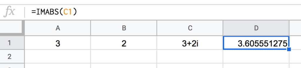
In cell G2:
=IMABS(D2)
Drag this formula across cells H2 and I2 also.
In cell J2, use the IFERROR function:
=IFERROR(IF(I2<=2,1,2),2)
Then leave a couple of blank columns, before putting the chart data in columns M, N and O, with the following formulas representing the x values and the two y series with different colors:
=A2
=IF(J2=1,B2,"")
=IF(J2=2,B2,"")
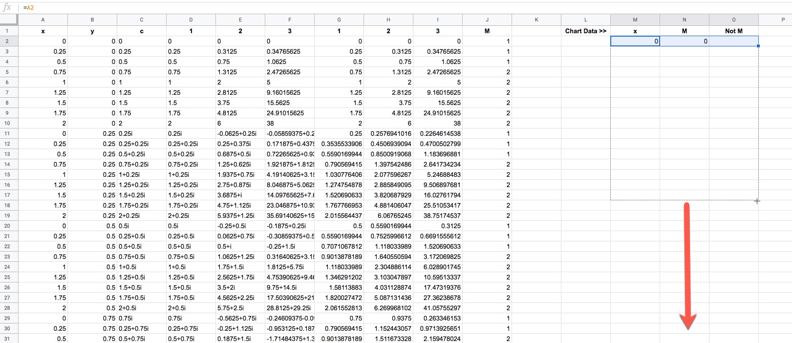
Thus, our dataset now looks like this (click to enlarge):
The final task is to drag that first row of formulas down to the bottom of the dataset, so that every row is filled in with the formulas (click to enlarge):
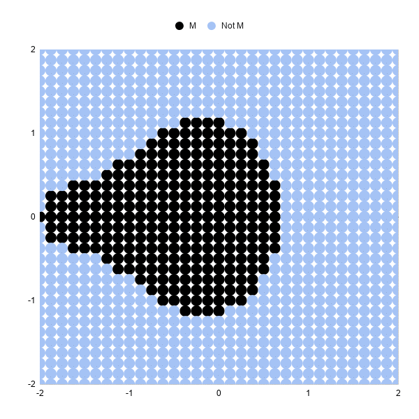
Ok, now we're ready to draw some pretty pictures!
Drawing The Mandelbrot Set In Google Sheets
Highlight columns M, N and O in your dataset.
Click Insert > Chart.
It'll open to a weird looking default Column Chart, so change that to a Scatter chart under Setup > Chart type.
Change the series colors if you want to make the Mandelbrot set black and the non-Mandelbrot set some other color. I chose light blue.
And finally, resize your chart into a square shape, using the black grab handles on the borders of the chart object.
Boom! There it is in all it's glory:
Note: you may need to manually set the min and max values of the horizontal and vertical axes to be -2 and 2 respectively in the Customize menu of the chart editor.
How To Draw A Better MandelBrot Set in Google Sheets
Generating Data Automatically
Generating those x-y coordinates manually is extremely tedious and not really practical beyond the simple example above.
Thankfully you can use the awesome SEQUENCE function, UNIQUE function, and Array Formulas in Google Sheets to help you out.
This formula will generate the x-y coordinates for a 33 by 33 grid, which gives a more filled-in image than the simple example above.
=ArrayFormula(UNIQUE({

MOD(SEQUENCE(289,1,0,1),17)/8,

ROUNDDOWN(SEQUENCE(289,1,0,1)/17)/8;

-MOD(SEQUENCE(289,1,0,1),17)/8,

ROUNDDOWN(SEQUENCE(289,1,0,1)/17)/8;

MOD(SEQUENCE(289,1,0,1),17)/8,

-ROUNDDOWN(SEQUENCE(289,1,0,1)/17)/8;

-MOD(SEQUENCE(289,1,0,1),17)/8,

-ROUNDDOWN(SEQUENCE(289,1,0,1)/17)/8

}))
Then drag the other formulas down your rows to complete the dataset as we did above.
Then you can highlight columns M, N, and O to draw your chart again.
Note: you may need to manually set the min and max values of the horizontal and vertical axes to be -2 and 2 respectively in the Customize menu of the chart editor.
With three iterations, the chart looks like:
Increasing The Iterations
Let's look at 5 iterations and 10 iterations, and you'll see how much detail this adds.
To move from 3 iterations to 5, we need to add some columns to our Sheet and repeat the algorithm two more times.
So, insert two blank columns between F and G. Label the headings 4 and 5.
Drag the formula in F2 across the new blank columns G and H (this is the z² + c equation as a Google Sheet formula):
In G2:
=IMSUM(IMPOWER(F2,2),$C2)
In H2:
=IMSUM(IMPOWER(G2,2),$C2)
We need to add the corresponding size calculation columns. Between K and L, insert two new blank columns and drag the IMABS formula across.
Now in L2:
=IMABS(G2)
And in M2:
=IMABS(H2)
Finally, update the IF formula to ensure it's testing the value in column M now:
=IFERROR(IF(M2<=2,1,2),2)
And that's it!
Our chart should update and look like this:
You can see the shape of the Mandelbrot set much more clearly now.
Increasing from 5 iterations to 10 iterations is exactly the same. Add 5 blank columns and populate with the formulas again.
The resulting 10 iteration chart is better again:

Increasing The Number Of Data Points
Increasing the number of points to 6,561 in an 81 by 81 grid will give a more "complete" picture than the examples above.
This sequence formula will generate these datapoints:
=ArrayFormula(UNIQUE({

MOD(SEQUENCE(1681,1,0,1),41)/20,

ROUNDDOWN(SEQUENCE(1681,1,0,1)/41)/20;

-MOD(SEQUENCE(1681,1,0,1),41)/20,

ROUNDDOWN(SEQUENCE(1681,1,0,1)/41)/20;

MOD(SEQUENCE(1681,1,0,1),41)/20,

-ROUNDDOWN(SEQUENCE(1681,1,0,1)/41)/20;

-MOD(SEQUENCE(1681,1,0,1),41)/20,

-ROUNDDOWN(SEQUENCE(1681,1,0,1)/41)/20

}))
Be warned, as you increase the number of formulas in your Sheet and the number of points to plot in your scatter chart, your Sheet will start to slow down!
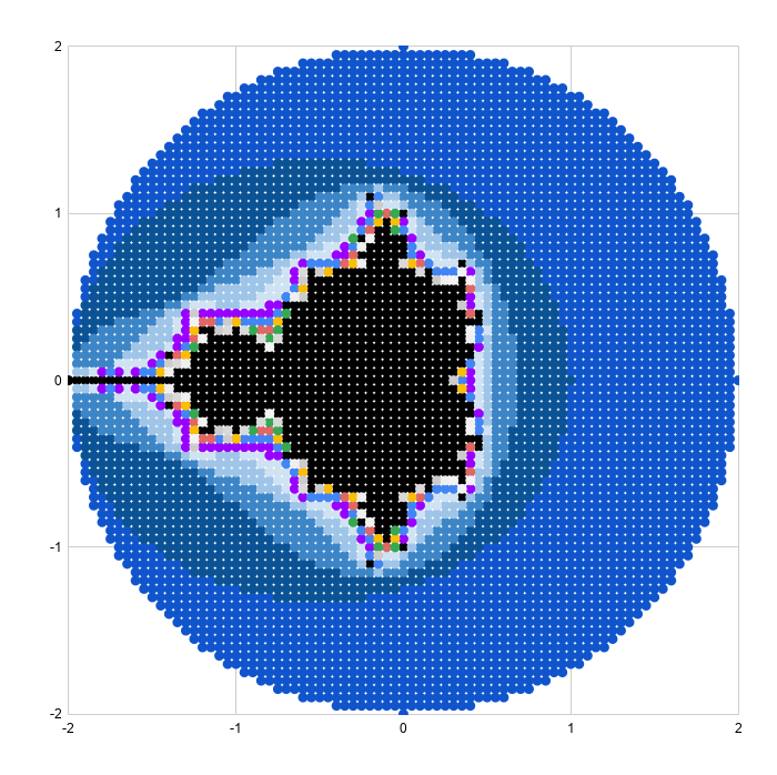
Adding Color Bands
We can add color bands to show which iteration a given point "escaped" towards infinity.
For example, all of the points that are larger than our threshold on iteration 5 get a different color than those that are less than the threshold at iteration 5, but become larger on iteration 6.
The formulas for the iterations and size are the same as the examples above.
Then I determine if the point is still in the Mandelbrot set:
=IF(ISERROR(AG2),"No",IF(AG2<=2,"Yes","No"))
And then what iteration it "escapes" to infinity, or beyond the threshold of 2 in this example:
=IF(AH2="Yes",0,MATCH(2,S2:AG2,1))
These formulas are shown in the Google Sheets template:
Next, we create the series for the chart:
First, the Mandelbrot set:
=IF(AH2="Yes",B2,"")
Then series 1 to 15:
=IF($AI2=AK$1,$B2,"")
The range for the scatter plot is then:
A1:A6562,AJ1:AY6562
where column A is the x-axis values and columns AJ to AY are the y-axis series.
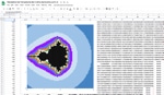
Drawing the scatter plot and adjusting the series colors results in a pretty picture (this is an 81 by 81 grid):
Reaching Google Sheets Practical Limit
As a final exercise, I increased the plot size to 40,401 representing a grid of 201 by 201 points. This really slowed the sheet down and took about half an hour to render the scatter plot, so not something I'd recommend.
The picture is very pretty though!
The 40,401 x-y coordinates can be generated with this array formula:
=ArrayFormula(UNIQUE({

MOD(SEQUENCE(10201,1,0,1),101)/50,

ROUNDDOWN(SEQUENCE(10201,1,0,1)/101)/50;

-MOD(SEQUENCE(10201,1,0,1),101)/50,

ROUNDDOWN(SEQUENCE(10201,1,0,1)/101)/50;

MOD(SEQUENCE(10201,1,0,1),101)/50,

-ROUNDDOWN(SEQUENCE(10201,1,0,1)/101)/50;

-MOD(SEQUENCE(10201,1,0,1),101)/50,

-ROUNDDOWN(SEQUENCE(10201,1,0,1)/101)/50

}))
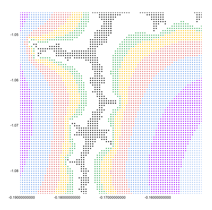
Zooming In On The Mandelbrot Set
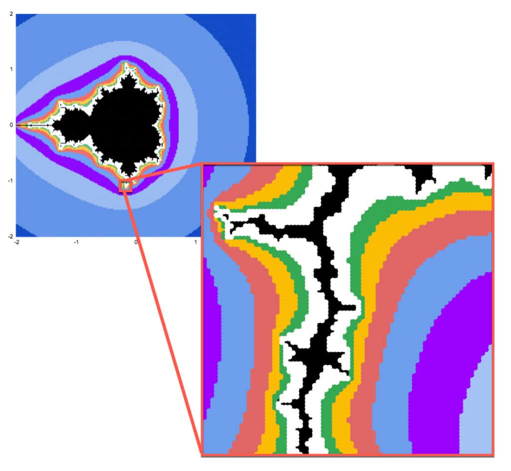
Mandelbrot sets have the property of self-similarity.
That is, we can zoom in on any section of the chart and see the same fractal geometry playing out on infinitely smaller scales. This is but one of the astonishing properties of the Mandelbrot set.
Google Sheets is definitely not the best tool for exploring the Mandelbrot set at increasing resolution. It's too slow to render graphically and too manual to make the changes to the formulas and axis bounds.
However, as the maxim says: the best tool is the one you have to hand.
So, if you want to explore in Google Sheets it is possible:
Generating Zoomed Data
I'm going to zoom in on the point: -0.17033700000, -1.06506000000
(Thanks to this article, The Mandelbrot at a Glance by Paul Bourke, which highlighted some interesting points to explore.)
Starting with this formula in cell A2 to generate the 6,561 data points (I wouldn't recommend going above this because it becomes too slow):
=ArrayFormula(UNIQUE({

MOD(SEQUENCE(1681,1,0,1),41)/20,

ROUNDDOWN(SEQUENCE(1681,1,0,1)/41)/20;

-MOD(SEQUENCE(1681,1,0,1),41)/20,

ROUNDDOWN(SEQUENCE(1681,1,0,1)/41)/20;

MOD(SEQUENCE(1681,1,0,1),41)/20,

-ROUNDDOWN(SEQUENCE(1681,1,0,1)/41)/20;

-MOD(SEQUENCE(1681,1,0,1),41)/20,

-ROUNDDOWN(SEQUENCE(1681,1,0,1)/41)/20

}))
In columns C and D, I transformed this data by change the 0,0 center to -0.17033700000, -1.06506000000 and then adding the values from A and B to C and D respectively, divided by 100 to zoom in.
=C$2+A3/100
=D$2+B3/100
The rest of the process is identical.
I set the chart axes min and max values to match the min and max values in each of column C (x axis) and D (y axis).
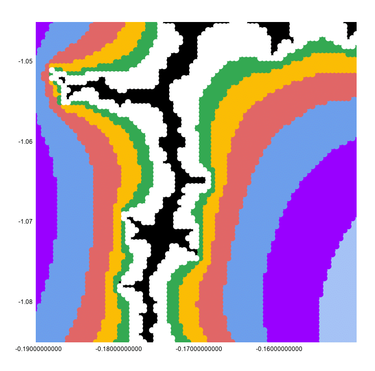
This looks continuous because the chart has a point size of 10px to make it look better.
If I reset that to 2px, you can see clearly that this is still a scatter plot:
I hope you enjoyed that exploration of the Mandelbrot set in Google Sheets! Let me know your thoughts in the comments below.
See Also
How To Draw The Cantor Set In Google Sheets
How To Draw The Sierpiński Triangle In Google Sheets
Exploring Population Growth And Chaos Theory With The Logistic Map, In Google Sheets