In this post, I want to show you something amazing: how a simple equation — the logistic map — can lead to incredible outcomes, and even to chaos.
And we’ll explore this with Google Sheets so you can follow along (please download the template at end of the post).
But first, we begin our story in a field far, far away, where two bunnies are getting down to, erm, business, shall we say, as they start a fluffle* of rabbits…
* collective noun for wild rabbits

Provided the growth rate is greater than one, the population grows until it becomes constrained by limited resources (for example, food). Then it settles into a stable population, neither increasing nor decreasing year on year.
But as the growth rate increases weird things start happening.
The rabbit population grows faster but it doesn’t settle down to a single equilibrium (stable population) anymore. No. In fact, the population oscillates between two equilibrium values. One year high, one year low, then back to the high value again, then low, and so on, to infinity.
Keep increasing the growth rate, however, and suddenly the population oscillates between four equilibriums. Then eight. Then sixteen.
And if it increases past the specific growth rate of 3.57, well all bets are off the table!
The population becomes chaotic and never settles into any equilibrium at all. It bounces around randomly, some years high, others low, others in the middle, with no pattern.
Except that’s not the end of the story.
Incredibly, within this region of chaotic behavior lie “islands of stability”. Short windows at specific growth rates where order re-establishes itself.
Out of the chaos, a periodic pattern emerges! 🤯
The Logistic Map
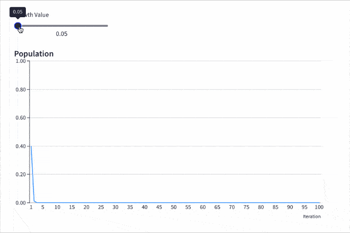
Here is the logistic map with a changing growth rate to illustrate how the population changes:
Contents:
- The Logistic Map Equation
- Comparing Populations At Different Growth Rates
- The Bifurcation Diagram
- How To Create The Logistic Map In Google Sheets
- How To Create An Interactive Population Model With Grid
- How To Create The Bifurcation Diagram
- Displaying The Logistic Map Equation In Google Sheets
- Logistic Map Template In Google Sheets
- Further Reading
The Logistic Map Equation
The logistic map is a simple, non-linear equation, written:
xn+1 = r xn ( 1 - xn )In words:
To calculate the new population, take the previous population, multiply it by the growth rate, and then multiply that by one minus the previous population.
Nothing too complex.
And yet the results are astonishing, as we’ll see in this post.
Comparing Populations At Different Growth Rates
Consider this chart showing how a population changes as the growth rate increases from 0 to 4:
(It’s the same interactive chart I shared above. You’ll learn how to build it yourself, with a tool called Grid, further down this post.)
Let’s dive deeper into the different phases and inflection points of the logistic map:
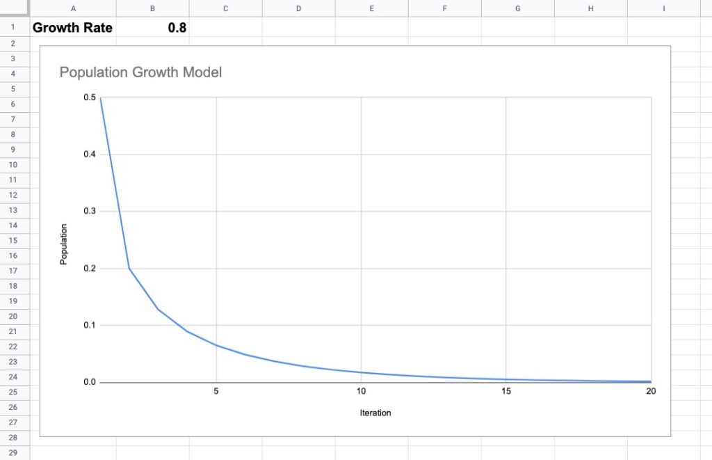
Extinction: Growth Rate Less Than 1
With a growth rate of less than 1, the population will go extinct, regardless of what the initial value is.
For example, the following chart shows a growth rate of 0.8 and a starting population of 0.5 (or 50% of the theoretical maximum population). After about 18 iterations, the curve meets the x-axis and the population drops to 0.
In other words, the population goes extinct.
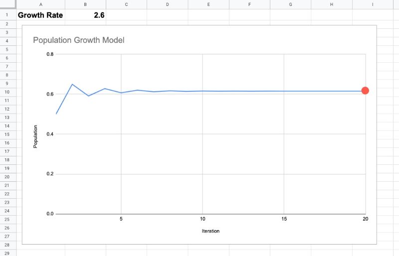
Equilibrium: Growth Rate Between 1 And 3
Once the growth rate passes 1, the population will survive and reach an equilibrium population, which is a stable population count that does not increase or decrease with future iterations. It simply exists ad infinitum at that value (provided other variables don’t change).
As the rate increases, the equilibrium value increases.
For example, this chart shows a growth rate of 2.6 with an initial population of 0.5. After 10 iterations, the population has settled into a steady state, at a value of 0.61.
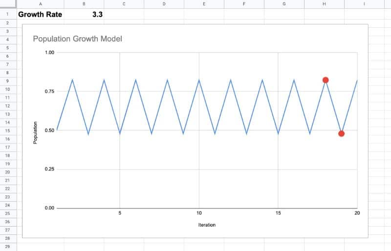
Osciallating Between Equilibriums: Growth Rate Greater Than 3
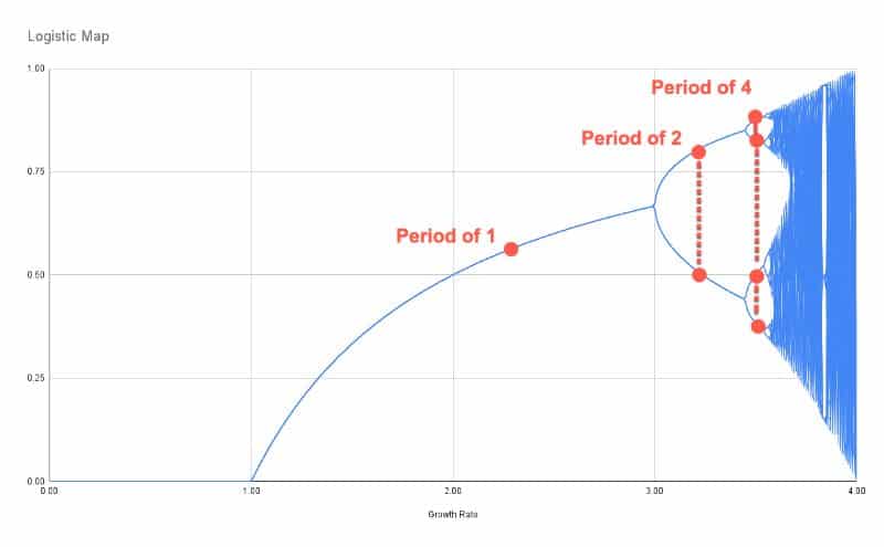
The fun begins as the growth rate passes 3.
The steady-state single equilibrium suddenly splits into two equilibriums and the population oscillates between these two values.
On one iteration the population might be at a lower equilibrium value. Then on the next iteration, the population jumps to a higher equilibrium value. Then it drops again, jumps again, drops again, and so on, forever bouncing between these two values.
This is clearly seen in the following chart with a growth rate of 3.3:
As the growth rate increases, the periodicity doubles, first to four, shown in this chart with a growth rate of 3.5:
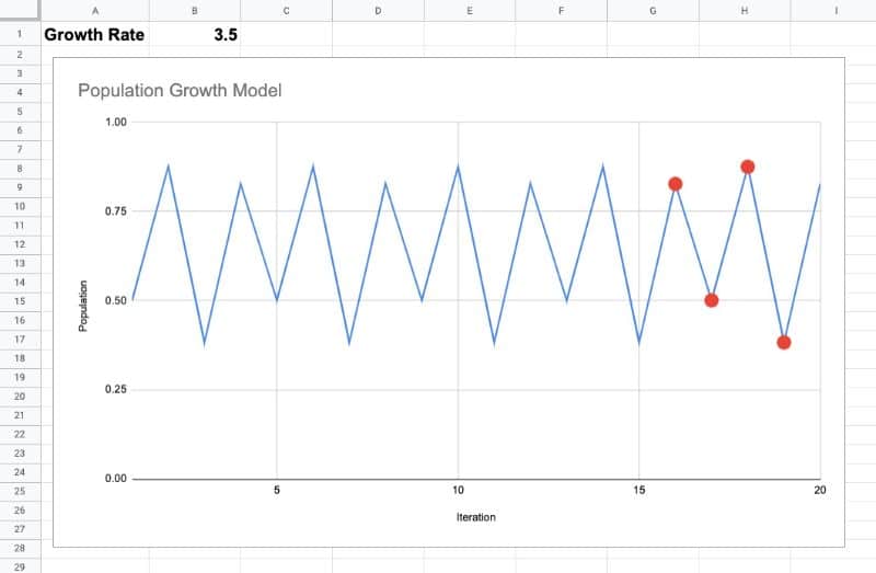
Then it doubles again to 8, again to 16, 32, 64, etc. These are known as period-doubling bifurcations.
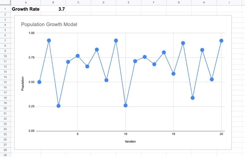
Chaos! Growth Rate At 3.57 And Beyond
The crazy stuff happens at 3.57 and beyond.
Here the population never settles to an equilibrium value. It jumps around in a seemingly random fashion, as can be seen clearly in this chart, where the growth rate is 3.7:
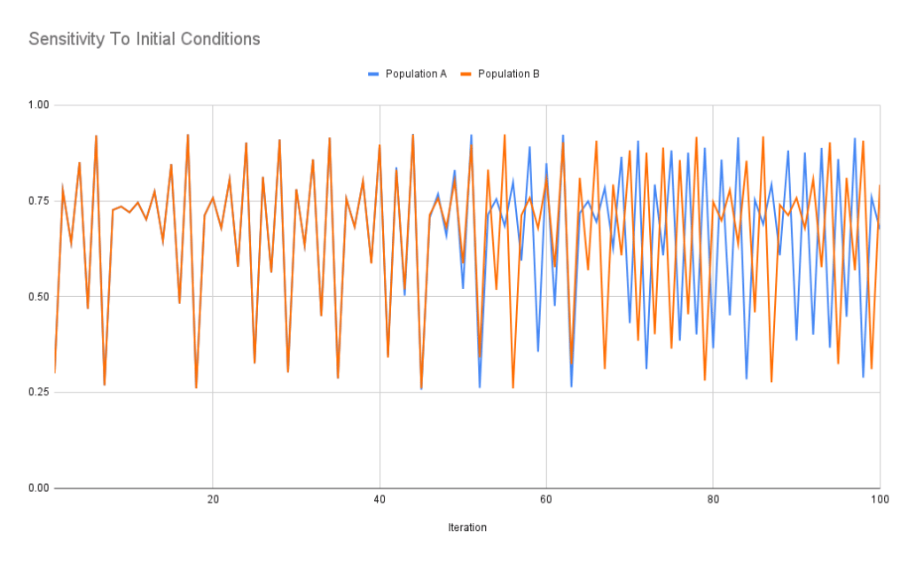
Additionally, the population is highly sensitive to the initial conditions.
Let’s model two populations and set the same growth rate for both, 3.7.
For population A, we’ll use a starting population of 0.3.
And then for population B, we’ll start it at 0.300000001, just a fraction bigger.
No big deal, right?
Wrong!
Take a look at this chart, showing the first 100 iterations of the logistic map for populations A (blue) and B (orange):
Wow!
Their behavior is markedly different from about iteration 50 onwards. That tiny difference in the starting population has led to wildly different outcomes.
This sensitive dependence on initial conditions is also known as the butterfly effect, the idea that a butterfly flapping its wings in the Amazon jungle leads to a tornado in Texas.
Islands of Stability
Despite chaos being the dominant state beyond 3.57, there are islands of stability, where regular periodicity miraculously emerges.
For example at a growth rate of around 3.83, the population settles into a steady state with period of 3:
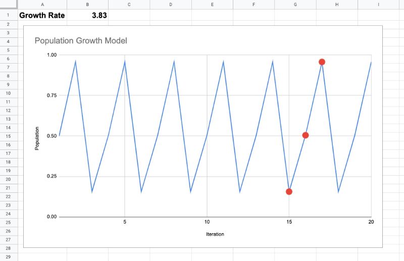
This means that if we hold the growth rate at 3.83, the population will oscillate between these three values forever, never descending into chaos.
However, as we increase the growth rate again, chaos re-emerges.
Upper Bound
When the growth rate exceeds 4, almost all initial values diverge outside the possible population set [0,1]. In practice, this means the population goes extinct again.
Feel free to explore this in the Google Sheet template below.
The Bifurcation Diagram: Equilibrium Population Versus Growth Rate
The picture of what’s happening becomes clearer when we plot these equilibrium values against growth rates.
In this case, let’s plot the growth rate along the x-axis and the outcomes (after a reasonable number of iterations, say 1,000) along the y-axis.
The resulting chart is called a bifurcation diagram and looks like this:
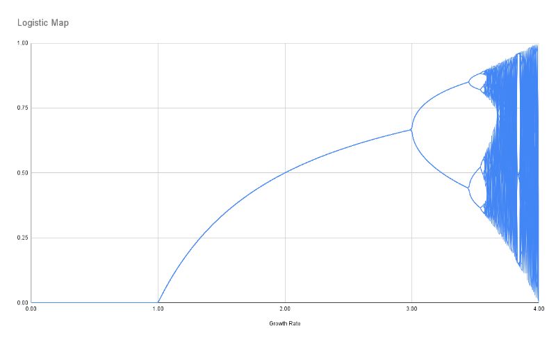
For a given growth rate (e.g. 2) we plot the outcome value, or values, on the y-axis (e.g. 0.5).
Let me highlight the regions based on the growth rates we explored above:
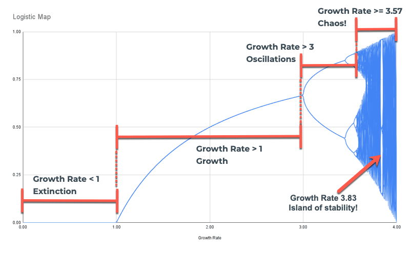
You can see the region of extinction, growth with a single equilibrium, growth with multiple equilibriums, and the region of chaos.
In the region of chaos, the line looks almost solid because for a given growth rate (e.g. 3.7) the population bounces around at many different values. Remember, it never settles. Instead, we have to plot all these different population values for a single growth rate, which gives it this “solid” appearance.
It’s also useful to point out the period-doubling bifurcations seen clearly in this image:
Ok, let’s get our hands dirty with some data in Google Sheets and explore the logistic map.
How To Create The Logistic Map In Google Sheets
Firstly, let’s create a single logistic map model.
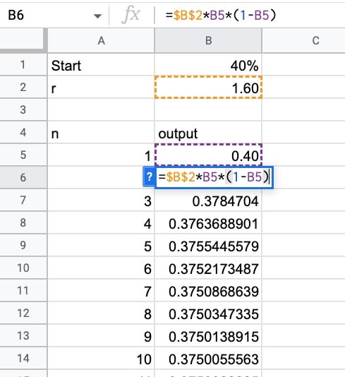
Begin by adding the assumptions in the first two rows: an initial population (a number between 0 and 1) and an initial growth rate (a number between 0 and 4).
Then, in row 4, add a header row: “n” and “output”
In cell A5, add this SEQUENCE formula to generate the iteration number (the “n” value):
=SEQUENCE(1000)Next to this, in B5, add this simple formula which simply takes the initial value:
=B1Underneath this, add the logistic map equation in cell B6:
=$B$2*B5*(1-B5)Notice the $ signs around the B2 reference, which creates an absolute reference and ensures that as we drag the formula down the column, it continues to point to the correct growth rate in cell B2.
Drag the formula down the whole column.
To create a chart, highlight these two columns of data and create a line chart.
You can now alter the initial assumptions to see the population growth change, especially around the inflection points highlighted earlier in this post.
To turn the chart into an interactive web chart, I used a tool called Grid:
How To Create An Interactive Population Model With Grid
Grid.is is a fantastic tool that turns your Google Sheets into interactive documents so that your colleagues can easily understand and interpret your data.
I used it to create the embedded interactive chart at the top of this post.
Step 1:
Create an account with Grid and then create a new blank document.
Step 2:
Click on the “Add spreadsheet” button in the bottom right corner and connect to your Google Sheet containing the simple logistic map model that we created in the section above.
Once you’ve connected your Sheet, click on the “Data” button in the bottom right corner. You should see your Sheet, now loaded into the Grid spreadsheet engine.
Step 3:
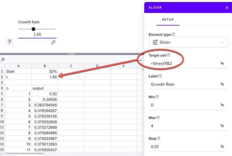
In the main editing window, click the Plus and add a slider element.
Set the slider target cell to be the growth rate cell in your spreadsheet, B2.
Label it as “Growth Rate”, set the min to 0, the max to 4, and set the step to 0.01.
Step 4:
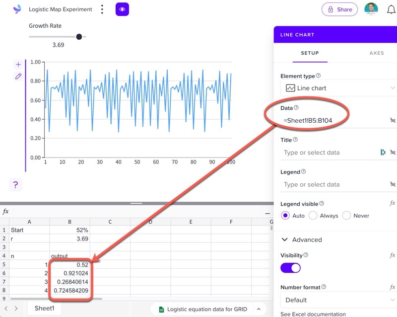
Add a line chart.
Set the Data to the range
=Sheet1!B5:B104Go to Axes > Y-axis and set the min to 0 and the max to 1.
Voila! Feel free to explore the logistic map dynamically with the slider!
How To Create The Bifurcation Diagram
For the bifurcation diagram — the chart plotting the equilibrium against the growth rate — we require more data, much more data.
We want to show the outcomes for each growth rate simultaneously.
So we run the model under different growth rate assumptions, 0.01, 0.02, 0.03, 0.04, etc., and then plot the resulting data.
As before, add the initial value assumption on row 1 and the iterations in column A, using the SEQUENCE formula above.
Then, generate the growth rates as column headings in row 3, using this array formula:
=ArrayFormula((SEQUENCE(1,401,0,1)/100))This creates 401 column headings (you will have to add enough columns otherwise the formula will show an error), in increments of 0.01.
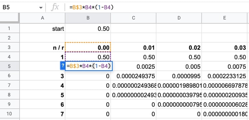
Next, bring in the initial value to row 4, as the value for the first iteration for every growth rate:
=$B$1Then create the logistic map equation, where the growth rate is referenced as the header of this column (note the single $ sign before the 3 to lock the reference to row 3, but not the column):
=B$3*B4*(1-B4)Copy this formula to the bottom of column B, and then copy it across all the other columns. This may take Google Sheets a while to compute.
The data looks like this:
Now, remember we want to plot the outcome values so we don’t need to plot all the iterations. We can simply use a reasonable number of rows at the end, since the equilibrium will have been reached, if at all, for the majority of growth rates. I chose the final 40 rows, which was enough data for the chart without overwhelming the chart tool.
Let’s also transpose the data so it’s in the correct orientation for the chart tool.
In a new Sheet, add this transpose formula to cell A2:
=TRANSPOSE(Data!B3:OL3)Then use the QUERY function to bring in the last 40 rows of data, i.e. iterations 960 to 1000, and wrap it with TRANSPOSE again. Put this formula in cell B1:
=TRANSPOSE(QUERY(Data!A4:OL1003,"select * offset 960",0))Great, that’s the data ready. Now we can plot the chart.
Highlight all the data.
Create a line chart through the menu: Insert > Chart
To tidy up the chart, delete the legend and add a descriptive title “Logistic Map”.
Finally, go to Series under the Customize menu, make sure “Apply to all series” is selected, and then change the color to blue to change all the lines to a single blue color. It also looks better with the line thickness set to 1px.
Displaying The Logistic Map Equation In Google Sheets
For a final digestif, let’s see how to write the logistic map by making use of subscripts in Google Sheets:
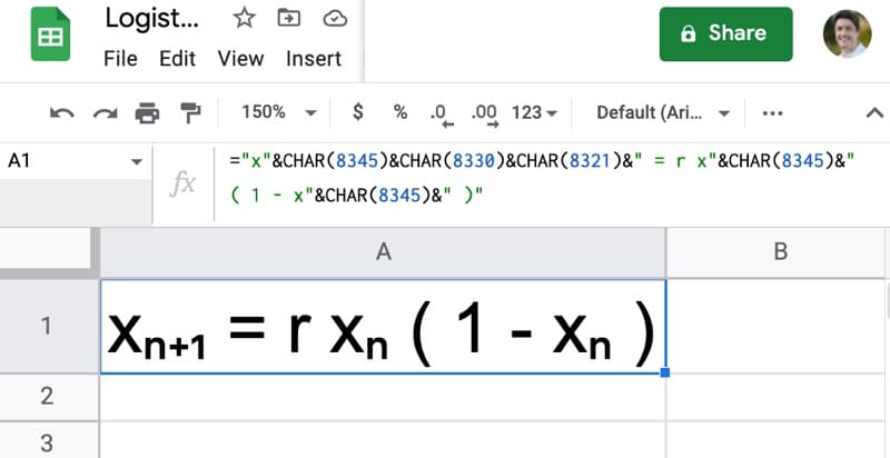
The formula to create this equation uses the CHAR function to create the subscripts:
="x"&CHAR(8345)&CHAR(8330)&CHAR(8321)&" = r x"&CHAR(8345)&" ( 1 - x"&CHAR(8345)&" )"Logistic Map Template In Google Sheets
Click here to open a view-only copy >>
Feel free to make a copy: File > Make a copy
If you can’t access the template, it might be because of your organization’s Google Workspace settings.
In this case, right-click the link to open it in an Incognito window to view it.
Further Reading
To learn more about the logistic map, I highly recommend this entertaining YouTube video from Veritasium.
For a more in-depth look at the mathematics of the logistic map, Wikipedia has you covered.
And finally, the book that started it all for me: Chaos by James Gleick
I first read it as an undergraduate mathematics student, and I’ve been fascinated ever since.
If you enjoyed this post, you might also enjoy my other explorations of fractal mathematics in Google Sheets: