Blog

Explorations with the Datatype Font in Google Sheets

The Datatype font turns text values into miniature charts. It’s like a magic trick that turns data values in your Sheet into sparklines, but without the complexity of the sparkline formula.

It’s been really fun to explore in Google Sheets.

How to add the Datatype font in Google Sheets

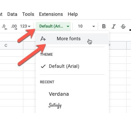
From the font selector in the toolbar, click “More fonts”, type in Datatype, and then select it:

add More Fonts Menu

Datatype Basic Syntax

Datatype converts text, called chart expressions, which are data values inside curly brackets {…}, into line, bar, or pie charts.

The syntax is:

  • an opening curly bracket,
  • a letter to denote the chart type (l, b, p),
  • a colon,
  • the comma-separated values,
  • finally a closing curly bracket.

For example:

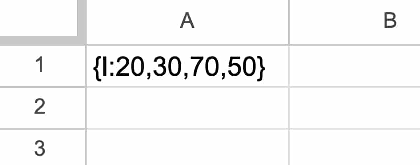
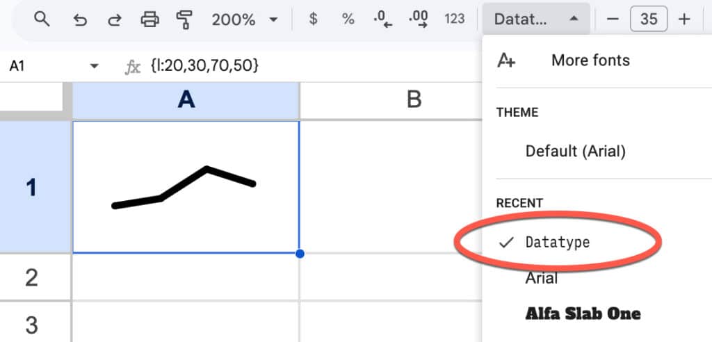
{l:20,30,70,50}

In a Google Sheet, it looks like this:

Then we apply the Datatype font to this cell from the toolbar:

Datatype font

Like magic, it turns into a mini chart! (Increase the font size to fill the cell.)

Datatype Options

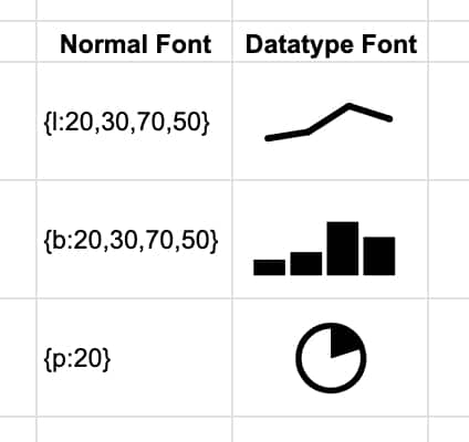
Datatype has line, bar, and pie charts available:

Datatype font chart expressions in Google Sheets

There are restrictions on each chart class, as follows:

  • Line charts: up to 20 datapoints, each with a value between 0-100
  • Bar charts: up to 20 bars, each with a value between 0-100
  • Pie charts: a single value between 0-100

Example Use Cases

Here are some example use cases, starting with the practical but ending with some esoteric, unhinged, and not at all useful examples!

1: Chart Inside Sentence

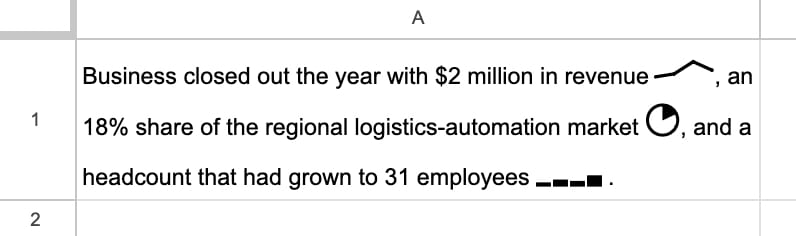
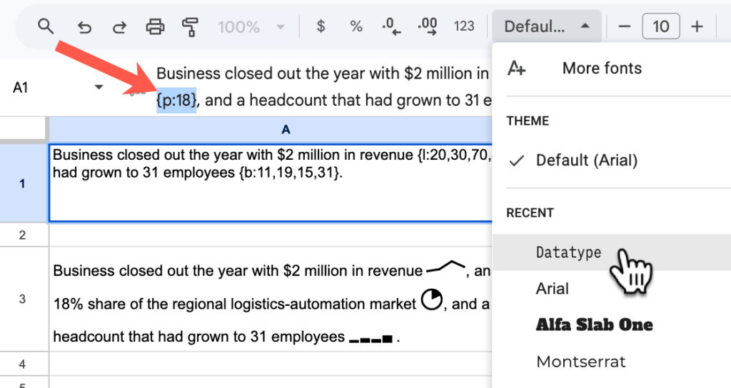
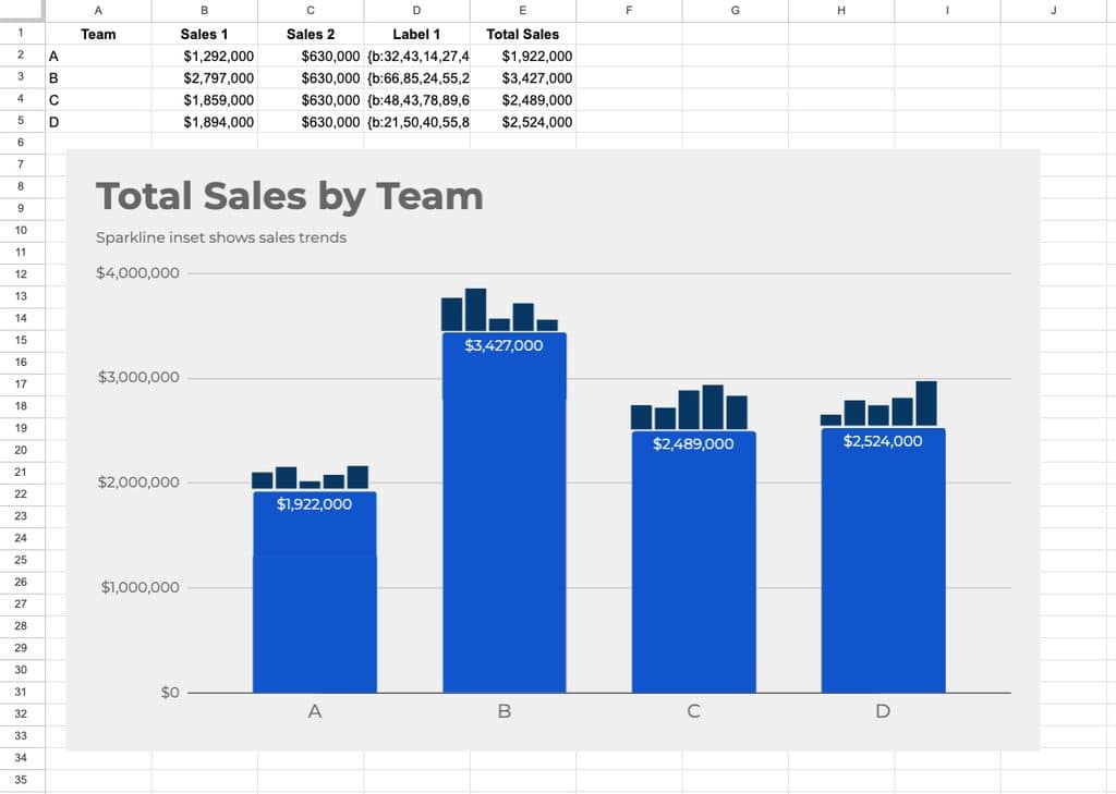
Since Google Sheets allows multiple fonts within a single cell, we can add miniature charts to sentences within our Google Sheets:

To achieve this, write out your sentence and include the chart expressions for the data you want to show, e.g. {p:18}. Then highlight that data and change the font to Datatype:

2: Formulas to Convert Values into Chart Expressions

It’s unlikely that you’ll have data already in the perfect format.

But thankfully, it’s easy to use a concatenation formula to combine the curly brackets, etc., with the data to get the correct chart expression format.

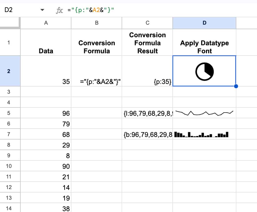
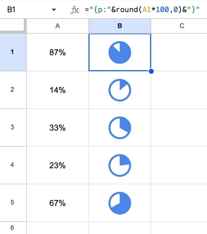
For example, to turn a value into a pie chart expression, we use this formula:

=”{p:”&A1&”}”

And to convert a set of values into the correct line or bar chart expression, we use this formula:

=”{l:”&JOIN(“,”,A5:A24)&”}”

or

=”{b:”&JOIN(“,”,A5:A24)&”}”

where the range of 20 values is in A5:A24.

It looks like this in our Sheet:

3: Pie Charts with Percentages

If you have true percentage figures, then you need to multiply them by 100 to get them into the correct formats for the chart expression.

Here’s an example in our sheet:

Note how I’ve applied a blue color to the font and it changes the color of the Datatype charts.

This approach using the Datatype font is much, much simpler than the previous way of implementing this using formulas and images.

You can also make these font charts bold or italic or even rotate the text, the same as you would with any other font.

And if you were planning to use these formulas often, you could set up a named formula to make your life easier.

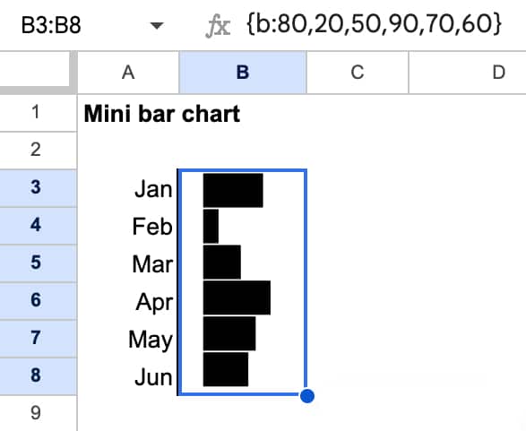
4: Bar Charts

The data type font bar charts are actually column charts, but we can easily create bar charts where the bars are horizontal by rotating the text 90 degrees.

Here’s an example:

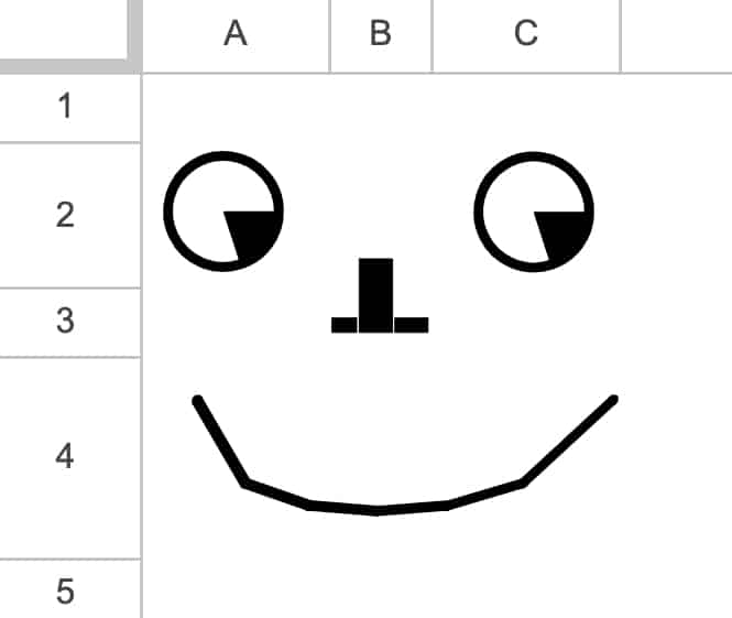
5: Pictures

Possible? Yes.

Useful? No.

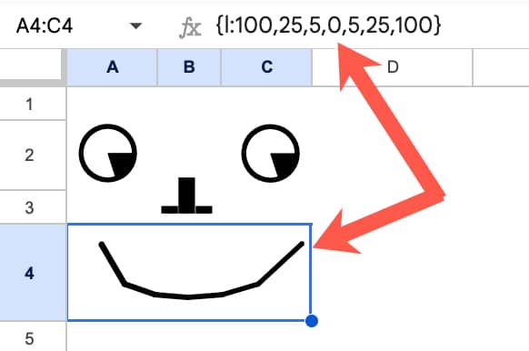
But it’s possible to draw silly things using only data with the datatype font applied, for example:

Under the hood, this is all values:

6: Animation

This is similar to some of the other crazy things I’ve built in Google Sheets, such as the Sparkline Formula Clock, the Etch-a-Sketch, and the Join-the-Dots.

Again, not necessarily useful, but an interesting concept to follow, for no other reason than to see what’s possible.

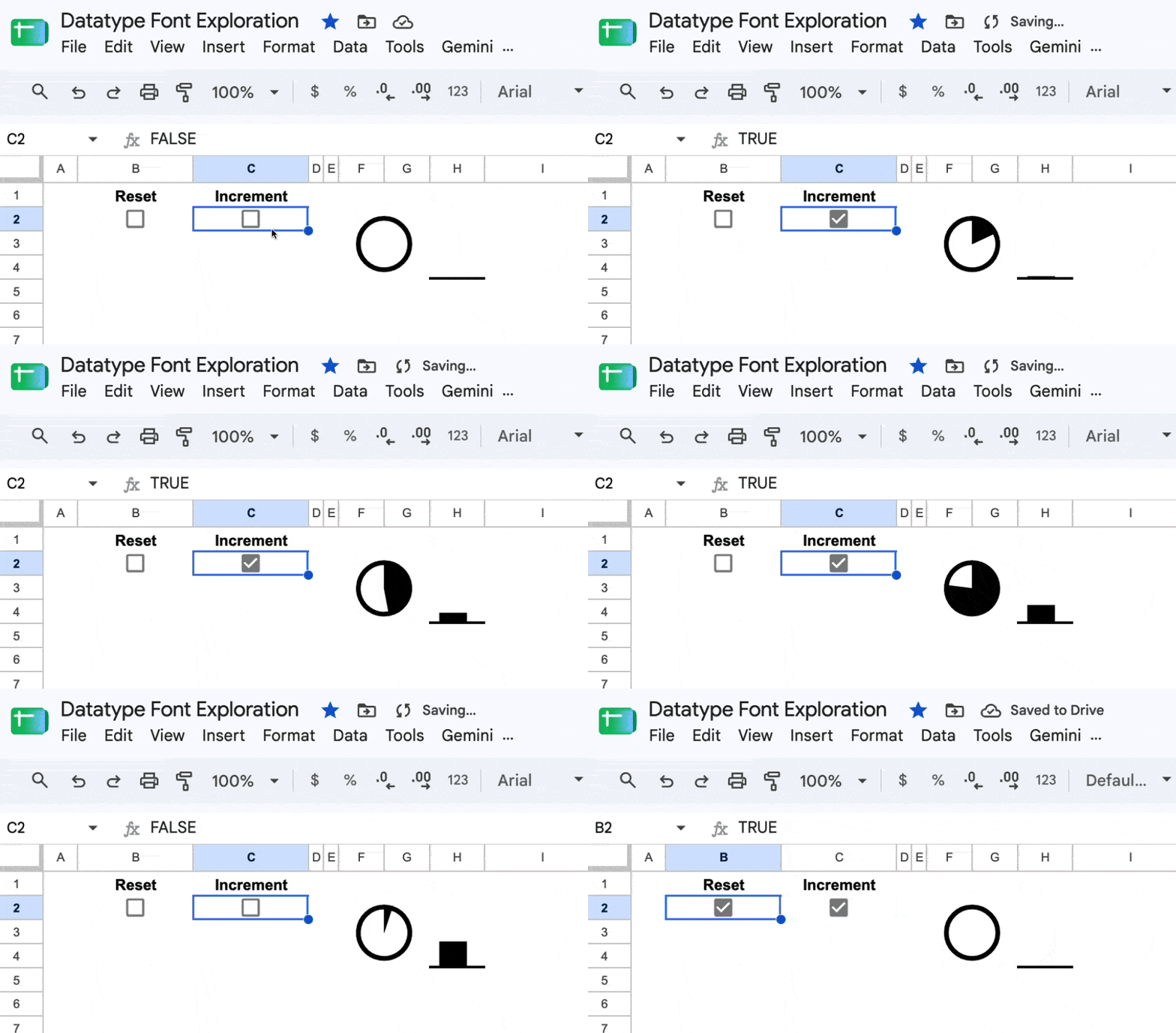
It’s based on the fact that Sheets calculates cells from top to bottom and left to right. For a fraction of a second, two cells with the same formula can have different values because one has updated but the other hasn’t. You can use this fact to create a counter. More background on this technique here.

By the way, you can toggle a checkbox very quickly on and off by holding down the spacebar.

Template

🔗 Click here to open a view-only copy >>

Feel free to make a copy by clicking on the “Use Template” button.

If you can’t access the template, it might be because of your organization’s Google Workspace settings.

In this case, right-click the link to open it in an Incognito window to view it.

Build Dashboards and Kanban Boards with the Google Sheets Canvas Tool

With the new Sheets Canvas feature, we can build professional-looking interactive dashboards directly in our Google Sheets, using nothing more than natural language prompts. It’s a huge upgrade from how we used to build dashboards in Sheets.

Sheets Canvas to build a professional dashboard

Previously, we clumped together charts and used formatting tricks such as borders and background cell colors to try and recreate a professional look. It was all rather challenging and time-consuming, with limited interactive options. (Read this post to see what I mean.)

Alternatively, we might have connected Google Sheets to a third-party tool, but these incurred extra costs, introduced security risks, and were often still pretty janky.

In this post, we are going to take a look at this new Sheets Canvas feature.

Sheets Canvas Availability

At the time of writing (August 2026), the Sheets canvas feature is only available to Google Workspace customers on Business or Enterprise Standard and Plus plans, or AI Pro for Education add-on subscribers, or to consumers on Google AI Pro and Ultra plans.

How To Build A Dashboard with Sheets Canvas

Firstly, you need to have your data ready to go in a Google Sheet, preferably in a Tables format, which is best for Gemini.

Secondly, it pays to think about your dashboard design before you start building it.

That way, you won’t end up building something that isn’t useful. Instead, you plan what information will be shown on the dashboard and how it will work, which will result in a more successful outcome.

For example, ask yourself these questions:

  • What are the key metrics to show?
  • Who is the intended audience for this dashboard?
  • How technically literate are they? Will they understand how to read complex charts?
  • How familiar are they with this data and its background context?

With your data and design plan to hand, you’re ready to start creating a Sheets Canvas.

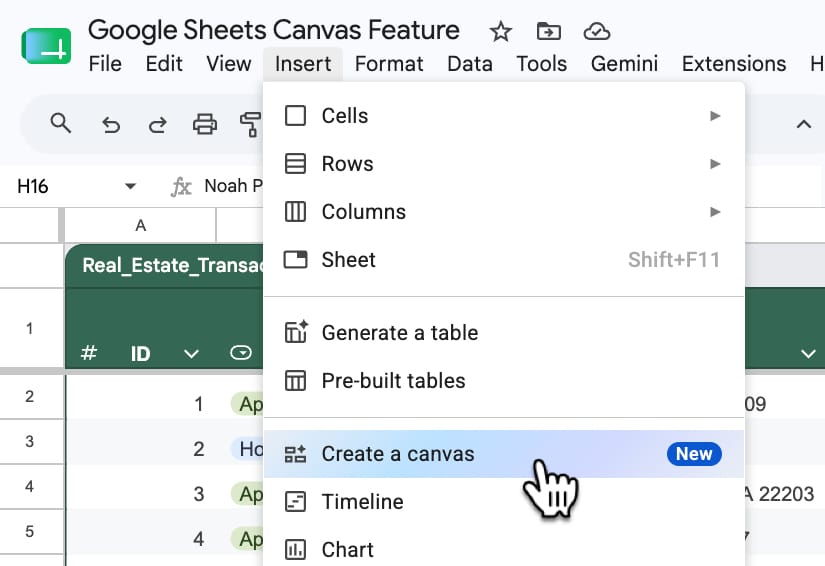
There are three entry points:

  1. From the toolbar: Insert > Canvas
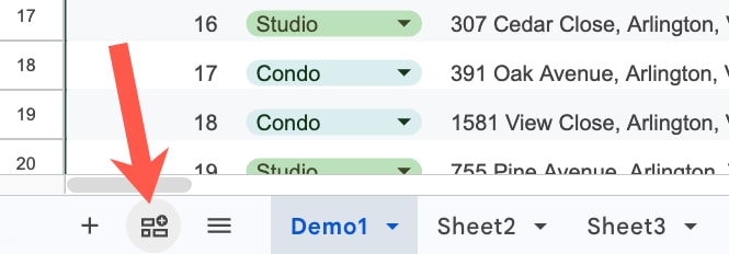
  2. Using the “Create a canvas” button in the bottom left of your Sheet, next to the Sheet names.
    (Both 1 and 2 open the Gemini sidebar with the Canvas option pre-selected.)
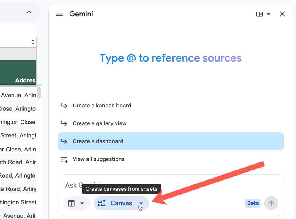
  3. You can select “Create canvas” directly in the Gemini sidebar too.

1. Insert menu:

Toolbar menu to insert a Sheets Canvas

2. Create a canvas button:

Insert button for Canvas feature in Google Sheets

3. Create canvas in Gemini Sidebar:

Canvas feature in Gemini sidebar of Google Sheet

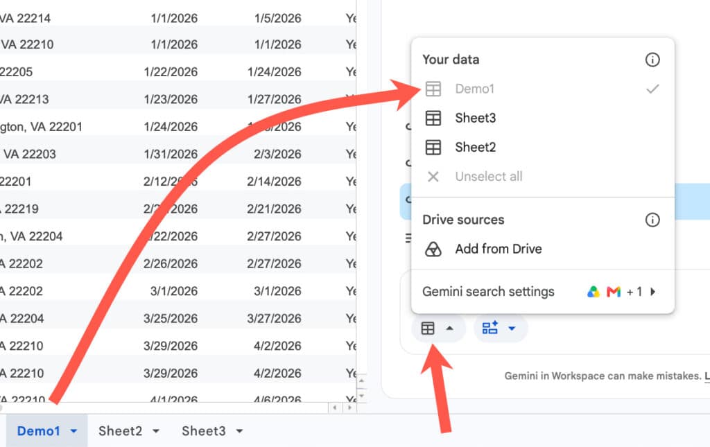
With Gemini sidebar open and the canvas feature selected, make sure you select the correct dataset(s) for the dashboard.

Use the button next to the Canvas option and choose the sheet containing your data. If you already have that sheet open, then it will automatically be selected, and you can deselect the other sheets if you don’t need them.

Select data in Sheets Canvas

Now you’re ready to insert your prompt.

Example 1: Real Estate Dashboard

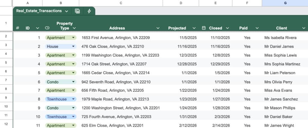
Consider this dataset of real estate transactions:

Real Estate data in Google Sheets

Here’s an example prompt to build a dashboard for this data:

Build a comprehensive real estate transaction dashboard to track performance, commissions, and lead generation. Include the following elements:

1. Key Performance Indicators (KPIs): Calculate the total sum of Sales Price, Commission Income, Agent Commission, and Net Profit for Tax for all “Closed” and “Paid” deals.

2. Agent Performance: Create a summary table or chart showing the total Commission Income and Net Profit generated by each Agent.

3. Lead Source Analysis: Create a bar chart breaking down total Sales Price and total number of transactions by Lead Source to see which marketing channels are most effective.

4. Buyer vs. Seller Split: Create a visual breakdown comparing the number of transactions and total Commission Income based on the Deal Side (Buyer vs. Seller).

5. Deal Pipeline: Provide a quick count of transactions categorized by Deal Status to show how many deals are currently pending versus closed.

Please format this with a clean, professional layout, using bold headers for each section and placing the charts logically next to the summary tables. 

Use hex color #0F9E59 as the primary color and #9E0F9C as the secondary color.

Pro Tip: Save your best dashboard prompts in a prompt library for future reuse.

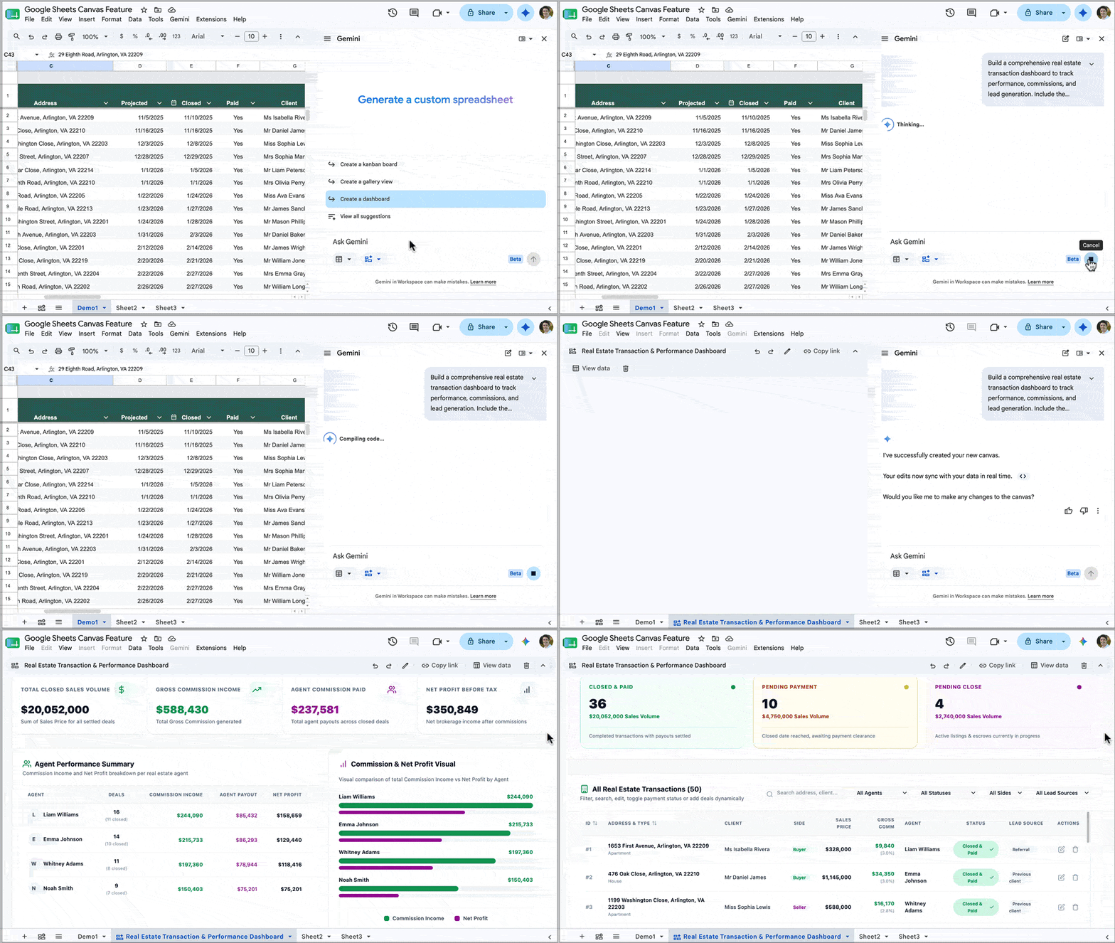
Typically, Gemini takes a few minutes to build the dashboard, depending on how complex your prompt is.

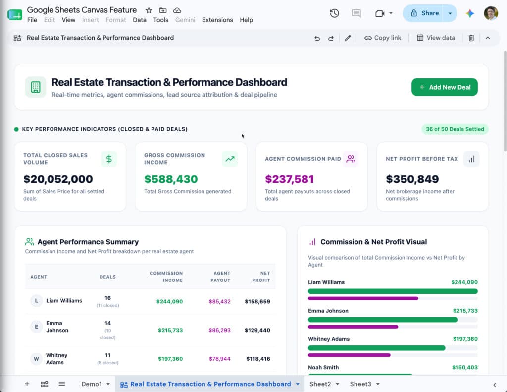
The output for the real estate data example looks like this:

A real estate dashboard built using Google Sheets Canvas

Notice how the colors match the colors mentioned in the prompt (#0F9E59 as the primary color and #9E0F9C as the secondary color).

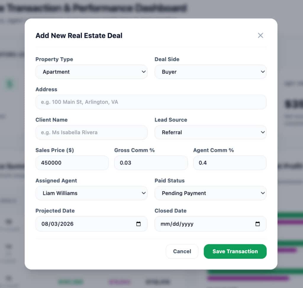
Also, notice the “Add New Deal” button in the top right corner. When you click this, it opens a pop-up with a form to add new deals:

Add new data button in Sheets Canvas

This data is inserted directly into your original data table in Google Sheets. It’s a great way for users to add new data without leaving the dashboard view, and it saves users from needing to navigate the data in the spreadsheet itself.

At the the top of the canvas is a small edit bar for making changes, sharing, or deleting the canvas:

To use the “Copy link” button to share the canvas, you need to first grant file access (through the regular “Share” button in the top right of your Google Sheet) to anyone you want to share the canvas with.

Example 2: Kanban Board

The Sheets canvas tool is not limited to regular dashboards, though.

It can also build interactive Kanban boards, which is my favorite use case and a killer feature.

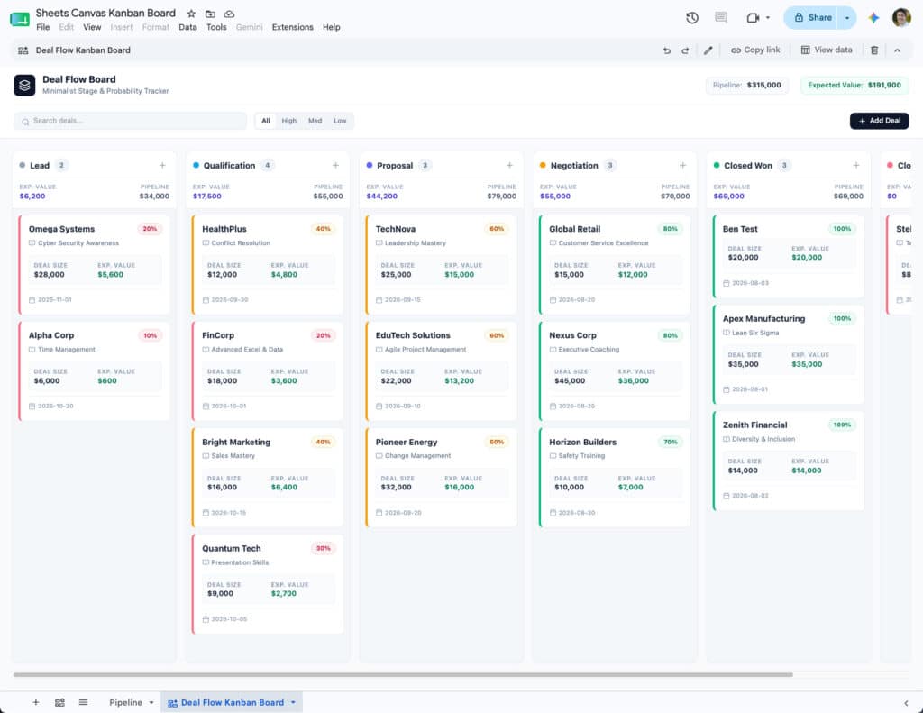
Build a Kanban board in Google Sheets with the Canvas feature.

Kanban boards are visual project management tools that organize tasks into columns and allow you to drag and drop cards between these columns.

Previously, this sort of interactivity was impossible inside of Google Sheets, but now with this new Sheets Canvas feature, you can build a fully featured Kanban board with a single prompt.

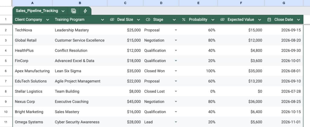
For example, here is a client pipeline data set for training contracts:

Sales Data Pipeline in Google Sheets

And here’s an example prompt to generate a Kanban board from this data:

Please generate a Kanban board layout with the following specifications:

1. Structure: Group the data using the “Stage” column.

2. Card Details: Under each Stage header, create individual “cards” or grouped cells for each transaction. Each card should display the most critical information at a glance:

  • Company & Client Name
  • Deal Size & Expected Value

3. Formatting:

  • Please apply conditional formatting or color-coding to the cards based on the “Probability” column (e.g., green for high probability, yellow for medium, red/gray for low) so I can easily identify which deals are most likely to close.
  • Ensure the layout is clean and minimalist.

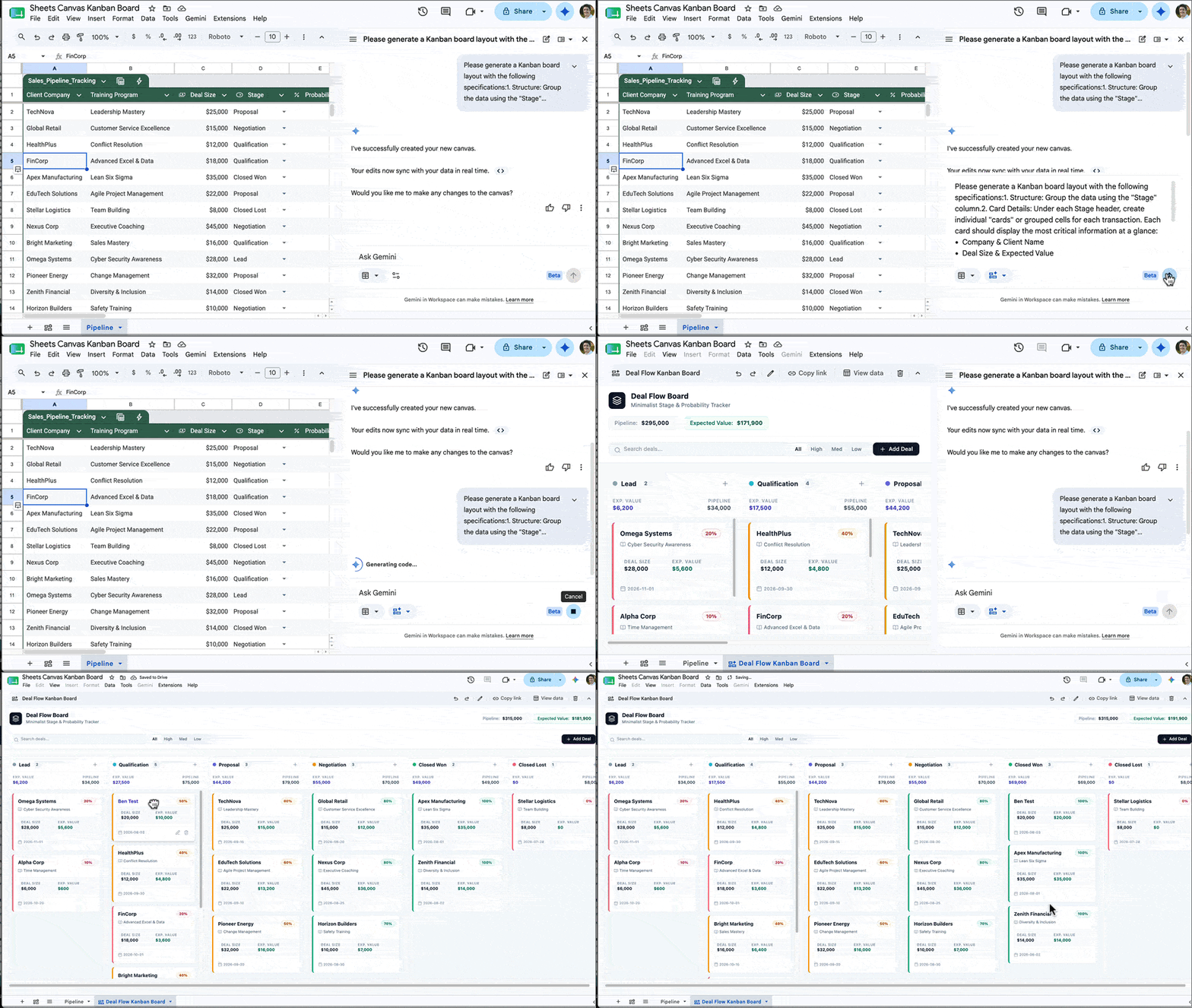
The output from this prompt looks something like this:

Kanban Board in Sheets Canvas

You can then drag these cards into different columns as needed to show progress. When you drag a card into a new column, the data in the underlying sheet also updates to reflect that, so they are always synced in real time.

And as with the dashboard from earlier, there is also a button to add new data from the Kanban canvas rather than having to go back to the actual spreadsheet data.

Limitations

At the moment, if you want to modify the dashboard generated by the Sheets Canvas tool, you give it an additional prompt in the Gemini sidebar. For example, you might prompt Gemini with “change the leads pie chart into a bar chart“.

Unfortunately, when Gemini updates the dashboard, other elements might inadvertently change too.

I think the real breakthrough will come when we can click on individual features within the Dashboard or Kanban board and give specific instructions to modify that specific feature only with a prompt. Hopefully that is something coming down the line.

Conclusion

This new Sheets Canvas feature is a fantastic tool that dramatically expands the possibilities of what you can do with data in Google Sheets.

And, whilst the regular chart tool will remain extremely useful for specific analysis and one-off charts, the old way of building dashboards is rapidly becoming obsolete.

I can’t imagine spending hours manually positioning charts, hand-picking background cell colors and borders, and all manner of other dark arts, to build a dashboard the old way, knowing it wouldn’t even look half as good as what this new canvas tool can build in a few minutes.

If you have access to this canvas tool, then I encourage you to experiment with it to build your dashboards.

Google Sheets and Workspace Updates from Google Next 2026

Unfortunately, I missed the Google Next conference this year. 

It looked like a great event with loads of exciting announcements, including significant ones for Google Workspace. The big shift in 2026 is the evolution from AI assistance (Gemini helping you) to Agent workflows (Gemini doing things for you).

Here’s a list of the most interesting for us Sheets/Workspace developers, but let me know if you think I missed anything!

Across Google Workspace

  • Google Workspace Intelligence: making Gemini assistant smarter by letting it tap into your organization’s actual work context, not just the open internet. It looks at your work content and patterns and reasons over that.
  • Universal Search: Agents can search across all Workspace Apps to get a consolidated view of the user’s context across all apps.
  • Official Workspace CLI (Command Line Interface) to call Workspace APIs from command line.
  • Dedicated Workspace MCP Server: For Gmail, Drive, Calendar, Chat, People.
  • Agent Control Centre in Google Workspace Admin Console to help you monitor, control, and audit agent access to your data in Workspace.

Gemini in Sheets

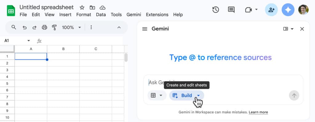
The new “Build” feature in Google Sheets.

Google Apps Script

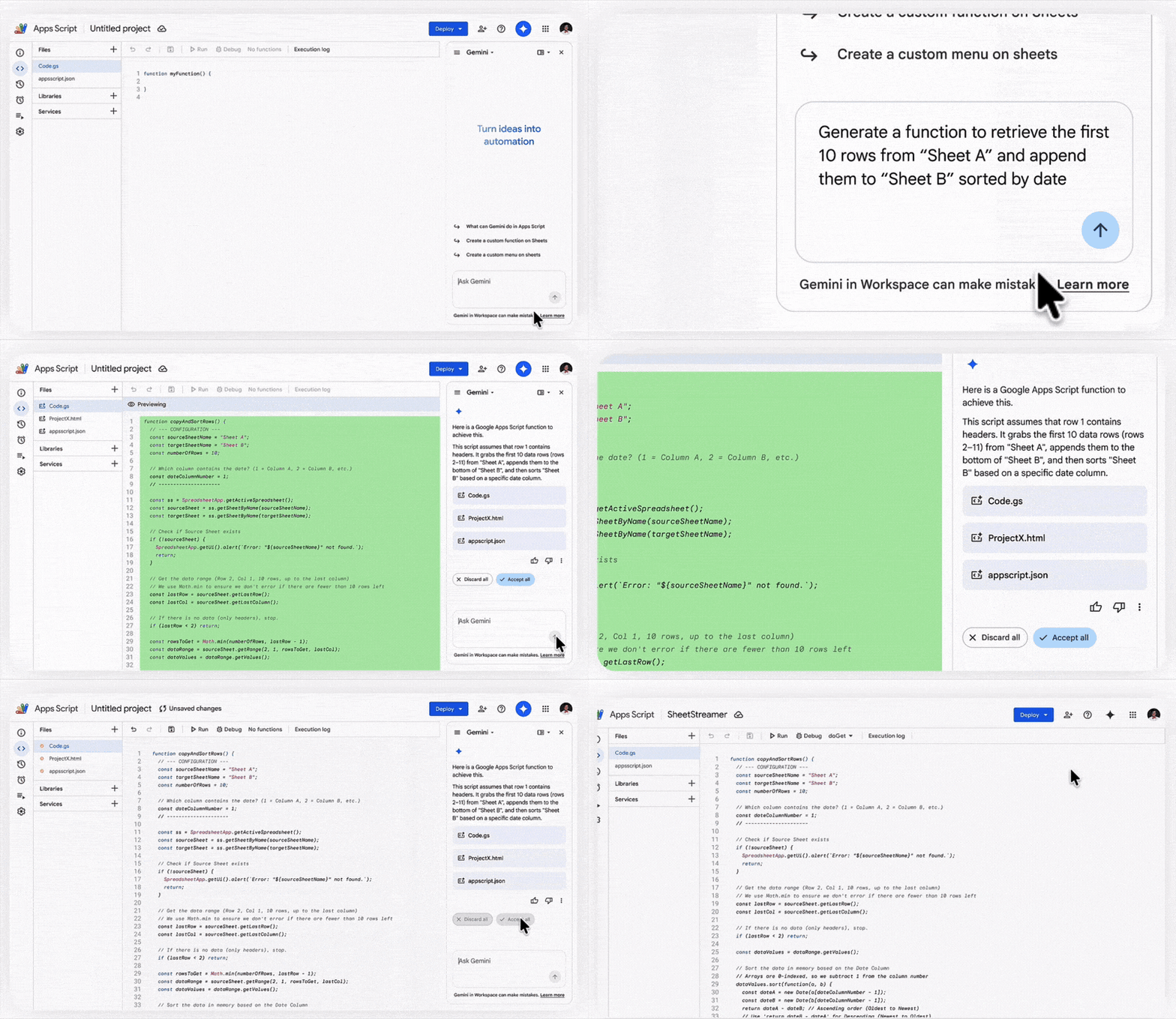
Gemini sidebar in Apps Script editor (coming soon).

Workspace Studio

Workspace Studio is the new visual, drag-and-drop tool that lets users build workflow agents using natural language. New features coming:

  • Skills feature (see announcement #2): To deploy agentic automation across every team.
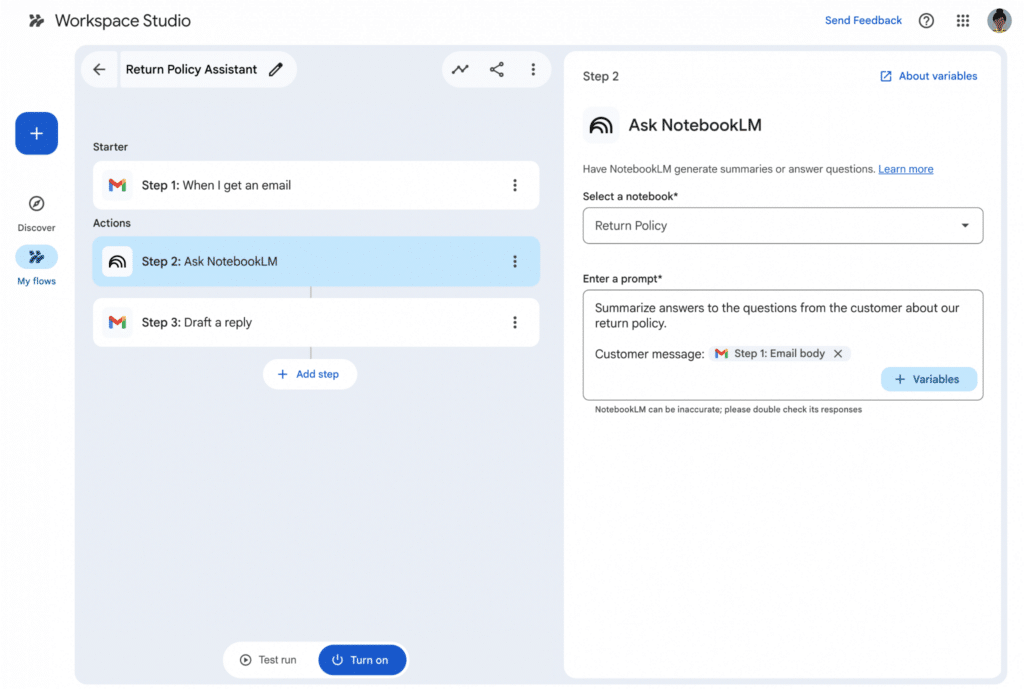
  • NotebookLM Integration: Integrate notebooks from NotebookLM directly into Google Workspace Studio automation workflows to use existing documents as a grounded knowledge source.
  • Third-Party Connectors: Out-of-the-box integration for agents to pull data from Asana, Jira, Mailchimp, and Salesforce directly into Workspace.
  • Gems Integration: An “Ask a Gem” step that allows flows to send prompts to private Gems to automate summaries or document creation.
NotebookLM integration with Workspace Studio.

Further Reading

Here’s Google’s official video summarizing the key Workspace announcements:

And here’s the full list of all 260 product announcements from Google Next 2026:

260 things we announced at Google Cloud Next ’26 – a recap

Is Formula Writing Dead? (And why we shouldn’t mourn it)

Why spend hours crafting formulas yourself if Gemini can do it for you?

For the better part of two decades, I’ve viewed my spreadsheet work through the lens of a craftsperson, rather than as a corporate analyst.

The grid of cells was my canvas and the formula my brush.

I pushed the limits of what formulas could do, creating clockschess gamesetch-a-sketch, and join-the-dots games, using only built-in formula logic.

But recently, over the past few months, something has shifted.

We’re seeing the “formula syntax barrier” dissolve in real-time. Years of experience and a deep knowledge of the function landscape is no longer required to write complex formulas.

The true impact of this realization hit me while I was experimenting with a new formula game: building a Minesweeper demo in Google Sheets, using only formulas. (Spoiler: I don’t believe it’s possible to do fully, without using code to control the game play.)

I started the traditional way, experimenting with various OFFSET functions to “see” what was in the adjacent cell to the formula. It was intellectually satisfying, but also slow going.

The New Way

Once I had a working OFFSET formula that checked a single cell, I decided to see what Gemini would do. Truthfully, I couldn’t justify the time doing it myself when I had “real” work to do (or, was I just too lazy to do that much hard thinking?).

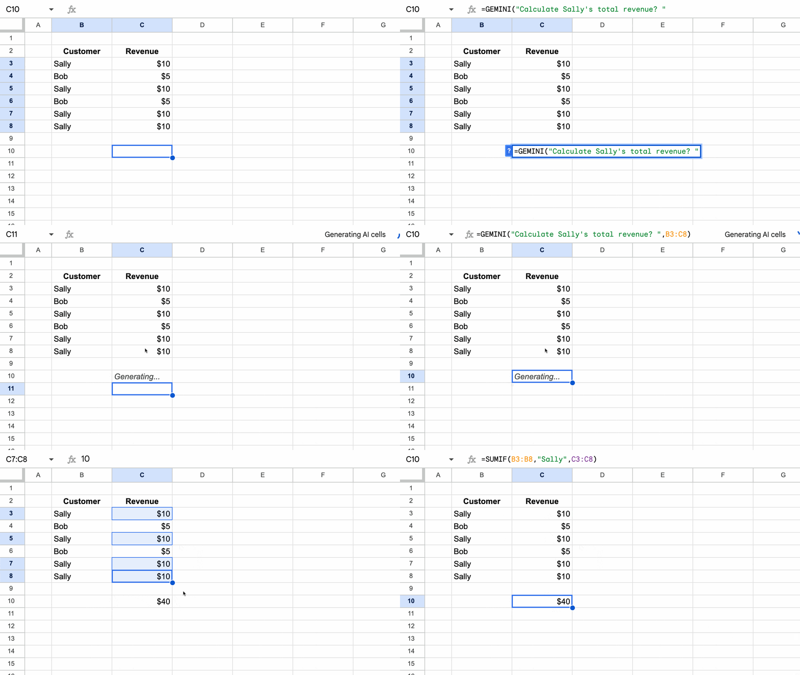
So I plugged the formula into Gemini with this prompt:

I have this formula in Google Sheets that checks whether the cell directly below is equal to "A". It gives an output 1 if the cell below equals A and blank otherwise:

=IF(OFFSET( INDIRECT( ADDRESS( ROW(), COLUMN())),1,0)="A",1,)

can you extend this concept and create a formula that checks if any of the adjacent cells that border the formula cell are equal to "A". There are 8 cells that surround the formula cell.

The formula Gemini generated was complex:

=IF(COUNTIF( OFFSET( INDIRECT( ADDRESS( ROW(), COLUMN())),-1,-1,3,3),"A")-IF( INDIRECT( ADDRESS( ROW(), COLUMN()))="A",1,0)>0,1,"")

But guess what? It worked. It just plain worked!

It extended the logic to check if there was an “A” in any of the cells surrounding the formula cell.

I like to think I would have got there myself, but it would have taken me a LOT longer than the minute that Gemini took.

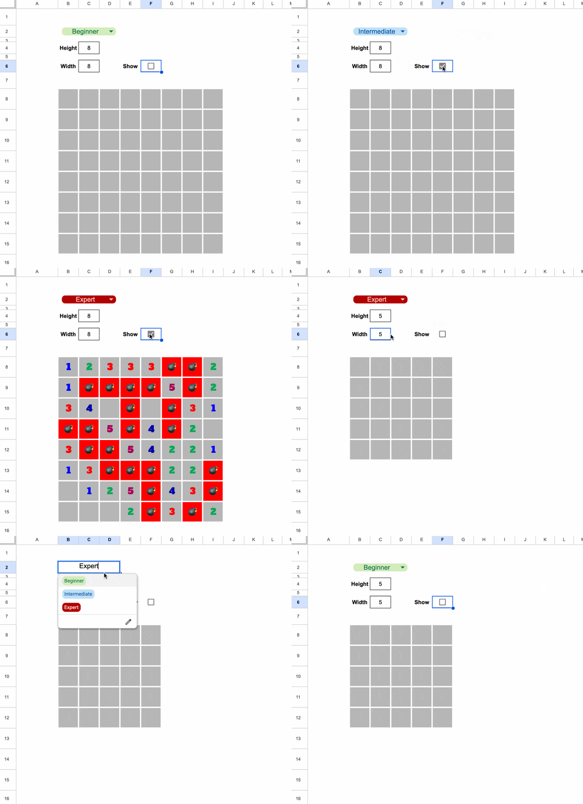
After more back-and-forth with Gemini, where I only directed Gemini and didn’t write any more formulas myself, I had a working demo of Minesweeper:

It’s running entirely from a single formula in cell B8, the top left of the grid.

Feel free to grab a copy of the template here, to explore the formula.

Now, it’s not playable in the traditional sense (that would require some coding) but it shows sort of how Minesweeper works.

What used to take me hours of deep-focus was delivered in minutes. And instead of getting stuck on syntax, I was free to focus on the high-level problem and design.

And here’s the thing. I could have just as well started with a text only prompt and skipped creating that first formula, and Gemini (or another AI tool) would have gotten the answer for me.

The Economic Argument

When time is money, writing complex formulas manually does not make economic sense. If it takes you an hour to figure out a complex array formula but only 30 seconds for an AI tool to generate it, then the “hand-crafted” version is no longer a demonstration of skill but instead a waste of resources.

Writing formulas today feels increasingly like hand-washing laundry when you own a functional washing machine.

Changing Nature of Work

Our role is shifting (has shifted?) from creator to director.

We now iterate our way to a solution through a conversation with an AI tool, refining logic and debugging via prompts.

However…

Being “formula literate” remains a superpower.

My Minesweeper experiment succeeded because of my years of honing my craft. I knew that the OFFSET function was key to making it work. And then I knew how to write the best prompts to get the solution I wanted.

So although you don’t necessarily need to master every function, parentheses, or comma anymore, it helps enormously to be able to audit the logic and spot mistakes.

I’d also make the case that for simpler formulas (e.g. a simple XLOOKUP to join data tables), it’s quicker to write the formula yourself, rather than switching to an AI tool.

The Verdict

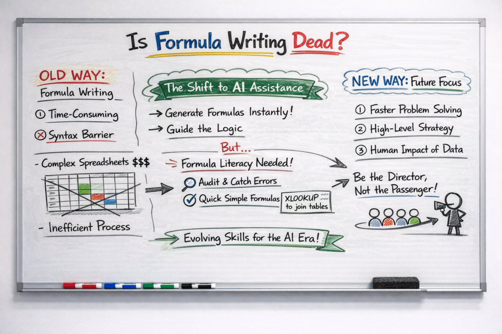
Image generated by ChatGPT

The goal was never to write the perfect formula; the goal was always to solve the problem.

If we reach the answer ten times faster by delegating formula syntax to Gemini, we haven’t lost our craft or diminished our work. Rather, we’re being smart with our time and opening ourselves up to solving more advanced problems.

So don’t mourn the manual formula.

Instead, use the hours you claw back to tackle the problems that AI can’t solve: business strategy and the human impact of the results on your customers.

And a Closing Caveat

Yes, AI is very good at generating formulas and fixing formula syntax.

But YOU are still much better at building entire spreadsheets, managing data, communicating with your clients, and solving complex problems.

So don’t get too drawn into the AI hype. By all means, work faster by leveraging AI tools but lean into your human experience to solve the bigger problem.

Now go forth and conquer those complex formulas! (With a little help from Gemini.)

How to Build a Content Engine with Apps Script, NotebookLM, and a Gemini Gem

Most of us are sitting on an absolute goldmine of unstructured data.

Think about it: years of client reports, research notes, project documentation, YouTube videos or, in my case, a decade’s worth of newsletter archives.

Usually, this information just sits there dormant. Why? Because it’s spread all over the place, too tedious to search through and catalog, and way too dense to summarize manually.

But by combining Apps Script, NotebookLM, and Gemini Gems, we can transform that forgotten archive into an AI content engine. We’re talking about a system that can access all your content and generate new work based on that specific foundation.

Why NotebookLM AND a custom Gem?

By using NotebookLM as the data foundation and a Gemini Gem as the creative interface, we create a workflow that captures the best of both worlds.

NotebookLM acts as a secure vault containing our data, ensuring that new derivative work is strictly grounded in our own history. However, NotebookLM is a research tool built more for consuming (reading, listening, slide decks, flash cards etc.) rather than creating “new” content. It lacks the ability to remember our voice between chats or access the live web.

A Gemini Gem, on the other hand, serves as a creative foil. It can remember our specific voice and formatting preferences, so we don’t have to explain this each time. It can also access the web to incorporate external data, if required. And it can generate images and video too.

This architecture allows us to take our archived knowledge and quickly transform it into new, high-quality content.

How To Build a Content Engine

To build this workflow, we need to solve for three things: 1) extracting our data, 2) storing our data, and 3) generating new content from this data.

If you don’t have much source data then you can just add it directly as sources in your NotebookLM (go straight to step 3 below).

But if you have a lot of source data (in my case, 375 newsletters at about 500,000 words and 240 blog posts at about 700,000 words) then it’s not as simple as just uploading them one-by-one to NotebookLM. For one thing, you can’t upload that many separate source docs to NotebookLM (the limit on the free plan is 50 sources). Secondly, can you imagine how tedious it is to manage almost 600 different sources!

The solution is to create a script to scrape all these web links and dump the content into a series of Google Docs. I created ten Google Docs, each with about 60 pieces of content. Don’t try to put everything into one single giant Doc, as again, you might run into the size limits in NotebookLM, which is up to 500,000 words per source.

1. Code Your Scraper (Optional)

I started with a Google Sheet containing a list of newsletter subject lines in column A and the URLs of the hosted newsletter content in column B, with 375 rows in total.

(Sign up to get the newsletter here)

Don’t worry, we don’t need to write the script ourselves from scratch! Simply prompt Gemini to write a Google Apps Script for you.

I used this prompt in Gemini to generate the script that would visit each URL in turn and save the text into a Google Doc. To ensure it could handle the volume of data without timing out (Apps Script has a 6-minute limit) I asked Gemini to grab content in batches and keep track of rows, so the script could “resume” where it left off.

Generate a Google Apps Script that takes a list of website links from a sheet called ‘Newsletter URLs’ and saves them into a single Google Doc. Put the subject line from Column A as a Heading 1 and then pull all the text from the URL in Column B underneath it.

It needs to remember where it left off if it hits a time limit, so I can just hit ‘Run’ again to pick up the progress. Also, make sure it pauses for a few seconds between each link and refreshes the document connection every few rows so it doesn’t crash or get blocked by the websites.

In your Sheet with the list of links, go to Extensions > Apps Script

Copy in the script that Gemini created.

Make sure your insert the correct ID from your Google Doc

To begin with, run a test with 5 URLs to ensure the script works as intended. If you encounter any errors, paste them back into Gemini and ask for a fix.

Once you’re happy its working, move to step 2 and start consolidating your online content into Google Docs.

2. Extract and Consolidate Your Data

Run your script from the Google Sheet containing your source URLs. It will visit each link in turn and paste the data into your Google Doc in batches.

This centralizes disparate web data into a single, clean Google Doc.

3. Create Your NotebookLM Archive

Visit NotebookLM and create a new notebook.

Upload your consolidated Google Docs as Sources.

This “grounds” the AI, ensuring it only uses your verified history and doesn’t “hallucinate” outside facts.

4. Distill Your Voice to Create a Style Guide

Back in Gemini, in a new chat, connect it to one of these Google Docs, which contains your best writing.

Prompt Gemini to analyze your voice and identify your unique formatting habits, vocabulary preferences, and “persona”.

Based on the attached google doc of my writing published online, write a style guide for a custom Gem that captures my voice. The instructions should enable the gem to write in my voice, using a notebooklm backend with access to all my previous published writings

In my example, this was the response from Gemini, which was a good starting point that could be tweaked to create my unique style guide:

Once you’re happy with the response, save it as a Style Guide in a Google Doc.

5. Build the Gem (The Interface)

In Gemini, open the Gem Manager and create a New Gem.

Link your NotebookLM archive in the “Knowledge” section and paste your Style Guide rules from section 4 into the Instructions box.

Hit Save and move to step 6!

6. Use Your Gem to Create New Content

Test the Gem with a prompt like: “Using the logic from [Source Name], draft a new response in my voice”.

In my example, I tried this prompt:

draft a newsletter about the VSTACK function

And here is the newsletter Gem taking this simple start prompt about the VSTACK function and generating a newsletter that is a pretty good mimic of the real thing.

Of course, if I was to use this example, I would need to review the text with a fine tooth comb, check all the examples, fix the links, and rewrite sections to make it my own.

However, as a first step, to generate ideas or scaffolding, it’s incredibly helpful.

Now, instead of spending hours drafting, I can ask my Gem to “draft a new tip about data validation based on the logic I used in Tip #210.” It generates a plausible draft in my voice, using my historical data, in seconds.