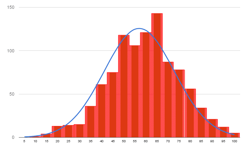
In this tutorial you’ll learn how to make a histogram in Google Sheets with a normal distribution curve overlaid, as shown in the above image, using Google Sheets.
It’s a really useful visual technique for determining if your data is normally distributed, skewed or just all over the place.
What is a Histogram?
A histogram is a graphical representation of the distribution of a dataset.
In this example, I have 1,000 exam scores between 0 and 100, and I want to see what the distribution of those scores are. What’s the average score? Did more students score high or low? How clustered around the average are the student scores? Are the scores normally distributed or skewed?
What is a Normal Distribution Curve?
The normal distribution curve is a graphical representation of the normal distribution theorem stating that “…the averages of random variables independently drawn from independent distributions converge in distribution to the normal, that is, become normally distributed when the number of random variables is sufficiently large”.
Bit of a mouthful, but in essence, the data converges around the mean (average) with no skew to the left or right. It means we know the probability of how many values occurred close to the mean.
We expect 68% of values to fall within one standard deviation of the mean, and 95% to fall within two standard deviations. Values outside two standard deviations are considered outliers.
We expect our exam scores will be pretty close to the normal distribution, but let’s confirm that graphically (it’s difficult to see from the data alone!).
Let’s see how to make a Histogram in Google Sheets and how to overlay a Normal Distribution Curve, as shown in the first image above.
How to make a Histogram in Google Sheets
Step 1: Raw data
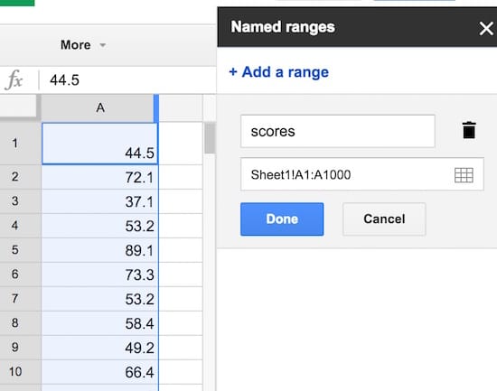
Copy the raw data scores from here into your own blank Google Sheet. It’s a list of 1,000 exam scores between 0 and 100, and we’re going to look at the distribution of those scores.
Step 2: Name that range
Create a named range from these raw data scores, called scores, to make our life easier. Highlight all the data in column A, i.e. cells A1:A1000, then click on the menu Data > Named ranges… and call the range scores:
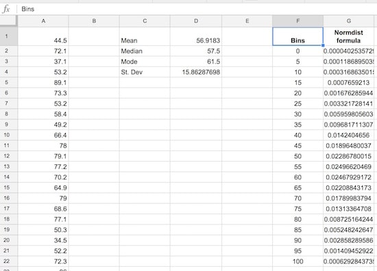
Step 3: Summary statistics
Set up a small summary table with the mean, median, mode and standard deviation of our population. The formulas are:
Mean:
=AVERAGE(scores)Median:
=MEDIAN(scores)Mode:
=MODE(scores)Standard Deviation:
=STDEVP(scores)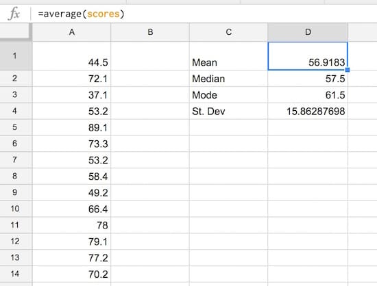
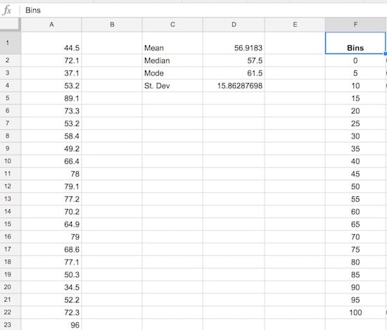
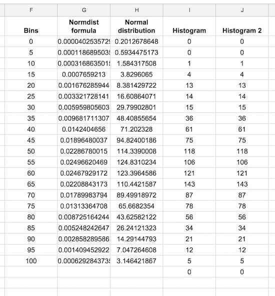
Step 4: Create the frequency bins
Set up the frequency bins, from 0 through to 100 with intervals of 5. Put 0 into cell F2 and then you can use this formula to quickly fill out the remaining bins:
=F4 + 5(it adds 5 to the cell above). Name this range bins.
Step 5: Normal distribution calculation
Let’s set up the normal distribution curve values.
Google Sheets has a formula NORMDIST which calculates the value of the normal distribution function for a given value, mean and standard deviation. We calculated the mean and standard deviation in step 3, and we’ll use the bin values from step 4 in the formula.
In G2, put the formula:
=NORMDIST(F2,$D$1,$D$4,FALSE)Drag it all the way down to G22 to fill the whole Normdist formula column:
Step 6: Normal distribution curve
Let’s see what the normal distribution curve looks like with this data.
Select the bins column and the Normdist column then Insert > Chart and select line chart, and make it smooth:
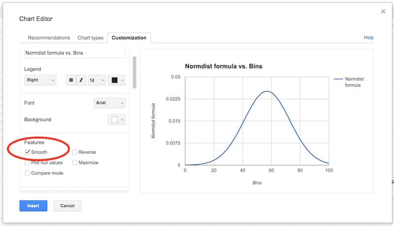
You’ll have an output like this:
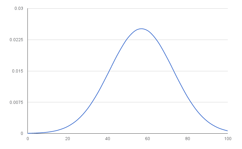
That’s a normal distribution curve, around our mean of 56.9. Great work!
We now need to calculate the distribution of the 1,000 exam scores for our histogram chart.
As we’re going to create a totally new chart with the histogram and normal curve overlaid (easier than modifying this one), you can put this normal distribution chart to one side now, or delete it.
Step 7: Frequency formula
Leave column H blank for now (we’ll fill this in shortly).
In column I, let’s use the FREQUENCY formula to assign our 1000 scores to the frequency bins. Type the following formula into cell I2 and press Ctrl + Shift + Enter (on a PC) or Cmd + Shift + Enter (on a Mac), to create the Array Formula. It’ll fill in the whole column and assign all the scores into the correct bins:
=ArrayFormula(FREQUENCY(scores,bins))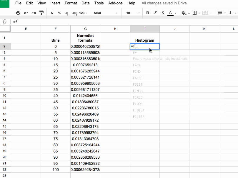
If you’re new to Array Formulas, check out this post: How do array formulas work in Google Sheets?
Step 8: Copy values
Copy this column of frequency values into the adjacent column J (we need this for our chart).
Pro tip: you can just copy I1:I2 into J1:J2, it’ll fill out the whole column with values.
Step 9: Scale the normal distribution curve
We need to scale our normal distribution curve so that it’ll show on the same scale as the histogram. Since we have 1,000 values in bins of 5, our scale factor is 5,000. Meaning, when I multiply the normal distribution values by 5,000, they’ll be comparable to the histogram values on the same axis. Also, they’ll sum to 1,000 matching the number of values in our population.
So in the blank column H, add the following formula and drag down to H22:
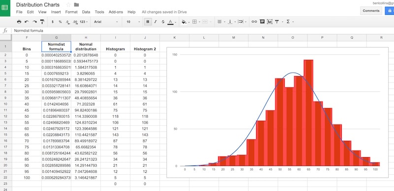
= G2 * 5000Our completed data table now looks like:
Step 10: Create the chart
This is where we see how to make a histogram in Google Sheets finally!
Note: the screenshots shared below show the old chart editor. The new chart editor opens in a side pane, but the steps and options are essentially the same.
Hold down Ctrl (PC) or Cmd (Mac) to highlight the bins data column, the Normal distribution and two histogram columns, but omit the Normdist formula column, as follows:
Then Insert > Chart, and select Combo chart:
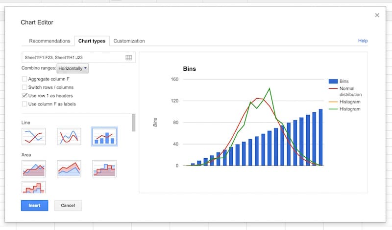
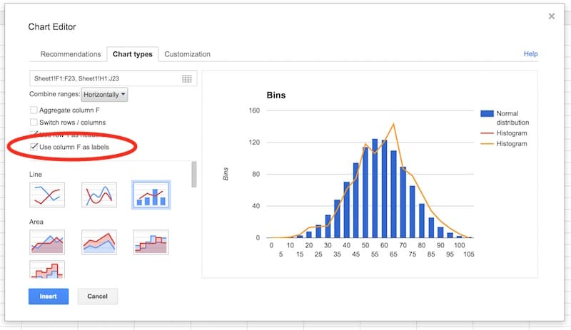
Select the option to use column F as labels:
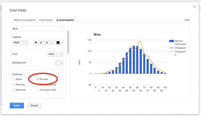
In the Customization tab, remove the title and legend. Select the Smooth option:
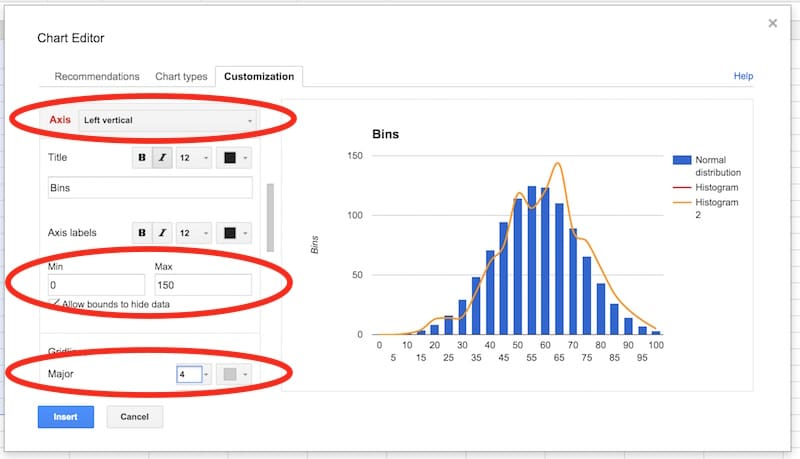
Select the vertical axis. Delete the axis name. Set to have a range of 0 to 150, and set the major gridlines to 4.
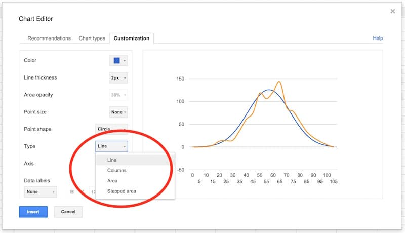
In the series section of the customization menu, choose the Normal Distribution series, and change from columns to line, so your chart looks like this:
Next, choose the Histogram series and change the type from line to columns:
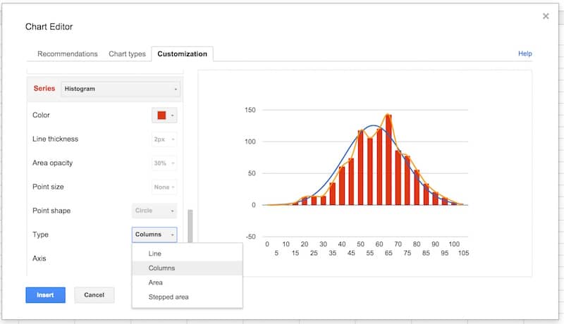
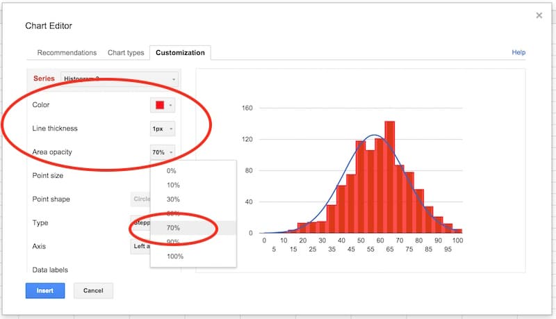
Select the Histogram 2 series and change the type from line to stepped area:
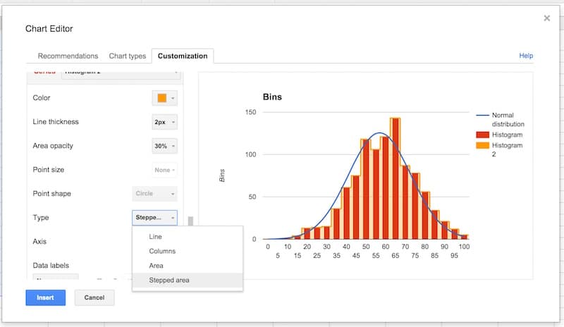
Then change the color to red, the line thickness to 1px and the opacity to 70%, to make our chart look like a histogram (this is why we needed two copies of the frequency column):
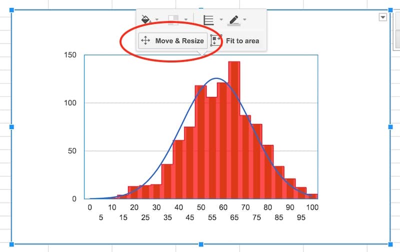
Final tidy up: set the axes labels font size to 10, then click in the chart area to move and resize the it by dragging the edges outwards, so it fills out the whole of our chart canvas:
Voila! You’ve now learnt how to make a histogram in Google Sheets, overlaid with a normal distribution curve:
Want your own copy of this histogram chart?
Click here to access your copy of this template >>
Conclusion:
To conclude, we can see our exam score data is very close to the normal distribution. Hooray!
If we look closely, it’s skewed very, very slightly to the left, i.e. it has a longer tail on the left, more spread on the left. See how there is space between the red bars and the blue line on the left side, but the red bars overlap the blue curve on the right side. It’s subtle though.
 Learn more
Learn more about how to make a histogram in Google Sheets with the Data Analysis in Google Sheets course