How To Add A Hyperlinked Index Sheet In Google Sheets

Admit it, we’ve all been there. Getting frustrated trying to find a specific sheet inside a huge workbook, and not being able to see it amongst all the other sheets.

Well, here’s a quick Apps Script to create a hyperlinked index page at the start of your workbook. Continue reading How To Add A Hyperlinked Index Sheet In Google Sheets

2016 in review and a look forward to 2017

Happy New Year to you all!

If 2015 was a year of huge change, then 2016 was more incremental, building on the foundations of 2015. I still tried lots of different things – different gigs, different projects, different tools – but I’ve found creating apps and solving data problems on the Google platform is my sweet spot of skills, experience and enjoyment.

2016 highlights:

On this site

Investing so much time and effort into this site really started to pay off over the course of 2016.

Web traffic chart

Over 2,500 of you have subscribed to my email list and enjoyed a free copy of my ebook: Spice Up Your Sheet Life.

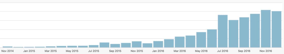
Midway through the year, I passed 100k pageviews, then 150k pageviews and am now close to 200k.

Several posts have garnered some really great commentary from readers, adding tons of value to the original post. This one in particular has 112 comments and counting!

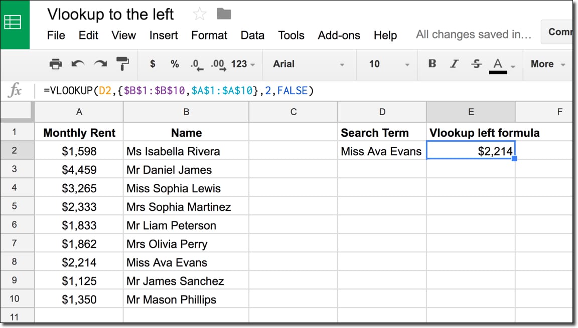
These have been the most popular posts of 2016:

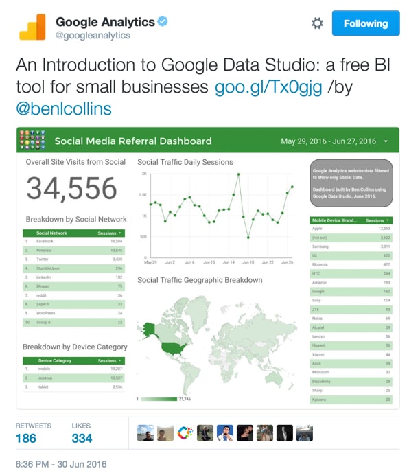
In addition, this post about Google’s new data visualization and dashboard tool, Data Studio, was the most “viral” post of 2016, getting a huge (for me) number of shares and views on the day I published it:

Google Analytics Data Studio tweet

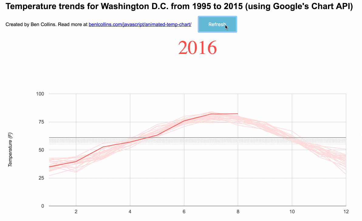
In addition to those posts mentioned above, I also really enjoyed creating this animated data visualization of Washington D.C.’s temperatures since the 1980’s, using Google’s Visualization API:

Animated temperature chart using Google Chart API

Client highlights

Over the past year, I’ve specialized in providing G Suite and Apps Script services to clients, building dashboards, apps and tools to solve problems and save clients time. I’ve really enjoyed these projects and have worked with some great clients. I look forward to continuing into 2017 and focussing even further on custom Apps Script solutions.

In addition, I really enjoyed teaching two more data analytics courses for General Assembly in Washington, D.C.. The students were great in both groups and it’s a real privilege to teach them, and see such rapid progress in 10 weeks.

For private clients, I taught a number of data visualization workshops, focussing on Excel and Tableau, in Minnesota, Virginia and California.

I learnt a ton this year about running my own consulting business.

One of the biggest lessons was one client disappearing off the face of the earth when it came to settling their invoice. Despite repeated calls and emails, I’ve heard nothing. It wasn’t a huge amount of money, but it taught me a valuable lesson about trust, respect and how I price my services.

Want to work with me in 2017? Let me know and I’ll be in touch.

Goals for 2017

January is an exciting time of the year: a chance to set ambitious goals and a strategy for getting there.

The one big goal for last year that I failed to complete was releasing my digital course on building dashboards with Google Sheets and Data Studio. However, I’ve not stopped working on it, and it’ll be even better when I do release it. I’ve now recorded enough material that I’m confident of a launch in Q1 of 2017. Sign up to my email list for news and an early-bird offer when it launches.

Specifically, my goals for 2017:

  • Launch my Google Sheets & Data Studio dashboard course
  • Launch Edition 2 of my free ebook: Spice Up Your Sheet Life, with more interesting tips and tricks for working with Google Sheets
  • Launch two other digital products
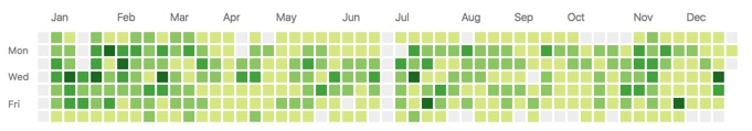
  • Make a huge push with Apps Script, to deepen my knowledge & experience, and create detailed articles for this site. One quick way to measure this is to see what my GitHub profile looks like by the year-end, hopefully something more like this:
  • Github Chart

  • Continue to create in-depth articles and tutorials for this site, aiming for 1 – 2 posts a week
  • Continue to provide great service and solutions for my clients, in the G Suite & Apps Script ecosystem

It’s going to take hard work, focus and dedication to achieve all of these goals, but it’s as easy as ABC*

*Always Be Coding

By this, I mean being productive and efficient, always moving forwards and minimizing distractions (beware the Shiny Object Syndrome!). It’s crucial as a freelancer to create efficient workflows and systems, and to stay organized.

Well, that should do it. I better get back to work 😉

Happy New Year and all the best for 2017!

Cheers,
Ben

Funnel charts in Google Sheets using the chart tool, formulas and Apps Script

Let’s talk about funnel charts in Google Sheets.

The charts themselves are a bit of a novelty. Yes, they’re aesthetically pleasing because of that resemblance to a real-world, tapering funnel, which reinforces their message, but a plain ole’ bar chart would be equally suitable and actually easier to read data from (because the bars have a common baseline).

However, they throw up some interesting techniques in Google Sheets and for that reason, merit this long article.

We’ll build them using tricks with the chart builder tool, then with two different types of funky formula and finally, and best of all, we’ll build a tool using Apps Script, as shown in this image:

Funnel charts with apps script in Google Sheets

Continue reading Funnel charts in Google Sheets using the chart tool, formulas and Apps Script

How to create a waterfall chart in Google Sheets

Update December 2017: Google has added Waterfall Charts to the native charts in the Chart Tool of Google Sheets, obviating the need for you to manually create your waterfall charts (or use apps script) per my original post.

Now you simply highlight your data, click Insert > Chart and under the Chart type picker choose “waterfall”, as shown in the following image:

New native waterfall charts in Google Sheets

Continue reading How to create a waterfall chart in Google Sheets

Animated Data Visualization of Washington D.C.’s warming temperatures

I love animated charts where the animation is central to the storytelling; where it adds value, rather than being simply fancy decoration.

When it’s done well, it can be extremely powerful, mesmerizing and compelling.

One of the best examples I’ve seen is Bloomberg’s animated temperature visualization. I love how powerfully this chart conveys its message, and I’ve been semi-obsessed with it ever since I saw it.

So, over the past few weeks and since my last experiment with the Google Visualization API, I’ve been chipping away at this project to create an animated temperature chart within the Google environment. It’s finally in a state I can share here, however it’s what you might call an MVP still…

Here’s my animated temperature chart built with the Google Visualization API connecting to Washington D.C. data in a Google Sheet:

Animated temperature chart using Google Chart API

You can see this animated chart in all its glory here.

The original Bloomberg temperature chart

Here’s the original animated visualization from Bloomberg – one of my favorite visualizations – that inspired this whole exercise.

I find it mesmerizing to watch and tremendously effective at illustrating the trend of rising temperatures.

I make no claim that my chart is a patch on Bloomberg’s sumptuous, smoothly animated chart with its incredible attention to detail (click through to the live version to see what I mean).

Hopefully though, my version captures some of the same spirit and demonstrates how powerful Google’s Visualization library can be.

Another example: NASA’s animated chart

I saw this chart from NASA show up in my Twitter feed recently and I couldn’t help but smile in appreciation.

Another beautiful, animated chart showing long-term temperature trends. This arrived as a timely dose of inspiration to push me to persevere with my own attempt.

NASA released this last month, showing that “August 2016 was the warmest August in 136 years of modern record-keeping”. Wowser!

I wonder if the authors of this chart were similarly inspired by the Bloomberg chart?

Creating an animated temperature chart with Google Sheets and the Google Chart API

Ok, so is it possible to create something similar with data in a Google Sheet?

Yes, but it involves coding with Google’s Visualization API.

The data is the same that I used for my other Google Visualization API project, which I documented here.

It comes from the University of Dayton: http://academic.udayton.edu/kissock/http/Weather/citylistUS.htm

I’ve put all of the data cleaning/wrangling in my previous post, so I won’t repeat it here.

Suffice to say, I did create a new pivot table with average monthly and average annual temperatures. Here’s the data in a Google Sheet, ready to go. It shows the average monthly temperature for each year from 1995 to 2016, along with an annual average.

Onwards with the Google Visualization API…

After plenty of head-scratching, reading documentation and trying different examples, I finally managed to create an initial, working prototype that cycled through the temperature data in my Google Sheet, comparing a baseline (1995) to each successive year:

First working prototype of the animated temperature chart

It was a start, even if it didn’t show much!

After another bout of head-scratching and staring gormlessly into space, I was a little closer:

Animated temperature chart progress

After another bout of…you get the gist.

I added the year in the top left and removed the legend. Also, you’ll notice in this next GIF that I’ve got the Chrome Dev Tools open so I can see the objects being created at each iteration of the loop. This helped me massively when figuring out how to build the Series object dynamically.

Animated temperature chart progress

Getting much closer now!

The last major hurdle was building the series options object dynamically within the loop, so I could control the colors of each series.

This allowed me to set the most recent monthly data to red, the most recent annual average to grey, and then have everything else fade into the background with muted colors.

After a final few tweaks, I had the chart I was after:

Animated temperature chart using Google Chart API

I’m not going to go through the code step-by-step, but it’s all here on GitHub.

I will however highlight a few interesting parts of the code, which were key to making this work.

Very briefly, the code collects all of the data from the Google Sheet and initially shows only the first two columns of data, the 1995 average line and the 1995 monthly line.

I used the DataView class to show only specific columns of data in the chart, e.g. the initial chart view is created from the data in this snippet:

var data = response.getDataTable();
var chart = new google.visualization.LineChart(document.getElementById('chart_div'));
var view = new google.visualization.DataView(data);

// set columns initially
view.setColumns([0,1,2]);
...

Then I loop through the remaining columns, adding them one at a time to the view and refreshing the chart on each iteration:

function updateChart() {
    if (i < howManyTimes ){
      arr.push(i+2)
    }
    view.setColumns(arr);
...

The color of the lines is controlled by the options object, which I build dynamically within each loop. Modulus arithmetic is used to distinguish odd and even columns (to distinguish between monthly and annual data) and color them accordingly:

for (var j = 0; j < i; j++) {
  var innerObj = {};
  if ((j % 2) == 0) {
    innerObj["color"] = '#e9e9e9';
    innerObj["lineDashStyle"] = [4,1];
  }
  else {
    innerObj["color"] = '#ffdbdb';
    innerObj["lineDashStyle"] = [0,0];
  }
  seriesObj[j] = innerObj;
}
...

The other key feature is a timer that refreshes the chart on every iteration of the loop, with an 80 millisecond buffer:

if( i < howManyTimes ){
    setTimeout( updateChart, 80 );
}

The full code can be seen here on GitHub.

Documentation

Should you want to create something with the Chart API yourself, here's some resources relating to the techniques discussed above:

Google Visualization API reference
DataTable class
DataView class
Line chart examples with the Visualization API
Animation examples with the Visualization API
And finally, the Google Visualization API Forum