In this post, I’ll show you how to create dynamic charts in Google Sheets, with drop-down menus.
I get lots of questions on how to add interactivity to charts in Google Sheets. It’s a great question that’s worthy of a detailed explanation.
Dynamic charts can really enhance reports and dashboards, allowing for more information to be conveyed in the same amount of screen space. This article will show you how to use the data validation method to make a Google Sheets drop-down menu to control a dynamic chart.
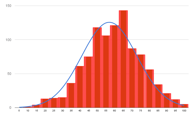
Histogram and Normal Distribution chart made in Google Sheets
In this tutorial you’ll learn how to make a histogram in Google Sheets with a normal distribution curve overlaid, as shown in the above image, using Google Sheets.
It’s a really useful visual technique for determining if your data is normally distributed, skewed or just all over the place.
What is a Histogram?
A histogram is a graphical representation of the distribution of a dataset.
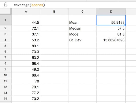
In this example, I have 1,000 exam scores between 0 and 100, and I want to see what the distribution of those scores are. What’s the average score? Did more students score high or low? How clustered around the average are the student scores? Are the scores normally distributed or skewed?
What is a Normal Distribution Curve?
The normal distribution curve is a graphical representation of the normal distribution theorem stating that “…the averages of random variables independently drawn from independent distributions converge in distribution to the normal, that is, become normally distributed when the number of random variables is sufficiently large”.
Bit of a mouthful, but in essence, the data converges around the mean (average) with no skew to the left or right. It means we know the probability of how many values occurred close to the mean.
We expect 68% of values to fall within one standard deviation of the mean, and 95% to fall within two standard deviations. Values outside two standard deviations are considered outliers.
We expect our exam scores will be pretty close to the normal distribution, but let’s confirm that graphically (it’s difficult to see from the data alone!).
Let’s see how to make a Histogram in Google Sheets and how to overlay a Normal Distribution Curve, as shown in the first image above.
Copy the raw data scores from here into your own blank Google Sheet. It’s a list of 1,000 exam scores between 0 and 100, and we’re going to look at the distribution of those scores.
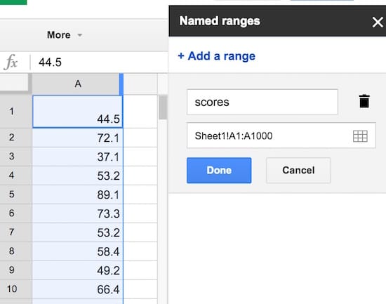
Step 2: Name that range
Create a named range from these raw data scores, called scores, to make our life easier. Highlight all the data in column A, i.e. cells A1:A1000, then click on the menu Data > Named ranges… and call the range scores:
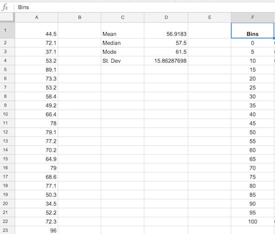
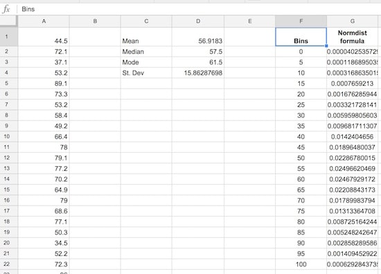
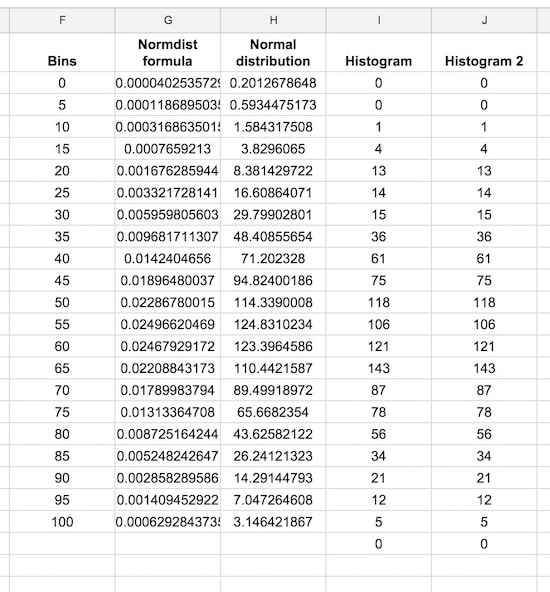
Set up the frequency bins, from 0 through to 100 with intervals of 5. Put 0 into cell F2 and then you can use this formula to quickly fill out the remaining bins:
=F4 + 5
(it adds 5 to the cell above). Name this range bins.
Step 5: Normal distribution calculation
Let’s set up the normal distribution curve values.
Google Sheets has a formula NORMDIST which calculates the value of the normal distribution function for a given value, mean and standard deviation. We calculated the mean and standard deviation in step 3, and we’ll use the bin values from step 4 in the formula.
In G2, put the formula:
=NORMDIST(F2,$D$1,$D$4,FALSE)
Drag it all the way down to G22 to fill the whole Normdist formula column:
Step 6: Normal distribution curve
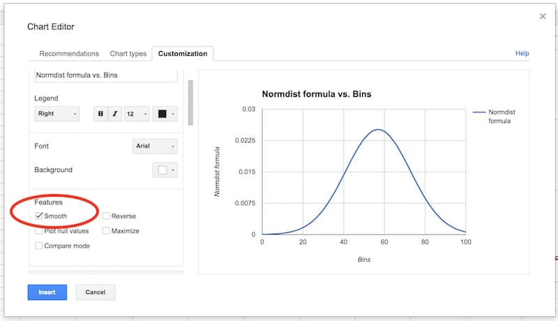
Let’s see what the normal distribution curve looks like with this data.
Select the bins column and the Normdist column then Insert > Chart and select line chart, and make it smooth:
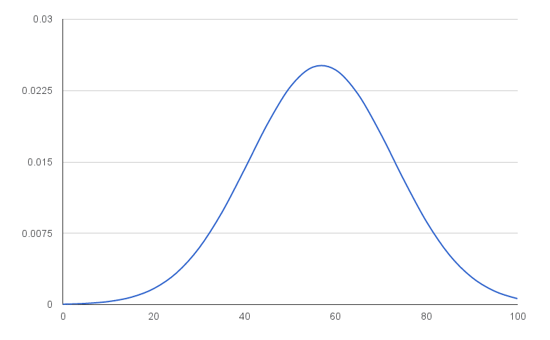
You’ll have an output like this:
Normal distribution curve in Google Sheets
That’s a normal distribution curve, around our mean of 56.9. Great work!
We now need to calculate the distribution of the 1,000 exam scores for our histogram chart.
As we’re going to create a totally new chart with the histogram and normal curve overlaid (easier than modifying this one), you can put this normal distribution chart to one side now, or delete it.
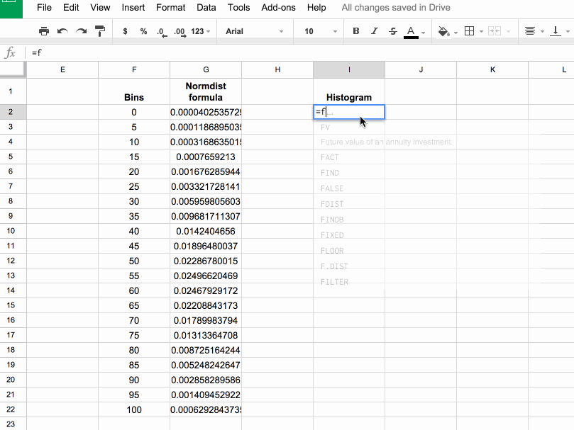
Step 7: Frequency formula
Leave column H blank for now (we’ll fill this in shortly).
In column I, let’s use the FREQUENCY formula to assign our 1000 scores to the frequency bins. Type the following formula into cell I2 and press Ctrl + Shift + Enter (on a PC) or Cmd + Shift + Enter (on a Mac), to create the Array Formula. It’ll fill in the whole column and assign all the scores into the correct bins:
Copy this column of frequency values into the adjacent column J (we need this for our chart).
Pro tip: you can just copy I1:I2 into J1:J2, it’ll fill out the whole column with values.
Step 9: Scale the normal distribution curve
We need to scale our normal distribution curve so that it’ll show on the same scale as the histogram. Since we have 1,000 values in bins of 5, our scale factor is 5,000. Meaning, when I multiply the normal distribution values by 5,000, they’ll be comparable to the histogram values on the same axis. Also, they’ll sum to 1,000 matching the number of values in our population.
So in the blank column H, add the following formula and drag down to H22:
= G2 * 5000
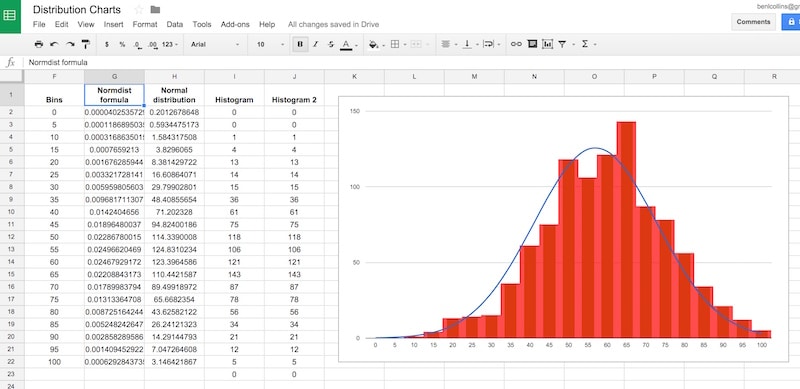
Our completed data table now looks like:
Step 10: Create the chart
This is where we see how to make a histogram in Google Sheets finally!
Note: the screenshots shared below show the old chart editor. The new chart editor opens in a side pane, but the steps and options are essentially the same.
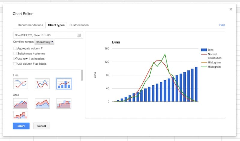
Hold down Ctrl (PC) or Cmd (Mac) to highlight the bins data column, the Normal distribution and two histogram columns, but omit the Normdist formula column, as follows:
Then Insert > Chart, and select Combo chart:
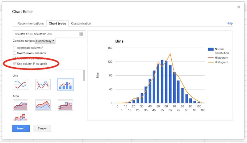
Select the option to use column F as labels:
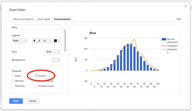
In the Customization tab, remove the title and legend. Select the Smooth option:
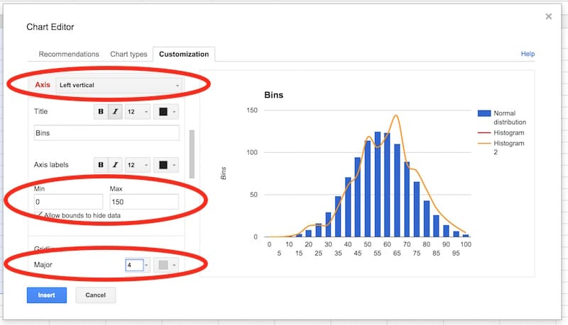
Select the vertical axis. Delete the axis name. Set to have a range of 0 to 150, and set the major gridlines to 4.
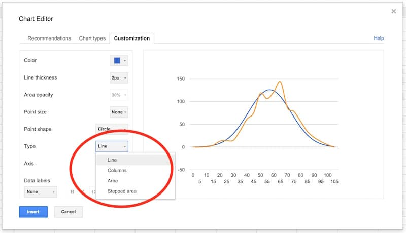
In the series section of the customization menu, choose the Normal Distribution series, and change from columns to line, so your chart looks like this:
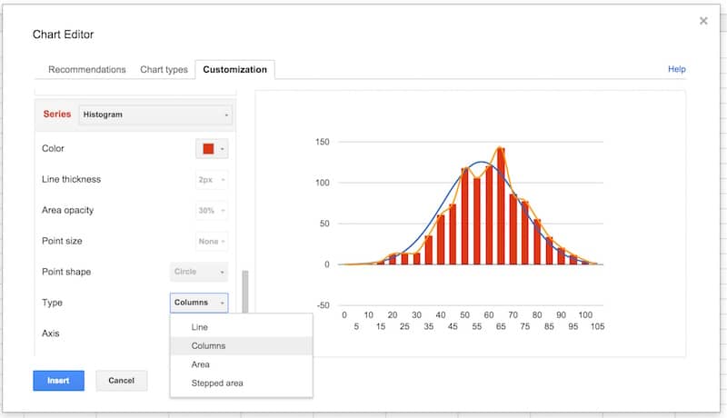
Next, choose the Histogram series and change the type from line to columns:
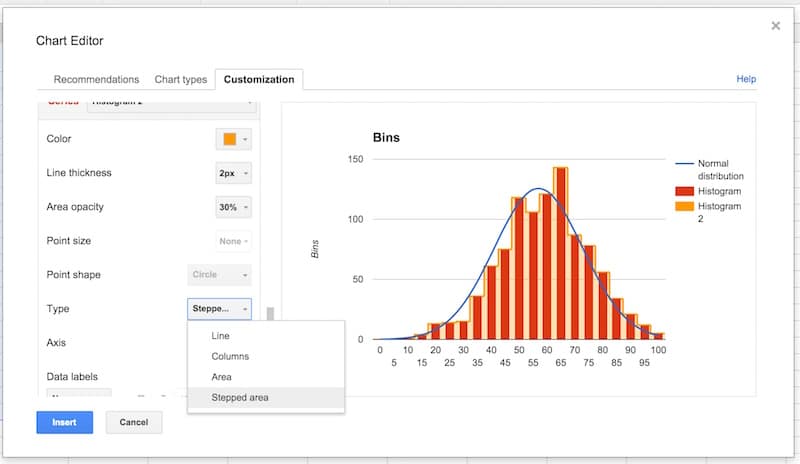
Select the Histogram 2 series and change the type from line to stepped area:
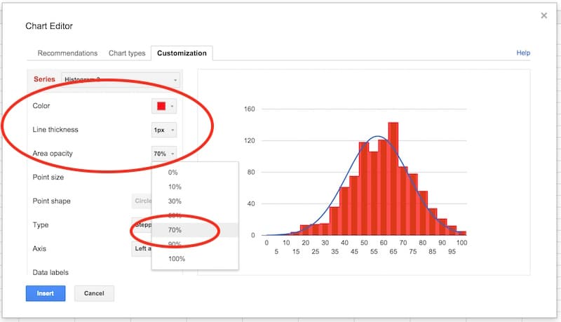
Then change the color to red, the line thickness to 1px and the opacity to 70%, to make our chart look like a histogram (this is why we needed two copies of the frequency column):
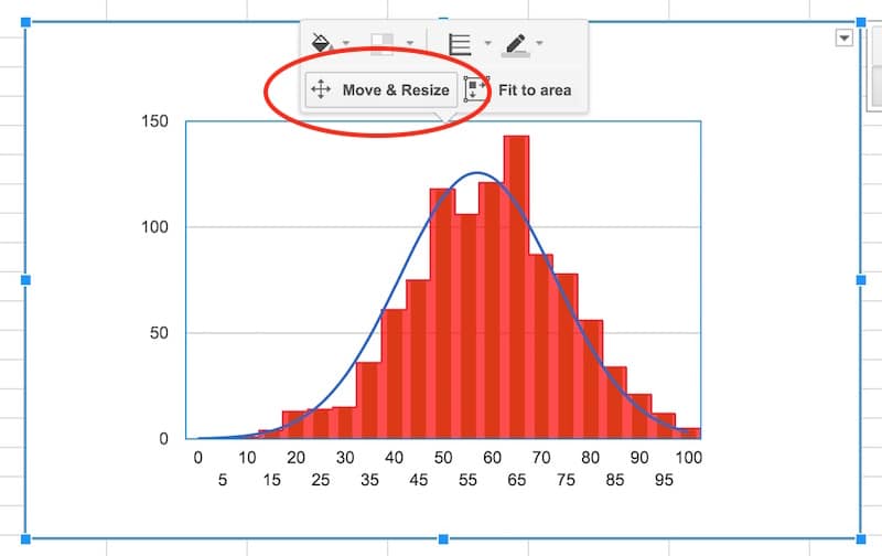
Final tidy up: set the axes labels font size to 10, then click in the chart area to move and resize the it by dragging the edges outwards, so it fills out the whole of our chart canvas:
Voila! You’ve now learnt how to make a histogram in Google Sheets, overlaid with a normal distribution curve:
To conclude, we can see our exam score data is very close to the normal distribution. Hooray!
If we look closely, it’s skewed very, very slightly to the left, i.e. it has a longer tail on the left, more spread on the left. See how there is space between the red bars and the blue line on the left side, but the red bars overlap the blue curve on the right side. It’s subtle though.
Sparklines are small, lightweight charts, typically without axes, which exist inside a single cell in your spreadsheets. They’re a wonderful, quick way to visualize your data, without needing the complexity of a full-blown chart.
Sparklines were first created by interface designer Peter Zelchenko around 1998. The term “sparkline” was coined by statistician and data visualization legend Edward Tufte.
Let’s start with keyboard shortcuts. It’s one of the single best investments of time you can make to further your spreadsheet skills. It’s all about reducing your reliance on the mouse and instead harnessing the awesome efficiency of navigating spreadsheets from the keyboard.
2015 was a year of huge growth, both personally and in a work capacity.
By far the biggest event of 2015 (or in fact, life so far) was the birth of my son which has enriched and changed life in so many ways. It’s been challenging to figure out how to care for and nurture a new human being. Balancing that with rest of life hasn’t been easy for my wife and me. But we’re finding our feet as new parents and the experience is so special that it trumps anything else. When he smiles back or laughs it makes every night ops session worth it.
In a work capacity in 2015, I focussed on establishing a freelance career in data analytics through client work and teaching for General Assembly. Early in the year, I expanded my technical skills with a foray into web development but things really took off for me when I doubled-down on my true work passion – making sense of data.
I worked with Excel, MySQL, PostgreSQL, Google Sheets, Geckoboard and Tableau for client projects and at General Assembly, teaching data analytics to students.
Figuring out a workaround using CSS and text widgets to create pie charts in a Geckoboard dashboard. This was undoubtedly the most detailed and time consuming side project of the year, but for that reason one of the most satisfying!
And finally, on a personal level, publishing stories and photos from the 2014 climbing trip to the beautiful Rocky Mountains – Part 1 and Part 2.
2016
I love the first few days of January, when the whole year stretches ahead and the options seem limitless. I’m really excited about 2016 and the work projects I have planned. It’s going to build on the foundations I laid in 2015, as I expand the teaching, client and website offerings.
Specifically, I have a couple of digital products launching in the first quarter, which I can’t wait to share. Watch this space!
So, goals for 2016:
Teach Data Analytics and Excel courses for General Assembly again. I’m signed up to teach the cohort starting on January 30th.
Launch my first ebook, featuring all of the most interesting, weird and wonderful spreadsheet tricks I’ve come across. I’ve nearly finished writing it and can’t wait to share it. It’s been hugely fun to research and write. Coming your way soon!
Launch my own dashboard course, likely through Udemy. I’m working on my first digital course which I plan to launch in the first quarter of this year. Again, I’m really excited about this.
Write more frequently on this blog. This website is critical to my business since the majority of my leads come through it, so I’m going to make a big push to create lots of interesting and valuable content on here this year.
Do more public speaking. I enjoyed speaking at GA’s graduation event last year and would love to speak at some events or meetups this year. It’s a great way to meet new people and share ideas with an interested audience.
What’s my secret mantra for 2016?
Focus!
This was my biggest single takeaway from last year. Things really started to move for me when I zeroed in on a niche and poured my heart and soul into it. So I plan to keep this in mind, stay focussed and avoid distractions this year.