Funnel charts in Google Sheets using the chart tool, formulas and Apps Script

Let’s talk about funnel charts in Google Sheets.

The charts themselves are a bit of a novelty. Yes, they’re aesthetically pleasing because of that resemblance to a real-world, tapering funnel, which reinforces their message, but a plain ole’ bar chart would be equally suitable and actually easier to read data from (because the bars have a common baseline).

However, they throw up some interesting techniques in Google Sheets and for that reason, merit this long article.

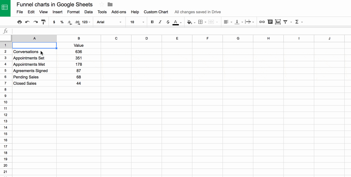
We’ll build them using tricks with the chart builder tool, then with two different types of funky formula and finally, and best of all, we’ll build a tool using Apps Script, as shown in this image:

Funnel charts with apps script in Google Sheets

Continue reading Funnel charts in Google Sheets using the chart tool, formulas and Apps Script

How to create a waterfall chart in Google Sheets

Update December 2017: Google has added Waterfall Charts to the native charts in the Chart Tool of Google Sheets, obviating the need for you to manually create your waterfall charts (or use apps script) per my original post.

Now you simply highlight your data, click Insert > Chart and under the Chart type picker choose “waterfall”, as shown in the following image:

New native waterfall charts in Google Sheets

Continue reading How to create a waterfall chart in Google Sheets

Web traffic chart with dynamic banding in Google Sheets

This is a simple but effective technique for adding dynamic bands to your charts, which are useful to highlight specific parts of your chart.

For example, in this chart of website pageviews, I’ve added bands to show weekdays or weekends and make it easier to see the changing trends.

Chart with dynamic banding

Continue reading Web traffic chart with dynamic banding in Google Sheets

Excel tutorial: build a dynamic bump chart of the English Premier League

Premier League team performance

Find your team: See the history of each of the 47 teams in the Premier League here.

In this post I’ll show you how to create a dynamic bump chart like the one above, using historical data for the English Premier League going back to 1992-93 when it was created.

Continue reading Excel tutorial: build a dynamic bump chart of the English Premier League