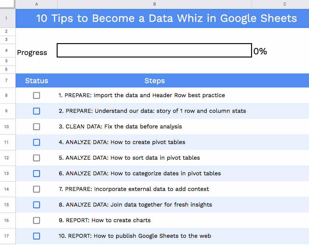
In this tutorial, we’ll create a checklist template in Google Sheets.
We’ll use checkboxes, conditional formatting and a sparkline to build a checklist template like this:
Educator and Google Developer Expert. Helping you navigate the world of spreadsheets & AI.
In this tutorial, we’ll create a checklist template in Google Sheets.
We’ll use checkboxes, conditional formatting and a sparkline to build a checklist template like this:
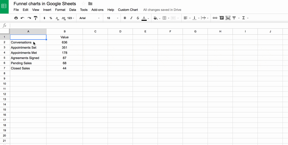
Let’s talk about funnel charts in Google Sheets.
The charts themselves are a bit of a novelty. Yes, they’re aesthetically pleasing because of that resemblance to a real-world, tapering funnel, which reinforces their message, but a plain ole’ bar chart would be equally suitable and actually easier to read data from (because the bars have a common baseline).
However, they throw up some interesting techniques in Google Sheets and for that reason, merit this long article.
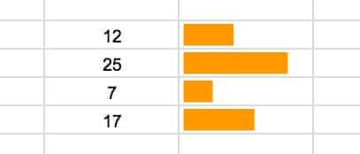
We’ll build them using tricks with the chart builder tool, then with two different types of funky formula and finally, and best of all, we’ll build a tool using Apps Script, as shown in this image:
Continue reading Funnel charts in Google Sheets using the chart tool, formulas and Apps Script
Sparklines are small, lightweight charts, typically without axes, which exist inside a single cell in your spreadsheets. They’re a wonderful, quick way to visualize your data, without needing the complexity of a full-blown chart.
Sparklines were first created by interface designer Peter Zelchenko around 1998. The term “sparkline” was coined by statistician and data visualization legend Edward Tufte.
Continue reading Everything you ever wanted to know about Sparklines in Google Sheets
You’re probably familiar with using Google Sheets to organize and analyze your data. But did you know you can build a dynamic Google Sheets dashboard to really understand your data?
With a handful of powerful techniques, you can add some pizzazz and dynamism to the presentation of your data. Here are ten tricks to try next time you’re building a Google Sheets dashboard.
Continue reading 10 Techniques for building a Google Sheets Dashboard
This time last year I worked with The Write Life during their three-day sale of The Writer’s Bundle, a collection of digital products for writers. I built a dynamic dashboard using Google spreadsheets so the team could visually monitor progress throughout the sale.
This year The Writer’s Bundle 2015 was bigger and better than ever, so I wanted to create an even more useful dashboard for the team. The dashboard was a key tool for the team, to monitor both overall and individual sales channel performance, as well as to be a motivating force by giving everyone a visual sense of progress.
Continue reading Building a dynamic dashboard for a 3-day digital flash sale