The end of an era: issue #400 was the last Google Sheets Tips newsletter and what’s coming next

14th September 2026

Last week I sent my 400th and final Google Sheets Tips newsletter.

The end of an era.

I sent the first newsletter in April 2018, eight and a half years ago.

I think this is where I’m supposed to write something profound and wax lyrical about how life-changing it’s all been.

But I’ve always found that sort of writing difficult (like writing a condolence card) so I’m not going to get too introspective in this post.

There are a few things I want to say though:

Thank You

→ First off, thank you if you were a reader of the Google Sheets Tips!

I hope you found the content valuable and enjoyed reading the issues as much as I did writing them. I appreciated everyone who replied and enjoyed conversing with thousands of you over the years.

→ Secondly, I’m still sending a weekly tech tutorial, now called Future Proof. The topic and format has evolved to stay relevant. More on that below.

→ Thirdly, on a personal level, ending the Google Sheets Tips series is a bittersweet moment.

Of course, part of me is sad. Change is inevitable in life though, and no matter how much we prepare for it, when it does arrive, it still seems to catch us off guard. Emotionally at least.

But I’m ready and excited for the next chapter and writing about different topics.

I started sending these weekly newsletters in April 2018 on the advice of a business coach, who suggested it would help me connect with my audience on a regular basis. I didn’t have a master plan, only a plan to share a valuable tip each week. It grew from that simple premise into a readership of over 50,000 and become the backbone of my whole business. I’m eternally grateful for that simple bit of advice.

Today I want to celebrate 400 issues of the Google Sheets Tips newsletter, starting with how it all began, before I share what’s coming next.

History

📌 The first issue — about keyboard shortcuts — was sent on 30 April 2018 to 2,357 readers. That means I’ve been sending this newsletter for over 8 years. Yikes! (Huge shout-out to anyone who’s been here since the beginning.)

📌 The newsletter began life as the “Monday Tips” newsletter, only becoming the “Google Sheets Tips” newsletter with issue 33 on January 7th, 2019.

📌 Readership grew steadily for years, from inception to the end of 2024, but has plateaued since then:

Popular Issues

📌 Sheets tip 257: I’ve lost count how many times I’ve used this formula…

A simple IF and a complex SCAN formulas to number groups like 1,2,3,1,2,3,1,2,3,…

📌 Sheets Tip 241: A Chart Makeover

Techniques for better charts in Google Sheets.

📌 Sheets Tip 238: Help your colleagues and clients with a Front Sheet

Shares strategies for making spreadsheets more user-friendly for clients.

Ben’s Personal Favorites

Some of my personal favorites to write:

📌 Google Sheets Tip 75: A FACT to blow your mind

Using the FACT function to explore that a shuffled deck of cards is unique, and using the CHAR function to create decks of cards in Sheets.

📌 Sheets Tip 184: CHICKEN and EGG finally solved!

Demonstrates a sorting technique inspired by the ‘chicken and egg’ problem.

📌Is Formula Writing Dead? (And why we shouldn’t mourn it) (Tip #377)

Essay on writing formulas with Gemini instead of manually.

Archive

The archive of all 400 tips is available here.

What’s next…

I published the first​ Google Sheets Tips newsletter in April 2018, a lifetime ago in technology terms.

The mission was simple: one practical, actionable lesson each week to help you work more effectively. That mission hasn’t changed.

Lately though, more and more of you are turning to AI to get things done.

And if you’re anything like me, you’re finding that knowing how to use those tools effectively is its own skill.

And that’s what I want to help you with going forward.

The Google Sheets Tips email is becoming Future Proof:
Just one clear, practical lesson each week that makes you meaningfully better at using these AI tools in your actual work.

A few things worth knowing about what’s changing:

⭐ The name is now Future Proof, reflecting the shift from Sheets-specific tips to broader AI skills, regardless of which tool you’re using.

⭐ Each issue will have two sections: one actionable AI tip you can apply immediately, and a short roundup of relevant AI news for professionals on the Google platform.

⭐ I may extend the lens beyond the Google ecosystem when it makes sense, to include Claude, ChatGPT, or other tools.

⭐ Finally, rest assured I will still keep a keen eye on Google Sheets and continue to share updates and tips whenever relevant. The majority of Google Sheets updates these days are AI powered, which certainly fit under the umbrella of this new newsletter.

Thanks for reading and cheers to the next 400! 🎉

Sign up for Future Proof

Join over 40,000 professionals looking to level up their AI skills with a weekly, practical AI tutorial.

Sign up here:
Explorations with the Datatype Font in Google Sheets

The Datatype font turns text values into miniature charts. It’s like a magic trick that turns data values in your Sheet into sparklines, but without the complexity of the sparkline formula.

It’s been really fun to explore in Google Sheets.

How to add the Datatype font in Google Sheets

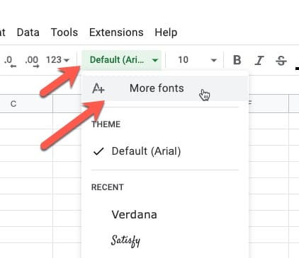
From the font selector in the toolbar, click “More fonts”, type in Datatype, and then select it:

add More Fonts Menu

Datatype Basic Syntax

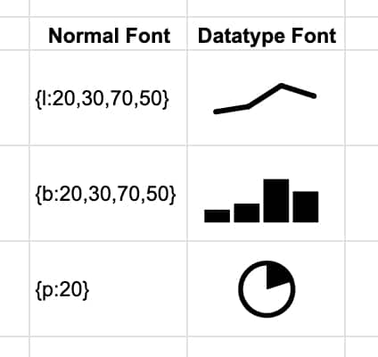
Datatype converts text, called chart expressions, which are data values inside curly brackets {…}, into line, bar, or pie charts.

The syntax is:

  • an opening curly bracket,
  • a letter to denote the chart type (l, b, p),
  • a colon,
  • the comma-separated values,
  • finally a closing curly bracket.

For example:

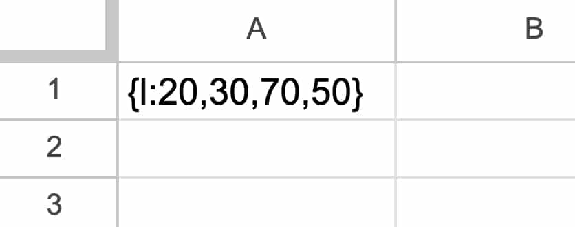
{l:20,30,70,50}

In a Google Sheet, it looks like this:

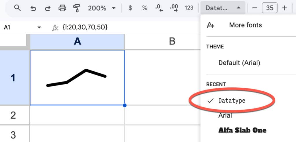
Then we apply the Datatype font to this cell from the toolbar:

Datatype font

Like magic, it turns into a mini chart! (Increase the font size to fill the cell.)

Datatype Options

Datatype has line, bar, and pie charts available:

Datatype font chart expressions in Google Sheets

There are restrictions on each chart class, as follows:

  • Line charts: up to 20 datapoints, each with a value between 0-100
  • Bar charts: up to 20 bars, each with a value between 0-100
  • Pie charts: a single value between 0-100

Example Use Cases

Here are some example use cases, starting with the practical but ending with some esoteric, unhinged, and not at all useful examples!

1: Chart Inside Sentence

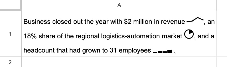
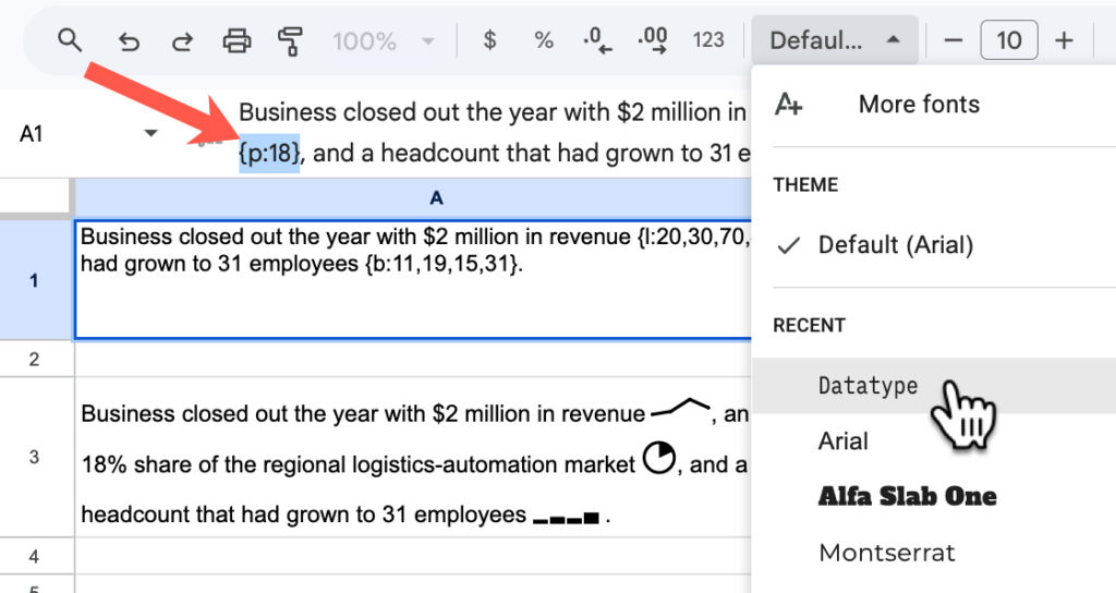
Since Google Sheets allows multiple fonts within a single cell, we can add miniature charts to sentences within our Google Sheets:

To achieve this, write out your sentence and include the chart expressions for the data you want to show, e.g. {p:18}. Then highlight that data and change the font to Datatype:

2: Formulas to Convert Values into Chart Expressions

It’s unlikely that you’ll have data already in the perfect format.

But thankfully, it’s easy to use a concatenation formula to combine the curly brackets, etc., with the data to get the correct chart expression format.

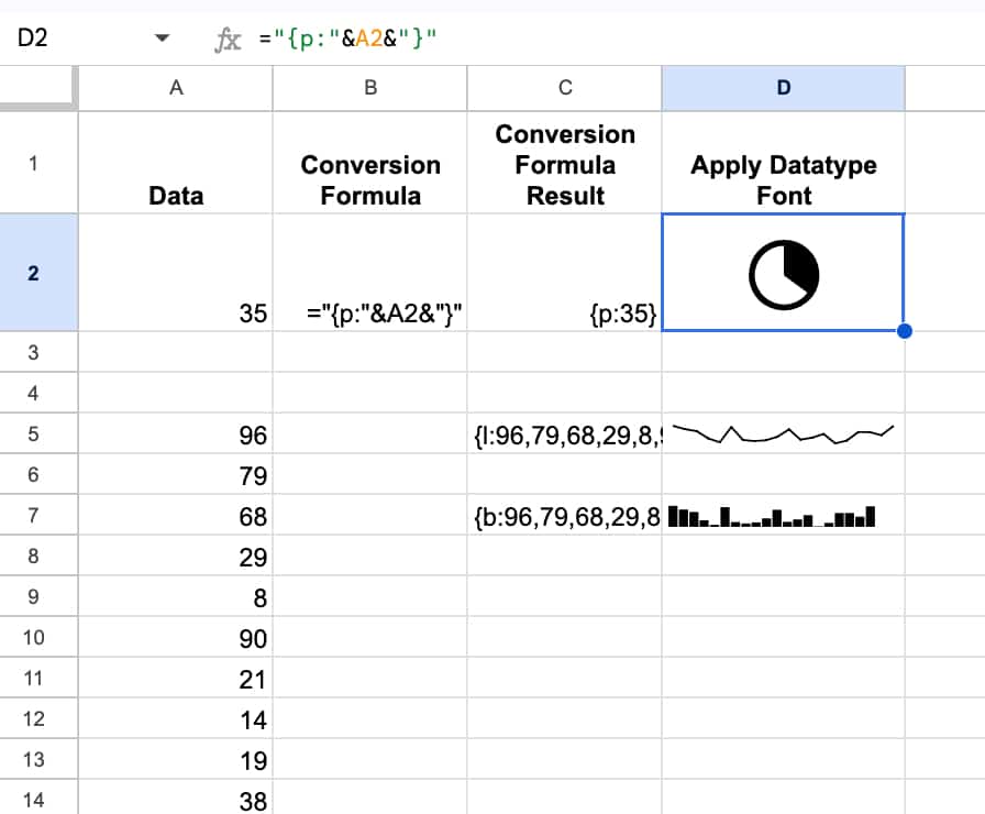
For example, to turn a value into a pie chart expression, we use this formula:

=”{p:”&A1&”}”

And to convert a set of values into the correct line or bar chart expression, we use this formula:

=”{l:”&JOIN(“,”,A5:A24)&”}”

or

=”{b:”&JOIN(“,”,A5:A24)&”}”

where the range of 20 values is in A5:A24.

It looks like this in our Sheet:

3: Pie Charts with Percentages

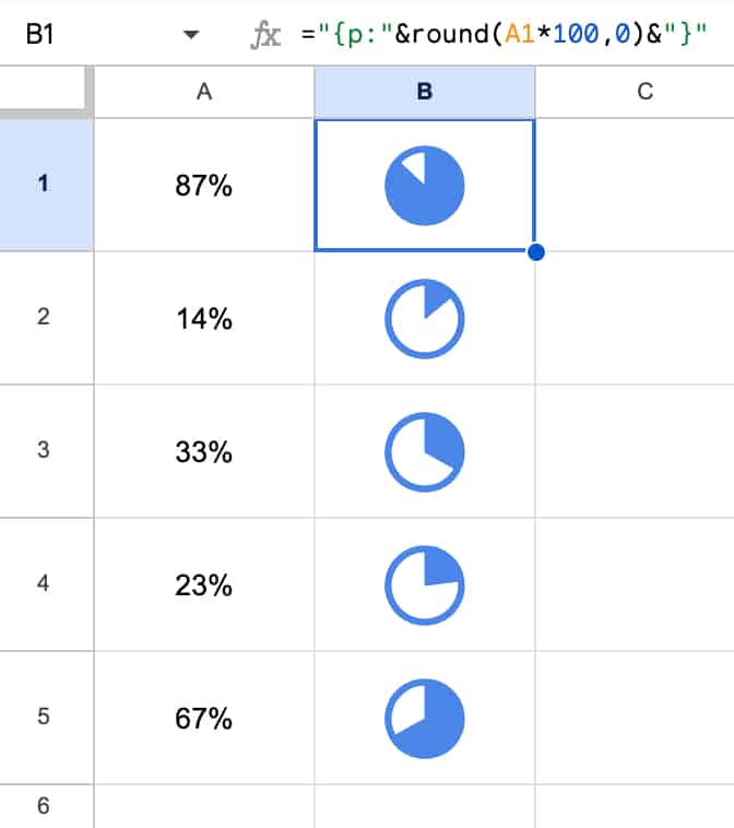
If you have true percentage figures, then you need to multiply them by 100 to get them into the correct formats for the chart expression.

Here’s an example in our sheet:

Note how I’ve applied a blue color to the font and it changes the color of the Datatype charts.

This approach using the Datatype font is much, much simpler than the previous way of implementing this using formulas and images.

You can also make these font charts bold or italic or even rotate the text, the same as you would with any other font.

And if you were planning to use these formulas often, you could set up a named formula to make your life easier.

4: Bar Charts

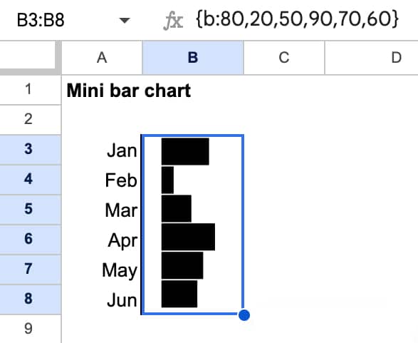
The data type font bar charts are actually column charts, but we can easily create bar charts where the bars are horizontal by rotating the text 90 degrees.

Here’s an example:

5: Pictures

Possible? Yes.

Useful? No.

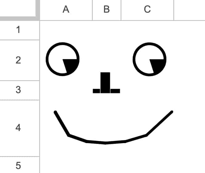
But it’s possible to draw silly things using only data with the datatype font applied, for example:

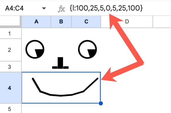
Under the hood, this is all values:

6: Animation

This is similar to some of the other crazy things I’ve built in Google Sheets, such as the Sparkline Formula Clock, the Etch-a-Sketch, and the Join-the-Dots.

Again, not necessarily useful, but an interesting concept to follow, for no other reason than to see what’s possible.

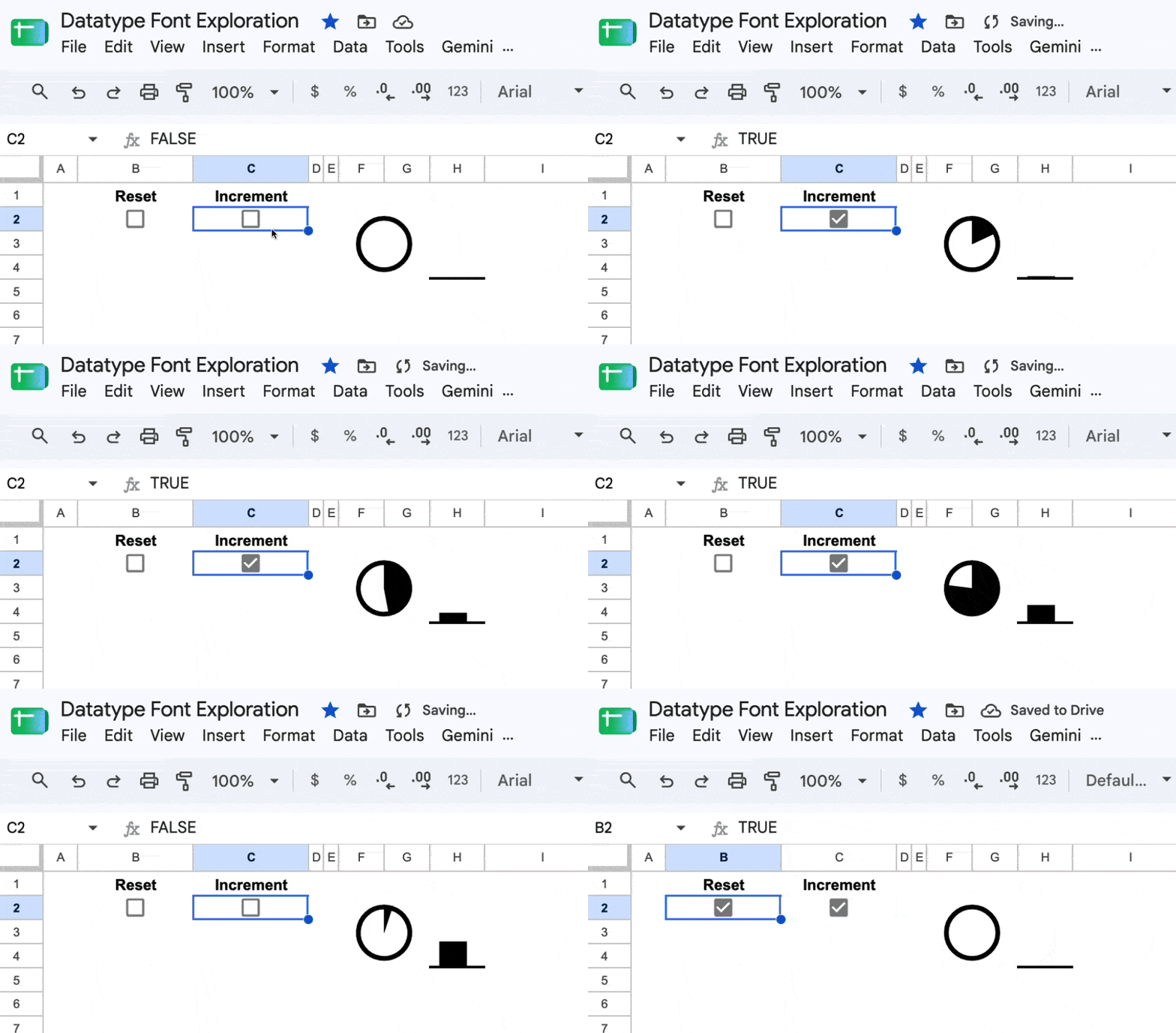
It’s based on the fact that Sheets calculates cells from top to bottom and left to right. For a fraction of a second, two cells with the same formula can have different values because one has updated but the other hasn’t. You can use this fact to create a counter.

By the way, you can toggle a checkbox very quickly on and off by holding down the spacebar.

7: Chart within a Chart

In September 2026, Google announced that the full Google Fonts web font library can now be used directly inside charts.

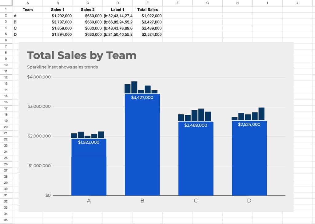
This means you can now create interesting “charts within charts” as shown in this example. (Whether you want to or not is another question.)

This technique uses the Datatype font to display chart labels as mini sparklines.

The trick is to include a label column that contains the Datatype chart expressions. In this example, it’s column D, called “Label 1” and contains data in this format: {b:32,43,14,27,45}

In the chart editor, we set this label font type to “Datatype” and it renders as mini-bar charts on top of the main bars.

This technique works for line charts as well, but weirdly, not with the pie chart option.

Template

🔗 Click here to open a view-only copy >>

Feel free to make a copy by clicking on the “Use Template” button.

If you can’t access the template, it might be because of your organization’s Google Workspace settings.

In this case, right-click the link to open it in an Incognito window to view it.

Build Dashboards and Kanban Boards with the Google Sheets Canvas Tool

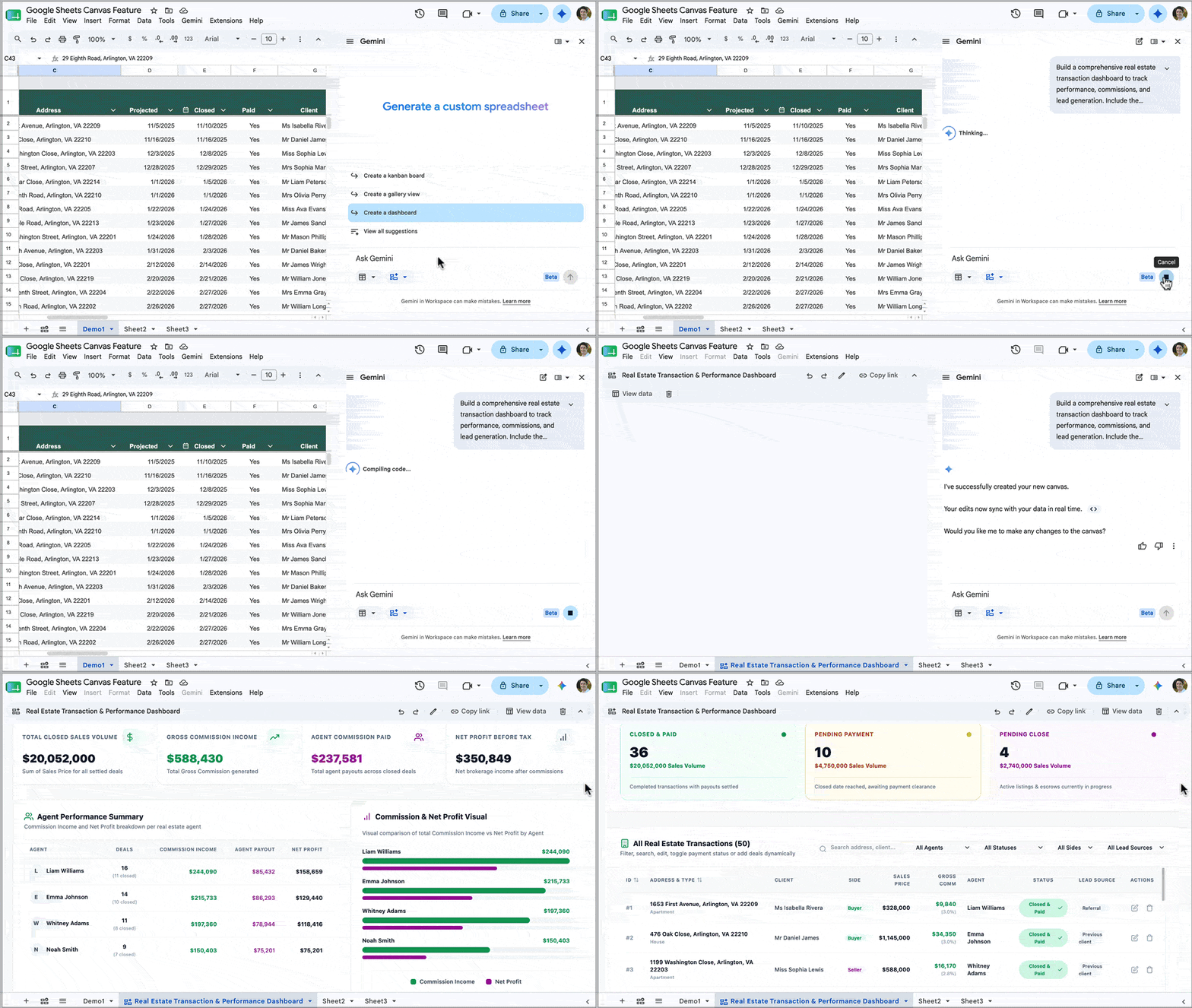
With the new Sheets Canvas feature, we can build professional-looking interactive dashboards directly in our Google Sheets, using nothing more than natural language prompts. It’s a huge upgrade from how we used to build dashboards in Sheets.

Sheets Canvas to build a professional dashboard

Previously, we clumped together charts and used formatting tricks such as borders and background cell colors to try and recreate a professional look. It was all rather challenging and time-consuming, with limited interactive options. (Read this post to see what I mean.)

Alternatively, we might have connected Google Sheets to a third-party tool, but these incurred extra costs, introduced security risks, and were often still pretty janky.

In this post, we are going to take a look at this new Sheets Canvas feature.

Sheets Canvas Availability

At the time of writing (August 2026), the Sheets canvas feature is only available to Google Workspace customers on Business or Enterprise Standard and Plus plans, or AI Pro for Education add-on subscribers, or to consumers on Google AI Pro and Ultra plans.

How To Build A Dashboard with Sheets Canvas

Firstly, you need to have your data ready to go in a Google Sheet, preferably in a Tables format, which is best for Gemini.

Secondly, it pays to think about your dashboard design before you start building it.

That way, you won’t end up building something that isn’t useful. Instead, you plan what information will be shown on the dashboard and how it will work, which will result in a more successful outcome.

For example, ask yourself these questions:

  • What are the key metrics to show?
  • Who is the intended audience for this dashboard?
  • How technically literate are they? Will they understand how to read complex charts?
  • How familiar are they with this data and its background context?

With your data and design plan to hand, you’re ready to start creating a Sheets Canvas.

There are three entry points:

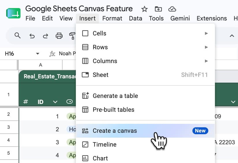
  1. From the toolbar: Insert > Canvas
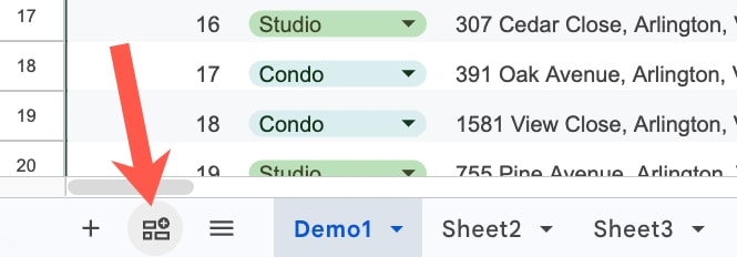
  2. Using the “Create a canvas” button in the bottom left of your Sheet, next to the Sheet names.
    (Both 1 and 2 open the Gemini sidebar with the Canvas option pre-selected.)
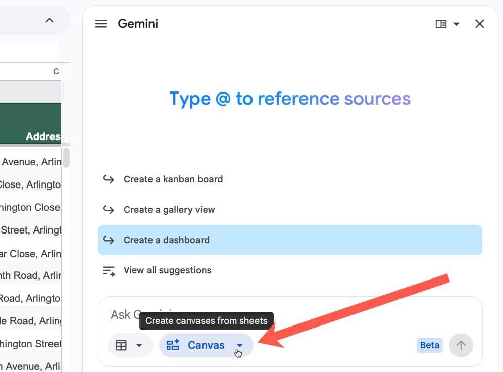
  3. You can select “Create canvas” directly in the Gemini sidebar too.

1. Insert menu:

Toolbar menu to insert a Sheets Canvas

2. Create a canvas button:

Insert button for Canvas feature in Google Sheets

3. Create canvas in Gemini Sidebar:

Canvas feature in Gemini sidebar of Google Sheet

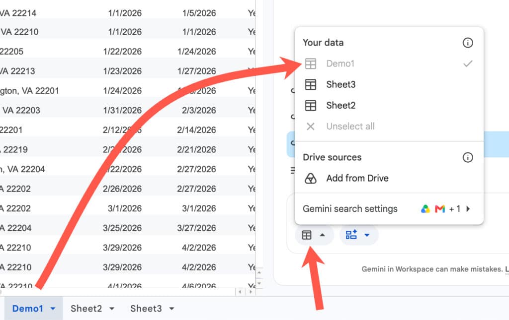
With Gemini sidebar open and the canvas feature selected, make sure you select the correct dataset(s) for the dashboard.

Use the button next to the Canvas option and choose the sheet containing your data. If you already have that sheet open, then it will automatically be selected, and you can deselect the other sheets if you don’t need them.

Select data in Sheets Canvas

Now you’re ready to insert your prompt.

Example 1: Real Estate Dashboard

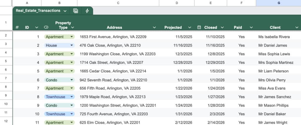
Consider this dataset of real estate transactions:

Real Estate data in Google Sheets

Here’s an example prompt to build a dashboard for this data:

Build a comprehensive real estate transaction dashboard to track performance, commissions, and lead generation. Include the following elements:

1. Key Performance Indicators (KPIs): Calculate the total sum of Sales Price, Commission Income, Agent Commission, and Net Profit for Tax for all “Closed” and “Paid” deals.

2. Agent Performance: Create a summary table or chart showing the total Commission Income and Net Profit generated by each Agent.

3. Lead Source Analysis: Create a bar chart breaking down total Sales Price and total number of transactions by Lead Source to see which marketing channels are most effective.

4. Buyer vs. Seller Split: Create a visual breakdown comparing the number of transactions and total Commission Income based on the Deal Side (Buyer vs. Seller).

5. Deal Pipeline: Provide a quick count of transactions categorized by Deal Status to show how many deals are currently pending versus closed.

Please format this with a clean, professional layout, using bold headers for each section and placing the charts logically next to the summary tables. 

Use hex color #0F9E59 as the primary color and #9E0F9C as the secondary color.

Pro Tip: Save your best dashboard prompts in a prompt library for future reuse.

Typically, Gemini takes a few minutes to build the dashboard, depending on how complex your prompt is.

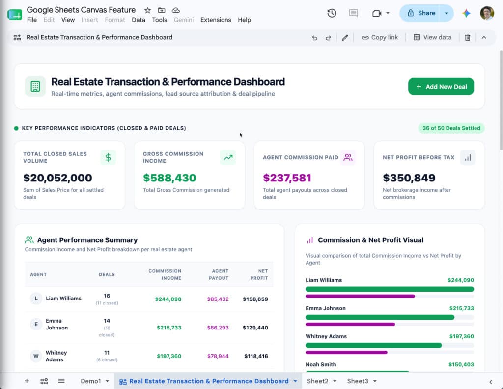
The output for the real estate data example looks like this:

A real estate dashboard built using Google Sheets Canvas

Notice how the colors match the colors mentioned in the prompt (#0F9E59 as the primary color and #9E0F9C as the secondary color).

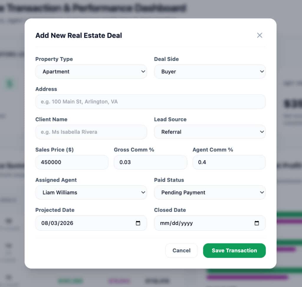
Also, notice the “Add New Deal” button in the top right corner. When you click this, it opens a pop-up with a form to add new deals:

Add new data button in Sheets Canvas

This data is inserted directly into your original data table in Google Sheets. It’s a great way for users to add new data without leaving the dashboard view, and it saves users from needing to navigate the data in the spreadsheet itself.

At the the top of the canvas is a small edit bar for making changes, sharing, or deleting the canvas:

To use the “Copy link” button to share the canvas, you need to first grant file access (through the regular “Share” button in the top right of your Google Sheet) to anyone you want to share the canvas with.

Example 2: Kanban Board

The Sheets canvas tool is not limited to regular dashboards, though.

It can also build interactive Kanban boards, which is my favorite use case and a killer feature.

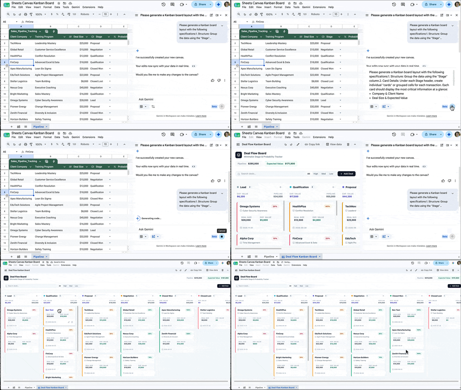
Build a Kanban board in Google Sheets with the Canvas feature.

Kanban boards are visual project management tools that organize tasks into columns and allow you to drag and drop cards between these columns.

Previously, this sort of interactivity was impossible inside of Google Sheets, but now with this new Sheets Canvas feature, you can build a fully featured Kanban board with a single prompt.

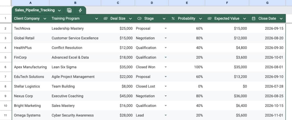
For example, here is a client pipeline data set for training contracts:

Sales Data Pipeline in Google Sheets

And here’s an example prompt to generate a Kanban board from this data:

Please generate a Kanban board layout with the following specifications:

1. Structure: Group the data using the “Stage” column.

2. Card Details: Under each Stage header, create individual “cards” or grouped cells for each transaction. Each card should display the most critical information at a glance:

  • Company & Client Name
  • Deal Size & Expected Value

3. Formatting:

  • Please apply conditional formatting or color-coding to the cards based on the “Probability” column (e.g., green for high probability, yellow for medium, red/gray for low) so I can easily identify which deals are most likely to close.
  • Ensure the layout is clean and minimalist.

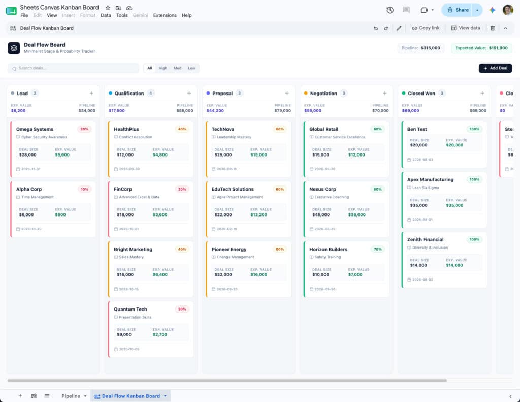
The output from this prompt looks something like this:

Kanban Board in Sheets Canvas

You can then drag these cards into different columns as needed to show progress. When you drag a card into a new column, the data in the underlying sheet also updates to reflect that, so they are always synced in real time.

And as with the dashboard from earlier, there is also a button to add new data from the Kanban canvas rather than having to go back to the actual spreadsheet data.

Here are 6 more mini apps you can create with Sheets canvas.

Limitations

At the moment, if you want to modify the dashboard generated by the Sheets Canvas tool, you give it an additional prompt in the Gemini sidebar. For example, you might prompt Gemini with “change the leads pie chart into a bar chart“.

Unfortunately, when Gemini updates the dashboard, other elements might inadvertently change too.

I think the real breakthrough will come when we can click on individual features within the Dashboard or Kanban board and give specific instructions to modify that specific feature only with a prompt. Hopefully that is something coming down the line.

Conclusion

This new Sheets Canvas feature is a fantastic tool that dramatically expands the possibilities of what you can do with data in Google Sheets.

And, whilst the regular chart tool will remain extremely useful for specific analysis and one-off charts, the old way of building dashboards is rapidly becoming obsolete.

I can’t imagine spending hours manually positioning charts, hand-picking background cell colors and borders, and all manner of other dark arts, to build a dashboard the old way, knowing it wouldn’t even look half as good as what this new canvas tool can build in a few minutes.

If you have access to this canvas tool, then I encourage you to experiment with it to build your dashboards.

Google Sheets and Workspace Updates from Google Next 2026

Unfortunately, I missed the Google Next conference this year. 

It looked like a great event with loads of exciting announcements, including significant ones for Google Workspace. The big shift in 2026 is the evolution from AI assistance (Gemini helping you) to Agent workflows (Gemini doing things for you).

Here’s a list of the most interesting for us Sheets/Workspace developers, but let me know if you think I missed anything!

Across Google Workspace

  • Google Workspace Intelligence: making Gemini assistant smarter by letting it tap into your organization’s actual work context, not just the open internet. It looks at your work content and patterns and reasons over that.
  • Universal Search: Agents can search across all Workspace Apps to get a consolidated view of the user’s context across all apps.
  • Official Workspace CLI (Command Line Interface) to call Workspace APIs from command line.
  • Dedicated Workspace MCP Server: For Gmail, Drive, Calendar, Chat, People.
  • Agent Control Centre in Google Workspace Admin Console to help you monitor, control, and audit agent access to your data in Workspace.

Gemini in Sheets

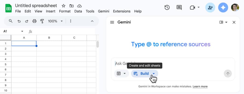
The new “Build” feature in Google Sheets.

Google Apps Script

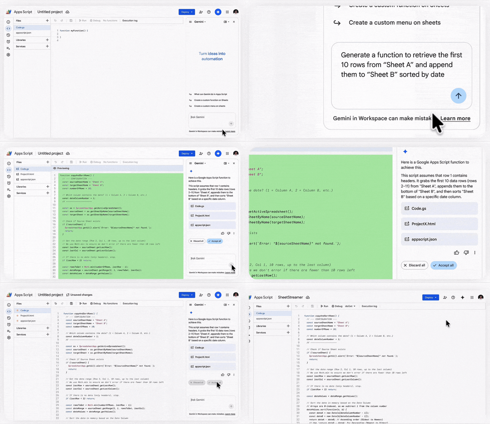
Gemini sidebar in Apps Script editor (coming soon).

Workspace Studio

Workspace Studio is the new visual, drag-and-drop tool that lets users build workflow agents using natural language. New features coming:

  • Skills feature (see announcement #2): To deploy agentic automation across every team.
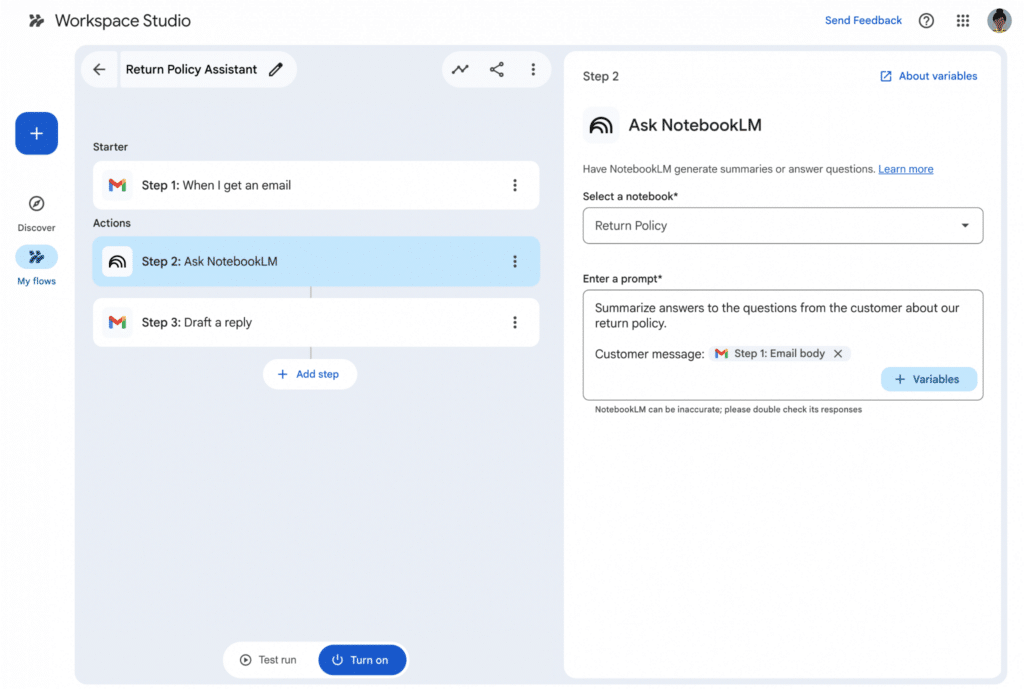
  • NotebookLM Integration: Integrate notebooks from NotebookLM directly into Google Workspace Studio automation workflows to use existing documents as a grounded knowledge source.
  • Third-Party Connectors: Out-of-the-box integration for agents to pull data from Asana, Jira, Mailchimp, and Salesforce directly into Workspace.
  • Gems Integration: An “Ask a Gem” step that allows flows to send prompts to private Gems to automate summaries or document creation.
NotebookLM integration with Workspace Studio.

Further Reading

Here’s Google’s official video summarizing the key Workspace announcements:

And here’s the full list of all 260 product announcements from Google Next 2026:

260 things we announced at Google Cloud Next ’26 – a recap

11 Incredibly Useful URL Tricks for Google Sheets

Did you know that by changing the URL of a Google Sheet we can change how it behaves?

In this post, we look at 11 incredibly useful URL Tricks for Google Sheets.

For example, we can create a URL that automatically downloads the Sheet as a PDF. Or create a template ready for copying. And much more.

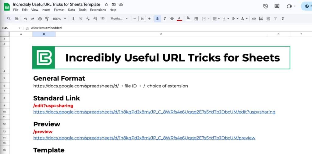
URL Tricks for Google Sheets

Take a look at any Google Sheets URL in the address bar of your browser.

It will take the following form:

https://docs.google.com/spreadsheets/d/ + file ID + / extension

We can change the /extension at the end of the URL to ensure a different action happens when a user uses that URL.

Feel free to click on any of the links below to see how they work. They are all linked to the following template, which you can copy for your own reference (bonus points if you use the correct URL trick to do that).

URL Tricks for Google Sheets

1. Standard Sharing Link Format

This is the default sharing link for Google Sheets. Users with appropriate permissions can view or edit the sheet.

  • Advantages: Provides direct access to the Sheet with full functionality.
  • Limitations: If set to “Anyone with the link can edit,” any users can make changes.
  • Best For: Team collaboration when you want users to view or edit the Sheet.

Extension Format:
/edit?usp=sharing

Example link:
https://docs.google.com/spreadsheets/d/1h8kgPdJx8myJP_C_8WRfs4x6Uqqg2E7s5YdTpJDbcUM/edit?usp=sharing

2. Preview

Opens the spreadsheet in a read-only format without showing the editing toolbar.

  • Advantages: Cleaner presentation without distractions from menus and tools.
  • Limitations: Users cannot edit or copy directly from this view.
  • Best For: Great for sharing data in a presentation format when you don’t want users to make edits.

Extension Format:
/preview

Example link:
https://docs.google.com/spreadsheets/d/1h8kgPdJx8myJP_C_8WRfs4x6Uqqg2E7s5YdTpJDbcUM/preview​

3. HTML View

Converts the sheet into a basic HTML page.

  • Advantages: Loads faster and is accessible without needing Google Sheets’ interface.
  • Limitations: Some formatting and interactive features may not function properly.
  • Best For: Useful for reports since it eliminates sheet controls but allows you to still navigate between tabs.

Extension Format:
/htmlview

Example link:
https://docs.google.com/spreadsheets/d/1h8kgPdJx8myJP_C_8WRfs4x6Uqqg2E7s5YdTpJDbcUM/htmlview

4. Template

Opens a “Use Template” preview, allowing users to see and create their own copy of the file.

  • Advantages: Prevents accidental changes to the original document while ensuring consistency across copies.
  • Limitations: Users must have permission to access the original file.
  • Best For: Ideal for distributing Google Sheets to wider audiences so they can create their own copies.

Extension Format:
/template/preview

Example link:
https://docs.google.com/spreadsheets/d/1h8kgPdJx8myJP_C_8WRfs4x6Uqqg2E7s5YdTpJDbcUM/template/preview​

5. Make a Copy

Prompts users to create their own editable copy of the spreadsheet.

  • Advantages: Ensures the original file remains unchanged and user makes a copy.
  • Limitations: Requires users to be signed into Google to create a copy.
  • Best For: Useful for ensuring users make a copy of a Google Sheet.

Extension Format:
/copy

Example link:
https://docs.google.com/spreadsheets/d/1h8kgPdJx8myJP_C_8WRfs4x6Uqqg2E7s5YdTpJDbcUM/copy​

6. Export as a PDF

Generates a downloadable PDF version of the spreadsheet.

  • Advantages: PDF format ensures consistency across devices and prevents edits.
  • Limitations: Not interactive, not all features will display correctly; updates to the sheet require generating a new PDF.
  • Best For: Perfect for distributing static reports, tables, invoices, or finalized documents.

Extension Format:
/export?format=pdf

Example link:
https://docs.google.com/spreadsheets/d/1h8kgPdJx8myJP_C_8WRfs4x6Uqqg2E7s5YdTpJDbcUM/export?format=pdf​

7. Export as a CSV

Provides a downloadable CSV version of the sheet, exporting only the active tab.

  • Advantages: Downloads your data in a universal format compatible with most data processing tools.
  • Limitations: Loses formatting, formulas, interactive elements, and multiple sheet structures.
  • Best For: Great for exporting data tables for analysis in other software, such as databases or coding environments.

Extension Format:
/export?format=csv

Example link:
https://docs.google.com/spreadsheets/d/1h8kgPdJx8myJP_C_8WRfs4x6Uqqg2E7s5YdTpJDbcUM/export?format=csv​

8. Export as an Excel Document

Downloads the spreadsheet as an Excel (.xlsx) file.

  • Advantages: Retains formulas, formatting, and multiple sheets.
  • Limitations: Some Google Sheets-specific features (like QUERY function or Google Apps Script) may not work in Excel.
  • Best For: Best for sharing Sheets with users who prefer or require Excel.

Extension Format:
/export?format=xlsx

Example link:
https://docs.google.com/spreadsheets/d/1h8kgPdJx8myJP_C_8WRfs4x6Uqqg2E7s5YdTpJDbcUM/export?format=xlsx​

9. Distraction Free Editor

Opens the sheet in a minimalistic mode with no toolbars or menus.

  • Advantages: Reduces clutter and distractions for focused editing.
  • Limitations: Some editing options may not be accessible.
  • Best For: Useful for presenting data cleanly or working in a distraction-free environment.

Extension Format:
/view?rm=minimal

Example link:
https://docs.google.com/spreadsheets/d/1h8kgPdJx8myJP_C_8WRfs4x6Uqqg2E7s5YdTpJDbcUM/view?rm=minimal​

(Because I shared a view-only copy, you won’t be able to do any editing. Share with editor rights if you want to use this feature.)

10. Basic Controls Editor

Opens the sheet in a limited interface with only essential tools.

  • Advantages: Allows basic editing without overwhelming users.
  • Limitations: Lacks full editing capabilities.
  • Best For: Ideal for users who need to make small modifications but don’t require full spreadsheet features.

Extension Format:
/view?rm=demo

Example link:
https://docs.google.com/spreadsheets/d/1h8kgPdJx8myJP_C_8WRfs4x6Uqqg2E7s5YdTpJDbcUM/view?rm=demo​

11. Embed in Iframe

Embeds the spreadsheet in a webpage without extra Google Sheets UI elements.

  • Advantages: Provides a seamless way to display live data in a website or online dashboard.
  • Limitations: Users cannot interact fully unless given editing access.
  • Best For: Great for embedding spreadsheets in blogs, dashboards, or reports where live data needs to be displayed.

Extension Format:
/view?rm=embedded

Example link:
https://docs.google.com/spreadsheets/d/1h8kgPdJx8myJP_C_8WRfs4x6Uqqg2E7s5YdTpJDbcUM/view?rm=embedded​