Exploring Population Growth And Chaos Theory With The Logistic Map, In Google Sheets

In this post, I want to show you something amazing: how a simple equation the logistic map can lead to incredible outcomes, and even to chaos.

And we’ll explore this with Google Sheets so you can follow along (please download the template at end of the post).

But first, we begin our story in a field far, far away, where two bunnies are getting down to, erm, business, shall we say, as they start a fluffle* of rabbits…

* collective noun for wild rabbits

Two rabbits in a field

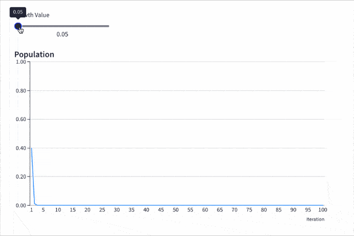
Provided the growth rate is greater than one, the population grows until it becomes constrained by limited resources (for example, food). Then it settles into a stable population, neither increasing nor decreasing year on year.

But as the growth rate increases weird things start happening.

The rabbit population grows faster but it doesn’t settle down to a single equilibrium (stable population) anymore. No. In fact, the population oscillates between two equilibrium values. One year high, one year low, then back to the high value again, then low, and so on, to infinity.

Keep increasing the growth rate, however, and suddenly the population oscillates between four equilibriums. Then eight. Then sixteen.

And if it increases past the specific growth rate of 3.57, well all bets are off the table!

The population becomes chaotic and never settles into any equilibrium at all. It bounces around randomly, some years high, others low, others in the middle, with no pattern.

Except that’s not the end of the story.

Incredibly, within this region of chaotic behavior lie “islands of stability”. Short windows at specific growth rates where order re-establishes itself.

Out of the chaos, a periodic pattern emerges! 🤯

The Logistic Map

Here is the logistic map with a changing growth rate to illustrate how the population changes:

Logistic Map Iterations in Grid

Contents:

  1. The Logistic Map Equation
  2. Comparing Populations At Different Growth Rates
  3. The Bifurcation Diagram
  4. How To Create The Logistic Map In Google Sheets
  5. How To Create An Interactive Population Model With Grid
  6. How To Create The Bifurcation Diagram
  7. Displaying The Logistic Map Equation In Google Sheets
  8. Logistic Map Template In Google Sheets
  9. Further Reading

Continue reading Exploring Population Growth And Chaos Theory With The Logistic Map, In Google Sheets

How To Use The Choose Function In Google Sheets

The CHOOSE Function in Google Sheets lets you choose between different options.

It’s a lookup function, akin to a limited VLOOKUP rather than an alternative to the IF function.

It takes an index number and returns a value at that numbered position from the list of possible options.

Here’s a simple example:

=CHOOSE(1,"A","B")

which will output:

CHOOSE Function in Google Sheets

The first argument is the index number: 1.

Subsequent arguments are possible choices. The CHOOSE function returns the value at index position 1 in this case, i.e. “A”.

If I changed the index number to 2, the CHOOSE function would output “B”.

🔗 Get this example and others in the template at the bottom of this article.

Continue reading How To Use The Choose Function In Google Sheets

How To Create A Heat Map In Google Sheets

Heat maps in Google Sheets are a great way to add context to your data.

They bring attention to the high and low values in your data, to outliers that demand attention.

Best of all, heat maps in Google Sheets are easy to create.

Consider this dataset showing monthly temperatures for Washington D.C.:

Temperature Data In Google Sheets

Without any formatting, it’s boring to look at, doesn’t convey any immediate takeaways, and it’s hard to spot trends such as which years were hotter than others.

Now compare that to the same dataset with a heat map overlay (click to enlarge):

Temperature Heat Map In Google Sheets

Wow! The stories jump off the page at you now. You can easily compare the years and see which years had longer winters, or hotter summers.

Let’s see how to create a heat map in Google Sheets.

Continue reading How To Create A Heat Map In Google Sheets

How To Create Arrays In Google Sheets (a.k.a. Array Literals)

Arrays in Google Sheets are collections of data, consisting of rows and columns. You can use arrays in formulas in the same way that you use regular A1-type ranges.

You construct arrays in Google Sheets with curly brackets: { }

They’re also known as ARRAY LITERALS.

Continue reading How To Create Arrays In Google Sheets (a.k.a. Array Literals)

How To Rank Data In Google Sheets With The RANK Function

Google Sheets has three functions to rank data: the RANK function, the RANK.EQ function, and the RANK.AVG function.

All three functions return the rank (position) of a value in a dataset.

RANK and RANK.EQ are equivalent to each other and return the top rank for values that are tied. RANK.EQ is the more modern notation, to explicitly differentiate itself from RANK.AVG.

The RANK.AVG function differs by returning the average rank of any entries that are tied.

Consider this dataset showing the three RANK functions in action, with a tie highlighted in yellow:

All Rank Functions

Both RANK and RANK.EQ display the tied values with the rank 5, whereas RANK.AVG shows the average rank of 5.5 (i.e. the average of position 5 and position 6).

The RANK formula in column C:

=RANK(B2,$B$2:$B$11)

And RANK.EQ formula in column D, giving the same answer:

=RANK.EQ(B2,$B$2:$B$11)

Finally, RANK.AVG formula is in column E:

=RANK.AVG(B2,$B$2:$B$11)

🔗 Get this example and others in the template at the bottom of this article.

Continue reading How To Rank Data In Google Sheets With The RANK Function